Built with Lovart
Kipple Brand Identity Development
Révolté
Kipple — Brand Identity
· Brand Identity, Visual Language, Campaign Design
· 2026
Overview
Kipple is a friendship-matching app — the social connection tool for people who've aged out of the easy, accidental friendships of school and into the deliberate, slightly awkward business of making new ones as an adult. The brief was to build a brand from zero: name, logo, visual language, and a full suite of campaign assets that could live across digital and physical media.
The challenge wasn't just aesthetic. It was emotional. The brand needed to feel genuinely warm without being saccharine, playful without being juvenile, and modern without falling into the sterile minimal-tech trap that most apps default to. It needed to feel like a person — someone you'd actually want to hang out with.
The Name
Ten names were explored before landing on Kipple. The selection criteria were simple: it had to be invented, short, pronounceable in any language, and carry no baggage. Kipple won because it sounds like a companion — a little quirky, immediately friendly, impossible to mishear. It has the cadence of a nickname someone gives you on the first day and it sticks forever.
Brand Strategy
Three pillars drove every decision:
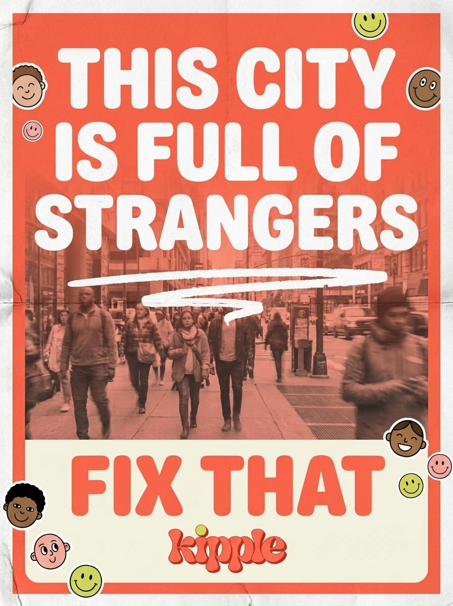
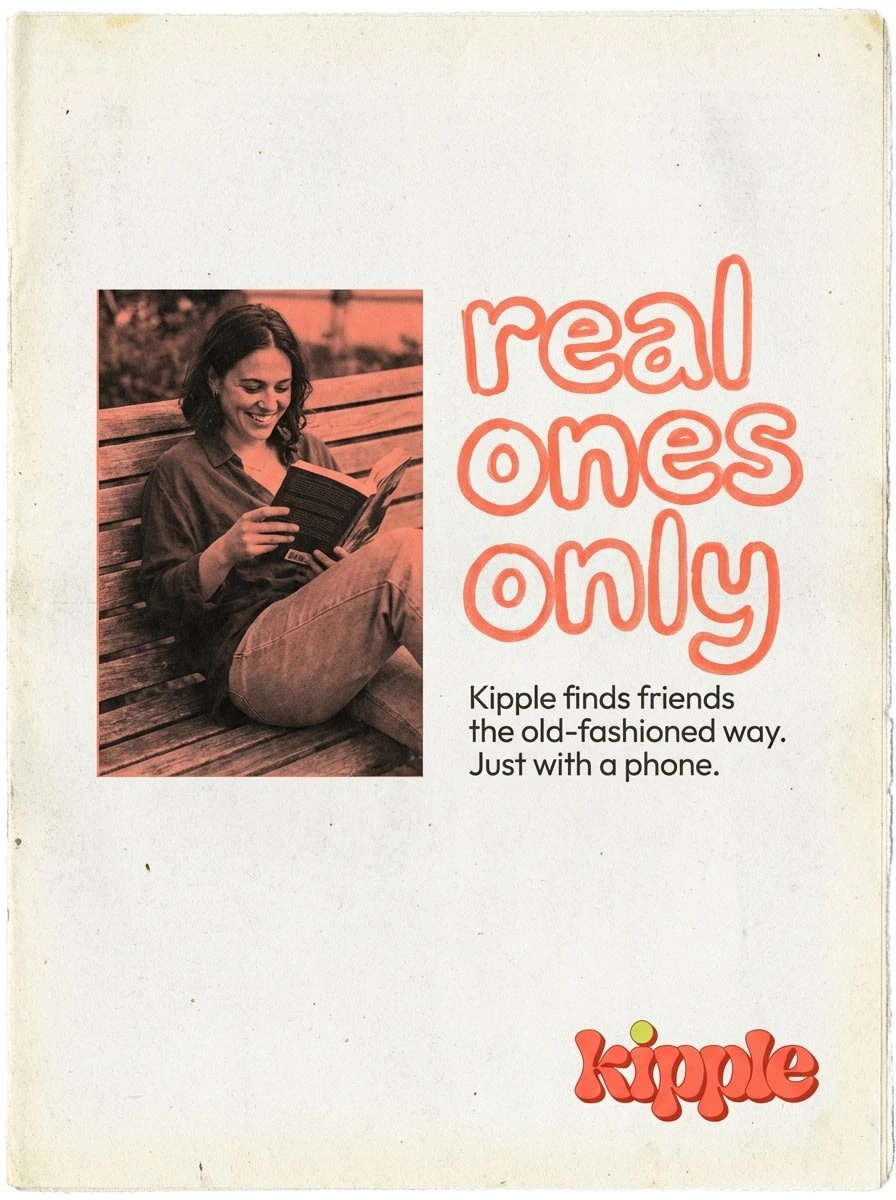
Real over polished. Friendship is messy, candid, and imperfect. The brand should never feel like a stock photo or a corporate campaign. Every image is candid in spirit — even when controlled in production.
Drawn into the world. The signature visual device is the collision of photography and hand-drawn illustration within the same frame. Not as separate layers stacked on top of each other, but as two realities actively interacting — illustrated elements growing out of photographs, figures crossing from one world into the other, drawn lines tracing the edges of real things.
Warm but not soft. The brand has opinions. The copywriting is direct, sometimes confrontational in a playful way ("this city is full of strangers — fix that"). The color palette is warm coral and electric lime, not blush pink and sage. The logo has 3D weight and retro attitude. This is a brand that believes in what it's doing.
Logo
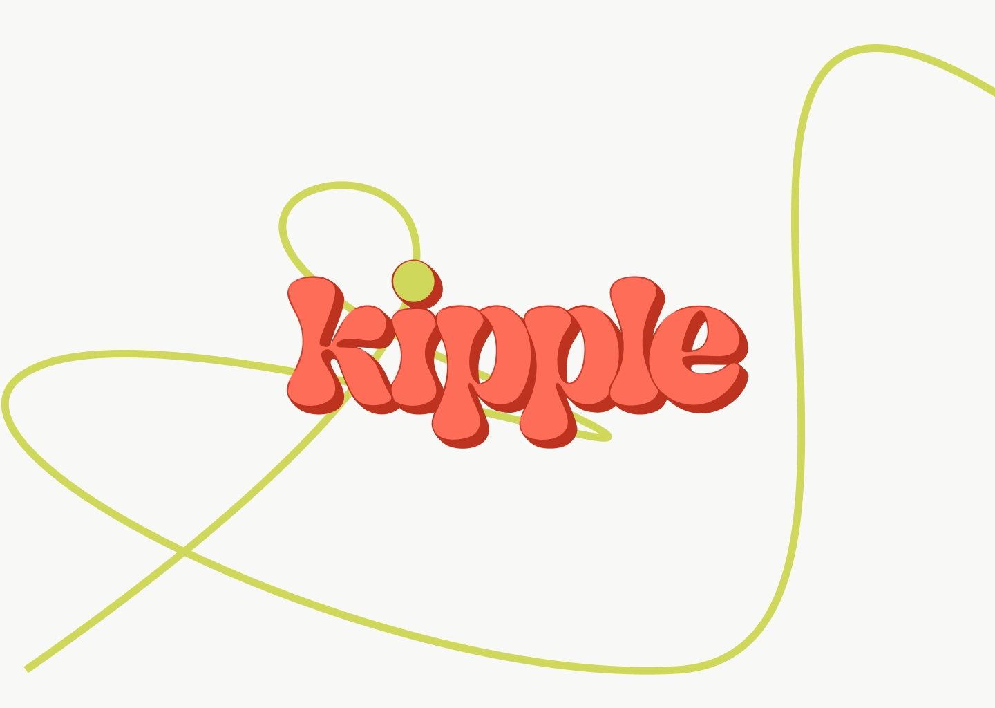
The wordmark is set in a custom-inflated rounded lettering style — all lowercase, deeply bubbly, with a subtle 3D depth treatment in a darker coral shadow that gives the letters physical presence. The letterforms sit close together, comfortable, like the characters themselves are already friends.
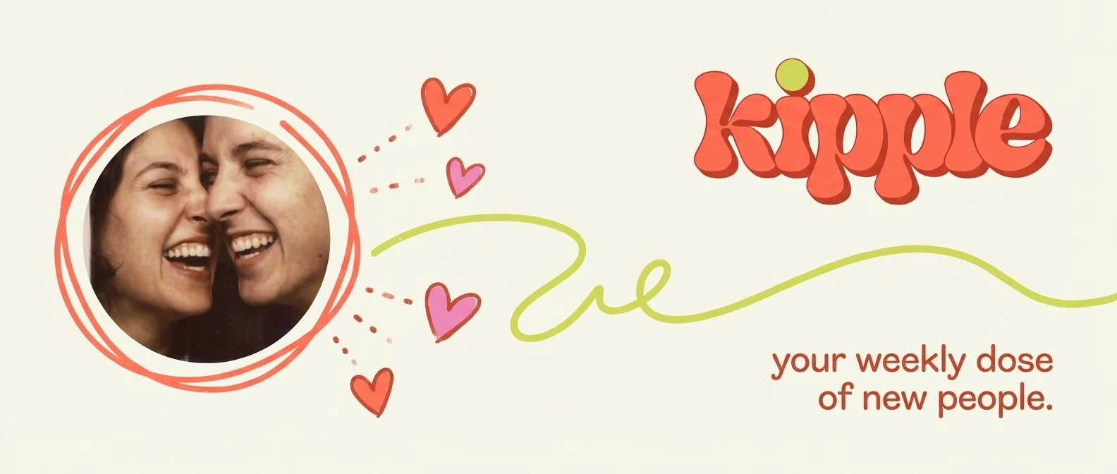
The single distinguishing mark: the dot on the i is replaced by a lime green (#B5E550) circle — the only element that breaks the coral monochrome. It functions as both a punctuation mark and a spark, visually implying the notification dot, the match, the moment of connection. Small, precise, essential.
The wordmark carries naturally across all scales: embossed into a cloth brand book cover, printed on a sweatshirt chest, displayed at billboard size, or sitting in a 32px app icon slot. It never loses its character.
Visual Language
Color palette: Warm coral (#FF6B4A) as the dominant brand color — energetic without being aggressive, warm without being feminine-coded. Lime green (#B5E550) as the single accent — used sparingly, always as a signal of life or connection. Cream (#FFF5EE) as the neutral ground. Deep charcoal for type when not reversing out.
Typography: A plump, rounded sans-serif system — bold display weights for headlines, clean rounded medium for body. All lowercase in brand contexts, sentence case in editorial contexts. The type has the same inflated quality as the logo — nothing sharp, nothing cold.
Illustration style: Loose, confident line work in coral and lime. Botanical elements (leaves, plants, stems) for warmth and growth. Human figures simplified to gesture and posture — no detailed faces, just body language that reads as connection. Speech bubbles, stars, sparkle marks, squiggly frames. The illustration never tries to be fine art — it has the energy of someone drawing while talking.
Photography style: Warm-toned, candid, slightly overexposed in the highlights. Real moments or real-looking moments. Skin texture, motion blur, available light. Color-graded with a coral wash when used in duotone contexts. Shot qualities range from medium-format editorial (brand book, lookbook) to film-grain documentary (artist print, poster series).
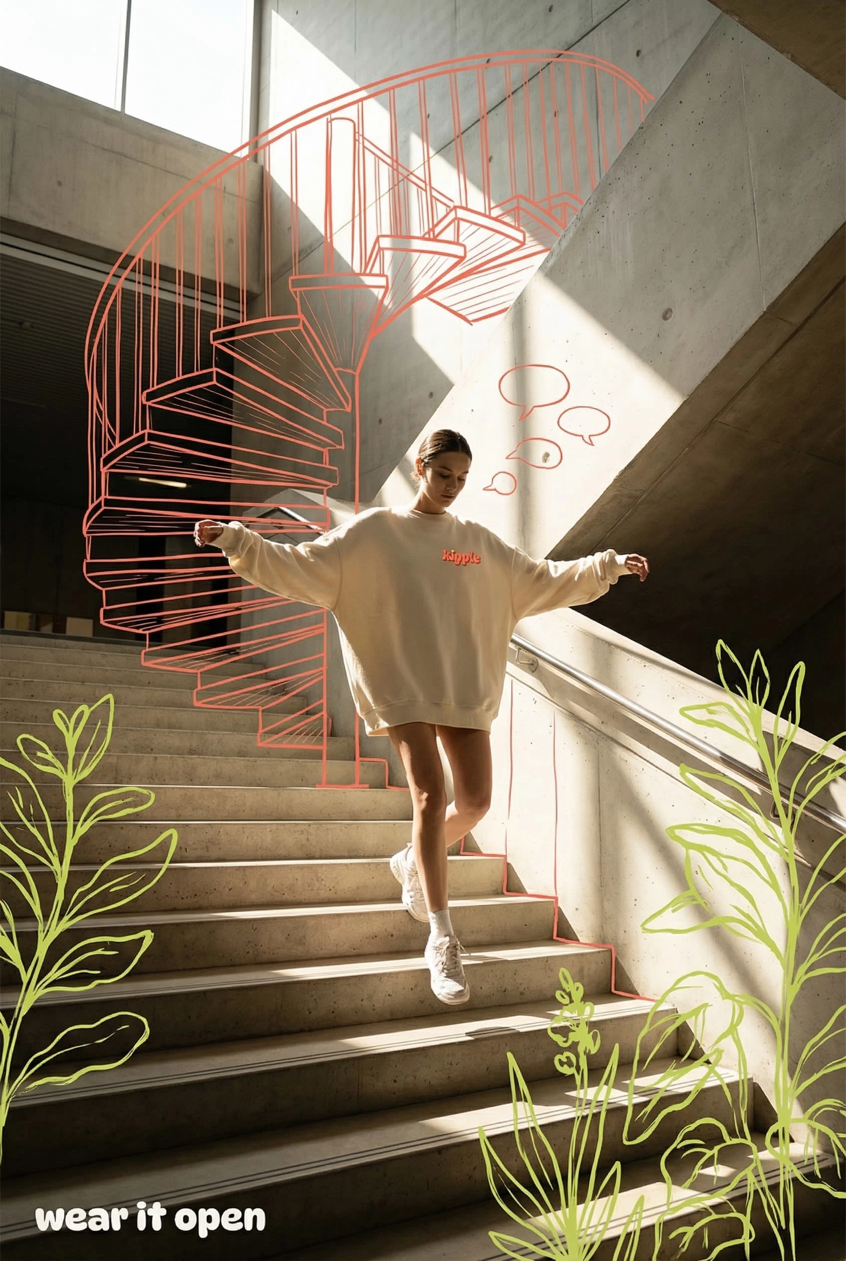
The hybrid device: The brand's most distinctive visual move is the active integration of photo and illustration within one image plane. Not collage — conversation. Illustrated staircase echoing a real staircase behind a figure. Drawn figures emerging from the base of a real photograph. A diagonal edge where the rooftop party physically crosses from photograph into illustration. This device is used differently in each context but follows one rule: the two worlds must feel like they belong together.
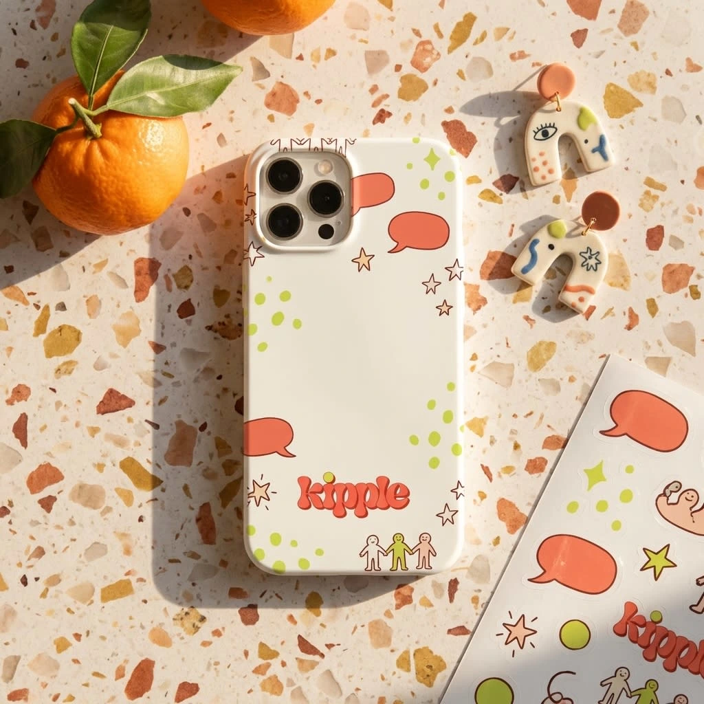
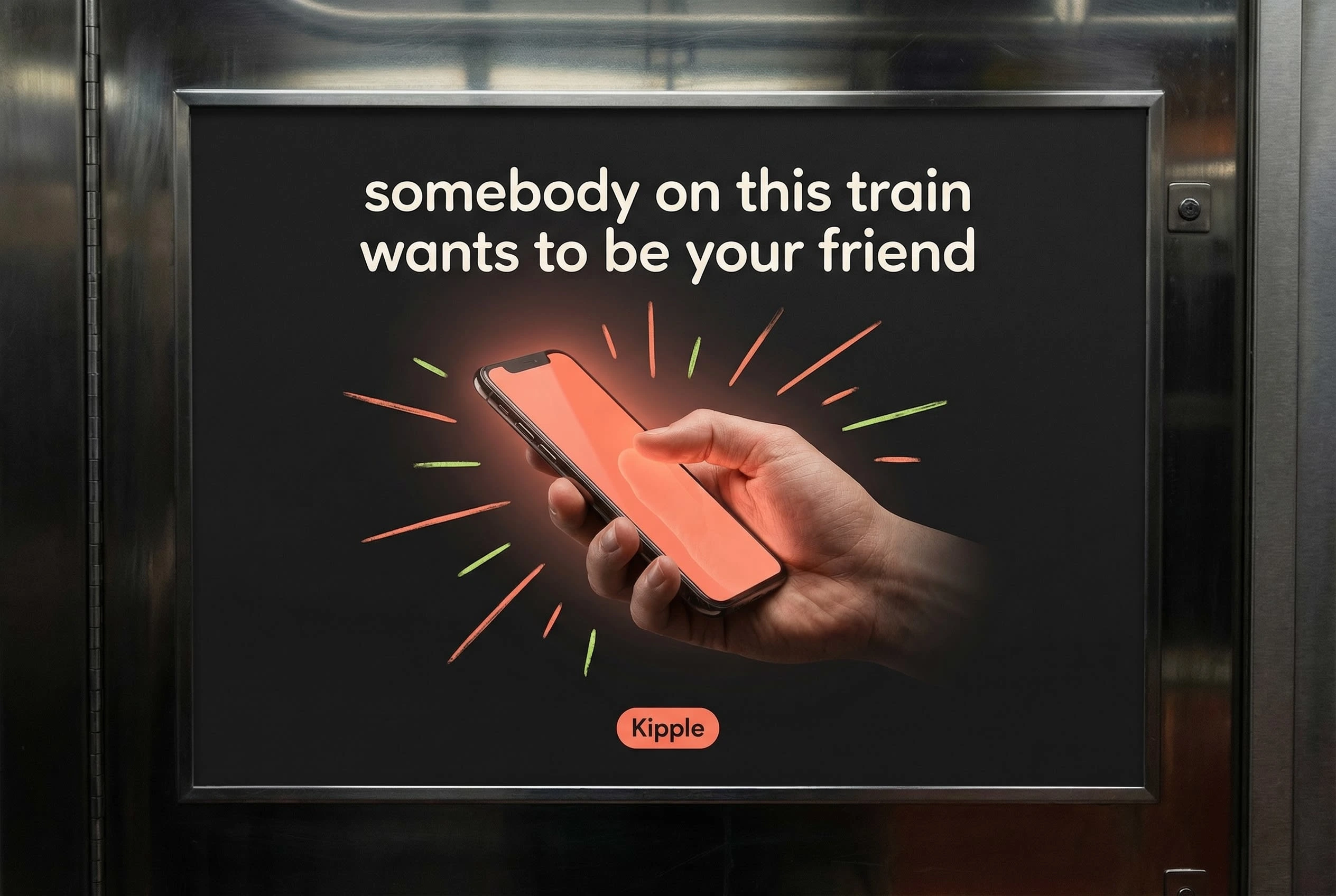
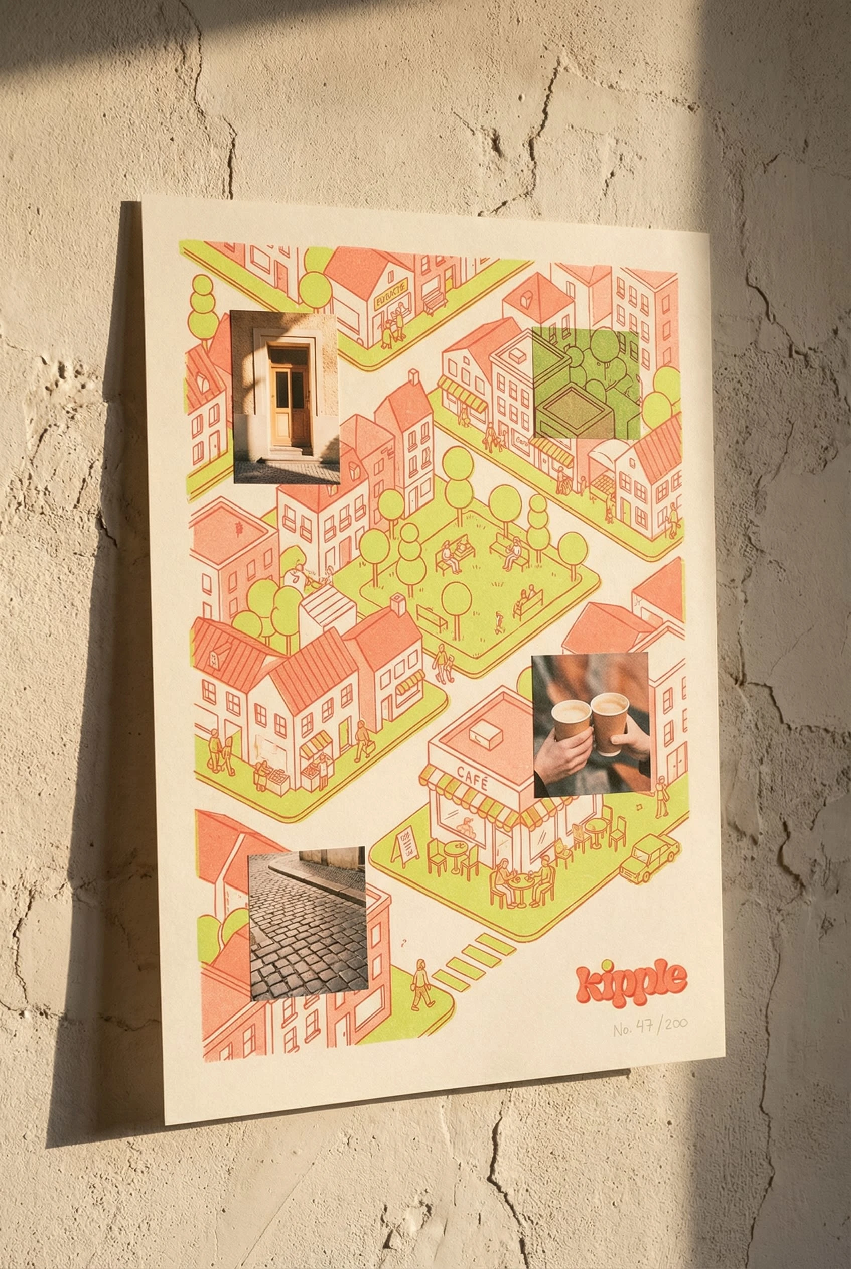
Applications
18 mockups were produced across the full brand touchpoint range, organized across three territories:
Campaign & Advertising — Social media post, billboard, story ad, subway carriage card, café poster, digital OOH screen. Each mockup demonstrates the photo-illustration hybrid at a different scale and context, from intimate (the email header circle portrait) to monumental (the diagonal-split digital billboard).
Editorial & Print — Newspaper ad, A2 poster, limited edition risograph print, brand book / welcome kit. The risograph print (Artist Series No.1) pushed the concept furthest — an isometric illustrated city with photographic fragments embedded as windows into real life, printed in two-color risograph on uncoated stock with deliberate misregistration.
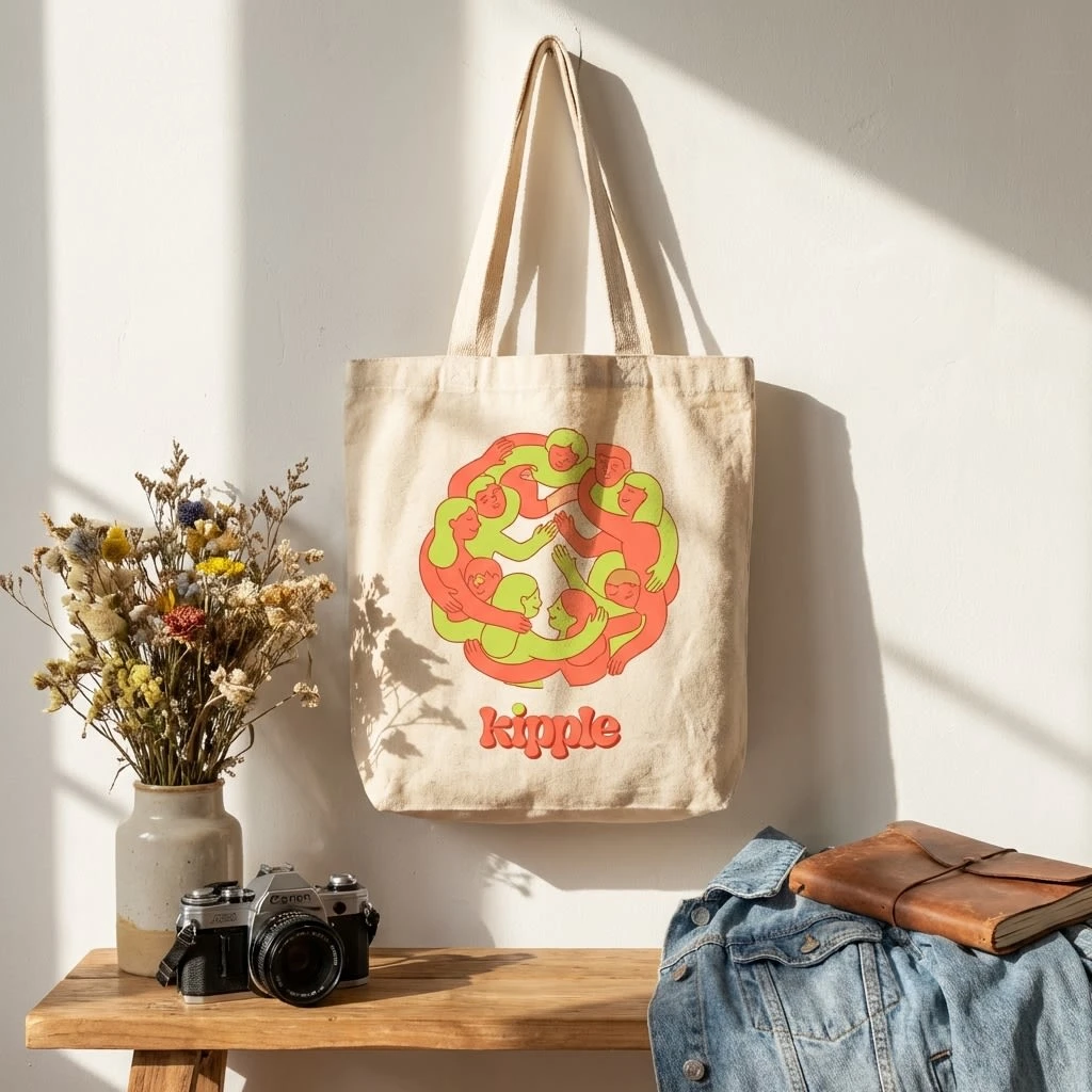
Physical & Product — Tote bag, phone case, apparel lookbook, café window vinyl, event installation panel. The lookbook image became one of the strongest pieces in the set: a model in a cream Kipple sweatshirt descending a concrete staircase, surrounded by a large coral illustrated spiral staircase echoing the real one, lime botanical elements growing from the frame edges.
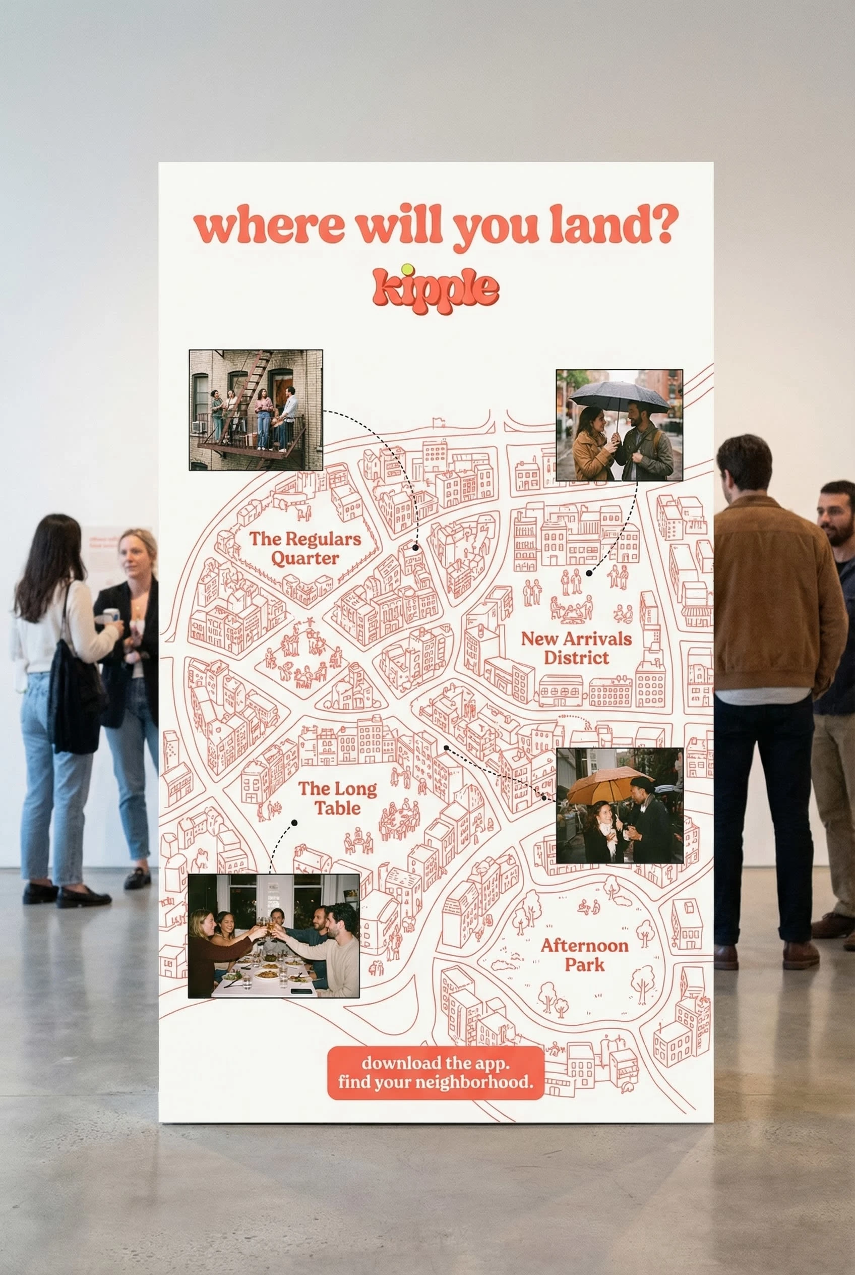
Experiential — The interactive kiosk installation ("The Kipple Map") demonstrated the brand at its most ambitious: a large-format illustrated map of an imaginary city, with photographic inserts at key landmarks and neighborhood names like The Regulars Quarter and New Arrivals District. Shot in a gallery-white space with real people interacting in the background, it showed the brand functioning as an experience rather than just a communication.
Outcome
Kipple emerged as a brand with a distinct, ownable visual identity that holds together across every scale and format — from a wax-sealed envelope to a 6-meter billboard. The core tension that makes it work: it feels handmade and human while being formally rigorous underneath. The photo-illustration hybrid device is not a style choice — it is a brand argument. Kipple exists at the boundary between the world you already live in and the connections you haven't made yet. The brand lives there too.
Brand identity, naming, logo design, visual language, campaign design, mockup production.
Year: 2026
Like this project
Posted Mar 22, 2026
Kipple, a friendship app brand built from scratch. Warm coral, bubbly logo, and a visual world where photography and illustration collide.
Likes
2
Views
38
Timeline
Mar 16, 2026 - Mar 22, 2026