Built with Lovart
DPLY Brand Identity & Web Creation
Révolté
DPLY — Brand Identity & Web Direction
Discipline: Brand Identity, Logo Design, Art Direction, Web Design
Deliverables: Mark, Wordmark, Color System, Type System, Copywriting, Hero/Landing Design, Digital & Physical Applications
The Brief
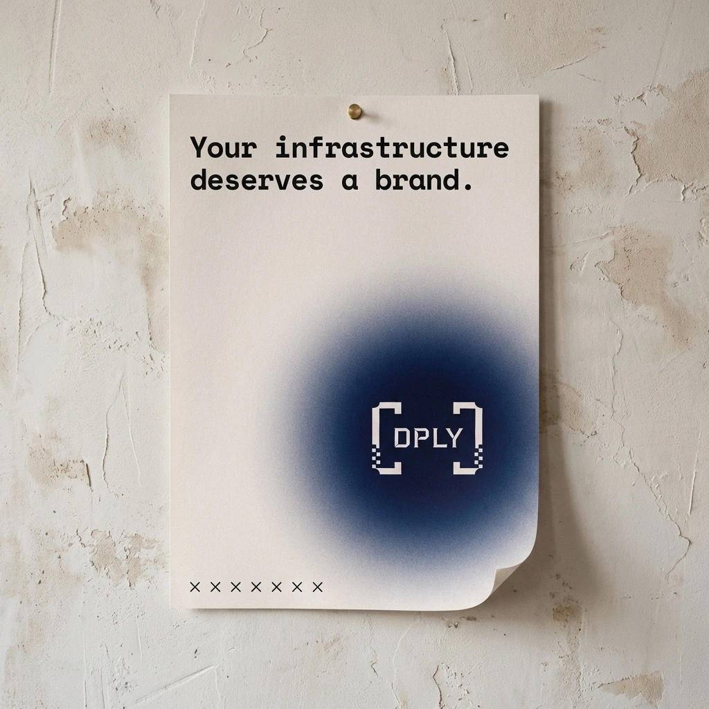
Status pages live at the worst possible moment — when something is broken, when users are frustrated, when engineers are scrambling. They are infrastructure. And for most companies, they look like it: plain, utilitarian, forgotten. A green dot on a white page that nobody designed and nobody owns.
DPLY was built on a different premise. If your status page is the face of your product during an incident, it should reflect the same care as everything else you ship. The brief covered two connected problems: build a brand identity that developer teams are proud to put their name next to, and design a web presence that makes the product's value proposition undeniable in the first three seconds.
Both problems had the same answer. Native to the environments where builders live — terminals, dark mode UIs, monospaced type, command lines. Minimal, authoritative, technically honest. If it couldn't survive in a terminal window, it had no place in the system.
The Logo
The central concept came from syntax. Square brackets in code denote containment — an array, a block, a defined scope. A status page is exactly that: a container for system state. Everything inside the brackets is what you're monitoring. Everything outside is the world waiting for an answer.
The mark is two brackets:
[ ]. Nothing inside. A contained void.That emptiness is intentional. The brackets don't explain themselves — they assume you already understand the context. It's the most confident version of the concept, and the most honest one. The mark works precisely because of what it doesn't say.
The geometry is constructed from pure rectangular forms — no curves, no rounded corners. Each bracket is a vertical stem with two inward-pointing serifs at top and bottom, built on a strict grid. Stroke weight sits at 18% of the total mark width: heavy enough to read at 16px as a favicon, bold enough to own a billboard at sunset.
The degradation detail is where the mark earns its character. Certain pixel units drop along the bracket corners in a deliberate, structured pattern — not noise, not distress. Structured absence. A signal that almost fully transmitted. At small sizes it reads clean. At large sizes the dropout becomes visible as craft. For a product that monitors uptime, a mark that references imperfection without being broken felt exactly right.
Typography & Color
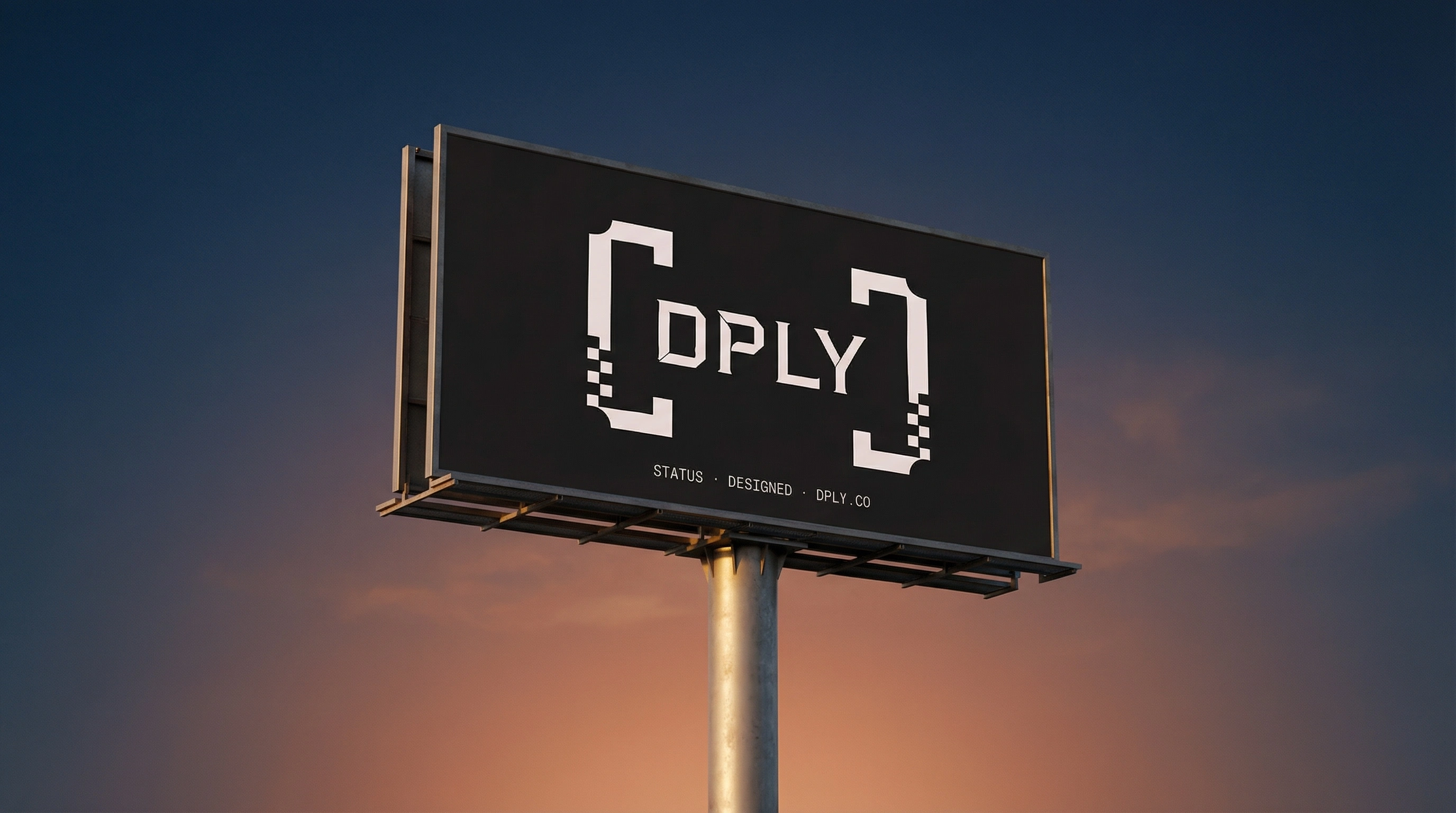
The type system is built entirely on monospace. One typeface. No exceptions. Everything in the DPLY world is typed, not written — headlines, body copy, UI labels, legal text, CTAs. The wordmark sits inside the brackets in bold monospace, all caps, tracked at -0.03em. Letters and brackets share a single cap height and baseline. The wordmark doesn't sit inside the mark — it fills it exactly.
The color system has two values at its core:
#222020 — Near-black with a trace of warmth. Not pure digital black. This version has weight and intention.
#EBDEDE — Near-white with a faint blush. The warmth in both values prevents the palette from reading cold or sterile.
A single accent — terminal green
#00C853 — appears only in product UI contexts: the operational status dot, live uptime indicators, active states. It never appears in logo or brand materials. Its scarcity is what gives it meaning.The visual language extends this palette atmospherically: deep navy blooms, muted teal washes, terracotta radial gradients — applied as grainy, noisy fields on off-white or near-black grounds. The grain is structural. It references thermal printers, newsprint, screen-printed ink bleeding into fabric. Every surface in the DPLY world has texture.
The Graphic System
Three visual registers built from the same DNA:
Dark mode atmospheric —
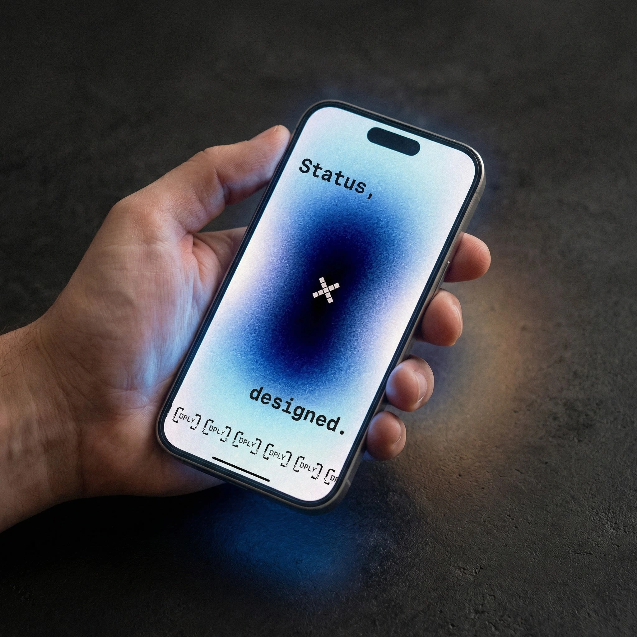
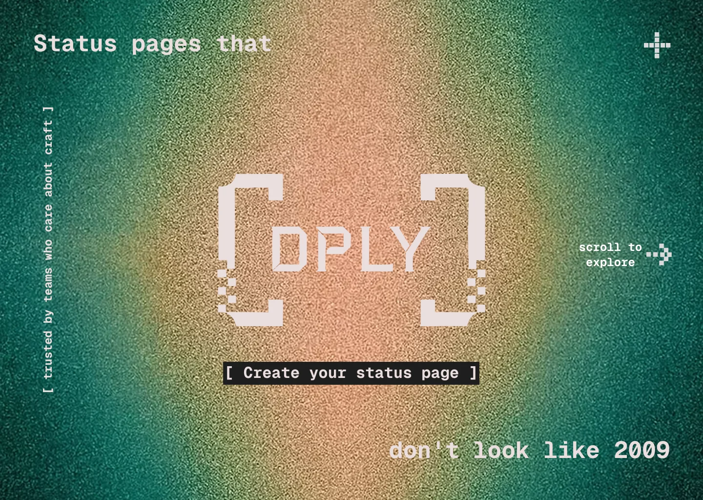
#222020 backgrounds with soft radial gradients in teal and orange-terracotta, the bracket mark glowing through. Used for the website hero, billboard, poster tube, and merch. The gradient communicates a system that is live, running, monitored.Off-white editorial —
#EBDEDE backgrounds with heavy film grain, large monospace type doing the compositional work. The staggered headline layout — first line left-aligned, second line right-aligned — creates tension and movement without any additional graphic element.Monochrome structural — pure
#222020 on #EBDEDE or reversed, no gradient, no grain. Used for business cards, office signage, the street billboard, and shipping. Maximum contrast, maximum legibility, zero noise.The ticker strip —
[ DPLY ] [ DPLY ] [ DPLY ] or × × × × × × — anchors the bottom edge of nearly every application. It is the brand's heartbeat: a repeating signal, always running, never stopping.Web Direction — The Hero
The website hero is where the brand system does its hardest work. The first screen had to answer three questions simultaneously: what is this, who is it for, and why does it look different from every other status page product.
The answer was to make the hero a direct extension of the brand's visual registers rather than a conventional SaaS landing layout. No feature grid above the fold. No illustration. No hero photograph. Just the atmospheric dark mode register at full bleed — the teal-to-terracotta radial gradient with heavy grain, the bracket mark centered and large — with the headline split across the frame the way the editorial poster does it: "Status pages that" anchored top-left in monospace bold, "don't look like 2009" landing bottom-right as the completion. The visitor reads the page the way they read code — top to bottom, left to right, the meaning assembling as they move.
The CTA sits directly below the mark, styled as a bracket element itself:
[ Create your status page ]. Not a button that looks like every other SaaS button — a piece of syntax that belongs to the system. The social proof line runs vertically along the left edge, rotated 90°, in small monospace: [ trusted by teams who care about craft ]. Present for those who look, invisible to those scanning fast.Two supporting navigation details complete the frame: a
+ crosshair in the top-right corner — a secondary brand element referencing precision and targeting — and a scroll to explore → in small monospace bottom-right, the arrow built from pixel units matching the bracket degradation style.The hero doesn't sell features. It establishes a world. The visitor understands immediately that this product was made by people who think about design the same way they think about code — with precision, with intention, and with no tolerance for the generic.
Applications
Physical. A heavyweight hoodie. A natural canvas tote with the ticker strip screen-printed along the base. A structured cap in near-black with the full bracket wordmark embroidered in
#EBDEDE — the thread catching the degraded pixel detail in three dimensions. A matte black shipping box stamped [ handle with care ] below the mark. A thermal receipt — the product's most literal application — printed with "ALL SYSTEMS OPERATIONAL / UPTIME 99.98% / DPLY.CO", held between two hands in warm directional light. Each physical object treats the brand as something worth making properly.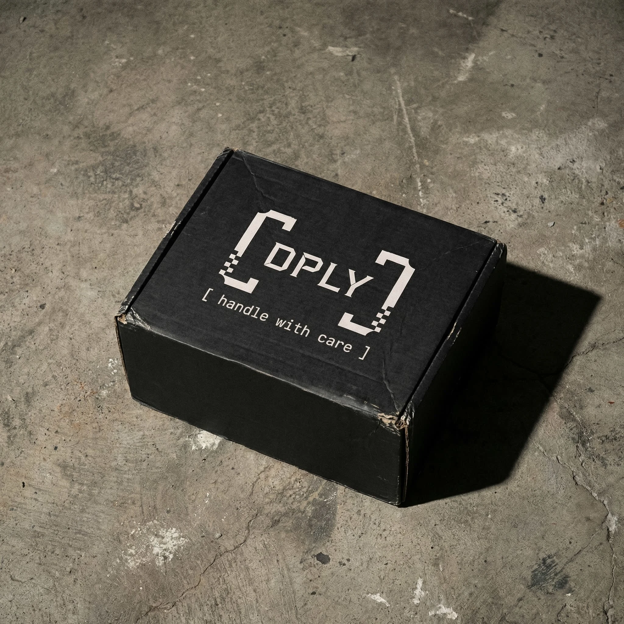
Environmental. The standalone
[ ] bracket mark applied as large format vinyl to a frosted glass office door — warm amber light bleeding through from inside, the brackets reading as a threshold. A backlit square sign mounted beside a doorframe: [DPLY] over STATUS · OPERATIONAL — the product's core promise as architectural signage. A street billboard at golden hour: near-white on near-black, STATUS · DESIGNED · DPLY.CO in small tracked monospace at the base. The mark owns the scale completely.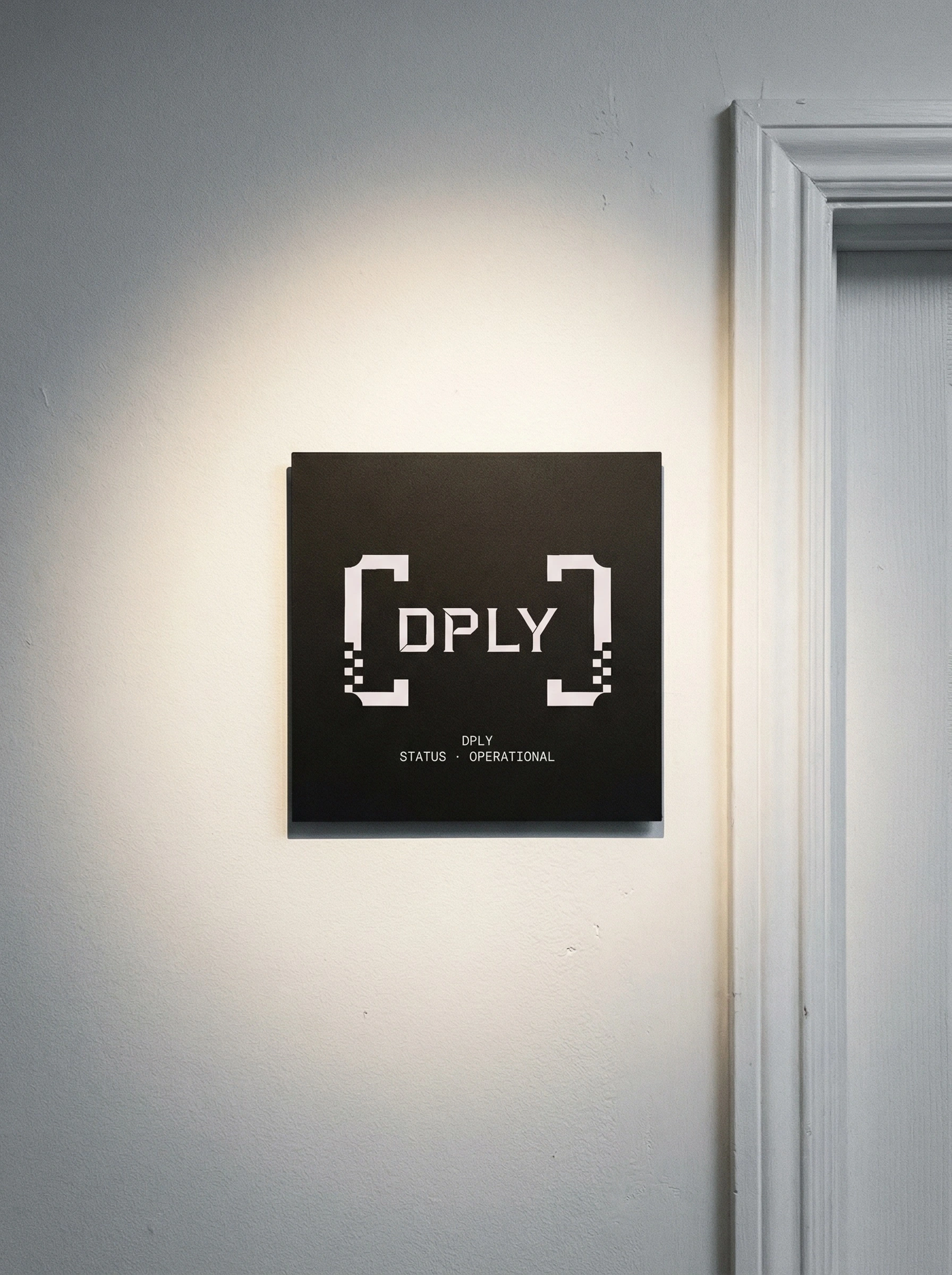
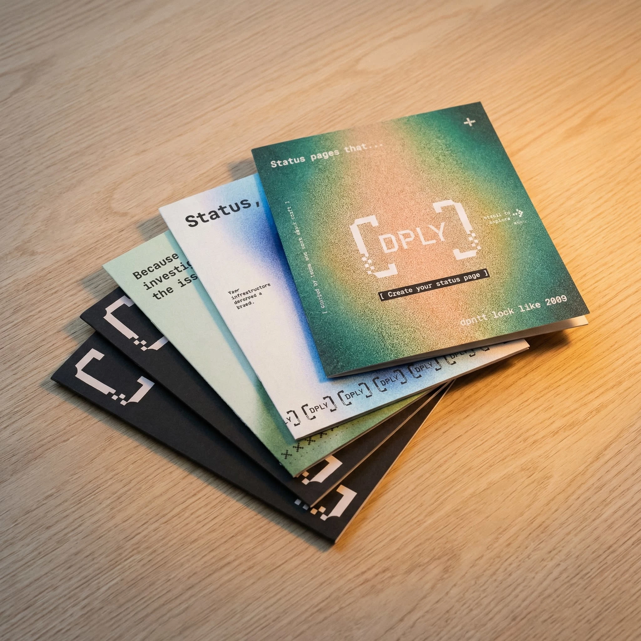
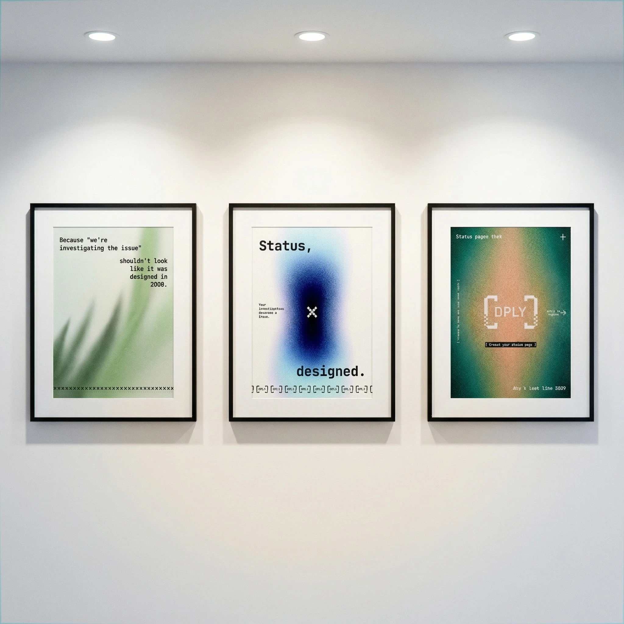
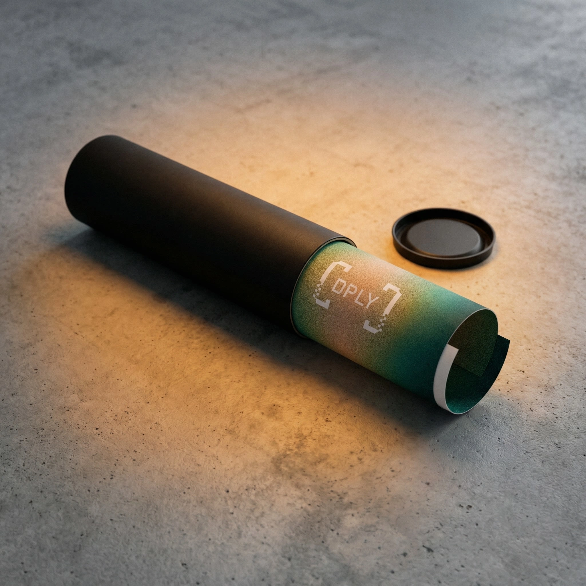
Printed matter. A poster tube in near-black with a partially unrolled poster revealing the atmospheric hero graphic. A gallery-style framed triptych of all three visual registers displayed together — the full range of the system visible at once. A set of square brand booklets fanned across an oak surface, each cover carrying a different visual register, the system's breadth visible in a single image.
Outcome
DPLY is a brand that developer teams recognize immediately and remember permanently — not because it's clever, but because it speaks their language without translating. The bracket mark scales from 16px favicon to 6-metre billboard. The degraded pixel detail rewards the people who look closely. The monospaced type system ensures that every touchpoint — physical, environmental, digital — feels like it belongs in the same world as the product.
The web hero extends the brand into the first and most critical user interaction: the moment someone decides whether this product is worth their attention. It answers that question without explaining itself. The same confidence that lives in the empty brackets lives in every pixel of the landing section.
The thermal receipt carrying uptime data. The cap embroidered with a degraded reticle. The office door with brackets instead of a nameplate. The hero that completes its headline across the full width of a screen. Each application asks the same question the product asks: what does infrastructure look like when someone actually cares?
This is the answer.
Brand identity, art direction, and web direction by Révolté — revolte.design
Like this project
Posted Mar 26, 2026
Status pages exist at the worst moment. I made sure DPLY's brand was ready for it and looked good getting there.
Likes
1
Views
14
Timeline
Mar 9, 2026 - Mar 26, 2026