Built with Lovart
Sōlum Brand Identity & Website
Révolté
Sōlum
Brand Identity & Website — Case Study
Overview
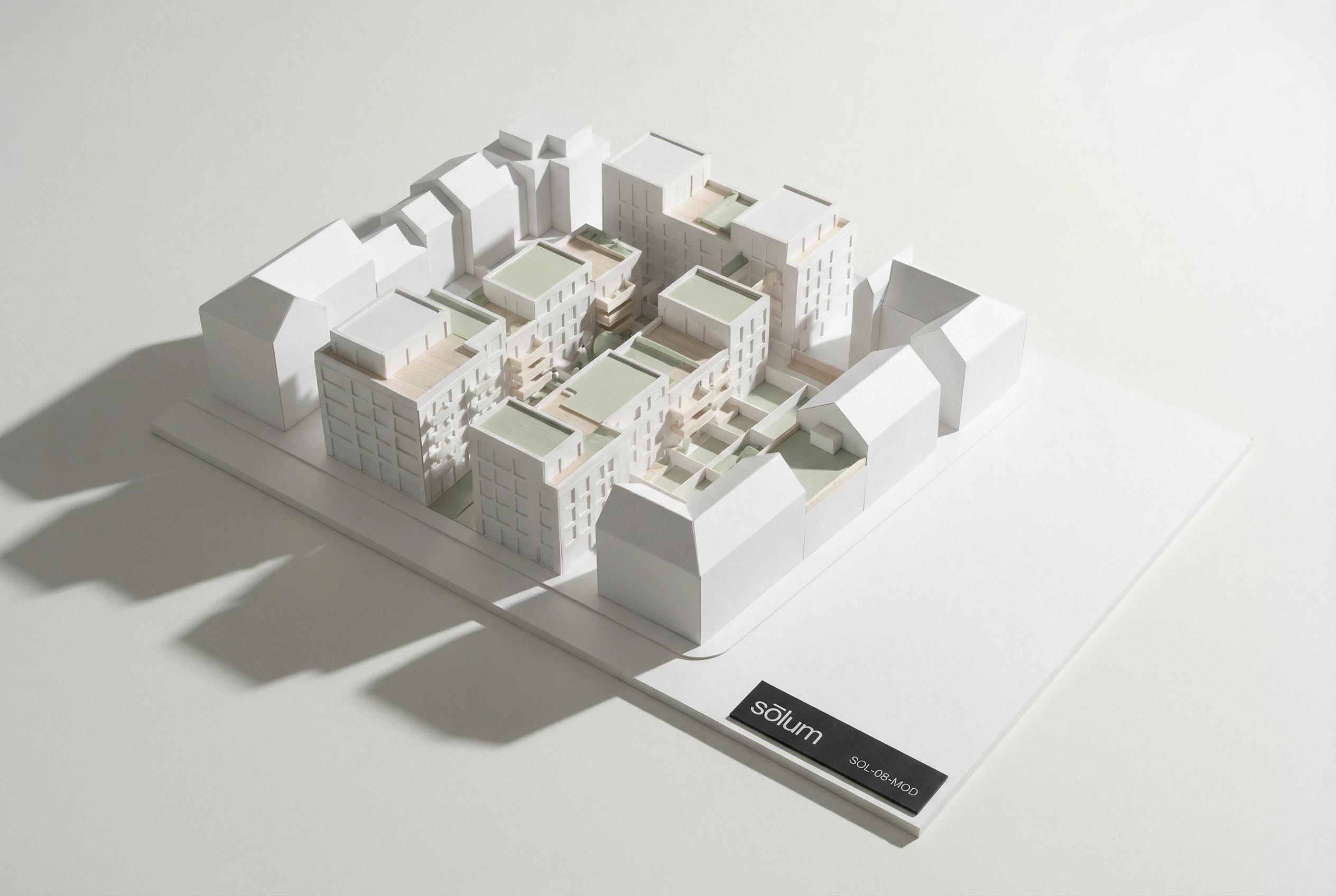
Sōlum is a sustainable architecture and urban planning firm that designs green infrastructure for dense cities — rooftop ecosystems, permeable streets, living walls. The brief was to build a brand identity from the ground up: one that could hold its own in boardrooms, on construction sites, and in the kind of publications that shape policy.
The challenge was not to make sustainability look good. That's been done, badly, by everyone. The challenge was to make rigorous, systemic thinking about cities feel like exactly what it is — the most serious and necessary design problem of our time — without borrowing the visual language of environmentalism. No leaves. No green gradients. No metaphors.
The answer was restraint as a radical act.
The Strategic Problem
Most firms working in sustainable urban infrastructure communicate through the visual vocabulary of environmentalism — organic forms, green palettes, nature photography, soft typography. The result is a category that looks identical and says nothing. The firms that are actually changing how cities are built are indistinguishable, visually, from the firms that are greenwashing their way through a rebrand.
Sōlum needed to look different not by being louder, but by being quieter. The brand needed to signal intelligence, permanence, and authority — the kind that doesn't need to announce itself. The visual reference points were Swiss engineering firms, Scandinavian research institutes, and the very specific confidence of organizations that have been right for a long time and know it.
The strategic position: Sōlum does not market itself. It presents itself.
Creative Direction — Quiet Authority
The chosen direction was built on a single principle: the brand says almost nothing, and means everything.
No metaphors. No eco-signaling. No decorative elements of any kind. All hierarchy achieved through size and space alone. A single typeface family across all applications. A palette so restrained it functions as a material system rather than a color system.
The visual references were Peter Zumthor's material philosophy — the idea that a surface should earn its presence — and the graphic identity of Nordic research institutions where the work is so self-evidently serious that the brand exists only to locate it. The brand was designed to feel as if it has always existed. Not new, not trend-responsive. Simply correct.
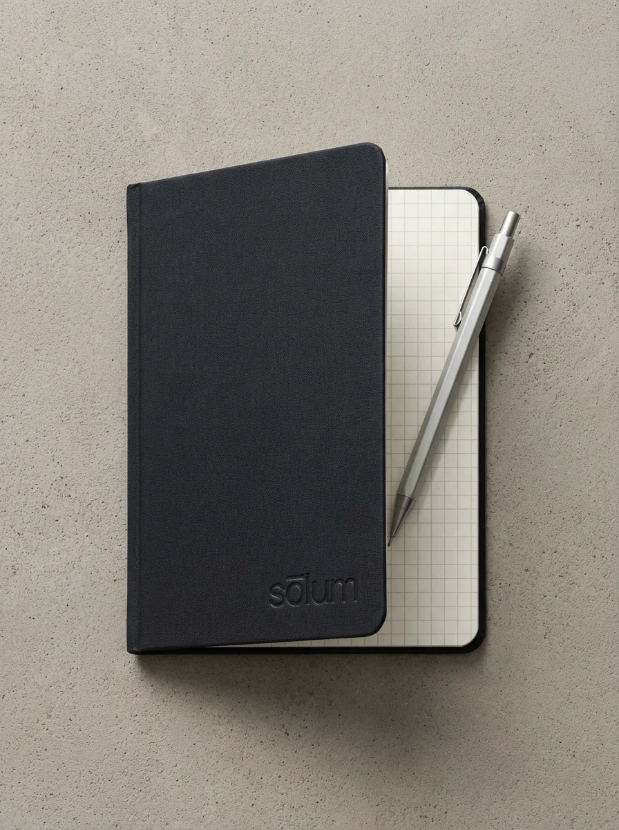
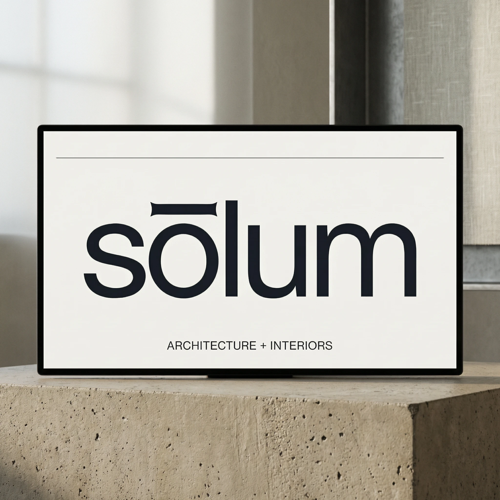
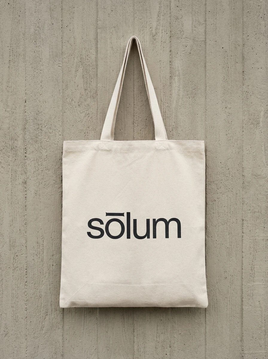
The Logo
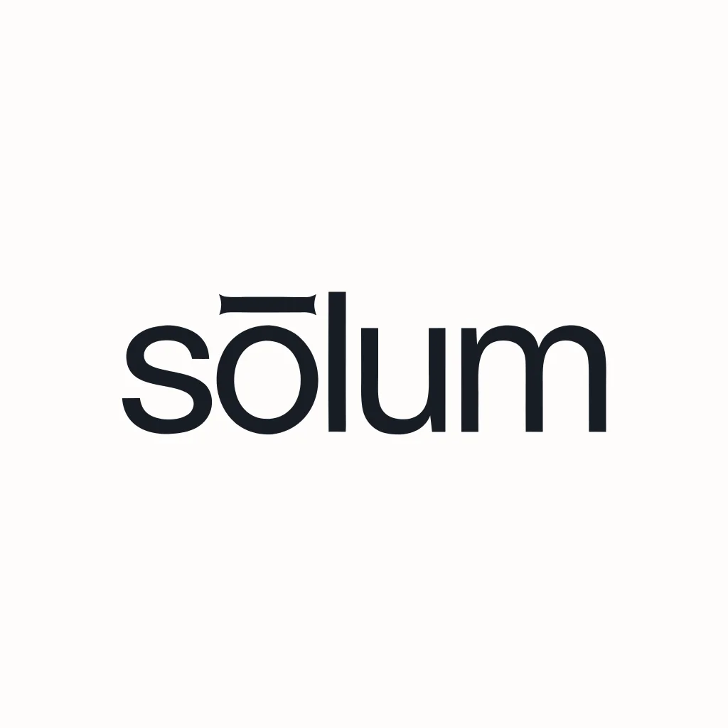
The wordmark is the identity. There is nothing else.
"sōlum" — set entirely lowercase, in a single weight of a geometric sans-serif. The macron above the ō is the only distinguishing mark in the system, and it does more work than any decorative element could. Slightly extended beyond the letter's natural width on both sides, it functions simultaneously as a diacritic, a horizontal rule, a datum line, and the brand's sole visual signature. At small sizes it reads as an accent. At large sizes it reads as architecture.
The typeface is a geometric sans-serif with enough warmth in its curves to avoid coldness — the letters are precise without being mechanical. The ō in particular carries the weight of the entire identity: the macron above it is the moment where the wordmark becomes a mark rather than a word.
The logo is never decorated, never enclosed, never accompanied by a tagline. It appears in one weight. It appears in two colors: Deep Slate #1C1C1E on Off-White #F2F0EB, or reversed. No exceptions.
Color System
The palette was designed as a material system — each color references a physical substance rather than an abstract mood.
Off-White #F2F0EB — the primary surface. Not white. The specific warmth of uncoated paper, linen, and poured concrete with a light pigment additive. Every surface that isn't actively structural lives here.
Deep Slate #1C1C1E — the structural color. Used for all type, all rules, all marks. Not black — the slight warmth stops it from reading as digital or cold. It reads as ink, as shadow, as the material weight of a building in section.
Warm Concrete #C4BCAF — the material reference. The specific tone of board-formed concrete on a northern overcast day. Used for physical surfaces: paper stocks, environmental applications, secondary backgrounds.
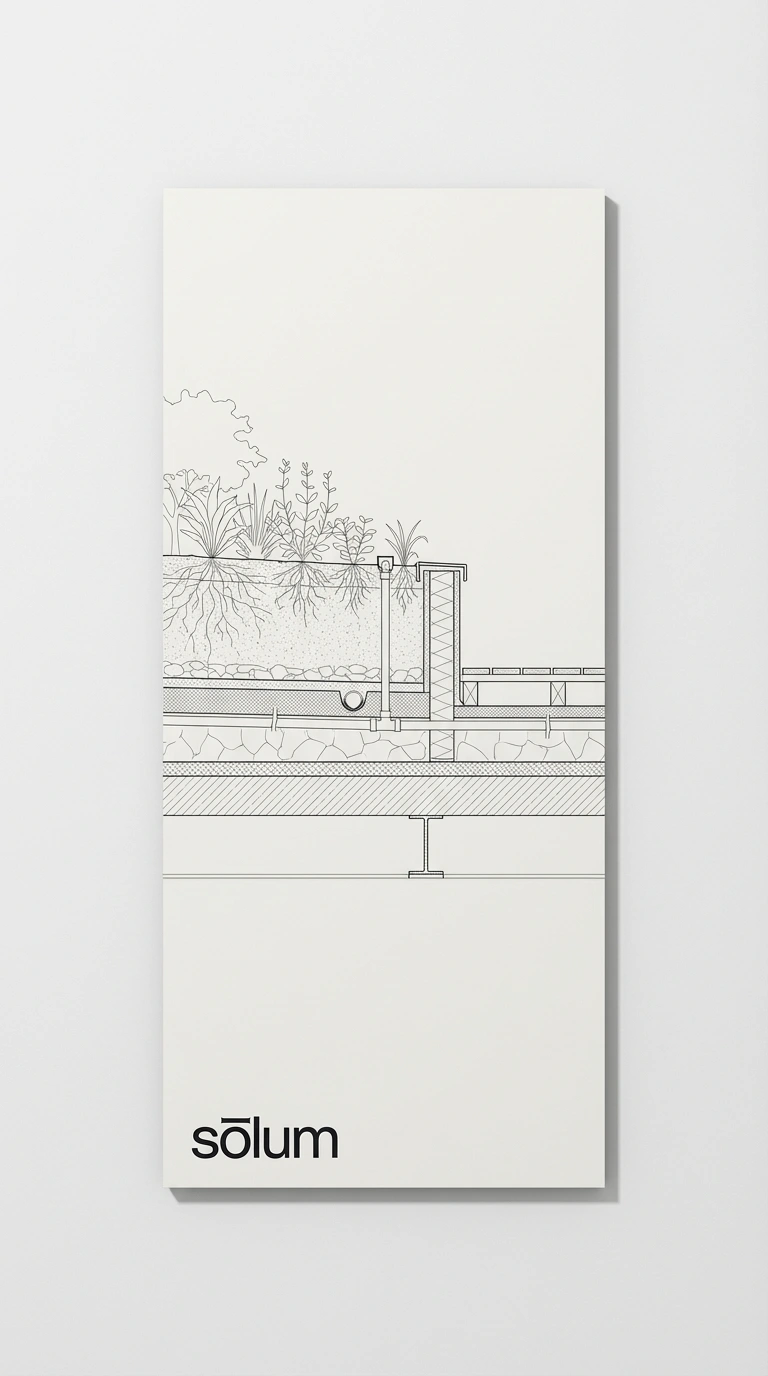
Pale Sage #D4DDD0 — the only nod to nature in the entire system. Used sparingly, almost secretively. It appears where the brand needs to acknowledge what it actually does — design living systems within cities — without making a statement about it. The restraint with which it is deployed is the statement.
No accent color. The absence of an accent is itself a position.
Typography System
A single geometric sans-serif family across all applications and all weights. The hierarchy is achieved entirely through size, weight, and space — never through decorative variation, never through a secondary typeface.
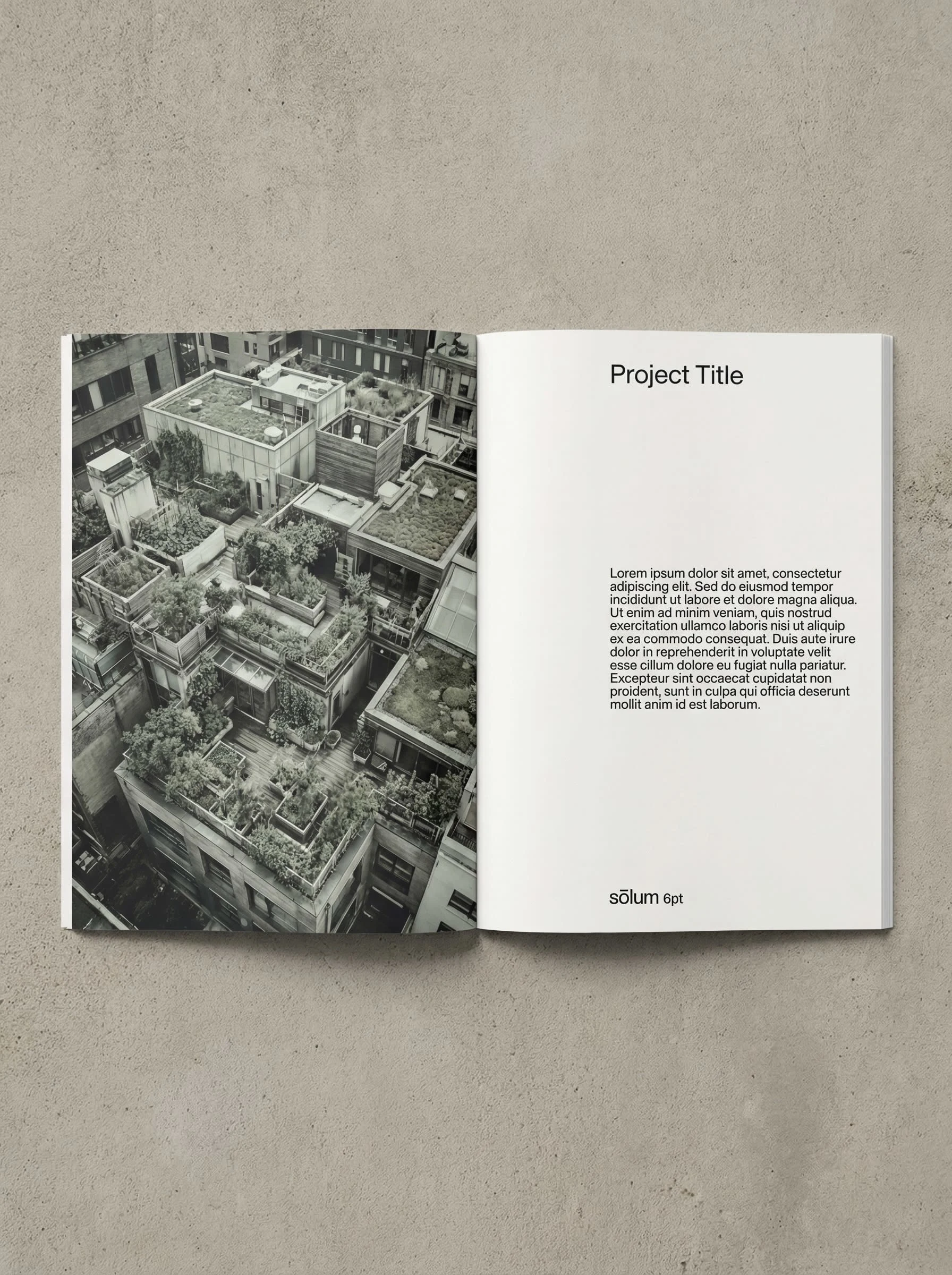
Display sizes — project titles, section headers, cover applications — are set large, tracked loosely, with generous leading. The type breathes.
Body sizes — project descriptions, proposal copy, correspondence — are set at reading size, tracked slightly open, in Light or Regular weight. Never bold in running copy.
Functional sizes — footer information, coordinates, reference codes — are set at 6–7pt, tracked at +60 or above, in Light weight. They read as texture before they read as text.
The typographic system has one rule: if you need to add decoration to make the hierarchy work, the hierarchy is wrong. Solve it with space.
Application System
The brand was developed across three distinct environments: print and stationery, architectural and environmental, and digital. Each environment was treated as a material problem — what does this surface want to be, and how does the brand exist on it without imposing?
Print and Stationery
Business cards are printed on uncoated stock in Off-White #F2F0EB, thick enough that the edge reads as a material detail. The logo sits flush left, nothing else on the front face. Contact information on the reverse in 7pt type, tracked at +40, right-aligned to the bottom edge. The card communicates through what it doesn't include.
Letterhead carries a single horizontal rule in Deep Slate #1C1C1E running the full page width at 28mm from the top — the datum line that runs through the entire identity system. The logo sits above it, top-left. The rule organizes all content below it without appearing in any way decorative.
Hardcover reports and publications are bound in Deep Slate #1C1C1E cloth with the logo blind-debossed — no ink, no foil — into the lower-left corner of the cover. The mark exists as a shadow, catching light at an angle, invisible face-on. For people who know the firm, it is immediately recognizable. For people who don't, the quality of the object does the work before the name does.
Architectural and Environmental
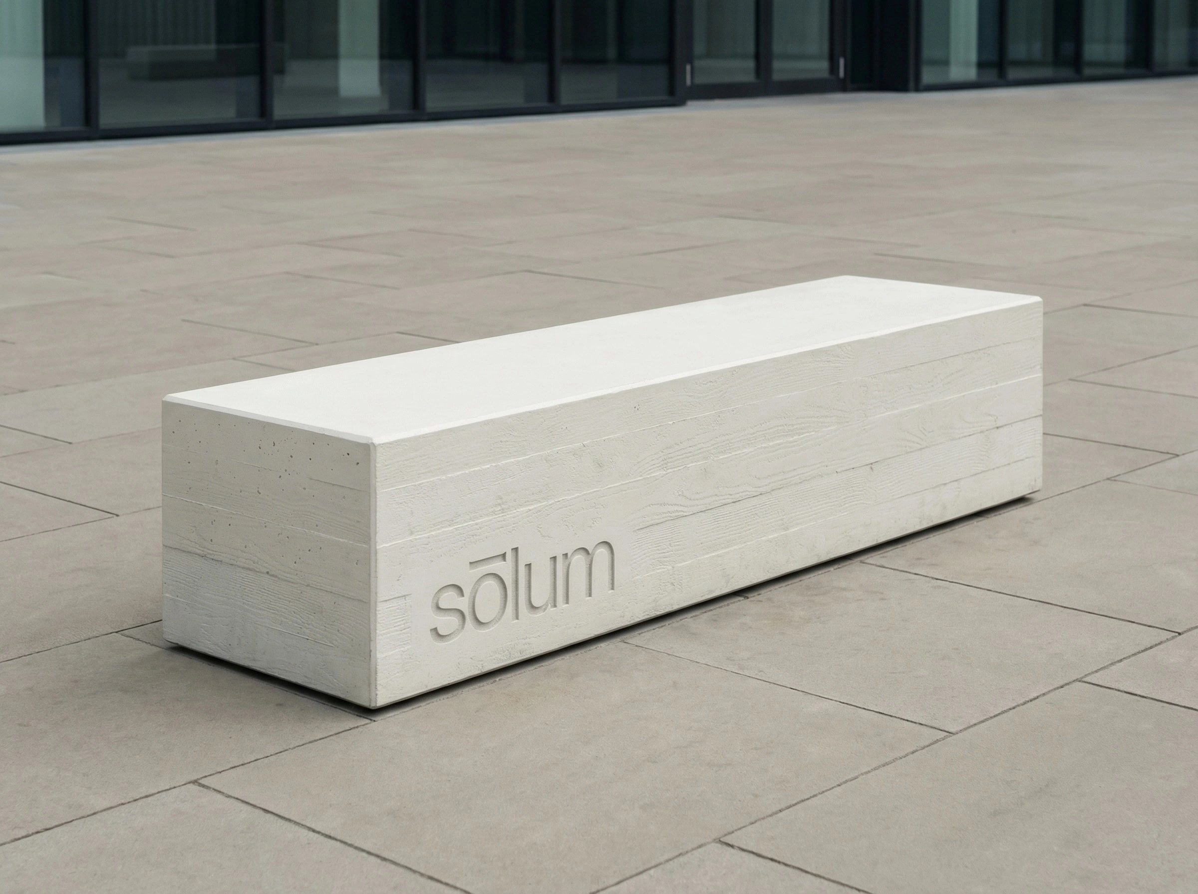
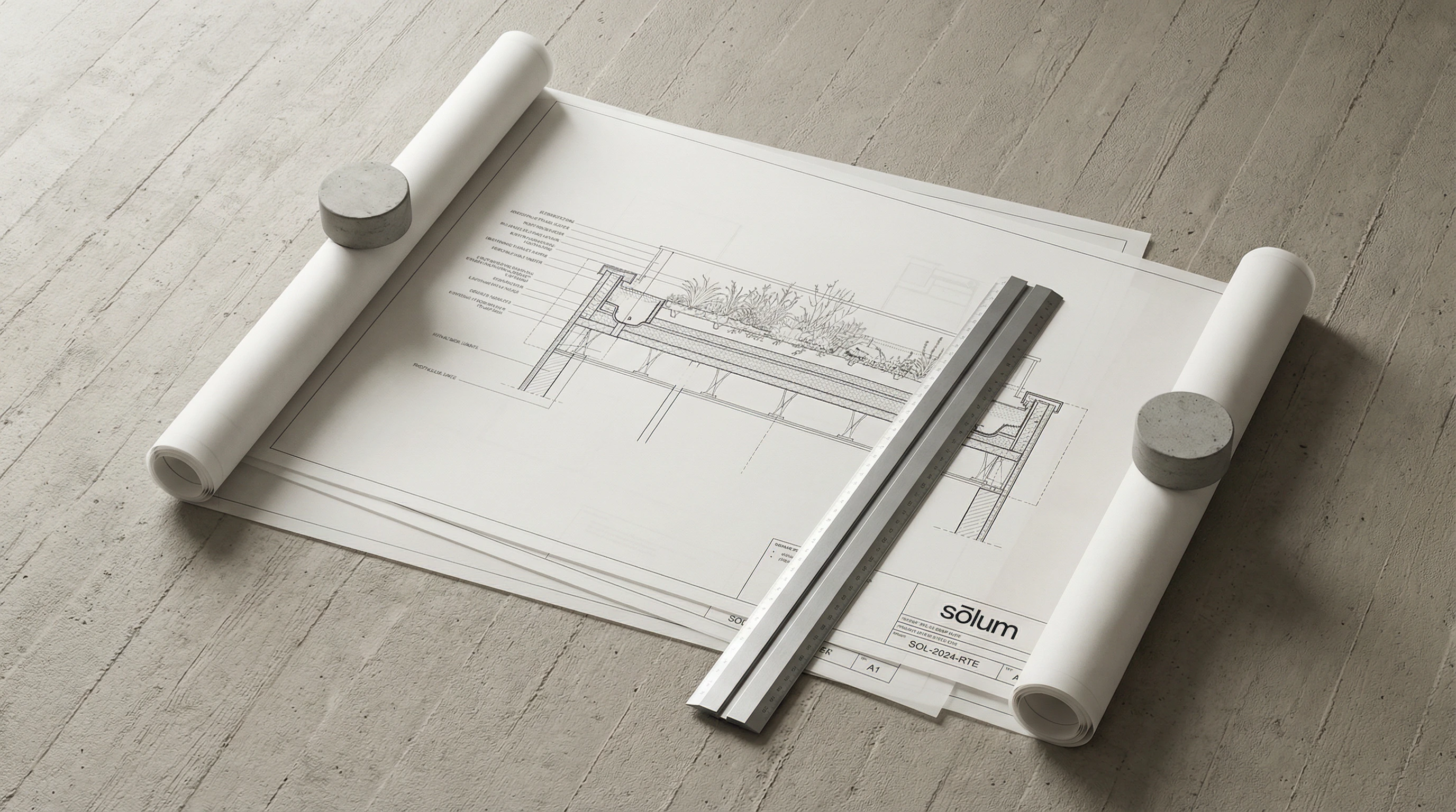
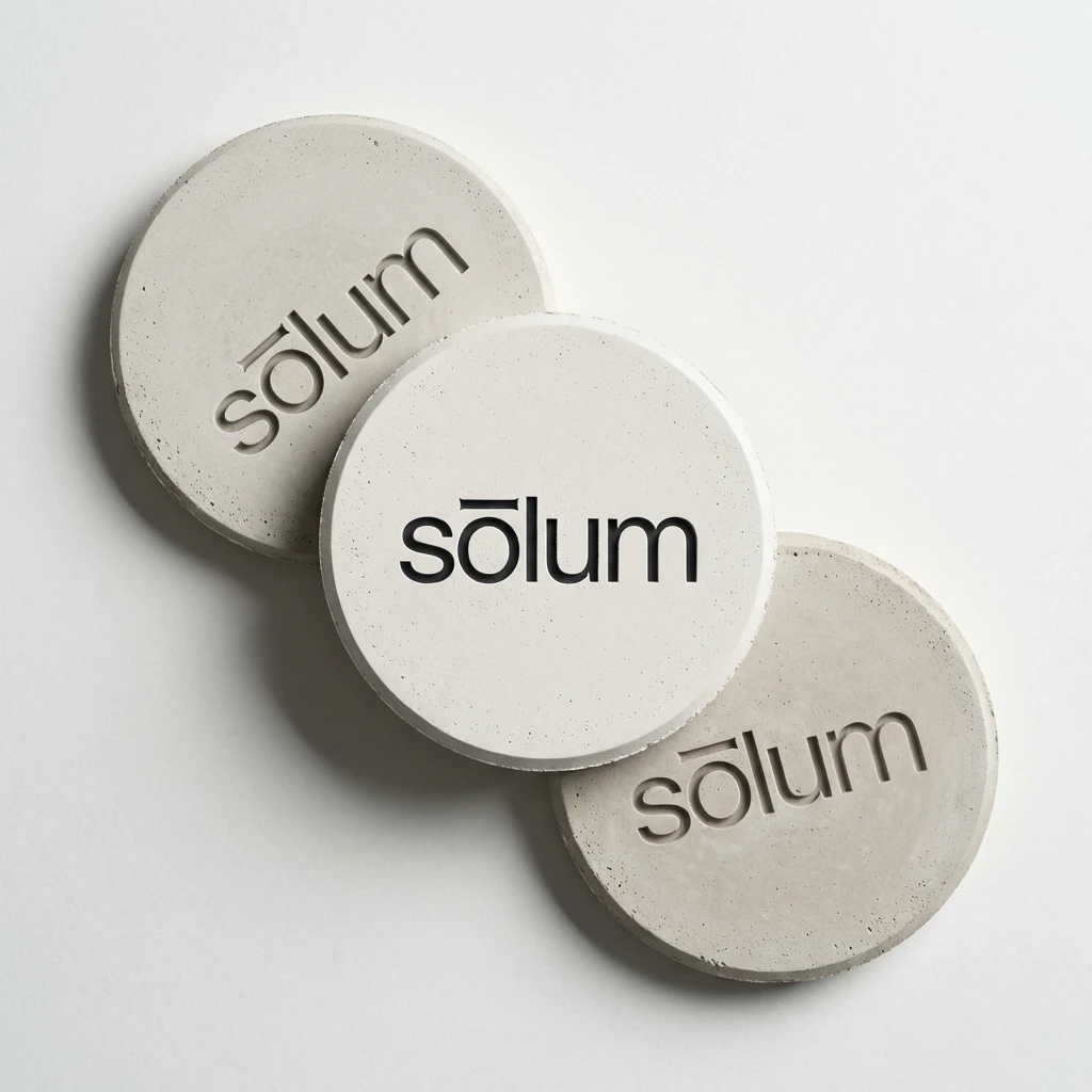
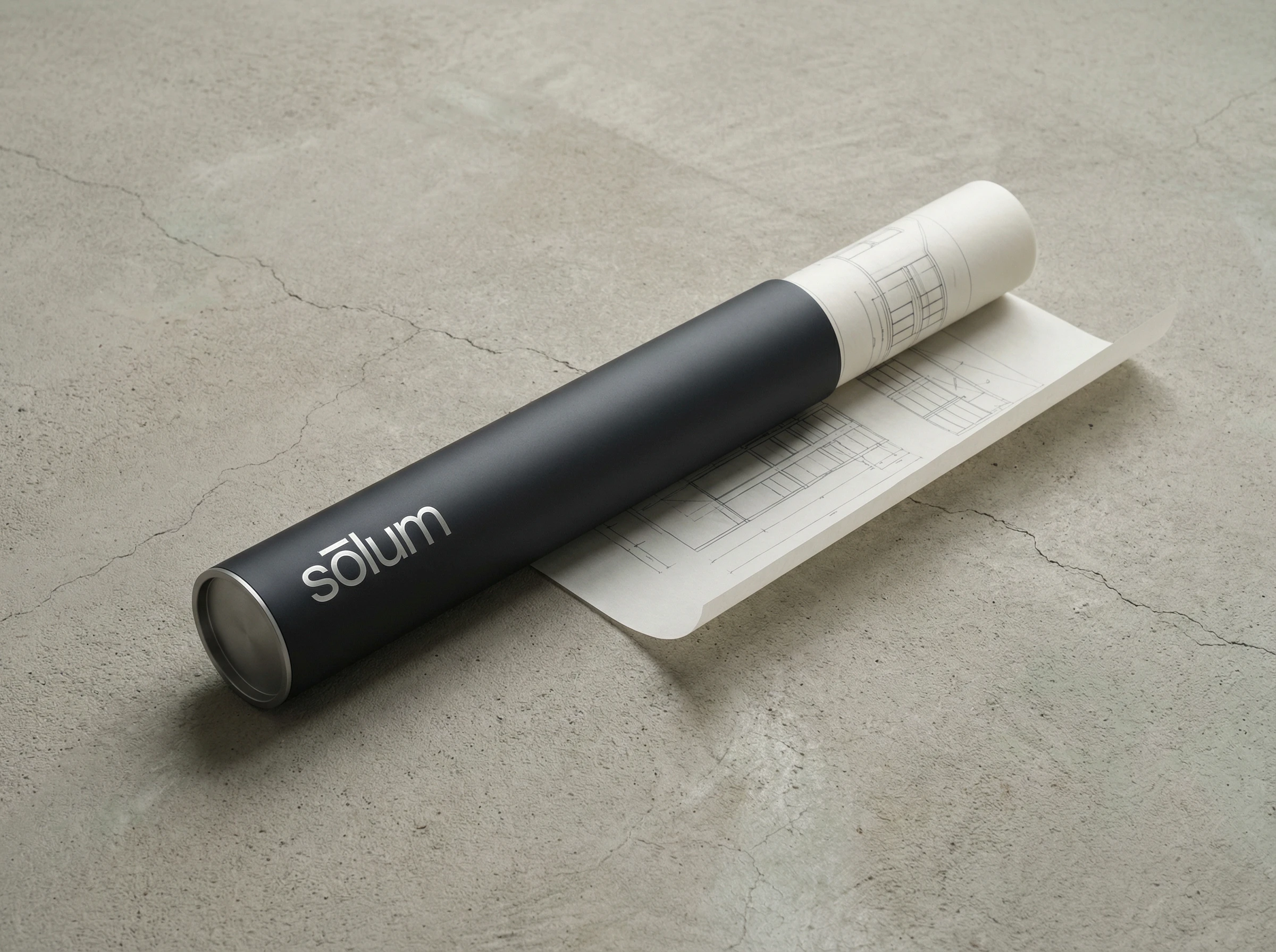
The brand was designed to exist on the materials of construction and urban infrastructure. Sandblasting into concrete paving. Laser-etching into anodized aluminum drawing tubes. Pressing into cast concrete objects. In every case the technique removes the question of color — the mark exists as texture, as depth, as the difference between two surfaces.
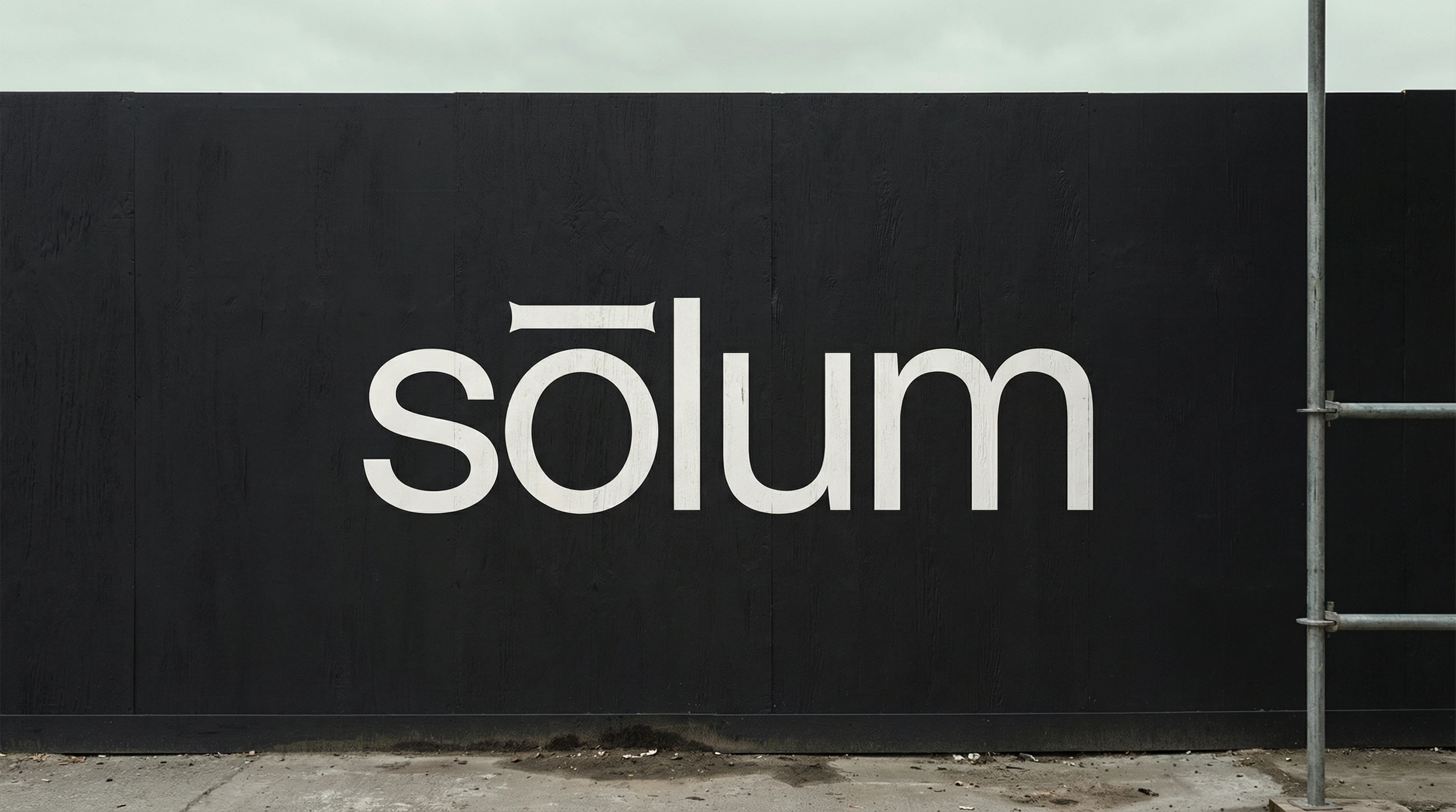
Site hoarding panels carry the logo alone at large scale — approximately 600mm wide — in Off-White #F2F0EB vinyl on Deep Slate #1C1C1E painted timber. Nothing else. No project name, no completion date, no contact information. The confidence of this decision is the communication.
Building-mounted plaques are cast in pigmented concrete, the logo pressed during casting so the letterforms read as shadow rather than as applied mark. The datum line — the horizontal rule from the print system — appears here as a physical groove in the concrete surface, running edge to edge of the plaque.
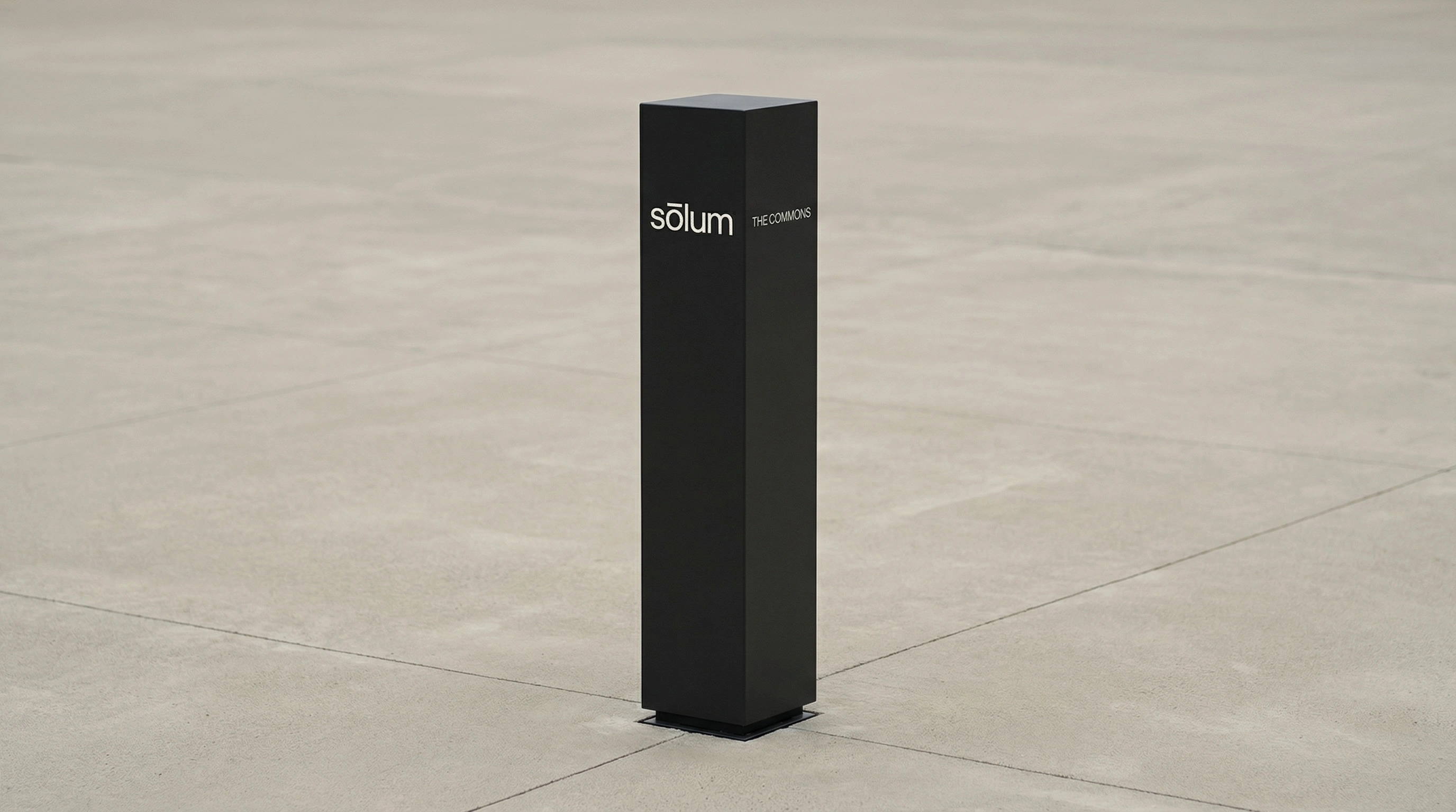
Wayfinding pylons in Deep Slate #1C1C1E powder-coated steel carry the logo at eye height in Off-White #F2F0EB vinyl. A single line of wayfinding text — a street name, a building reference — appears on the adjacent face in the same typeface, same weight, same size. No icons. No arrows. The assumption is that the person reading it is intelligent.
Digital
The website operates on the same principles as the print system. Full-bleed Off-White #F2F0EB background. The logo centered and large on the hero — approximately 18vw — in Deep Slate #1C1C1E. The datum line runs full-width at 72px from the top of every page. Navigation is minimal, typographic, and flush right. No images on the homepage. The work is accessed through text.
The mobile interface carries the same logic into a smaller surface. Project lists in Light weight, tracked open, generous line spacing. The logo at 14px top-left. The datum line separating the logo from the content. The entire interface reads as a typeset document, not an app.
The Datum Line
One element recurs across every application in the system — print, environmental, digital — and deserves specific mention: the horizontal rule.
At 1px in digital applications. At 0.75pt in print. As a physical groove in concrete. As a sandblasted line in aluminum. As a debossed crease in cloth. Always the full width of its surface. Always at a consistent positional logic — separating the brand from the content, locating the work in relation to the identity.
The datum line is an architectural concept applied to graphic design. In a building section, the datum is the reference plane from which all measurements are taken — the agreed-upon zero point. In the Sōlum identity, the line performs the same function. It says: everything above here is the firm. Everything below here is the work. The two are related but distinct.
No other decorative element exists in the system. The line is not decorative. It is structural.
Design Principles
Every decision in the Sōlum identity can be tested against four principles that emerged from the strategic brief and remained consistent throughout the development process:
Restraint is not absence. Every element that remains in the system is there because it earns its presence. The logo, the datum line, the palette, the single typeface — these are not a stripped-back version of a richer system. They are the complete system. Nothing was removed. Nothing was added.
The brand should feel older than it is. Not nostalgic, not heritage — simply correct in the way that things that have been thought through for a long time are correct. The identity should look as if it existed before the firm needed a logo.
Material before visual. Every application was considered as a material problem before a graphic one. What is this surface? How does it receive a mark? What technique is native to this material? The answers to those questions produced better design decisions than any visual reference could.
Confidence through omission. The most powerful communication in the Sōlum system is what it doesn't say. No tagline. No manifesto on the hoarding. No project name on the cover. The brand trusts the work. The work trusts the brand. The circle is closed.
Outcome
The Sōlum identity is a brand that behaves like the firm it represents — rigorous, precise, and completely uninterested in being liked for the wrong reasons. It will not win awards for being the most visually inventive identity of the year. It will be mistaken, by people who don't look carefully, for a brand that spent very little. By people who do look carefully, it will be understood immediately.
That is exactly the intended audience.
The brief was to build a brand that could hold its own in boardrooms, on construction sites, and in the publications that shape how cities are built. The identity does all three without changing. It is the same mark on the business card as on the concrete paving. The same weight of type in the proposal as on the site hoarding. The same rule — the datum line — on the website as on the building plaque.
Consistency is not repetition. It is the signal that the thinking behind the system is sound.
Sōlum doesn't ask for your attention. It is simply present when you look for it. That, in the end, is what quiet authority means.
Brand identity developed as a design case study. All applications are speculative.
Like this project
Posted Mar 29, 2026
Sustainable architecture doesn't need a leaf. Sōlum is a brand identity built on material rigour, Swiss restraint, and a single horizontal rule.
Likes
2
Views
29
Timeline
Mar 16, 2026 - Mar 29, 2026