Built with Lovart
Minimalist Brand Identity for The Yawn
Révolté
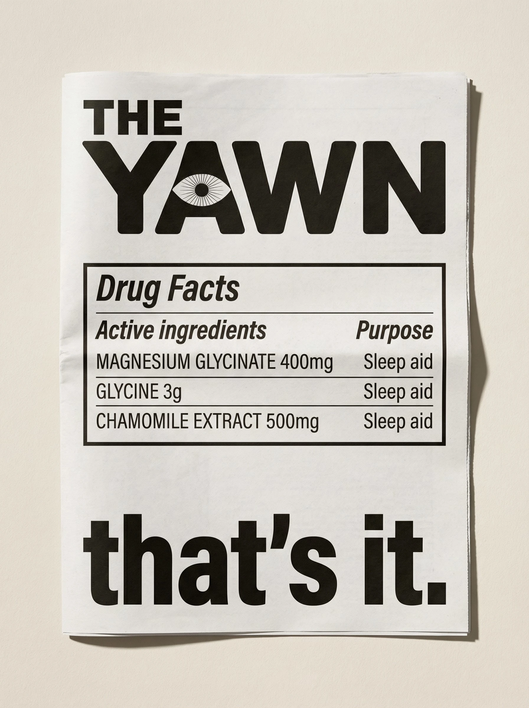
THE YAWN
Brand Identity Case Study
OVERVIEW
The Yawn is a minimalist sleep supplement brand built around a single, aggressive constraint: three products, three ingredients, nothing else. The brief called for a brand that could exist in the wellness space without speaking wellness — no moon imagery, no adaptogens, no "unlock your body's natural intelligence." A brand for people who are tired of being sold sleep.
The creative challenge wasn't making something minimal. Minimal is easy. The challenge was making something minimal that had personality — deadpan, dry, confident, and quietly funny without ever winking too hard at itself.
THE PRODUCTS
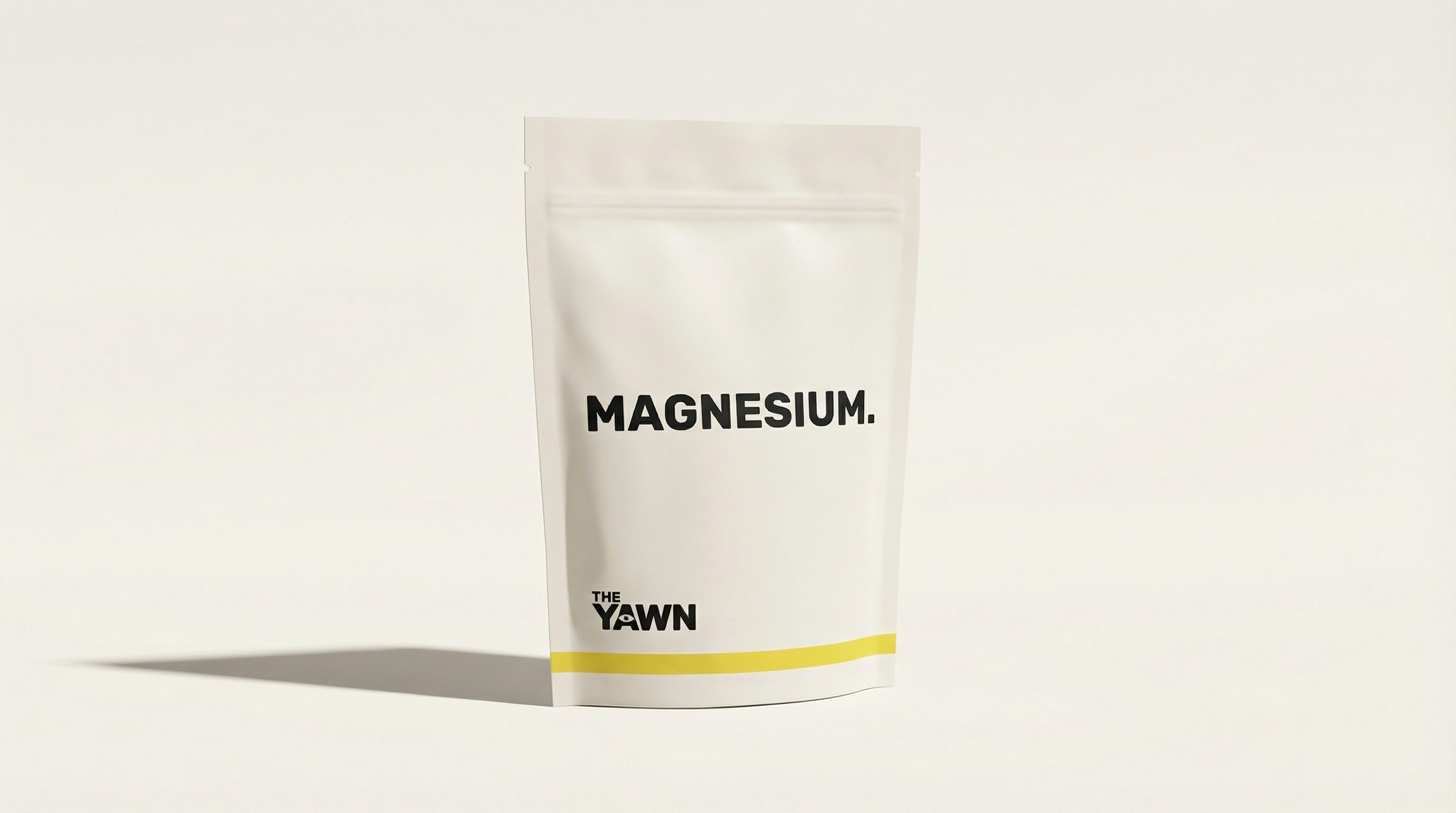
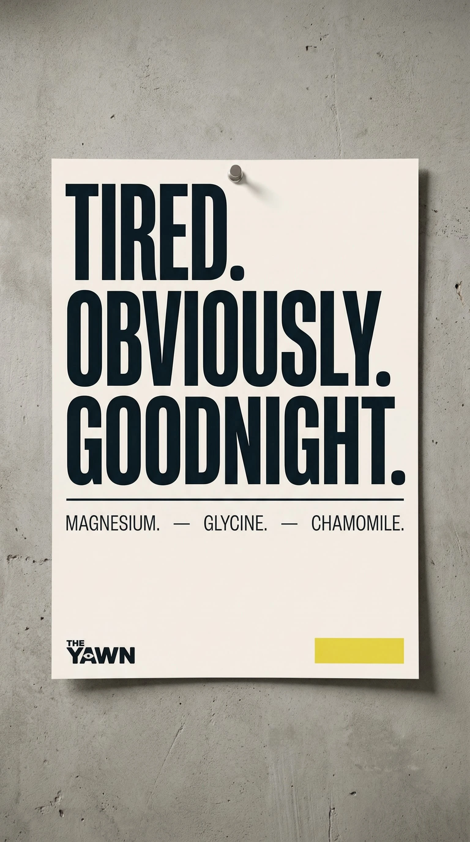
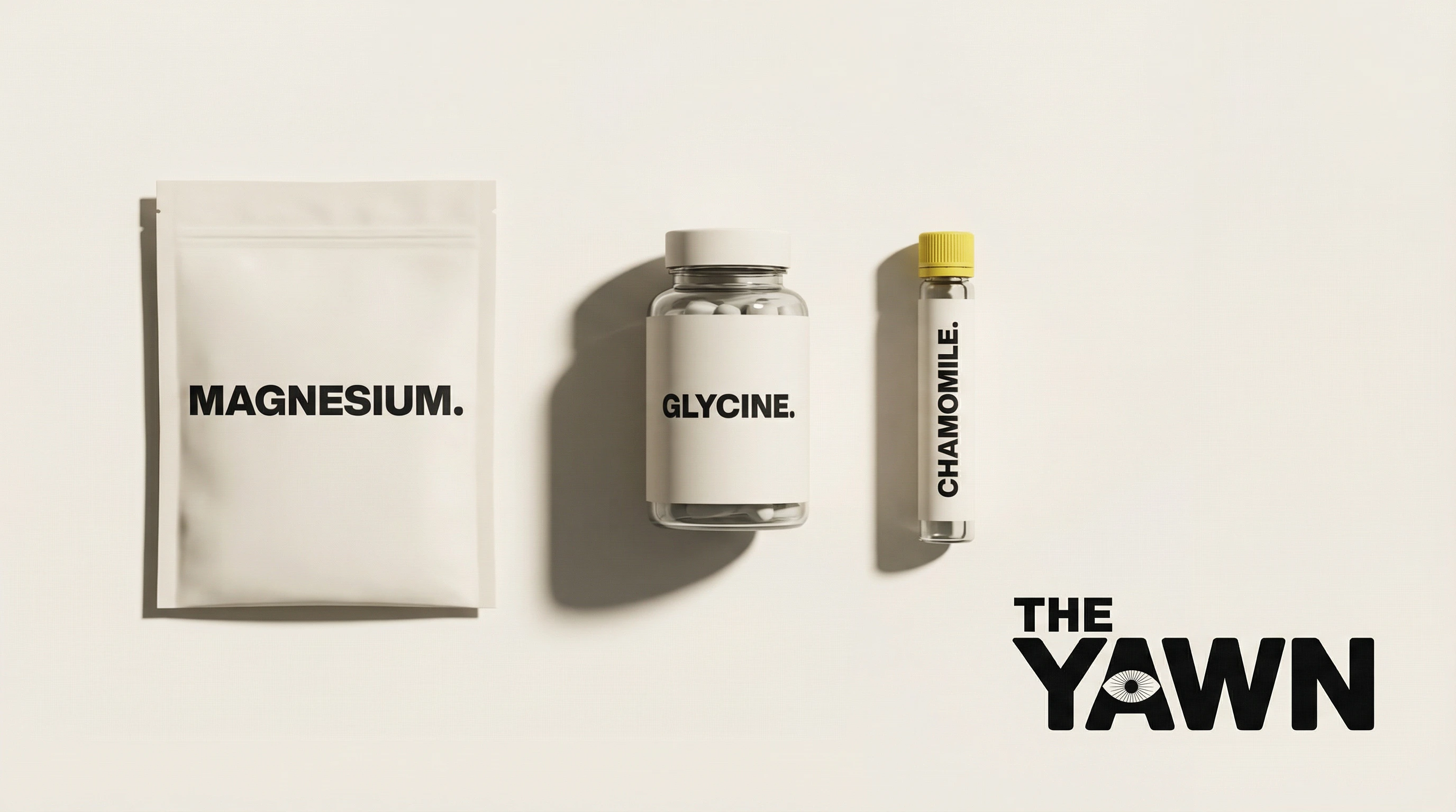
MAGNESIUM. — Magnesium glycinate powder drink.
GLYCINE. — Glycine amino acid capsule.
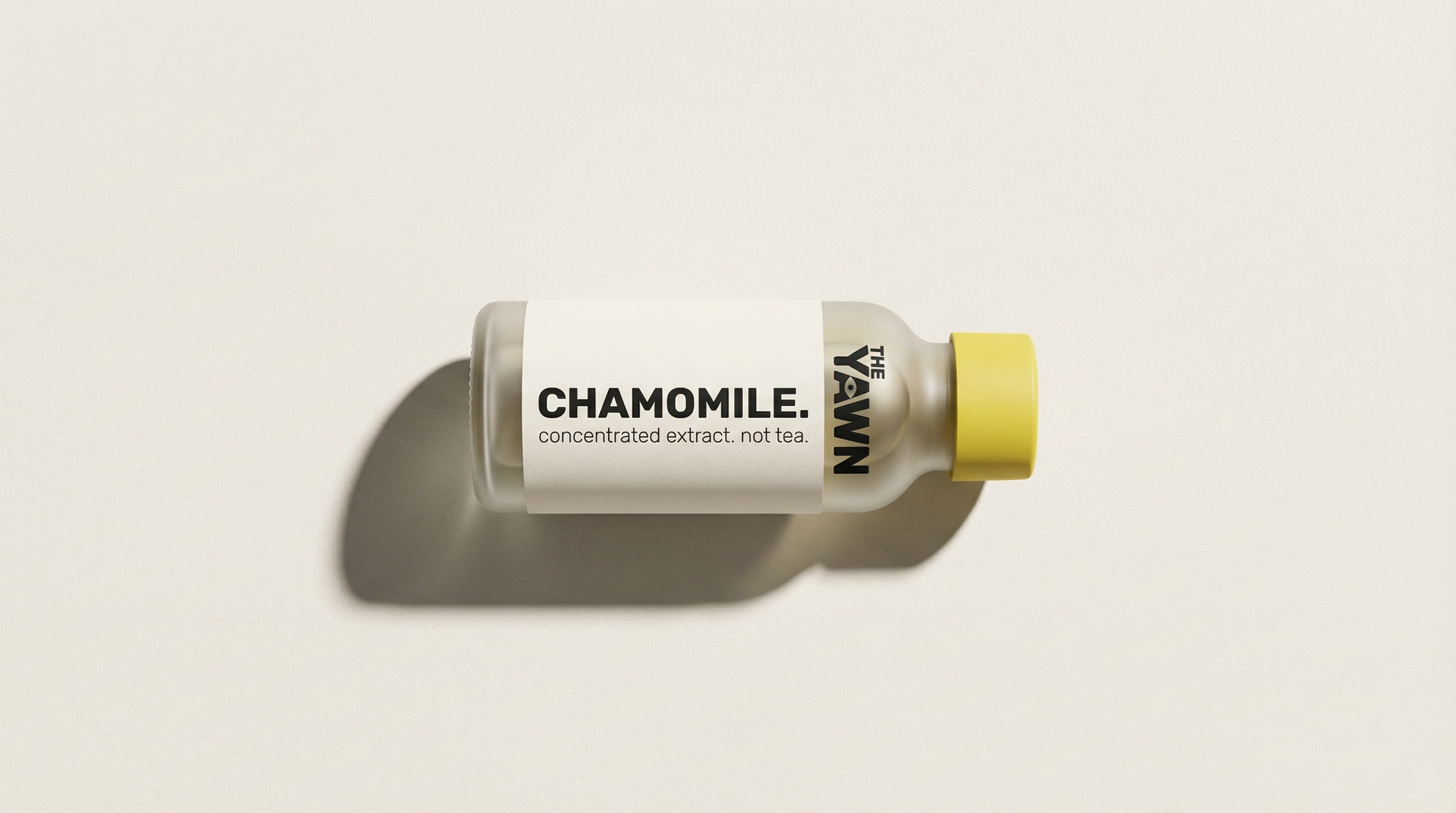
CHAMOMILE. — Concentrated chamomile extract shot.
The product names are the ingredients. Full stop, literally. The period is not punctuation — it's attitude. It ends the conversation before it starts.
THE LOGO
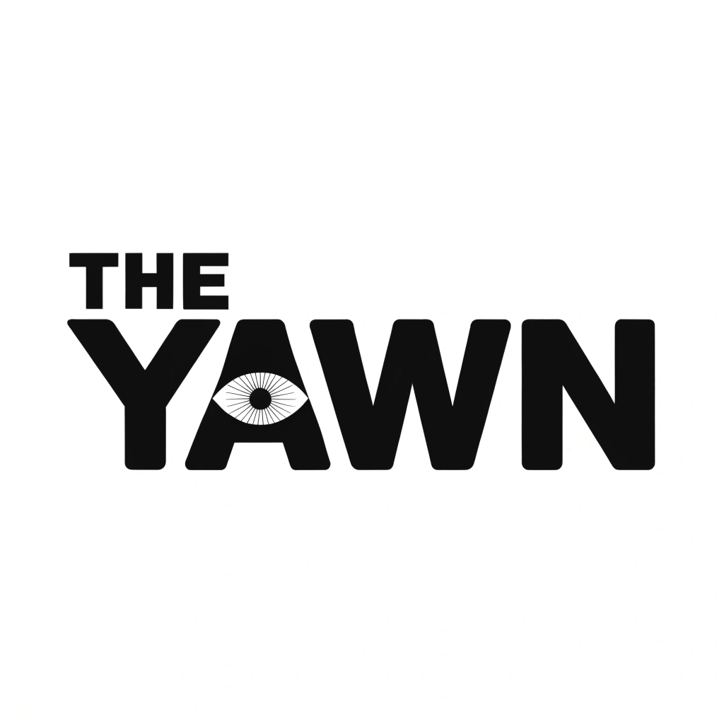
The wordmark is set in a heavy, wide-tracked grotesque — THE sitting above YAWN at roughly 40% of the cap height, left-aligned to the Y, deliberately off-center in a way that feels stubborn rather than accidental.
The defining move: the O in YAWN is replaced by a wide-open eye with radiating iris lines. The eye sits fully inside the solid black letterform — it reads as the letter from a distance and as a face detail up close. It does two things simultaneously: it references the act of staring wide-eyed at the ceiling at 2am, and it gives the brand a single visual detail that rewards attention without demanding it.
No icon system. No separate mascot. The logo is the mark. The eye is the logo. At small scale, the radiating lines are the only fine detail in the entire brand — which makes them the most important.
COLOR SYSTEM
Bone (
#F5F0E8) — everything.
Ink (#1A1A1A) — all type, all logo applications.
Yawn Yellow (#E8D84A) — once per touchpoint, never twice.The yellow rule is the brand's most important constraint. It appears as a cap, a stripe, a rectangle with no text inside it. It never explains itself. It is the brand's single wink — deployed once, earning its place, then gone.
TYPOGRAPHY
Heavy grotesque for all headlines and product names. Ultra-thin grotesque for all secondary copy and body text. The contrast between the two weights does all the hierarchy work. No serifs. No scripts. No decorative type of any kind. The blankness of the typeface is the personality — it refuses to be charming on a typographic level, so the copy has to carry the voice entirely.
VOICE
"It's magnesium. It works. Goodnight."
"concentrated extract. not tea."
"you bought three things. good."
"SLEEP IS NOT A HACK."
"AMINO ACID. BORING NAME. WORKS THOUGH."
Every line is short. Every line ends with a period even when it doesn't grammatically need one. The brand never asks questions. It never invites engagement. It tells you something true in the flattest possible way and trusts you to find that funny.
APPLICATIONS
Packaging — Three products, three formats: a matte stand-up pouch, a frosted glass bottle, a horizontal shot vial. Each labeled with the ingredient name and nothing else except the logo and the yellow accent. The CHAMOMILE. vial lying on its side was the correct call — it reads as pharmaceutical, clinical, and slightly absurd simultaneously.
Print / OOH — A typographic poster series where each execution is three stacked words and a product list. "TIRED. / OBVIOUSLY. / GOODNIGHT." is the hero. Every ingredient gets its own poster. The series can run indefinitely. The Yawn Yellow rectangle in the bottom right corner of each poster has no text inside it. It is just there. No explanation given.
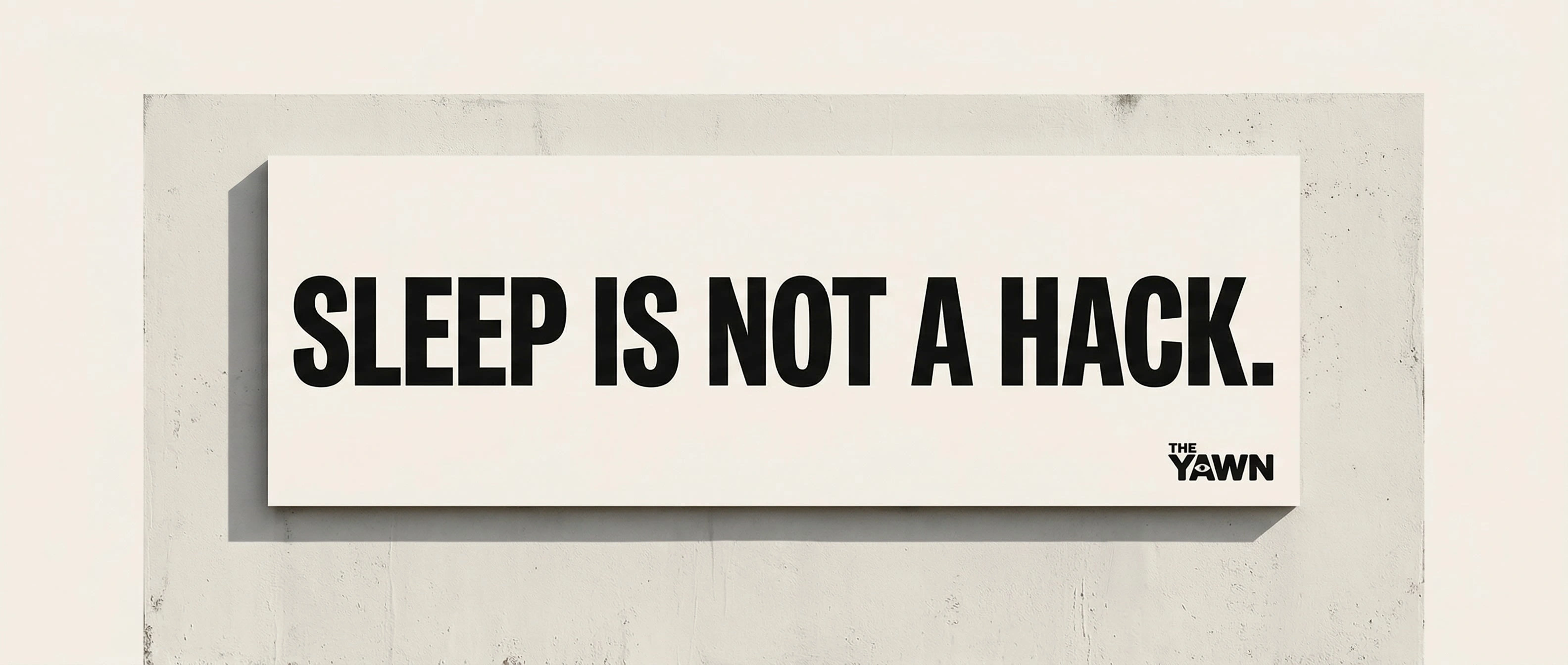
Environmental — "SLEEP IS NOT A HACK." on a billboard. Nothing else. The logo, small, bottom right. No product shown. No URL. This is the brand's most confident execution — it makes a statement that has nothing to do with selling and everything to do with positioning.
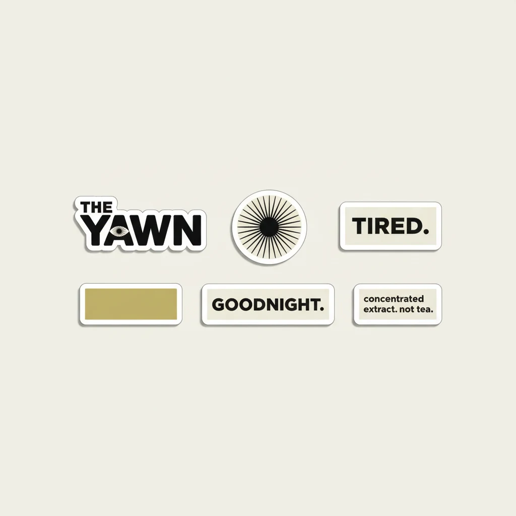
Merch — A Bone hoodie with the logo centered on the chest. The only color: a Yawn Yellow woven label at the collar, too small to read from the outside. The sticker sheet includes six die-cuts: the logo, the isolated eye from the O, "TIRED.", "GOODNIGHT.", "concentrated extract. not tea.", and a blank Yawn Yellow rectangle. The blank yellow sticker is the best one.
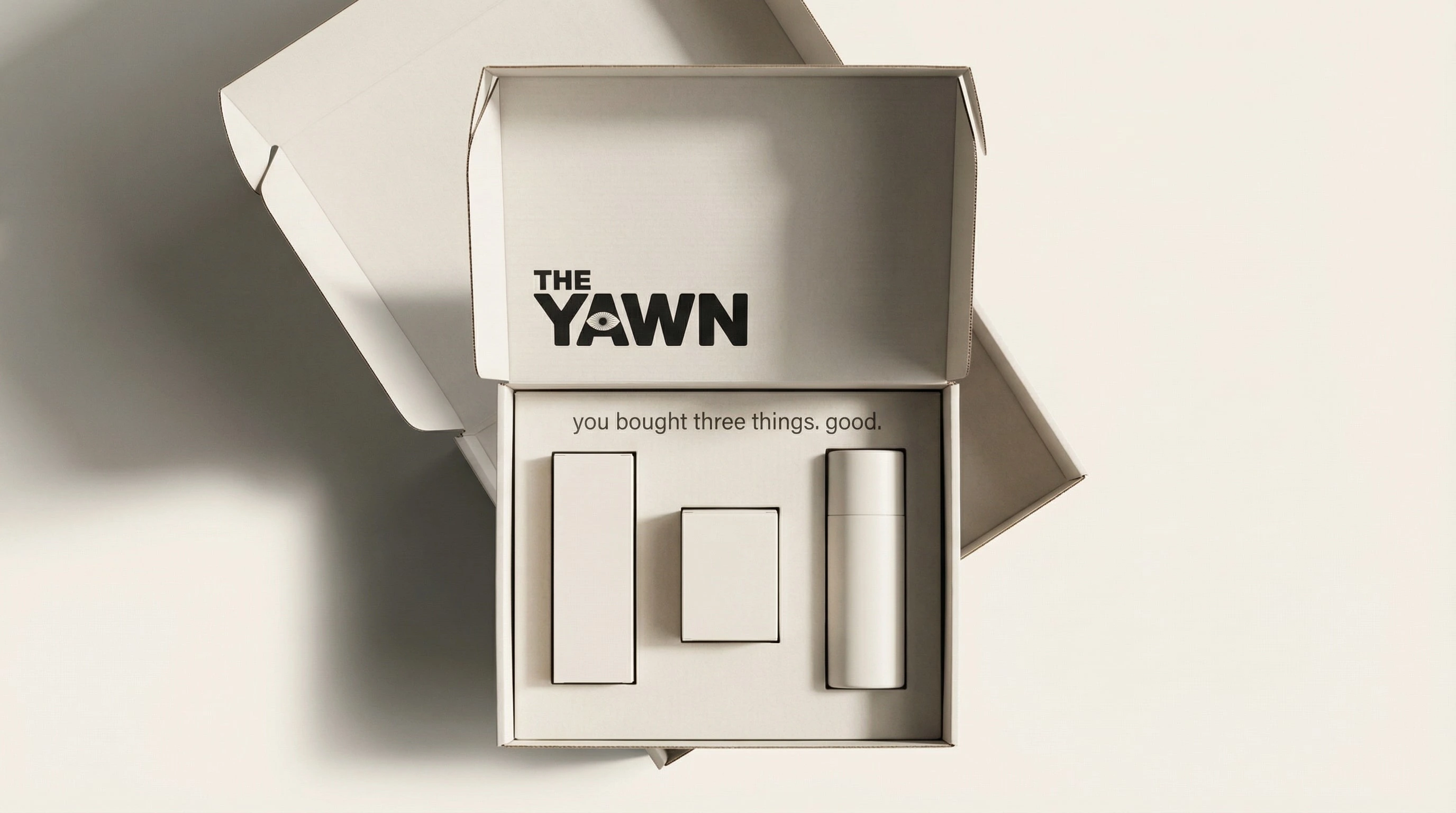
Shipping — The inside of the box reads "you bought three things. good." That's the unboxing experience. No tissue paper. No card with a handwritten font. No thank-you note. The products sit in die-cut inserts and that's it.
WHAT THIS BRAND IS NOT
It is not a wellness brand.
It is not a pharmaceutical brand.
It is not trying to look expensive.
It is not trying to look clinical.
It is not purple, navy, or "nighttime blue."
It does not have a sunrise in the logo.
It does not have a tagline.
WHAT WORKED
The eye in the O is the project's single best decision. It scales from billboard to sticker without losing legibility or meaning. It gives journalists and social accounts something to describe in one sentence. It rewards people who look closely without punishing people who don't.
The yellow rectangle with no text inside it is the second best decision. It appears across packaging, posters, the sticker sheet, and merch — always in the same proportion, always unexplained. By the third touchpoint the viewer stops needing an explanation. That's how a brand element becomes a brand element.
The copy voice is airtight. The constraint — no exclamation marks, ever — kept every execution honest.
DELIVERABLES
Logo system (wordmark + reduced applications)
Full color system
Typography system
Packaging — MAGNESIUM. / GLYCINE. / CHAMOMILE.
Shipping box interior
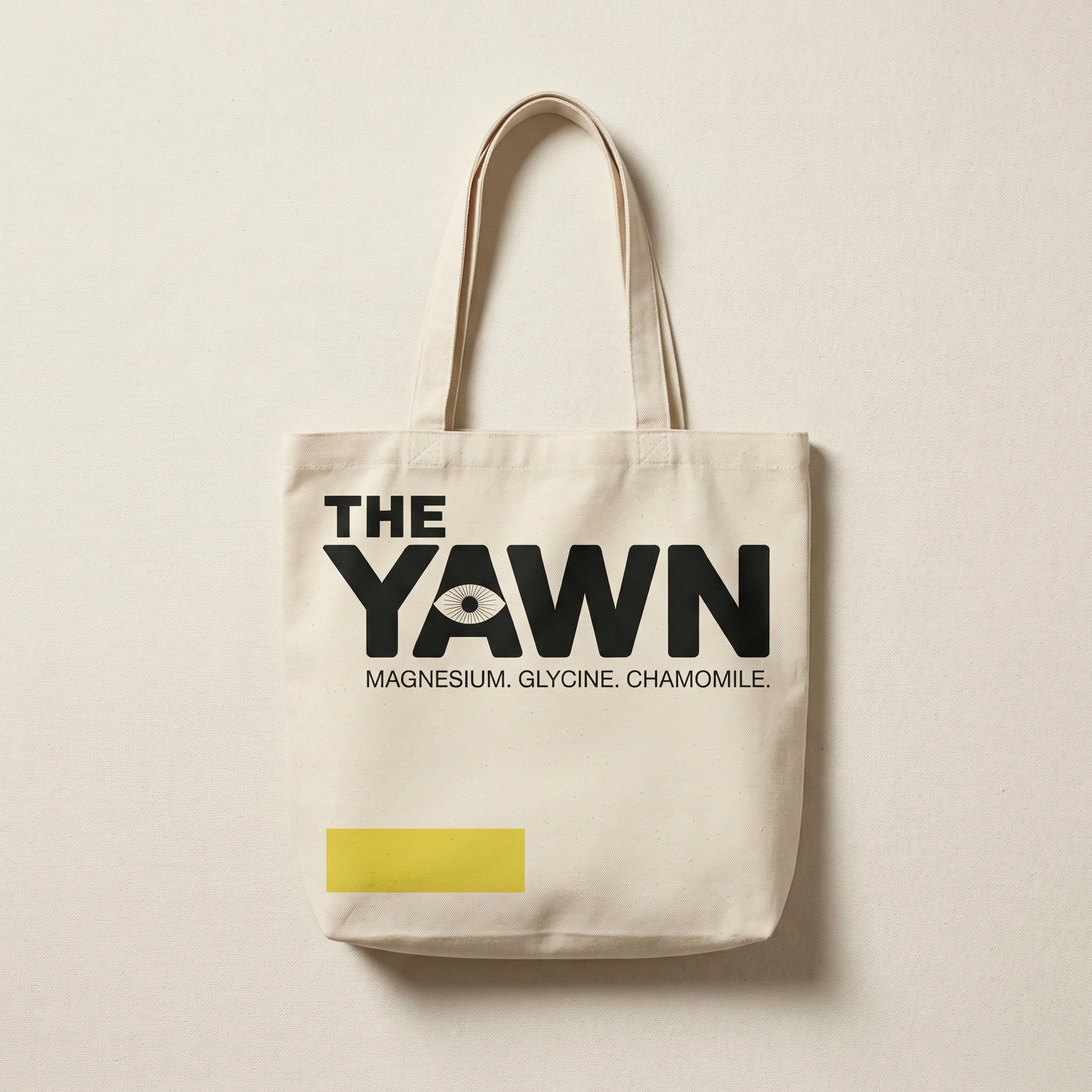
Tote bag
Hoodie
Sticker sheet
Subway poster — TIRED. / OBVIOUSLY. / GOODNIGHT.
Billboard — SLEEP IS NOT A HACK.
Newspaper full-page ad — drug facts format
Instagram square ad — MAGNESIUM. product
Product trio campaign flatlay
Designed by Révolté.
Like this project
Posted Apr 3, 2026
Three ingredients. Three products. A sleep brand that refused to be a wellness brand. Deadpan voice, one yellow accent, and an eye that stares back.
Likes
4
Views
13
Timeline
Mar 18, 2026 - Apr 3, 2026