Built with Lovart
Auris Brand Identity Development
Révolté
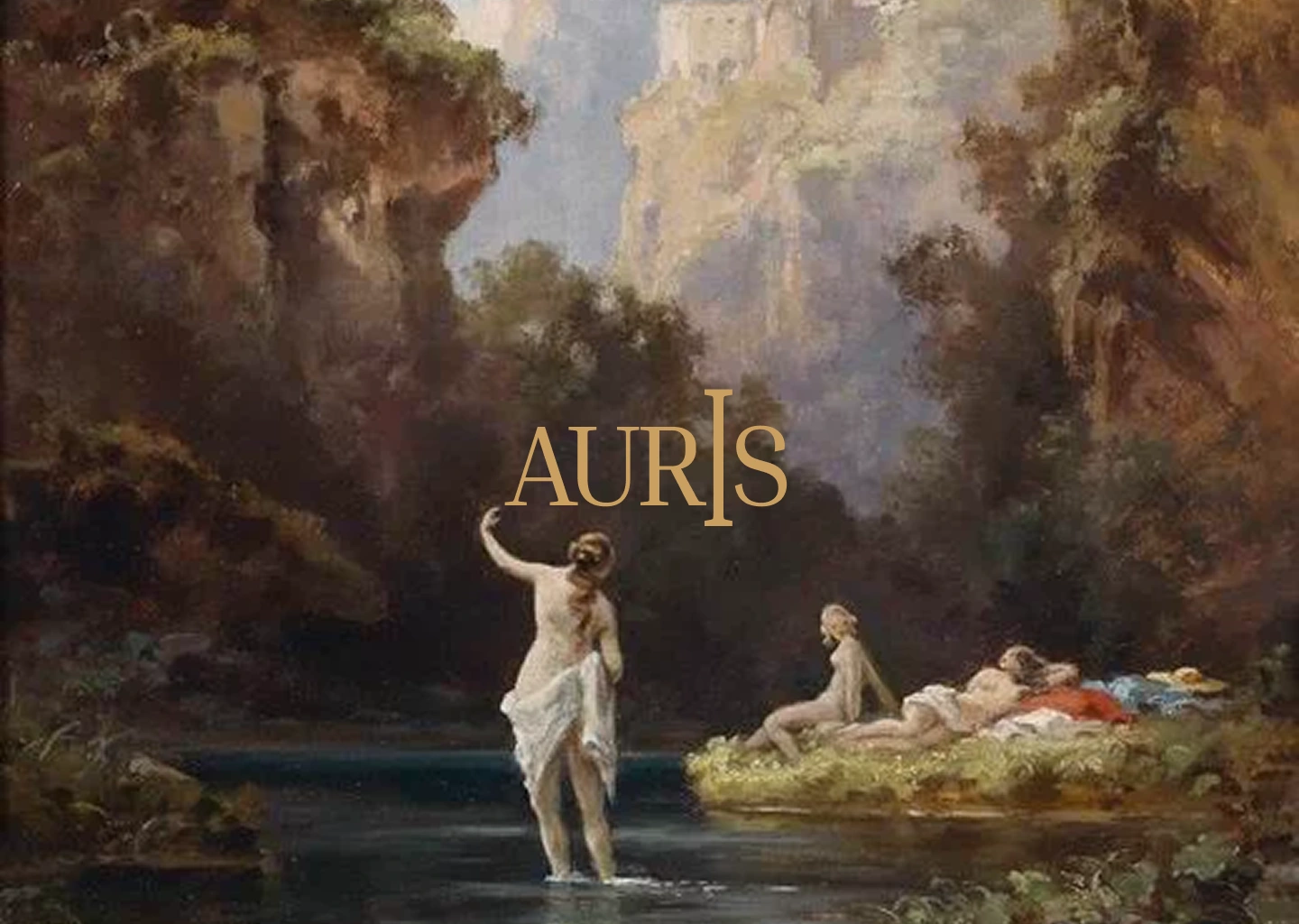
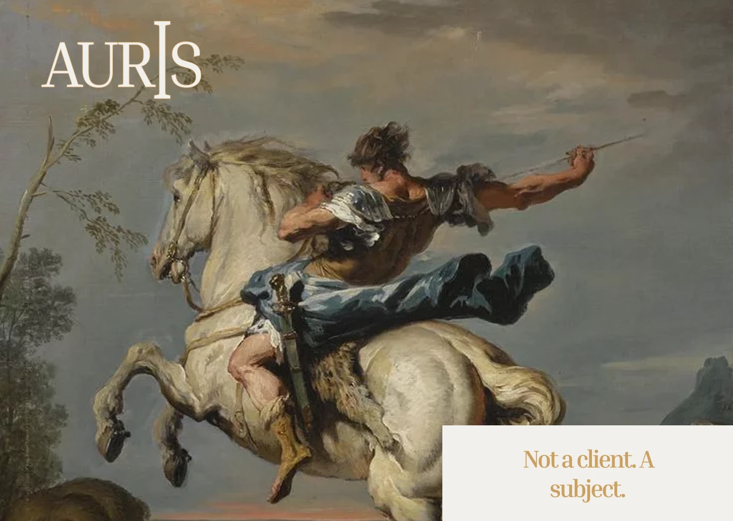
AURIS
Financial Wellness — Brand Identity Case Study
Overview
Auris is a financial wellness practice built on a single belief: that every person's economic life deserves the same quality of attention a Renaissance master gave to a subject. Not a bank. Not an app. A practice.
This case study documents the full development of the Auris brand identity — from strategic direction through visual language, campaign system, and physical object world. The brief was to build something that felt ancient and urgent at the same time. Something that had clearly always existed, and had simply been waiting to be named.
The Problem
Financial services brands fall into two traps. The first is coldness — marble lobbies, navy suits, the language of exclusion. The second is false warmth — fintech green, growth arrows, gamified dashboards that turn money into a video game. Neither tells the truth about what money actually is: a deeply human subject, bound up with dignity, fear, hope, and time.
Auris was founded to occupy the space neither camp will touch — radical transparency, genuine warmth, and a visual language that treats the client as a subject worthy of the full attention of a craftsman.
Strategic Direction
The brand is built on one tension held in perfect balance: Renaissance humanism meets radical honesty.
Renaissance humanism placed the individual human being at the center of everything — worthy of being studied, depicted, celebrated, understood in full. Radical financial transparency means showing everything: the numbers, the shape, the gap between where you are and where you want to be. No euphemism. No soft-focus optimism. Just clear sight.
The positioning statement that anchored all creative decisions: Your financial life is worthy of the same care and craft that Renaissance masters gave to their subjects. Not aspirational. True.
The name Auris carries two meanings simultaneously. From the Latin aurum — gold, the elemental symbol of value. And auris — ear, the organ of listening. A brand built on attention. A brand that hears.
Logo
The AURIS wordmark is set in a classical serif, all-caps, in burnished gold
#b8922a on midnight #1c1710. The defining detail is the vertical bar bisecting the I — a plumb line, a measure, a scribal mark. It reads as both an architectural element and a typographic flourish, referencing the precision of Renaissance draftsmanship without decorating it. The mark has the weight of something carved, not printed.The wordmark works in two modes: gold on midnight for dark applications, midnight on vellum for light. There is no third version. The logo never appears in a box, never acquires a drop shadow, never shrinks below the point at which the I-bar reads. Those are the only rules it needs.
Color System
Three colors. That is the entire palette.
Midnight ink #1c1710 — the primary ground. Every dark surface, every background, every folio, every box. The color of a room lit by one candle.
Burnished gold #b8922a — the signature. Used once per composition, never twice. The gold in the wax seal. The foil stamp on the box. The type in the caption strip. It earns its presence by its rarity.
Warm vellum #faf5e4 — the light ground. Paper stock, light UI, the caption panel. The color of a page that has been kept.
Typography
Two typefaces. No exceptions.
The display face is a classical high-contrast serif — the literary voice of the brand. It carries the headlines, the campaign lines, the pull quotes. It is always set at generous size with generous leading. It is never used small.
The functional face is a clean humanist grotesque — the working voice. Data, labels, UI, contact details. It never tries to be beautiful. It is simply clear.
The contrast between the two typefaces is the entire personality of the brand. The serif feels. The sans works. Together they say: this is a practice that takes both seriously.
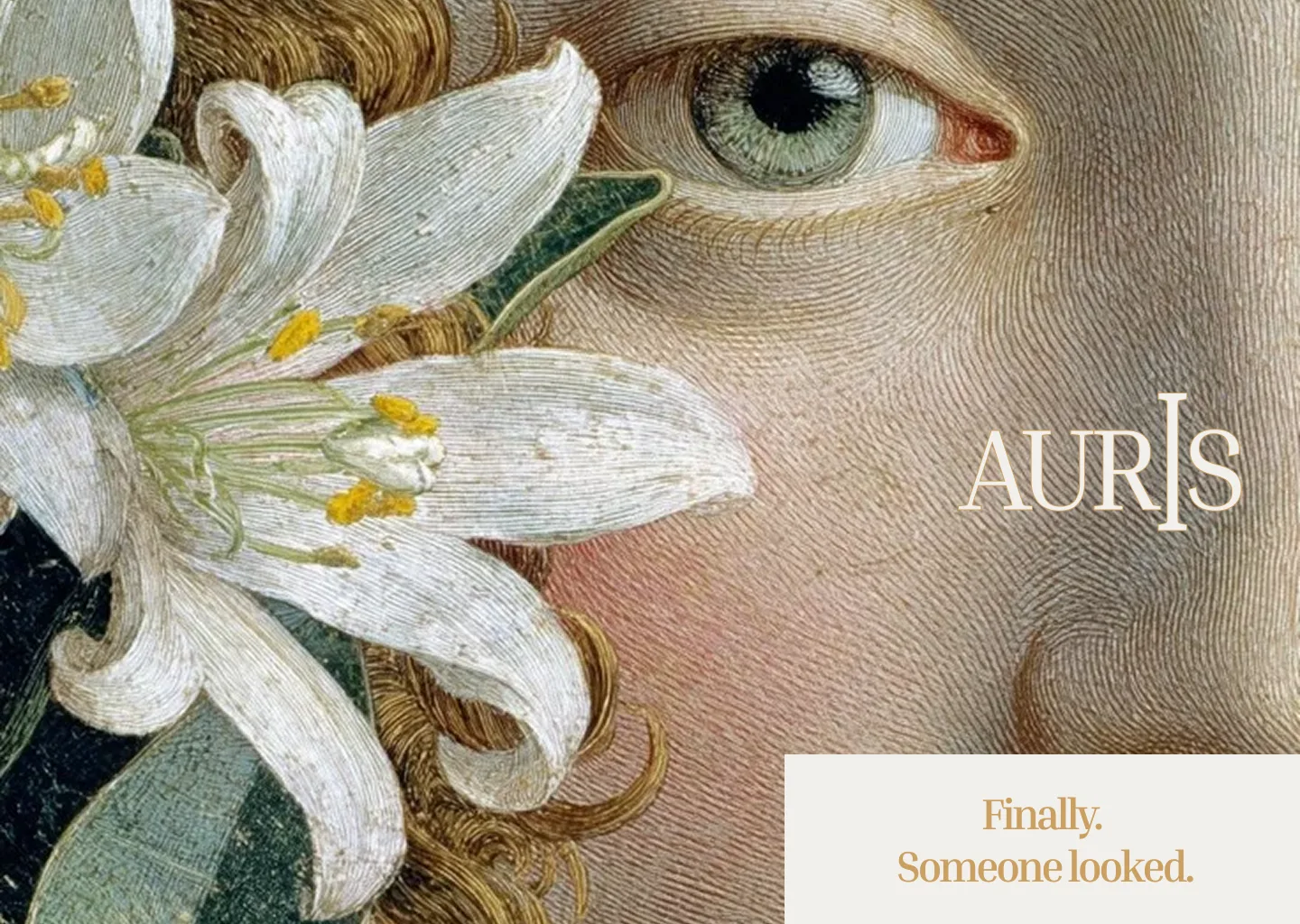
Campaign System — Old Master Paintings
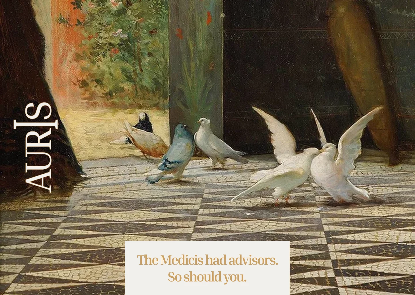
The campaign visual language emerged from one decision: use Renaissance and Old Master paintings as the primary image medium.
Not as decoration. Not as reference. As the actual image — full-bleed, unaltered, oil on canvas with cracked varnish and deep tonal warmth — placed in direct service of a financial brand. The paintings are public domain. Their subjects are human. Their light is warm. Their attention to the individual is absolute.
The system has three components and three only:
The painting. Full-bleed, unfiltered, ungraded. The oil canvas texture is part of the image. The painting is chosen for its subject — a figure reading, a craftsman working, a harvest, a judgement — not for its beauty.
The logo. Placed flat on the painting, as if letterpress-printed directly onto the canvas. Top-left in most executions, occasionally centered or free-floating when the composition demands it. No shadow. No box. No treatment.
The caption panel. A vellum rectangle —
#faf5e4 — containing one line of bold serif gold type. The panel is never full-width as a rule. It floats, anchors to a corner, sits as a ticket or label — its shape determined entirely by what the composition needs. The line inside it is never more than two lines. It always stands alone.The gap between the ancient image and the plain-spoken line is where the brand lives. Every caption was written to widen that gap as much as possible — to make the contrast between the grandeur of the painting and the directness of the copy feel like a philosophy, not a design choice.
The five campaign lines that define the system:
Dignity is not a premium feature.
Finally. Someone looked.
Not a client. A subject.
The Medicis had advisors. So should you.
Something worth keeping.
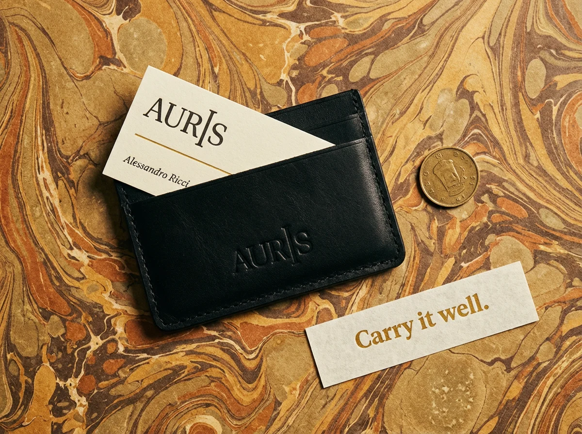
Physical Object World
The physical identity extends the campaign logic into three dimensions. Every object follows the same rules as the campaign: matte surfaces, organic materials, deboss and foil stamp only, burnished gold as the single accent, one caption element per scene.
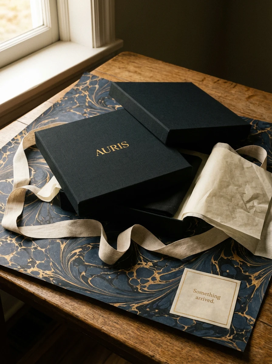
The material palette is fixed: midnight bookbinder's cloth, heavyweight uncoated vellum cotton stock, vegetable-tanned leather in midnight, natural unbleached canvas, aged oak, unpolished brass, Florentine marbled paper in midnight-and-gold swirl. No gloss. No plastic. No synthetic surfaces anywhere.
The Welcome Kit — a rigid midnight cloth box, foil-stamped AURIS centered on the lid, containing a welcome letter, a midnight cloth notebook, a brass paper clip, and a sealed vellum envelope. The marbled paper wrapping is the first thing you see. The caption card reads: Something arrived.
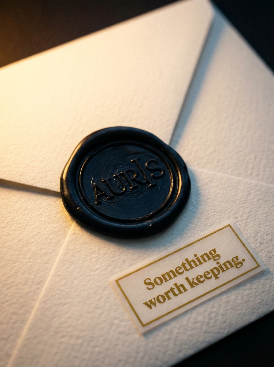
The Wax-Sealed Envelope — the most intimate object in the identity. Heavyweight vellum cotton envelope, sealed with a large midnight wax disc impressed with the AURIS wordmark. A small caption ticket in the lower corner, bordered in gold, reads: Something worth keeping. Shot in near-candlelight, the wax and the gold type catching the same warmth.
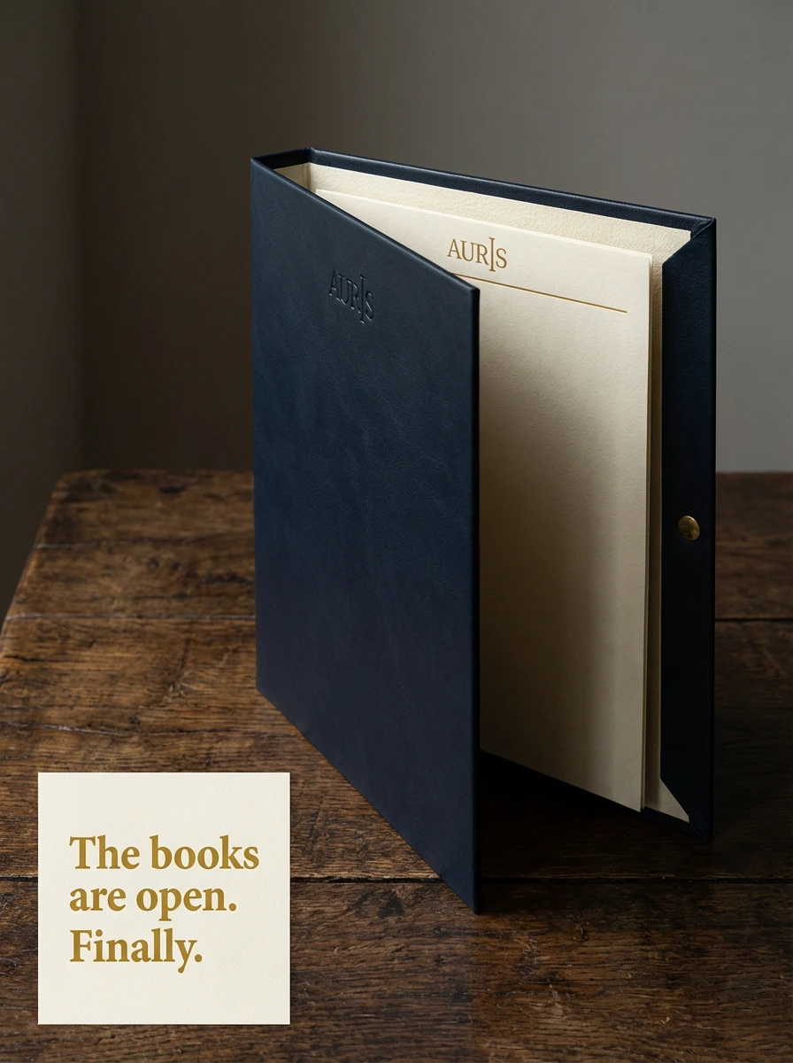
The Folio Sleeve — midnight full-grain leather, rigid, standing upright on aged oak. AURIS blind-debossed upper-left on the exterior, no color. The interior visible: vellum letterhead with the gold rule header. The caption panel anchored lower-left, off the edge of the folio: The books are open. Finally.
The Card Wallet — slim midnight vegetable-tanned leather on Florentine marbled paper in warm ochre and umber. Business card partially drawn from the slot, the AURIS wordmark letterpress on vellum stock above the gold rule. An old coin lying beside it. The caption strip is a narrow horizontal ticket: Carry it well.
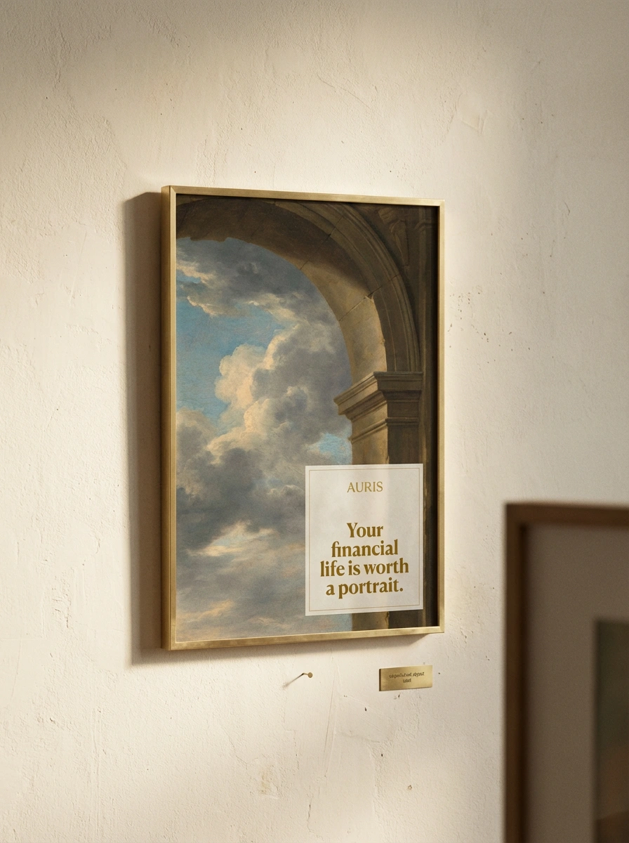
The Framed Print — A3, thin brass float frame, hung on aged warm plaster. The painting inside: a Renaissance arch opening onto a clouded sky. In the lower-right quadrant of the print, inside the frame, a contained vellum cartouche with AURIS above and the campaign line below in bold serif gold: Your financial life is worth a portrait. A small brass object label pinned to the plaster below the frame, too small to read. The second frame partially visible at the right edge.
The Annual Report — perfect-bound hardcover in midnight bookbinder's cloth. AURIS debossed on the cover, no color. Spine in gold foil: AURIS and the year. Pages in vellum stock, single gilt edge on the top. Open interior: Old Master painting full-bleed left, clean typography right. A brass letter opener resting beside it on aged oak.
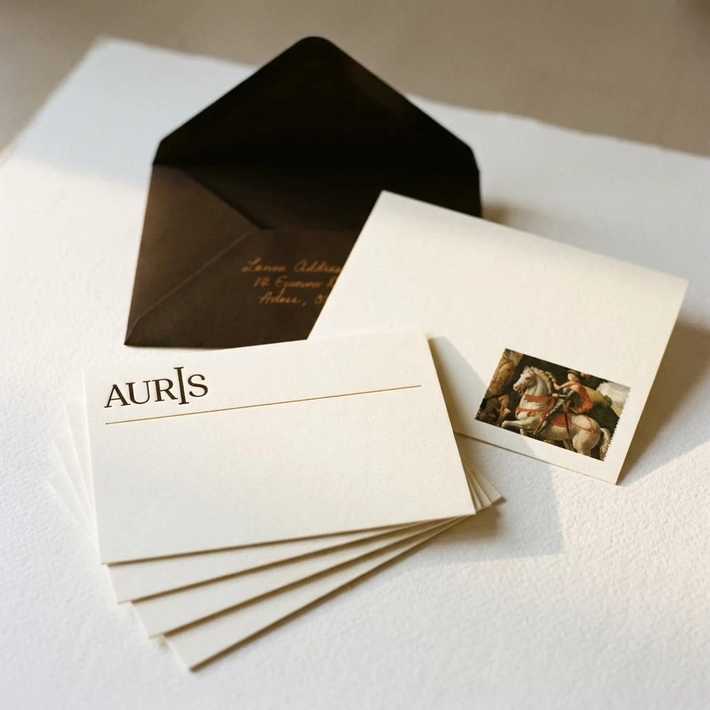
The Correspondence Cards — A6 heavyweight vellum cotton, letterpress AURIS top-left, gold rule below, blank face. The reverse: a detail crop of an Old Master painting in the lower corner, like a collector's stamp. Midnight envelope lined, handwritten address visible. Shot on cold-pressed white paper, softly lit.
The Notebook and Pen — midnight linen hardcover, AURIS debossed lower-right on the cover. A brass rollerball pen, uncapped, resting on the open page. AURIS letterhead partially visible behind. Shot at a desk with warm window light, the scene of someone who thinks before they write.
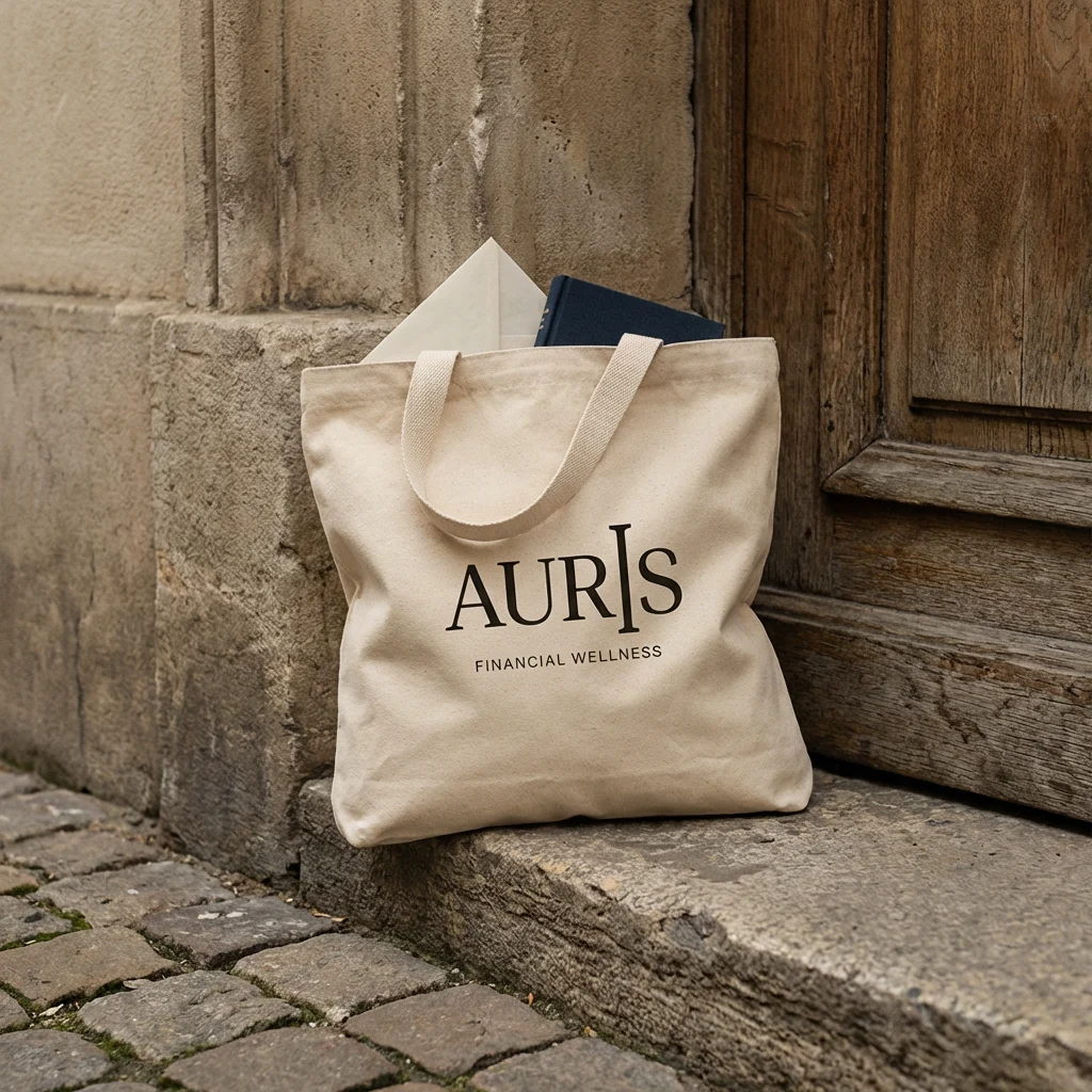
The Tote — natural unbleached heavyweight canvas, AURIS screenprinted in midnight centered, FINANCIAL WELLNESS in small tracked caps below. Leaning against a European stone threshold, aged wooden door behind. The spine of a midnight cloth book visible from the top. No caption element — the tote is the caption.
The Packaging — midnight cloth box on Florentine marbled paper in midnight-and-gold swirl, natural linen ribbon draped loose, tissue paper folded back to reveal the corner of an object inside. Shot at a window, warm light across the oak table. Caption card lower-right corner of the scene: Something arrived.
What Was Learned
Three things about this brand that became clear only through making it:
The name Auris is better than Auric. The double meaning — gold and listening — is the entire brand strategy compressed into five letters.
The Old Master paintings work not because they are beautiful but because they are serious. They communicate that the subject — whatever the subject — deserves to be looked at carefully, for a long time, by someone who knows what they are doing. That is exactly what Auris promises.
The caption panel is the most important design decision in the system. Not the logo. Not the color. The decision to put one plain-spoken line on a piece of vellum and place it in the corner of a four-hundred-year-old painting — that decision is the brand.
Deliverables
Logo — wordmark in SVG and PNG, two colorways
Color system — three colors, fully specified
Typography system — two typefaces, usage rules
Campaign visual system — paintings, logo placement, caption panel logic
Ten campaign posters and ads with captions
Ten physical object mockups
Full brand guidelines (this document)
Auris — Financial Wellness
Your money has a shape. Let's see it clearly.
Like this project
Posted Apr 7, 2026
Financial wellness practice built one belief: that every person's economic life deserves the same quality of attention a Renaissance master gave to a subject.
Likes
2
Views
19
Timeline
Mar 2, 2026 - Apr 7, 2026