Built with Lovart
VITRD, Threat Intelligence Platform Brand Identity
Révolté
VITRD — The Breach as Brand Language
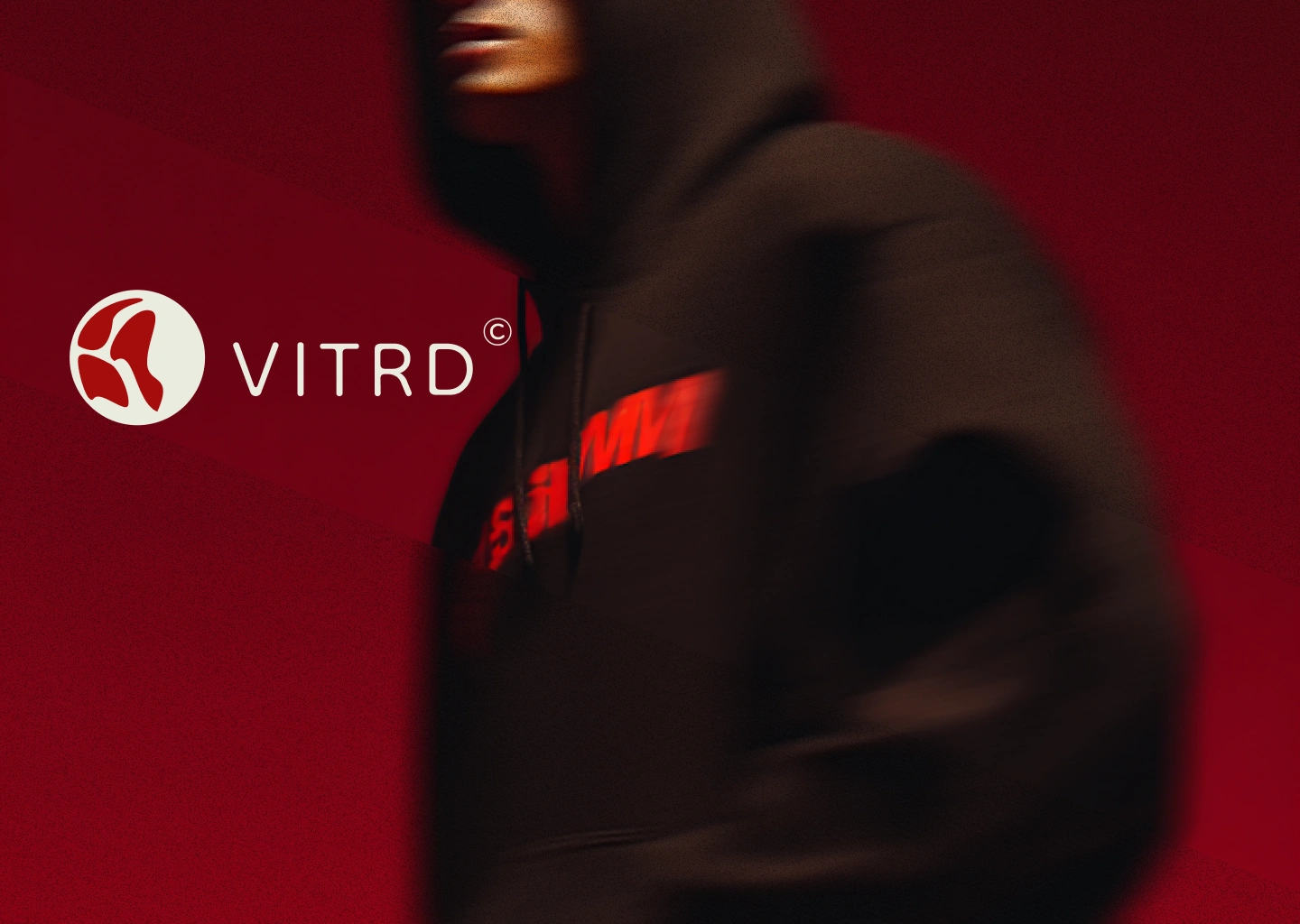
A security SaaS platform built from the forensic vocabulary it already lived in. No borrowed aesthetics. No consumer tech gloss. Just classified documents, severity codes, and a single rule: red means something.
The Brief
VITRD is a speculative brand identity for a threat intelligence and vulnerability management platform — the kind of tool that tracks CVEs, scores asset exposure, and surfaces what's breaking before it breaks. I created it as a portfolio project to answer a question I kept asking about the security industry: why do these brands all look the same?
Most cybersecurity visual identities borrow from consumer tech — dark gradients, glowing UI, sans-serif logotypes that could belong to a fintech or a fitness app. They signal "modern" and "trustworthy" through aesthetic proximity to brands the audience already trusts. The problem is it doesn't feel earned. A security platform doesn't need to look like it belongs in the App Store. It needs to look like it belongs in an incident report.
The brief I set myself was simple and hard: build a brand that looks like it was produced by the security operations team, not the marketing department. No warmth. No reassurance. No performed authority — just the real thing.
The Approach
My first direction was full brutalist — maximum type, absolute black and white, confrontational scale. I rejected it quickly. It felt aggressive in a way that performed toughness rather than having it. Security operations isn't aggressive. It's cold. Forensic. It documents everything and expresses nothing.
The pivot came from looking at the actual language already inside security ops. CVE identifiers. Classification stamps. Severity matrices. Incident timelines. Asset tags. None of these were designed. They evolved from necessity — from the requirement to communicate critical information precisely, under pressure, to someone who needs to act on it. That language has authority because it has to, not because a designer decided it should. I wanted to borrow that authority without faking it.
I built the entire system around one rule: color means severity, never mood.
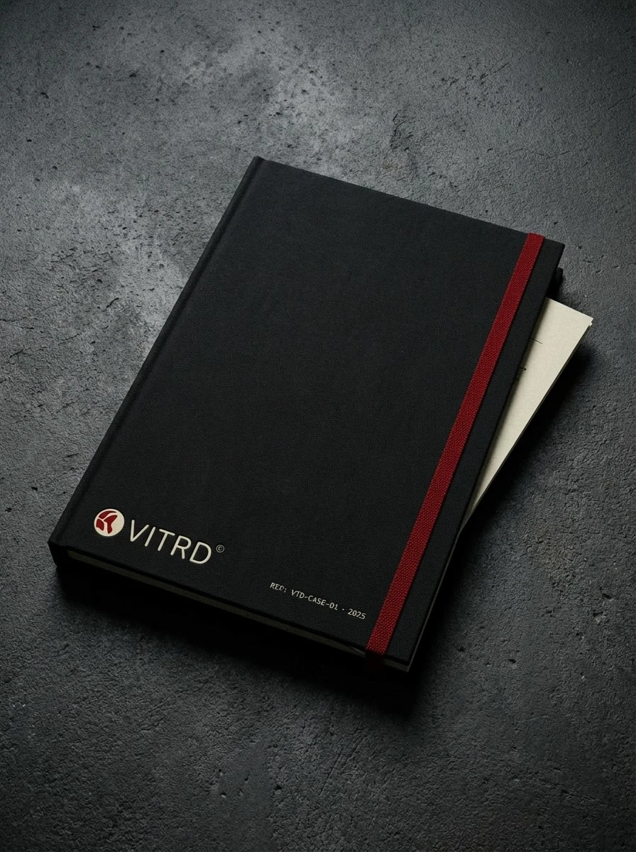
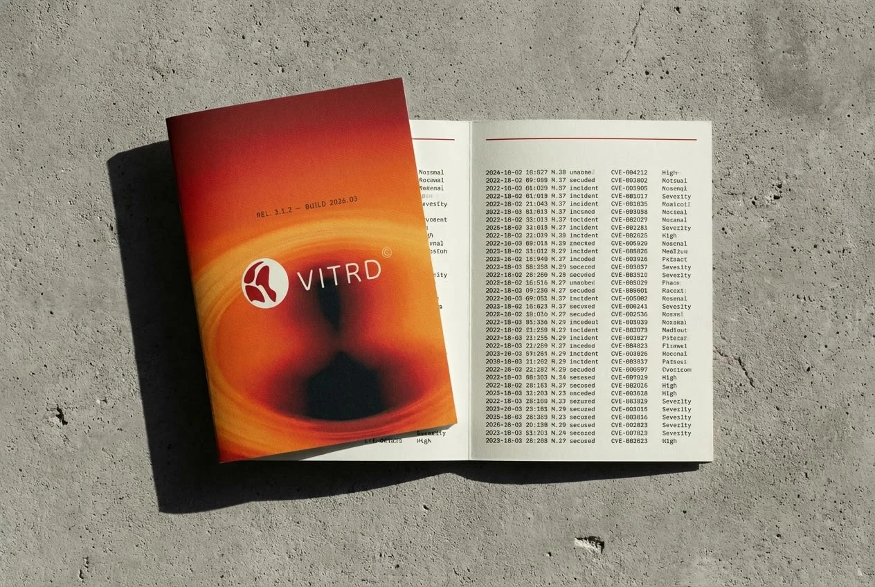
#A50D0D — a deep forensic red, closer to dried blood than danger signal — appears once per composition. Always functional. Never decorative. That constraint forced everything else. The wordmark had to defer to the mark, which meant a thin display typeface — Dongle Light, an unusual choice for a security brand, which is exactly why it works. The data layer had to read like system output, not design choice, which meant IBM Plex Mono throughout. The surface color had to feel like paper, not a screen — which gave me #EAEBDF, slightly warm, the color of uncoated stock and thermal print.[INSERT: Construction geometry sheet — grid diagram, step-by-step process panels]
The Work
Logo System
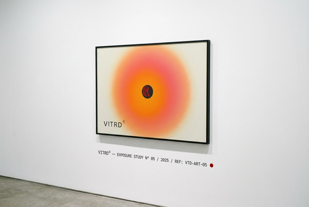
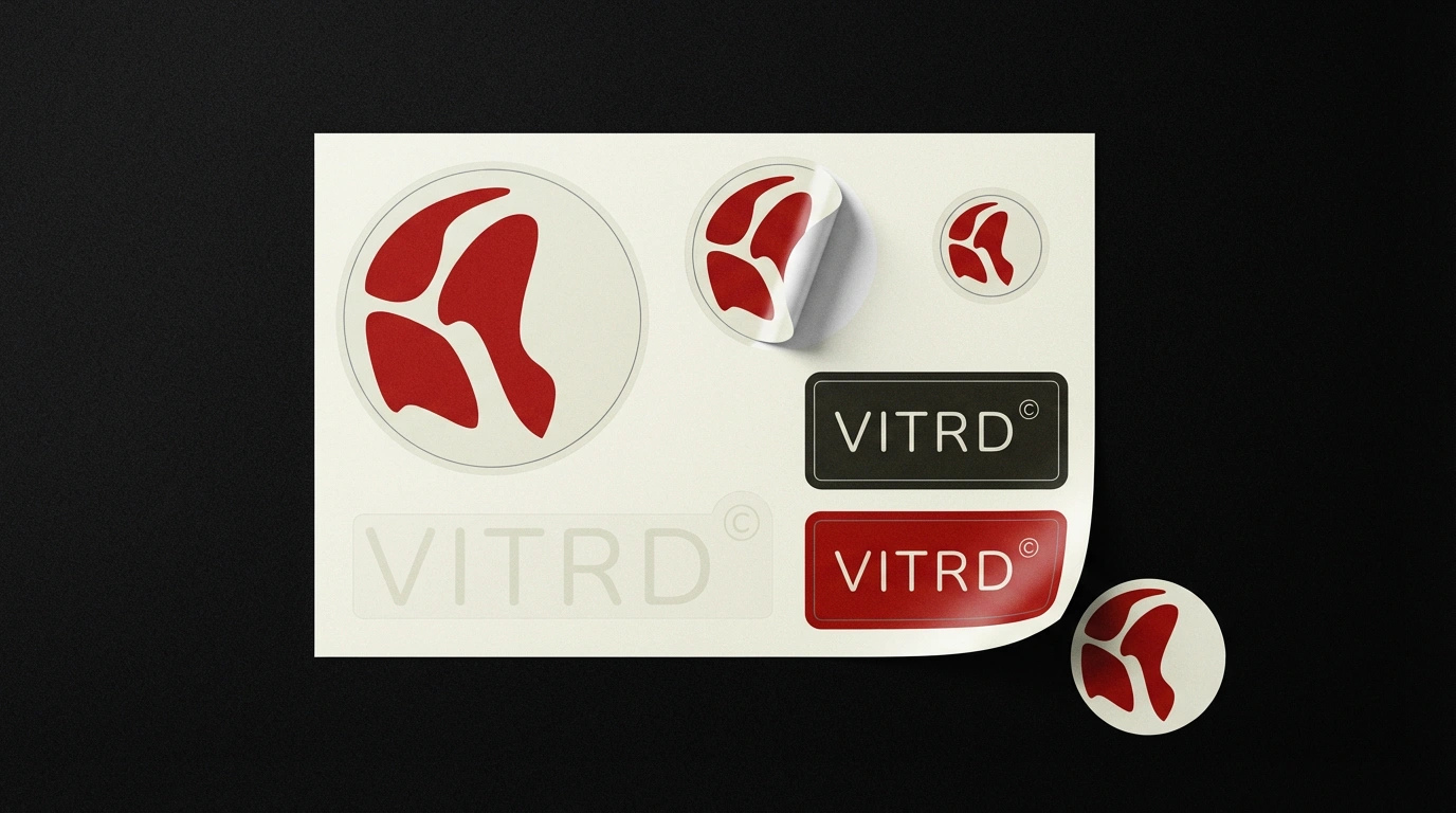
The icon is three irregular petal-like fragments inside a cream circle. Formally it suggests a quarantined object — a seal that's been cracked, a classified emblem in a state of breach. The geometry is constructed on a strict grid: master circle at base radius R, three fragment circles offset at 38–40% of R, placed on 120° rotational axes with petal radii of 28–32% of R. The forms are set in
#A50D0D on #EAEBDF — dark red on warm cream — and the result looks stamped rather than designed, which was the target.The wordmark "VITRD©" is set in Dongle Light. The © is a brand device — borrowed from the same visual language as the EP posters and label graphics that shaped the references for this project. It signals registration, authorship, classification. The tension between the aggressive icon and the near-disappearing wordmark is the identity's primary logic: the mark dominates, the wordmark classifies.
Typography System
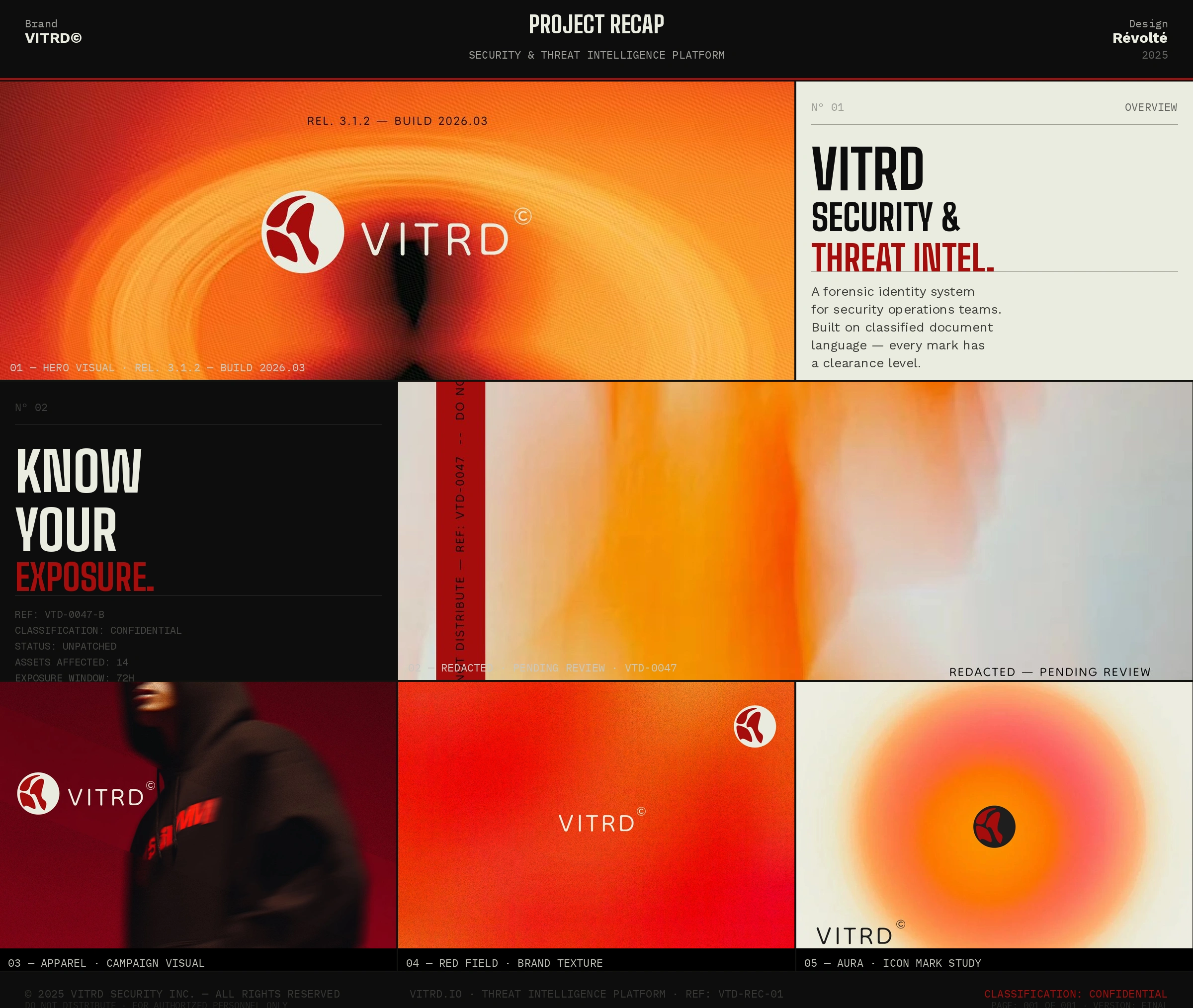
Three voices, strictly separated by function. BigShoulders Bold for campaign display — all-caps, maximum weight, used at 200pt on a poster and at 9pt on a report label without losing its character. IBM Plex Mono for all data output — CVE IDs, timestamps, asset tags, classification stamps, severity codes, every piece of metadata the brand produces. Dongle Light for the wordmark only. The rule is absolute: size and weight carry hierarchy. Color carries severity. Never reversed.
Color System
Three colors. No exceptions.
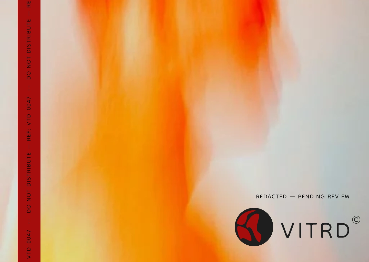
#0D0D0D — the void. The default surface. Everything lives here or on document cream. #EAEBDF — not pure white. Slightly warm, slightly aged. The color of a printed document rather than a backlit screen. #A50D0D — critical red. One per composition. Always means something is flagged. The system is built on a single restraint: red is never decorative. If red is present, something is wrong — and the brand communicates that without explaining it.Copywriting System
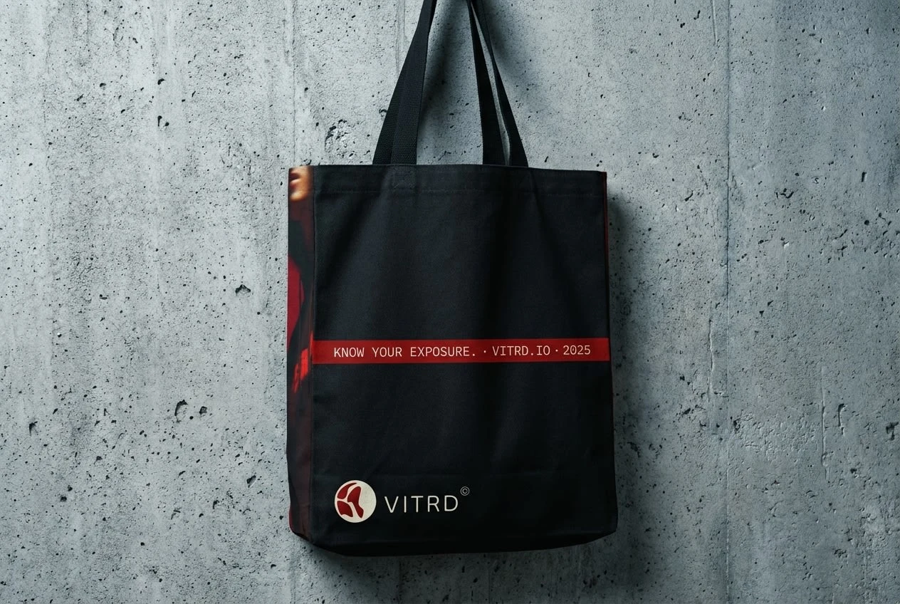
The brand writes like a CVE description. Structured, terse, factual. Active verbs. Short sentences. Status before explanation. I built a complete label language from scratch: classification stamps, severity badges, asset tags, incident entries, campaign lines, document headers, footer meta, product identifiers. "KNOW YOUR EXPOSURE." "NOTHING GOES UNLOGGED." "SIGNAL. NOT NOISE." "REMEDIATE OR DOCUMENT. THERE IS NO THIRD OPTION." Every line could appear on a report cover, a poster, a thermal label, or a UI alert — and mean the same thing in each context.
Mockup Direction
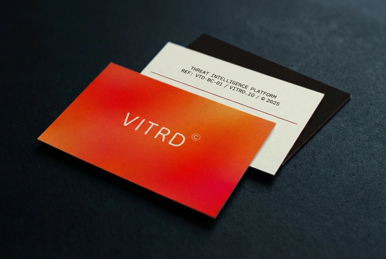
Fifteen mockups across three batches — report covers, campaign posters, thermal labels, document cases, tote bags, framed exhibition prints, broadsheets, wax-sealed envelopes, outdoor billboards, shipping tape, hardcover publications. Every scene was directed with the same rules applied to the brand: one red element, forensic surfaces, film grain, cold directional light. The goal was for every mockup to feel like it was retrieved from evidence, not shot for a portfolio.
The Result
VITRD is speculative — no client, no launch. What it proves is that the security industry has a design language already, and it's more powerful than anything borrowed from elsewhere. Classification stamps have more authority than gradient hero sections. Severity codes communicate more than brand colors. Thermal labels carry more weight than full-bleed photography — not because they're beautiful, but because they mean something.
The identity scales from a 16px favicon to a 200cm outdoor billboard without losing its logic. The icon reads on a wax seal and on a newspaper front page. The copywriting sounds like it came from inside the machine. That's the only outcome I was tracking.
Freelance: Révolté
Website: revolte.design
Project: VITRD — Threat Intelligence Platform
Year: 2026
Scope: Brand Identity, Logo System, Typography System, Color System, Copywriting System, Mockup Direction, Geometric Construction
Industry: Security SaaS / Cybersecurity
Type: Speculative / Portfolio
Like this project
Posted Apr 10, 2026
A security SaaS platform built from the forensic vocabulary it already lived in. No borrowed aesthetics. No consumer tech gloss.
Likes
0
Views
20
Timeline
Mar 19, 2026 - Apr 10, 2026

