Built with Lovart
BLEEDLINE Website and Brand Identity Project
Révolté
BLEEDLINE — Everything That Bleeds Past The Edge
A brand identity and website direction for an independent music label built around the visual language of collage, newsprint, and the physicality of print.
THE BRIEF
I built BLEEDLINE as a self-initiated project — a fictional independent music label with a specific problem I kept seeing in the space: too many underground labels trying to look like major ones. Muted palettes, clean sans-serifs, minimalism borrowed from fashion. The music was raw. The identity wasn't.
The brief I wrote for myself was direct: an identity that looks like it came from the same place as the music. Not designed around a genre — designed around a material reality. Photocopiers. Newsprint. Press marks. The kind of thing you'd tape to a telephone pole at 2am.
The tension was between permanence and disposability. A label needs to feel institutional enough to be taken seriously, but the visual world I was building was deliberately degraded, torn, ephemeral. That contradiction became the whole project.
THE APPROACH
I started with the wordmark because I needed a fixed point — something that could hold across every surface, regardless of how chaotic the collage underneath it got. The first direction I explored was a distressed slab serif, something that read like a rubber stamp. I rejected it immediately. It was too referential — it pointed at a genre aesthetic rather than building one.
What I kept coming back to was monospace. The equal-width character grid of a monospace typeface produces a very specific tension when tracked tight: the letters compress into something that reads like a barcode, a catalog number, a file tag. At −4% tracking, BLEEDLINE in geometric monospace stops being decorative and starts being functional. That was the distinction I needed.
The rest of the system followed one rule: every element had to feel physically produced. Halftone photography processed to bitmap. Torn newsprint as a compositional texture, not an ornament. Bleed red (
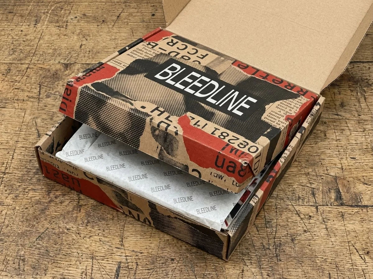
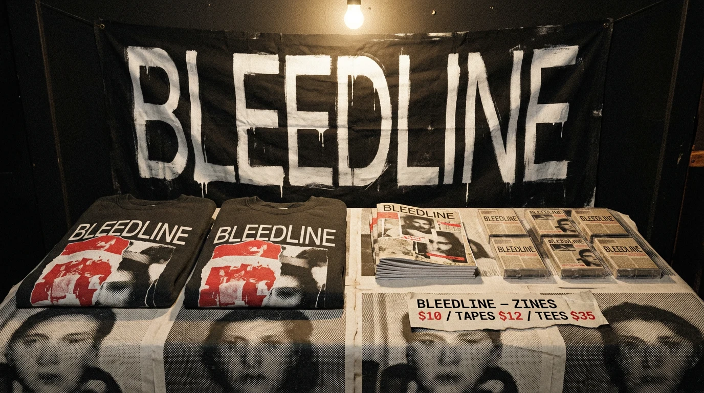
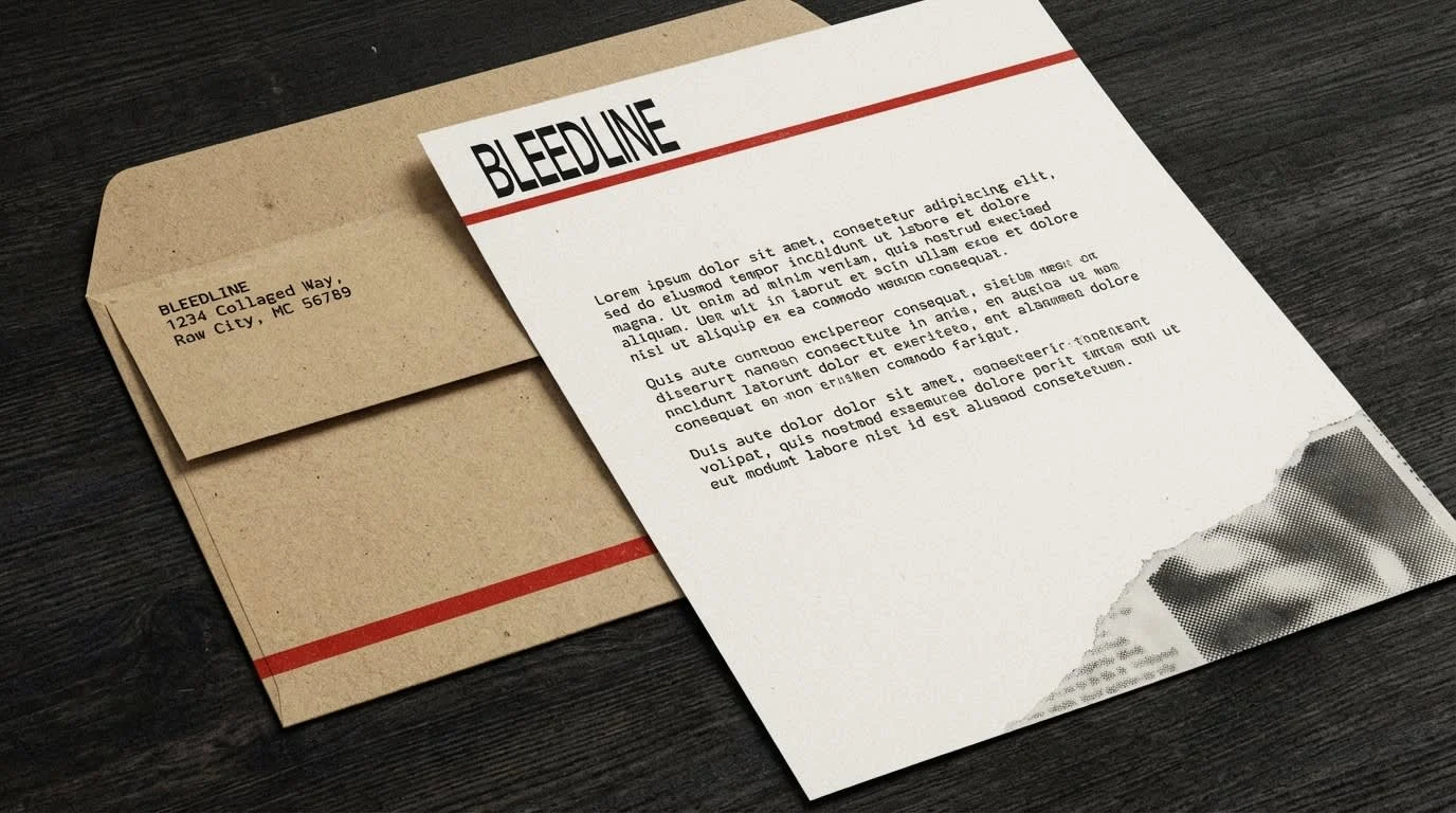
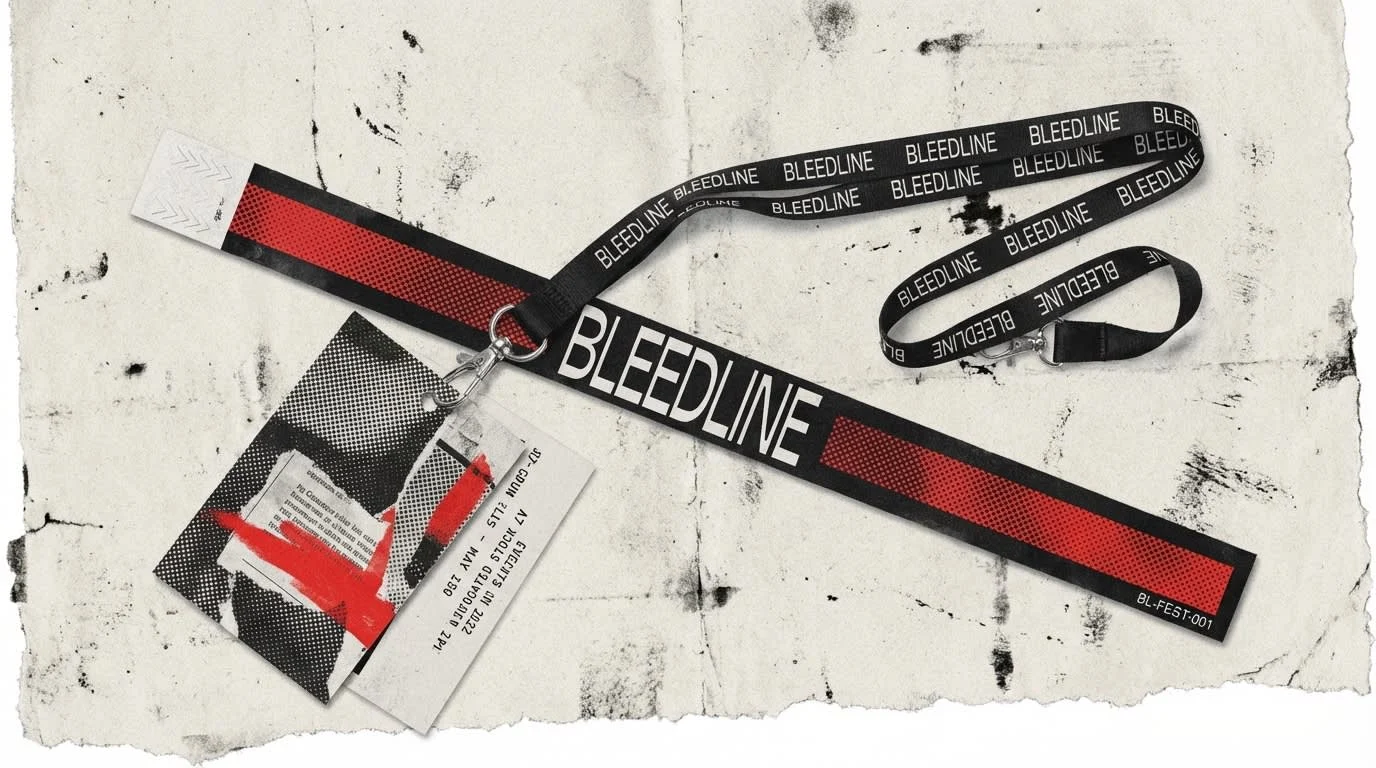
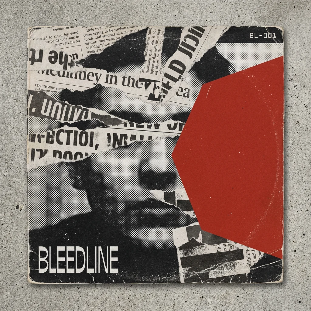
#C8281E) used structurally — as a registration stripe, a geometric cut, an ink wash — never decoratively. The grain pass on every surface. Nothing renders clean.The catalog numbering system (BL-001, BL-002, BL-003) came late but mattered. It recontextualized every piece of collateral as an artifact from an archive — something numbered, logged, finite. A limited run. That logic ran through the vinyl sleeve, the cassette J-card, the CD digipak, the wristband, the mailer box. Every object became evidence of something that existed.
THE WORK
LOGO
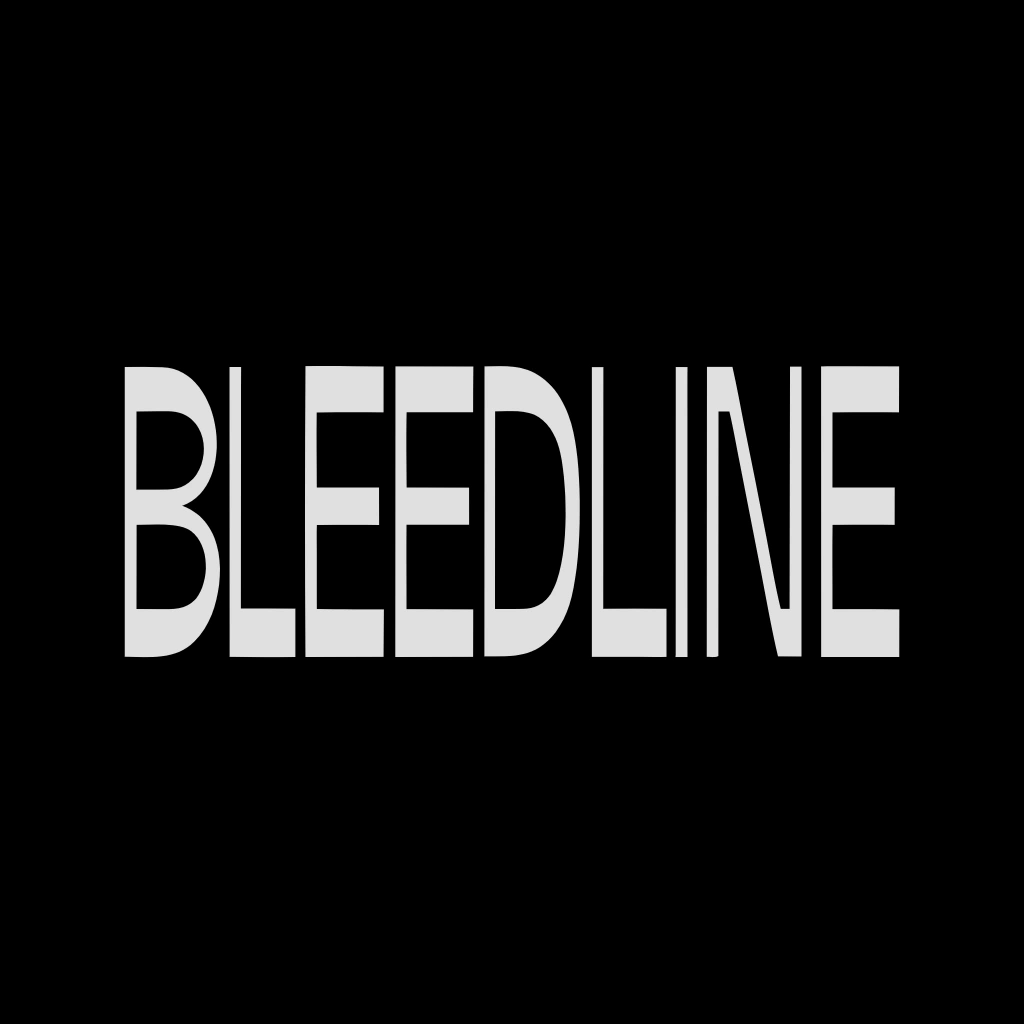
Geometric monospace wordmark set in all caps, tracking at −4% to −5%. The double-L at the center of BLEEDLINE produces a quiet vertical rhythm at close reading — two parallel strokes nearly touching, like a tape splice or a measure bar. Regular weight only. The density comes entirely from the compressed tracking, not from stroke weight. Canonical version: newsprint white (
#F0EDE6) on press black (#0A0A0A). No outline version, no enclosed container, no gradient. The wordmark functions as a stamp — it either holds on a surface or it doesn't.TYPOGRAPHY SYSTEM
Primary: OCR-B or Pitch Mono — geometric monospace, all caps for headlines and catalog codes. Secondary: the same typeface at a smaller size for body copy, with generous leading (130%) and tight tracking (−3%). No mixing of serif and sans. The entire system runs on one typeface family — the hierarchy comes from size and weight, not from type variety. Catalog codes (BL-001, BL-REC, BL-FEST-001) function as a secondary identity element — they appear on every object, treating each release and product as an entry in a physical archive.
COLOR SYSTEM
Press black
#0A0A0A — the dominant ground. Used as background, as ink, as the canonical version of the wordmark reversed out.
Uncoated newsprint #F0EDE6 — the paper. Used for letterhead, J-cards, zine stock, tissue liner inside the mailer box. This color is never used as a decorative accent — it is always a material reference.
Bleed red #C8281E — the single color accent. Used structurally: as a registration stripe on the wristband, as a geometric cut on the vinyl sleeve, as an ink wash on the sweatshirt graphic, as a horizontal rule on the letterhead. It never decorates. It interrupts.
Overexposed silver #B5B0A8 — used sparingly, only in photographic contexts where a halftone face dissolves toward the light.VISUAL COLLAGE SYSTEM
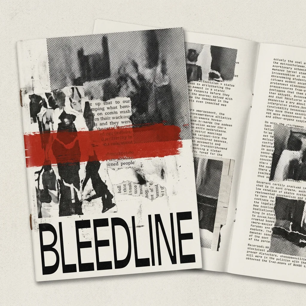
Every composition follows the same construction logic: a halftone-processed black and white photograph as the base layer, torn newsprint fragments overlaid as texture and compositional interruption, one bleed-red geometric element used structurally, OCR-B catalog text scattered at varying scales, and a grain pass over the entire surface. No piece of collateral uses clean photography. No render is presented without a texture layer. The system is intentionally inconsistent in composition but rigidly consistent in material — every piece feels like it came from the same archive, assembled by different hands.
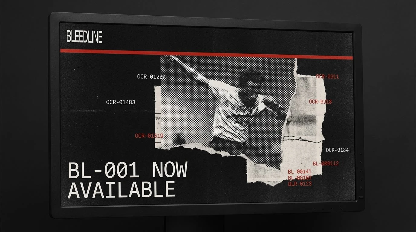
WEB DIRECTION
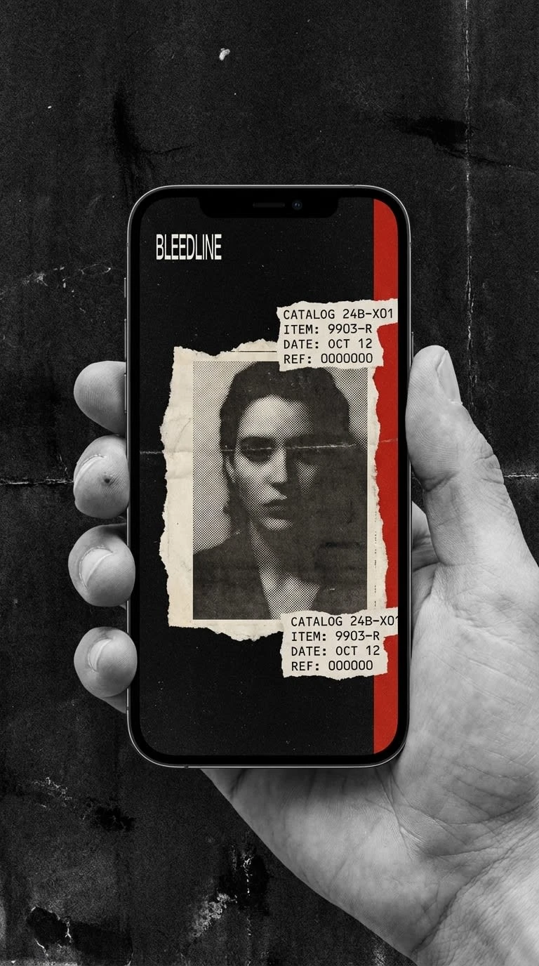
The website hero was built as a direct extension of the print system — full-bleed press black background, halftone portrait fragmenting into torn newsprint at the edges, a single bleed-red horizontal rule dividing the upper and lower thirds, catalog codes in OCR-B scattered as floating elements across the field. The BLEEDLINE wordmark sits top-left at navigation scale. The headline "BL-001 NOW AVAILABLE" runs bottom-left in large OCR-B, left-aligned. No hero image that looks like a hero image. The screen reads like a poster that happens to be interactive.
PRINT + PACKAGING
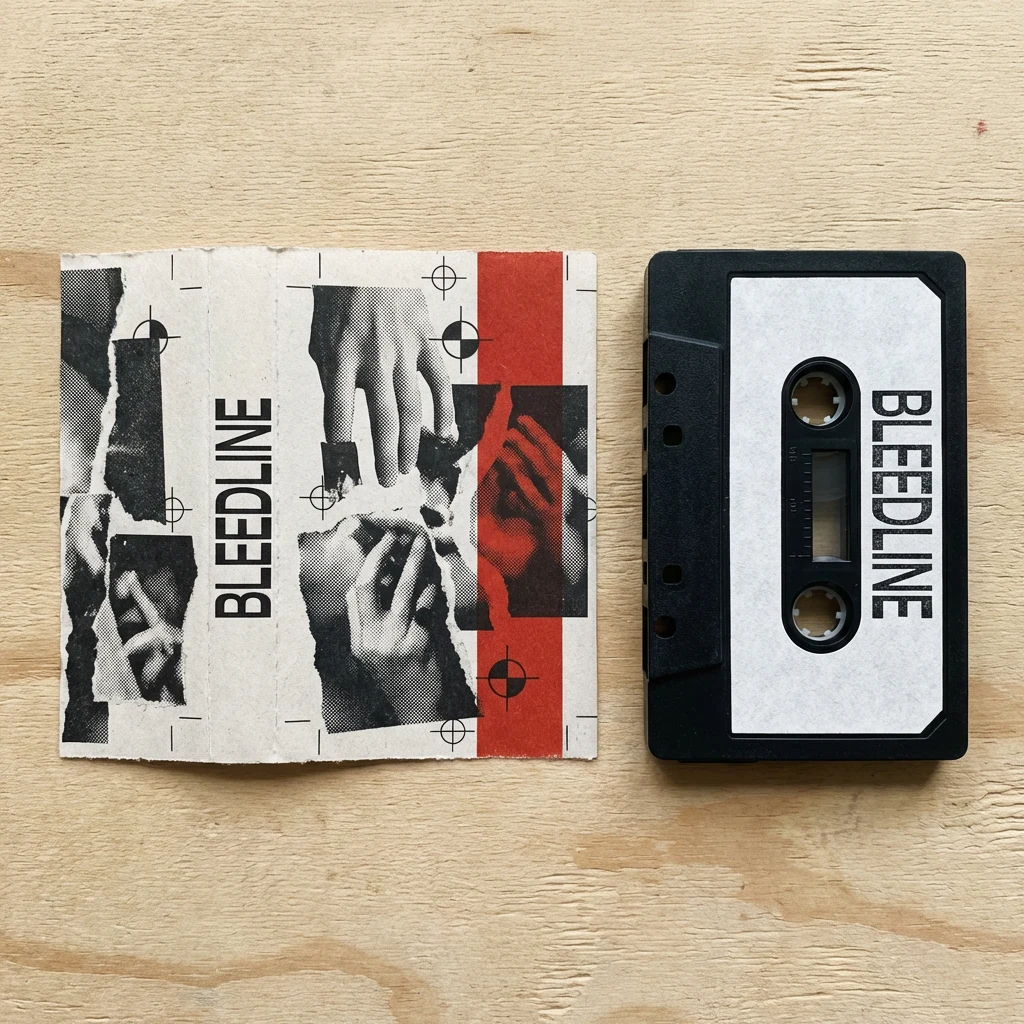
The vinyl sleeve and cassette J-card established the template for all print objects: uncoated stock, two-color printing where possible (press black + bleed red), collage imagery that wraps across edges, catalog number top-right. The shipping mailer box extended the system to packaging — collage pattern wrapping all faces continuously, BLEEDLINE tissue liner inside, no kraft left unprinted. The zine / press kit runs the same system on saddle-stitched newsprint stock, with dense OCR-B body text interrupted by collage elements at irregular intervals.
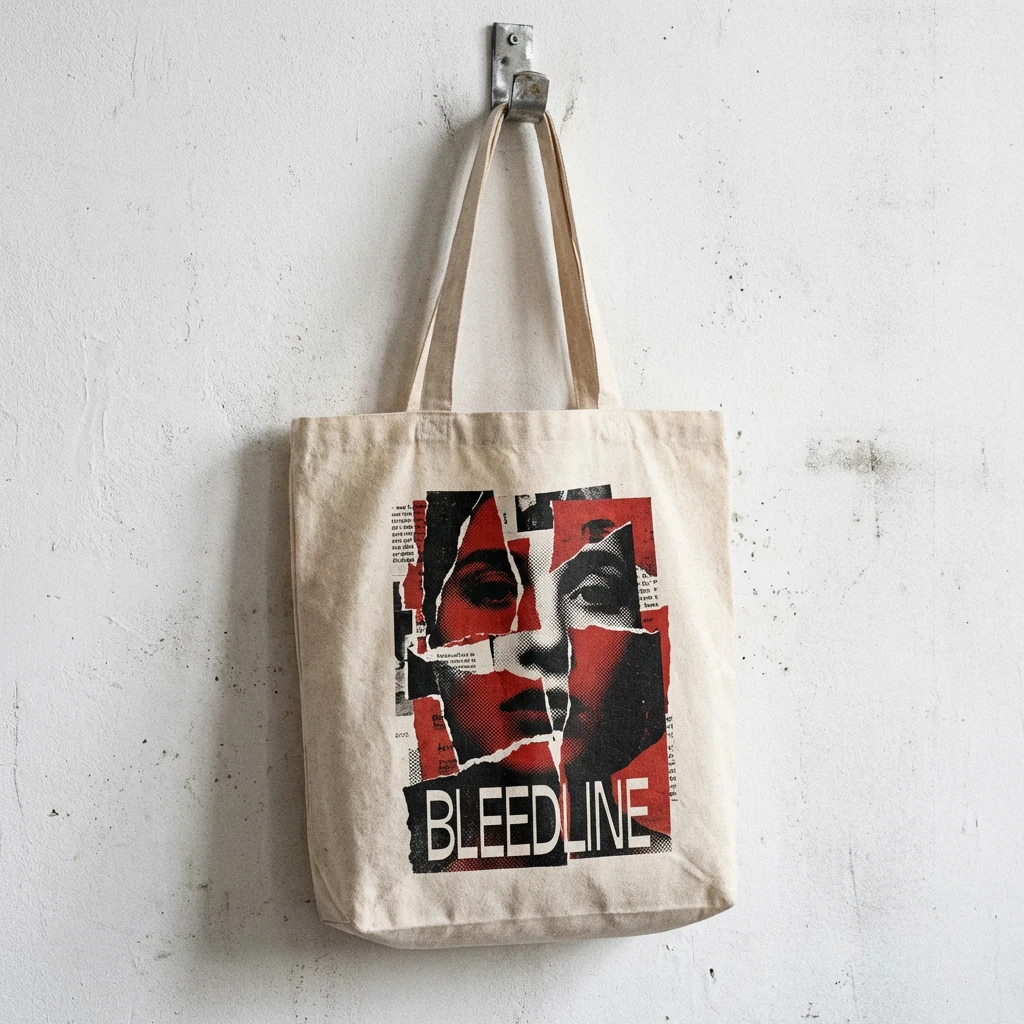
APPAREL + MERCH
The crewneck sweatshirt resolved a specific problem: how do you put a collage system on fabric without it looking like a graphic tee? The answer was scale. The graphic runs large — a halftone figure dissolving into torn newspaper strips, with the bleed-red wash occupying the lower third. The BLEEDLINE wordmark printed above the graphic, full chest width, at a scale that reads first. The BL-REC label tag at the hem. The sweatshirt reads as a garment before it reads as merch.
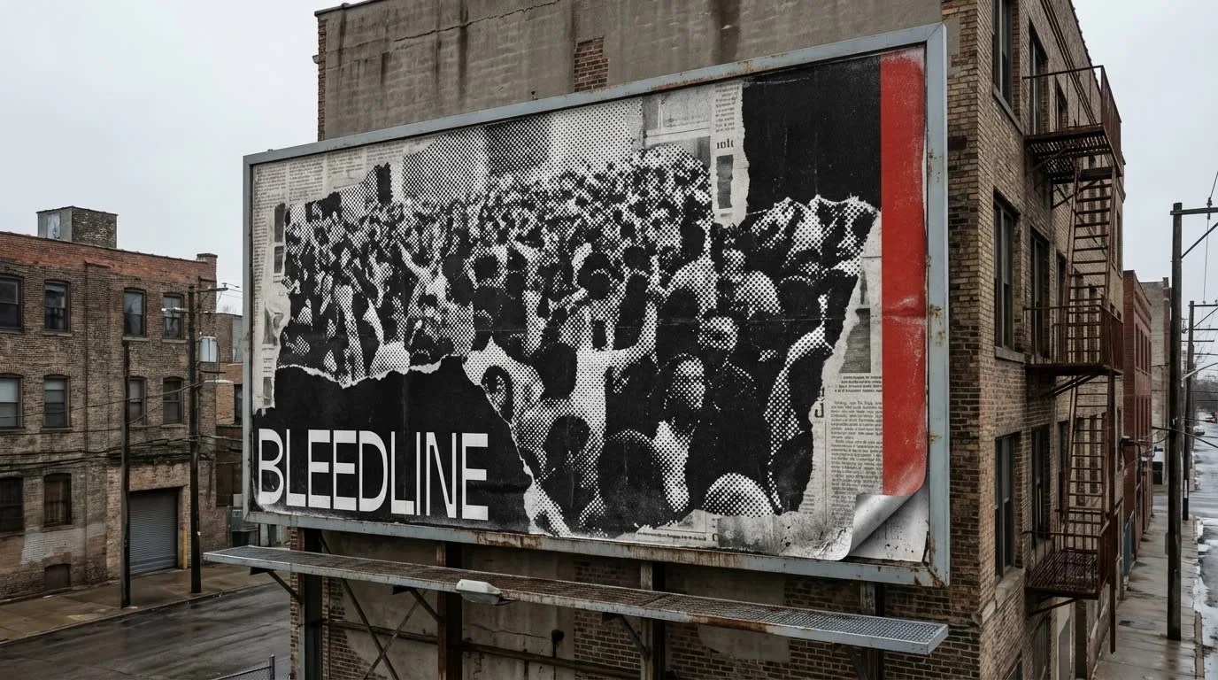
ENVIRONMENTAL + OUTDOOR
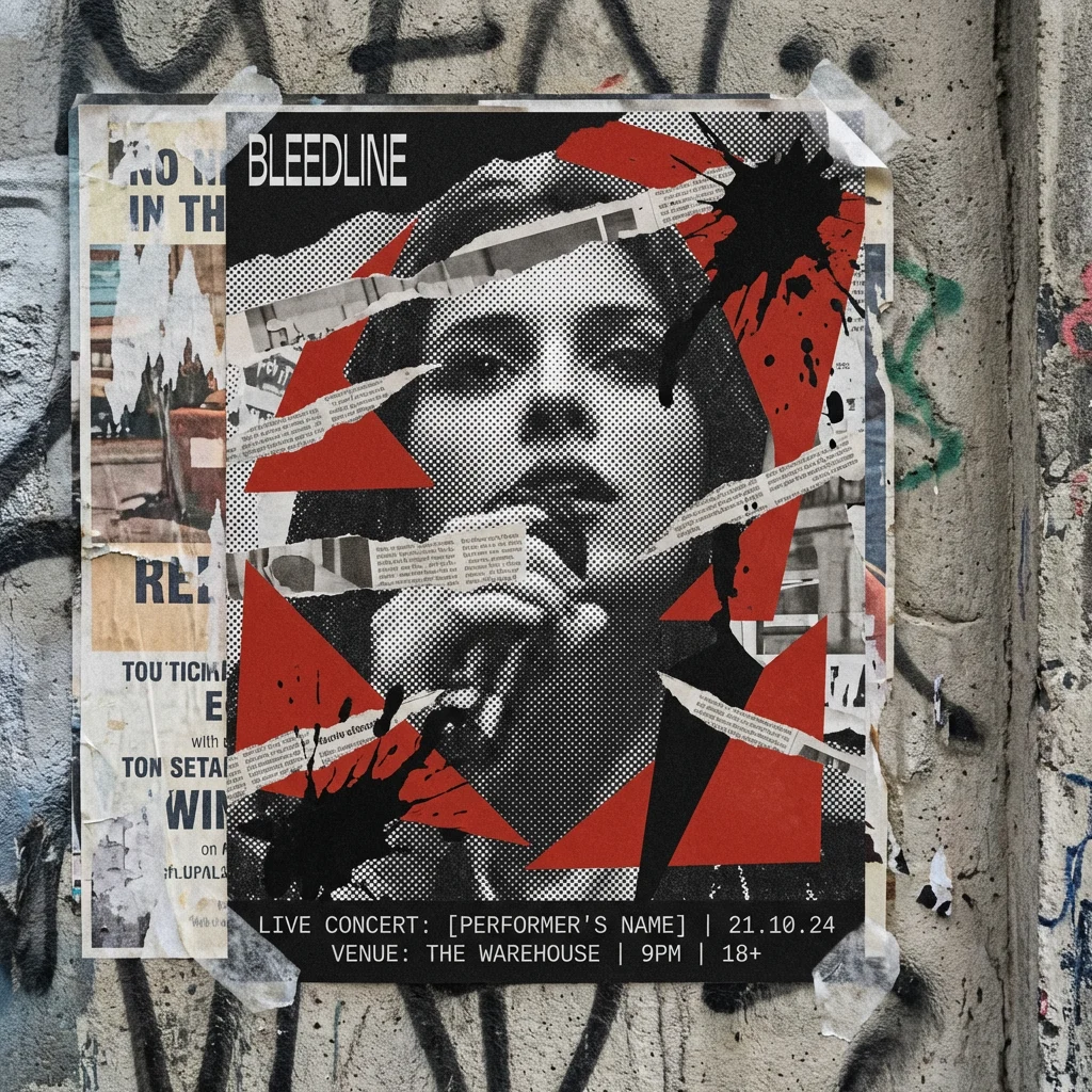
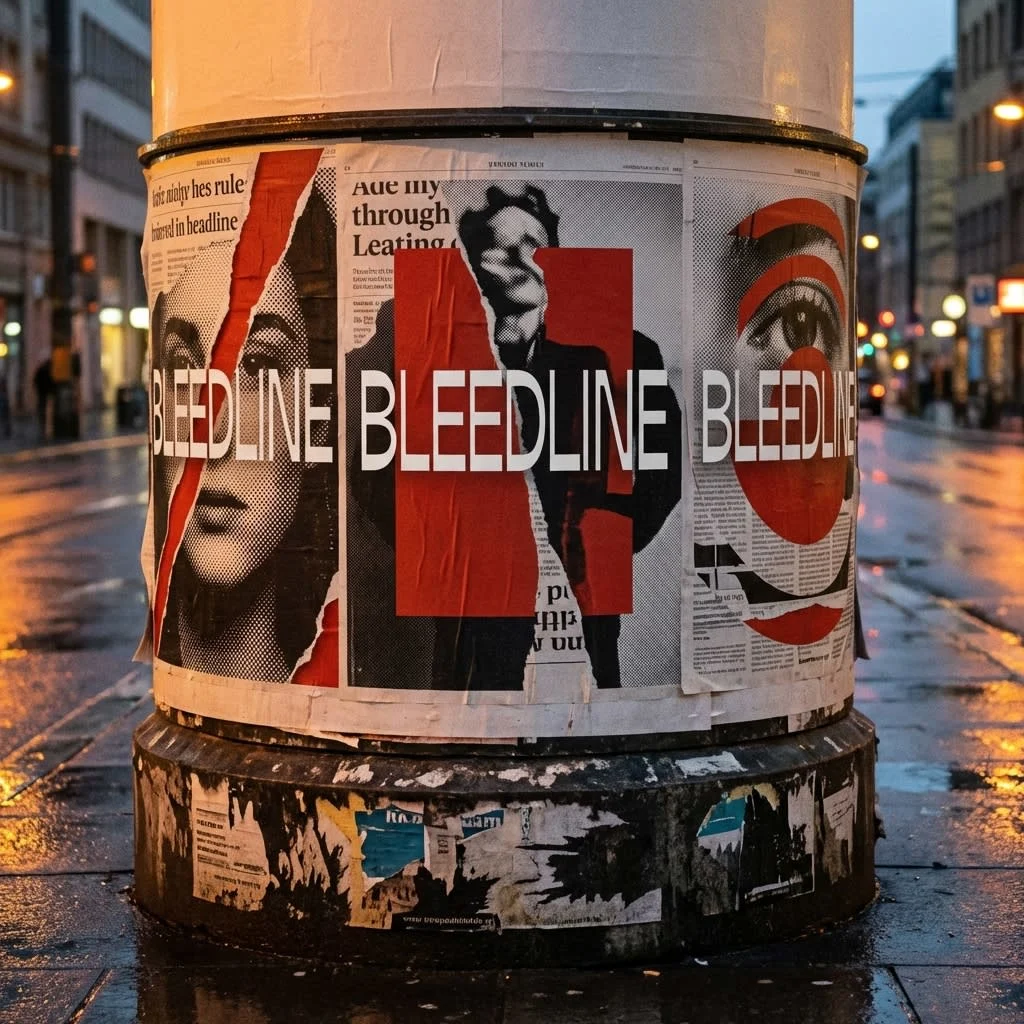
The advertising column, concert poster, and billboard all use the same structural logic as the print system, scaled to context. On the column, three poster variations wrap the cylinder — same visual system, different compositions — creating the impression of a label with a campaign, not a single release. The billboard strips the composition back to its essentials: halftone crowd photograph, newsprint texture dissolving at the edges, bleed-red registration stripe at the far right, BLEEDLINE wordmark bottom-left. At distance it reads as image. At reading distance it reads as system.
THE RESULT
BLEEDLINE shipped as a complete identity system across fifteen touchpoints — from a 12-inch vinyl sleeve to a large-format outdoor billboard. The visual world held across every surface without requiring a rigid template: the system was loose enough to feel handmade, tight enough to feel intentional.
What I was testing was whether a collage-based visual language — inherently irregular, textured, fragmented — could function as a scalable brand system. The answer was yes, but only if the constraints were structural rather than aesthetic. The monospace wordmark, the catalog numbering system, the bleed-red structural use, and the grain pass as a mandatory texture layer were the rules. Everything else was collage.
Révolté — revolte.design
Project: BLEEDLINE
Year: 2026
Scope: Brand Identity, Logo, Typography System, Color System, Web Direction, Print Collateral, Packaging, Apparel, Environmental / Outdoor, Digital / Social
Industry: Independent Music Label
See more at revolte.design
Like this project
Posted Apr 14, 2026
A label needs to feel institutional enough to be taken seriously, but the visual world I was building was deliberately degraded, torn, ephemeral.
Likes
1
Views
17
Timeline
Apr 1, 2026 - Apr 14, 2026