Built with Lovart
Kira Website & Brand Identity System Development
Révolté
KIRA
Case Study — 2026 — Branding, Website & Identity
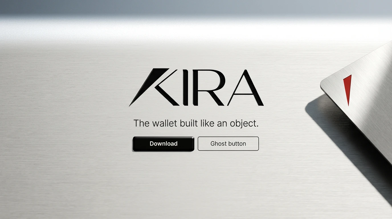
The wallet built like an object.
A crypto wallet brand that treats precision as a philosophy — not a feature. Built for the user who already knows what they're doing.
Sector: Crypto Infrastructure
Type: Brand Identity System & Website
Deliverables: Identity, UI, Packaging, Campaign
Influence: Japanese Precision / EDC Culture
01 — THE PROBLEM
Every crypto wallet looks like it was built by a startup in a hurry.
The category is saturated with the same visual language: purple gradients, glowing orbs, motion graphics borrowed from DeFi protocols, and a tone of voice that oscillates between technical and breathless. The dominant players — Phantom, MetaMask, Rainbow — have staked out their territory. There is no premium position in the market.
The brief was simple and radical: build a wallet brand that feels like it was designed by Braun, used by a Tokyo architect, and discovered in a concept store you had to be recommended to find. No hype. No cycle chasing. No confetti on send.
The opportunity isn't to out-design the competition. It's to out-think the category entirely — and arrive somewhere no crypto brand has been before.
02 — THE STRATEGY
Precision as Identity.
Every brand decision — type, spacing, material, copy — is made with the logic of a precision instrument. Nothing decorative. Nothing approximate. The brand is the product.
Warmth Through Material.
Cold technology made tactile. The brand references the physical world constantly — titanium grain, washi paper fiber, lacquer enamel — because digital trust is built through material honesty.
The Anti-Hype Position.
While the market shouts, Kira is quiet. While competitors chase cycles, Kira is built to outlast them. The brand's restraint is its loudest statement — and its clearest differentiator.
03 — THE IDENTITY
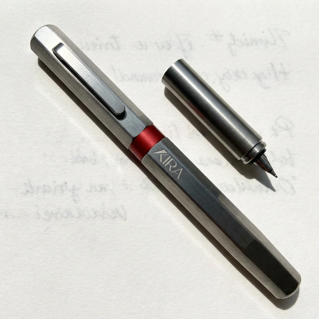
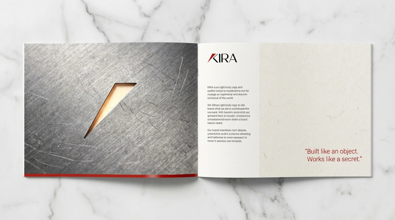
Built from a single cut.
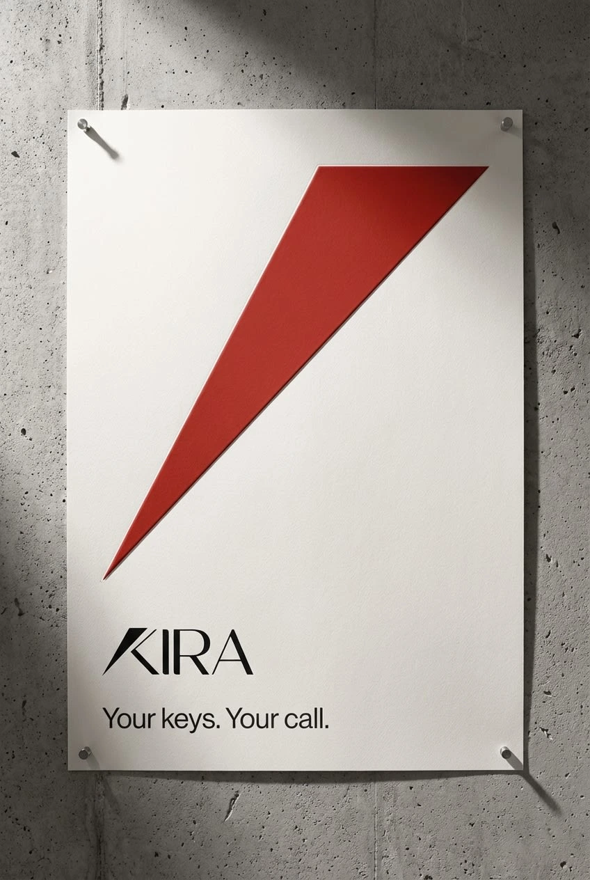
The logo is The Cut — a diagonal slash in Lacquer Red bisecting the K, referencing both the act of cutting cleanly and the precision of a blade. It is the only fast element in the system. Everything else is still.
Logotype
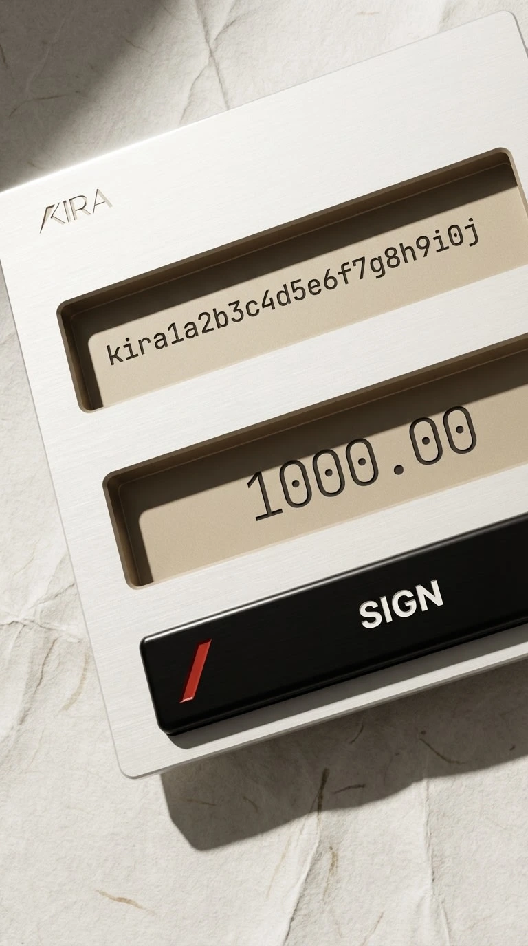
The slash mark in #C0392B Lacquer Red divides the K into two forms — a body and a blade. The wordmark is set in a refined geometric sans with surgical tracking. In dark mode, the slash remains red; everything else inverts. The mark works at 12px and 12 meters. It is the same object at every scale.
Color System
Five tones. One rule: Lacquer Red appears once per composition, maximum. It is a signature, not a decoration. When red appears, it means something has happened — a transaction signed, a CTA reached, an identity confirmed.
#F7F4EF — Washi (base surface)
#0A0A0A — Void (dark mode base)
#2B2B2B — Charcoal (primary text)
#C0392B — Lacquer (the only accent)
#D4C5A9 — Sand (secondary surface)
Typography
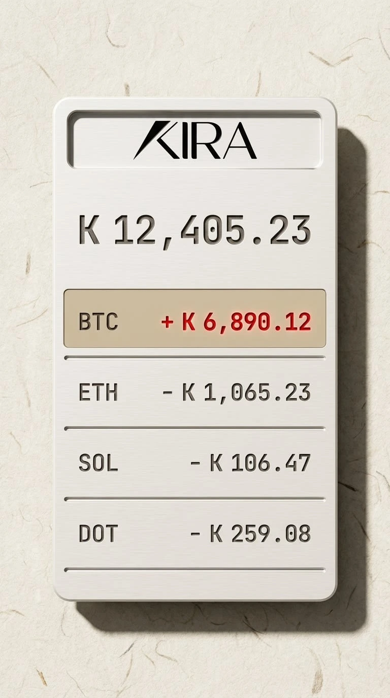
Söhne carries all language — set in Light for display, Regular for body, Halbfett for the single CTA per screen. JetBrains Mono handles all numeric and cryptographic data exclusively: balances, addresses, timestamps. If it's a number, it's mono. If it's a word, it's Söhne. They never share a line.
Skeuomorphic UI Direction
Every UI element has material logic. Input fields are milled recesses — not drawn borders, but actual depth, with inner shadows proving the inset. The SIGN button is a raised anodized bar with a visible specular highlight proving convexity. The UI feels fabricated, not designed. This is the defining move that separates Kira from every competitor in the space.
Voice
Short. Active. Final. Kira speaks like a precision manual written by someone who loves design.
"Your keys. Your call."
"Sign. Done."
"Every chain. One pocket."
Never: "Seamlessly manage your multi-chain portfolio experience."
What Kira is not:
Not Phantom. No purple gradients, no neon, no dark-mode-as-personality. Not Coinbase. No corporate blue, no rounded corners trying to make crypto feel safe. Not a trading app. No candles, no ticker anxiety, no dopamine loops. Not a startup. Kira has no "building the future of finance" energy. It is already built. It is already here.
04 — THE EXECUTION
Fifteen scenes. One material world.
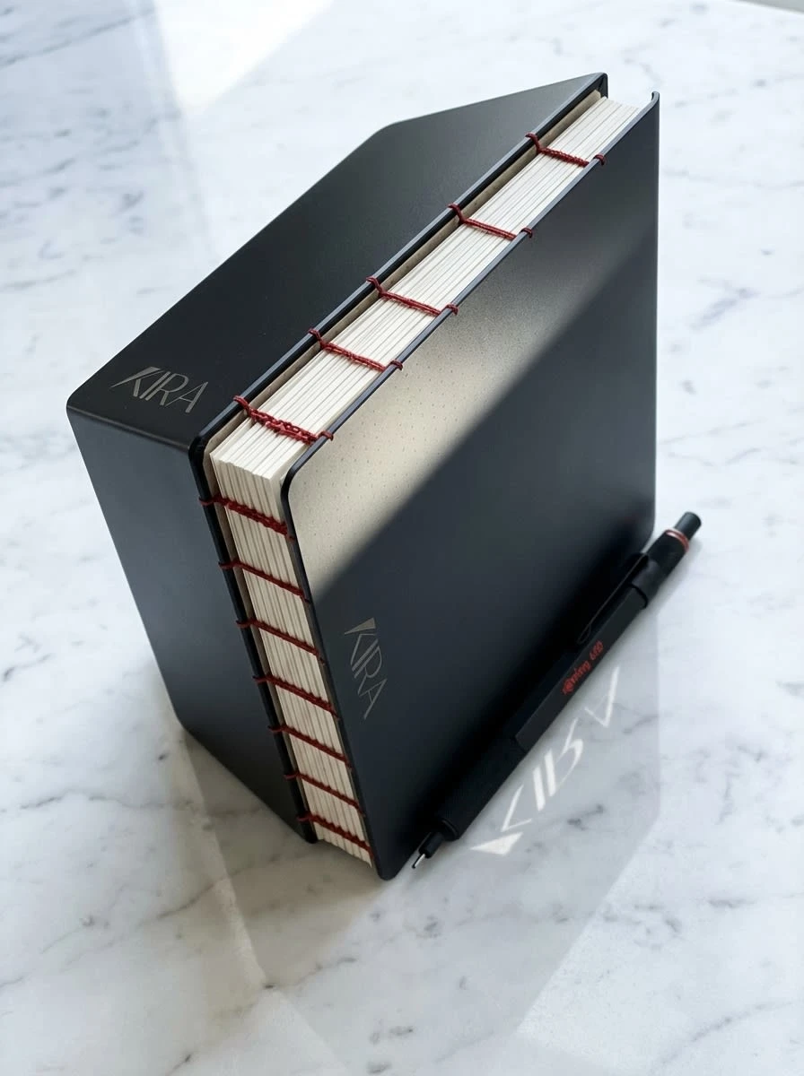
The full brand system was developed across three batches of five mockups — covering app icon, portfolio UI, transaction flow, titanium card, packaging, campaign poster, environmental signage, editorial spread, notebook, pen, website hero, motion still, social assets, retail display, and brand film.
Every scene shares a single hard light source from the upper left. Every surface is photographically real: brushed titanium with directional grain, washi paper with individual fibers visible, anodized aluminum with micro-pore texture. The campaign poster — the slash alone, "Your keys. Your call." — is the strongest distillation: pure brand, zero explanation needed.
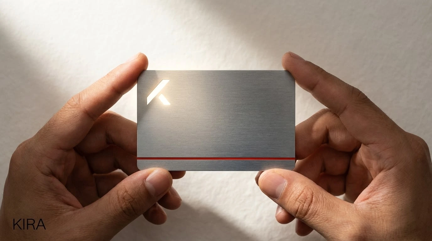
The brand film still — hands holding the titanium card, the laser-cut aperture glowing warm through cold metal, the red pinstripe bisecting the frame — carries the entire brand promise in a single image.
The skeuomorphic UI screens are the most surprising differentiator. No other wallet in the market renders its interface as if it were physically fabricated. The portfolio dashboard reads like a milled aluminum instrument. The SIGN button has weight. The input fields have depth. The UI is an object, not a screen.
05 — WHAT WAS BUILT
15+ skeuomorphic mockup scenes across print, digital, physical, and environmental touchpoints.
5 logo concepts developed, one executed into a complete identity system.
1 Lacquer Red accent — used once per composition, maximum, always.
0 purple gradients. 0 glowing orbs. 0 confetti on send.
CLOSING
Built like an object. Works like a secret.
Kira proves that crypto infrastructure doesn't have to look like crypto infrastructure. The category is still young enough that one brand with a coherent point of view — executed with absolute consistency — can define what premium means for the next decade.
This is that brand.
Kira — Brand Identity System — 2026
Like this project
Posted Apr 15, 2026
A crypto wallet brand that treats precision as a philosophy, not a feature. Built for the user who already knows what they're doing.
Likes
1
Views
9
Timeline
Apr 6, 2026 - Apr 15, 2026