Built with Lovart
GRIMHEAT Brand Identity & Campaign
Révolté
GRIMHEAT — The Sauce That Grins Back
A hot sauce brand built from a single image — a grinning cartoon skull — into a full identity and three campaign directions, each designed to live in a completely different world.
THE BRIEF
The starting point wasn't a brief. It was an image — a grotesque retro-cartoon character, thick black outlines, exaggerated hollow eyes, a wide grinning mouth, the visual DNA of 1930s animation crossed with tattoo flash art. The question was simple: what brand could live here?
Hot sauce made immediate sense. The skull, the heat, the dark comedy — the category has always had an appetite for exactly this kind of irreverence. But the trap was obvious too. Skull plus hot sauce is a tired equation. Every other bottle at the back of the shelf is trying the same move. The work wasn't going to be in choosing the aesthetic. It was going to be in making the character mean something — and then building a campaign language specific enough that the brand couldn't be mistaken for anything else.
I took on the full scope: name, identity system, and three distinct campaign directions executed as mockup sets. The name came fast — GRIMHEAT. Short, two-word compression, dark without being aggressive, the "grim" doing the skull work without saying skull.
THE APPROACH
The logo came first, and I knew it had to be a mascot mark. This brand lives or dies on its character. A wordmark alone would strip out everything that made the original reference compelling — the movement, the exaggeration, the cartoon grotesque energy. The skull needed to be the product's face, literally.
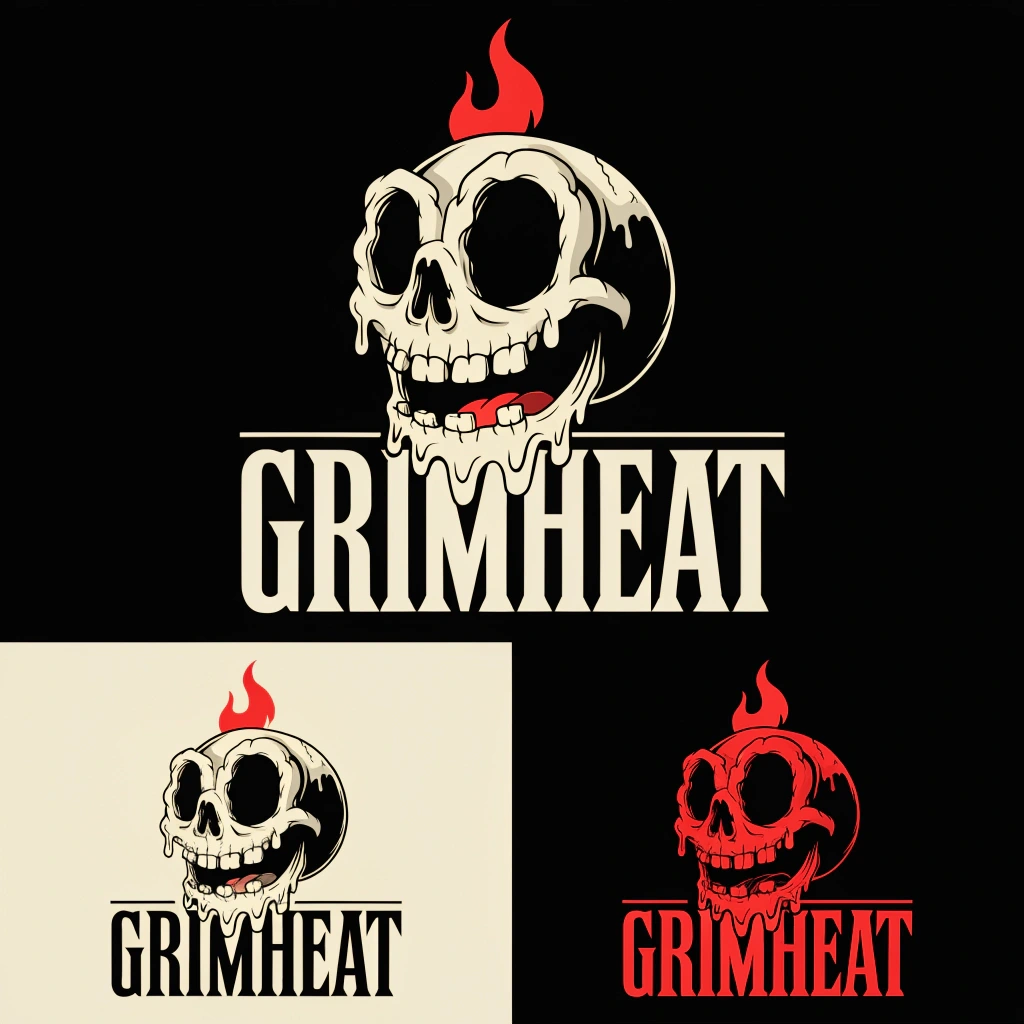
I directed toward a melting skull — not clean, not polished, not a standard skull icon. The wax-drip edges reference both the heat and the old cartoon logic of things literally dissolving under pressure. A red flame sits on the crown, integrated into the silhouette. The wordmark below is heavy condensed serif — sideshow poster meets boxing match flyer. Three colorways: bone cream on black as primary, full burn in red for merchandise and contrast situations, single-color for stamp and embroidery use.
The color system was built around tension rather than harmony. Grimstone Black (
#1A1A1A) as the void the character lives in. Hellfire Red (#D62828) as the only accent that earns attention. Bone Cream (#F2E8D5) as the skin of the brand — aged, warm, never pure white. Ember Orange (#F77F00) reserved for heat indicators. Tattoo Blue (#2D4B8E) as a cold wildcard for limited SKUs, unexpected enough to feel intentional.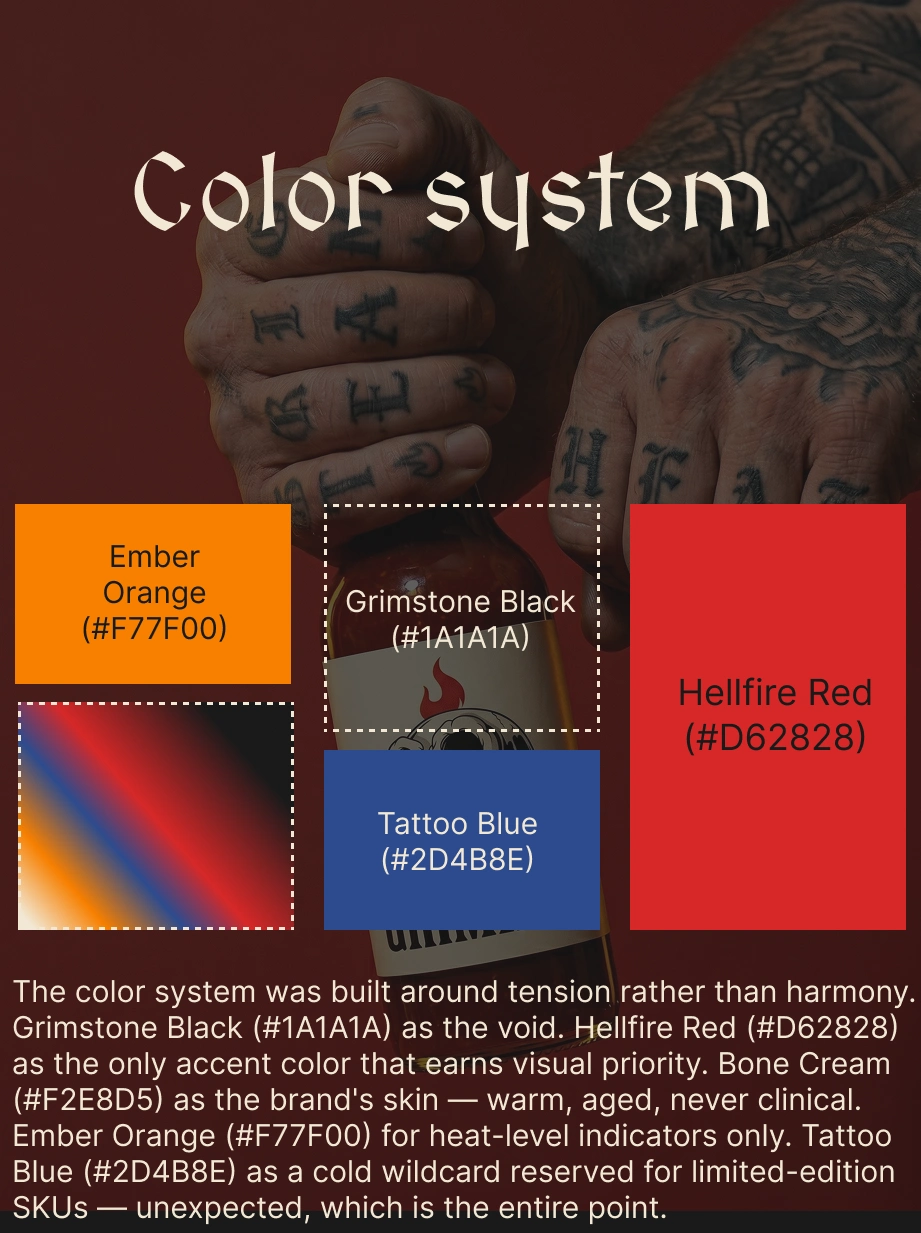
With the identity locked, the question became: what kind of brand is this in the real world? Not just what does it look like, but how does it behave photographically? What surfaces does it occupy? What's its relationship to humor? I answered that by splitting the visual campaign into three distinct directions, each functioning as a separate campaign logic.
THE WORK
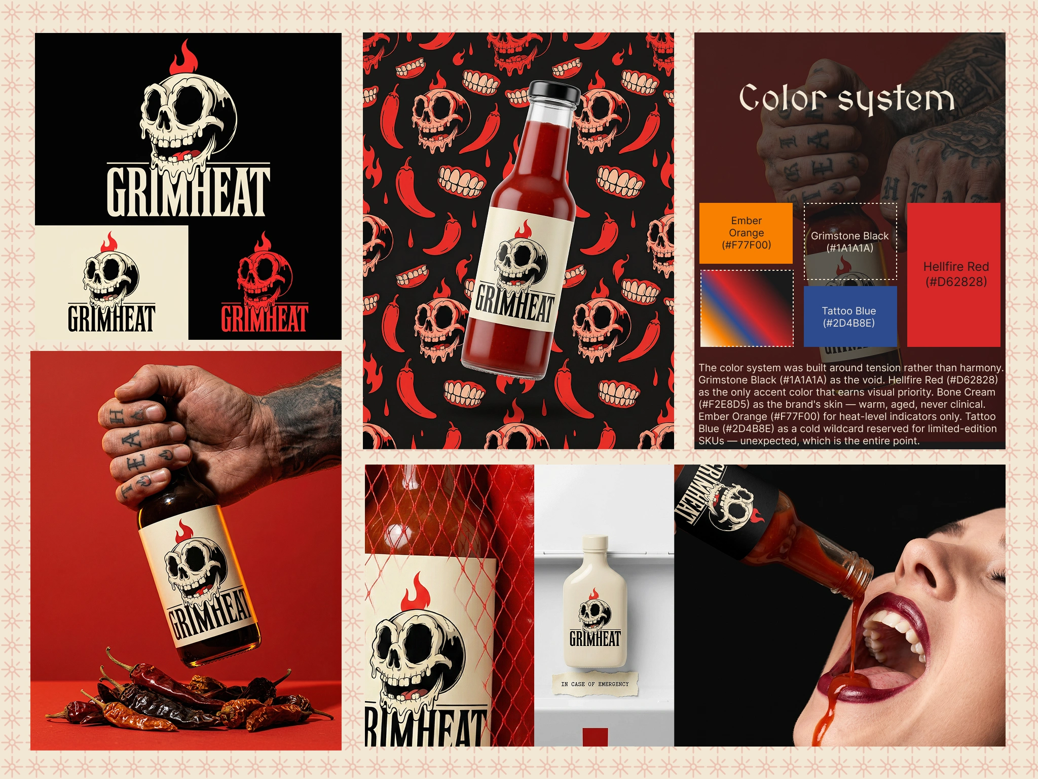
BRAND IDENTITY / LOGO SYSTEM
The mascot mark sits at the center of the entire system. Melting skull, red flame, drip edges, six-to-eight visible teeth in a wide grin. Bone Cream fills on Grimstone Black. The wordmark is set in a heavy condensed serif with minimal tracking — the letters brace against each other like the word itself is under pressure. Three colorways ensure the mark works across every surface from glass bottle labels to embroidered caps to wax stamps on kraft packaging.
CAMPAIGN 01 — PRODUCT FOUNDATION
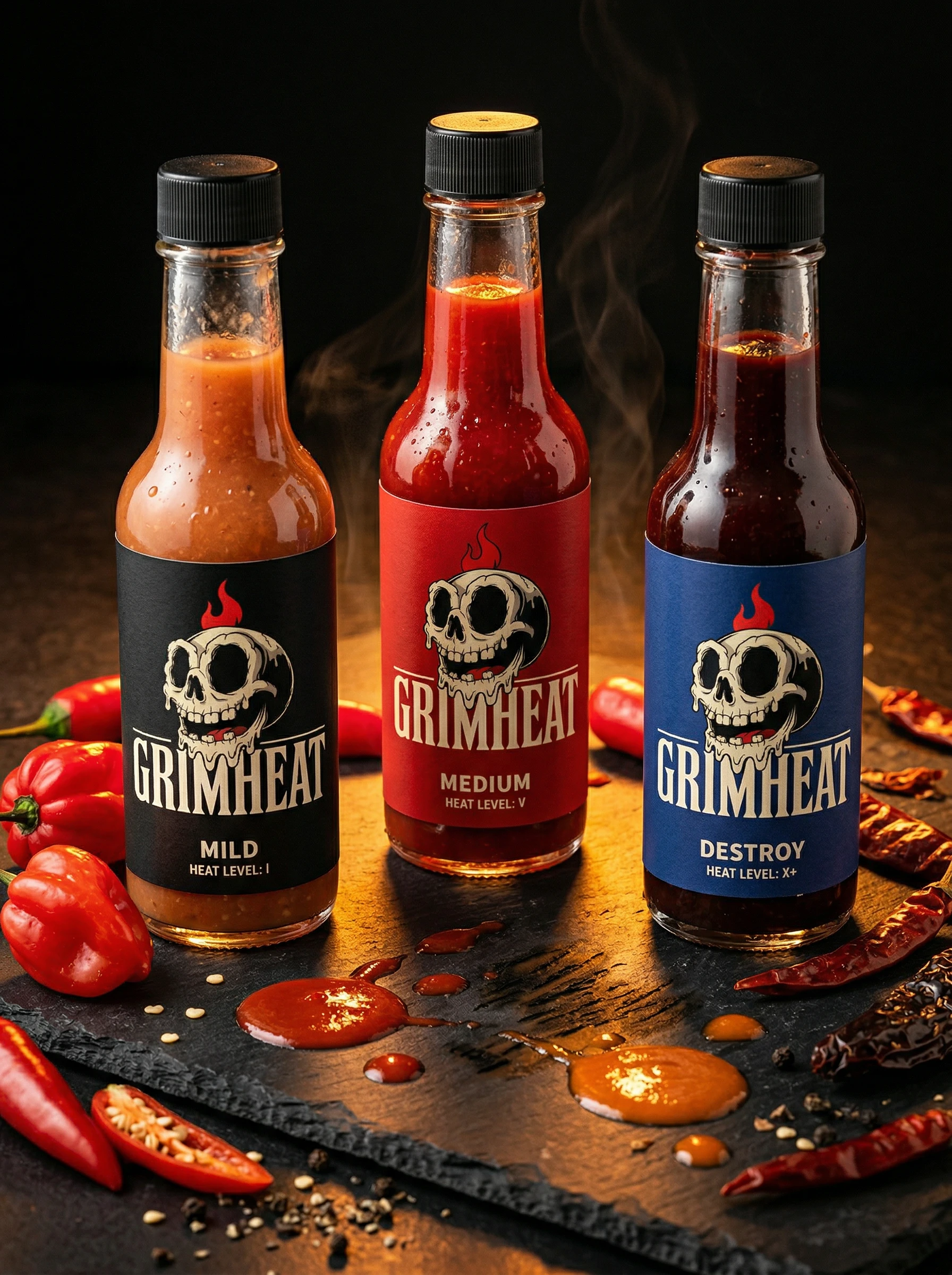
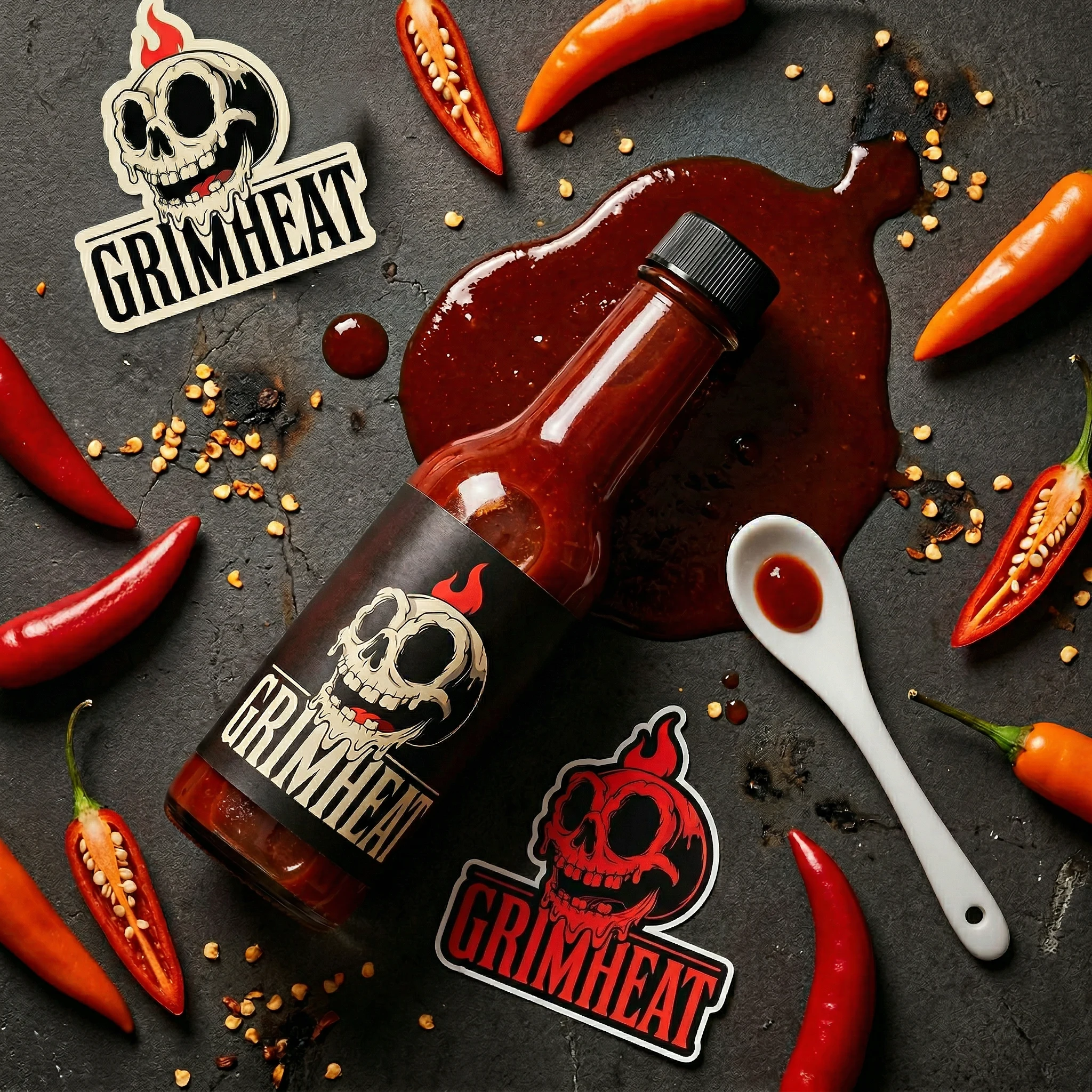
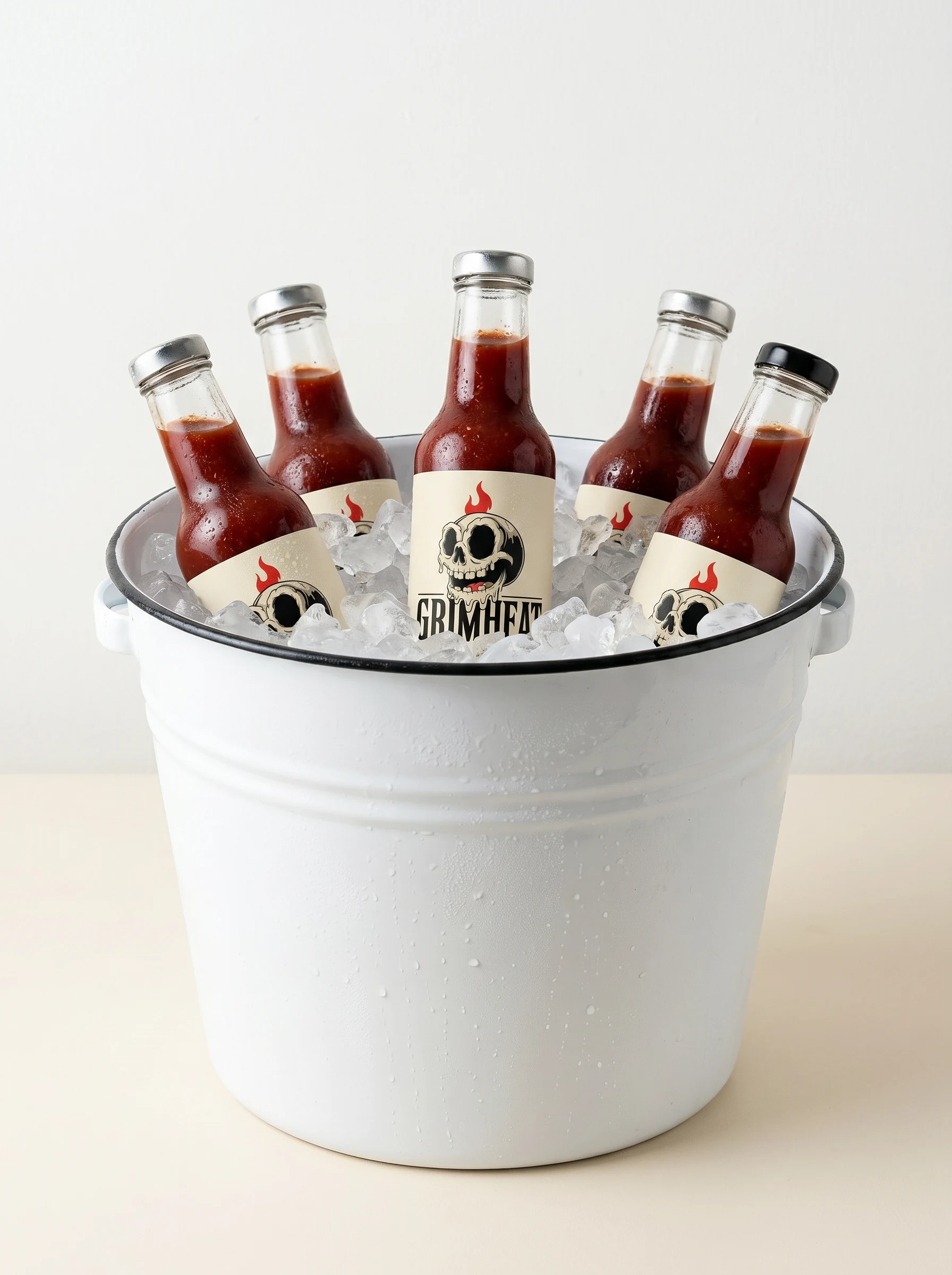
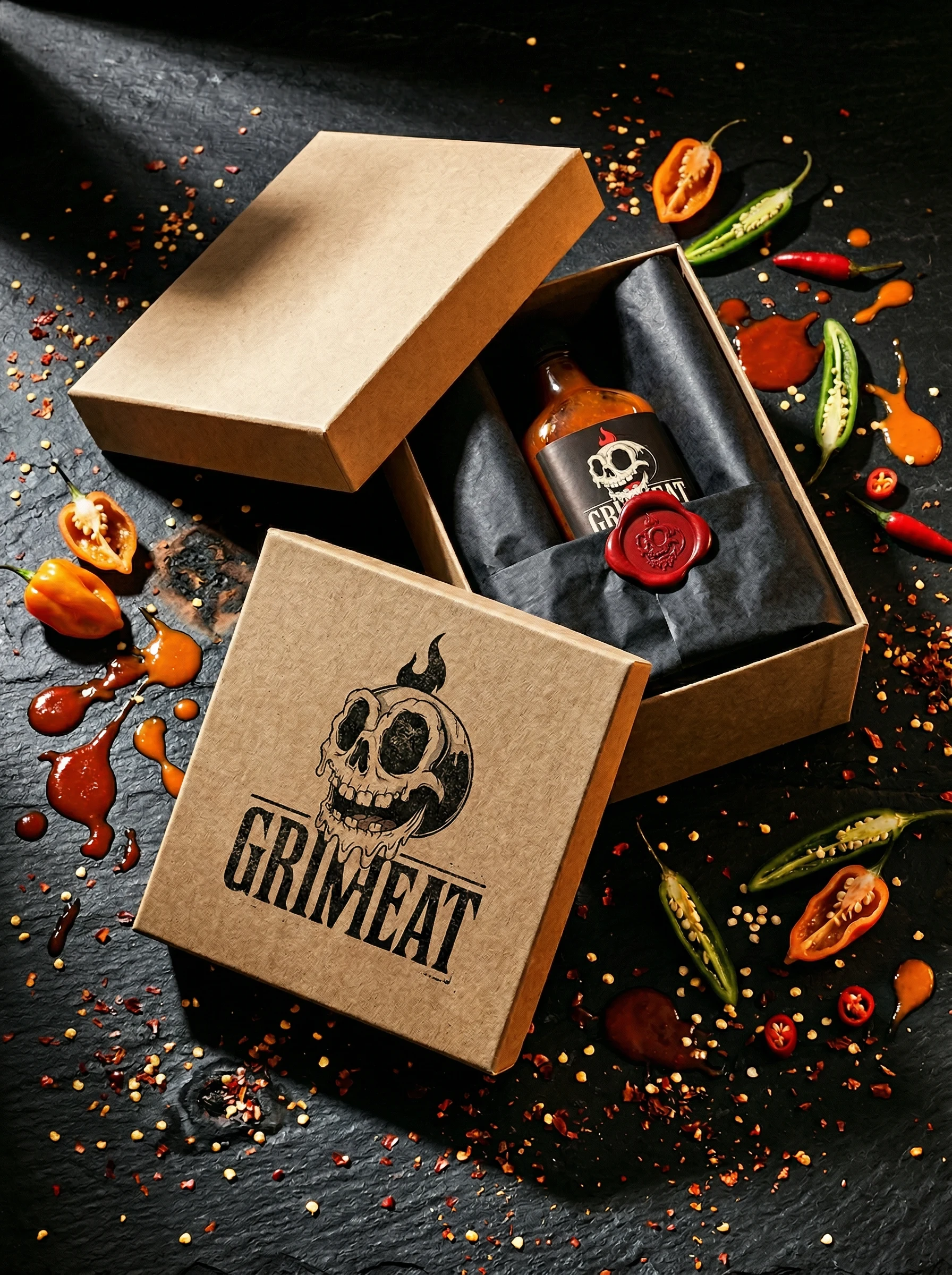
The first campaign was about establishing what GRIMHEAT looks like in its natural environment. Dark scorched wood, black slate, high-contrast directional lighting from the upper left, Hellfire Red sauce splatter, split chilies, scattered seeds. Five mockups: hero bottle, three-bottle heat lineup (Mild / Medium / Destroy), sauce splatter flat lay, die-cut sticker sheet, kraft gift box with red wax seal. This campaign does the foundational work — it answers "what is this brand?" with maximum product clarity. Everything here is about the object itself being undeniable.
CAMPAIGN 02 — EDITORIAL / CHARACTER
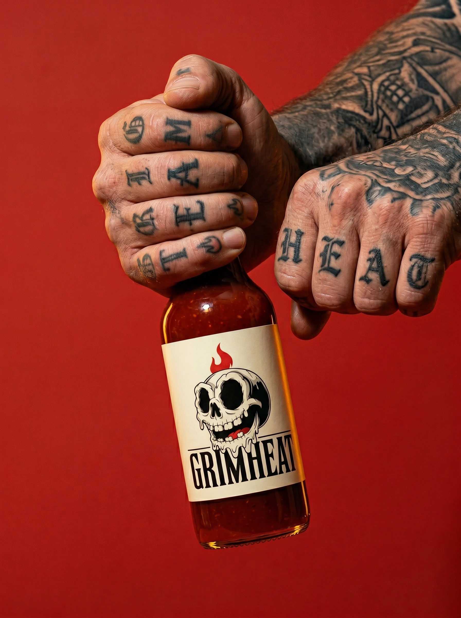
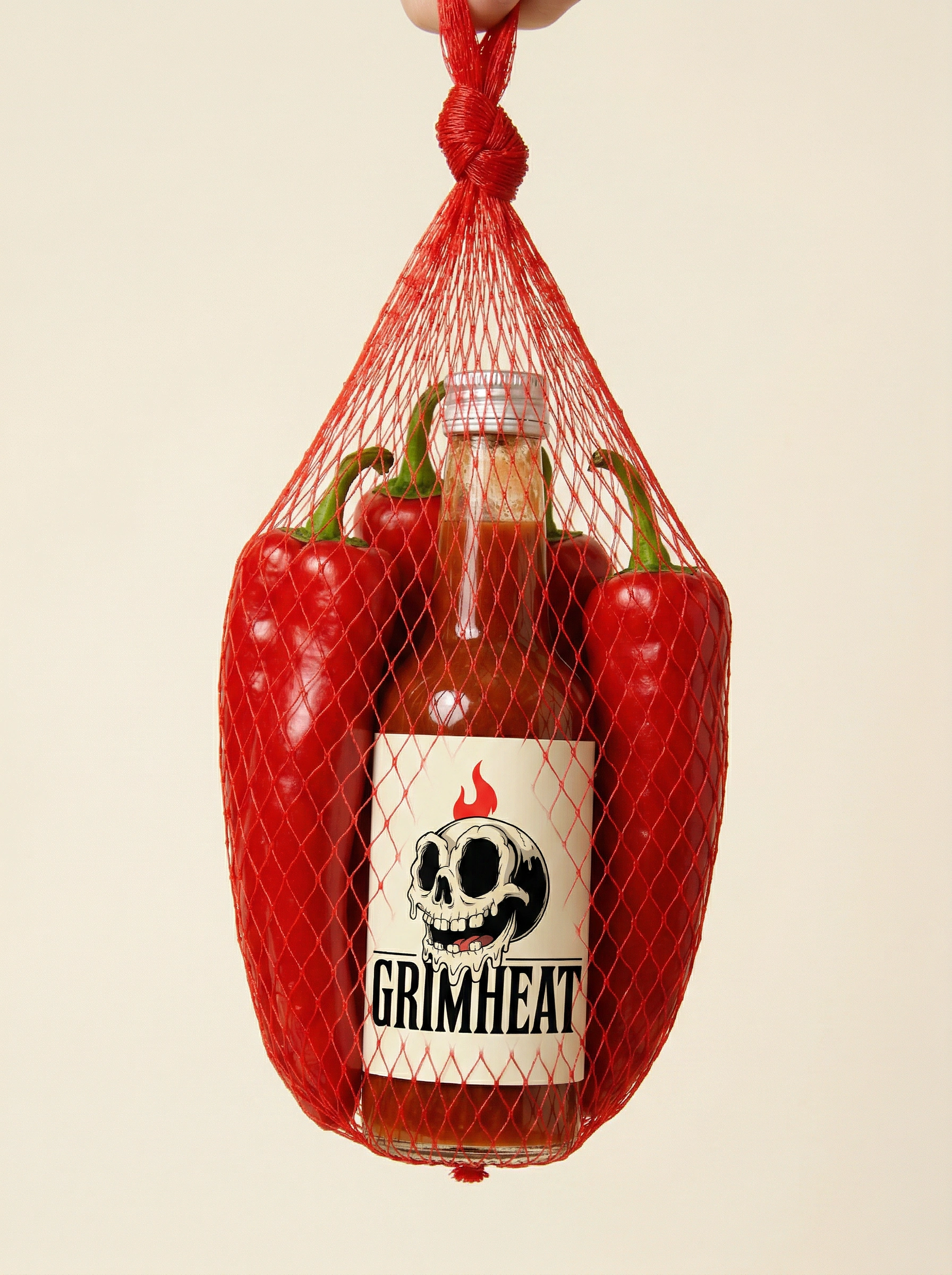
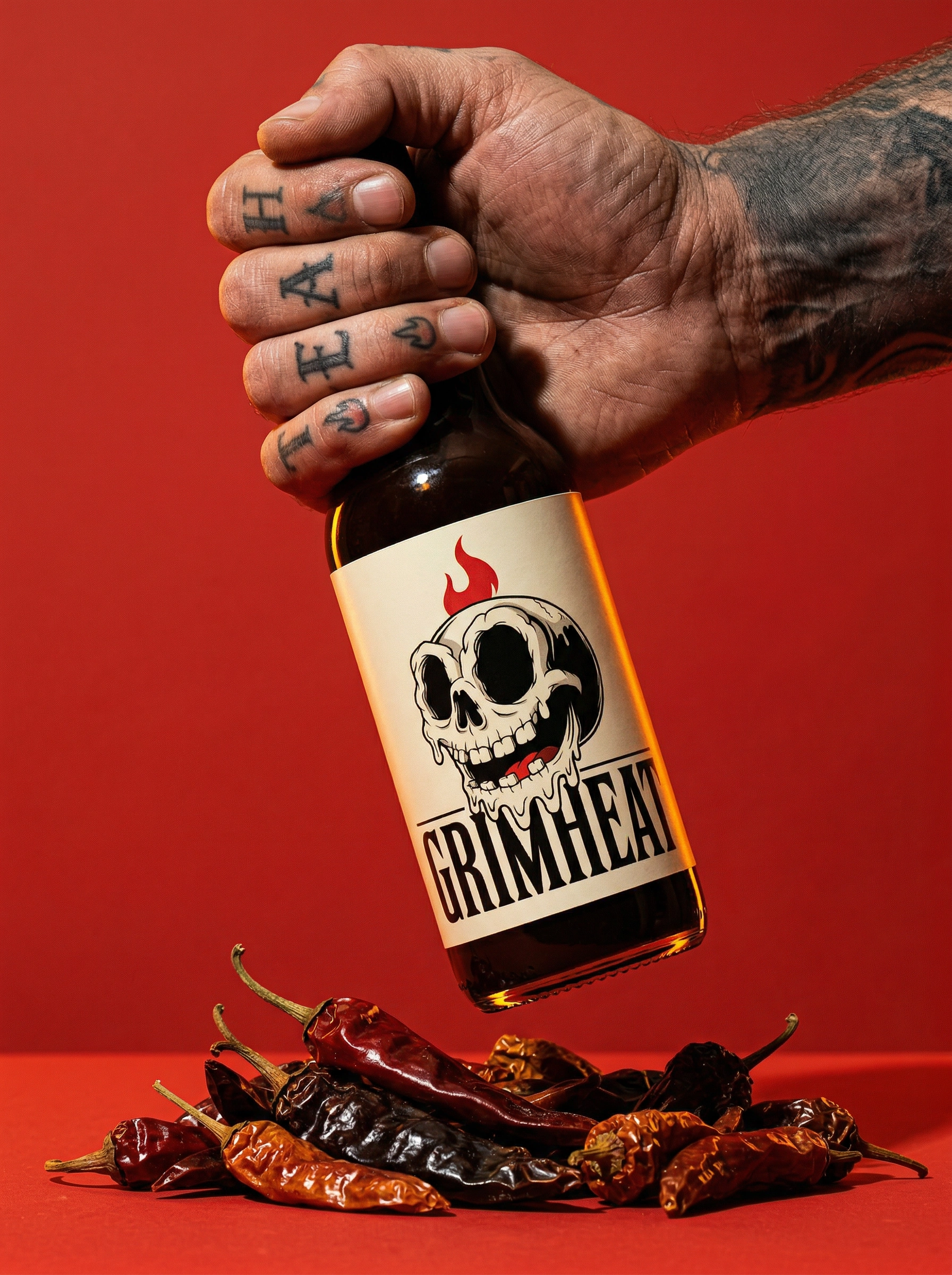
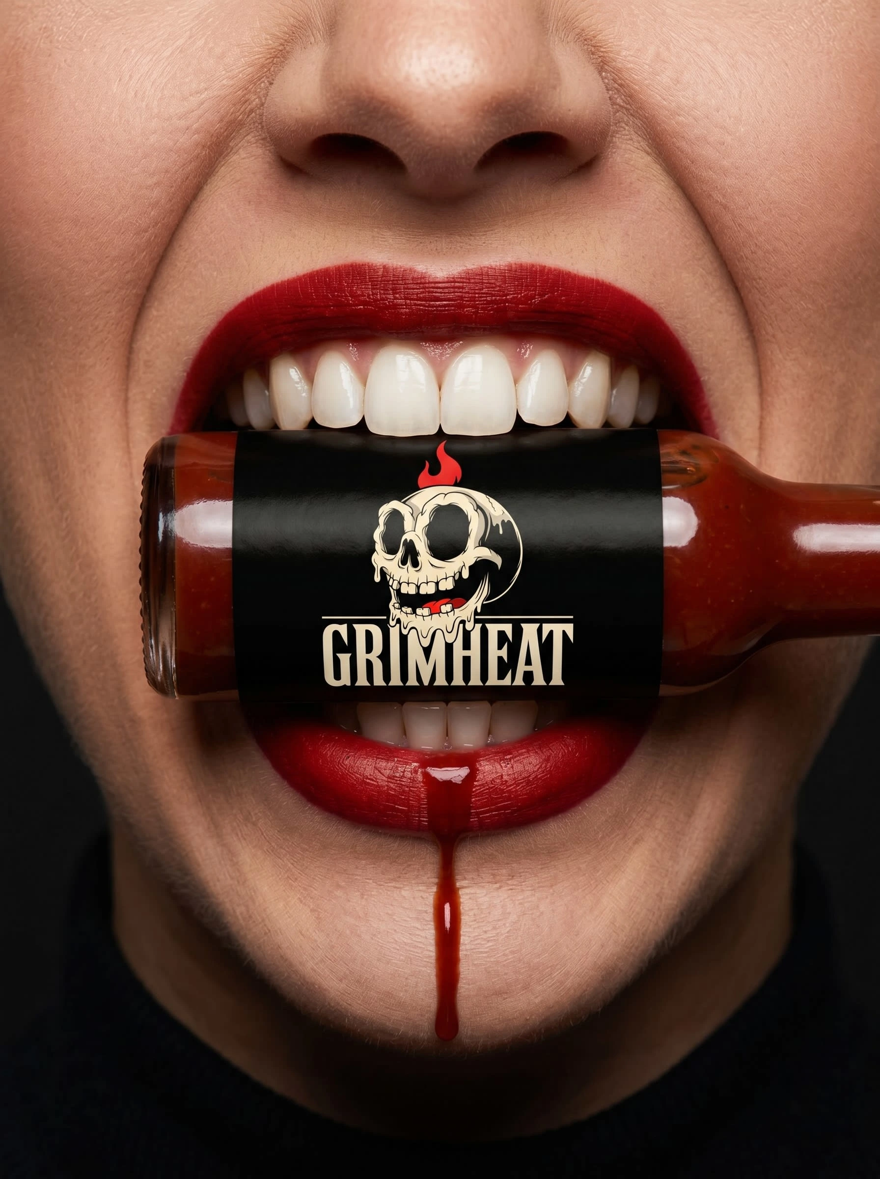
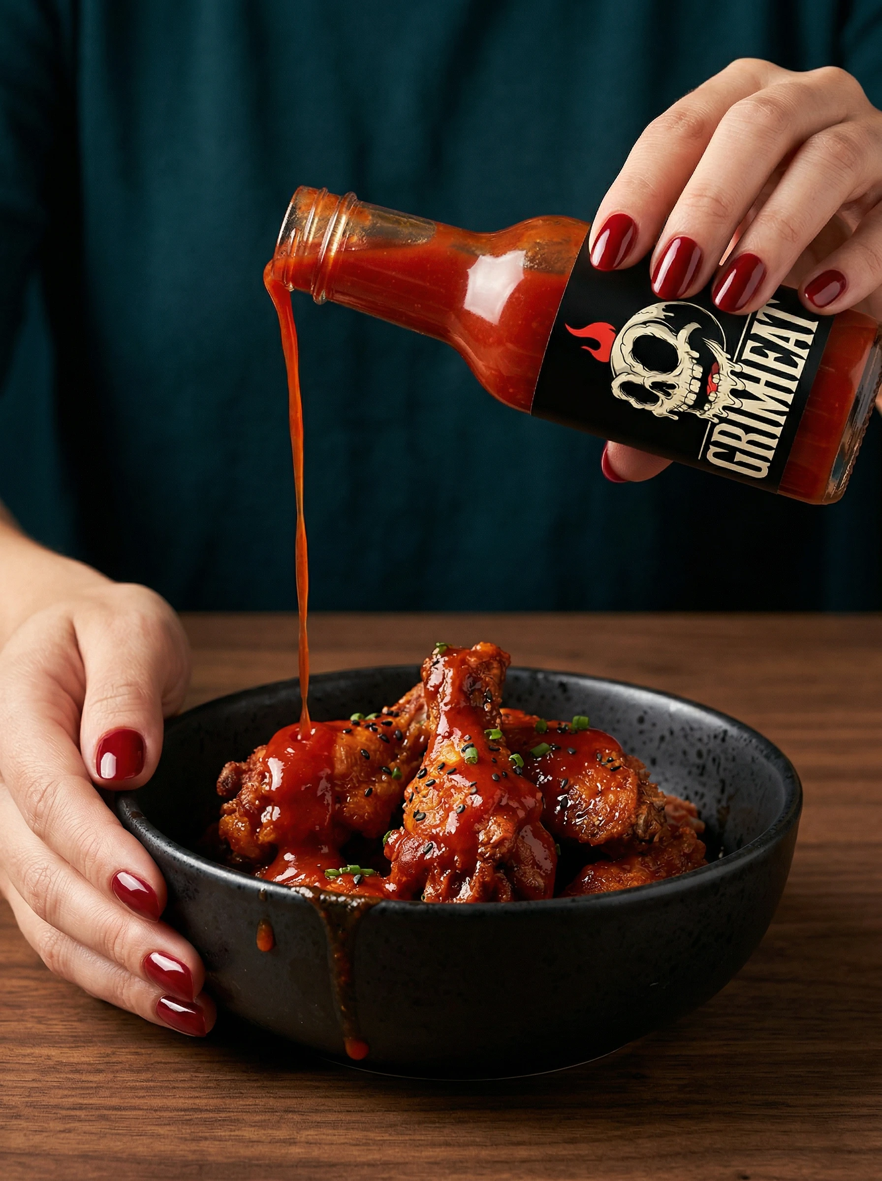
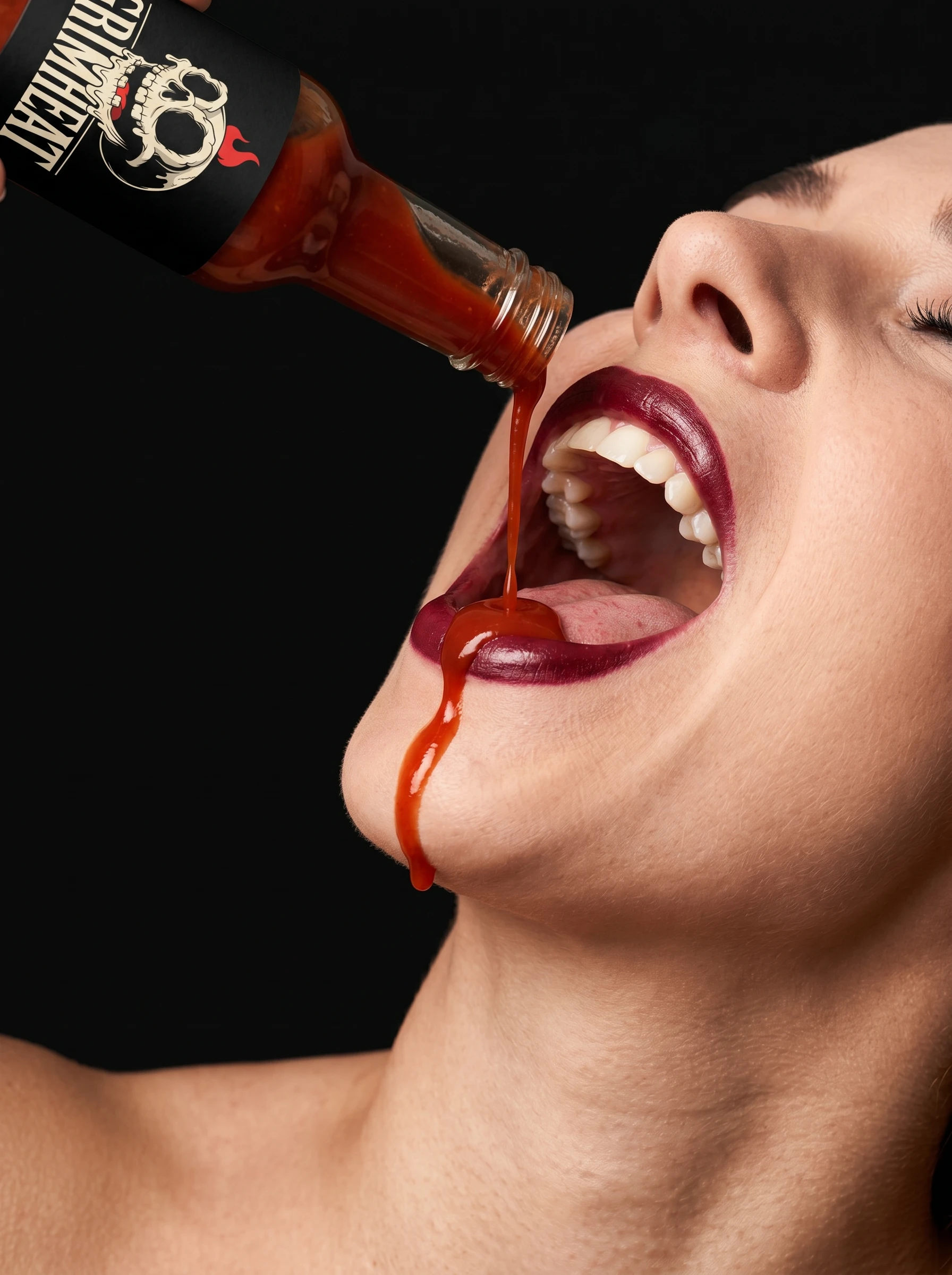
The second campaign pulled directly from reference images the client provided: a Tabasco bottle bitten by red lips, a mesh net bag of peppers, a tattooed hand gripping a bottle against a saturated backdrop, red-nailed hands pouring over a black bowl, a floating CGI bottle against a brand pattern. I used these as the language brief for five mockups that pushed GRIMHEAT into editorial territory. The Teeth Bite shot made the human face echo the skull mascot. The Red Net Bag stripped everything back to clean cream backgrounds and single-color prop drama. The Tattooed Hand established the brand's human — not a lifestyle character, a specific type of person. The Illustrated Pattern Float moved the brand into fully graphic space. This campaign answers "who is this brand for?" by showing the brand in the world, not just on a surface.
CAMPAIGN 03 — IRREVERENT PLACEMENT
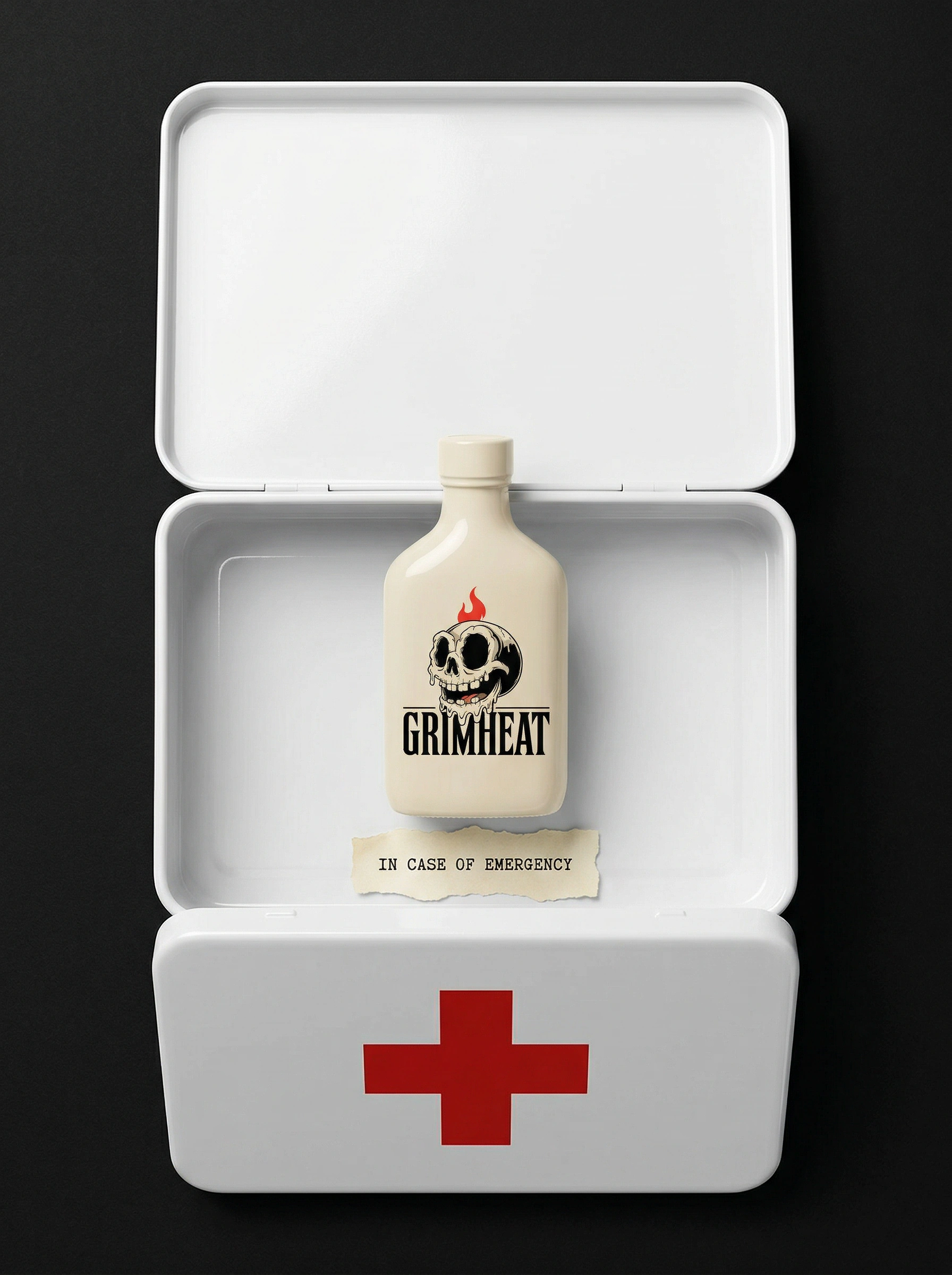
The third campaign is where the brand's personality becomes its marketing strategy. Five mockups, five wrong contexts: a first aid kit containing only a GRIMHEAT bottle and a note reading "IN CASE OF EMERGENCY." A breakfast table with the sauce bottle standing where the milk should be. A ring box with a miniature bottle where the diamond should be. A gym bag with the bottle in the water bottle holster. A prescription sticker on the label reading "Take as needed. Do not exceed common sense. Refills: unlimited." The product is always the calmest thing in the frame. The humor is deadpan — nothing explained, nothing winking at the camera. This campaign answers "what does GRIMHEAT think of itself?" — and the answer is: it takes the heat seriously and nothing else.
THE RESULT
Twenty mockups across three campaigns, each operating as a standalone campaign direction that could be deployed independently or sequenced as a launch strategy. Campaign 01 for retail and DTC product photography. Campaign 02 for editorial, press, and social media content. Campaign 03 for organic social, viral potential, and brand character establishment.
The brand is built to scale. The mascot is distinctive enough to anchor merchandise, limited editions, and collabs. The three-bottle heat range (Mild, Medium, Destroy) is already a product architecture, not just a mockup choice. GRIMHEAT exists as a complete brand — not a label.
Révolté — revolte.design
Project: GRIMHEAT Brand Identity & Campaign
Year: 2026
Scope: Brand Identity, Logo Design, Visual System, Packaging Direction, Campaign Art Direction
Industry: Food & Beverage / Hot Sauce
See more at revolte.design
Like this project
Posted Apr 17, 2026
GRIMHEAT: a hot sauce brand built on cartoon-grotesque DNA. Identity system + 20 campaign mockups across three visual worlds.
Likes
1
Views
15
Timeline
Apr 7, 2026 - Apr 17, 2026