Built with Lovart
RELIQUARY: Ancient-Future Brand Identity Project
Révolté
RELIQUARY — The Permanent Record
A Web3 infrastructure brand built for assets that matter. The brief demanded something the crypto space almost never produces: a brand that looks like it was already here before the money arrived.
THE BRIEF
They came to me with a positioning problem disguised as a visual one. RELIQUARY is a Web3 custody and provenance protocol — the kind of infrastructure that sits beneath the noise, holding digital assets with legal and technical permanence. The sector they operate in is crowded with gradient-heavy, hype-forward visual language that ages badly and signals exactly the wrong thing: speculation, speed, impermanence.
The tension was real. The product is serious — immutable ledgers, verified provenance, permanent custody — but the category's visual vocabulary is anything but. Every competitor looks like a 2021 NFT drop. The ask was to build a brand that communicates the opposite: gravity, authority, permanence. Something that would make a collector or institutional holder feel like their asset was in a vault, not on a dashboard.
What made it interesting was the conceptual unlock hiding in the brand name itself. A reliquary is a container for sacred objects — bones, artifacts, things considered worth preserving. The entire visual logic of the brand could grow from that one word.
THE APPROACH
The first instinct was to lean fully into medieval heraldry and stay there. Clean, legible, referencing manuscript culture and stone inscription. That direction held up as a base, but it didn't solve the problem on its own — a purely heraldic brand risks reading as costume, not infrastructure. I needed the ancient-future tension: one foot in a 15th-century scriptorium, one in the machine.
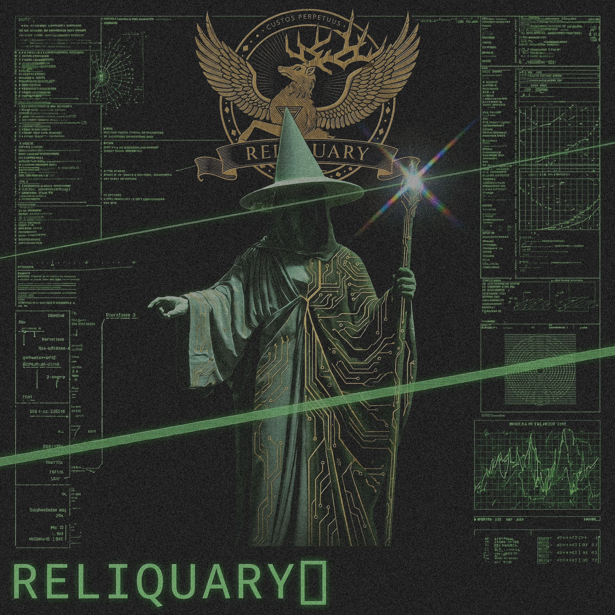
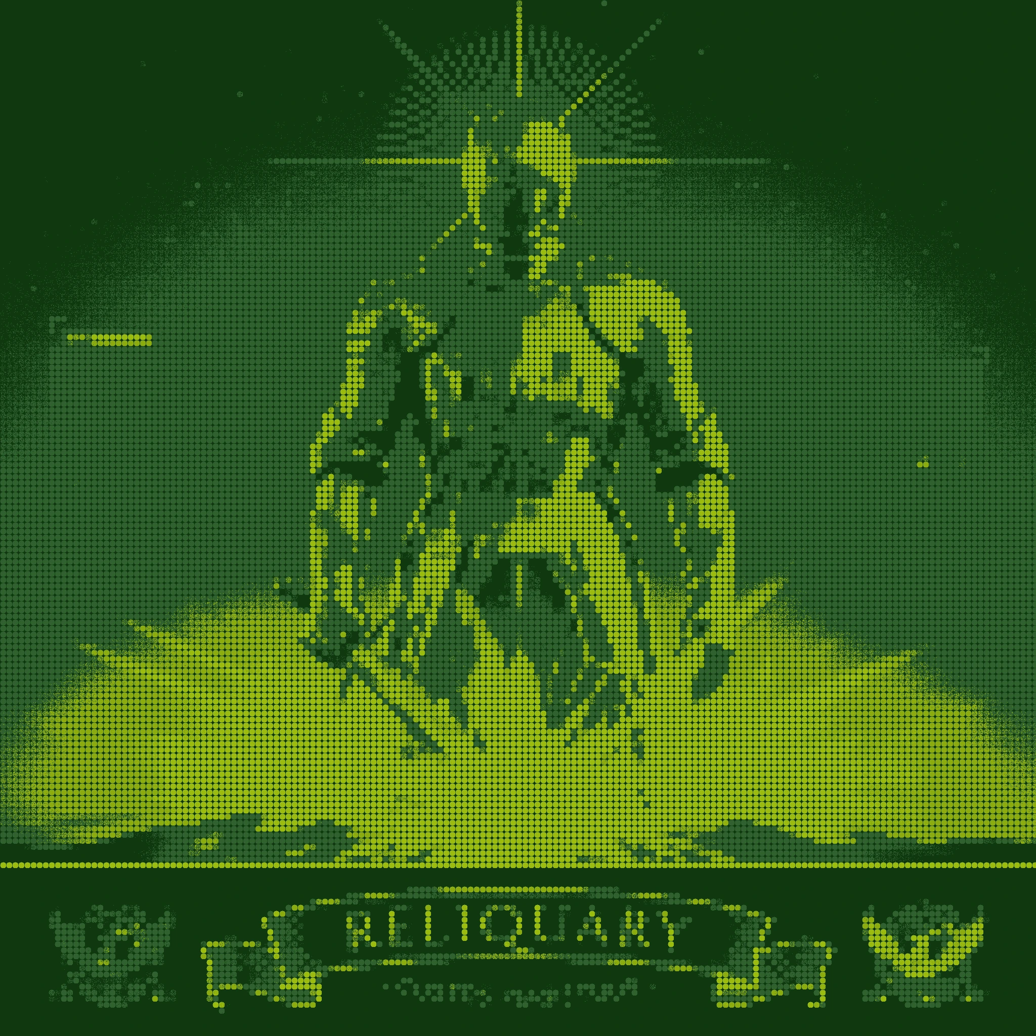
The visual unlock came from the reference images the brief was built around — specifically a set of existing artworks that combined armored figures, halftone dot matrices, prismatic lens flares, and phosphor-green GUI annotation panels overlaid on physical subjects. The interface annotating the artifact. The scan confirming the sacred object. That combination — woodcut beast meets HUD readout — became the conceptual logic running through everything.
I rejected paper-texture approaches early. The temptation with woodcut-style illustration is to lean into the analog warmth of aged parchment. I pushed in the opposite direction: the linework is ancient, the substrate is cold. Void Black ground, Chrome highlights, Phosphor Green data. The beast was cut in 1487. It was minted this morning.
The color system came directly from that tension. Aureate gold (
#C9922A) carries all ceremony and revelation — halos, seals, wordmarks, contract addresses at moments of inscription. Phosphor Green (#39FF6A) carries all data and system — GUI panels, hash fragments, HUD brackets, blinking cursors. Chrome (#D0D8E8) carries all material — armor, marble, polished metal. Cobalt Sanctum (#1A2A6C) carries all environment — the sky behind the guardian. They never compete because they occupy different layers of the same composition.THE WORK
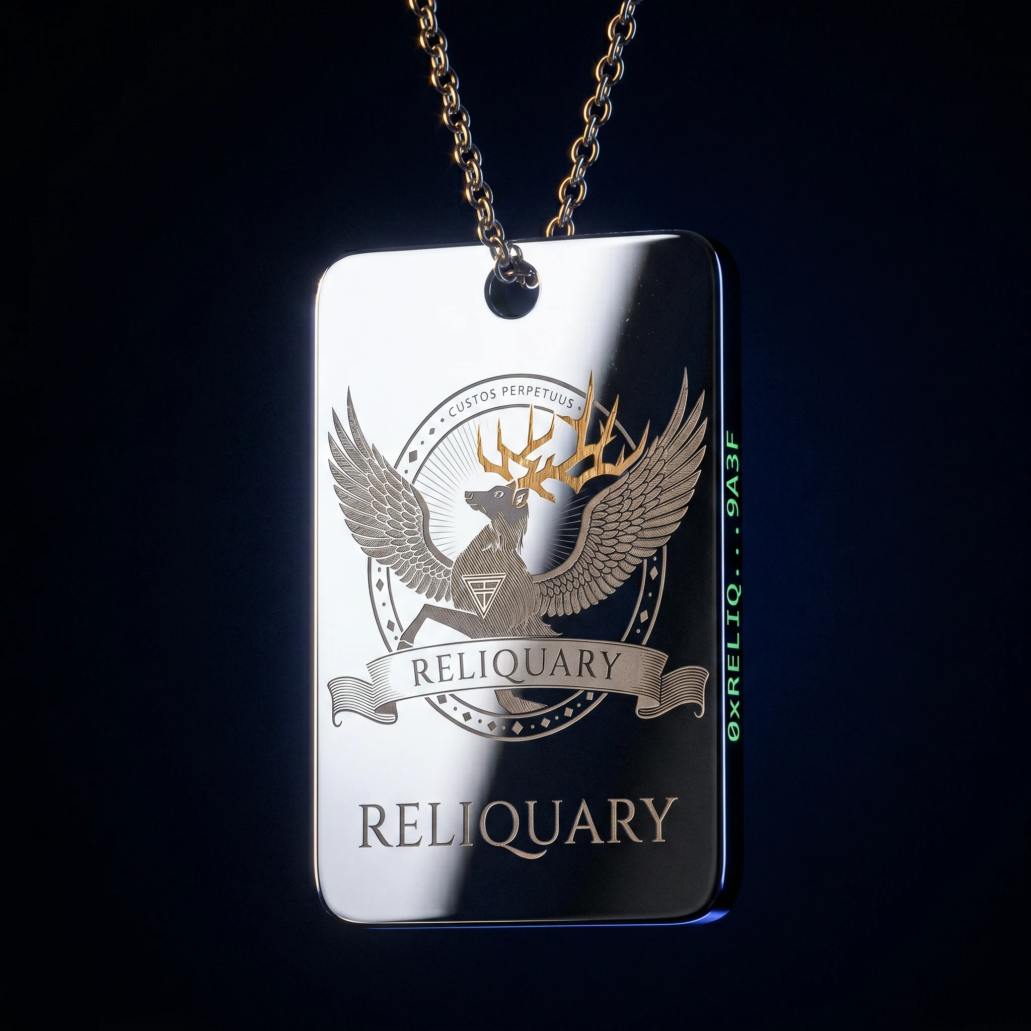
LOGO — THE WINGED STAG SEAL
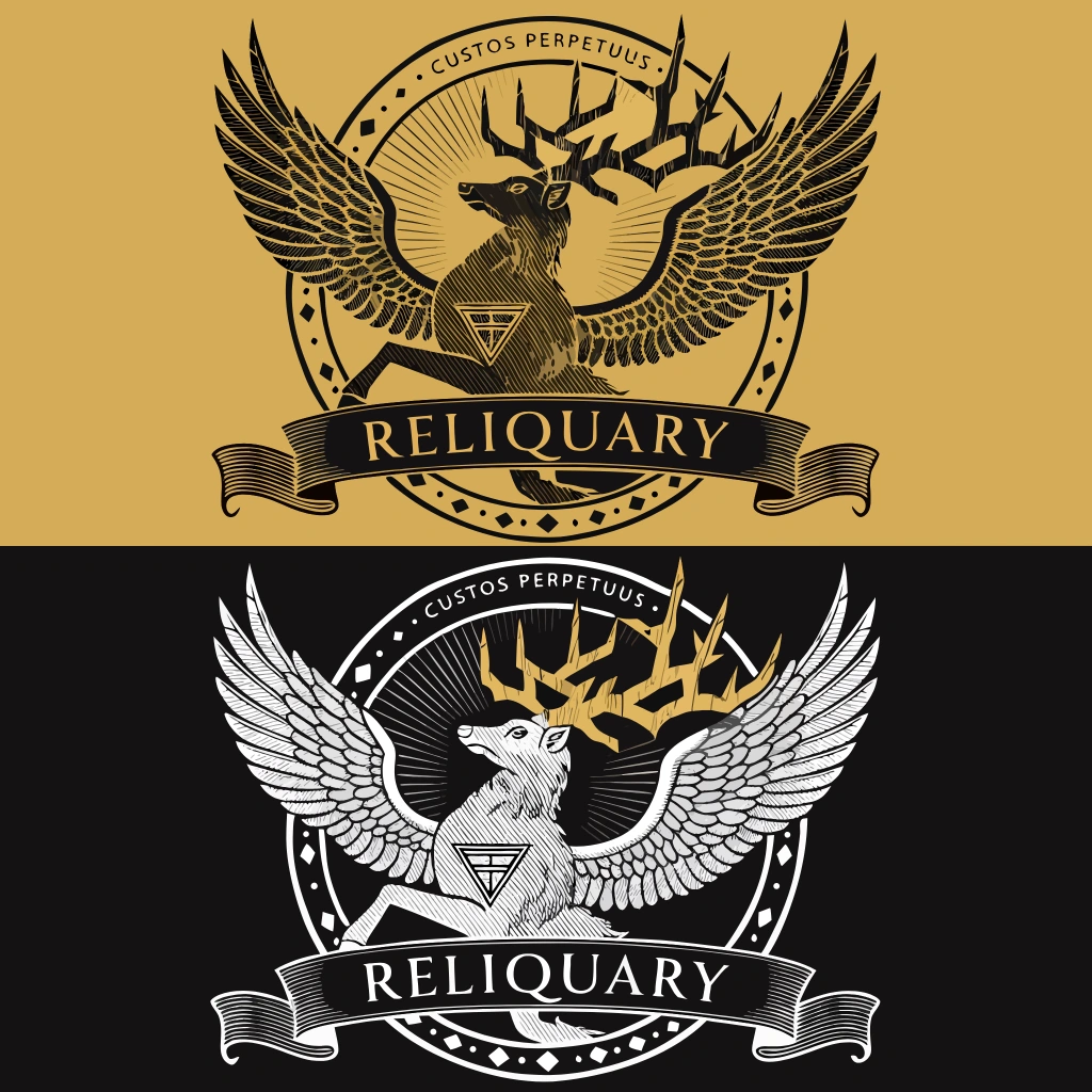
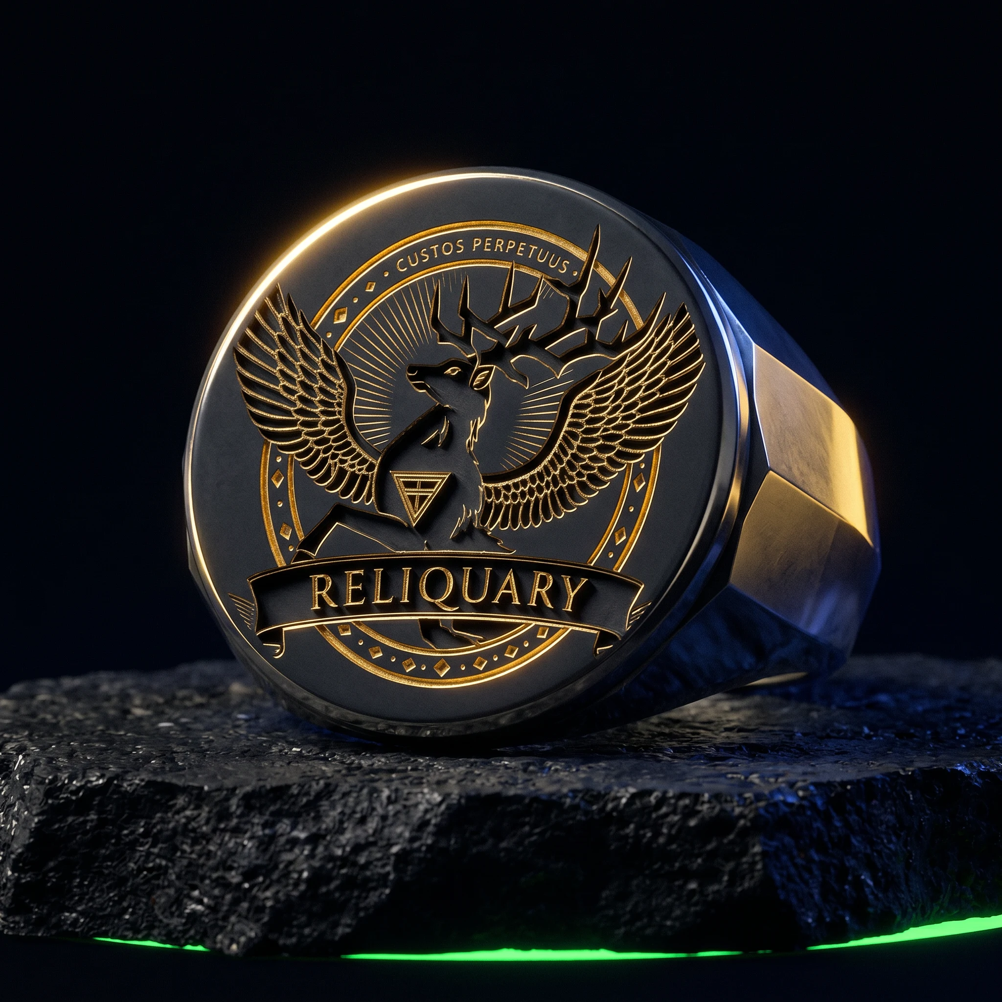
The primary mark is a circular heraldic seal built around a winged stag rampant — rearing on hind legs, wings fully spread, constructed in authentic woodcut cross-hatch linework. No fills, no gradients — only line density creating the illusion of mass and shadow. The stag's chest carries the brand sigil: a downward triangle bisected by a horizontal line, the alchemical symbol for permanence, carved into the linework as if the animal was born with it. The antler tips are the one anachronism: sharp three-sided geometric points, cut-gem architecture, the digital tell in an otherwise purely analog mark. "RELIQUARY" inscribed on a heraldic banderole at the base. "· CUSTOS PERPETUUS ·" arcing along the inner top ring. Two color variants: Void Black linework on Aureate Gold ground (ceremonial), Chrome linework on Void Black (digital interface).
TYPOGRAPHY SYSTEM
Primary: Cinzel — a Roman lapidary serif with genuine inscriptional weight, used for the wordmark and all ceremonial text. All caps, wide tracking, the feeling of stone. Secondary: Share Tech Mono — a monospaced terminal font used for all data, metadata, hash fragments, GUI panel text, and the phosphor layer across all compositions. The two typefaces occupy entirely separate registers and never compete: the serif carries identity, the mono carries system.
COLOR SYSTEM
Void Black
#0A0A0F — primary ground across all applications. Cobalt Sanctum #1A2A6C — sky, depth, environmental blue on chrome-figure compositions. Aureate #C9922A — halos, seals, foil applications, revealed moments. Phosphor #39FF6A — all data, all interface, all system text. Chrome #D0D8E8 — armor, marble, polished metal, secondary mark variant. Used only in its designated register — Phosphor never appears as ambient color, Aureate never appears as decoration.CAMPAIGN POSTERS
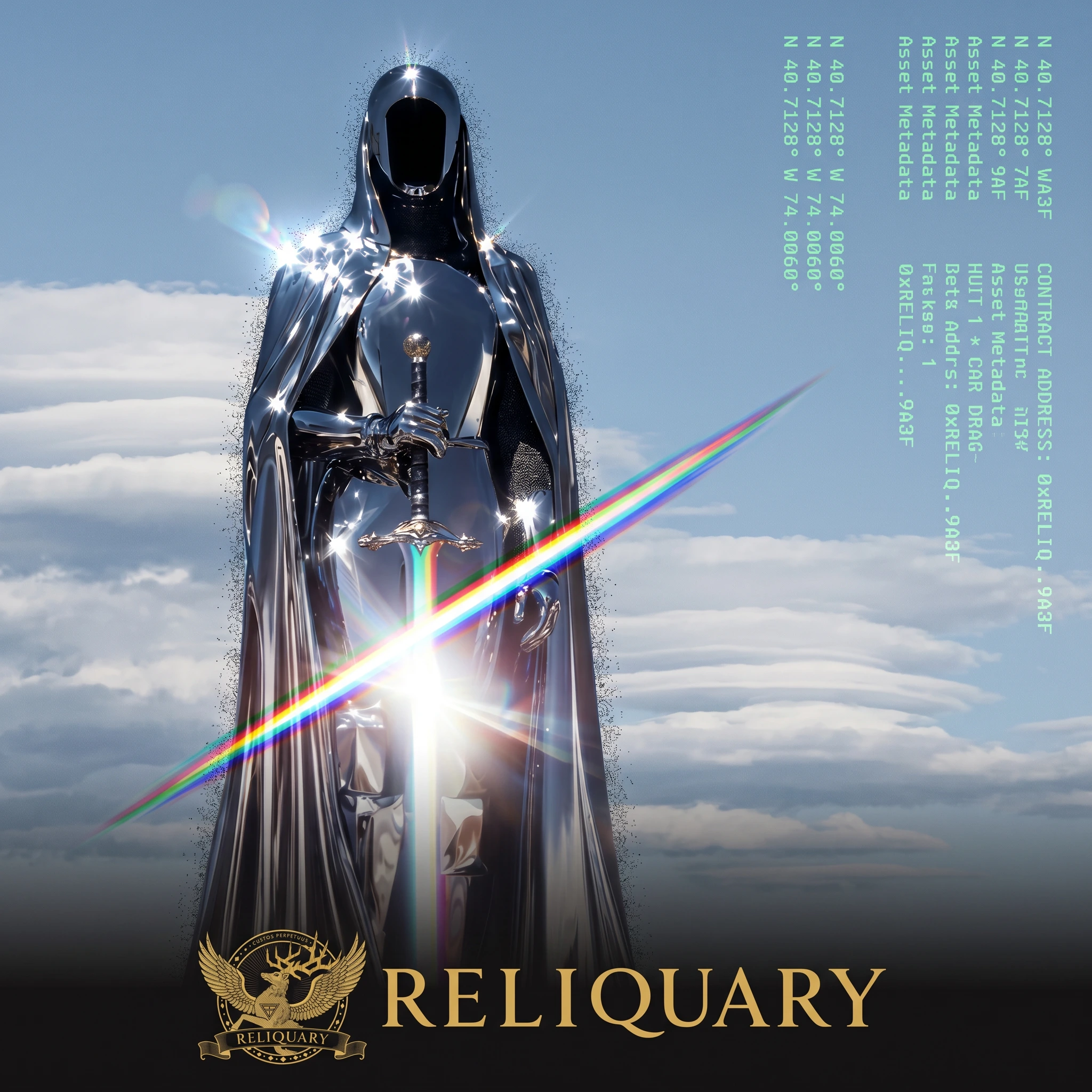
Five campaign posters, each built around a different archetype: The Sworn (chrome knight, phosphor dither), The Unnamed (faceless cloaked figure, cobalt sky, prismatic sword flare), The Recorded (marble angel statue annotated with full GUI dashboard), The Annotated (robed wizard with circuit-board gold tracery and full HUD coverage), The Riding (chrome horseman, star field, diagonal prism slash). Each poster carries exactly one prismatic lens flare — full visible spectrum, diagonal slash, originating from the blade or staff — and a consistent bottom strip: winged stag seal, Aureate gold wordmark, Phosphor hash fragment. The GUI annotation system references the visual language of field-scan interfaces: targeting brackets, leader lines, waveform charts, data panels. The interface does not replace the figure. It catalogs it.
PHYSICAL MOCKUPS
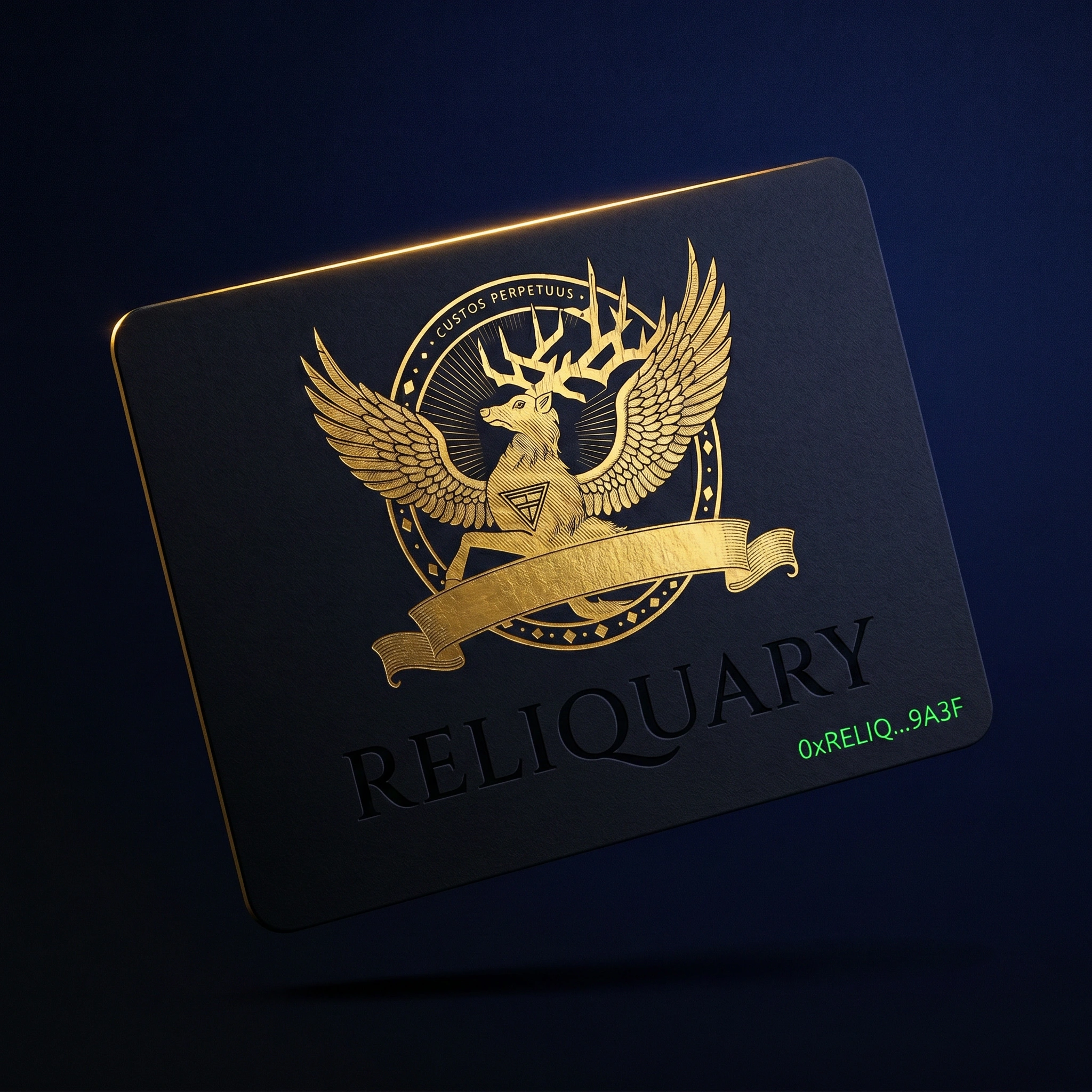
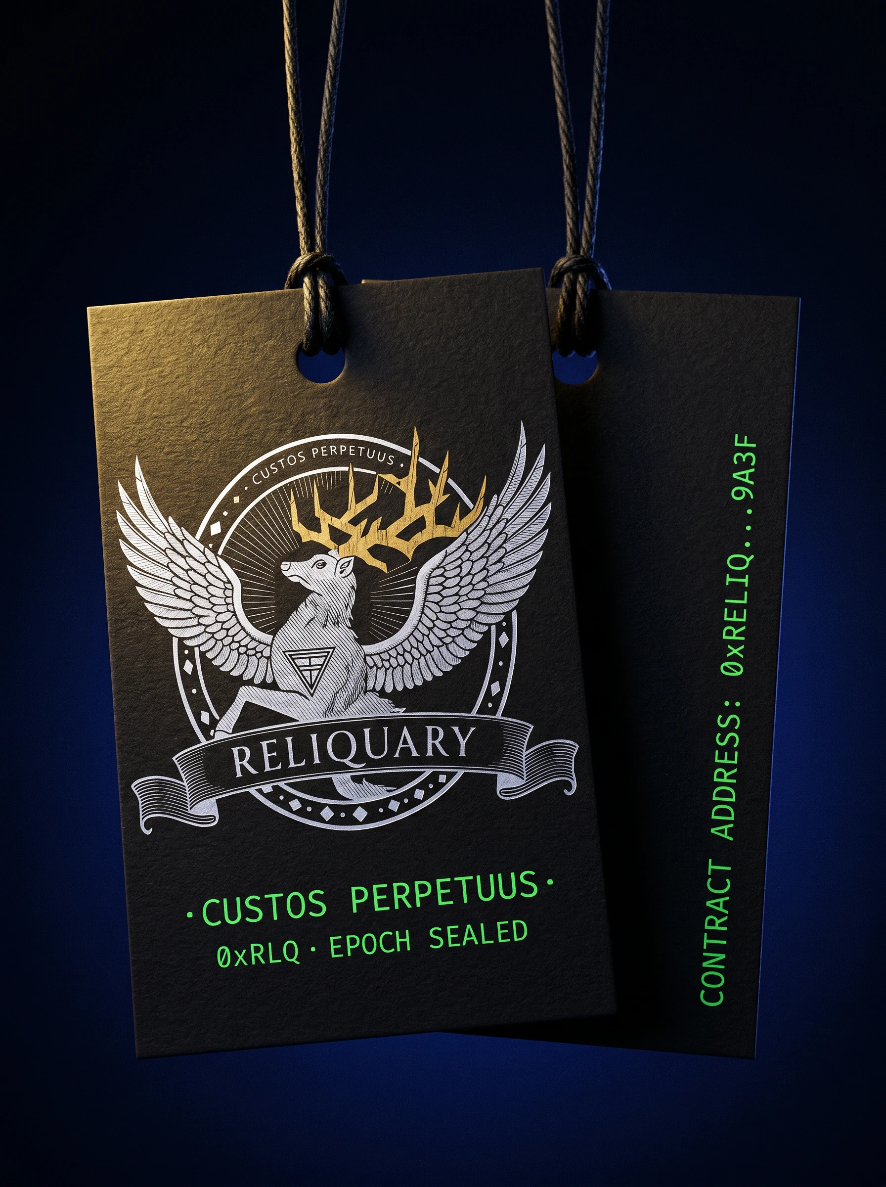
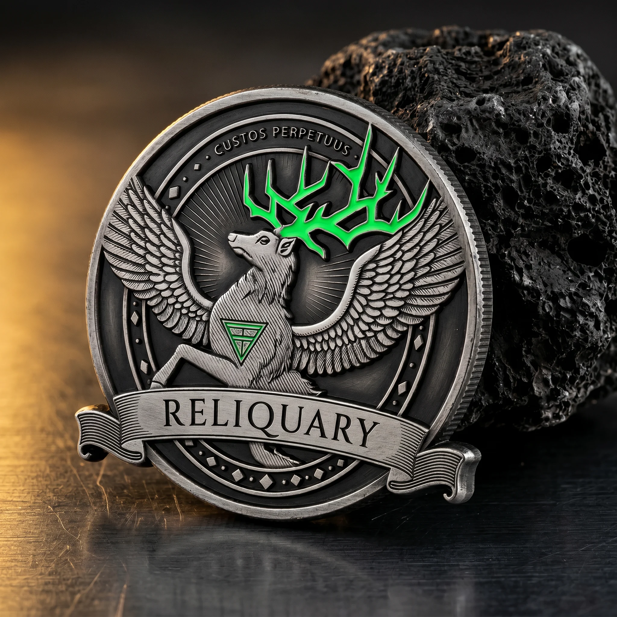
Fifteen physical and digital applications testing the brand across material registers: black foil token card, mirror-polished chrome dog tag pendant, chainmail-texture hardcover manifesto, Aureate gold wax seal on black envelope, desktop website hero, deep-cobalt spirits bottle with gold linework seal, black cotton hoodie with Chrome-white screen print, black paper hang tag, blackened signet ring with intaglio bezel, rigid-lid archive box with phosphor-lit interior, cold-pressed stainless metal business card, blind-embossed leather passport wallet, brass wax stamp tool on liquid black wax, leather document folio, and antique silver on-chain coin with phosphor-filled antlers. Across every application: the seal mark remains fixed and unchanged. The system adapts — the mark does not.
THE RESULT
RELIQUARY shipped as a complete speculative identity system — brand mark, visual language, campaign series, and full physical application suite. The conceptual logic held across every register it was tested against: from a 7px favicon to a 120mm foil stamp on a rigid-lid box, the mark reads with the same authority. The tension the brand was built around — ancient permanence carrying digital infrastructure — stayed legible and unresolved in the best possible way. It does not look like Web3. That is the point.
Révolté — revolte.design
Project: RELIQUARY
Year: 2026
Scope: Brand Identity, Logo System, Typography, Color System, Campaign Posters, Physical Mockups, Digital Mockups
Industry: Web3 / Blockchain Infrastructure
See more at revolte.design
Like this project
Posted Apr 18, 2026
Web3 custody and provenance protocol, the kind of infrastructure that sits beneath the noise, holding digital assets with legal and technical permanence.
Likes
0
Views
11
Timeline
Feb 19, 2026 - Apr 18, 2026