Built with Lovart
Spore: A Biological Exploration in Branding
Révolté
SPORE — The Organism Doesn't Explain Itself
A functional mushroom supplement brand built entirely around biological strangeness. The brief was simple: no wellness theater, no soft beige, nothing that looks like it belongs next to a yoga mat. The answer was to treat fungi with the seriousness they deserve — and let the weirdness do the work.
THE BRIEF
Spore came out of a question I kept asking: why does every supplement brand feel like it was designed to calm you down? The category is dominated by muted earth tones, calming sans-serifs, and photography of someone holding a mug in a soft-lit kitchen. None of it has anything to do with what mushrooms actually are — ancient, structurally alien, networked underground across entire forests, neither plant nor animal. The visual language of the category had almost nothing to do with its subject.
The brief I set for myself was deliberately uncomfortable: build a brand that treats fungi honestly. Not as a lifestyle accessory, not as a psychedelic reference, not as a wellness prop. As an organism. Something that predates almost everything, that communicates through chemistry and light, that will outlast every brand that ever tried to make it approachable.
The scope covered everything — logo, visual system, full packaging range, campaign photography direction, print collateral, environmental and large-format applications. I wanted to prove the brand could live anywhere from a subway wall to a macro photograph without losing its logic.
THE APPROACH
The first instinct was to go clinical — raw science, taxonomy, specimen aesthetics. I explored that direction and it had integrity, but it was cold in the wrong way. Too archival. The brand felt like it belonged in a university library rather than on a shelf or a wall. The strangeness was there but it was contained, and contained strangeness isn't really strange at all.
What unlocked it was thinking about Ernst Haeckel — the 19th century naturalist whose biological illustrations look more like psychedelic art than science, simply because the organisms he was drawing were genuinely that strange. He didn't stylize anything. He just looked carefully. That became the operating principle: look carefully at what mushrooms actually are, and reproduce that faithfully. The weirdness is already there. You just have to not soften it.
The conceptual framework became biological accuracy as surrealism. Every visual decision had to come from the organism itself — the gill structure that radiates from a single point, the asymmetry of a cross-section, the way mycelium threads carry light differently than anything else in a forest. The brand's strangeness would be earned, not applied.
I rejected anything that referenced drug culture explicitly. No fractals, no color-field trippy gradients, no obvious psychedelic clichés. The palette had to feel like something alive in the dark — controlled, not chaotic. Near-black (
#0F0F12) as the ground. Electric moss (#5AE87A) as a single bioluminescent accent, never used as a fill, always used as the one moment of living intensity in an otherwise near-monochrome world.THE WORK
LOGO
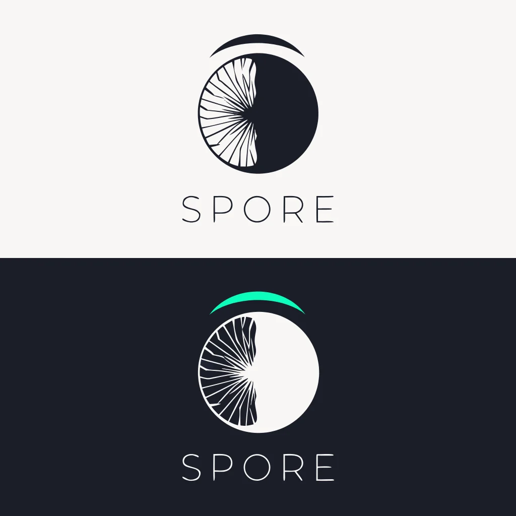
The symbol is a mushroom cross-section — the circle bisected by an asymmetric vertical, the gill lines radiating from a single point in the left hemisphere, a floating arc above representing the cap. Nothing is fully resolved: the gill detail is biological, not geometric. The arc doesn't touch the circle. The mark looks like a specimen under glass and a brand symbol simultaneously. In the light version, the arc runs in electric moss (
#5AE87A) — the only color moment in the mark. In the dark version on near-black, the arc suppresses to spore white. The wordmark is set in a refined geometric sans, tracked wide in small caps, below the symbol — neutral enough that the symbol carries everything.COLOR SYSTEM
Five colors, each with a specific role. Near-black (
#0F0F12) is the primary ground — almost but not quite black, which makes it feel biological rather than graphic. Spore white (#F0EDE8) is warm, slightly organic — never pure white. Electric moss (#5AE87A) appears once per composition, always as a single detail: a gill edge glowing in a photograph, the arc on the logo, a thread of mycelium in a campaign image. Deep violet (#3D1F5C) runs secondary packaging, interior surfaces, wax seals. Warm bone (#D4C9B0) grounds light-mode applications — uncoated card, tissue stock, ceramic surfaces.TYPOGRAPHY SYSTEM
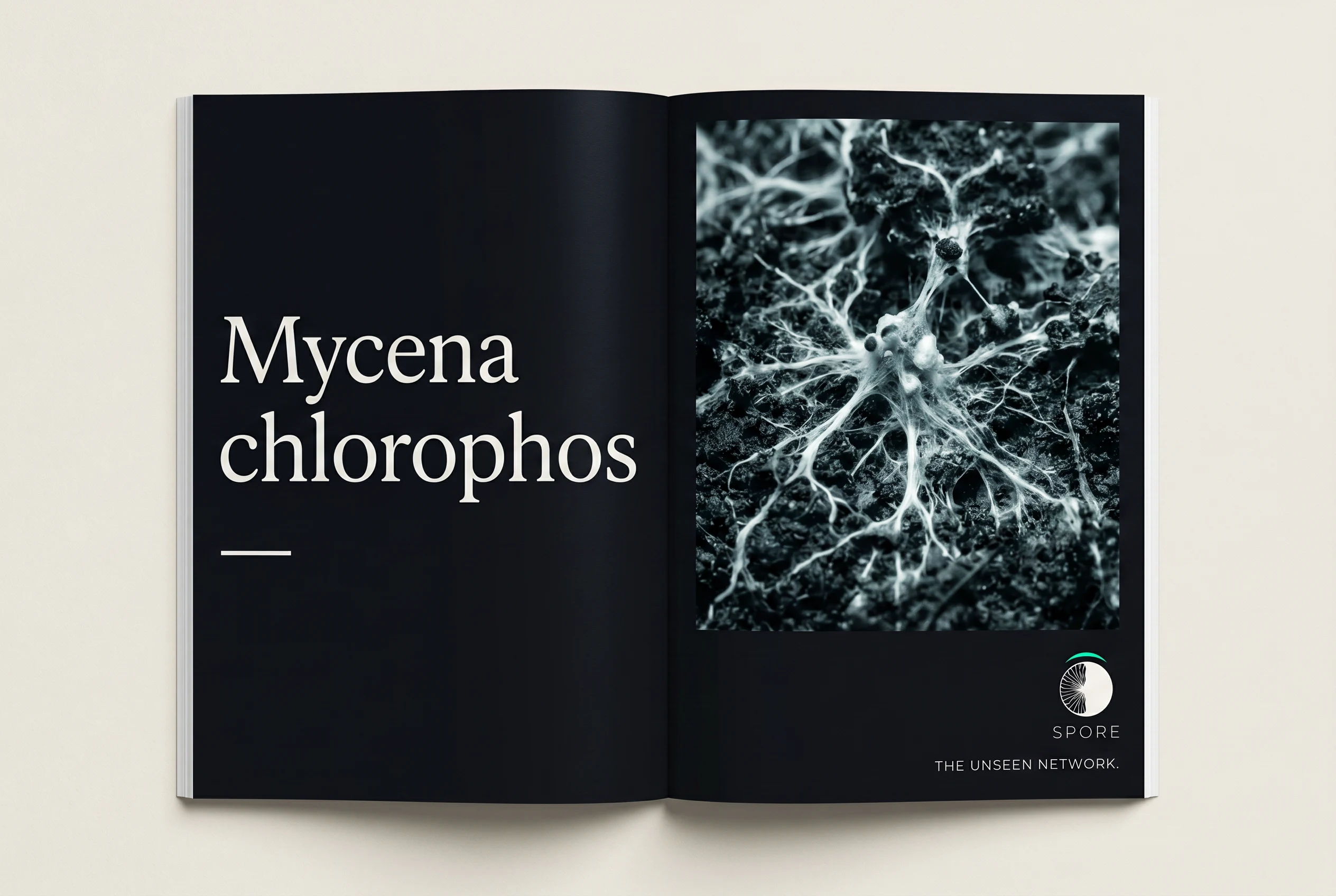
Display in an organic serif with irregular terminals — letterforms that read as grown rather than constructed. Body in a clean humanist sans (generous leading, small size, neutral enough to make the display face feel stranger). Monospace for scientific names, ingredient notations, production data — used like a footnote that knows something you don't.
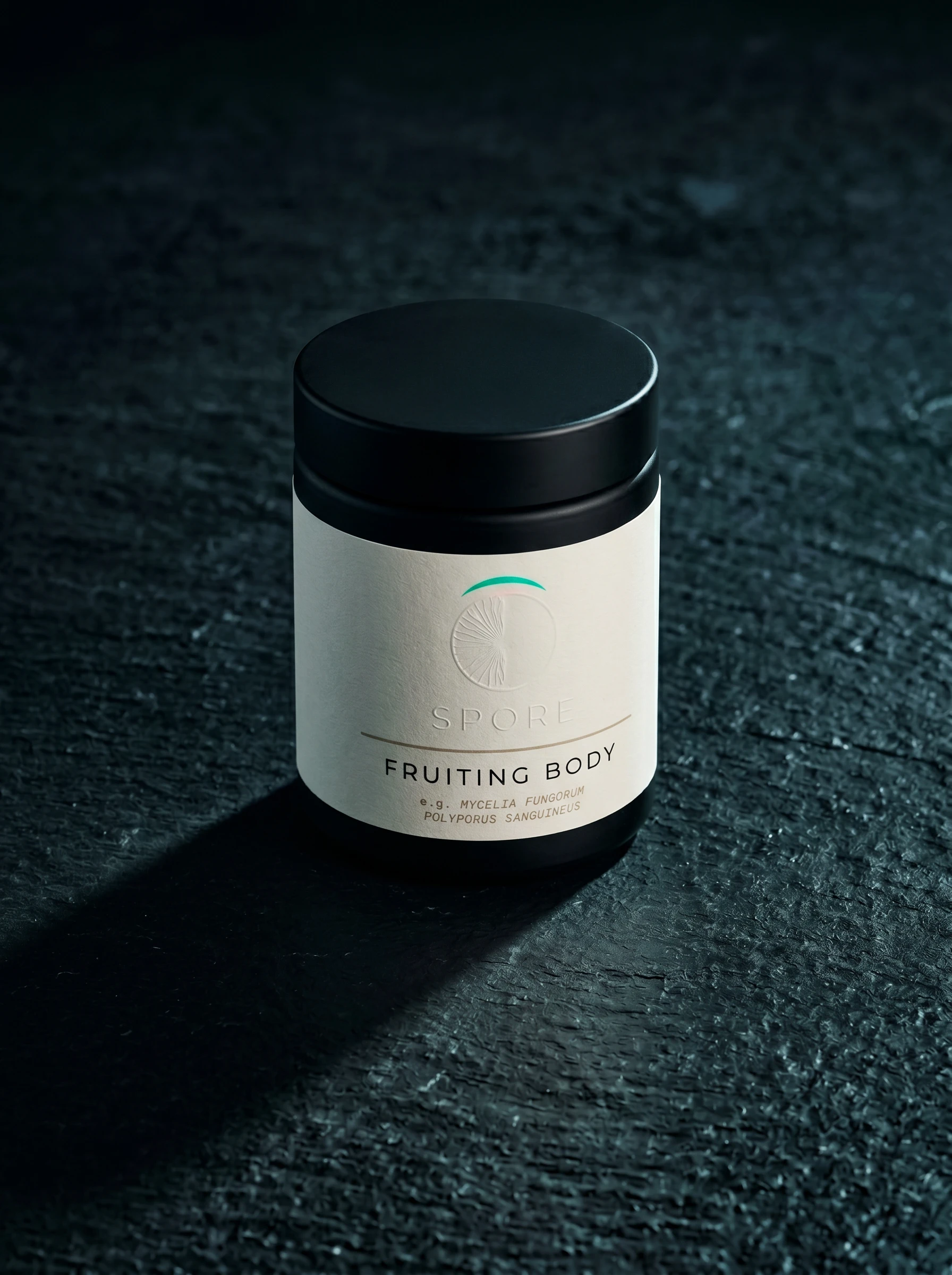
PACKAGING
The primary supplement jar runs a bone uncoated label on matte black glass — the logo light version, the product name "FRUITING BODY" in wide-tracked small caps, and a Latin species name in monospace below. The shipping box is rigid matte near-black with a blind-embossed symbol on the lid and a deep violet (
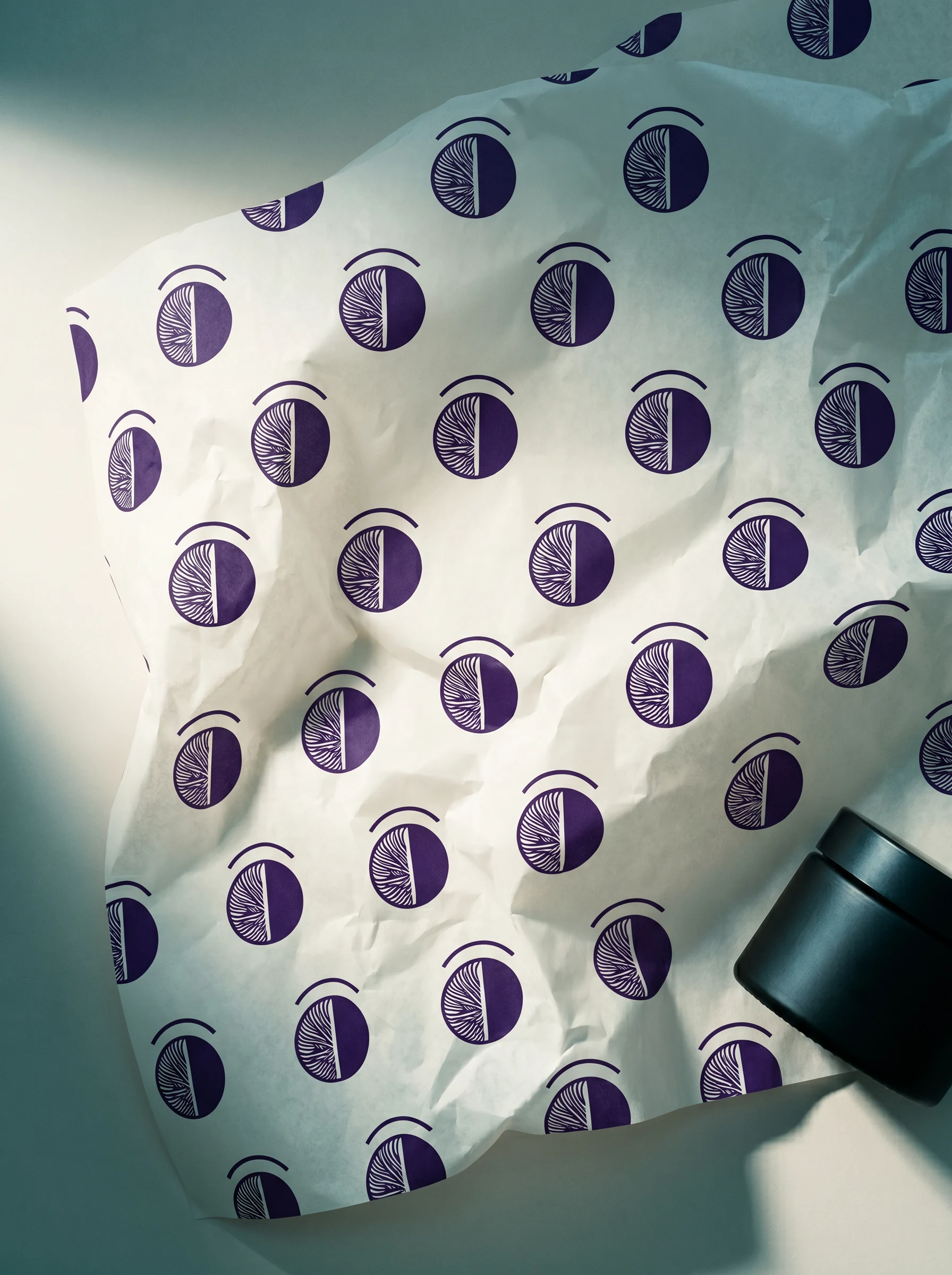
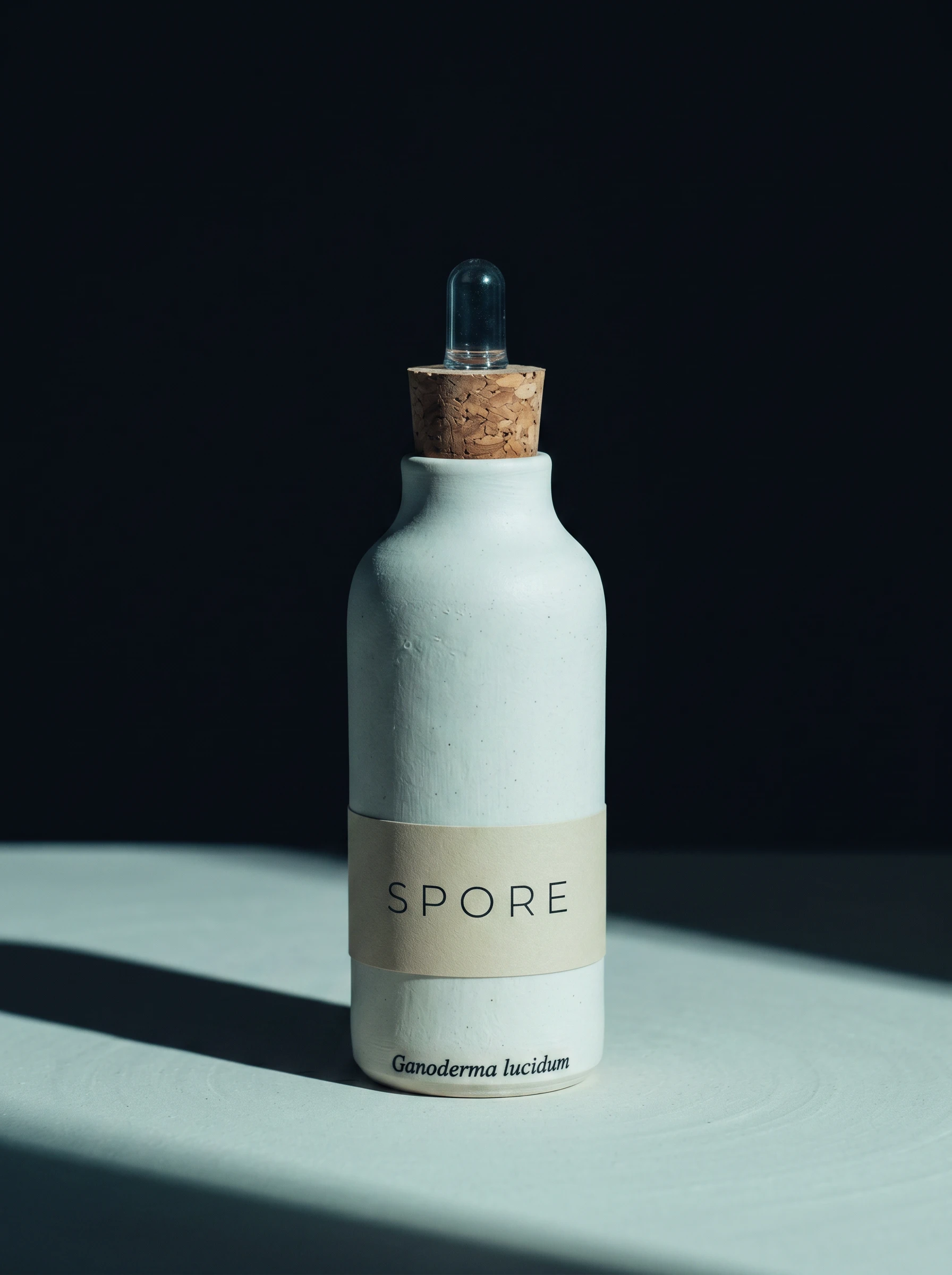
#3D1F5C) interior lining visible when opened. The ceramic dropper bottle carries only the wordmark on a bone band label — no symbol — and a stamped Latin name at the base like a pottery mark. The apothecary bottle runs a deep violet label with the full logo at small scale, the product name in lowercase monospace. Interior tissue is printed with a repeating symbol pattern in deep violet on bone stock.CAMPAIGN
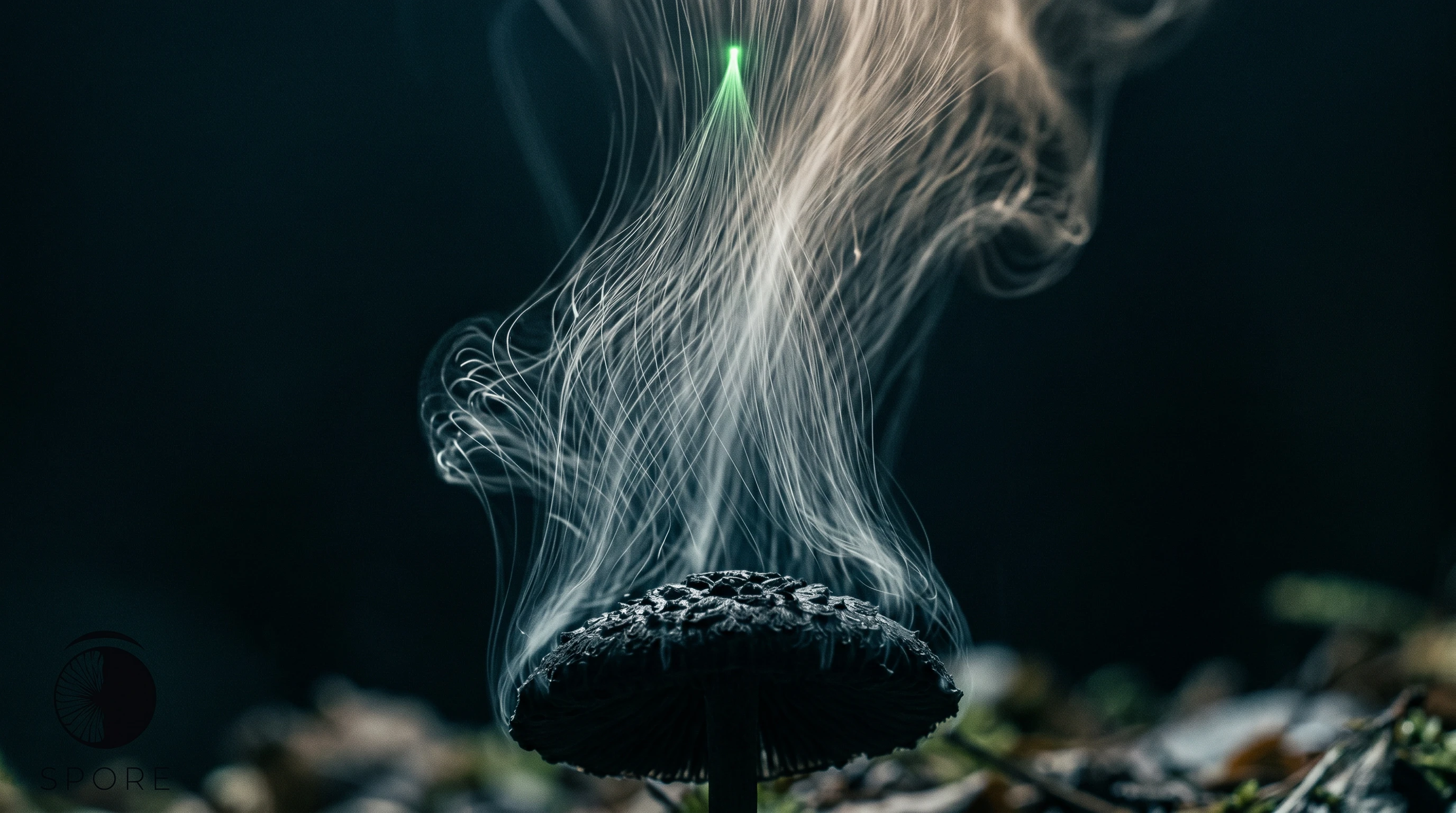
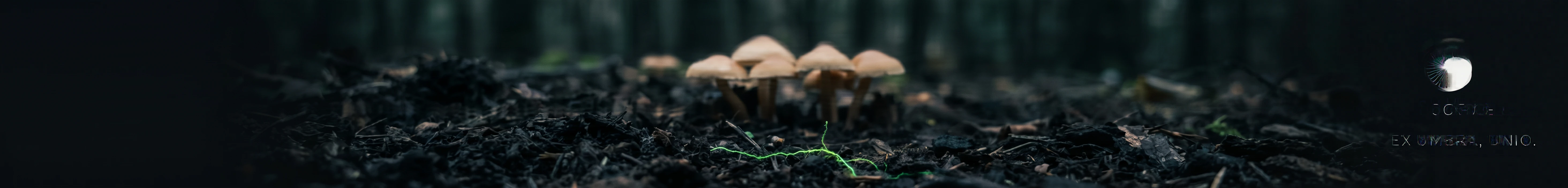
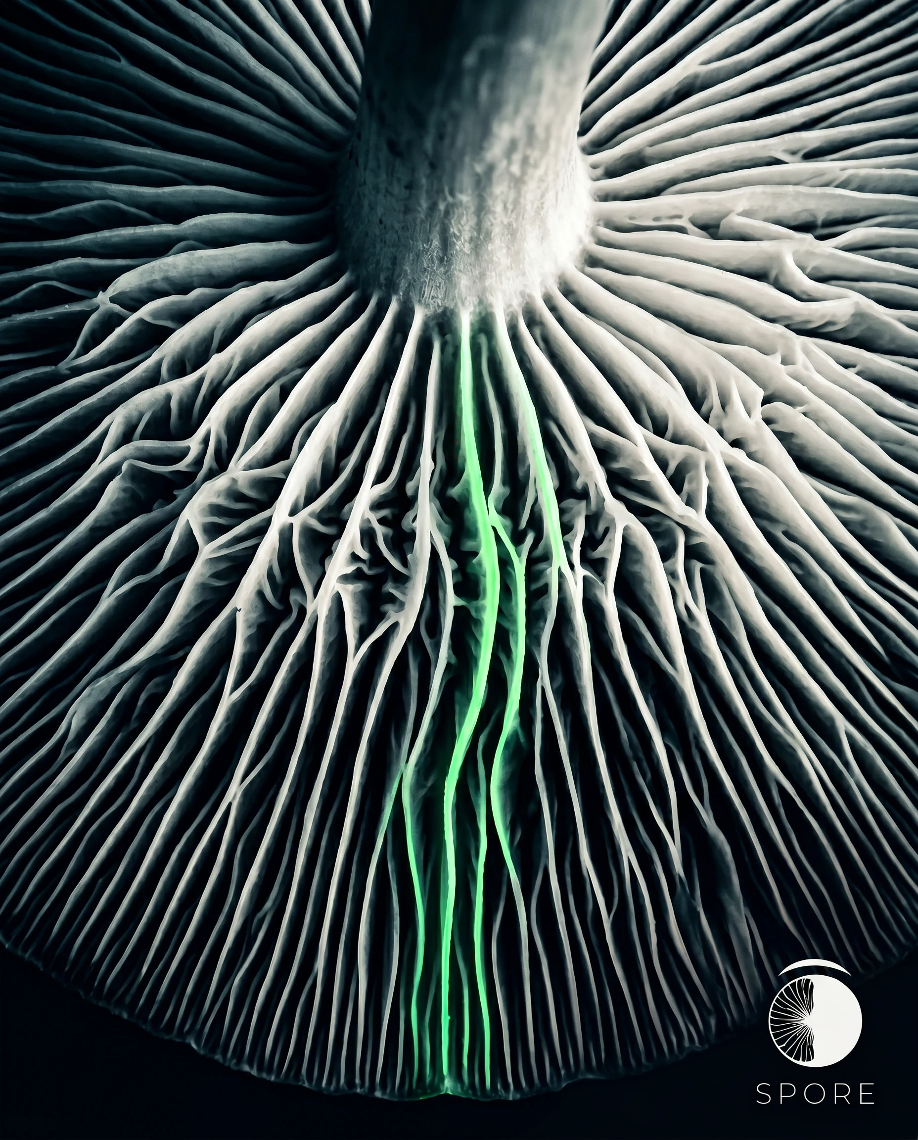
Four campaign photographs built around biological subjects, not products. The macro gill structure — shot from beneath looking up, the gills radiating in near-monochrome, a single gill edge catching in electric moss. The spore dispersal long exposure — the cap silhouetted at bottom, spore trails rising in spore white, a single point glowing in electric moss at the apex. The forest floor panoramic — ground-level, a mycelium thread catching in electric moss as the single color moment, the logo impossibly small at far right with the campaign line "Ex Umbra, Unio." The subway poster — full-bleed near-black, the symbol large and silent at center, the electric moss arc the only color on the entire wall.
THE RESULT
Spore is a speculative project, which means the only client is the work itself. What I was testing was whether a brand could be built entirely around biological honesty — whether strangeness, held with enough discipline, could read as desirable rather than alienating. The answer, across 20 applications, is yes. The system is coherent from a 15mm sticker to a subway poster. The electric moss holds its function — one accent, always earned, never decorative. The logo works blind-embossed into cloth, screen-printed on canvas, at 3% of frame width in a campaign photograph, and at 400mm on a concrete wall.
The brief I set was: don't explain the organism. I didn't.
Révolté — revolte.design
Project: Spore
Year: 2026
Scope: Brand Identity, Logo Design, Packaging, Campaign Direction, Print Collateral, Environmental
Industry: Functional Supplements / Wellness
See more at revolte.design
Like this project
Posted Apr 19, 2026
Spore came out of a question I kept returning to: why does every supplement brand feel designed to calm you down?
Likes
2
Views
18
Timeline
Apr 13, 2026 - Apr 19, 2026