Built with Lovart
Nightshift Website and Brand Identity Design
Révolté
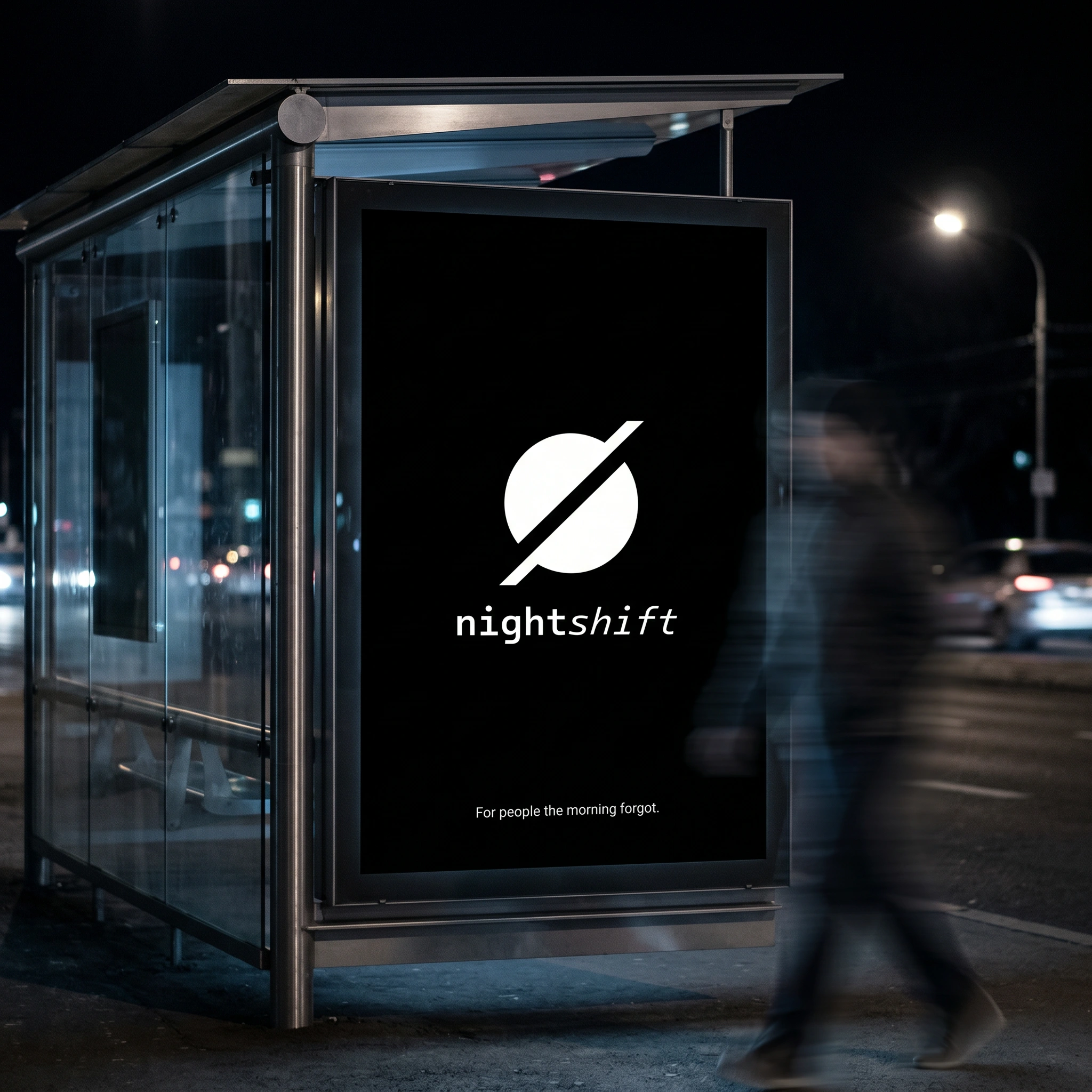
NIGHTSHIFT — For People the Morning Forgot
A productivity brand built for the people the morning has always ignored. The challenge wasn't designing an app — it was designing a lifestyle that already existed but had no name.
THE BRIEF
Most productivity software is built around the assumption that your best work happens between 9 and 5. Clean desks, morning routines, motivational notifications at 7am. I wanted to design the opposite of that — something for the people who don't start until midnight, who hit their stride at 3am, who have never once related to a sunrise productivity influencer.
There was no client. That was the point. I gave myself the brief: build a brand from scratch for a productivity tool that treats the night shift as a feature, not a flaw. No pastel gradients, no "get things done" energy. The brand had to feel like a film you watch alone at 2am — cinematic, a little transgressive, genuinely alive.
The tension I had to solve wasn't visual. It was attitudinal. Productivity brands either scream hustle culture or retreat into zen minimalism. Nightshift needed to occupy a third space: dry, cinematic, not trying to motivate you — just acknowledging that you're already here, already working, and that's enough.
THE APPROACH
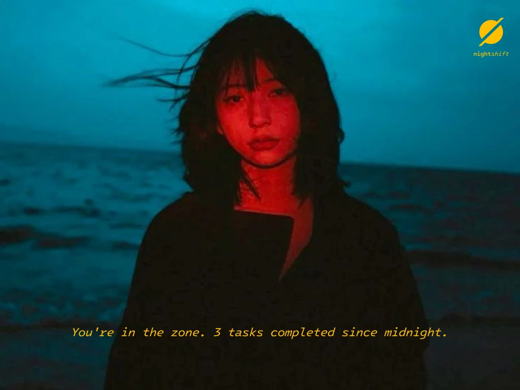
I started with a moodboard built entirely from night photography — neon-drenched car interiors, fluorescent-lit gas stations, solitary figures in train windows, amber windshields cutting through absolute darkness. The visual world I was building wasn't designed; it was found. These were real places where people do real work at real hours the world pretends don't exist.
The first instinct was to go full terminal — monochrome, monospace, reference the hacker aesthetic. I rejected it. It's been done, and it would have made the brand feel like a developer toy rather than something anyone who works at night would actually own.
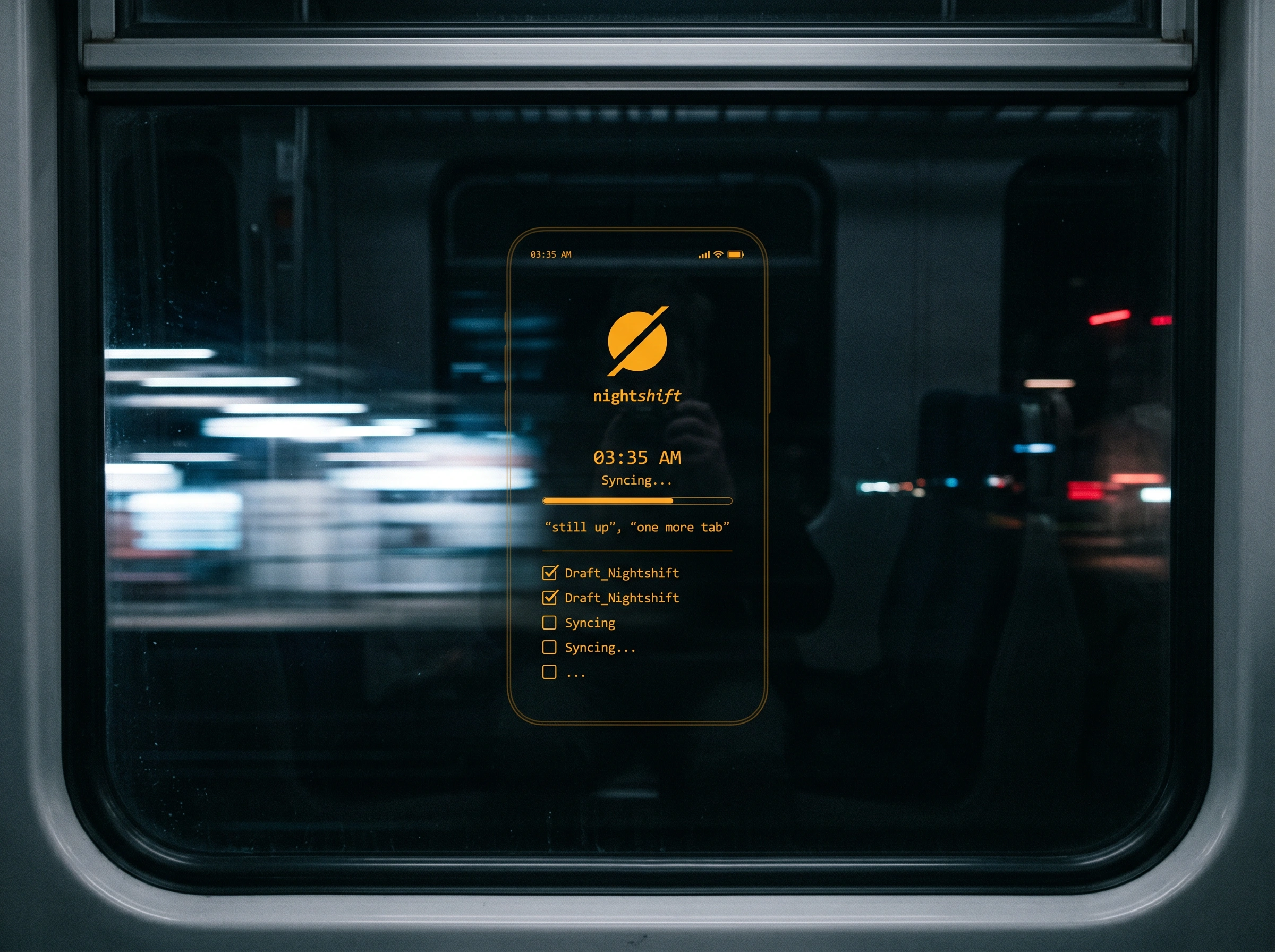
What I kept coming back to was the idea of time as the only currency. Every touchpoint in the system had to answer the question: what time is it? Not as a feature — as an identity statement. The gas station receipt isn't a receipt. It's a productivity log. The clock on the vending machine isn't a price tag. It's 03:12 because that's when you're standing there. The brand lives in the hours most brands pretend don't exist.
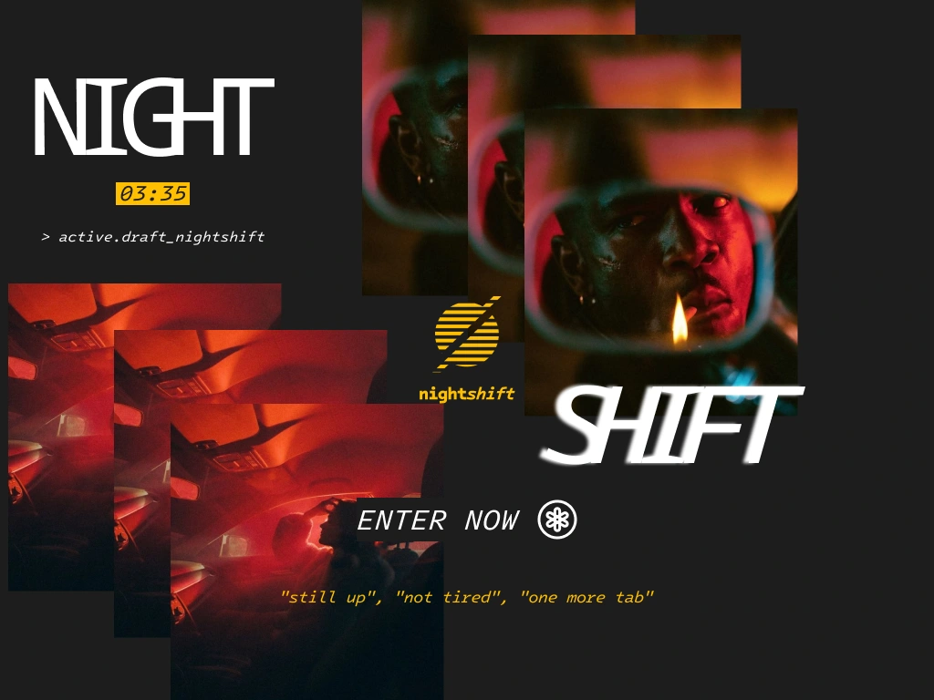
The logo came from that logic. I explored three directions: a condensed wordmark with a cursor blinking from the I, a pill-shaped lockup referencing the train window, and a mark-only option — a filled circle bisected by a diagonal slash. The third one won immediately. It reads as a stopped clock, a dimmer at zero, a planet in silhouette. It's ambiguous in exactly the right way. Paired with the wordmark —
night in regular weight grotesque, shift in italic — it creates a small typographic argument between stability and movement that mirrors the brand's whole premise.THE WORK
LOGO SYSTEM
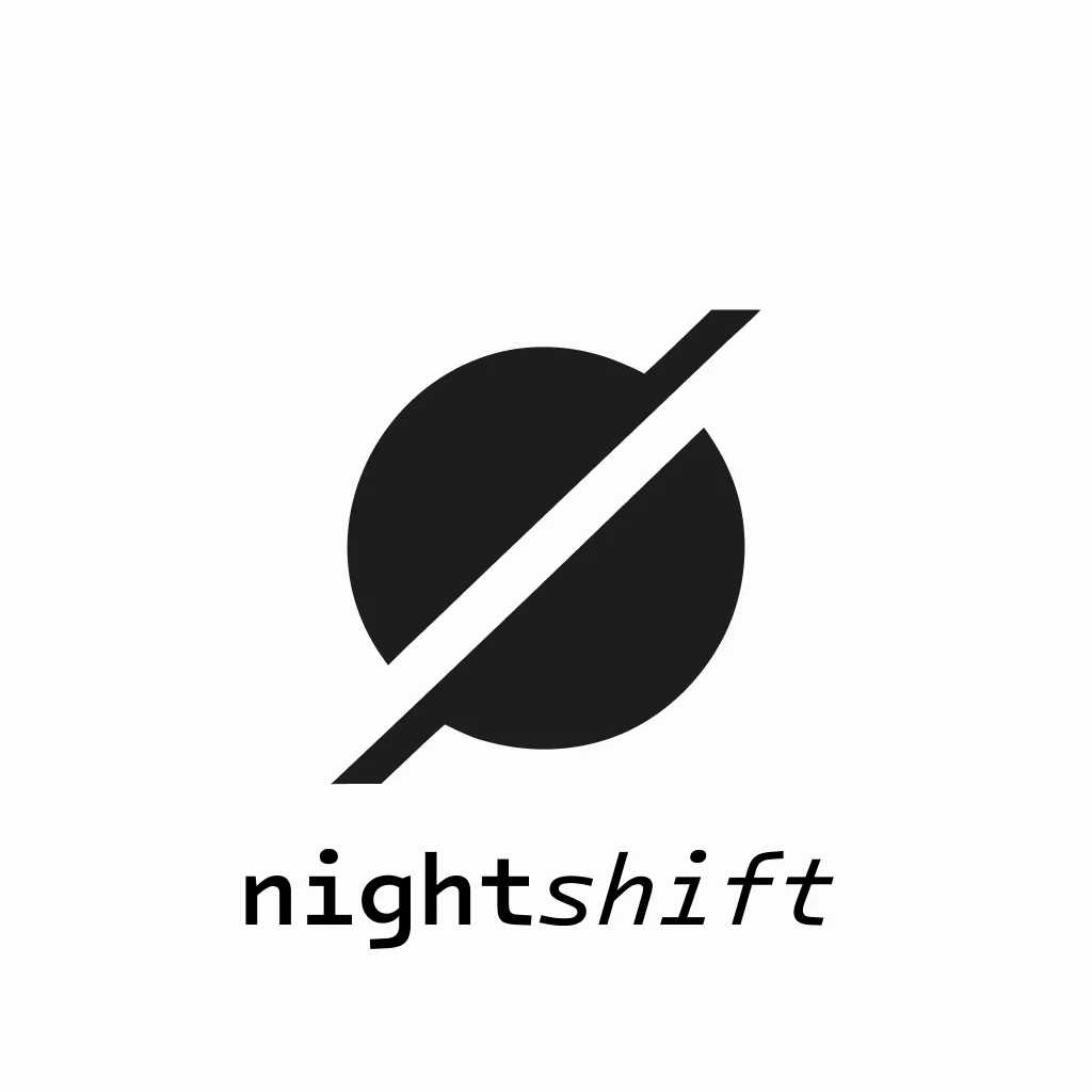
The Signal mark — a solid circle cut by an oversized diagonal bar — operates across three executions: amber-filled on black (primary), outline-only in amber (editorial), and white on black (OOH and merch). The stroke weight on the slash is intentionally heavier than expected, giving the mark a blunt confidence rather than elegance. The wordmark uses a grotesque base with a manual italic applied only to "shift" — not a paired italic from the family, a slanted variant — creating a tension between the two halves that holds at every scale.
COLOR SYSTEM
One active color: amber at approximately
#F5A623. Everything else is black (#0A0A0A), near-black, or white used sparingly. The amber was chosen for its dual reference — digital clock displays and practical light in darkness — not for warmth or energy. It doesn't feel motivating. It feels like the only light on in the building. Red and deep teal appear only in photographic contexts, never in the identity system itself, keeping the brand from feeling editorial when it needs to feel functional.COPY SYSTEM
The micro-copy became its own design system: "still up", "not tired", "one more tab",
STATUS: STILL GOING. Each line is written as a status update rather than a call to action. The brand never tells you what to do. It just confirms you're already doing it. The tagline — "For people the morning forgot." — operates on the same logic. It's not aspirational. It's recognition.PHYSICAL TOUCHPOINTS
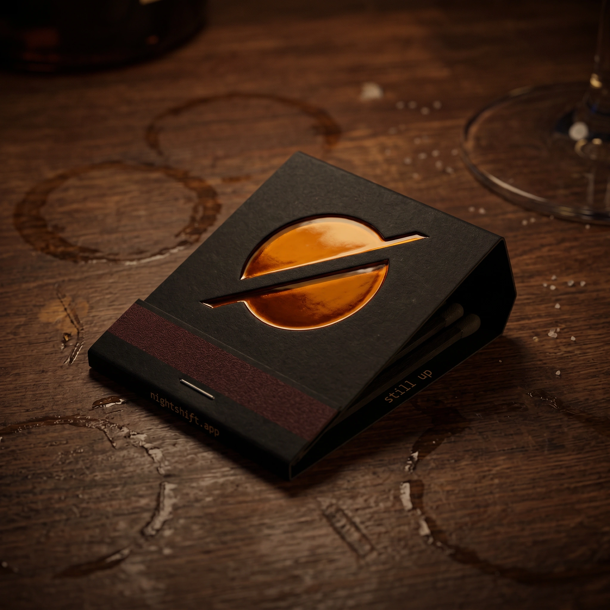
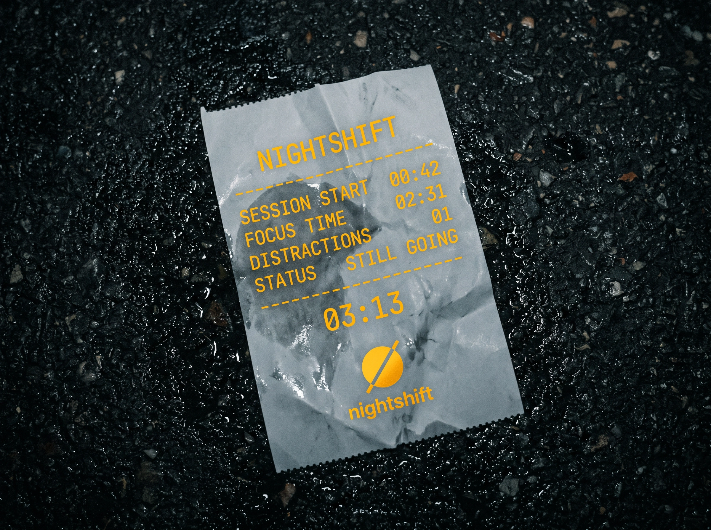
The gas station receipt is the standout piece. A crumpled thermal print on wet asphalt, branded as a session summary:
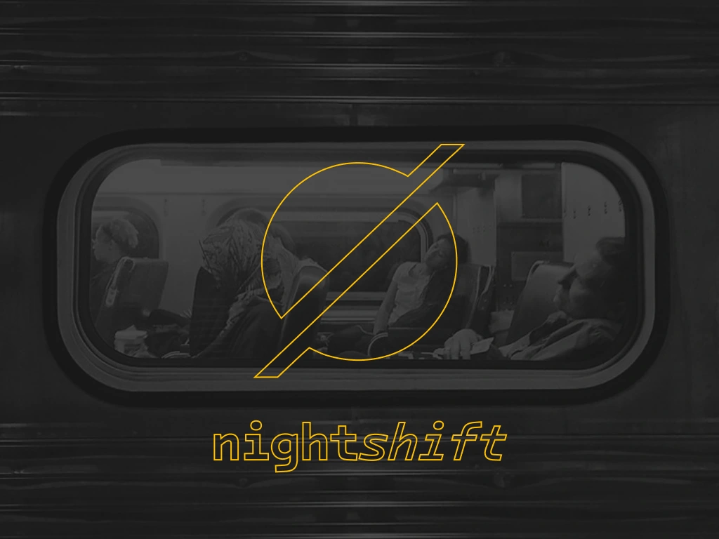
SESSION START 00:42 / FOCUS TIME 02:31 / DISTRACTIONS 01 / STATUS STILL GOING. It reframes productivity data as something you'd find in your pocket at 4am — already done, already real. The matchbook uses a die-cut Signal mark on the cover with nightshift.app and "still up" on the spine. The brand card is matte black, die-cut logo window revealing the surface beneath, with 03:47 as the only content on the reverse. Nothing explains itself. The brand assumes you already know.OUT-OF-HOME
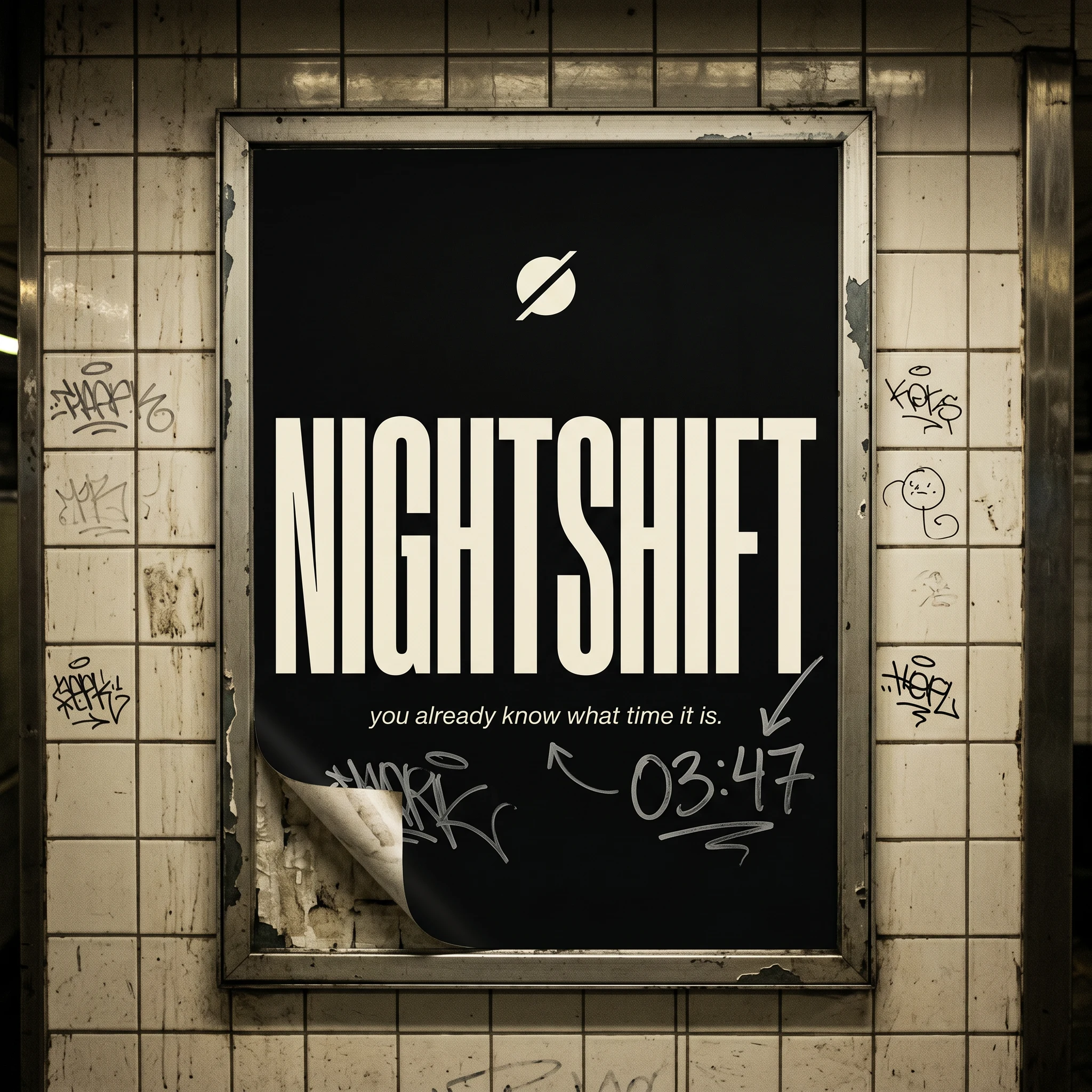
The billboard and subway poster work the same way — maximum negative space, the Signal mark, and one line of copy. The subway poster version gained a layer when "03:47" appeared as graffiti next to the tagline "you already know what time it is." — as if the audience had already verified it. I kept it. It's the best thing in the whole system.
DIGITAL PRESENCE
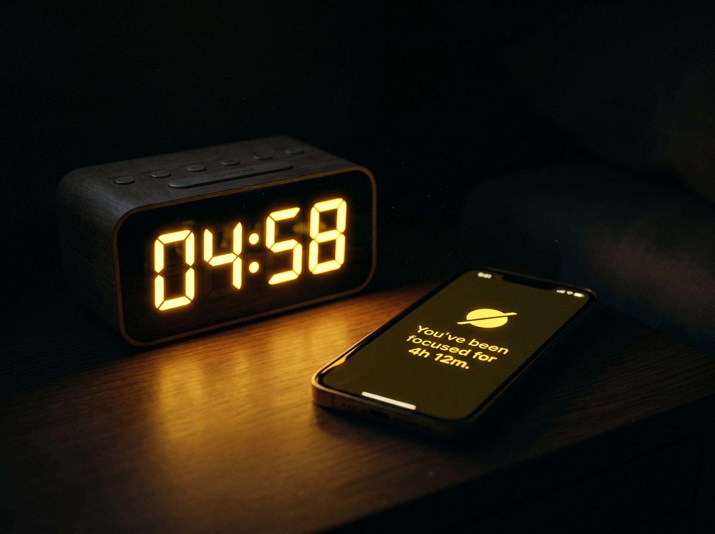
The desktop UI shot — a near-empty screen showing a single task and a blinking cursor at 02:17 AM — communicates the product faster than any feature list. The vending machine mockup inverts the whole consumer logic of productivity software: features as physical objects dispensed at time-stamped prices.
FOCUS MODE / 03:12. DO NOT DISTURB / 04:07. Nobody needed an explanation.THE RESULT
Nightshift exists as a complete, deployable brand identity — logo system, color, type, copy, physical and digital touchpoints, 15 mockups across OOH, merch, product UI, and environmental design. Every piece of it was built around a single premise: the night shift is not a liability. It's a timezone with its own culture, and it deserved a brand that understood that without romanticizing it.
The brand didn't try to make late nights feel productive. It just showed up for the people who were already there.
Révolté — revolte.design
Project: Nightshift
Year: 2026
Scope: Brand Identity, Logo System, Visual Language, Copy System, Merch Design, OOH, Digital Mockups
Industry: Productivity Software / B2C SaaS
See more at revolte.design
Like this project
Posted Apr 21, 2026
A productivity brand built for the people the morning has always ignored. The challenge was designing a lifestyle that already existed but had no name.
Likes
3
Views
18
Timeline
Apr 1, 2026 - Apr 21, 2026