Built with Lovart
PREST: Tennis Club Brand Identity & Website
Révolté
PREST — The Club That Doesn't Need To Explain Itself
A self-initiated brand identity for a fictional private tennis club. Two colors, one custom wordmark, fifteen touchpoints. No sport iconography. No heritage performance.
The Brief
This project started as a question: why does every tennis club brand look like it's trying to prove something?
The category splits cleanly into two camps. The first reaches for heritage markers — engraved crests, Caslon serifs, foxed paper textures — and ends up performing history rather than having it. The second overcorrects into generic minimalism: a neutral sans-serif, off-white backgrounds, and a layout that could belong to a wellness app or a private bank. Neither version feels like the kind of place where old money actually lives, which is without announcement, inside materials that have been used for decades.
I set PREST up as a fictional private tennis club — a self-initiated portfolio project, held to the same standard as a paid commission. The brief I wrote for myself had three hard constraints: maximum two colors, zero sport iconography (no racquets, no balls, no net illustrations), and the identity had to function at every scale from a 6cm embroidered chest logo to a 40cm architectural gate sign. The underlying question was whether a brand could feel genuinely archival without pretending to be old.
The Approach
The name came first. PREST — archaic English for "ready." Single syllable, carved-sounding, not soft. It doesn't whisper the way club names often do. It arrives.
My first logo instinct was a high-contrast didone — the predictable move for anything in old-money territory, and exactly what I rejected. Didones signal heritage decoratively. I needed something that felt constructed, even industrial, but sat inside a warm material world. The reference that cracked it open was a brand called BARK: a custom geometric wordmark with heavy rounded letterforms deployed against dark walnut furniture and forest green velvet. The gap between the bold, almost brutalist logo and the tactile environment it lived in was the entire concept. I wanted that same productive tension for PREST.
The construction rule I set for the wordmark was strict: every curve is a perfect circle arc, every corner is either fully rounded or cut at 45 degrees. Nothing between those two options. The P and R share an identical bowl geometry — a semi-circle punched from a rectangle. The R's leg exits at a 45-degree diagonal cut. The E uses three equal-weight bars, the middle fractionally shorter for optical rhythm. The S is built from two opposing circle arcs with flat-cut terminals, which gives it an aggressive, almost stamped quality. The T closes the word with a crossbar whose terminals mirror the R's diagonal logic — the word has internal coherence, a system you can feel before you can articulate it.
The weight is extreme — counter-to-stroke ratio of approximately 1:3.5. The tracking is tighter than comfortable. The letters almost touch. The result is a wordmark that reads as a single carved object before it reads as five letters. That was the target.
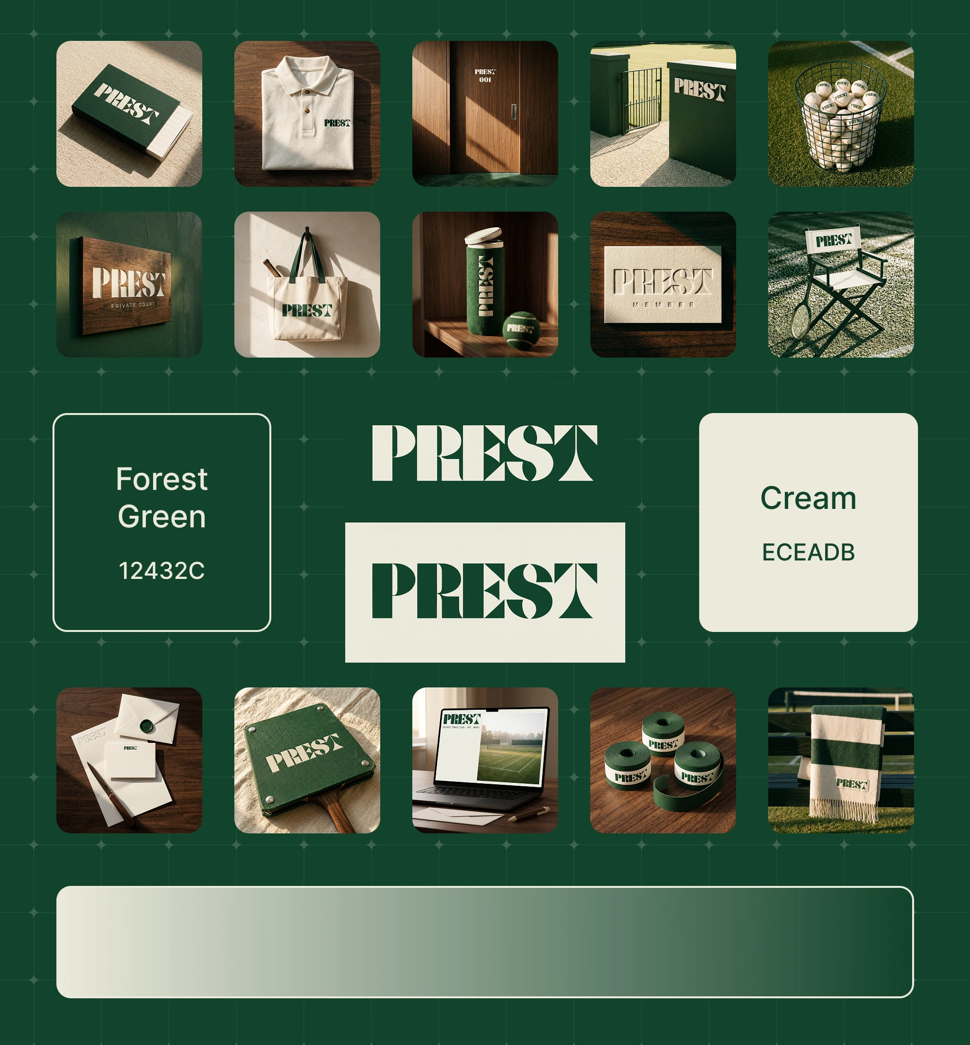
Color took ten minutes. Forest Green
#1D3D2A (Pantone 12432C) and Cream #ECEADB. Two colors, no exceptions across any touchpoint. The decision wasn't about minimalism as an aesthetic preference — it was about trusting the material world to carry visual complexity. Walnut grain, wool felt texture, wire mesh, canvas weave, cut grass: the surfaces do the work. The brand doesn't need to decorate them. It stamps them.The Work
LOGO SYSTEM
Fully custom geometric wordmark — no existing typeface adapted, no starting font modified. Built from a single circle radius and a single cut angle applied consistently across all five letterforms. Two deployment versions: Cream
#ECEADB on Forest Green #1D3D2A as the primary mark; Forest Green on Cream as the reversal. A material-only variant — debossed, router-carved, or blind-embossed — handles surfaces where color reproduction isn't the mechanism. The logo was designed to work without color entirely.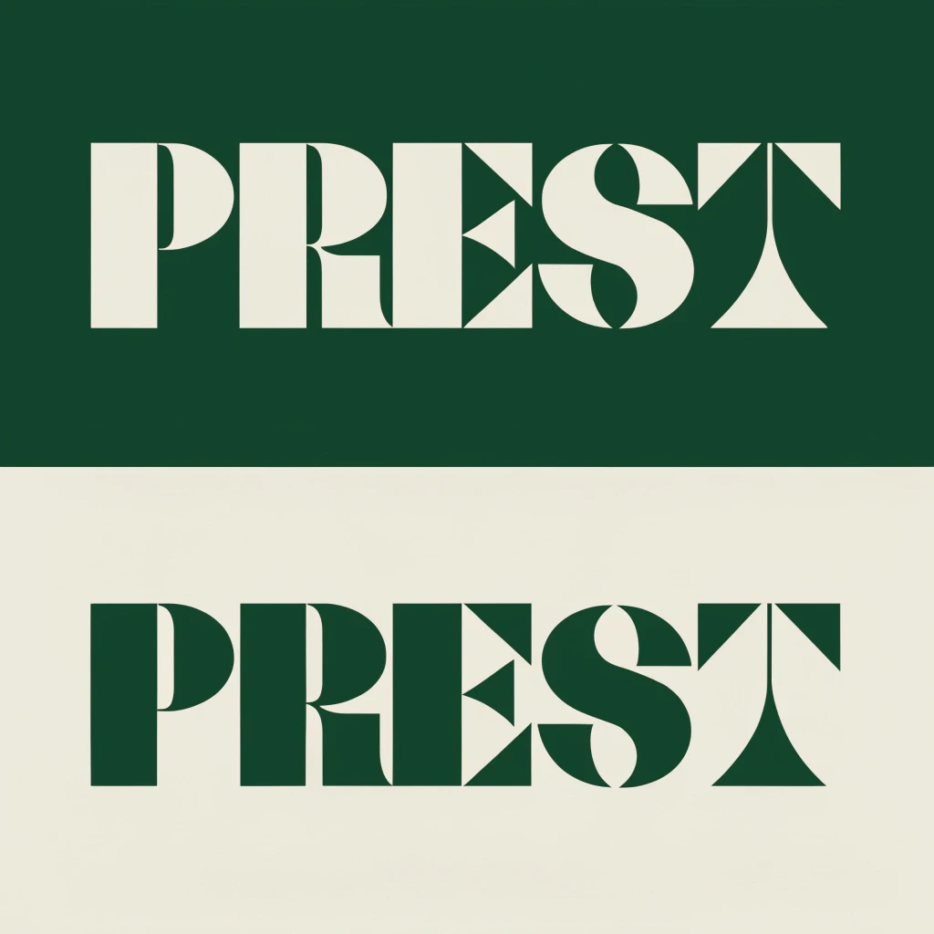
COLOR SYSTEM
Forest Green
#1D3D2A and Cream #ECEADB function as a material language across the system. Green carries the associations of canvas, felt, powder-coated steel, painted plaster, and cut grass. Cream carries paper, cotton, bone, and ivory. The same two colors read differently depending on the surface they're applied to — which means the palette never feels repetitive across fifteen touchpoints.STATIONERY
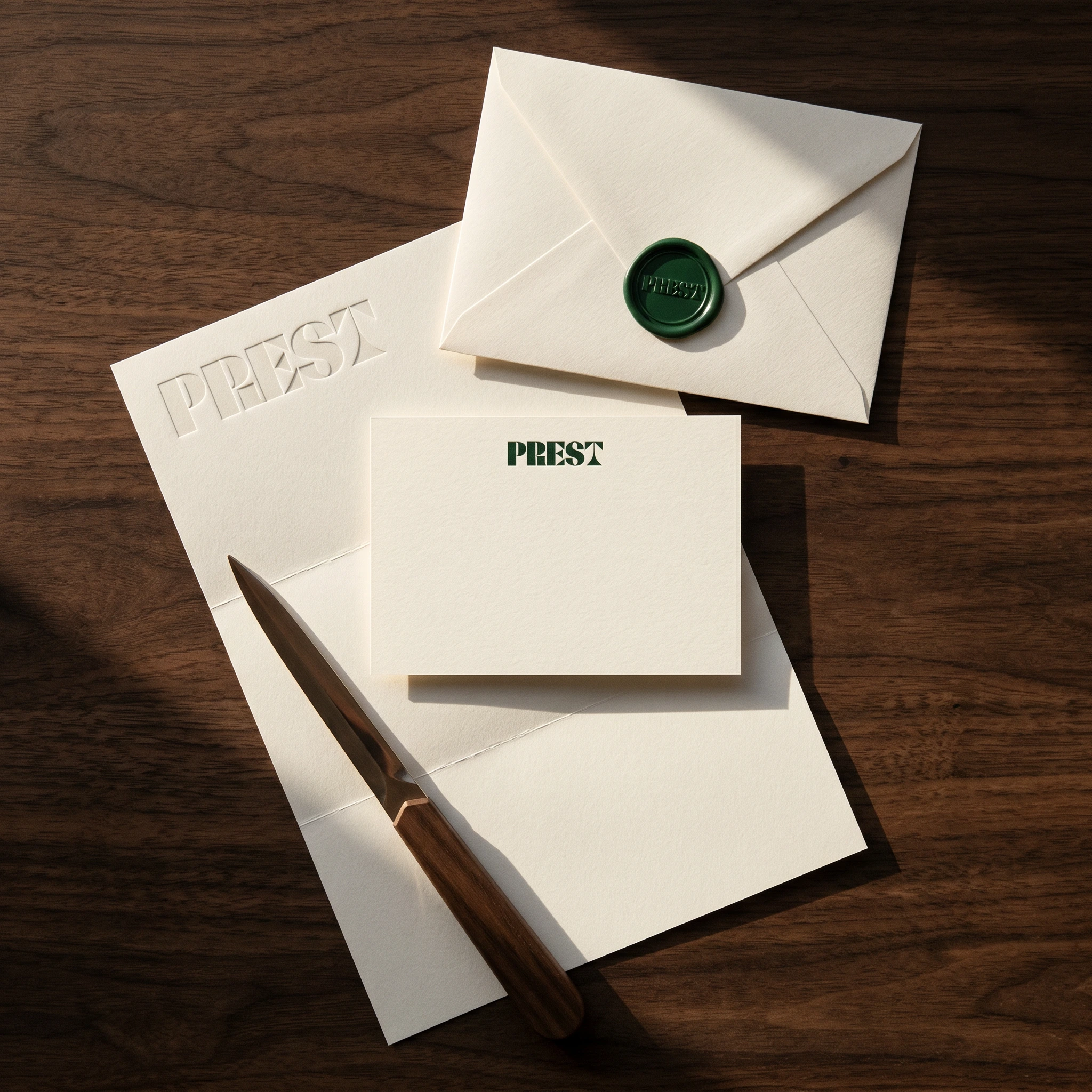
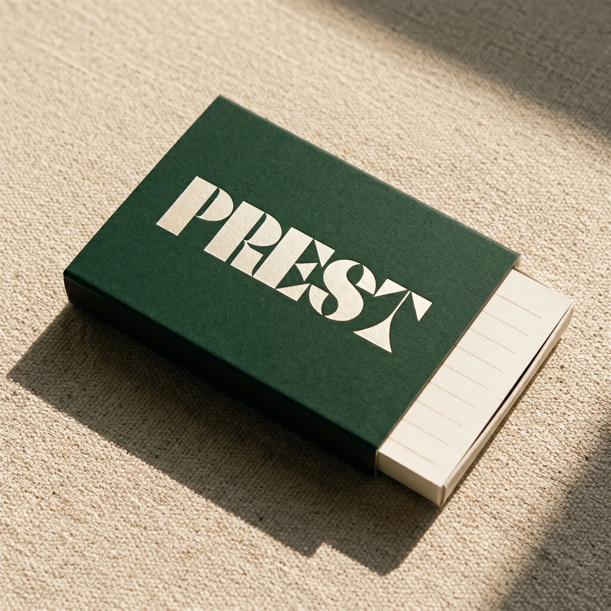
Three-piece system across letterhead, correspondence card, and envelope, all on uncoated cotton stock. The letterhead carries a blind-embossed wordmark — depth only, no ink, the brand physically present before a word is written. The correspondence card uses a Forest Green print at small scale, top-centered. The envelope closes with a Forest Green wax seal. The hierarchy is entirely tactile: you read the brand through your fingertips before your eyes process it.
MEMBER CARD
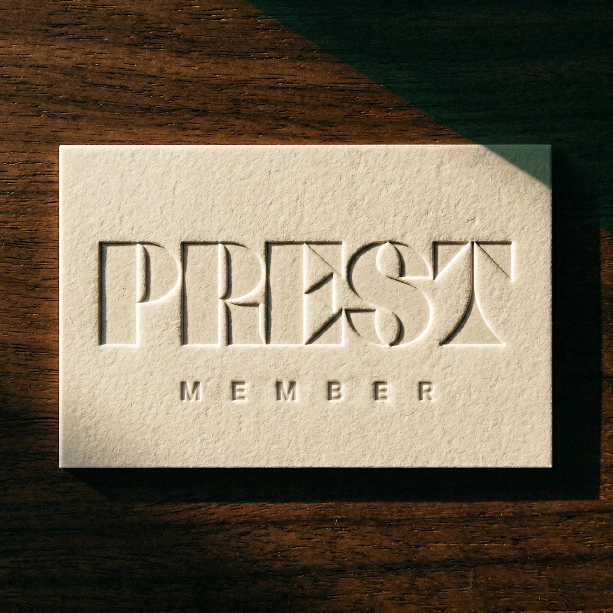
Thick cotton-stock card with the PREST wordmark blind-debossed — no fill color, counters reading as sharp shadow cuts in raking light. The word MEMBER set below in small spaced capitals, same technique. The card's only colors are the cream of the stock and the dark of the walnut surface it rests on.
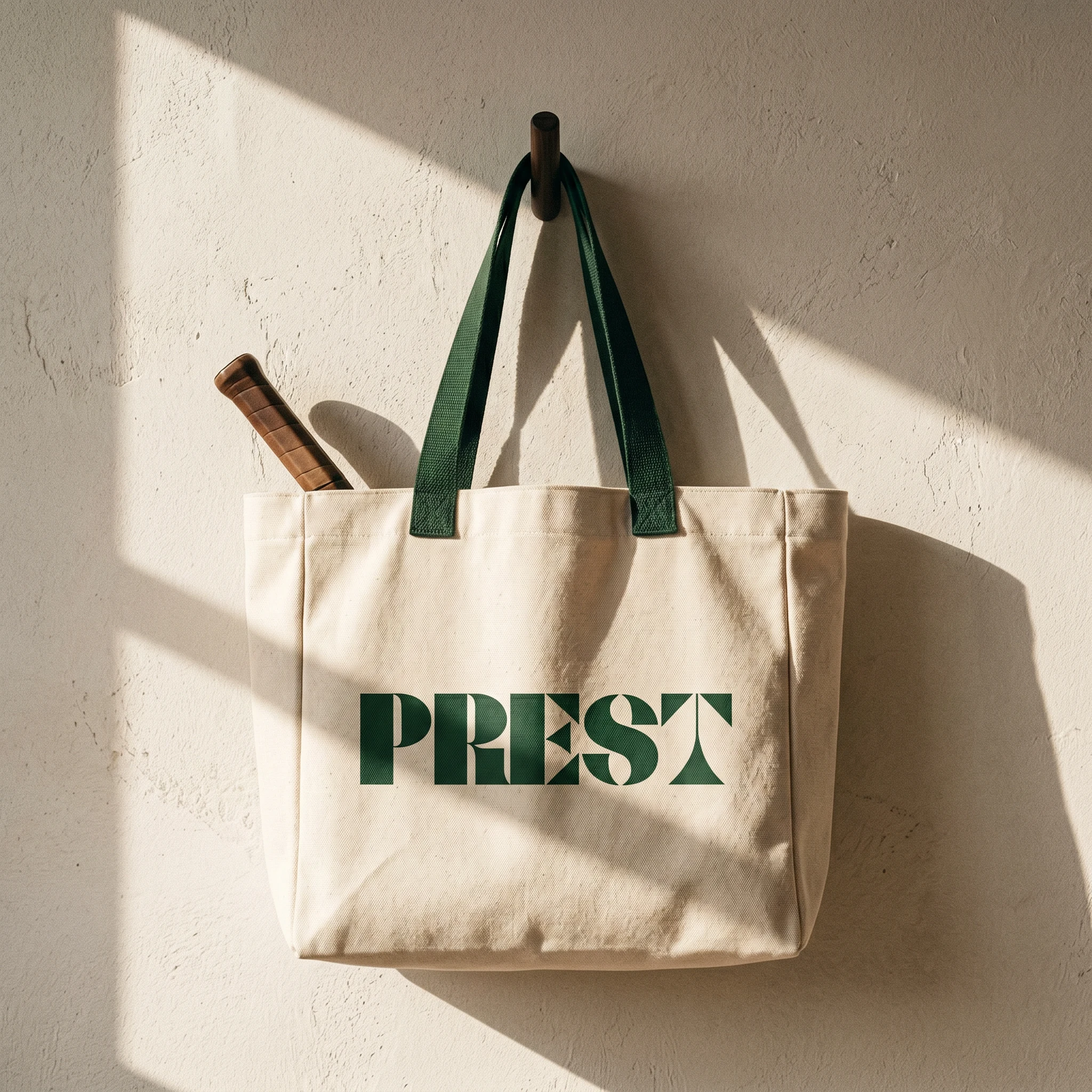
APPAREL
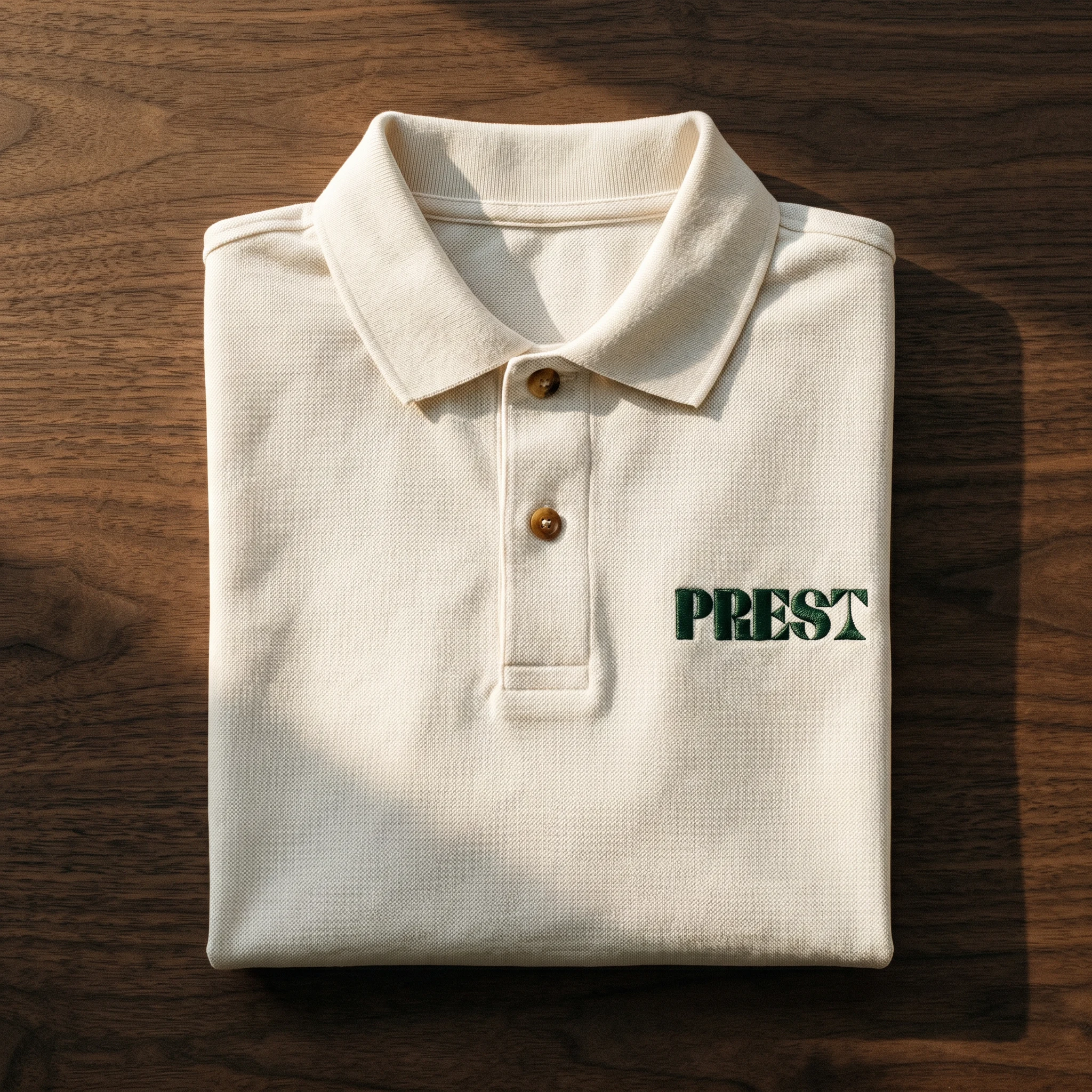
Heavyweight cream piqué polo with a Forest Green embroidered chest logo, approximately 6cm wide. Horn buttons. The embroidery thread is slightly raised — in raking light it catches like the debossed card does. The logo works at this scale for the same reason it works at gate-sign scale: the geometry is structural, not decorative, so it holds.
ENVIRONMENTAL SIGNAGE
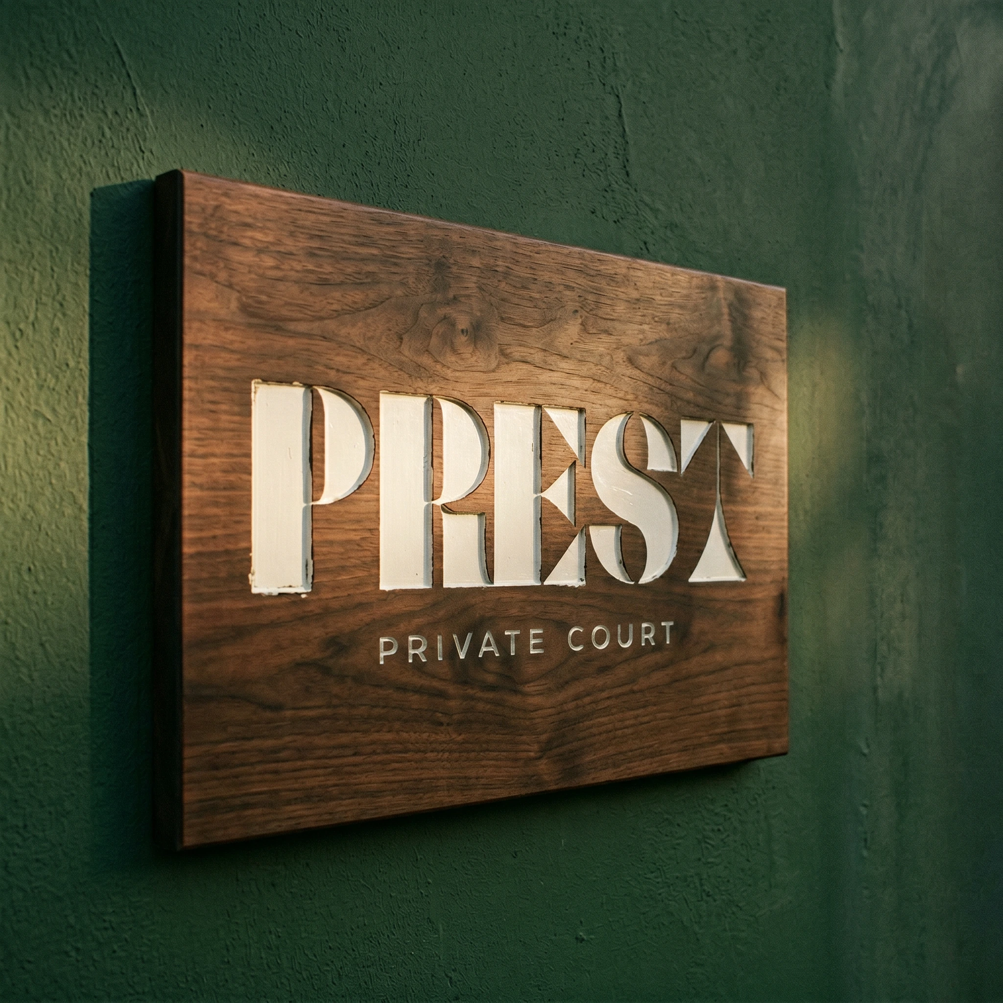
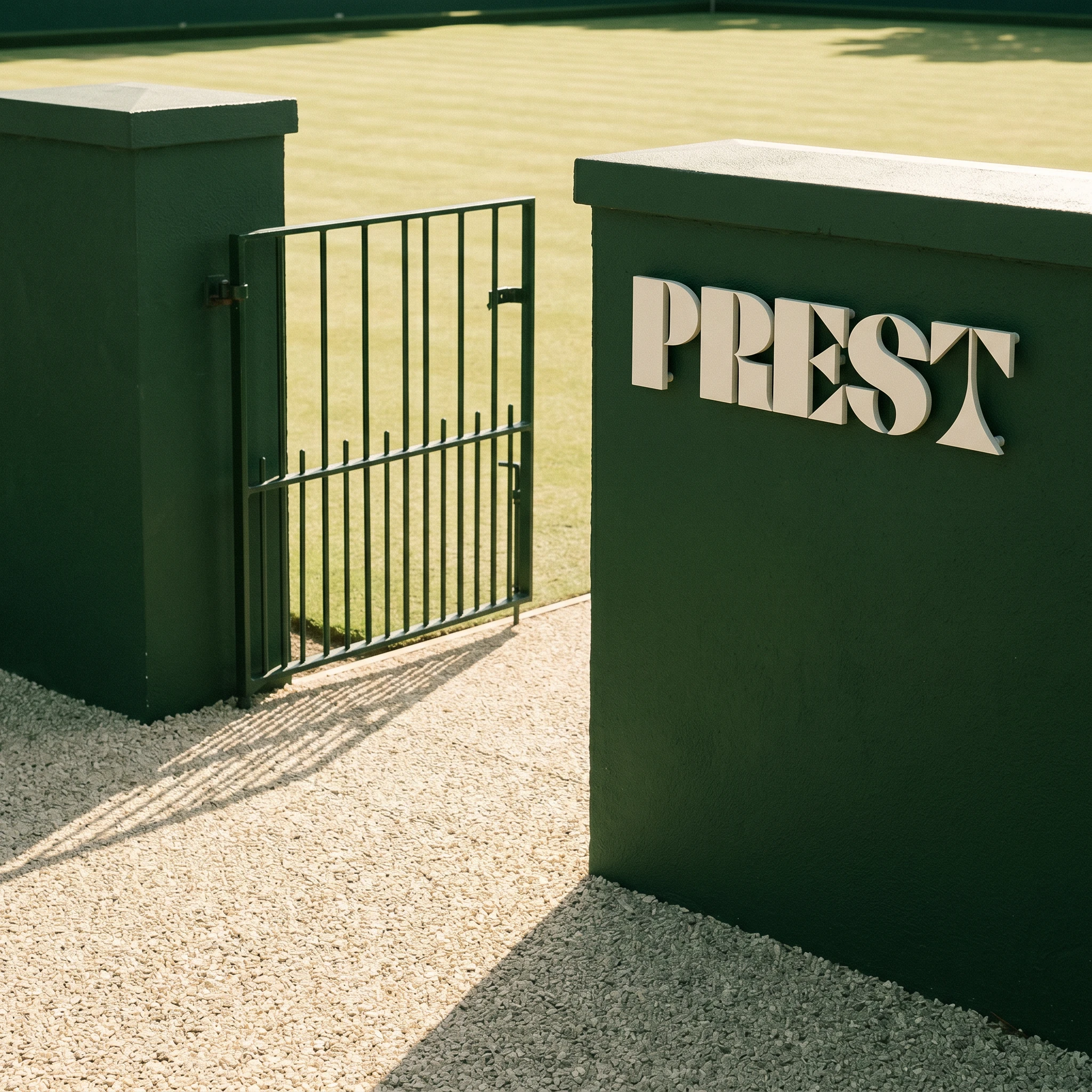
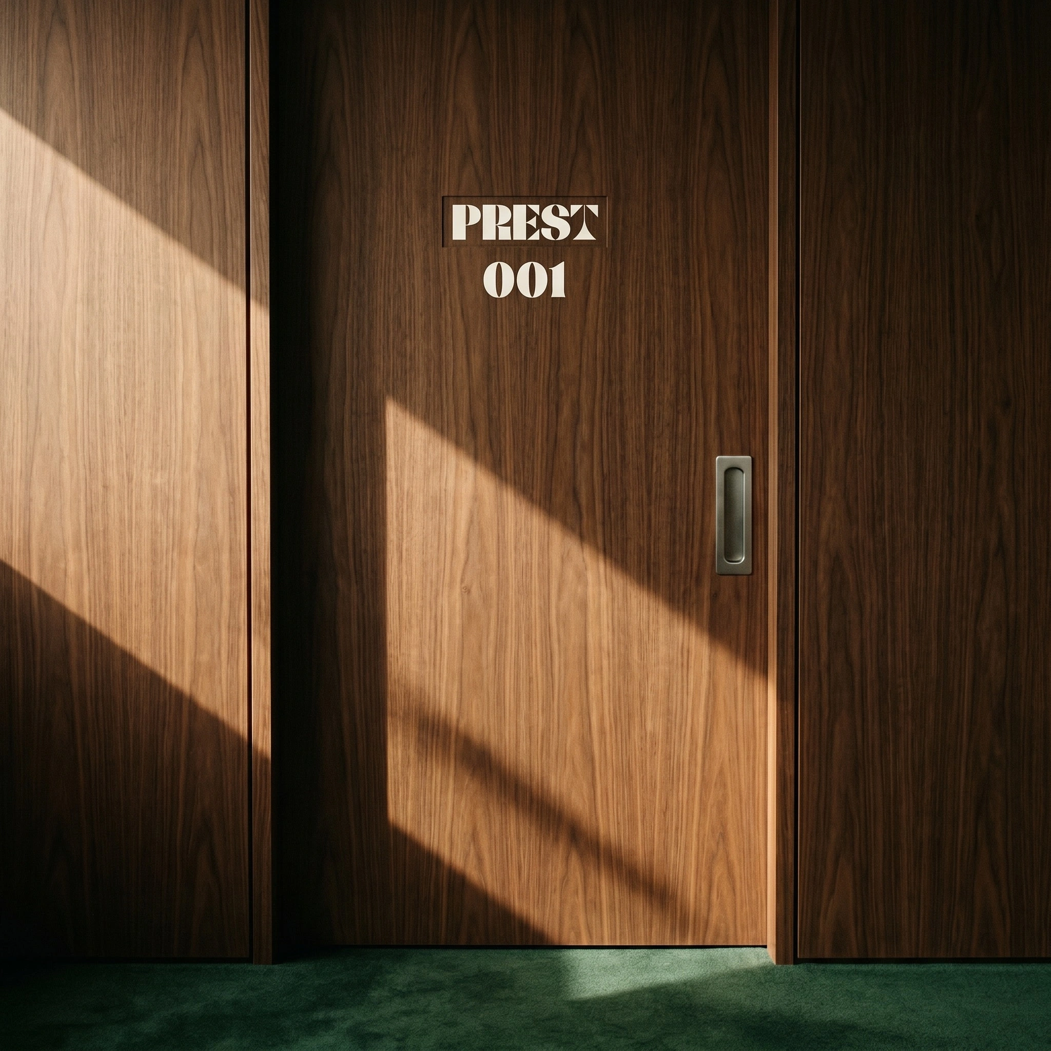
Two applications. The first: a dark walnut panel, router-carved and cream-filled, flush-mounted on a Forest Green rendered plaster wall — PREST PRIVATE COURT in carved letters, the brand operating as architecture. The second: individual three-dimensional cream metal letters bolted directly to a Forest Green pillar at a court entrance, shot with a grass court visible through the open gate behind. This is the brand at full environmental scale — no backing panel, no frame, just letters on a wall in natural light.
PRODUCT TOUCHPOINTS

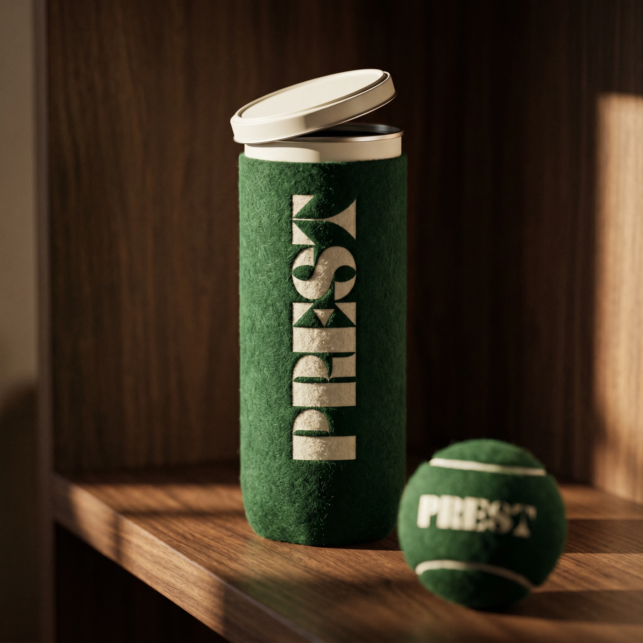
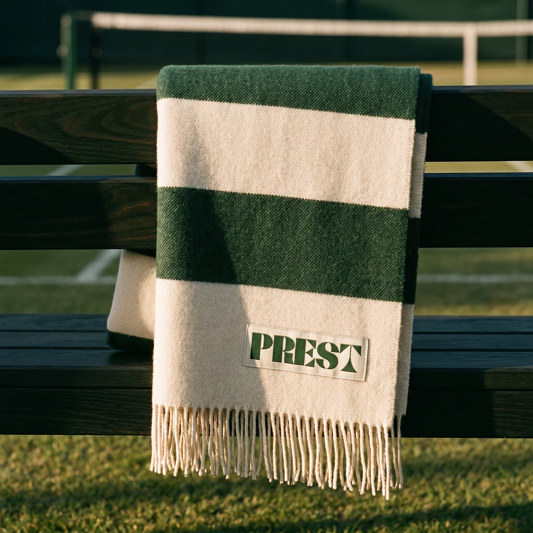
The wire ball basket — Forest Green powder-coated wire, cream tennis balls stamped with the PREST wordmark — is a direct reference to the DEWEY image that first anchored the project's visual world. The logo stamped on every ball at the same scale, readable from above, no other graphic language in the frame. The wool blanket uses a bold green-and-cream stripe system with a woven cream label patch carrying the wordmark, draped over a dark walnut bench courtside. The grip tape rolls are Forest Green with a cream paper band label — the logo as product packaging, as tight and functional as a price tag.
DIGITAL
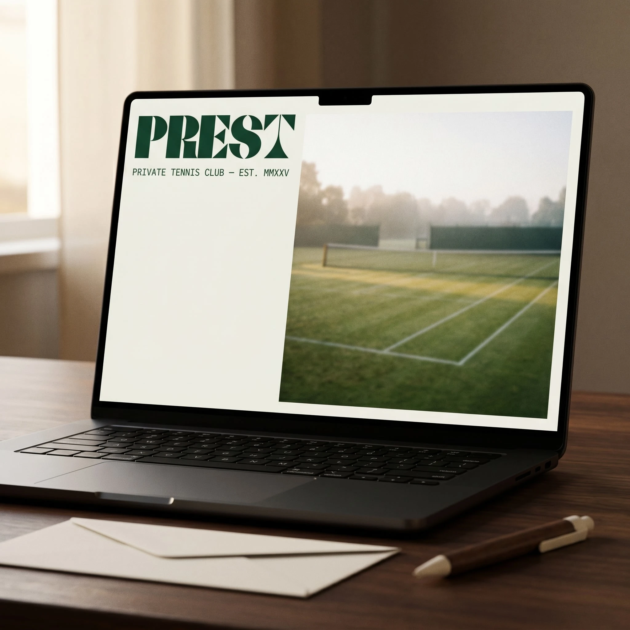
The website homepage translates the system directly: Cream background, Forest Green PREST wordmark at large scale top-left, PRIVATE TENNIS CLUB — EST. MMXXV in small spaced capitals beneath, a film-grain photograph of an empty grass court occupying the right two-thirds of the layout. No navigation, no hero copy, no call to action visible in the first view. The brand trusts that if you're here, you already know what this is.
The Result
PREST shipped as a complete brand identity system across fifteen touchpoints — environmental, product, apparel, stationery, and digital. The two-color constraint held across every application without a single exception or workaround. The system is proof that a material-first approach scales: the same logic that makes the member card work makes the gate sign work, because neither is relying on graphic decoration to carry meaning.
The court entrance image is the strongest single frame in the project. Natural light on cream letters against a Forest Green wall, a private grass court visible through the gate behind, gravel path in the foreground. It looks like a place that exists. That was always the real deliverable.
Révolté — revolte.design
Project: PREST Private Tennis Club
Year: 2026
Scope: Brand Identity, Logo Design, Visual System, Environmental Signage, Stationery, Apparel, Digital
Industry: Hospitality / Private Members Club
Like this project
Posted Apr 22, 2026
PREST, archaic English for "ready." Short, carved-sounding, not precious. It doesn't whisper the way most club names do. It lands.
Likes
1
Views
29
Timeline
Mar 18, 2026 - Apr 22, 2026