Built with Lovart
KŌRO: Brand Identity Design and Website for Japanese Whisky
Révolté
KŌRO — The Vessel Is the Brief
A Japanese whisky import brand that needed to exist in two worlds simultaneously. The answer wasn't to balance them — it was to find the one object that already did.
THE BRIEF
KŌRO is a specialty Japanese whisky importer and bar consulting operation. The brief was deceptively simple on the surface: build a brand that communicates Japanese precision to a Western audience without the usual cultural shorthand — no cherry blossoms, no brushstroke clichés, no half-translated aesthetics. The harder version of the same brief was this: build a brand that a Michelin-starred head bartender in London trusts on the same level as a collector in Tokyo. Those are not the same person. The brand had to hold both.
The consulting arm made it more complicated. This wasn't just a product brand — it was also a professional services identity. It needed the credibility of a consulting house and the tactile pleasure of a premium spirits label. Most brands resolve that tension by picking one register and gesturing at the other. I didn't want to do that.
What I took on was the full visual system: logo, color, typography, packaging, print collateral, campaign photography direction, and web. The scope was total. That was the point.
THE APPROACH
My first instinct was typographic duality — a brand that lived explicitly in translation, Japanese and Latin at equal weight. I spent time in that direction. It was conceptually tight and visually interesting, but it felt like it was explaining itself too much. Every time the kanji appeared alongside the wordmark, it read as a statement about cultural identity rather than a demonstration of it. I rejected it.
What I kept coming back to was the bottle. Not as a product, but as a structural logic. The vessel is the most honest object in the whisky world — it holds the thing, it labels the thing, it is the first and last impression of the thing. In Japanese product culture, the container is never incidental. The packaging is the product. That's not decoration, it's philosophy.
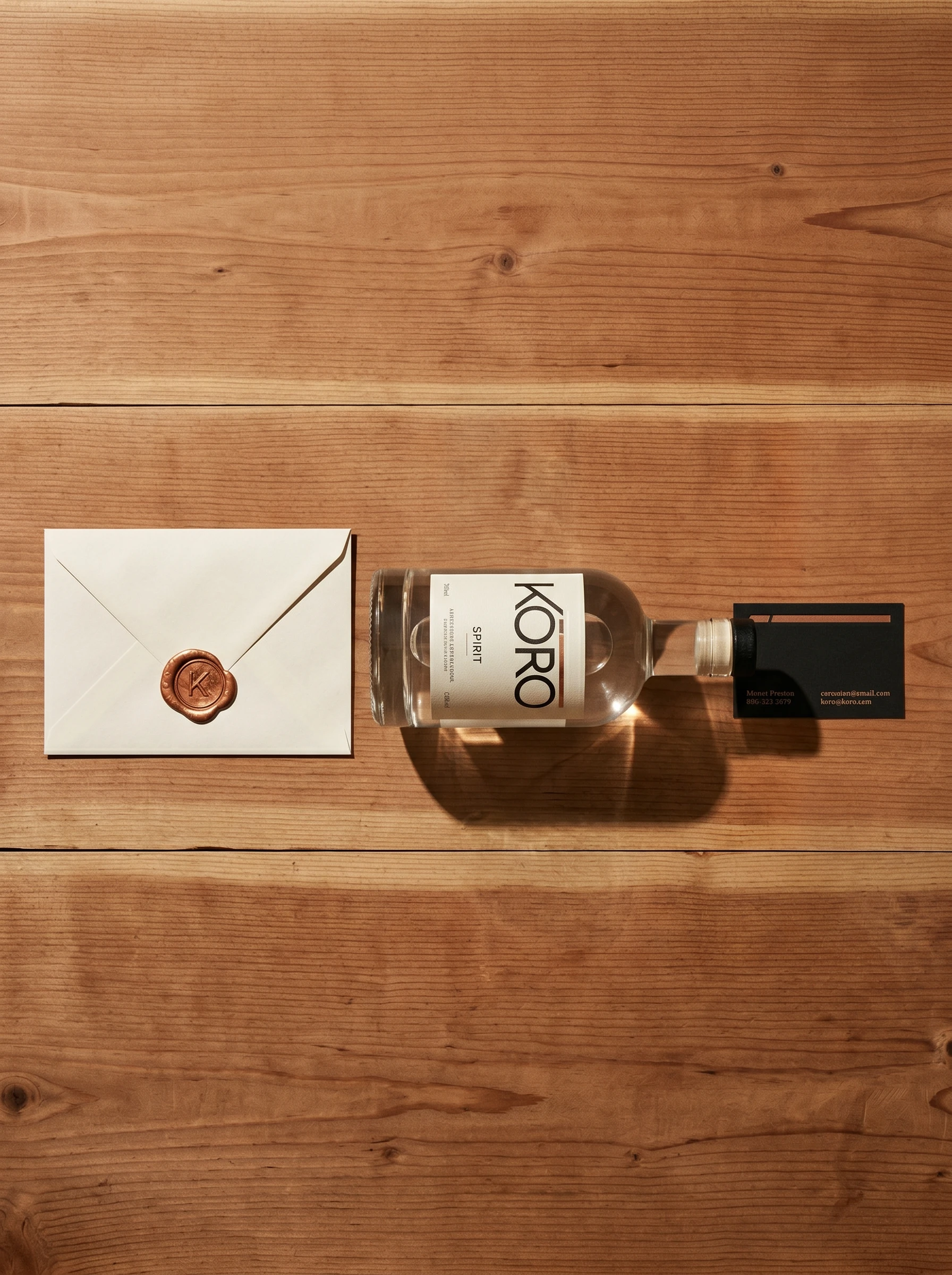
So I built the entire identity from the logic of the cylindrical label. A wordmark designed to wrap. A copper rule above the type that functions as the label's top edge — and when applied to a bottle, that rule becomes structural, not decorative. The system extended from there: business cards are miniature labels. The website hero is a scroll-reveal that mimics the experience of unwrapping. The shipper box lid has only the copper rule debossed on its exterior — the wordmark appears only inside, on the liner, when you open it. Every touchpoint is the act of revealing the vessel.
The typography followed the same logic. A precisely-tracked geometric sans for the wordmark — optically tightened, the letters behaving like a band around a cylinder. A monospaced serif for all provenance data: batch numbers, ABV, prefecture, year. The contrast between the two systems is the brand's personality. The geometric sans is confident and quiet. The monospaced serif is technical and honest. Together they read like a label that has nothing to prove.
THE WORK
LOGO
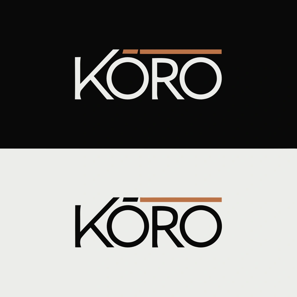
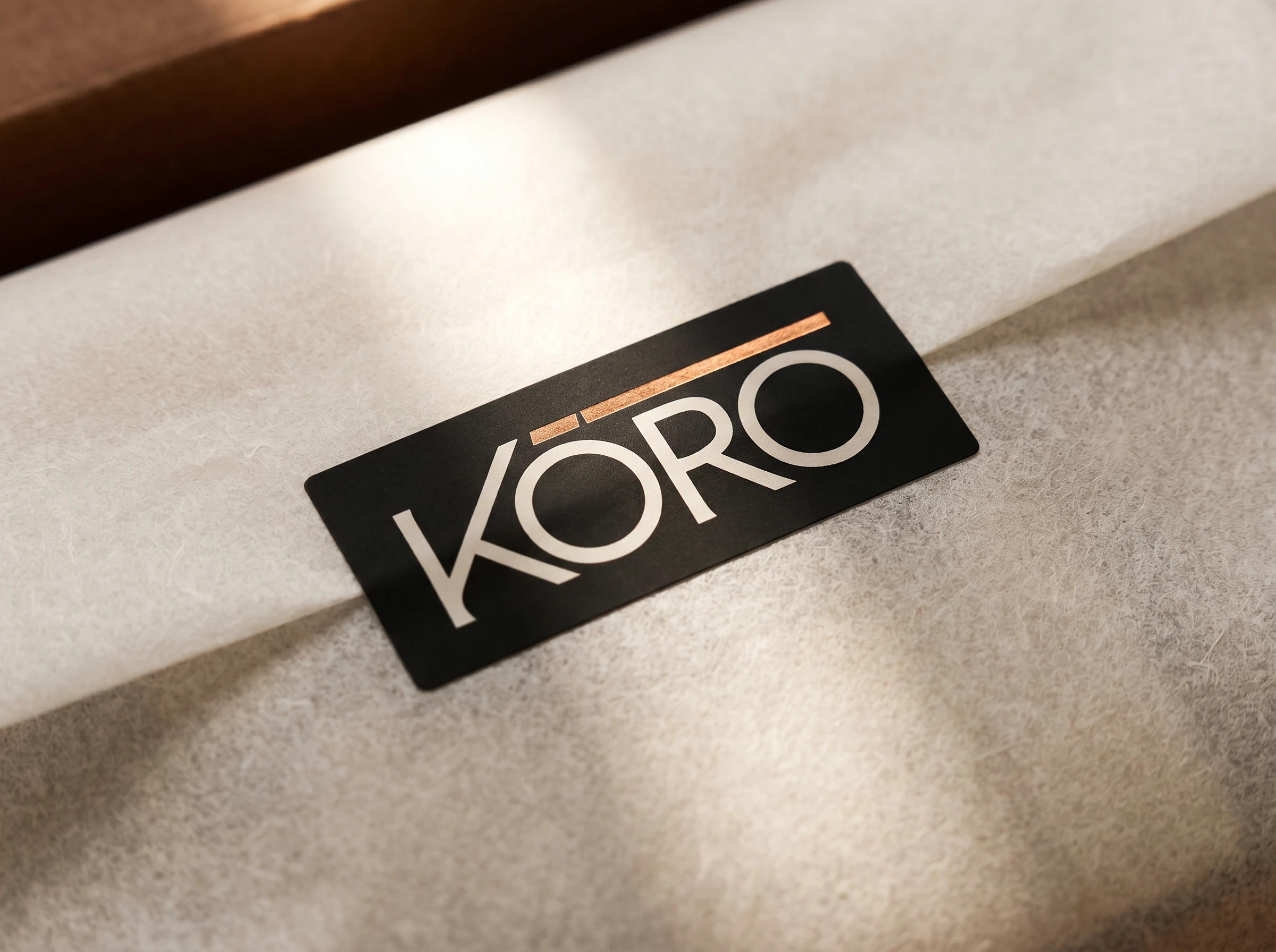
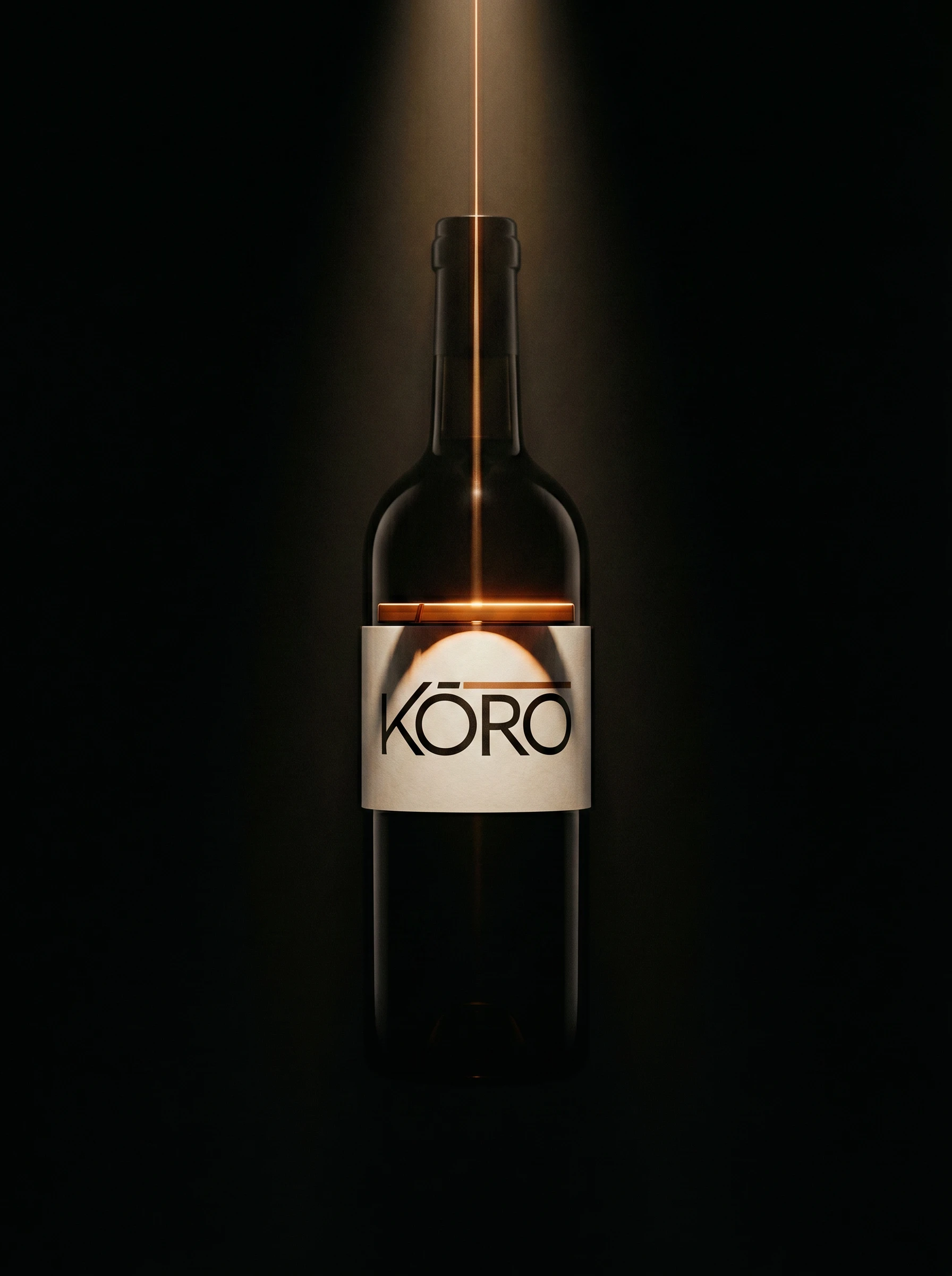
The Wrap is a single wordmark in all-caps geometric sans with a copper rule above it — the rule extending just beyond the natural width of the type, the macron on the Ō reinforcing the horizontal logic. Applied flat, it reads as a considered logotype. Applied to a cylindrical surface, the rule wraps continuously and the label becomes architecture. Both colorways — Rice paper
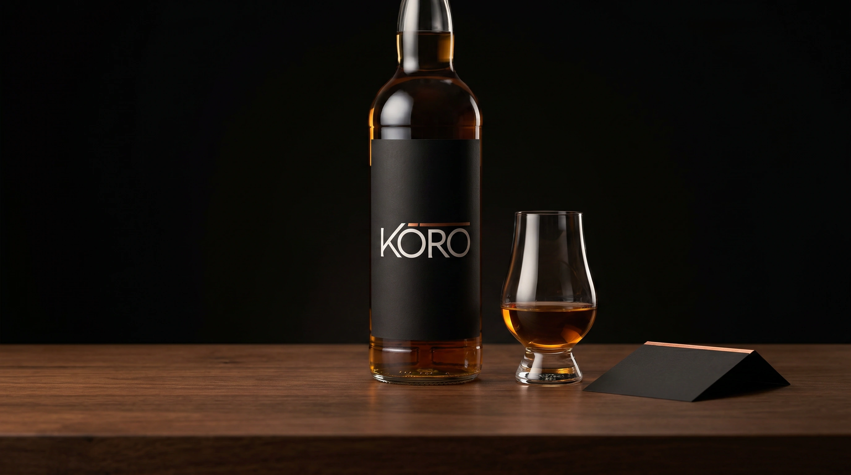
#F5F0E8 on Matte black #111111, and Ink on light — hold equally. The copper rule never changes color. It is always #B87333. That consistency is the mark's anchor point.COLOR SYSTEM
Five colors, strict hierarchy. Matte black
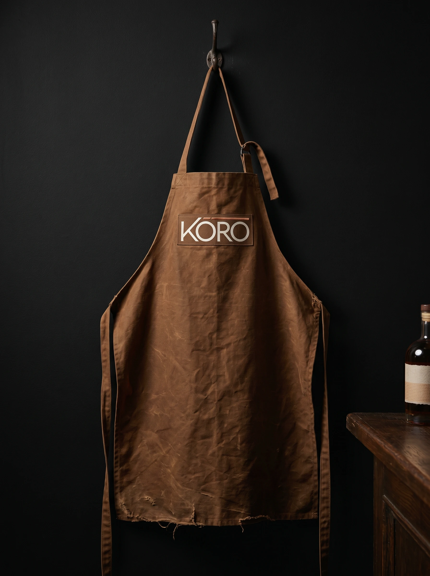
#111111 is the dominant substrate — it appears on the bottle, the primary business card face, the campaign backgrounds. Rice paper #F5F0E8 is the label surface and the light-mode ground. Aged copper #B87333 is the rule, the foil, the wax seal, the single metallic note in every composition. Cedar #8B5C3A is the material color — the shipper box board, the apron, the environmental warmth. Gold leaf #C9A84C appears only at scale or in premium finishing — foil embossing, seal variants. The system has a clear temperature logic: black and rice paper are neutral. Copper and cedar are warm. Gold is exceptional.PACKAGING
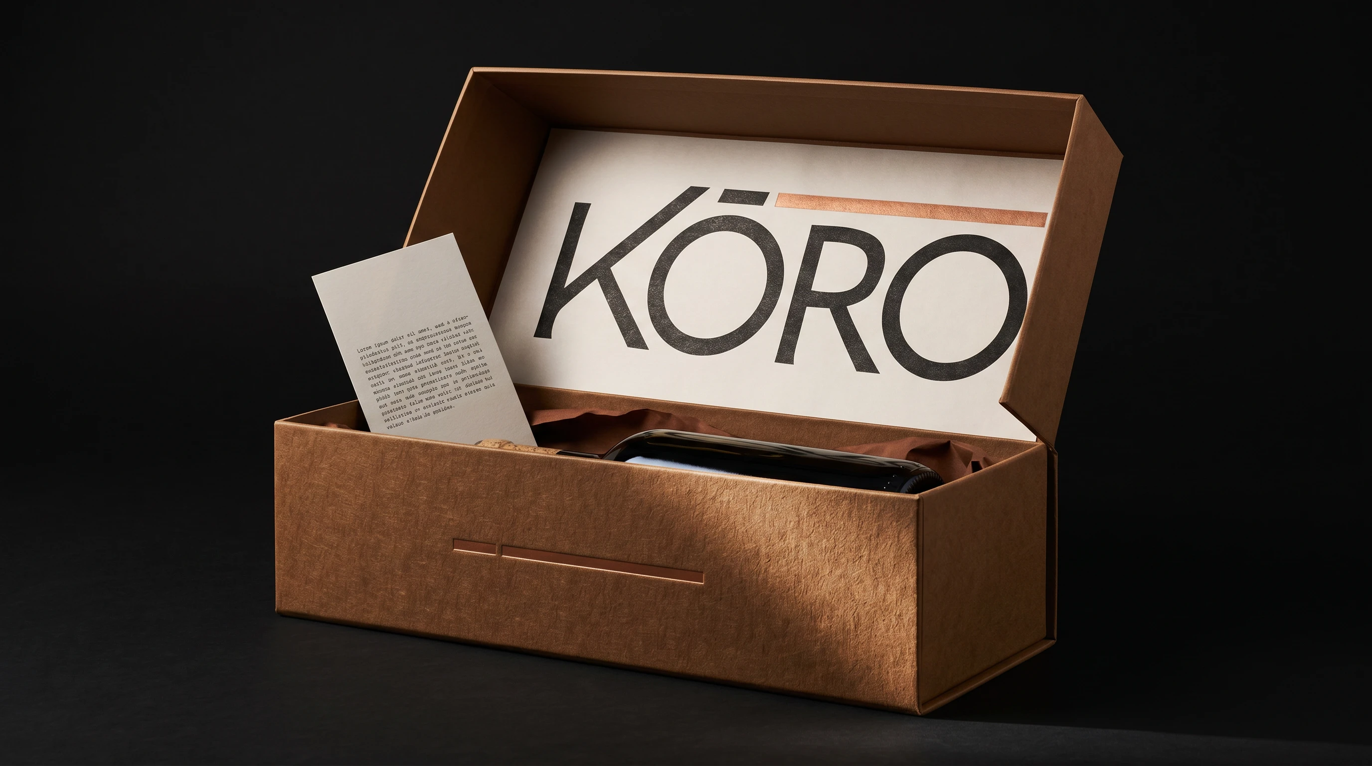
The primary bottle label is a clean rectangle of Rice paper on dark glass — no borders, no decorative elements. The copper rule spans the full label width and becomes the label edge. Below the wordmark: batch number, prefecture, ABV in monospaced serif at minimum size. The shipper box exterior shows only the debossed copper rule on the front face. The wordmark is inside, printed large on the Rice paper liner — it's the first thing you see when you open the box. The tasting card is a matte black rectangle, landscape, with the logo top-left and provenance data right-justified in monospaced type. The wax seal stamps the copper rule mark, not the full wordmark. Every physical touchpoint is a deliberate reduction of the system to its minimum legible form.
CAMPAIGN PHOTOGRAPHY
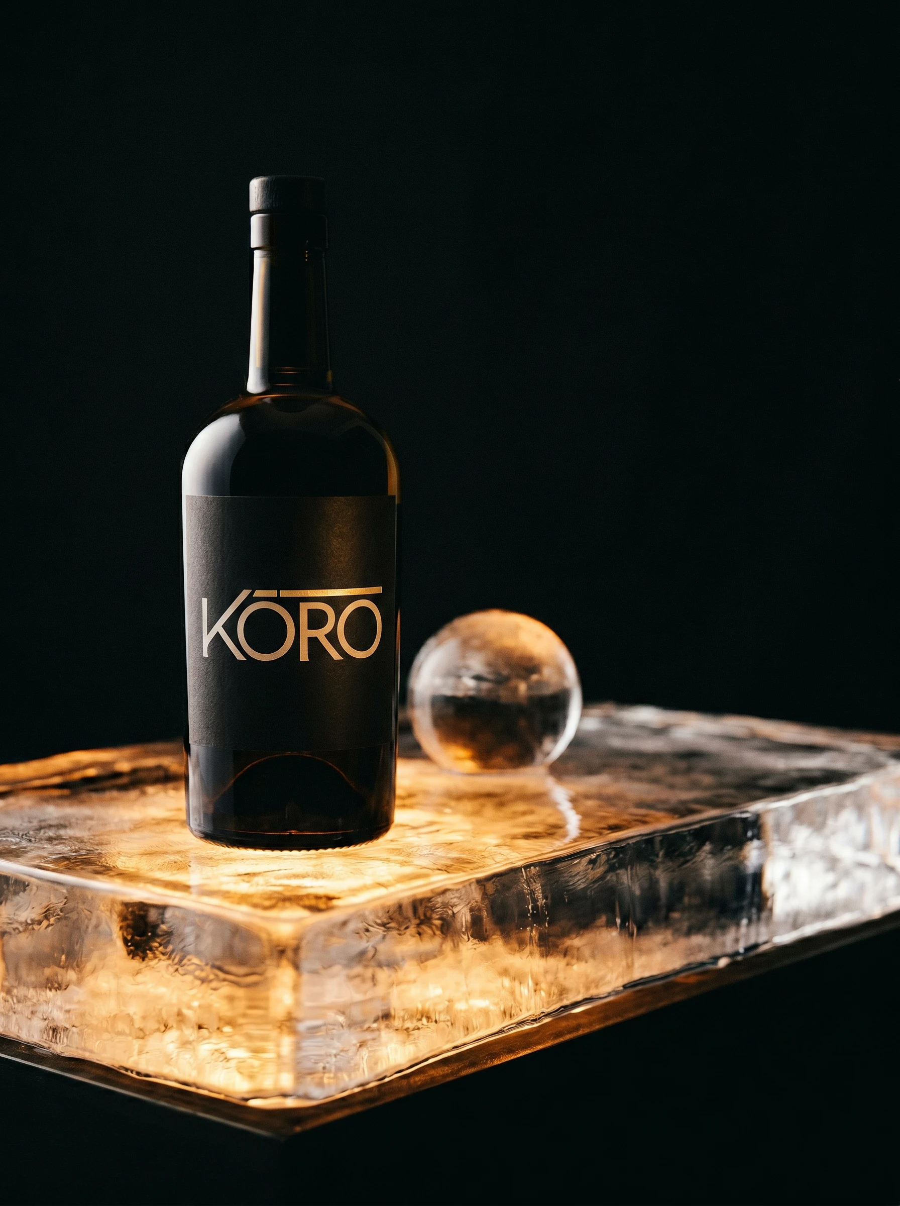
I directed five campaign images, each treating the bottle as a portrait subject. The visual language across all five: single-source directional light, matte surfaces, fine analog grain, no props that don't earn their place. The window light portrait — late afternoon, stone sill, hard shadow — is the brand's most human image. The ice slab shot is the brand at its most sculptural. The pour is the only image that implies motion. Together they form a campaign that doesn't feel like product photography. It feels like documentation of something that already existed.
THE RESULT
KŌRO is a speculative project — there is no client, no launch, no metrics to report. But the work is complete and the system holds. Every touchpoint is derived from the same logic. You can trace the copper rule from the logo to the label to the foil card to the wax seal and the system never breaks. That was the test I set myself at the start, and it's the test I'd apply to any real brief at the same level.
What I'm most satisfied with is how the brand sits in two registers simultaneously — the campaign images could run in a spirits trade publication; the packaging system would hold on a shelf next to Nikka and Hibiki. It doesn't explain its cultural references. It just embodies them.
Studio: Révolté — revolte.design
Project: KŌRO Brand Identity
Year: 2026
Scope: Brand Identity, Logo, Packaging, Print Collateral, Campaign Art Direction, Web Direction
Industry: Spirits / Import & Consulting
Like this project
Posted Apr 23, 2026
KŌRO, a Japanese whisky import brand that needed to exist in two worlds. The answer wasn't to balance them, it was to find the one object that already did.
Likes
2
Views
17
Timeline
Apr 13, 2026 - Apr 23, 2026

