Built with Lovart
NOCTREF Brand Identity Design
Révolté
NOCTREF — The System That Runs After Midnight
A brand built for the hours between midnight and 4am, when the world is quiet enough to actually think, and the only light in the room is a reading lamp.
THE BRIEF
The brief didn't come from a client. It came from a question I kept asking myself: why do the brands that exist around books always look like Sunday mornings? The bookshop aesthetic, the linen-and-coffee palette, the warm-and-approachable serif — none of it matches what it actually feels like to be alone with a book at 3am, fully awake, in a room that the rest of the world has forgotten about.
I wanted to build the brand for that experience instead. Not cozy. Not nostalgic. Not academic. A nocturnal reference library — precise, archival, slightly haunted — with a catalog that has been running since 1998 and sees no reason to stop.
The scope was total: name, logo, visual system, typography doctrine, color logic, and a full suite of physical objects that could exist as real products. The constraint I gave myself was absolute palette discipline and a binary typeface rule — two typefaces, two contexts, no exceptions.
THE APPROACH
I started with atmosphere and worked backward. The world I was designing for had a specific light source — a single amber desk lamp — and everything in the brand had to be calibrated for that light. Warm, but electric. Analog, but running on a system. The DOS aesthetic wasn't irony or nostalgia — it was the correct interface for a library that has never updated its catalog software because it has never needed to.
The first direction I explored leaned too warm. A catalog card as the primary logo form, humanist serif up front, amber everywhere. It looked good but it felt domestic — like a very designed version of the thing I was trying not to make. I rejected it because the warmth was coming from the wrong place. It was the warmth of a Sunday market, not the warmth of a terminal screen glowing in a dark room.
What unlocked everything was treating the Terminal Green cursor block not as a graphic element but as proof of life. The system is still running. That single pixel that blinks between receiving input and waiting for more — that was the logo. Everything else followed from there.
The palette rule I settled on was strict: Catalog Black (
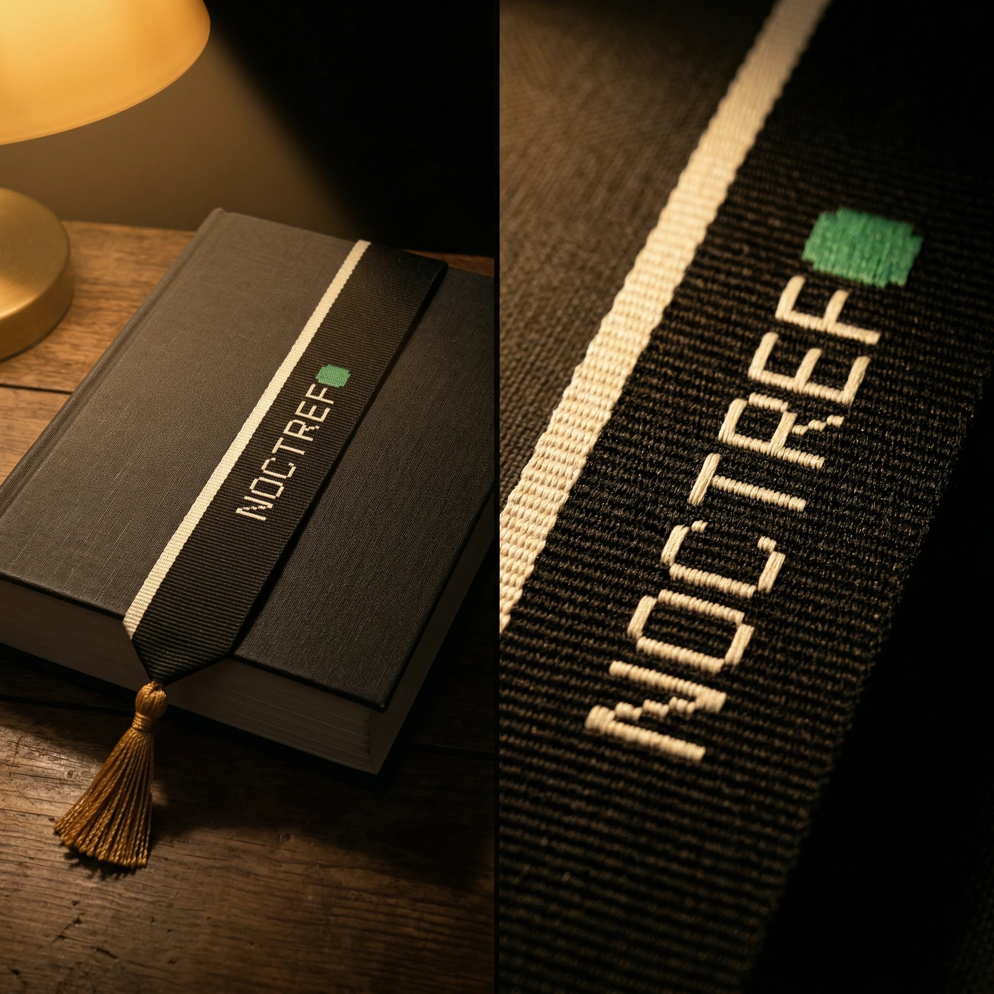
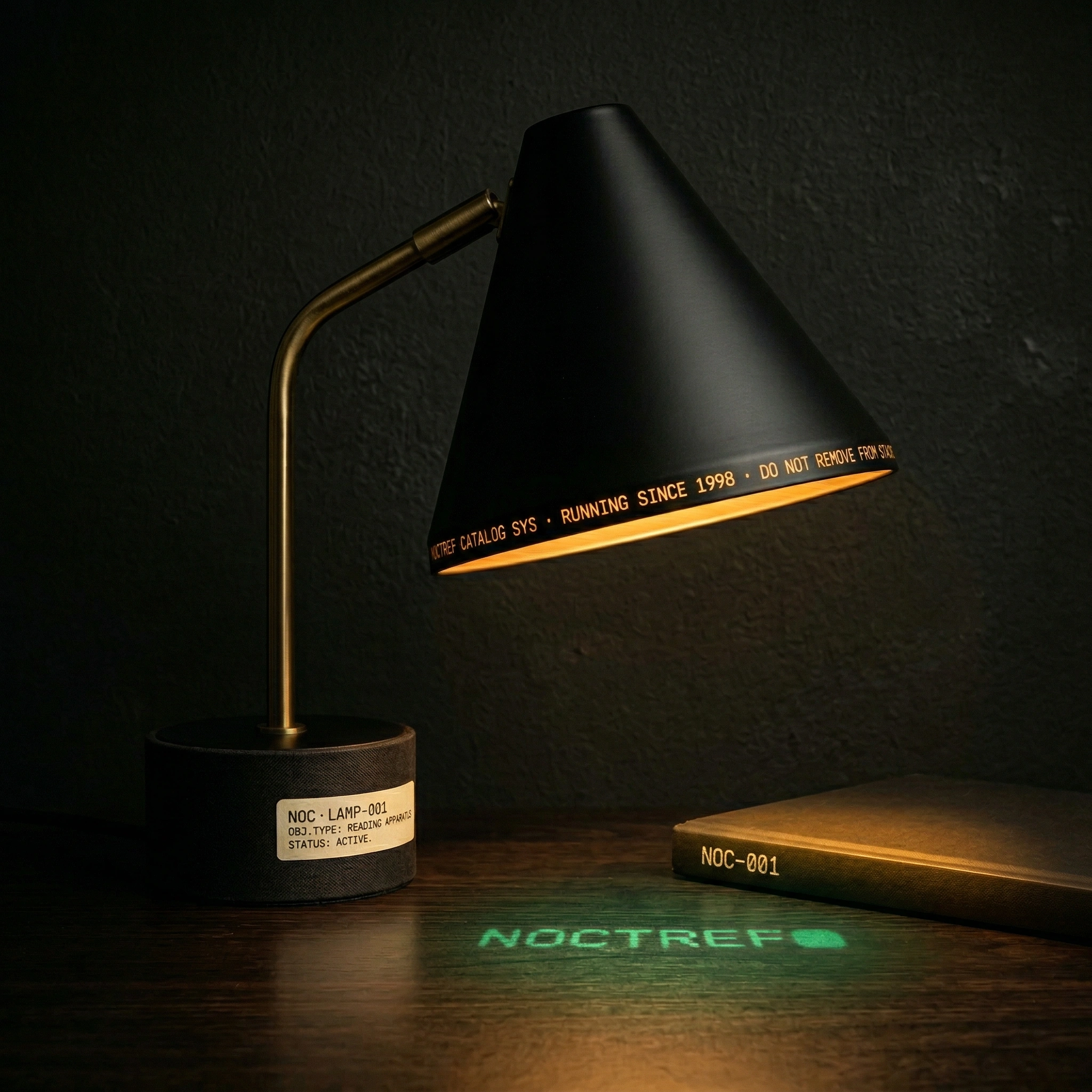
#0C0C08) is always the ground for the logo. Card Cream (#F0E8D0) is all print surfaces. Reading Lamp Amber (#C89040) is warmth — used for call numbers, rules, accent states, lamp light. Terminal Green (#40A060) is the only truly digital color in an otherwise analog world. Spine Gray (#808878) is structure. The five colors are not interchangeable. Each has one job.THE WORK
LOGO — THE TERMINAL CURSOR
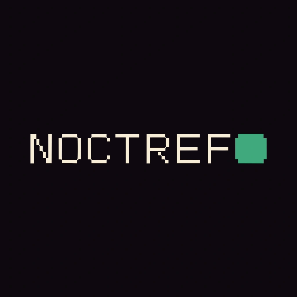
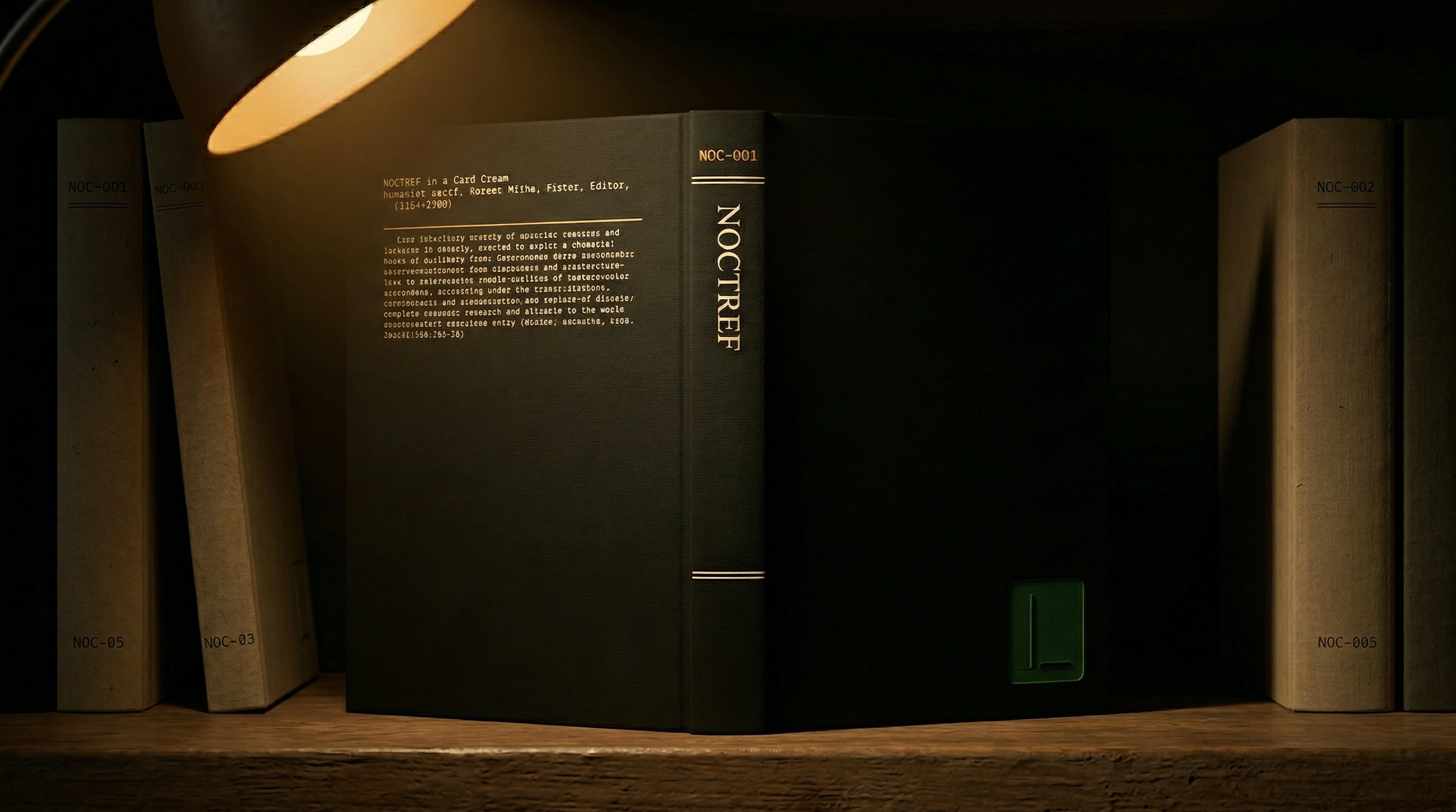
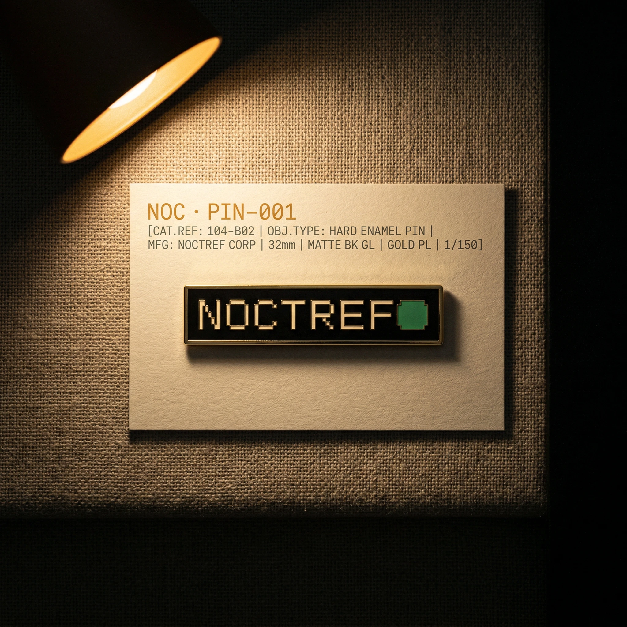
NOCTREF in IBM 3270 mono, all-caps, tracked at +200 — the equal mechanical spacing of the typewriter, intentional and unkerned. Followed immediately by a solid Terminal Green rectangle, 8x14px at reference size, proportioned to the character cell of an IBM terminal. No rounded corners. No outline. The cursor block is the punctuation mark, the heartbeat, the only thing that moves. In digital contexts it blinks at 1-second intervals. In print it is frozen mid-blink — caught. The logo never appears on a light background at full weight. The terminal needs its ground.
TYPOGRAPHY SYSTEM
Two typefaces. Two contexts. IBM 3270 or exact DOS mono equivalent owns all catalog, navigation, system, and reference language — call numbers, timestamps, running headers, catalog entries. A refined humanist serif owns all editorial and book content — cover titles, body copy, long-form text. They never share a layout at equal hierarchy. The serif leads or is absent entirely. The catalog and the book are different objects and the type system enforces that at every scale.
COLOR SYSTEM
Five colors, each with a single assigned function. Catalog Black (
#0C0C08) is the ground — not pure black, it carries faint warmth, as if the room has absorbed decades of lamp light. Card Cream (#F0E8D0) is all print surfaces — slightly aged, never clinical. Reading Lamp Amber (#C89040) is the warmth at the center of everything — call numbers, rules, active states, lamp-lit surfaces. Terminal Green (#40A060) is the cursor, the digital accent, the proof the system is live — used sparingly and never inverted. Spine Gray (#808878) is architecture — shelves, dividers, inactive catalog entries.PHYSICAL OBJECTS
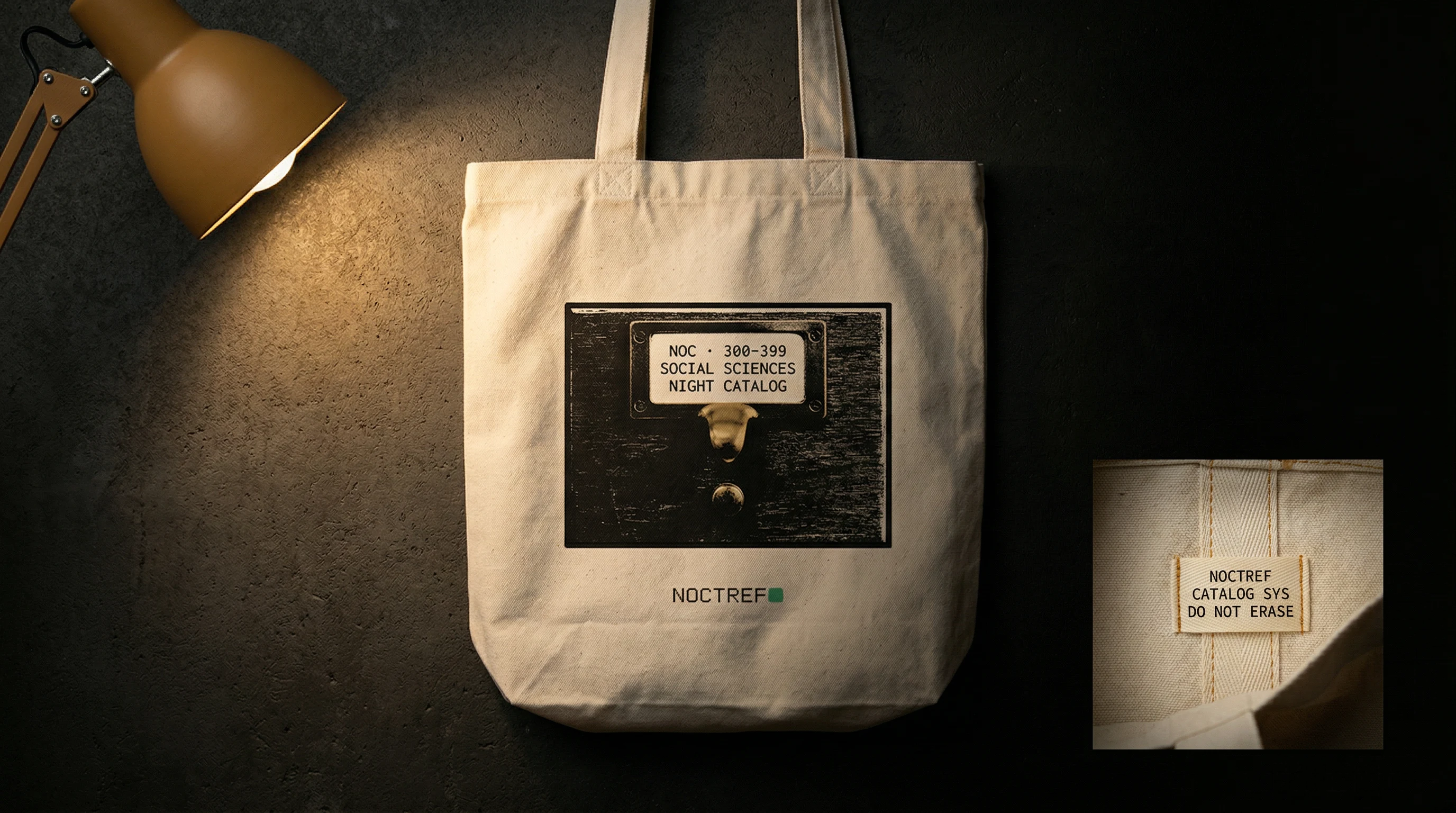
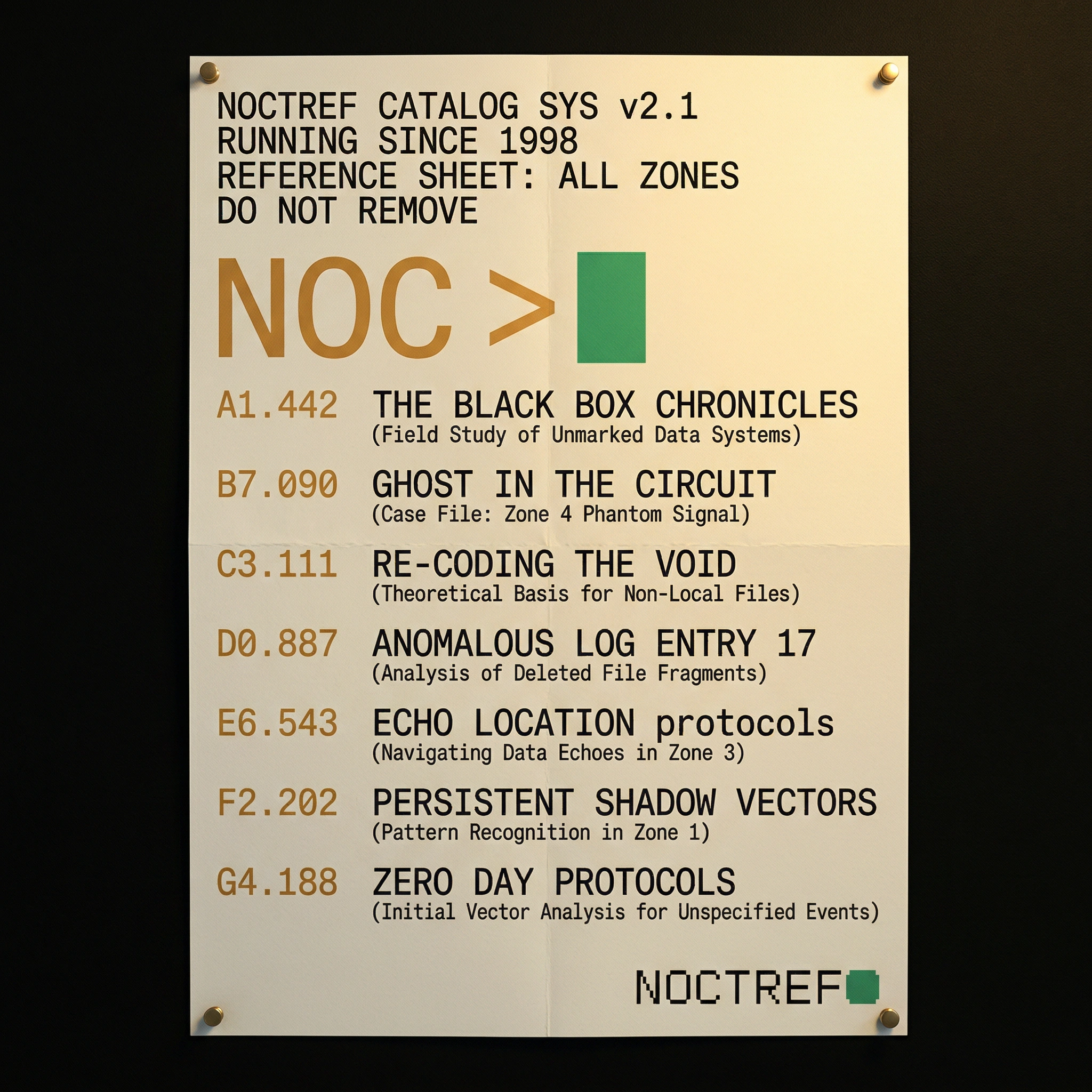
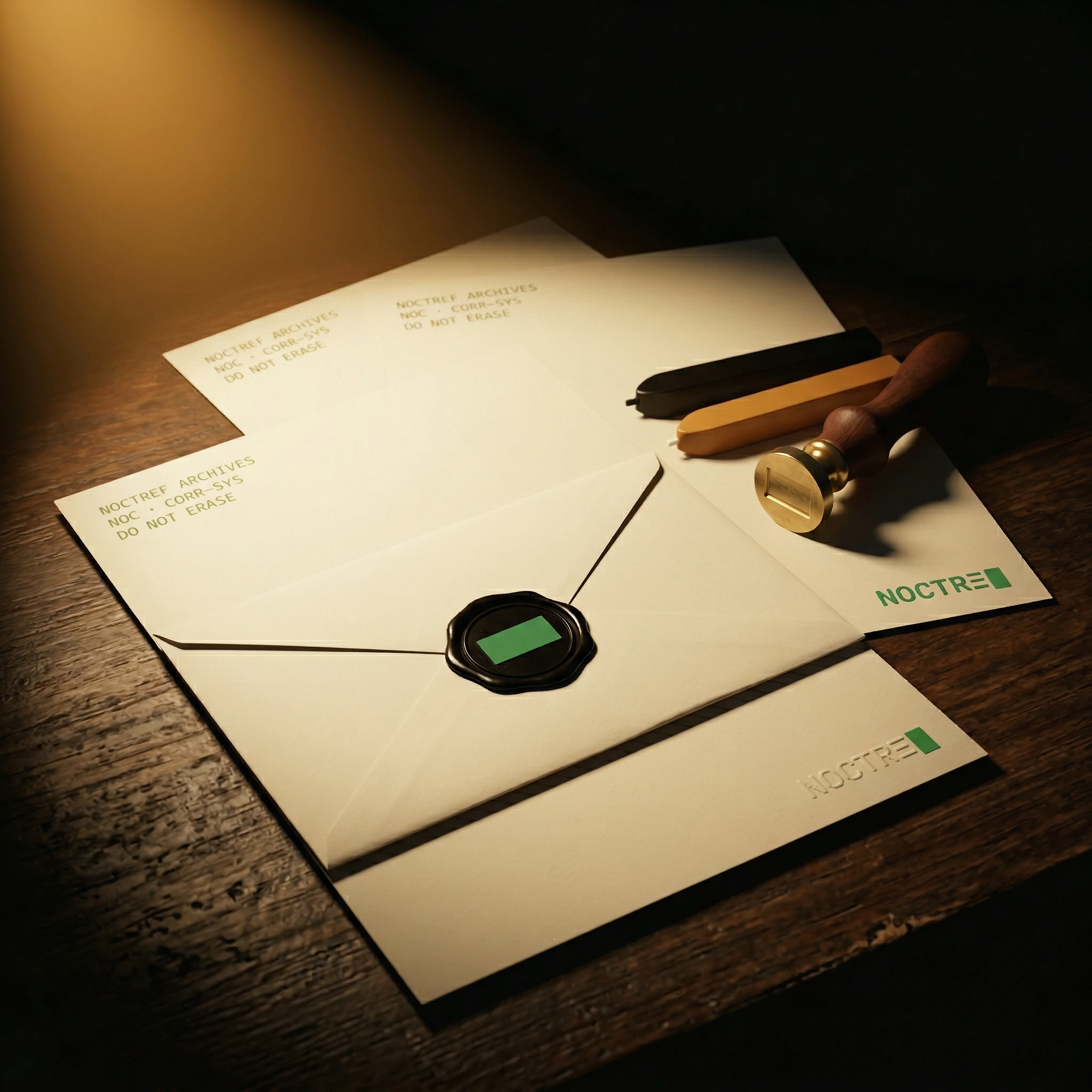
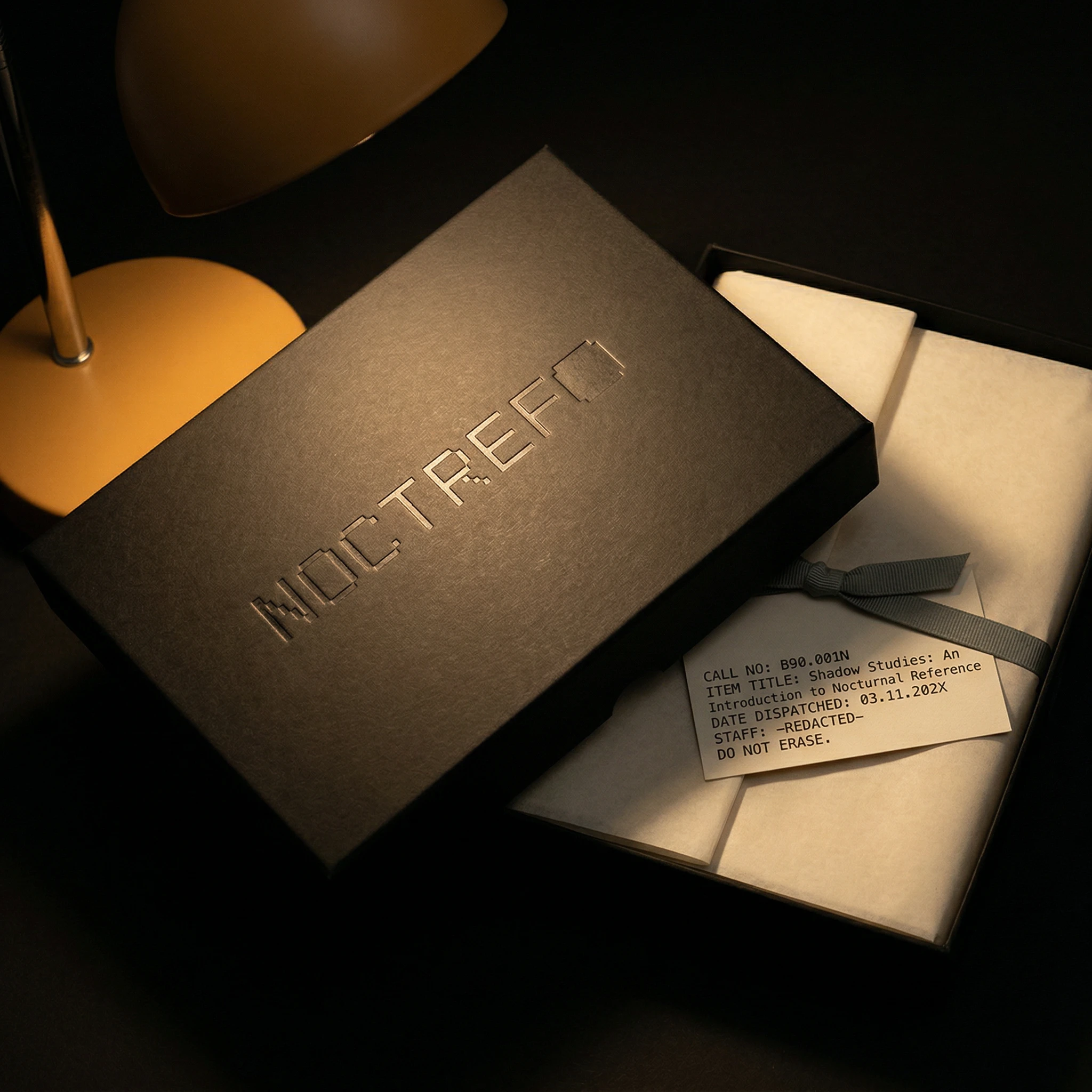
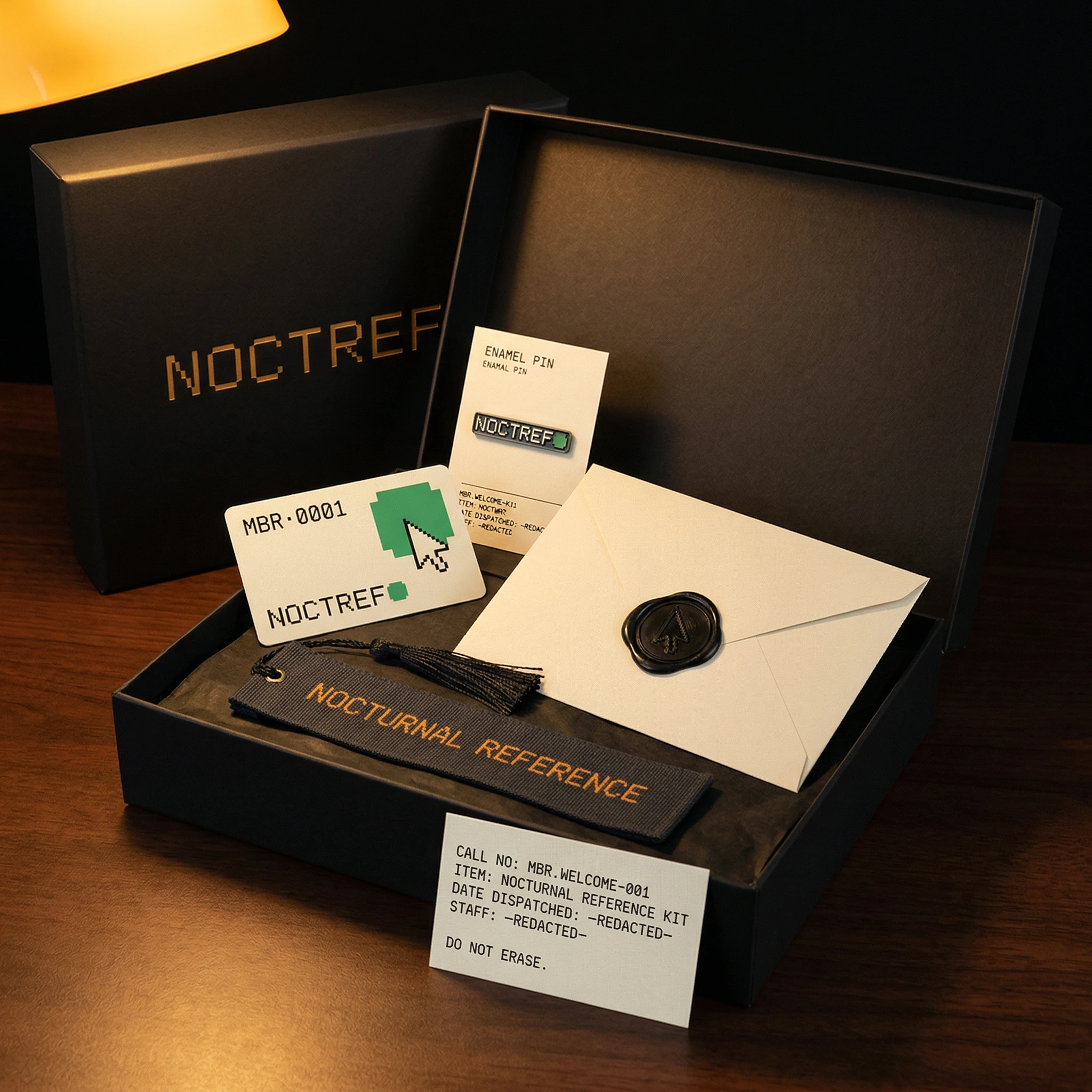
Fifteen objects across the full territory of the brand: membership card in matte black lacquer with a catalog entry label physically misaligned by specification, not accident. Hardcover book in midnight linen cloth with a Terminal Green cursor block debossed into the cover — no foil, pure texture. A cassette tape with a Card Cream label typed in DOS mono: NOC · AUDIO-001 / TITLE: SOUNDS FOR READING AFTER MIDNIGHT / DO NOT ERASE. A reading lamp with the brand's catalog string running along the interior rim of the shade in amber mono, the logo projected onto the desk surface below in Terminal Green. A membership welcome kit — matte black rigid box, debossed wordmark on the lid, containing enamel pin, woven bookmark, wax-sealed correspondence envelope, and a catalog card for the kit itself. A wax seal correspondence set where the seal stamp face is the Terminal Green cursor block — the only mark in the entire system made from pure wax.
Every object has a call number. Every object has a catalog entry. The brand is not a style applied to objects — it is a classification system that those objects belong to.
THE RESULT
This was a self-initiated project built to answer a question I couldn't find an existing answer to. What shipped is a complete brand system — logo, visual doctrine, physical object language — across fifteen mockups that cover membership, publishing, apparel, correspondence, environmental, and archival categories.
The system holds. Every object reads as part of the same catalog without needing the logo to say so. The amber lamp, the DOS mono, the Card Cream label applied at a 0.8-degree offset — these are not style decisions. They are system rules. That's the part I'm most satisfied with: the brand can generate new objects it hasn't made yet and they will still belong.
Révolté — revolte.design
Project: Noctref Brand Identity
Year: 2026
Scope: Brand Identity, Logo Design, Visual System, Typography, Color System, Physical Collateral, Art Direction
Industry: Independent Publishing / Editorial
See more at revolte.design
Like this project
Posted Apr 26, 2026
A nocturnal publishing brand built on one rule: the cursor proves the system is running. DOS mono, amber lamp, 15 objects, one catalog.
Likes
0
Views
14
Timeline
Mar 2, 2026 - Apr 10, 2026