Built with Lovart
Tessler & Co. Brand Identity Design
Révolté
TESSLER & CO.
Brand Identity & Website — Case Study
Overview
Tessler & Co. is a fictional tools and artisan brand built around a single conviction: things should be made to last, and when they don't, they should be repaired. In a market saturated with disposable products and seasonal refreshes, this brand operates as a quiet counterargument — anti-disposable not as a marketing angle, but as a founding philosophy.
This project was developed as a portfolio case study exploring how a strong conceptual direction, applied consistently across touchpoints, can produce a brand that feels genuinely inhabited rather than designed. Every decision — from the typeface weight to the wax seal color — was made in service of that one idea: dignity through longevity.
The Brief
Design a complete brand identity for a multigenerational tools and repair workshop. The brand should feel like it has existed for over a century without feeling nostalgic or costumey. It must work at every scale — from a rubber stamp impression to a shopfront fascia — and communicate authority, warmth, and craft without using any of the clichés those words usually produce.
The target audience is not hobbyists or lifestyle consumers. It is people who buy something once, take care of it, and expect it to outlast them.
Naming

The name Tessler & Co. was chosen for its suggestion of a multigenerational family business — a founder's name that implies a workshop that has passed through hands. The ampersand is doing real work here: it signals continuity, partnership, and the idea that no craftsperson works alone. The "& Co." suffix adds institutional weight without grandeur. It sounds like a place with a phone number that hasn't changed since 1960.
Creative Direction
The visual language draws from three source references that rarely appear together: industrial maintenance manuals, European trade guild marks, and the functional typography of mid-century engineering documentation.
The brand does not romanticize the past. It learns from how things were built. The worn quality of the materials and surfaces in every application is earned — not simulated with artificial aging filters or faux-distress treatments. Photographs are lit by a single practical source. Surfaces are real. Hands appear mid-task, never posed.
The result is a brand that feels simultaneously old and completely contemporary — because the values it represents have always been contemporary. Craft doesn't age.
Logo
The chosen mark is the Inspection Stamp — a circular emblem constructed with a double-rule border. TESSLER & CO. runs along the top arc, EST. 1914 along the bottom. The center element is an abstract ratchet tooth pattern: five interlocking angular blades arranged in a half-circle, referencing mechanical rotation and the perpetual motion of maintenance. At small sizes it reads as a pure abstract mark. At large sizes its mechanical origin becomes legible.
The mark is deliberately versatile across application methods. It performs equally well as a screen print on canvas, an embossed leather patch, a rubber stamp impression, a window vinyl decal, and a woven back-patch. This was a design constraint built into the logo from the start — every proposed mark was tested against all of these surfaces before selection.
Single-color always. Lamp Black or Cream Linen. The Oxide Red version is reserved for physical stamp applications only.
Color Palette

Lamp Black — #1A1A18
The primary color. Not pure black — it carries warmth, like iron that has been in a workshop for forty years. Used for type, borders, and all structural elements.
Cream Linen — #EDE8DC
The primary background. Everything that needs to feel handled, printed, and physical. Always paired with Lamp Black.
Oxide Red — #A83228
Used only when earned. Warning markings, rubber stamps, the PAID impression on an invoice, the wax seal. Never decorative.
Machinery Grey — #6B6B6B
Mid-tones, secondary labels, inactive states. The color of metal that has been in regular use for a decade.
Safety Yellow — #F2C12E
The accent. Used sparingly and with full intention — a stripe, a sticker, a single highlight. Appears twice across the entire system: the twine on the parcel, the patch border on the work jacket. If it appears more than that, it has lost its meaning.
Typography
Primary — Heavy industrial slab serif, optically corrected. Used for the wordmark, all headlines, and any moment requiring authority. Set in Lamp Black or Cream Linen only, never in any other color.
Secondary — Barlow Condensed Regular and Medium. The workhorse typeface. Body copy, captions, part numbers, specifications, labels. Set tight, small, and efficient. Never used decoratively.
Accent — IBM Plex Mono. For serial numbers, dates, measurements, and any content that behaves like data. This is the typeface on the tags, stamps, and inspection stickers.
The hierarchy rule is simple: headlines are large and few. Body copy is small and dense. Nothing competes. The page breathes through white space, not type variation.
Brand Voice
Write like a master craftsperson explaining something to an apprentice. Precise, direct, generous with knowledge, and completely free of marketing language. The brand never uses the words innovative, sustainable, journey, or passion. Technical language appears accurately, never decoratively. Instructions read like instructions. Copy reads like it was typed on a machine that cost more than the computer that replaced it.
Touchpoints
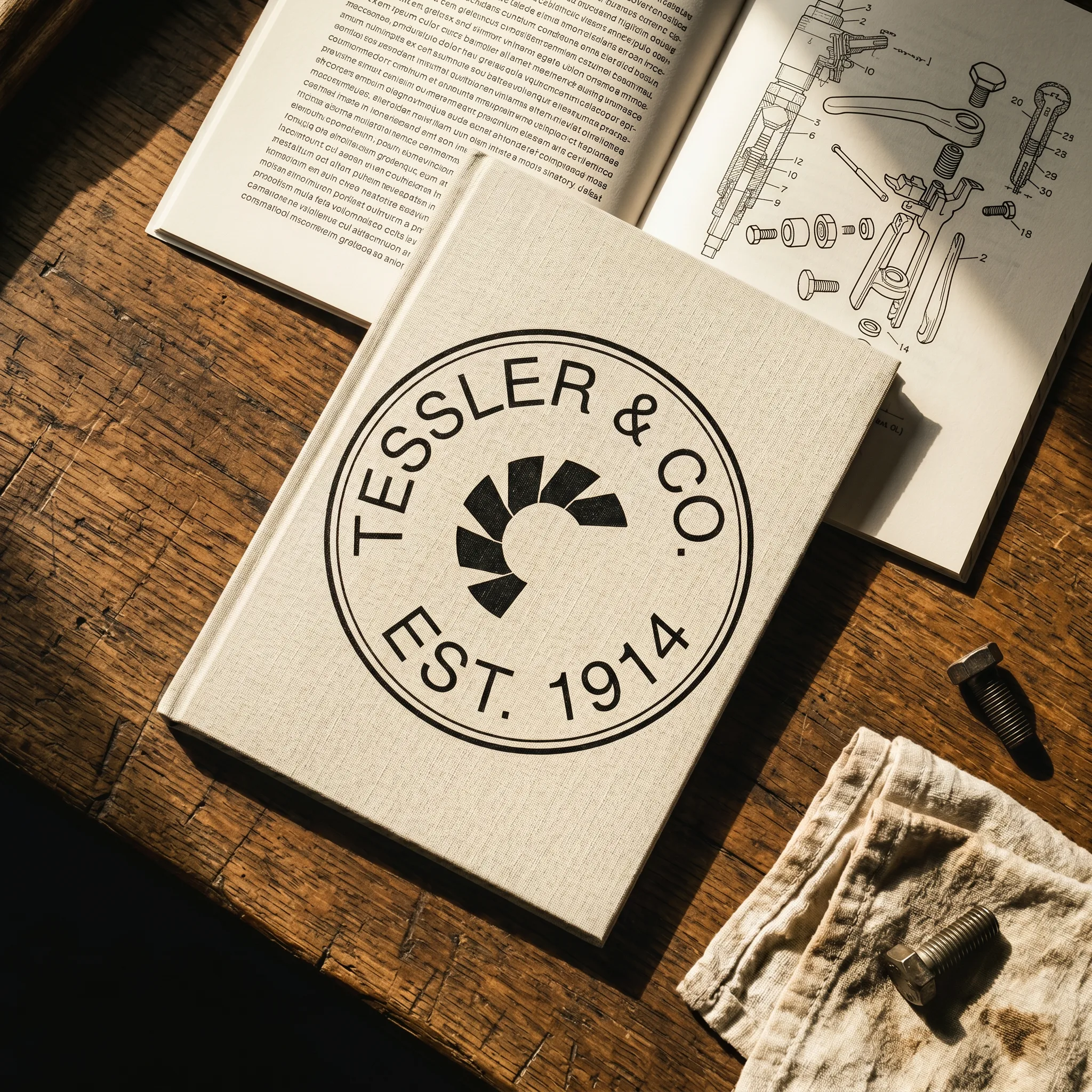
Workshop Manual / Brand Booklet — Perfect-bound, A5, printed on thick uncoated stock. The Inspection Stamp wordmark centered on the cover. Dense condensed grotesque body copy alongside technical line illustrations of disassembled tools. It reads like a document you keep, not a brochure you discard.
Kraft Paper Packaging — Heavy natural kraft, sharp folds, no tape. Safety Yellow twine in a flat knot. A cream linen adhesive label with the Inspection Stamp mark and monospaced address block. A pressed wax seal in Oxide Red bearing the logo. The parcel looks like it has been packed by someone who knows what is inside.
Leather Apron — Full-length vegetable-tanned leather in oil-darkened mid-tan. The Inspection Stamp embroidered on the bib in cream linen thread — chain stitch outline, satin fill, raised texture visible under raking light. Two riveted D-rings in aged brass at the waist. The apron shows honest wear: a faint oil smear, a scratch across the center panel. Not performance wear. Work wear.
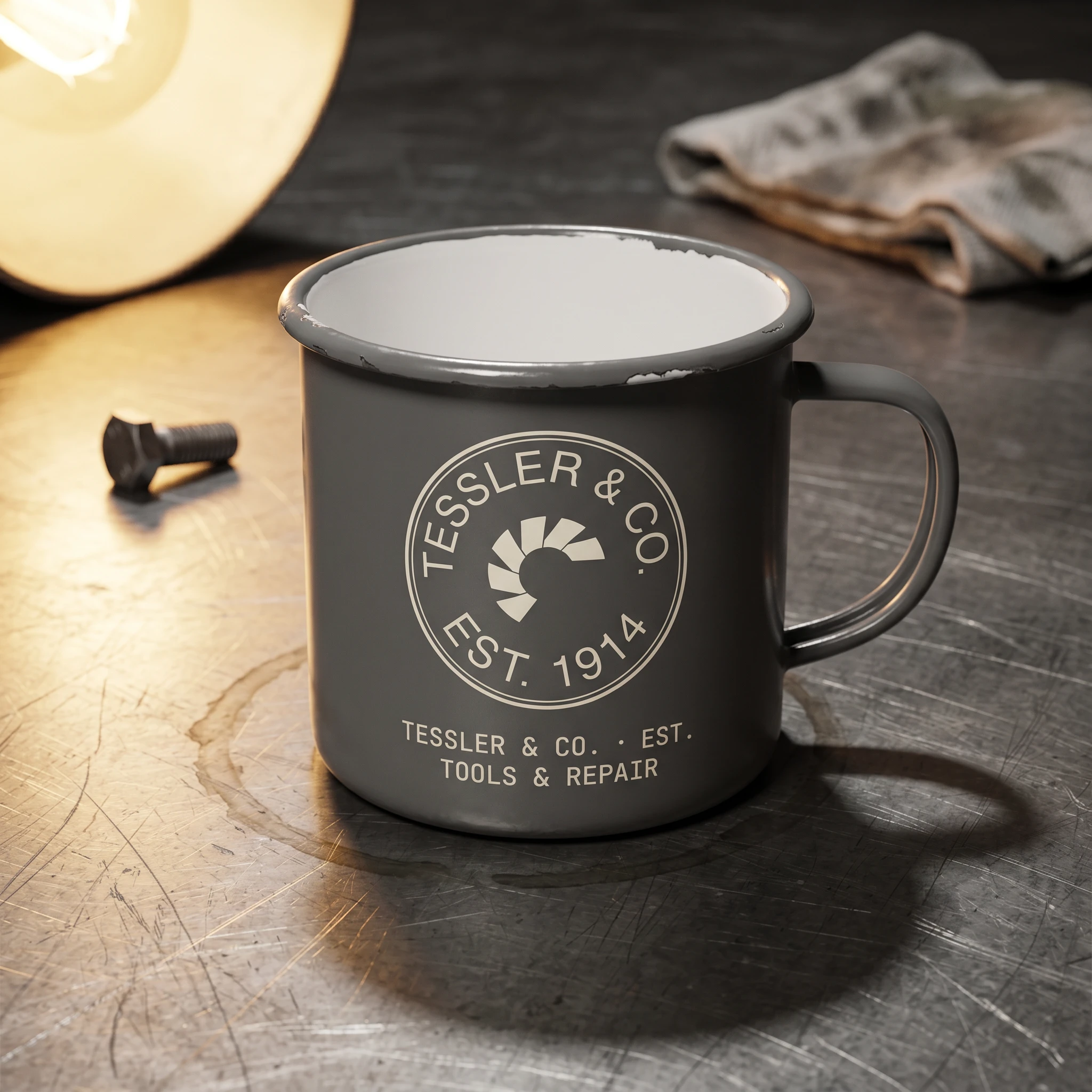
Enamel Coffee Mug — Machinery Grey enamel, chipped at the rim, showing white undercoat. The Inspection Stamp in cream linen, centered on the body. One bolt and a folded rag visible in the soft background. The mug looks like it lives in the workshop, not a gift shop.
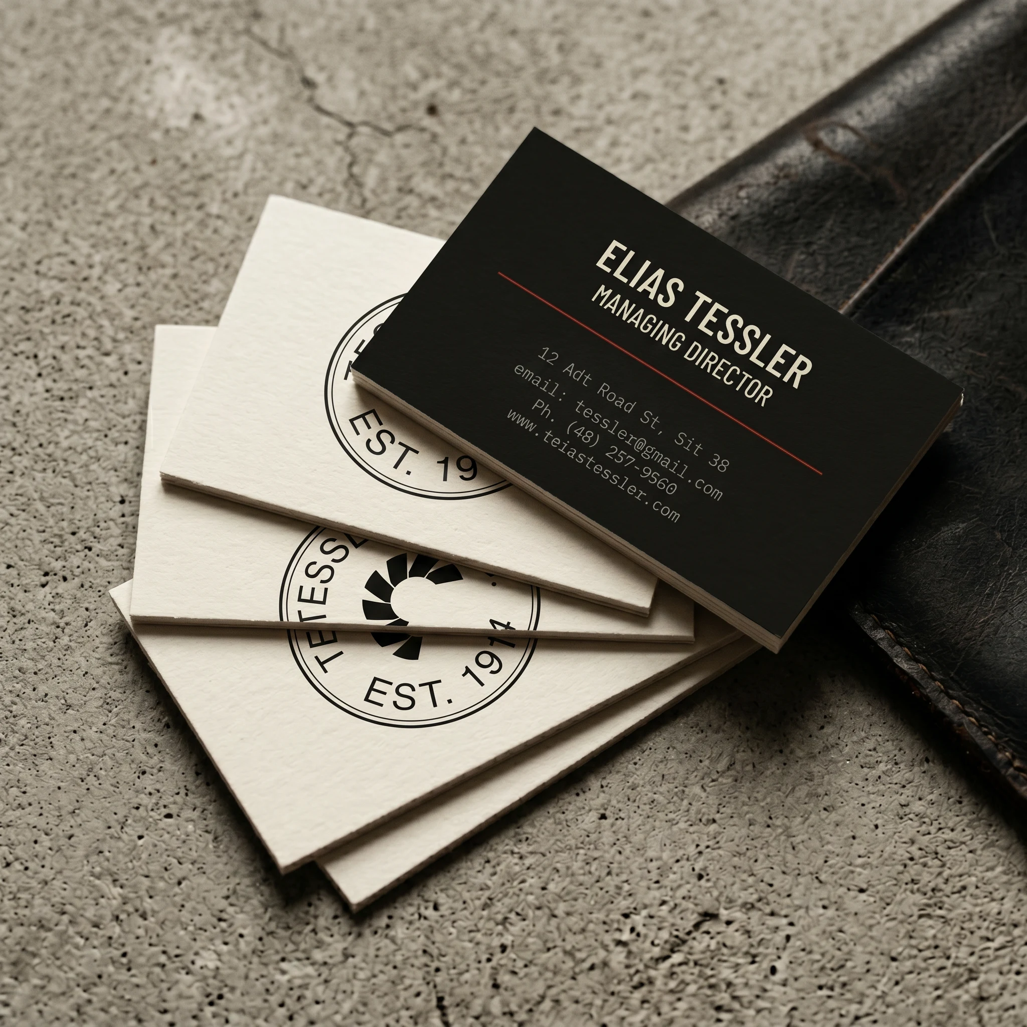
Business Cards — Extra-thick 600gsm uncoated stock, raw fibrous edge, no lamination. Front: cream linen ground, the logo centered, nothing else. Back: lamp black ground, name and title in condensed type, contact in monospace, an Oxide Red rule separating the two. The thickness of the card is part of the design.
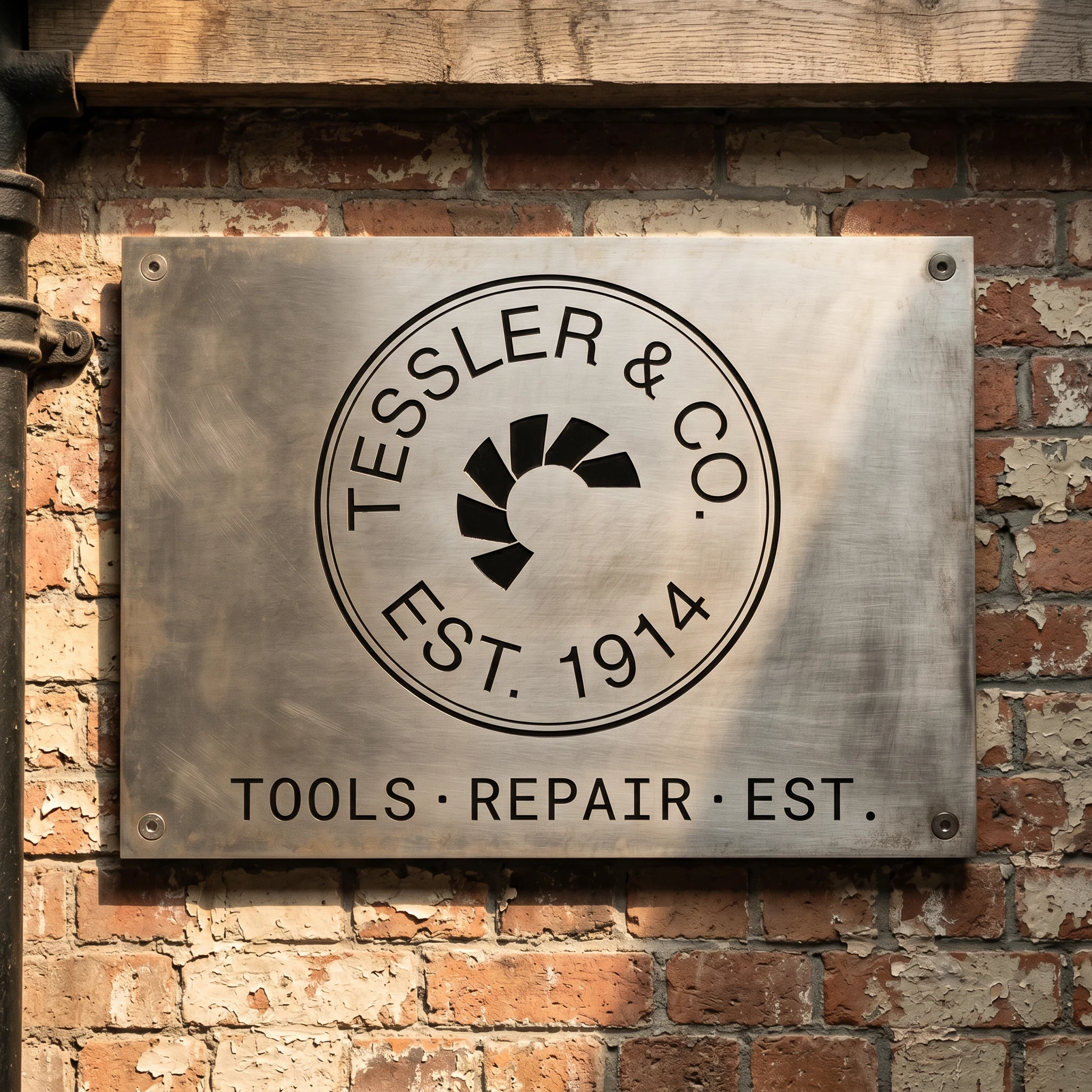
Workshop Signage — Brushed steel plate, four countersunk corner bolts, mounted flush to raw brick. The wordmark routed directly into the metal and filled with black enamel. No frame. No illumination. It has been there since before you arrived.
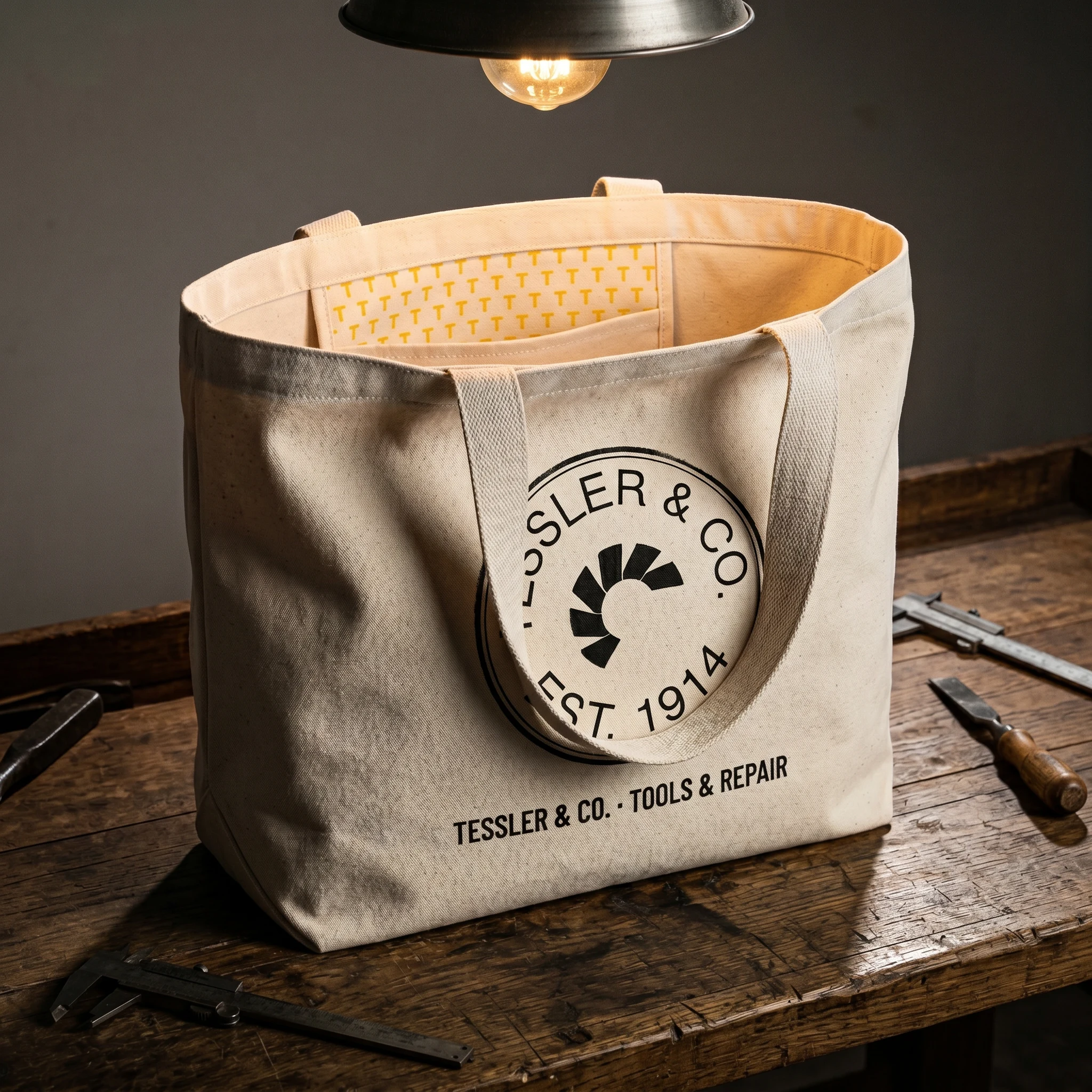
Canvas Tote — Natural duck canvas, heavy enough to hold its shape. The Inspection Stamp screen-printed in lamp black — slight ink spread at the border edges consistent with a hand-pulled screen. Interior pocket with a Safety Yellow repeating T lettermark pattern. The only moment of yellow on the outside is the handle stitching.
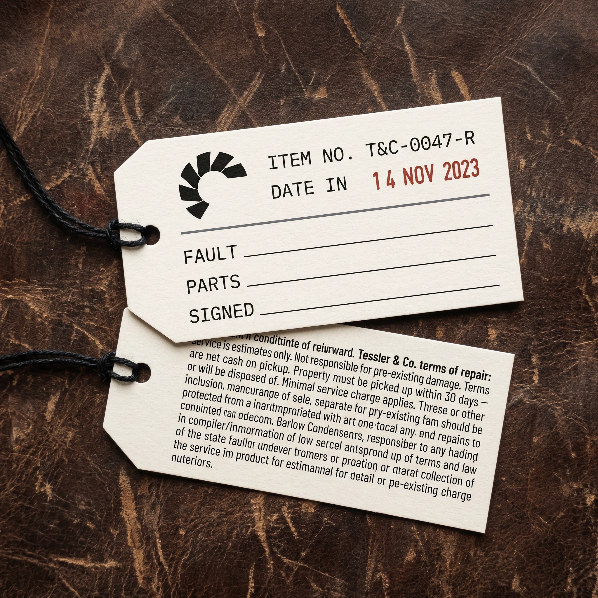
Repair Tag — Die-cut 400gsm cream linen card, waxed black twine. Front: logo top left, serial number and Oxide Red date stamp. Three blank ruled fields: FAULT, PARTS, SIGNED. Back: full lamp black, terms of repair in 6pt condensed type. The tag exists to be written on, handled, filed, and found again years later.
Storefront Window Vinyl — The Inspection Stamp at 40cm diameter, cut from cream linen opaque vinyl, applied to the interior face of the glass. Exterior daylight creates a slight transmission halo. An Oxide Red translucent minimark in the lower corner glows through the glass. The shop behind reads as warm and dark. The mark reads as permanent.
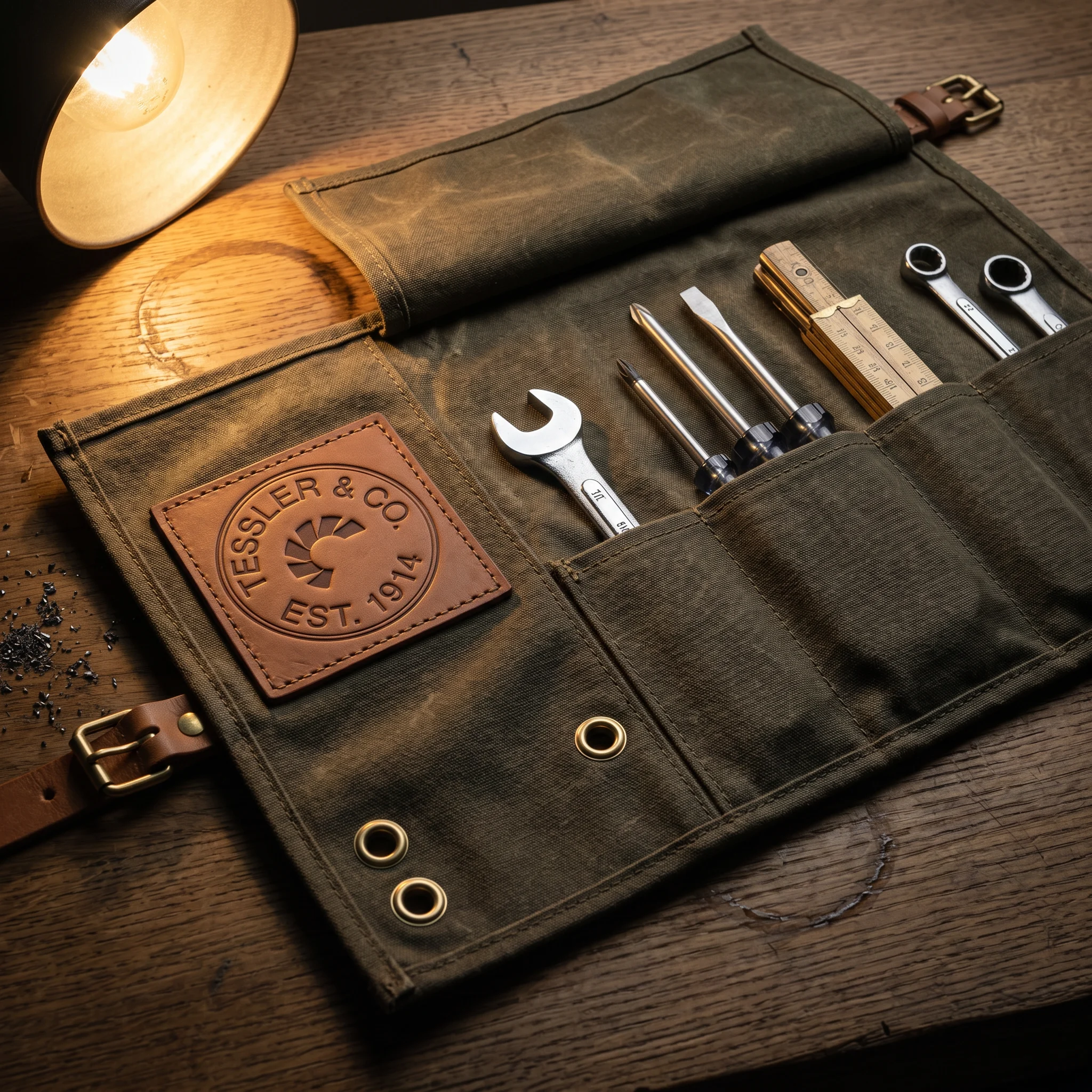
Steel Tool Roll — Waxed olive canvas, leather straps, brass buckles. A debossed leather patch in the upper left — the logo pressed into the surface, no ink, filled with natural shadow from the raking light. Two brass grommets below. Tools filling every pocket. The roll looks like it belongs to someone who uses it every day.
Printed Invoice — Uncoated cream linen stock, full-width Oxide Red rule separating header from body. Condensed grotesque columns for line items, tabular figures, tight spacing. PAID stamped at angle in Oxide Red in the lower right, slightly over-inked at one edge. This is a document that communicates competence before the recipient reads a single number.
Work Jacket — Waxed cotton in deep olive. A large woven patch centered on the back: lamp black ground, cream linen embroidered Inspection Stamp, Safety Yellow overlock stitch border. Chain-stitched TESSLER & CO. below the patch, directly on the jacket fabric. The jacket is hung, not modeled. The person who wears it is working, not posing.
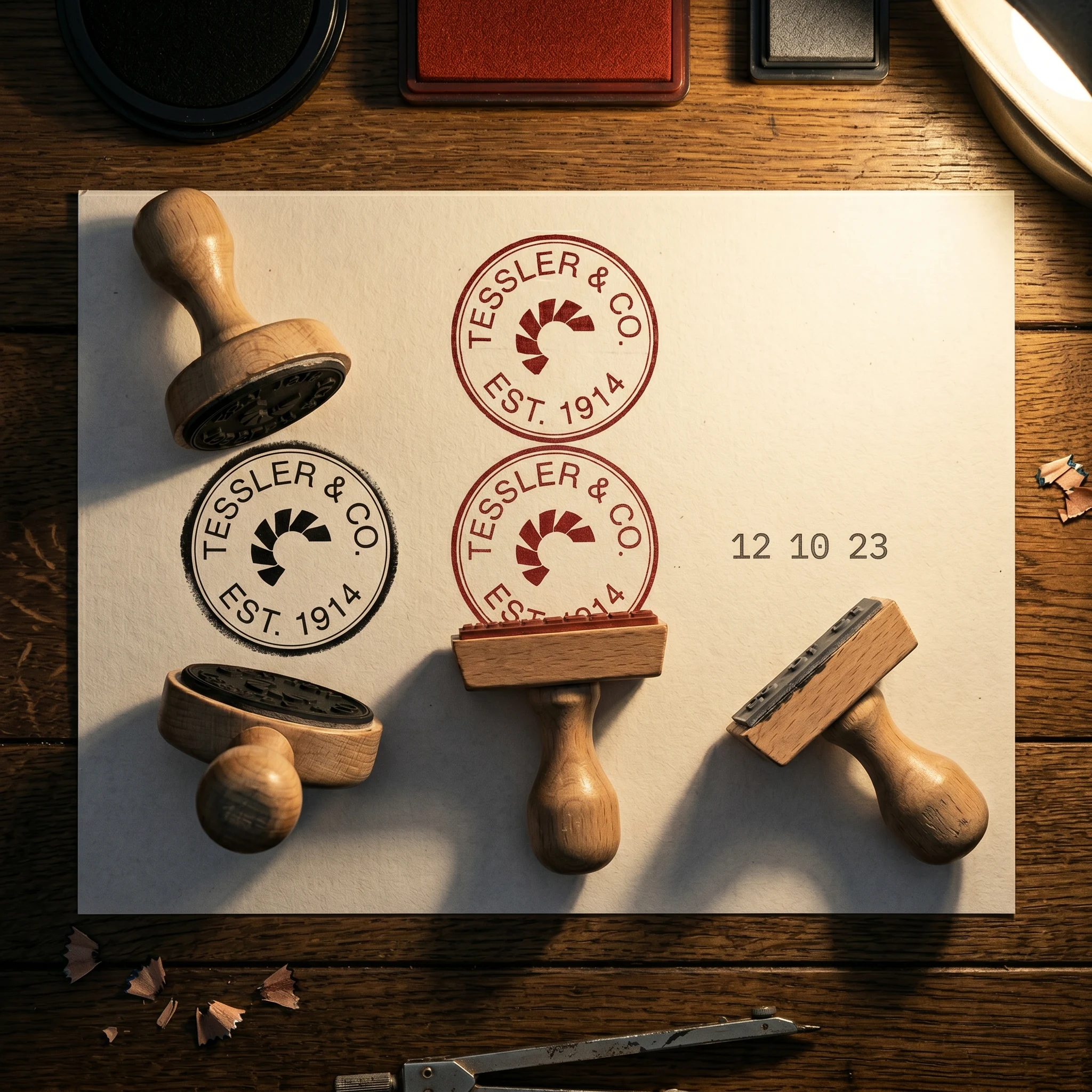
Rubber Stamp Set — Three stamps, three ink colors: lamp black for the circular mark, oxide red for the INSPECTED text, machinery grey for the date. Oak handles, worn at the grip. The impressions on the paper are slightly imperfect — over-inked at one edge, crisp at the center. This is how authentication looks when it is not digital.
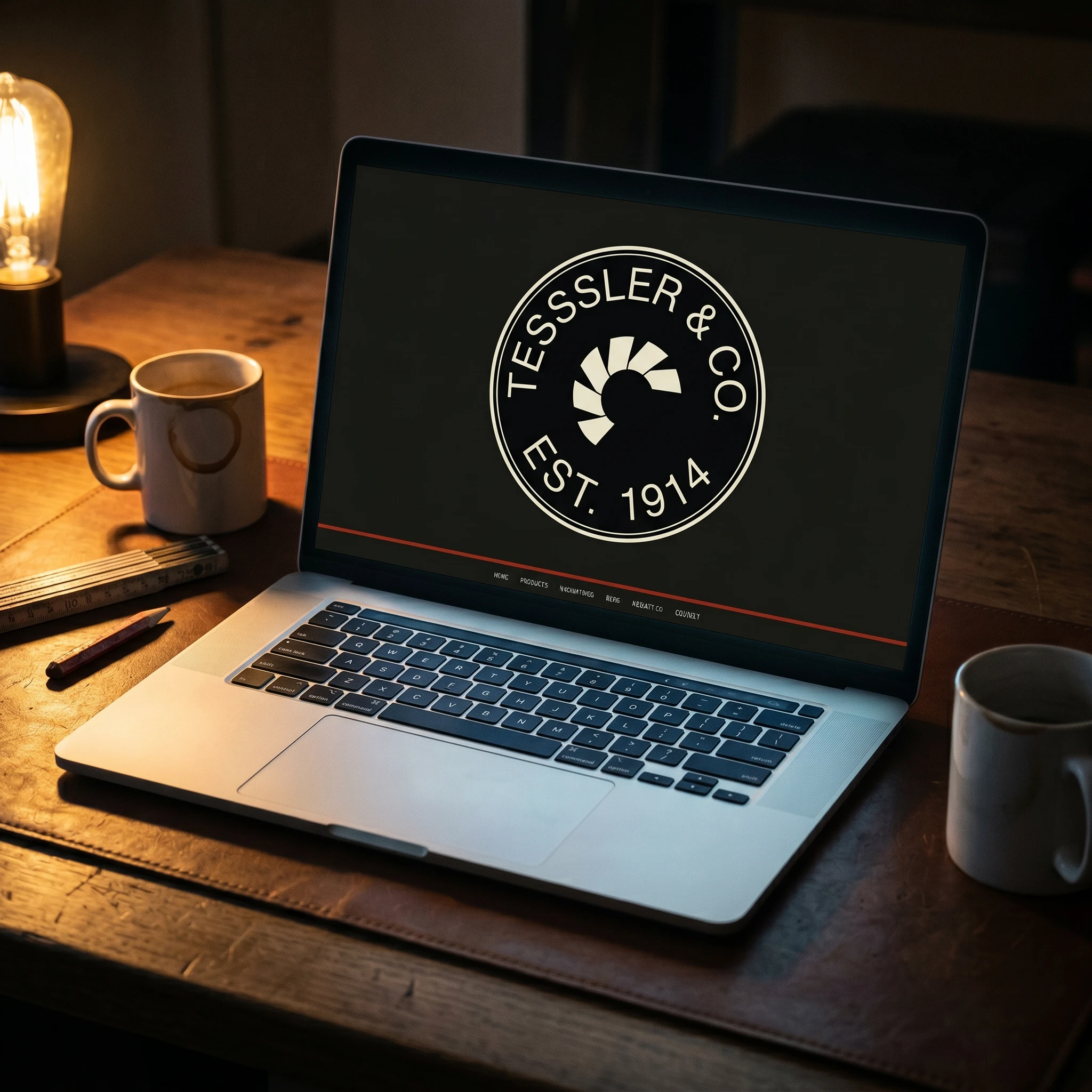
Website Hero — Lamp black viewport, the Inspection Stamp centered at 60% width in cream linen. One line of condensed type below: TOOLS MADE TO LAST · REPAIRED TO LAST LONGER. Oxide Red navigation rule at the bottom of the viewport. The page is quiet before you scroll.
Enamel Pins — Three hard enamel pieces in polished black nickel. The pentagon emblem. The Blueprint T. The word REPAIR in Safety Yellow on lamp black — a statement pin, intentionally blunt. The raking light catches the polished nickel edges. These are objects, not accessories.
What This Brand Is Not
Not heritage cosplay. No artificial aging, no sepia filters, no fake patina. The worn quality must be earned.
Not a lifestyle brand. Tessler & Co. does not sell an identity. It sells capability and conviction.
Not minimalist tech. No rounded corners, no san-serif-everything, no pastel neutrals. This brand has weight.
Not loud. It does not compete for attention. It waits to be found by the right person.
Outcome
Tessler & Co. demonstrates that a brand built around a single, deeply held conviction — that things should outlast the people who make them — can generate a visual system that is both highly specific and completely scalable. Every touchpoint asks the same question: what would this look like if it were built to last? The answer, consistently, is: nothing like what most brands produce.
The case study proves the value of constraint. A five-color palette, three typefaces, one mark, and one idea. Applied with discipline across fifteen touchpoints. The result is a brand that feels inevitable — as if it could not have looked any other way.
Tessler & Co. is a fictional brand created as a portfolio case study. All mockups are original creative work.
Like this project
Posted Apr 29, 2026
A tools brand built on one conviction: make it last, or fix it. Identity for the workshop that refuses to close.
Likes
4
Views
16
Timeline
Apr 10, 2026 - Apr 29, 2026