Built with Lovart
MRCRY: Brand & Website Design
Révolté
MRCRY — The Body Doesn't Lie When the Mind Already Has
A streetwear brand built around a single idea: the body as the last honest system. Chrome, bone, organism, and glitch — identity design for Chrome Slick, Season 01.
THE BRIEF
MRCRY started as a question about legibility — not visual legibility, but the kind that asks what a brand is actually made of when you strip the branding away. The brief I set for myself was uncomfortable on purpose: build a streetwear identity that has no face. No lifestyle. No aspiration. Just a system — cold, anatomical, and precise — that people either feel immediately or don't.
The tension was between two things I didn't want to compromise. I wanted the identity to feel dangerous in the way biological diagrams feel dangerous — like looking at something real that's usually hidden. But I also wanted it to be genuinely systematic. Not dark streetwear with bones on it. A constructed visual language with its own internal logic, where every element earns its presence.
The scope was total. Logo, mark, color system, typography, lookbook, apparel, objects, web, editorial. If it wasn't going to be a complete world, it wasn't going to work at all.
THE APPROACH
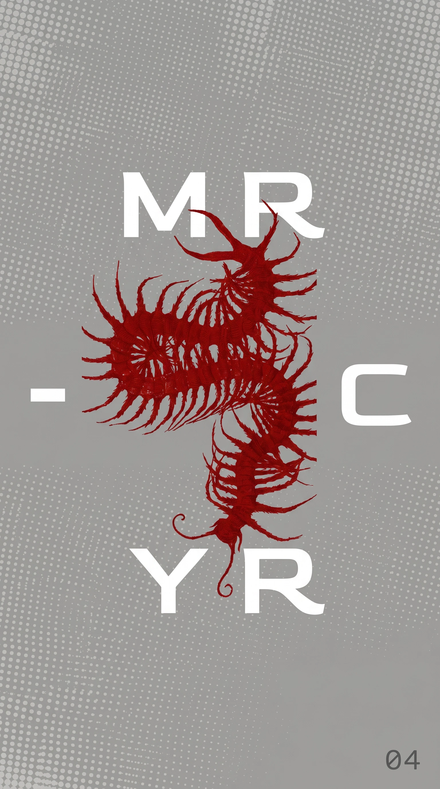
The name came first. MERCURY — the element, the planet, the god — something that moves between states. Liquid and metallic. Toxic and beautiful. That gave me the first structural decision: the logo would not spell MERCURY. It would fragment it. MR on top. YR at the bottom. C to the right. The vowels — the readable part, the human part — replaced by the symbol.
The symbol is a molecular diagram. Six circles arranged in a 3x2 grid, with a central connector node — smaller orbs radiating in four directions from a larger center mass. It reads as a molecule, a face, a target, a diagram. The ambiguity was intentional. I kept pushing it until it felt like something that could have been cast in iron somewhere and forgotten about, not designed.
The first direction I rejected was anything that leaned into liquid-mercury visually — chrome gradients, fluid shapes, reflective type. Too literal. What I came back to instead was bone. The rib cage as the brand's primary image — not as decoration but as structural logic. The body holds what the mind discards. The skeleton is the system underneath everything. It doesn't change regardless of what's layered on top.
The centipede arrived as the counterpoint. If the rib cage is order — symmetrical, architectural — the centipede is chaos that moves through order. Red (
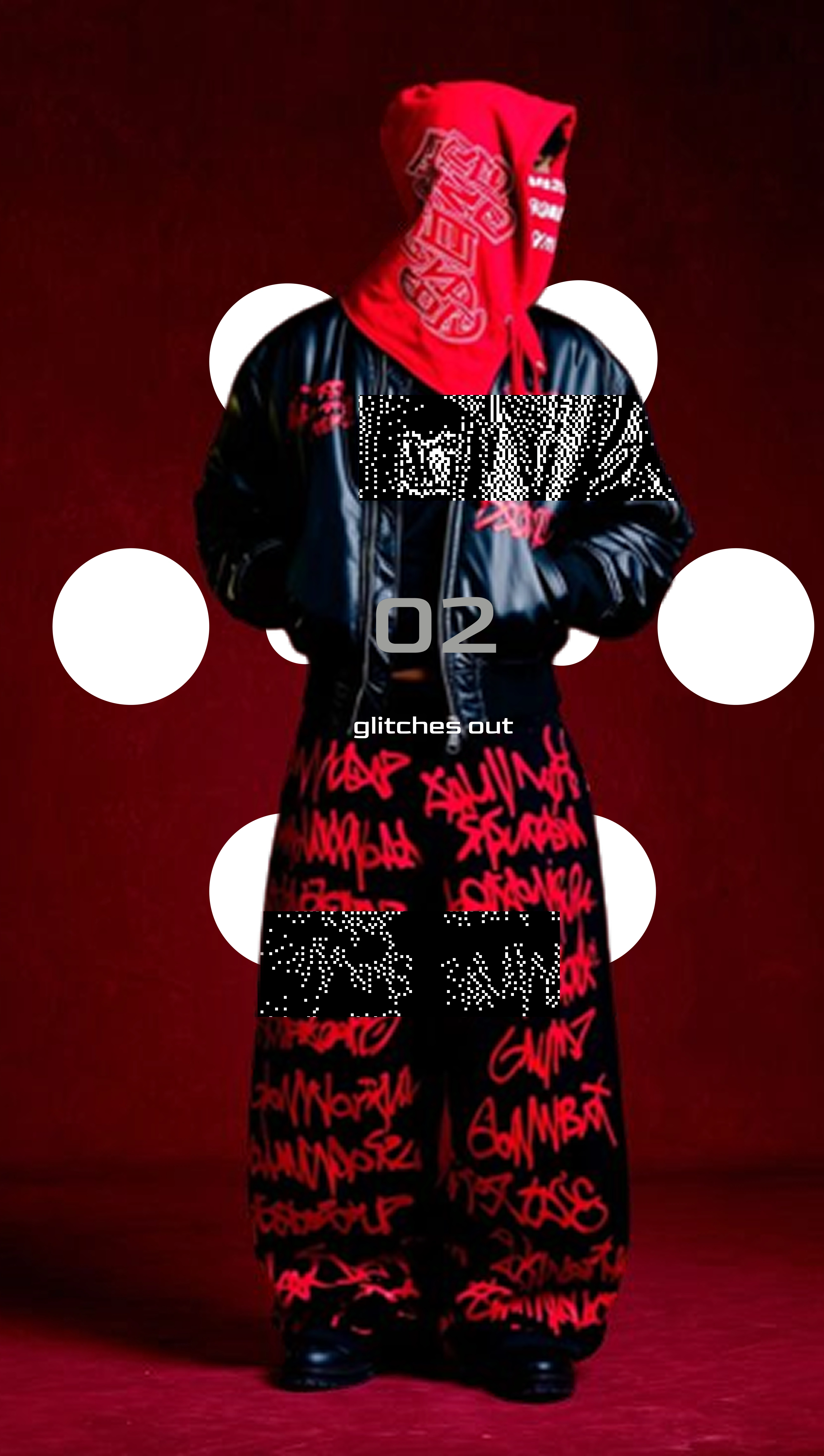
#8B0000) against desaturated grey. Organism against infrastructure. Every piece in the system needed both registers present.As the world expanded, a third visual register emerged: the glitch. A black synthetic bust with the skull opened, neon organic matter pouring out, a glitch rectangle cutting across the face — halftone dithering dissolving the figure mid-frame. This is where the brand gets its psychological dimension. The body holds what the mind discards. The glitch is the mind failing. The anatomy is what's left after.
THE WORK
LOGO SYSTEM
The wordmark fragments MERCURY into four parts — MR / [symbol] / C / YR — arranged in a loose vertical axis with the molecular mark as center of gravity. The letterforms are a wide-set grotesque with open counters and soft terminals. The mark scales to a standalone symbol for apparel hardware. Both versions live only in black, white, or the grey field — never colored, never treated. A secondary variant replaces the molecular symbol with the centipede organism, the red body filling the exact negative space left by the missing vowels — the system and the chaos occupying the same position.
TYPOGRAPHY SYSTEM
Two registers. Large sequential numbers (01–13+) in a tracking-heavy extended grotesque — cold, indexing, like a medical catalog. Body annotations in a narrow monospaced face, all-lowercase, loose-tracked: "glitches out", "season 01", "the body holds what the mind discards", "handle with care", "deconstructed. fragmented type. mercury dots. glitch rectangle. chaotic system." The number classifies. The phrase describes a condition.
COLOR SYSTEM
Four values, nothing more. Pure black (
#000000) as the primary field. Warm matte grey (#A8A8A8) as the photographic and editorial base. Off-white (#F0F0F0) for logo and type on dark grounds. Deep crimson (#8B0000) as the sole warm accent — belonging exclusively to the centipede, biological references, and environmental light. The red never touches the logo. That separation is structural.SPECIMEN SHEET / EDITORIAL IDENTITY
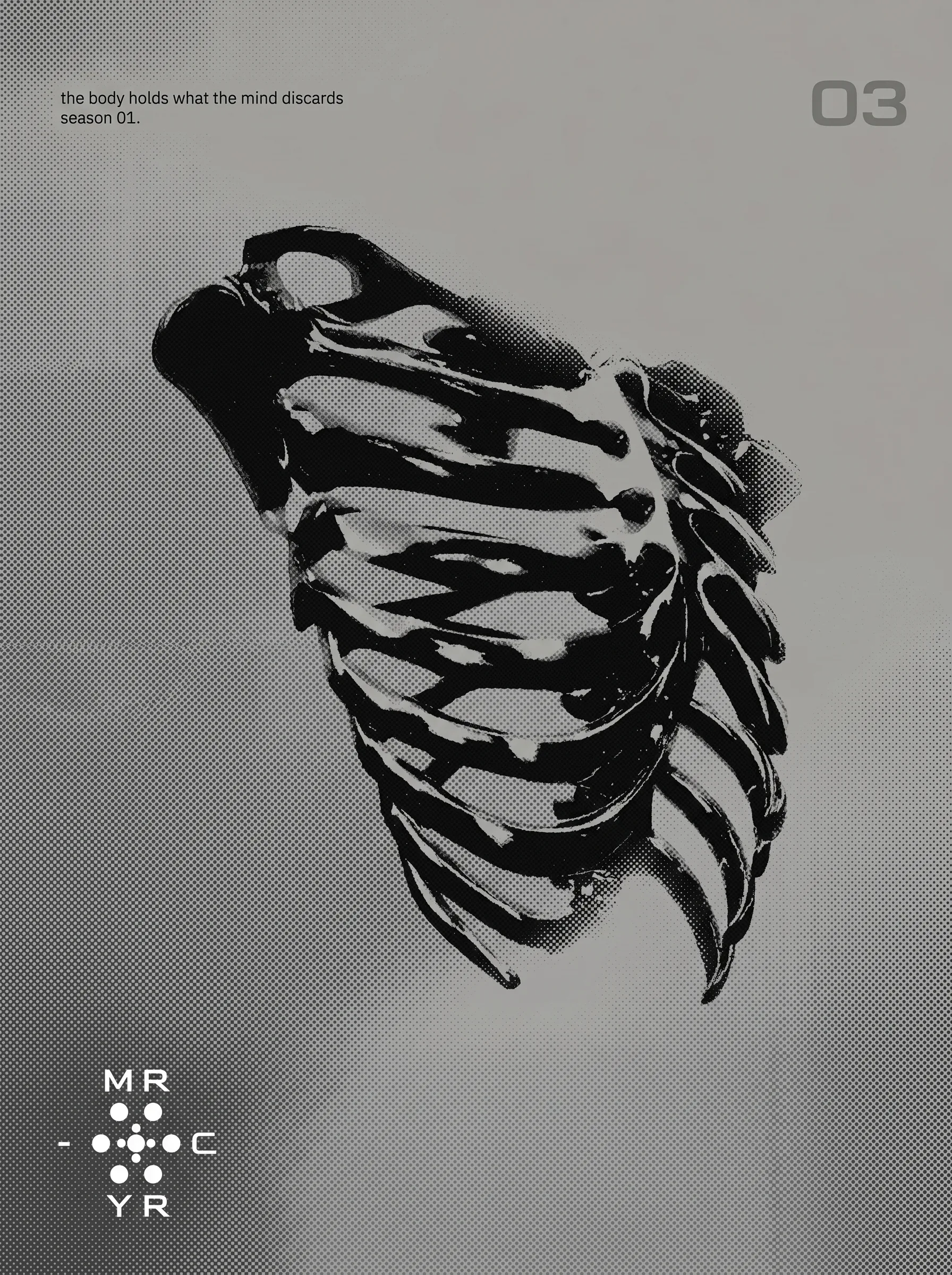
The brand uses a specimen sheet format to catalog its own visual system — the logo, the mark, and the rib cage image laid out on a grey halftone ground like biological taxonomy. Number "01" in the upper right. Small print annotations bottom left. This is the system documentation made into a designed object, not hidden in a brand guide.
APPAREL — CHROME SLICK SEASON 01
Oversized black tee: chrome halftone rib cage front-printed in white, "01 / glitches out" annotated below the print. Compact logo mark on the right sleeve. The neck label reads "MR-C-YR / CHROME SLICK / SEASON 01."
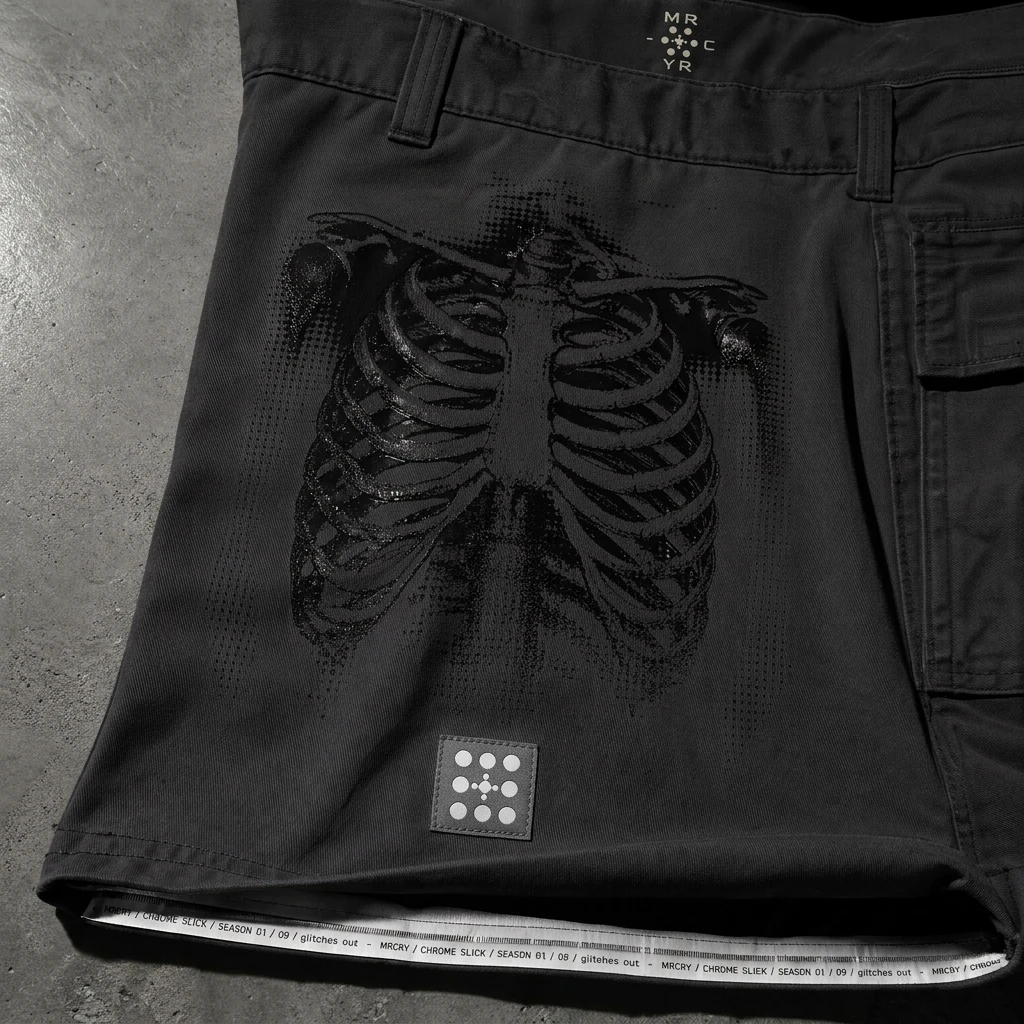
Cargo trousers in dark graphite: rib cage printed black-on-black across the left thigh in gloss finish. Mercury dot mark as a rubberized woven patch at hem. Interior waistband tape reads "MRCRY / CHROME SLICK / SEASON 01 / glitches out —" repeated continuously.
Chrome bomber: mirror-finish silver shell, rib cage in gloss black across the full back. Molecular dot mark embroidered white on left chest. Sleeve annotation: "06 / glitches out." Anonymous figure, white morphsuit head, shot from behind.
Packaged hoodie: sealed polybag, full MRCRY logo on front label insert, red centipede card loose inside. "CHROME SLICK / SEASON 01 / HANDLE WITH CARE."
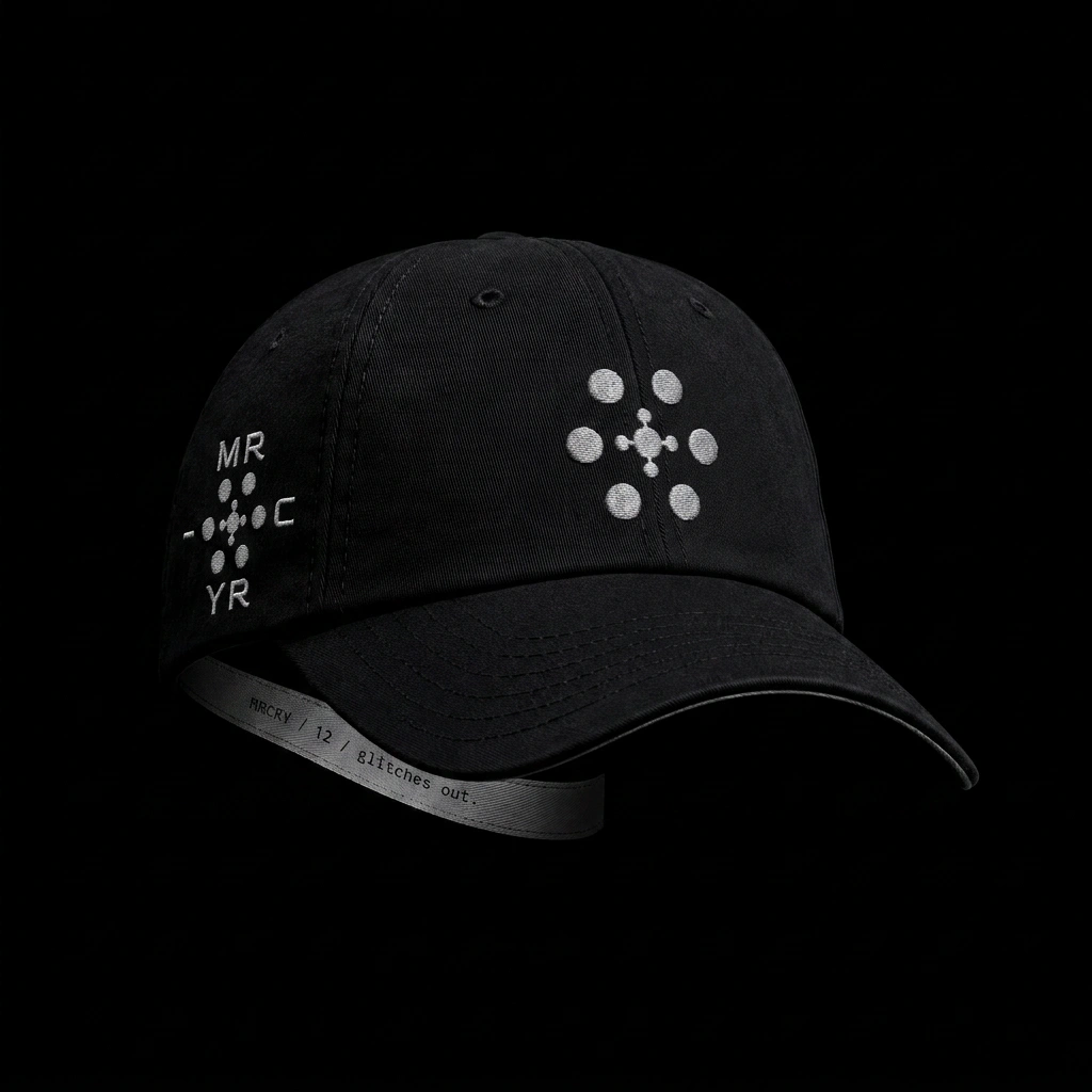
Void black cap: full wordmark embroidered on left panel, standalone dot mark large on crown. Brim ribbon reads "MRCRY / 12 / glitches out."
LOOKBOOK / ZINE — ISSUE 001
Saddle-stitched A4 zine, grey photographic ground throughout. Spreads pair anatomy/organism imagery against garment shots — rib cage, bird skeleton suspended and rendered in white on black halftone against a wireframe, a figure in all-black with the red centipede printed large across the chest. Figures are always anonymous, always indexed. The cover: a face replaced entirely by the molecular mark, flesh giving way to logo, organic matter growing at the edges of the void.
INSTAGRAM STORIES / SOCIAL ASSETS
Three story formats. The first: full-frame grey with the rib cage graphic large, logo bottom-left, specimen annotation top-left, number in the upper right — the specimen sheet translated into a 9:16 vertical. The second: the fragmented logo wordmark on black with the centipede running beneath the YR — the full visual system in one frame. The third: figure with the molecular mark overlaid at chest level, body becoming billboard. Each story functions as a standalone poster.
WEBSITE
The desktop interface extends the editorial language of the zine directly into screen. The rib cage specimen, the logo system, and the grey halftone ground translate without friction from print to screen. No decorative UI — the brand system is the interface.
ENVIRONMENTAL EXTENSIONS
A blacked-out vending machine stocked with poly-bagged garments, "OUT OF ORDER" sticker half-peeled — underground parking, fluorescent light, crimson puddle reflection below. A wooden shipping crate stenciled with the logo and centipede, wax-sealed. A cast iron manhole cover with the full logo system cast into the surface, a red centipede at the edge. A chain-link fence vinyl banner — torn, the centipede visible through the rip on the reverse. These are not product environments. They are the world MRCRY inhabits.
GLITCH FIGURE
A black synthetic bust — skull open, neon organic matter pouring out, colours bleeding from green to amber as they drip down the neck. A glitch rectangle cuts across the upper face, dissolving the head into halftone noise. The MRCRY wordmark sits beneath, intact. The image is the most precise articulation of the brand's central idea: the body holds what the mind discards. The glitch is the mind breaking. The anatomy is what remains.
THE RESULT
Chrome Slick Season 01 is in active development. The full identity system — logo, color, typography, image language, garment line, zine, social assets, website, and environmental objects — is built and consistent across every surface.
What I was testing was whether a streetwear brand could carry authority without lifestyle. No face. No influencer. No location. Just a system — anatomical, constructed, internally consistent — that communicates exactly one thing: this was built by someone who had a specific idea and didn't compromise it.
The world holds. That was the only benchmark that mattered.
Révolté — revolte.design
Project: MRCRY — Chrome Slick Season 01
Year: 2026
Scope: Brand Identity, Visual System, Art Direction, Apparel Design, Editorial / Lookbook, Web Design, Environmental Design, Social Assets
Industry: Streetwear / Fashion
See more at revolte.design
Like this project
Posted May 1, 2026
Created a comprehensive streetwear identity for MRCRY's Chrome Slick Season 01., the website and brand Design
Likes
3
Views
24
Timeline
Apr 10, 2026 - May 1, 2026

