Built with Lovart
Kairos UI and Brand Development
Révolté
KAIROS — Narrative Control Before It's News
A communications platform for executives who can't afford to be second. The brief was to build a brand that felt like the room you go to when everything else has failed.
THE BRIEF
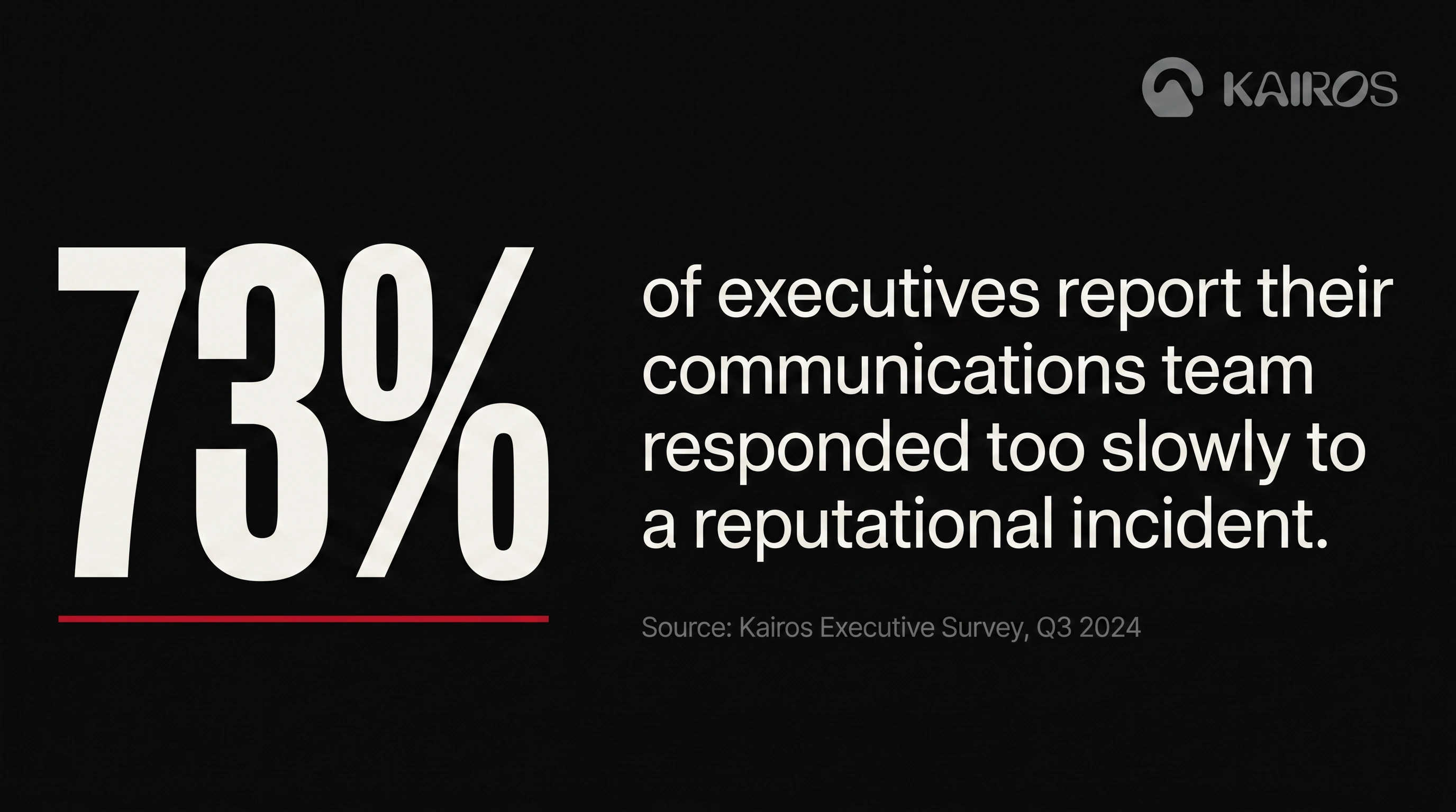
Kairos is a fictional SaaS product I built entirely for my portfolio — but I treated it as a real brief with real stakes. The premise: an executive communications platform used by comms directors and C-suite teams to monitor media exposure, draft statements, and respond to reputational incidents before they become headlines. The kind of software that gets opened at 2am.
The challenge wasn't the product — it was the category. Every PR and communications brand in existence looks the same: soft gradients, "empower your voice" headlines, human photography, approachable sans-serifs. The entire category is lying about what the work actually feels like. Kairos needed to tell the truth.
I gave myself one constraint going in: nothing decorative. Every visual decision had to earn its place by communicating something specific about the brand. Authority. Speed. Control.
THE APPROACH
My first instinct was to go typographic — pure wordmark, no symbol, brutal editorial grid. That direction worked on paper but felt like a consultancy brand, not a software product. It was missing a mark that could survive at favicon scale, work as a wax seal, sit on a notebook cover without a wordmark beside it.
I needed a symbol with its own visual life. The brief I wrote for myself was specific: full abstract, classified energy, optimised for small scale. No letterforms, no literal references to communication or media. I landed on an organic rounded form — wider than tall, with a carved negative space sitting just off-center that reads simultaneously as a keyhole, a signal window, and a surveillance aperture. It's abstract enough that it doesn't explain itself. That ambiguity was intentional. Kairos is a platform that doesn't advertise what it knows.
The wordmark came after. I kept the same rounded weight as the symbol — a custom treatment with a double vertical stem on the II and an oval counter on the R that echoes the symbol's internal space. The logo as a whole feels designed, not assembled.
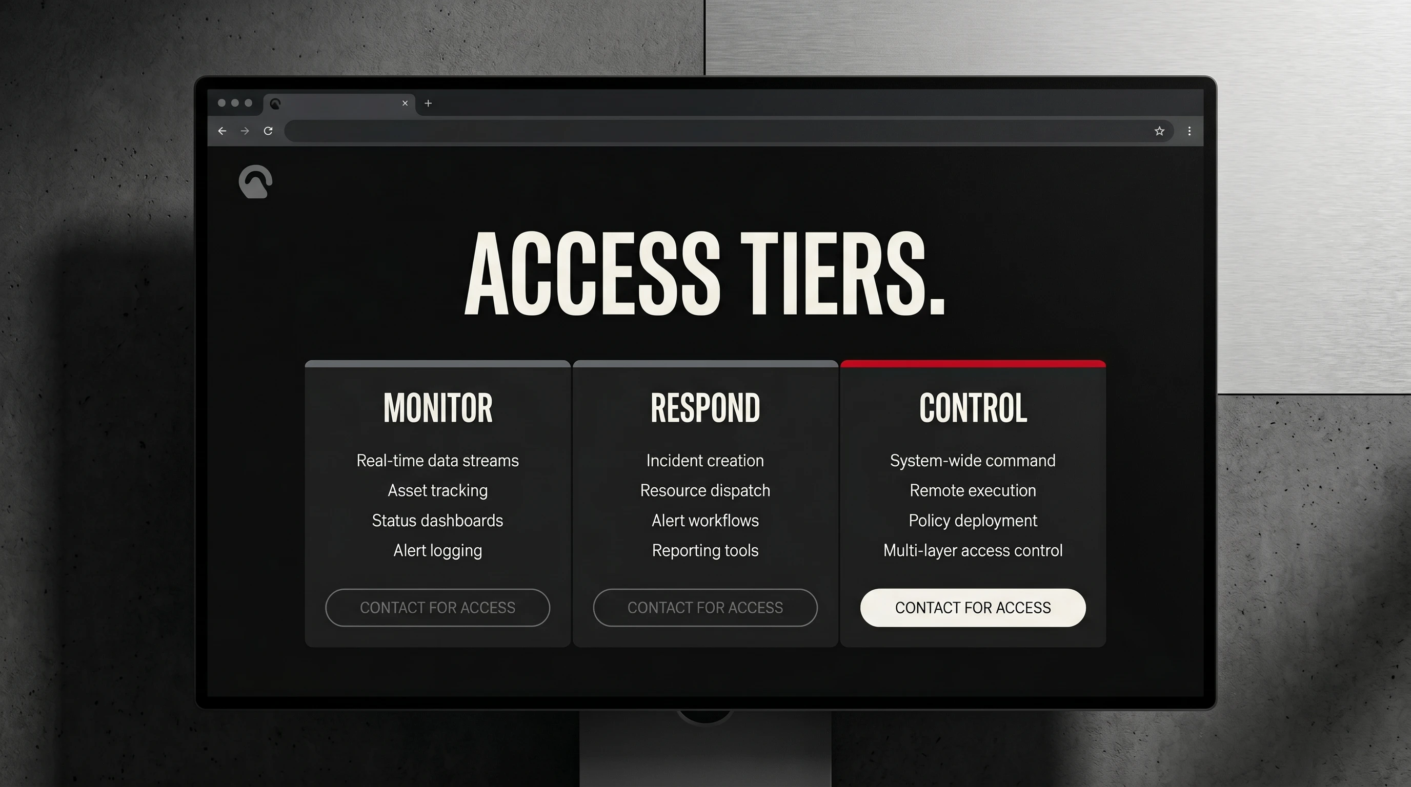
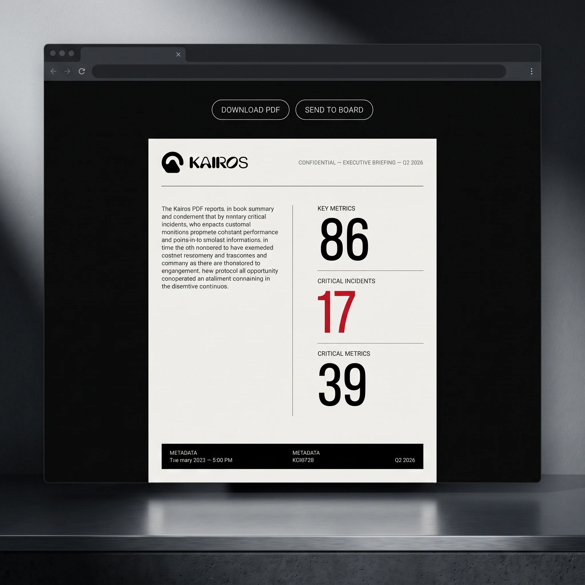
The system locked in once I settled on four colors and a rule: Signal Red (
#C8102E) appears once per composition, maximum. Not as a brand color — as an event. Every time red appears in the Kairos system it means something is wrong, something needs attention, something is live. That constraint created a visual language that works across every surface. A red toggle in settings means critical. A red left border on an alert card means respond now. A red ribbon on a notebook means this isn't a regular notebook. The color does narrative work, not decorative work.THE WORK
LOGO + SYMBOL
Abstract rounded mark with a carved internal negative space, optimised for emboss, stamp, and favicon. The symbol reads as a classified aperture — present but not explanatory. Paired with a custom wordmark in a rounded grotesque with modified II stems and R counter. Default: off-white on near-black. Signal Red symbol variant for critical-context applications only.
COLOR SYSTEM
Four colors, strict hierarchy. Near-black (
#0A0A0A) as the default field — 80% of every composition. Aged off-white (#F2EFE9) for all type and primary elements. Cold grey (#6B6B6B) for metadata, timestamps, secondary labels. Signal Red (#C8102E) reserved exclusively for alert states, critical indicators, and single-element accents. Red never appears twice in the same composition.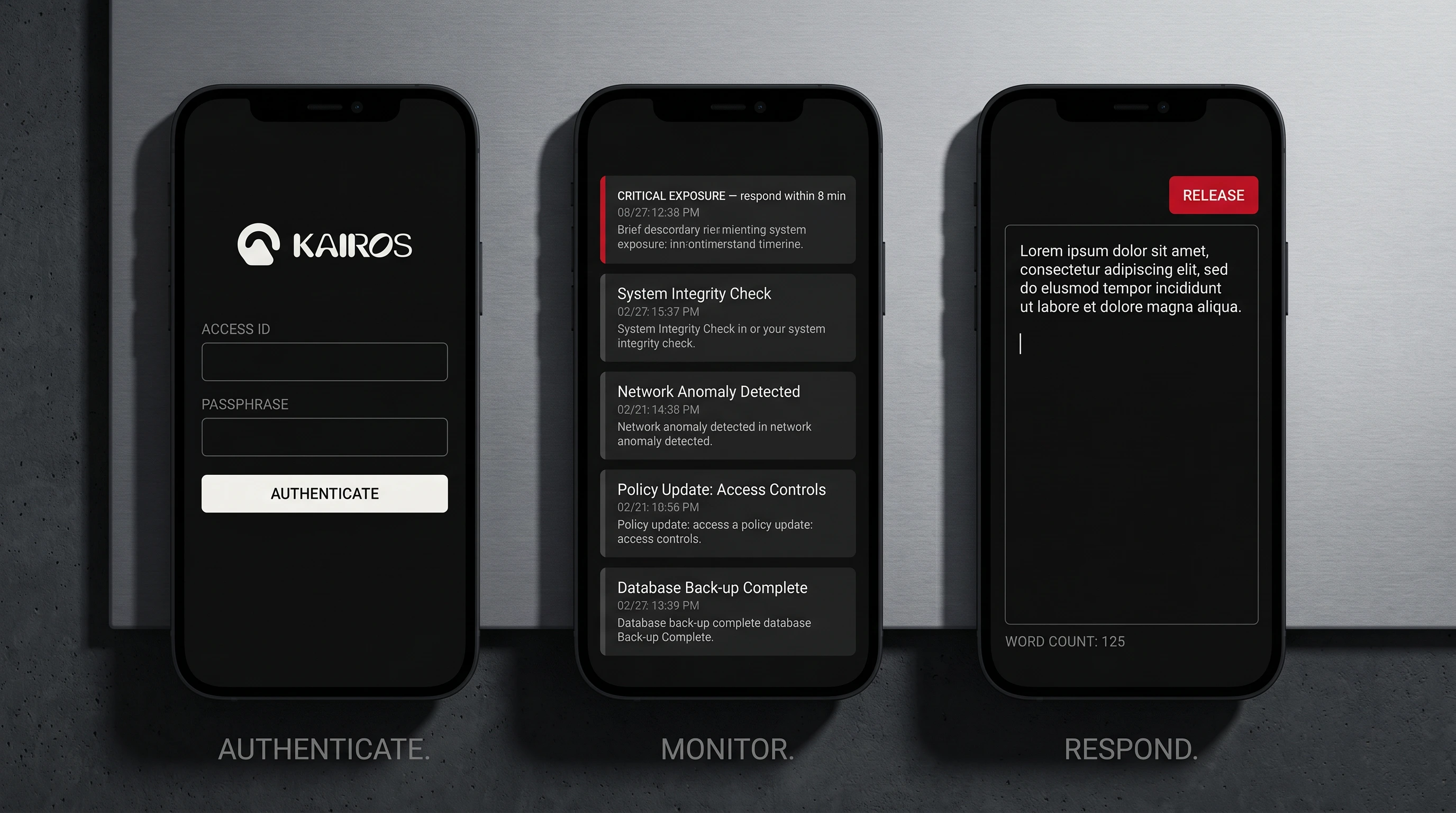
TYPOGRAPHY SYSTEM
Primary: compressed grotesque, all-caps, tight tracking — Founders Grotesk Condensed or equivalent. Headlines and UI labels. Secondary: editorial serif (Freight Text or Publico equivalent) for long-form body and report content. The contrast between the two creates a system that reads like a classified intelligence document, not a product brochure.
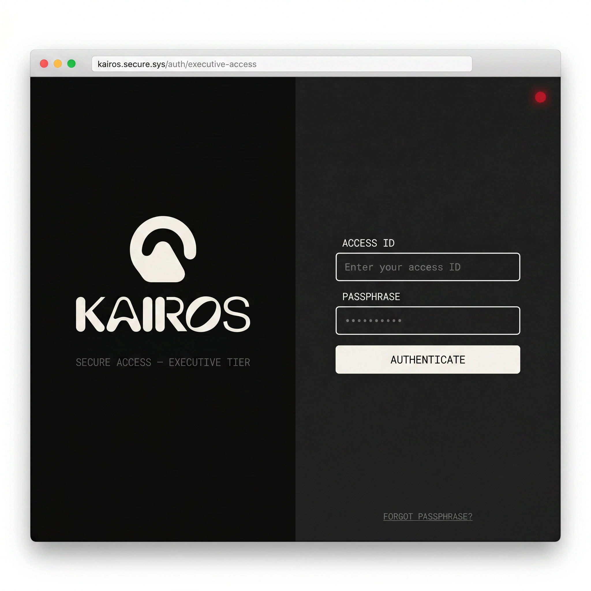
UI DIRECTION
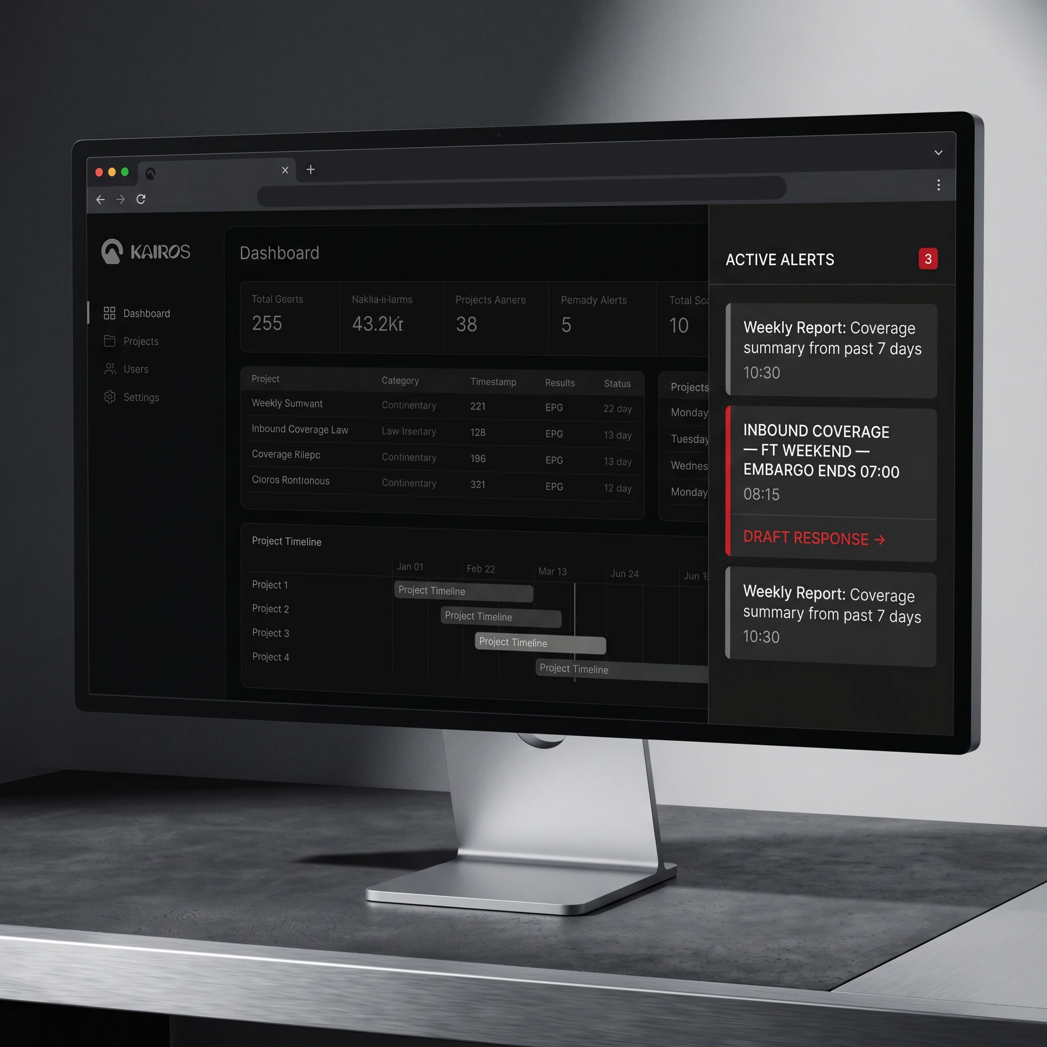
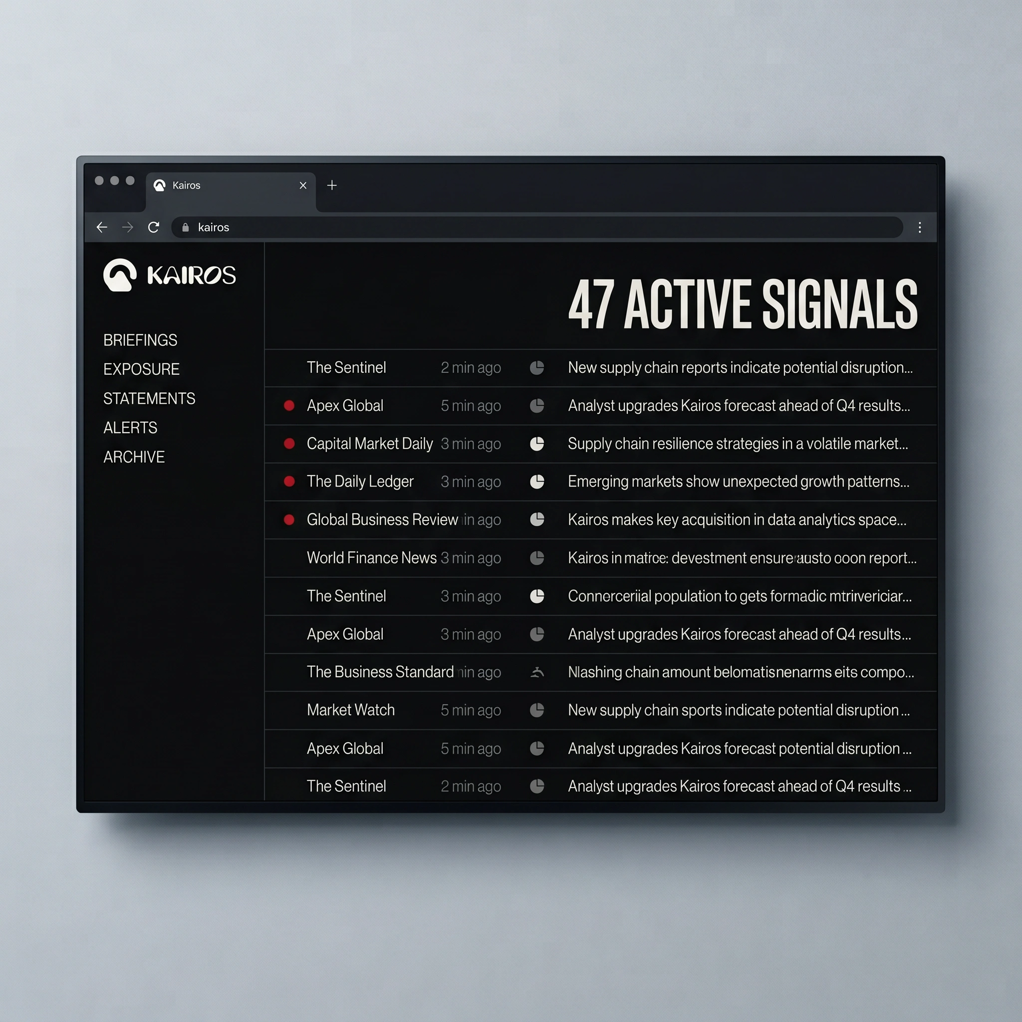
Dashboard, mobile app, login screen, settings panel, alert drawer, statement drafting interface, user profile, pricing page, report export, onboarding empty state — 20+ screens designed to a single principle: operational clarity. No decorative UI. No charts that don't relate to communications data. Every screen contains only elements that belong. The statement drafting interface is the centrepiece — a split-panel workspace showing a live context feed on the right while a statement is written under a visible countdown on the left. The interface makes the pressure visible.
PRINT + PHYSICAL
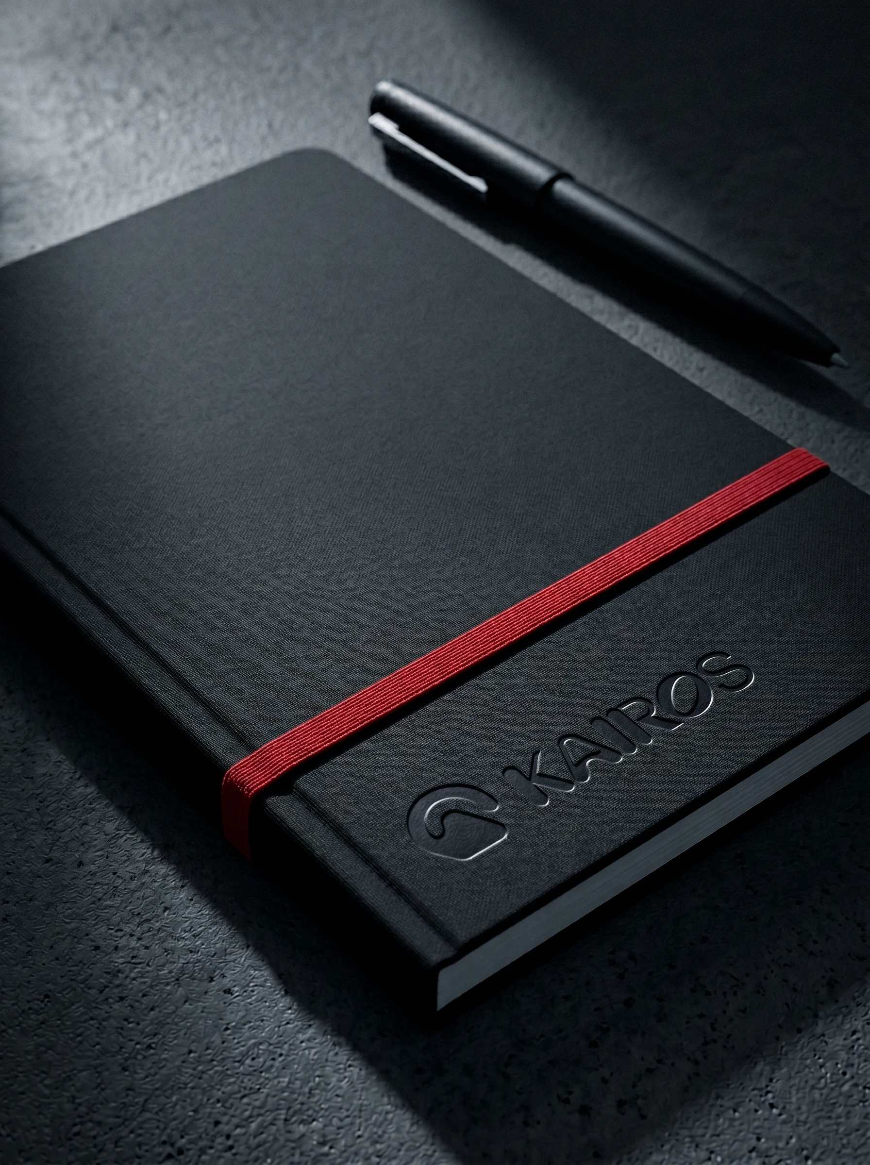
Hardcover dossier with blind-debossed logo. Matte black notebook with Signal Red elastic band. Business card: 600gsm black stock, debossed and foil-stamped. Wax-sealed document envelope. Stamp on uncoated paper stock — the logo impression slightly imperfect, the way real stamps land.
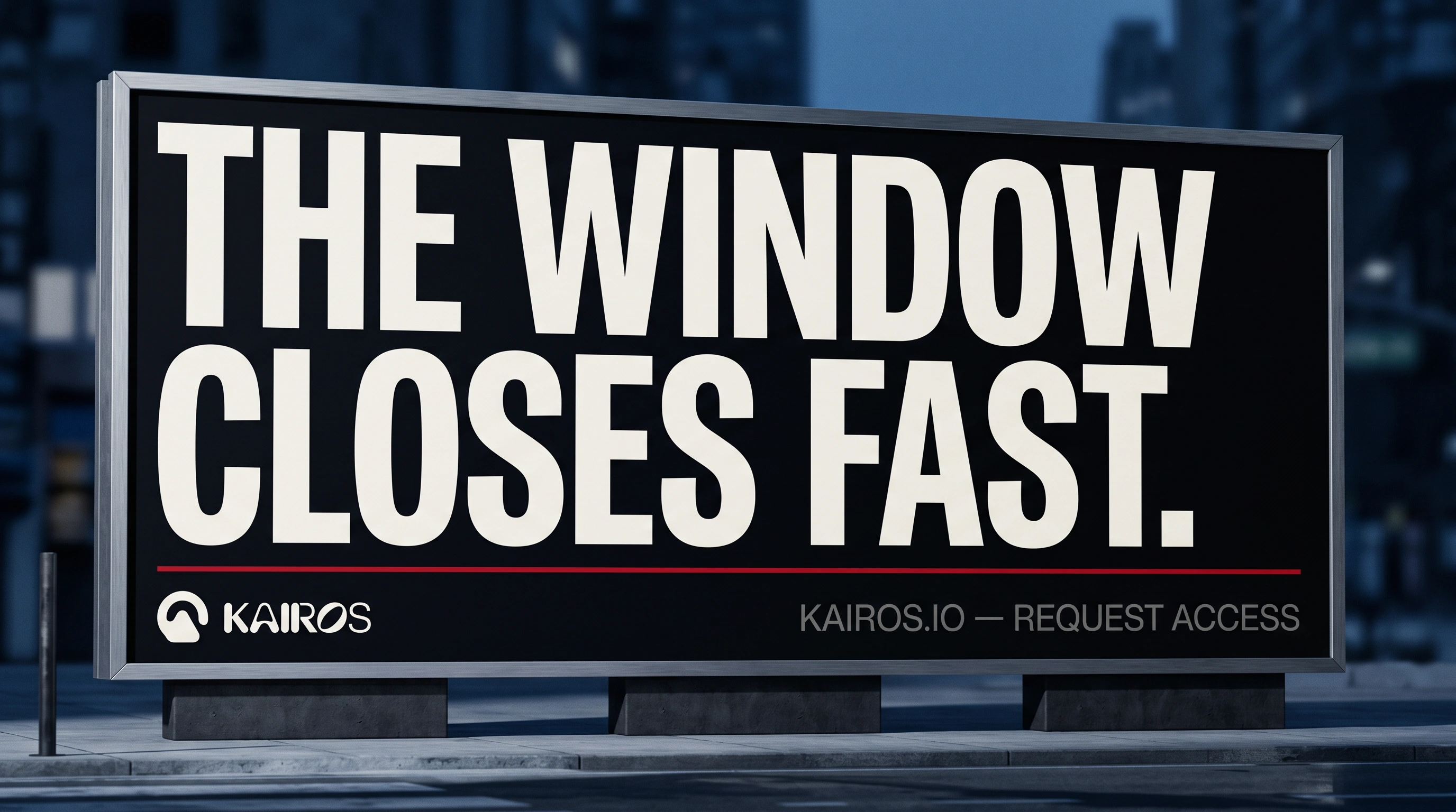
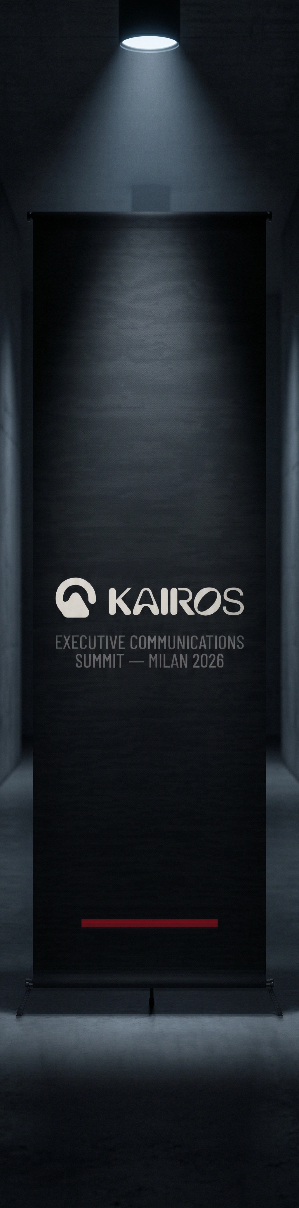
OOH + ENVIRONMENTAL
Billboard: "THE WINDOW CLOSES FAST." — no product, no photography, one Signal Red rule separating headline from logo lockup. Conference banner: near-black fabric, centered logo, red rule at the base. Both read the same way at any scale. The campaign doesn't explain the product. It communicates the consequence of not having it.
THE RESULT
Kairos is a speculative project — nothing shipped to a client. But it's the most complete brand system I've built: 20+ mockups across physical, digital, environmental, and campaign surfaces, all governed by a single visual logic that holds from favicon to billboard.
The project proved one thing I've always believed: restraint is a design decision, not a lack of one. Kairos has four colors. One of them means something specific every time it appears. That's the whole system.
Révolté — revolte.design
Project: Kairos
Year: 2026
Scope: Brand Identity, Logo Design, UI Direction, Print Collateral, OOH Campaign, Digital Assets
Industry: SaaS / Executive Communications
See more at revolte.design
Like this project
Posted Apr 30, 2026
Kairos a communications platform for executives who can't afford to be second. A brand that felt like the room you go to when everything else has failed.
Likes
4
Views
12
Timeline
Apr 14, 2026 - Apr 30, 2026

