Built with Lovart
PALE Brand Identity Design
Révolté
PALE — The Smartest Thing You Put On Your Skin
A sun care brand built on a single premise: protection doesn't need a lifestyle. It needs to be right.

The Brief
Sun care is a category that shouts. Every brand sells a feeling — warmth, vacation, the particular golden quality of late afternoon. The pitch is always emotional. The product is almost secondary.
PALE started from the opposite position. The premise was that UV protection is an act of intelligence, not aspiration. The person who uses it every day, winter and summer, indoors and out, isn't romanticizing it. They just understand skin. The brand needed to talk to that person — directly, without decoration.
The scope covered the full identity: logo, visual system, packaging design across five formats, campaign direction, and a production-ready mockup suite. The constraint that made it interesting was also the one that made it hard: PALE had to feel warm without being soft, restrained without being cold. In a category this loud, silence is a genuine risk.
The Approach
The first direction I built for PALE was wrong in a way that took me a while to name.
It was architecturally correct — cool tones, a soft-script lowercase wordmark, matte stone surfaces, long shadows. It looked like premium skincare. That was exactly the problem. It looked like premium skincare. PALE isn't a skincare brand in the spa sense. It's a sun care brand, which means it lives outside, in real light, on real skin. I was designing for a lobby, not for noon in July.
I scrapped everything. The logo, the palette, the photography direction — all of it.
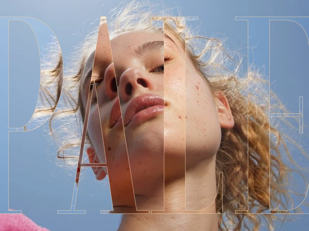
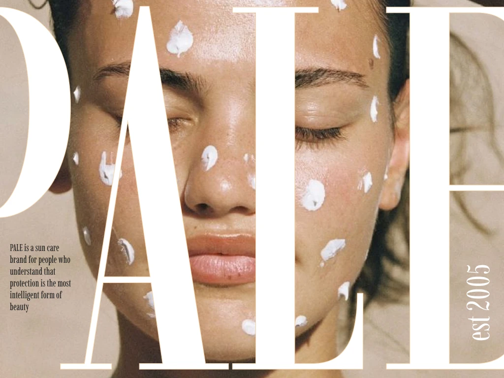
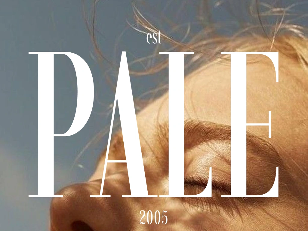
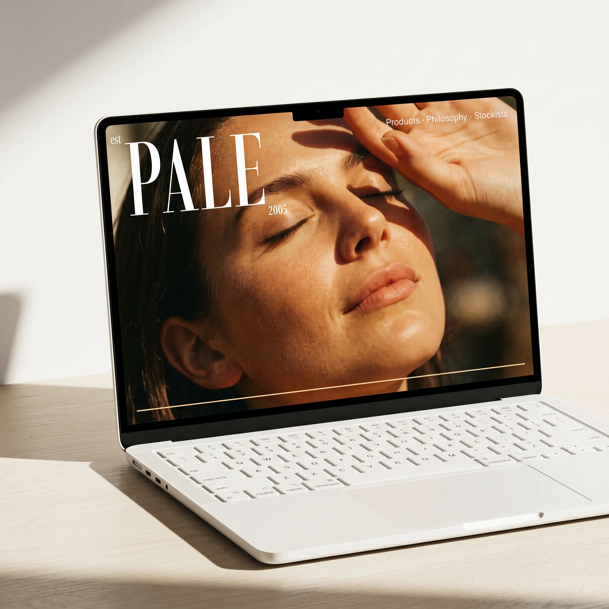
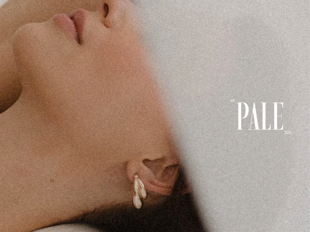
What unlocked the rebrand was thinking about editorial photography before thinking about packaging. Specifically: what does the best sun care image look like? Not the most beautiful one. The most honest one. The answer was skin under direct light, unretouched, the kind of close-up where you see the actual texture of a nose or a cheekbone catching UV. From that image, everything else followed.
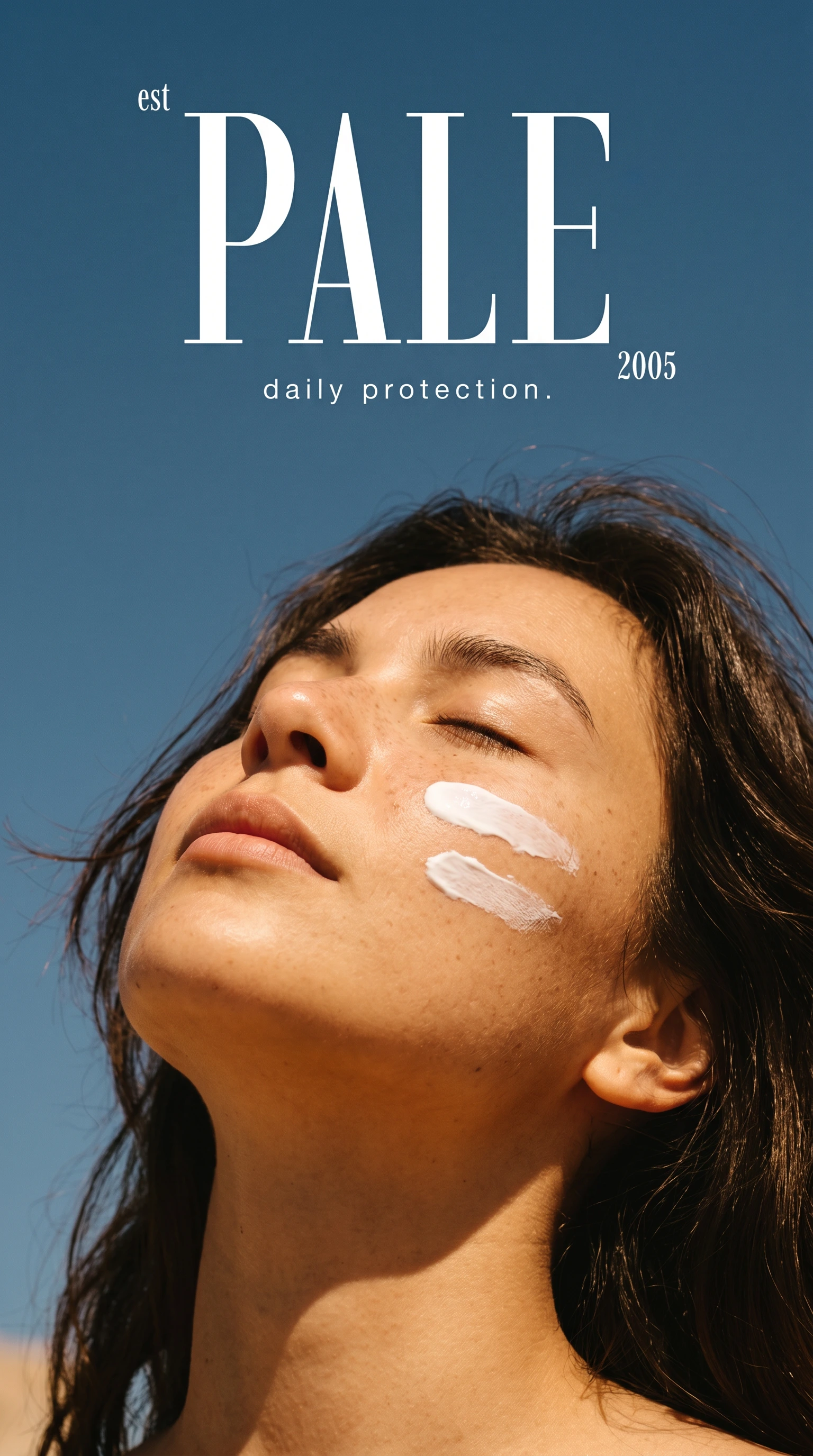
The logo became a high-contrast display serif, all-caps. The masthead logic — where the type is so confident it doesn't need to compete with anything. The palette collapsed from a full system down to three: white, warm sand, near-black. The campaign stopped trying to be beautiful and started trying to be real.
The Work
Logo System
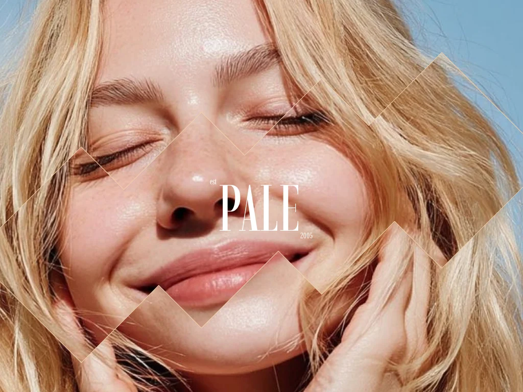
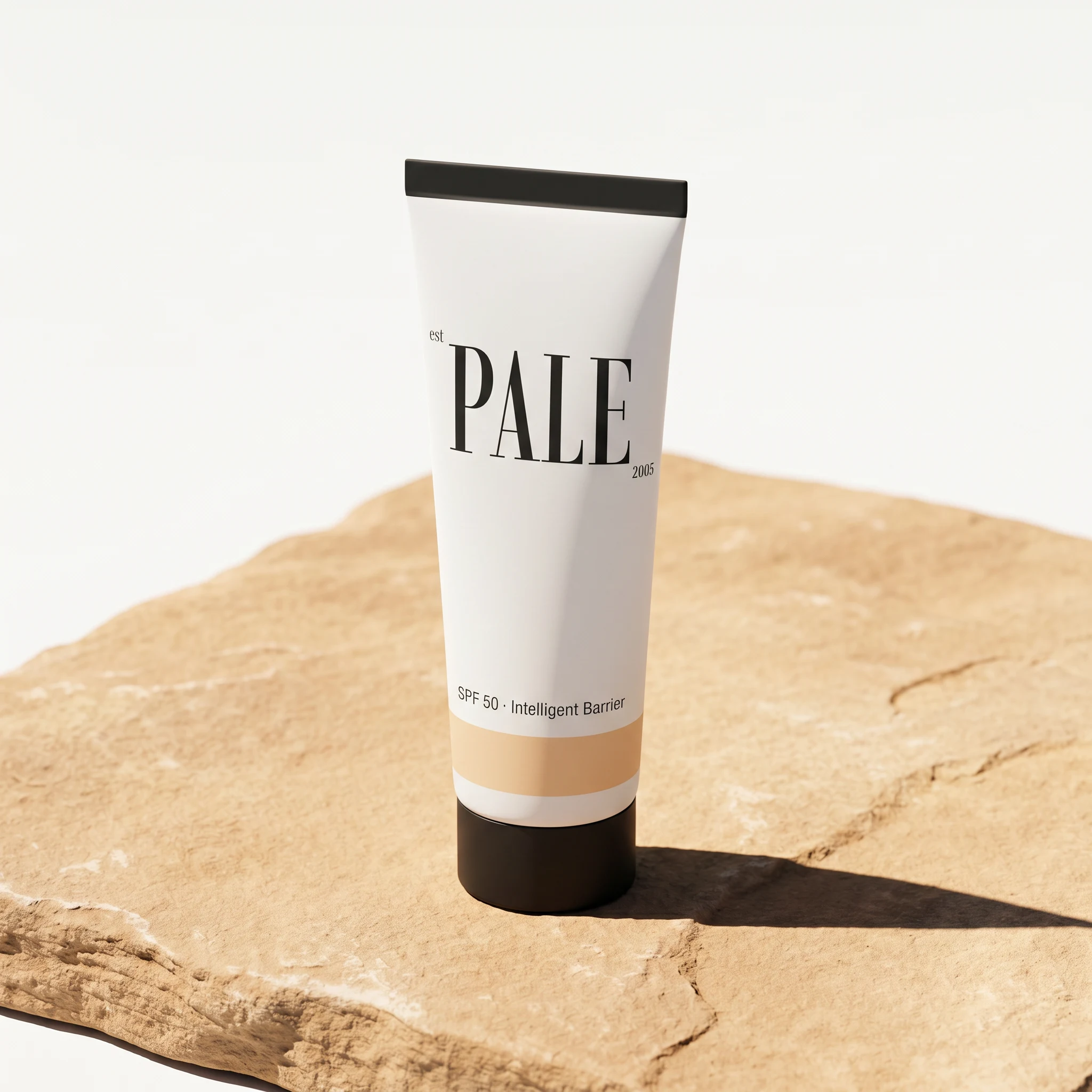
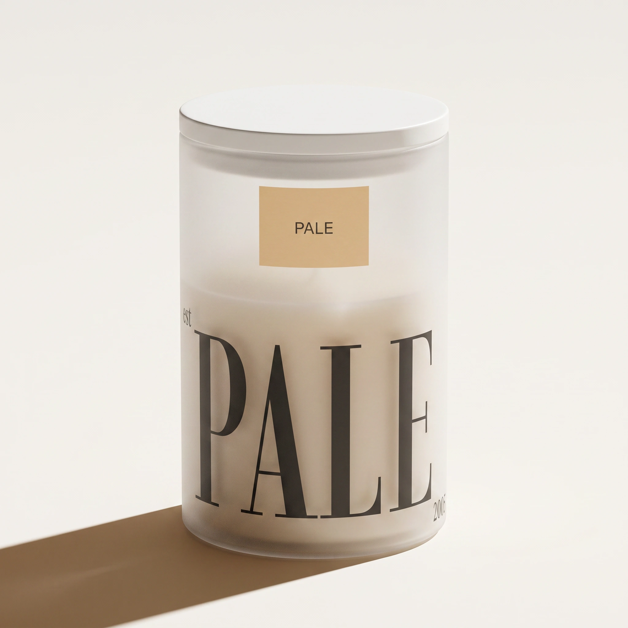
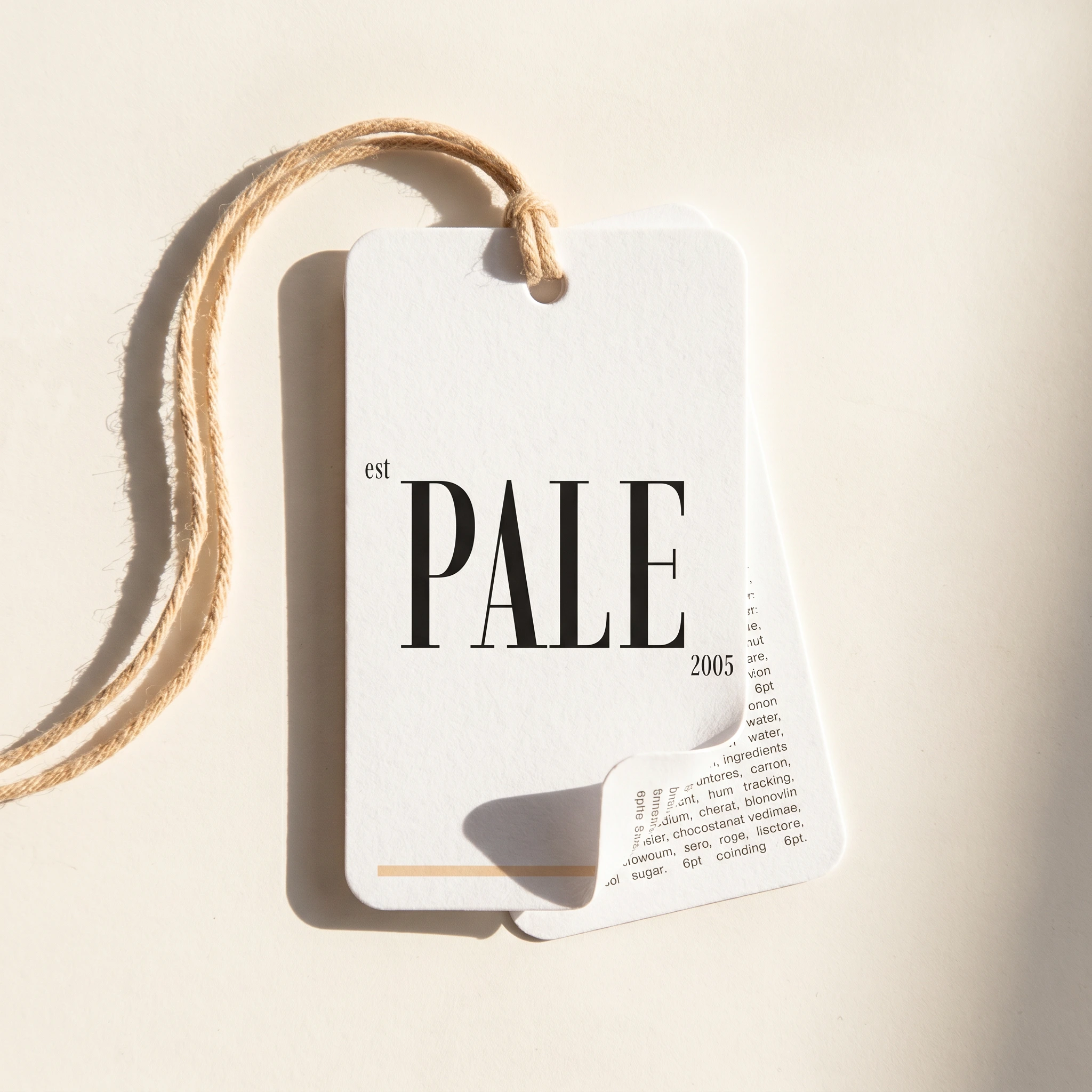
The wordmark is a high-contrast editorial serif set in all-caps at a weight that lands between fashion magazine and institutional signage. Two pieces of micro-text anchor the mark: "est" in light grotesque sits top-left of the P, "2005" mirrors it at the bottom-right of the E. Together they give the brand an age, a history, a sense that it predates the current moment in beauty. The logo operates at two scales: placed with precision on packaging, and expanded full-bleed on campaign material where the letterforms become architecture.
Color System
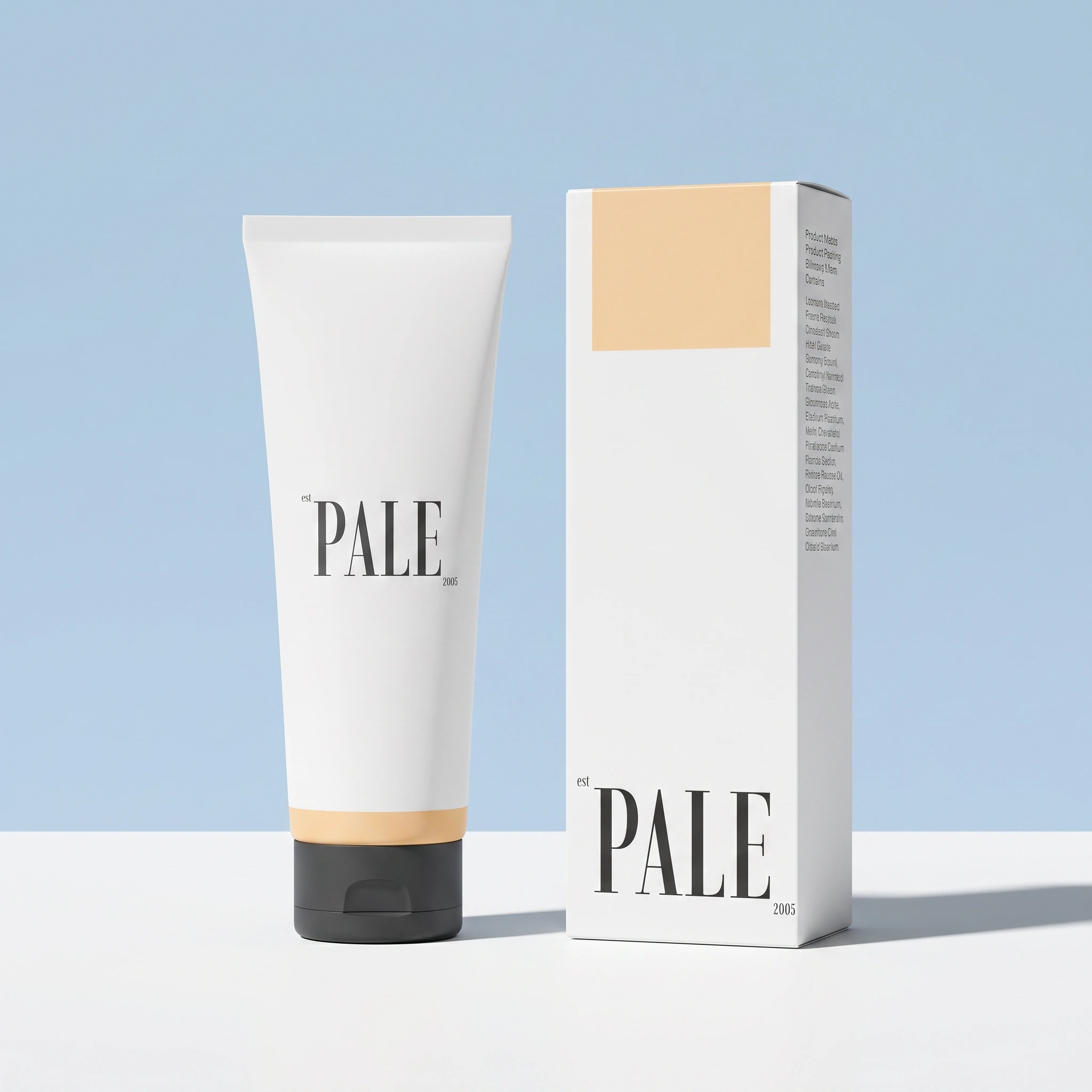
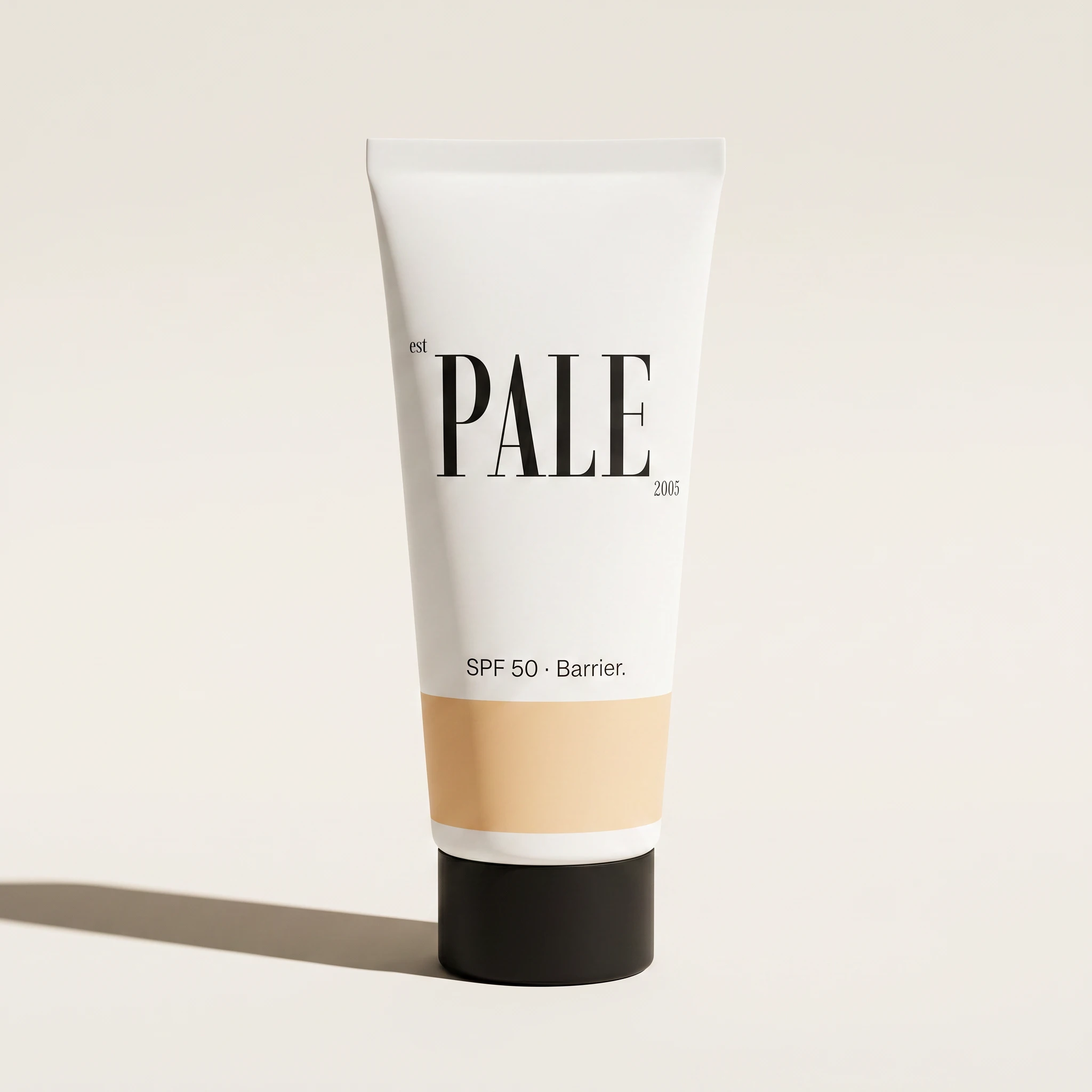
Three colors only. White (
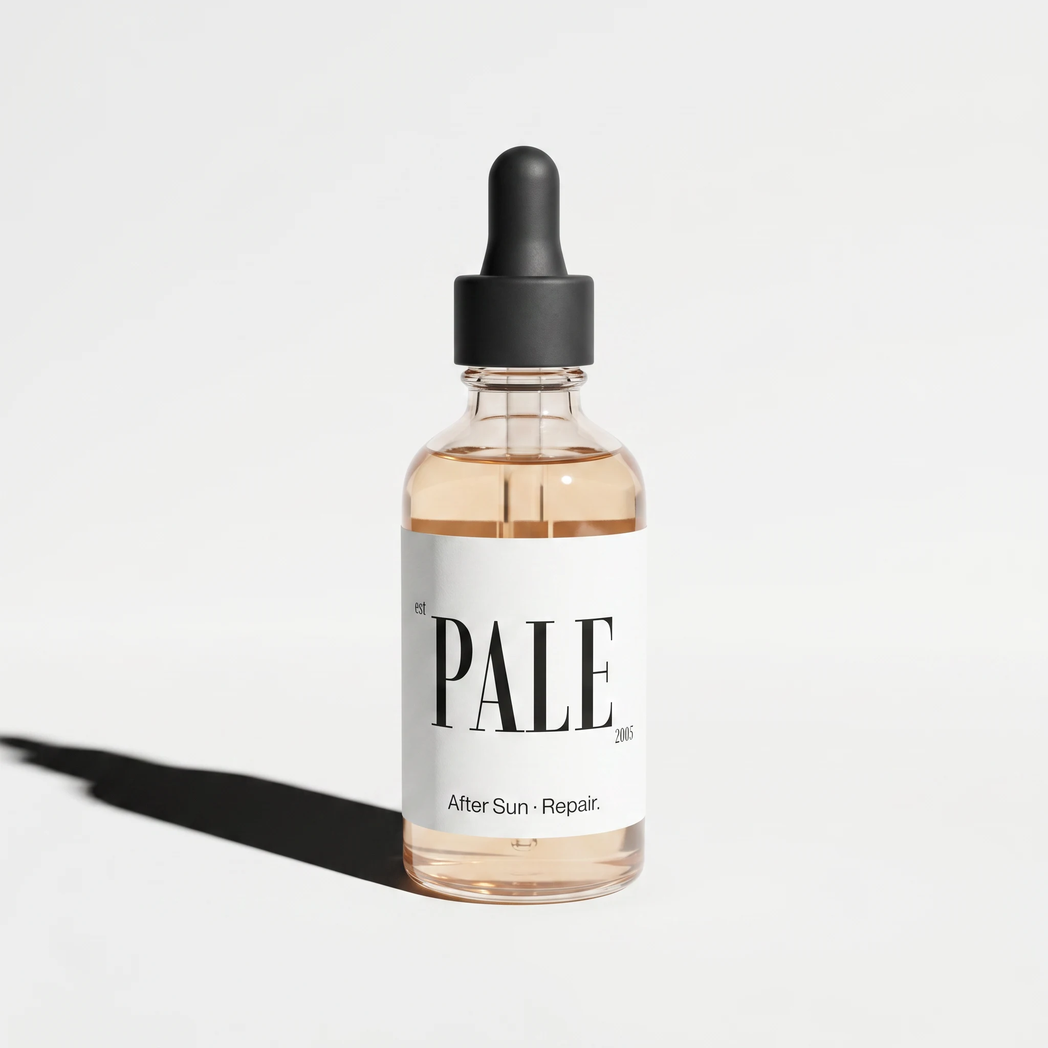
#FFFFFF) for all primary packaging surfaces — not warm white, not cream, always clean. Warm sand (#F2D2AB) for every accent detail: cap color, base band on tubes, label patch on the frosted canister, interior ribbon on the tote. Near-black (#1E1E1E) for all typography, logo applications, and outlines. The palette reads warm without being nostalgic, minimal without being sterile.Typography System
Two registers, no middle ground. The logo serif handles all display use — headlines, campaign type, full-bleed wordmark applications. A light-weight grotesque at 8pt with wide tracking handles everything else: product names, ingredient lines, campaign taglines, navigation. The contrast between the two is the entire typographic system. Nothing in between.
Packaging
The packaging brief I set myself was: the object is the communication. No illustration. No decorative layer. No pattern. A matte white tube with a
#F2D2AB warm sand band at the base and a #1E1E1E near-black cap. The PALE logo placed large on the upper body. One line of grotesque below it. That's the full design. The system holds across five formats — primary tube, carton box, 50ml glass dropper, frosted polypropylene canister, travel zip kit — because the logic is structural. Change the form, the proportion system adjusts, the color application stays.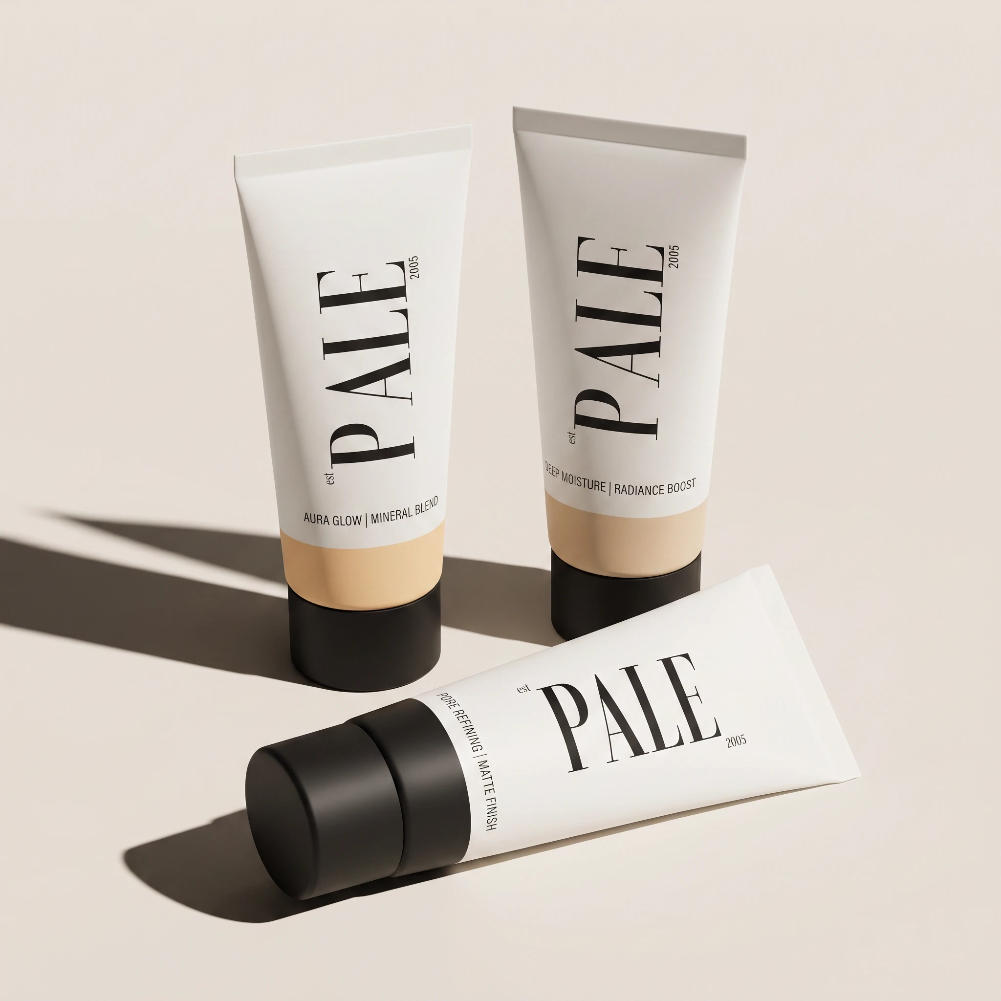
Campaign Direction
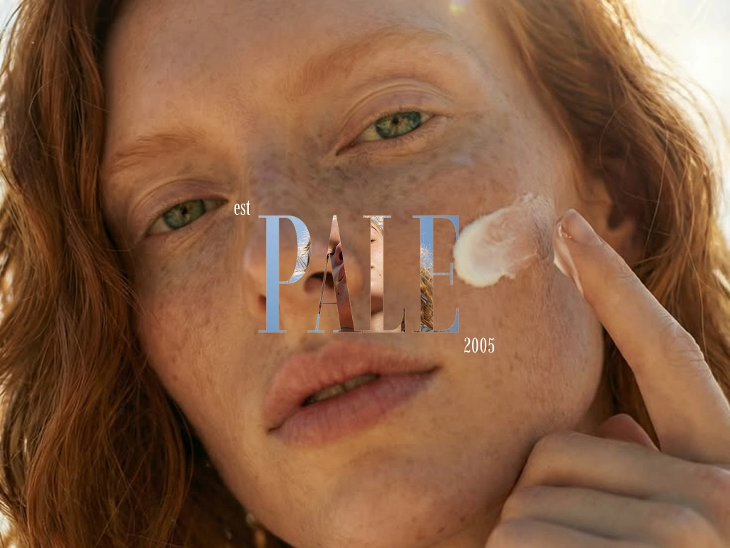
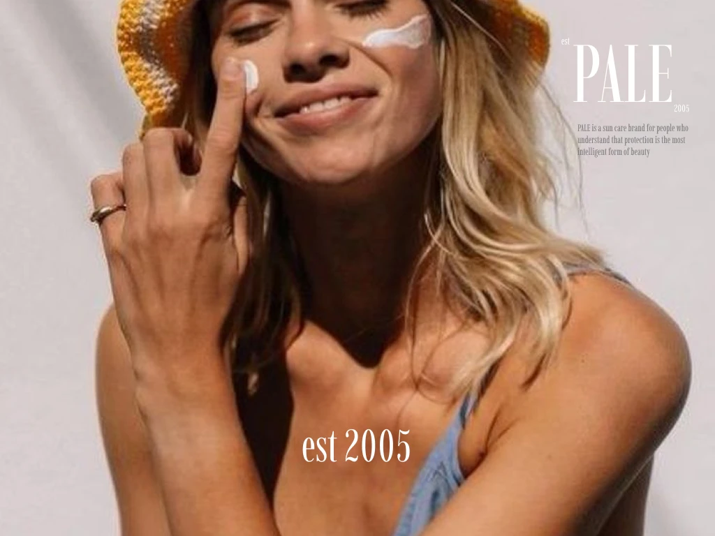
Two modes. In the first, the PALE logo runs full-frame over skin photography — the high-contrast white serif laid directly over warm skin tone, the letterforms becoming a mask through which the image reads. No other copy. The skin and the type are the entire composition. In the second mode, the logo sits small in a corner of a frame that is mostly photograph — a face tilted toward the sun, or a collarbone under direct light. Both work because the logo is strong enough to hold either register without adjusting its weight.
Collateral
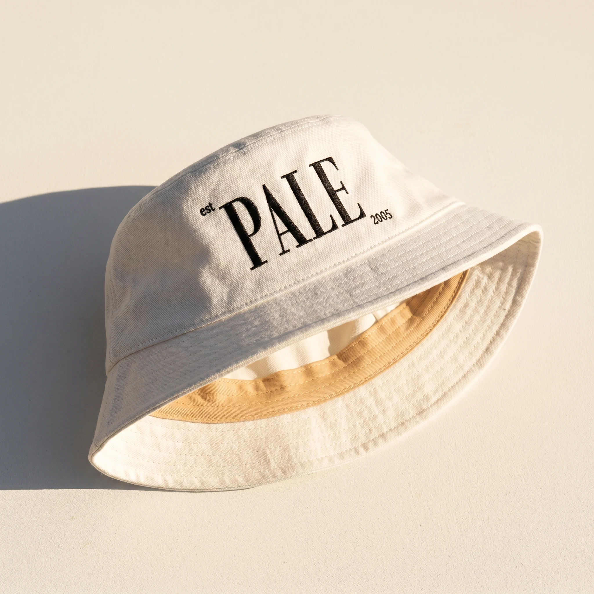
The collateral system extends the same logic outward: a hang tag in thick uncoated board with the logo debossed, a sticker sheet in three formats, a canvas tote with a screenprinted wordmark, a structured bucket hat with embroidered logo. Every object uses the same three colors and the same two typographic registers. No exceptions.
The Result
PALE shipped as a complete speculative brand identity: logo system with micro-text anchors, a three-color palette applied across every surface, a packaging family in five formats, a campaign visual language with two modes, and a full collateral suite from billboard to hang tag.
The identity is production-ready. The packaging system could go directly to a manufacturer. The campaign direction could brief a photographer tomorrow. Nothing in it is decorative — every element is either structural or load-bearing. That's the standard I held it to.
What PALE demonstrates is that a position of restraint requires more decisions, not fewer. Three colors decided hundreds of times, consistently, is harder than a full palette used loosely. The tightness is the work.
Studio: Révolté — revolte.design
Project: PALE
Year: 2026
Scope: Brand Identity, Logo Design, Visual System, Packaging Design, Campaign Direction, Collateral
Industry: Beauty — Sun Care / UV Protection
Like this project
Posted May 13, 2026
Developed complete brand identity of PALE, a sun care brand built on a single premise: protection doesn't need a lifestyle. It needs to be right.
Likes
2
Views
25
Timeline
May 4, 2026 - May 13, 2026

