EXPERI/MENTAL Crypto Wallet Design
Révolté
EXPERI/MENTAL — Finance for People Who Don't Trust Finance
A speculative crypto wallet built for the DeFi-native user who's bored of blue-gradient fintech. The answer wasn't a better interface — it was an honest one.
THE BRIEF
The crypto wallet category has a design problem that isn't really a design problem. Every app in the space uses the same visual language: dark mode, neon gradients, rocket emojis, promises of financial freedom. They all look like they were designed by the same committee with the same brief: make volatility feel safe. I wanted to try the opposite.
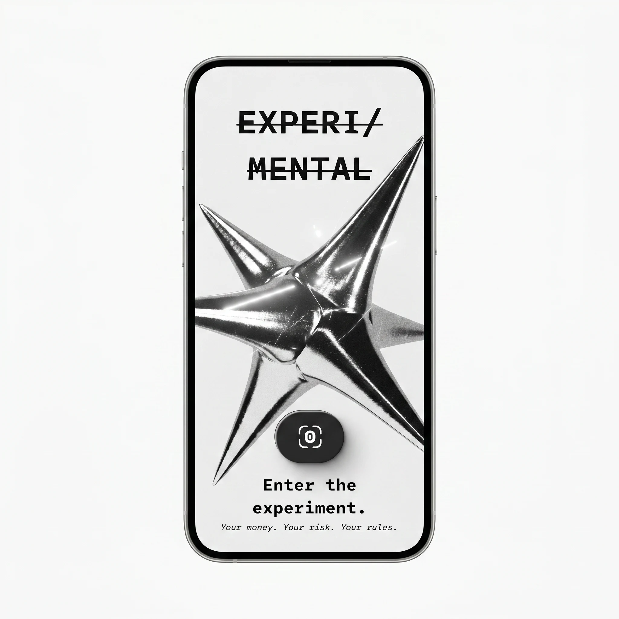
EXPERI/MENTAL is a speculative wallet concept built around a single premise — what if a financial product told the truth? Not as a disclaimer buried in the legal copy, but as the primary design language. The brand doesn't reassure. It doesn't celebrate. It acknowledges that markets move, that you might be wrong, and that this is your experiment to run.
The brief I gave myself was narrow: design a crypto wallet for someone who already knows how this works, who doesn't need a mascot or an onboarding wizard, and who would respect a product more for admitting its own uncertainty than for pretending it has answers.
THE APPROACH
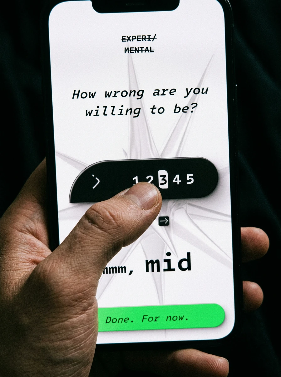
The first decision was the brand voice, because everything else would follow from it. I wrote a simple rule and held it for the entire project: the app never reassures, never celebrates too hard, and always puts the decision back on the user. That rule produced every copy line in the system — from "How wrong are you willing to be?" on the risk profile screen to "Not bad. Not guaranteed." on the trade confirmation.
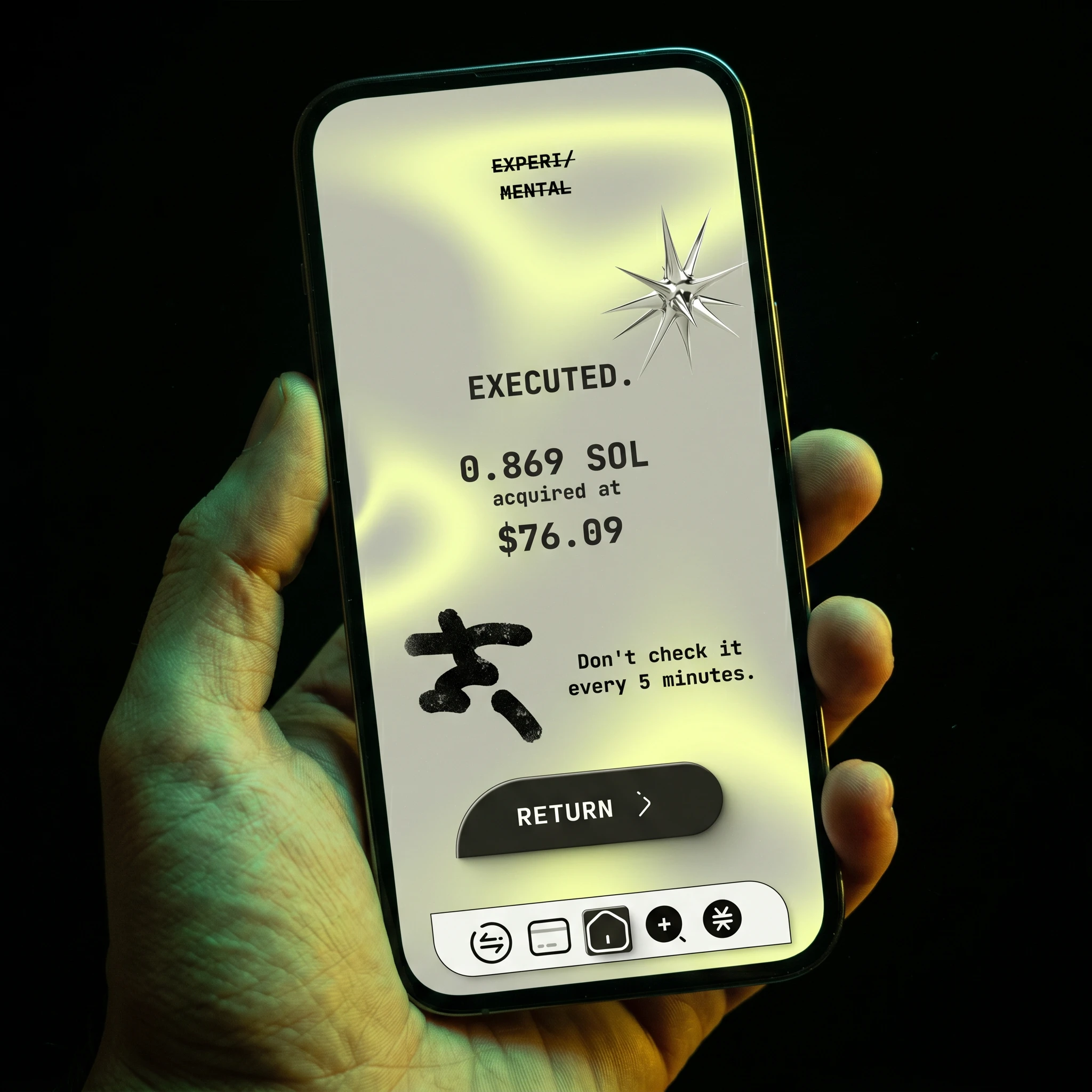
The visual language came from a similar instinct. I rejected the standard crypto aesthetic immediately — dark mode, glowing coins, aggressive green numbers. Instead I pulled from three directions that don't usually share a room: post-internet art, Japanese ink calligraphy, and Y2K chrome sculpture. The chrome star became the primary brand object — not a logo, a recurring artifact that appears differently across every surface. The ink brushstroke kanji/figure mark became the emotional register of the brand: raw, gestural, slightly broken. The strikethrough on the wordmark was the conceptual anchor — EXPERI/MENTAL with both words crossed out says everything about what this product refuses to be.
The color system emerged from the screens themselves rather than being imposed on them. Orange for loss and action, green for gain and completion, red for error, terracotta for exit and closure, yellow-green for execution and confirmation. Four screens into the design I realized I'd built a semantic color language without planning it. I kept it.
The hardest screen was the empty state. Every design system shows its real character in its empty states — what does the product say when there's nothing to show? I landed on "Nothing here yet. That's a position too." as the copy, and "PICK YOUR POISON" as the CTA header. That single screen captures the brand better than any other.
THE WORK
BRAND IDENTITY
The wordmark is set in a tight monospace with a horizontal strikethrough across both lines — EXPERI/ and MENTAL, both crossed out. The strikethrough is not decorative. It signals self-awareness: this is not a bank, and it's not trying to be one. The chrome star object is photographed in multiple states across the system — as a 3D render, as a physical printed object, as a component of the UI itself. The ink brushstroke mark doubles as error state, empty state illustration, and avatar system. Every brand element earns its place functionally before it earns it aesthetically.
TYPOGRAPHY SYSTEM
Monospace throughout — no exceptions. Body copy in italic monospace for sub-labels and emotional copy. All-caps monospace for headers, section labels, and CTAs. The typeface choice isn't about aesthetics — it references financial terminals, code output, receipts. It signals that this is data, not marketing.
COLOR SYSTEM

Off-white (
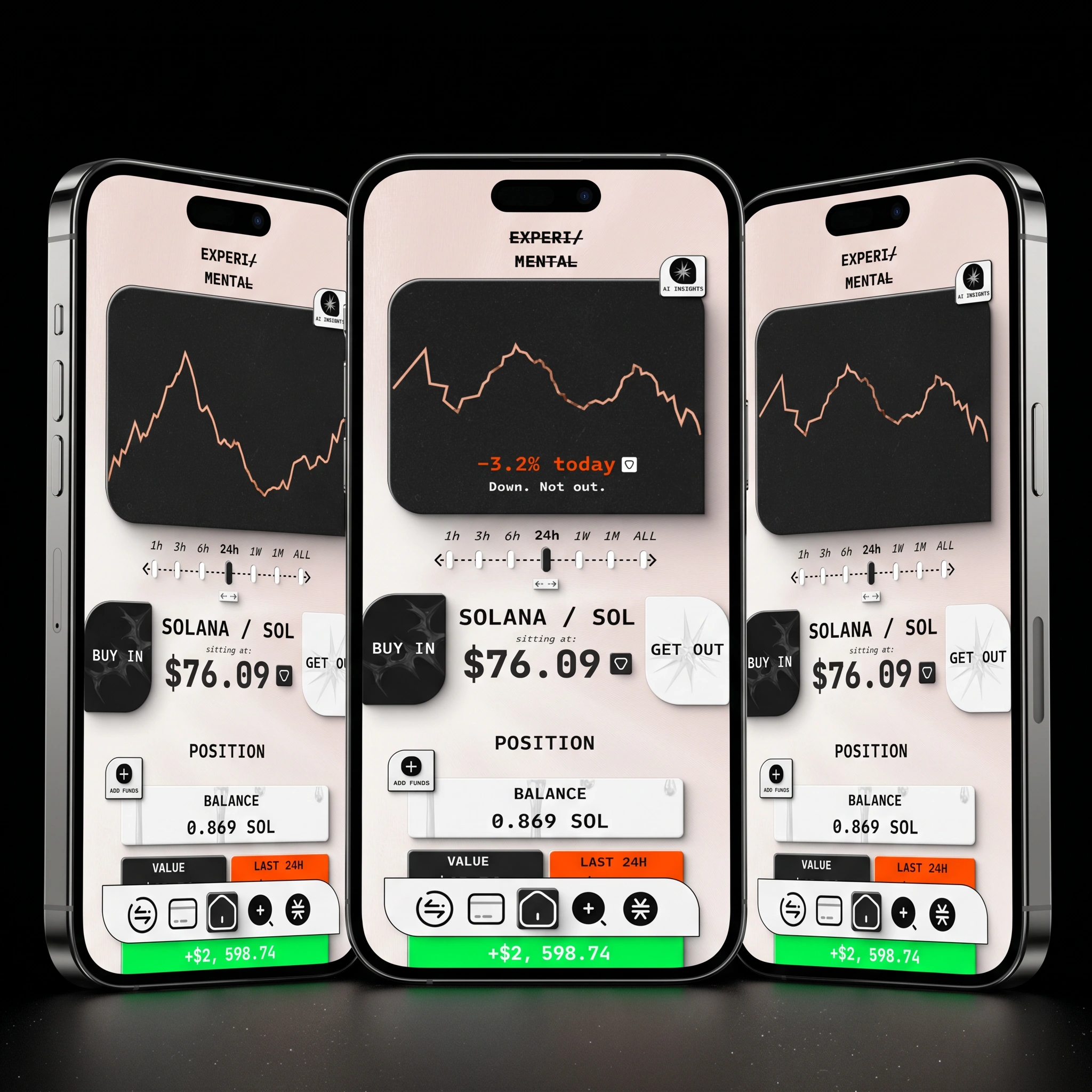
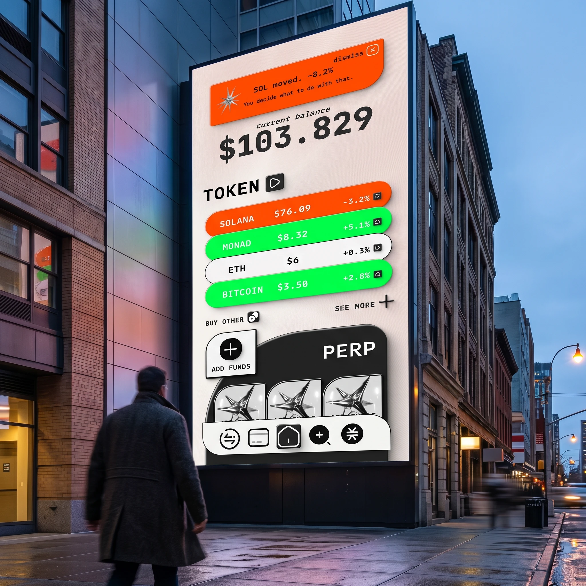
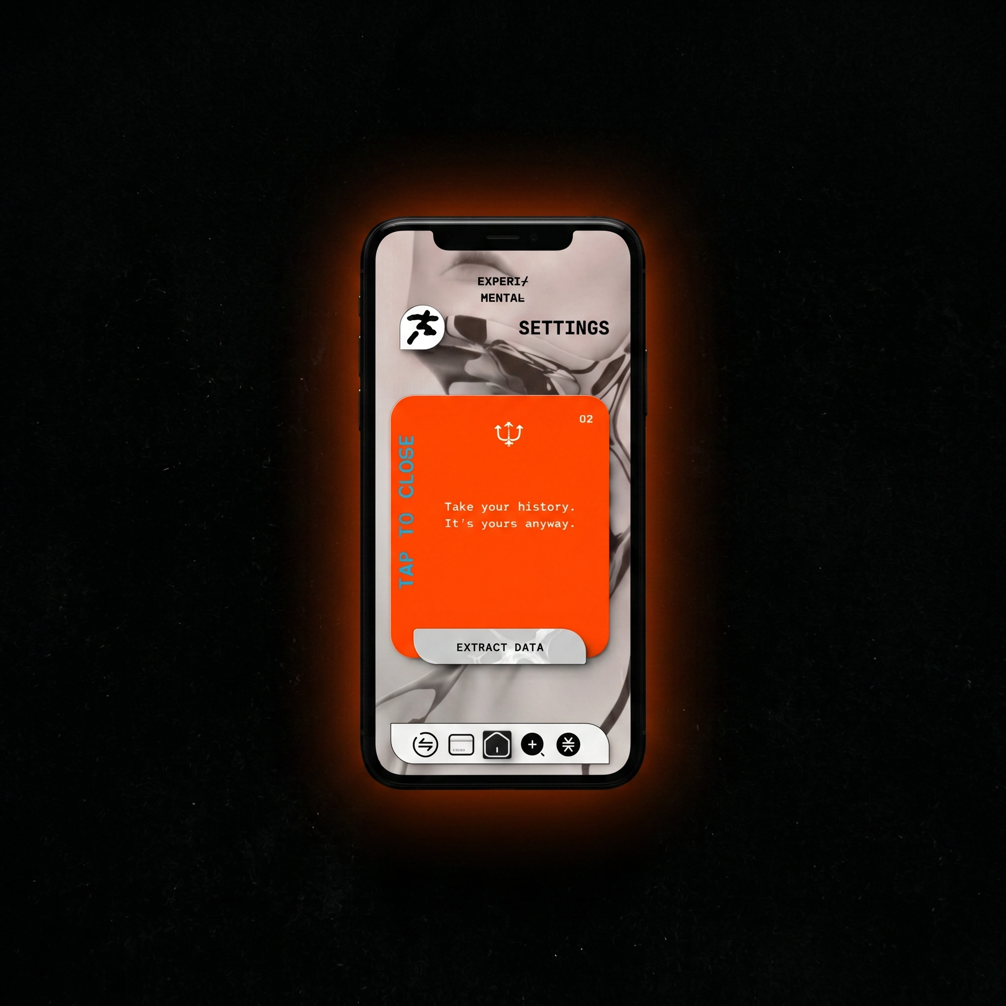
#F5F2EE) as the base. Black (#0A0A0A) for all primary type and UI elements. Orange (#FF4D00) as the dual-purpose signal for loss and action — a deliberate tension, since orange traditionally means warning in finance. Red (#CC2200) reserved exclusively for error states, where the kanji runs red. Acid green (#AAFF00) for the guerrilla campaign only. Yellow-green gradient for buy confirmation screens. Terracotta gradient for sell confirmation and short position screens. The gradients are the only moment of warmth in the system — they're earned by the trade being complete.UI SYSTEM — 27 SCREENS
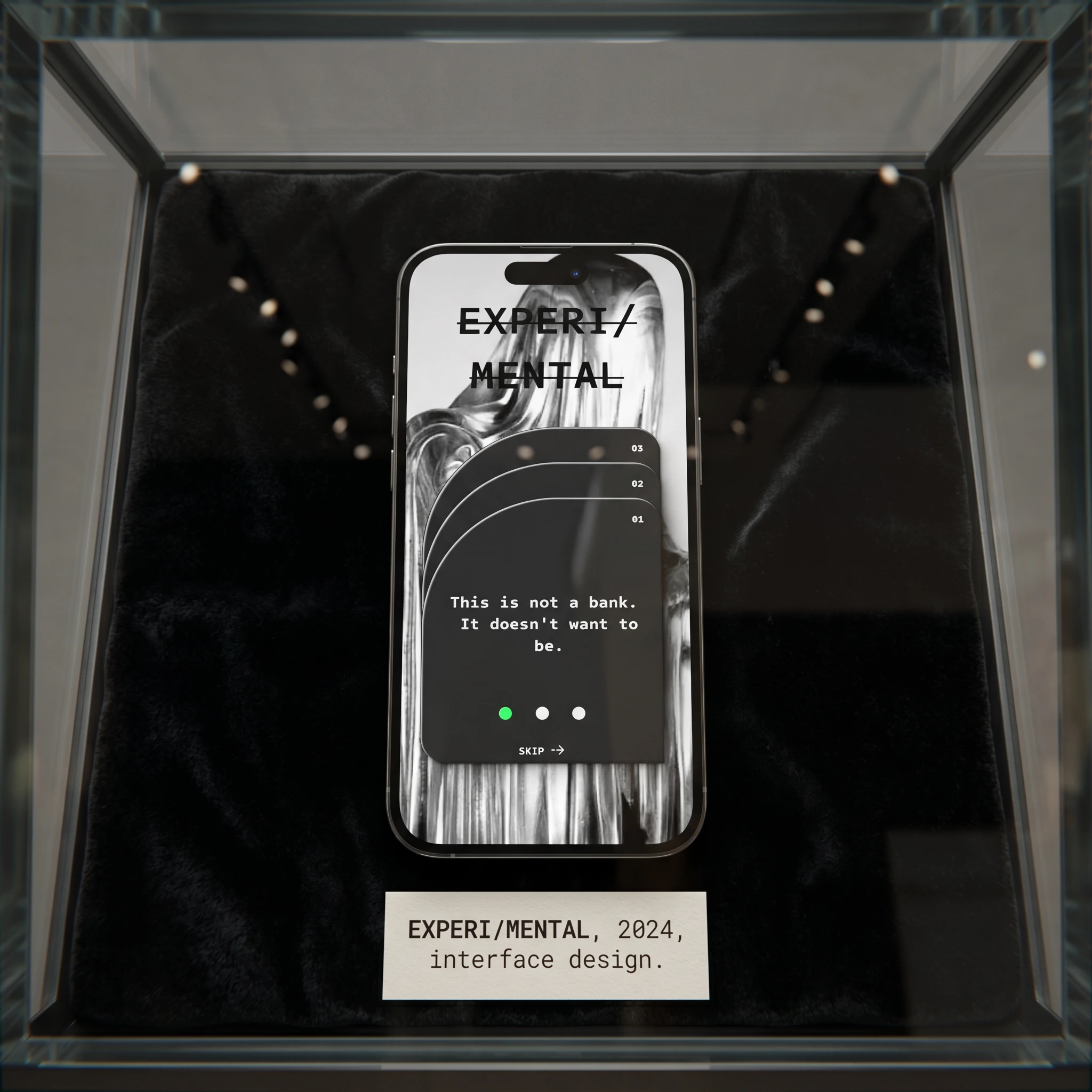
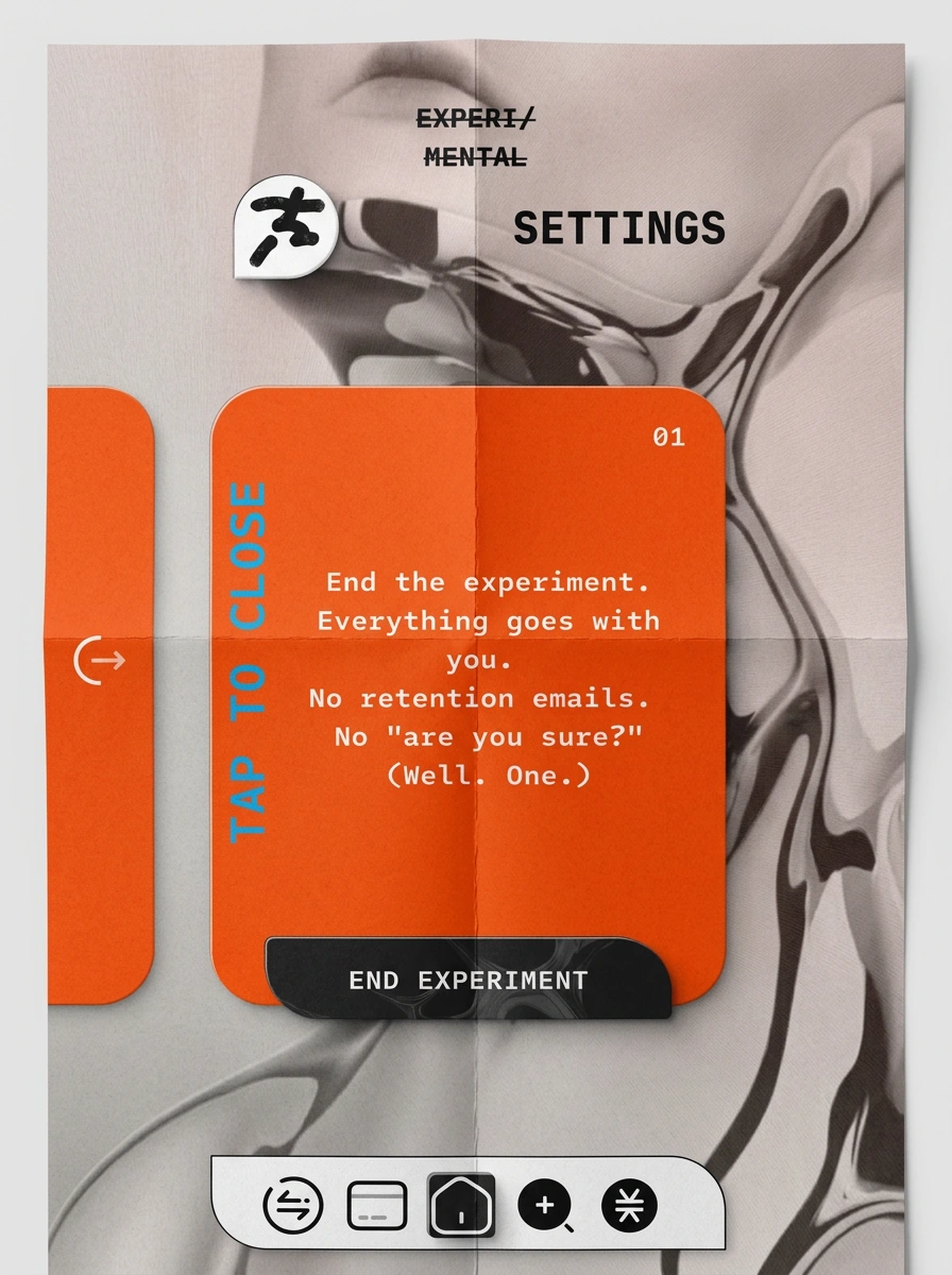
The screen system covers the full user journey: three onboarding cards, access screen, risk profile, dashboard, token detail (three states: default, buy confirmation, sell confirmation), PERP detail (three states), empty state, error screen, deposit and success, settings (three states: main, termination, data extraction), search, empty search, user profile, and four trade execution confirmations. Each confirmation screen uses the semantic background color — yellow-green for buys, terracotta for sells — making the outcome legible before the copy is read.
The button interaction is the most distinctive UX decision in the system. On the token detail and PERP screens, the buy and sell actions are presented as two pills — one dark, one light — sitting side by side. Tapping one causes it to expand across 75% of the bar while the other shrinks. The expanded state reveals a texture (liquid chrome for buy, chrome star for sell) and the confirmation copy: "Tap again. No going back." / "Tap again. Position closes." The second tap executes. No modal. No separate screen. The confirmation is built into the expansion.
COPYWRITING SYSTEM
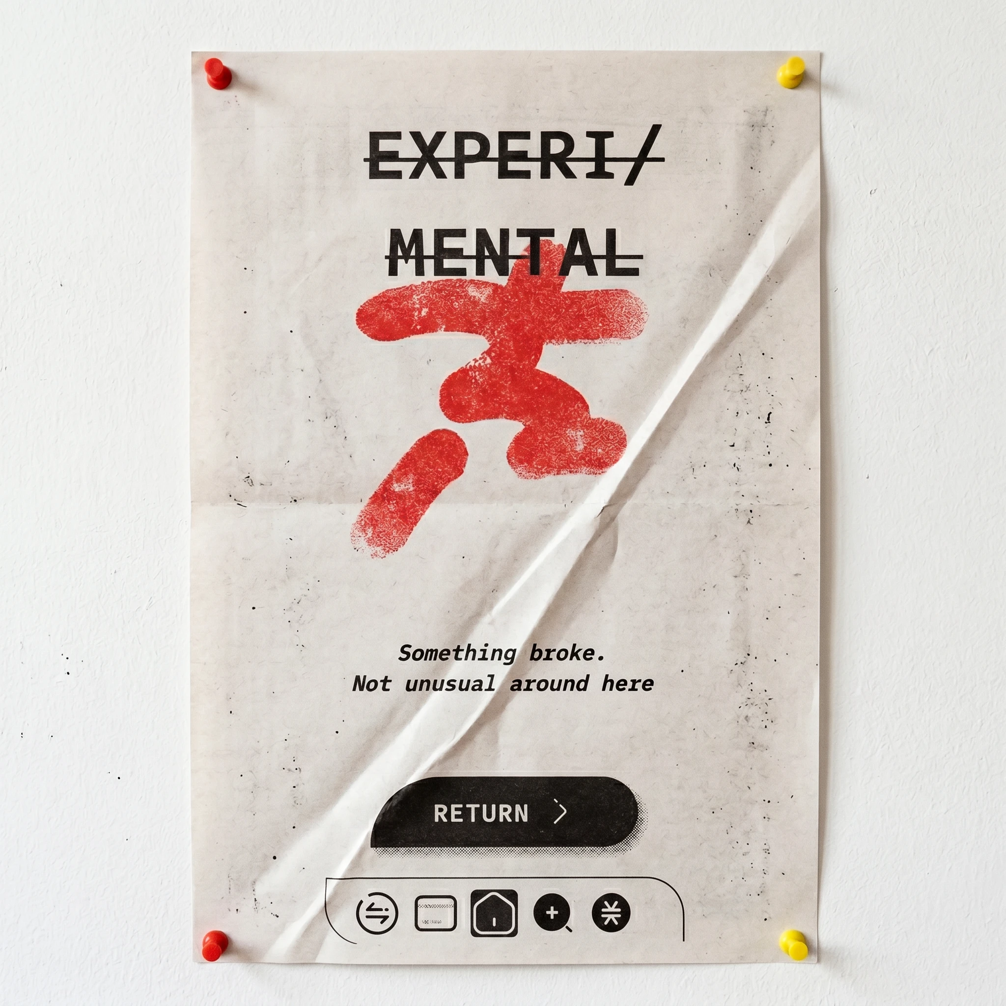
Every screen has a voice rule: acknowledge the reality, don't soften it, put the choice back on the user. The copy system runs from macro to micro — "Enter the experiment." on the access screen to "Don't check it every 5 minutes." on the post-trade confirmation. The risk profile screen asks "How wrong are you willing to be?" and labels the five levels: barely in, cautious, mmm mid, committed, all the way down. The error screen says "Something broke. Not unusual around here." The offboarding screen says "No retention emails. No 'are you sure?' (Well. One.)" Every line was written to sound like the app talking to an equal, not a customer.
CAMPAIGN — 5 ADS
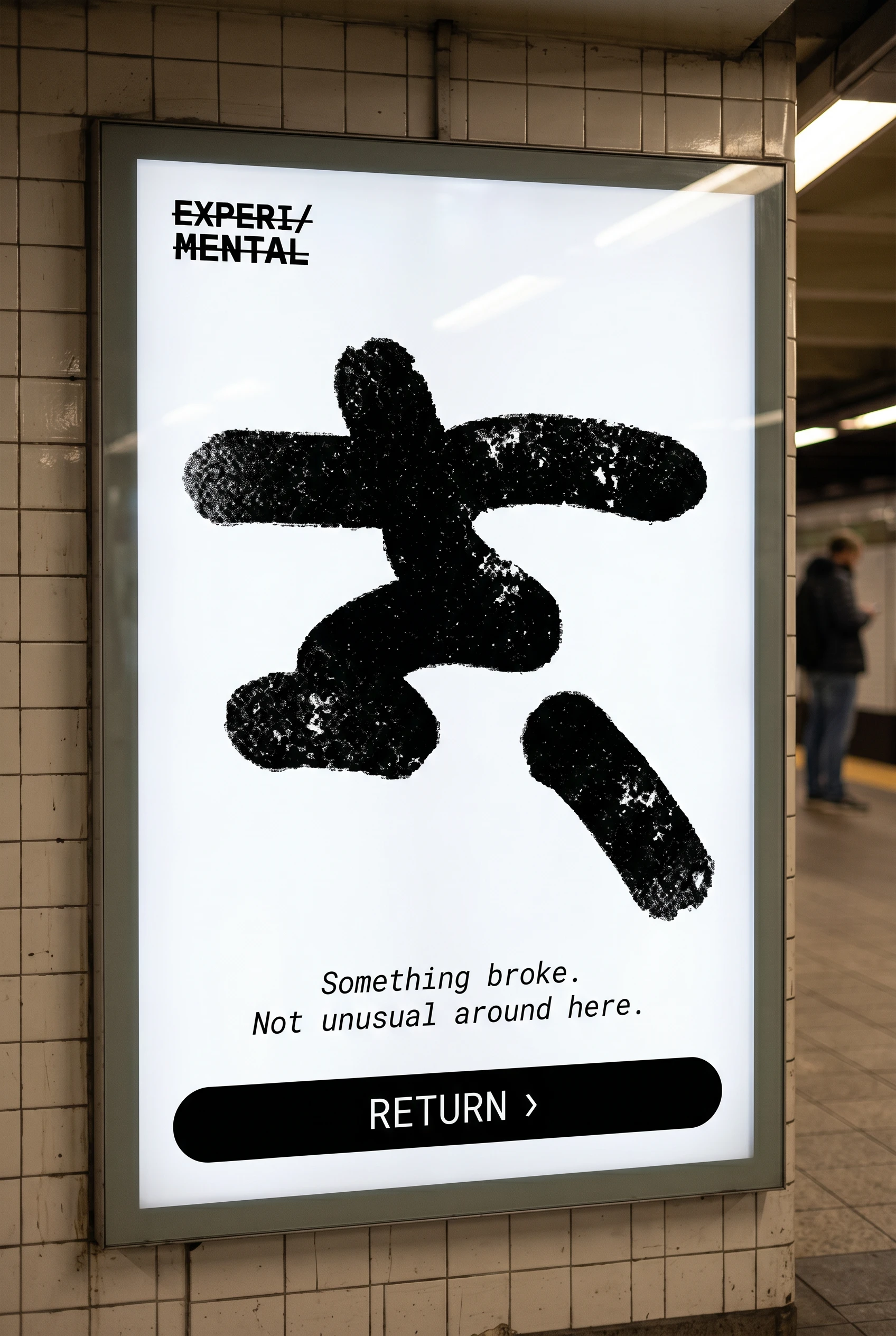
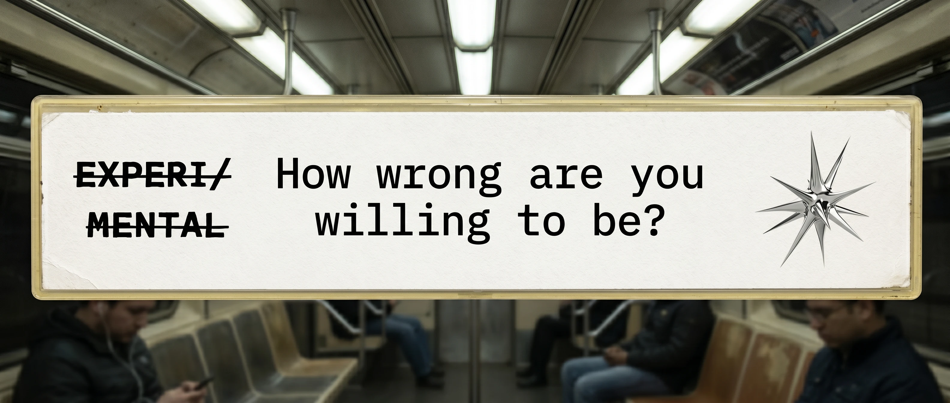
The campaign extends the brand into physical space across five formats. The metro billboard uses the chrome star and three-line copy pyramid: "YOUR MONEY. / YOUR RISK. / YOUR RULES." — each line heavier than the last, no URL, no download CTA. The metro poster inside the station brings the error screen into OOH — the kanji at poster scale, the RETURN button as a full-width black pill at the bottom, a commuter visible out of focus behind the lightbox. The street billboard renders the dashboard UI at building scale — orange notification pill as headline, token rows casting colored reflection onto wet pavement. The subway strip runs "How wrong are you willing to be?" in a single horizontal line with the star as the closing punctuation. The guerrilla paste brings "PICK YOUR POISON" in massive black on acid green (
#AAFF00), the chrome star as a full stop below the text, wheat-pasted on concrete.MOCKUPS — 17 FORMATS
The mockup set spans physical print, environmental, studio, and editorial formats: a die-cut hang tag on concrete, a screen-printed tote with a physical chrome star resting on it, a museum vitrine with the onboarding screen labeled as an artifact, an OOH billboard on a rain-wet financial district street, a folded paper poster with the orange card sitting across the crease, a risograph-printed error screen on newsprint, a notebook with the sell confirmation embossed into the leather cover, two stickers on black metal with a corner peeling, a phone face-down with the error screen spilled out beneath it onto a white surface, and a trade confirmation screen casting yellow-green light onto the hand holding it in the dark.
THE RESULT
EXPERI/MENTAL is a complete speculative product — brand identity, UI system, copy voice, campaign, and mockup set — built around one honest idea: that a financial product can respect its users by refusing to lie to them. The design system holds across 27 screens, 5 ads, and 17 mockup formats without breaking character once.
The strongest proof that the concept works is the error screen. "Something broke. Not unusual around here." next to a red kanji on a white background is more honest than any fintech app on the market. It's also more distinctive. The two things turned out to be the same thing.
Révolté — revolte.design
Project: EXPERI/MENTAL
Year: 2026
Scope: Brand Identity, UI/UX Design, Copywriting, Campaign, Mockups
Industry: Fintech / Crypto / Speculative
See more at revolte.design
Like this project
Posted May 5, 2026
Designed EXPERI/MENTAL is a wallet concept built around a single premise: what if a financial product told the truth?
Likes
2
Views
20
Timeline
Mar 24, 2026 - May 5, 2026

