Built with Lovart
TOKAN Brand Identity Design
Révolté
TOKAN — The Practice Brand

A technical apparel brand built for athletes who train in private. No faces, no manifesto, no story on the hangtag — just the weight of the fabric and one red cord.
THE BRIEF
I started TOKAN as a self-initiated project with one constraint I imposed on myself: no lifestyle. Every technical apparel brand I've studied sells a version of who you'll become. Arc'teryx sells the mountain. Lululemon sells the community. Even the most restrained players — PNS, MAAP, Satisfy — sell a kind of person. I wanted to build a brand that refused the sale entirely. A brand that says: the garment is the argument.
The category is athletic apparel. The athlete is someone who trains before anyone is watching — in empty car parks, in concrete tunnels, before the city wakes up. They're not collecting gear. They're using it. The practice is private. The product has to earn its place through construction, not narrative.
The tension I kept circling was this: how do you build a brand identity for a brand that distrusts branding? Everything I designed had to function as a garment detail first and a brand signal second.
THE APPROACH
My first instinct was restraint — a near-invisible identity that whispers its name. I mocked up a wordmark so light it almost disappeared. It felt honest but wrong. Invisible isn't the same as quiet. The brand needed weight. It needed to feel like a component, not a concept.
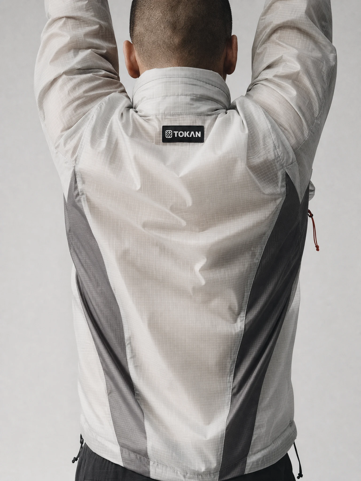
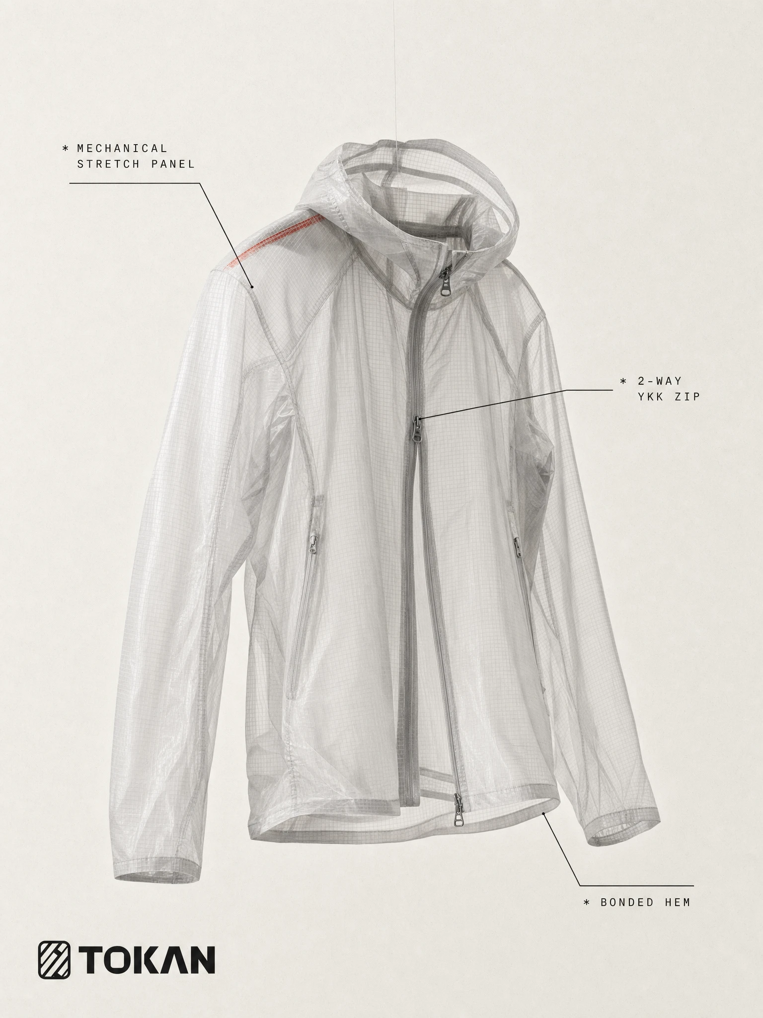
What unlocked it was the fabric. I kept coming back to the ripstop weave — the grid structure of the ripstop nylon, the interlocking geometry of the warp-knit mesh. The logo had to come from the material, not from a type specimen. The TK mark I landed on — two letterforms constructed entirely from interlocking perpendicular strokes — reads simultaneously as initials and as a textile cross-section. A fabric sample that became a badge. That's when the system opened up.
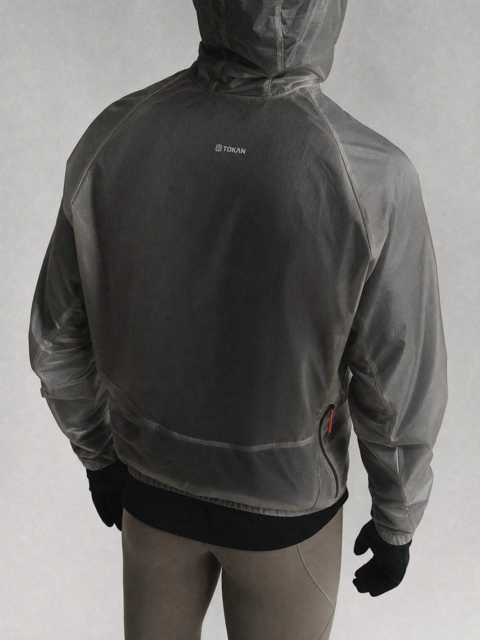
From there, every decision followed one rule: the brand exists only on the garment. The logo appears as a woven patch sewn into the collar, a reflective hit on a hood, a debossed surface on hardware. It never floats in mid-air as a graphic. The annotation language — asterisks, spec callouts, monospaced product references — came directly from the aerospace and technical manufacturing world. Not as a style choice. As the honest language of things that are engineered.
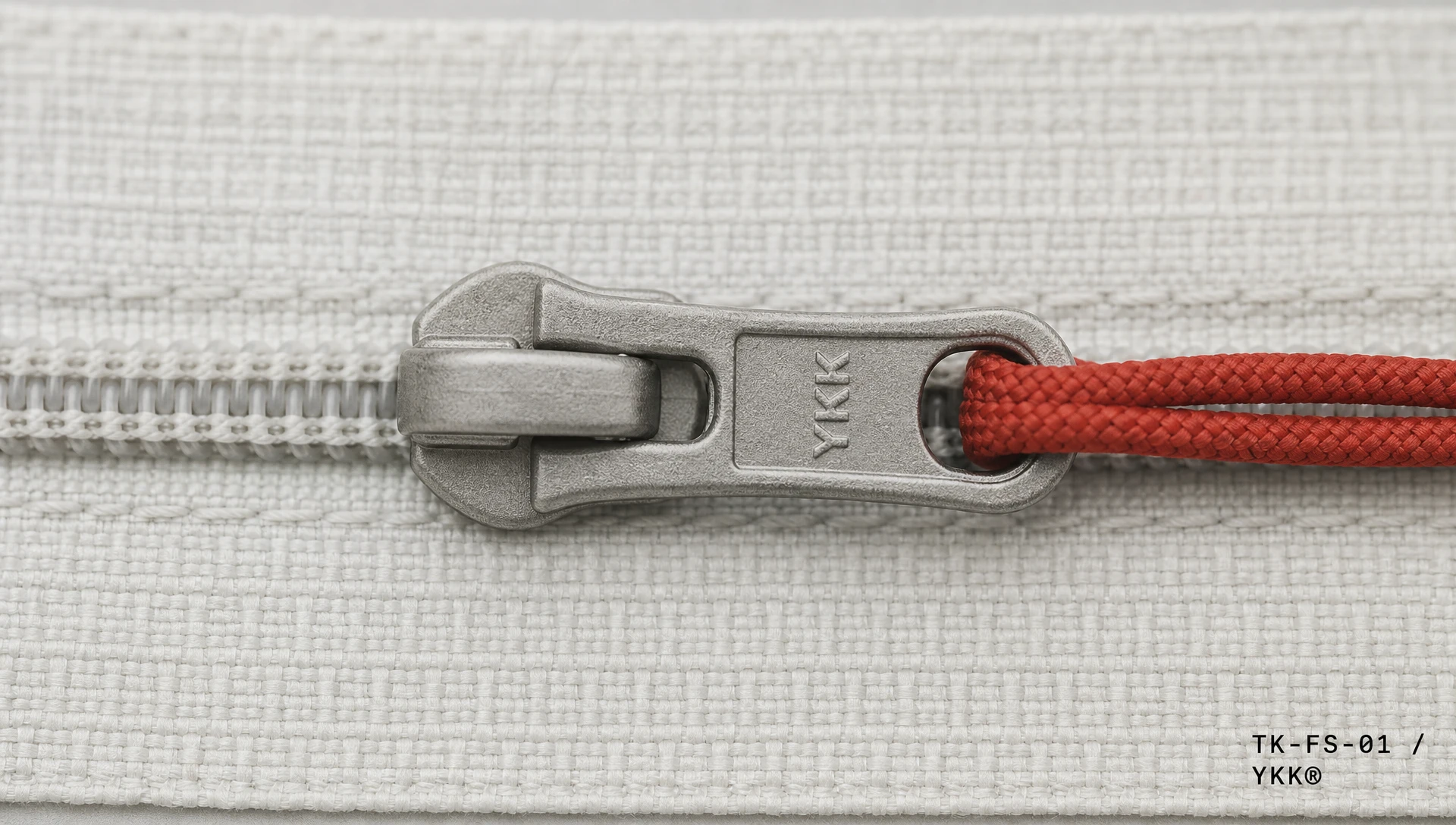
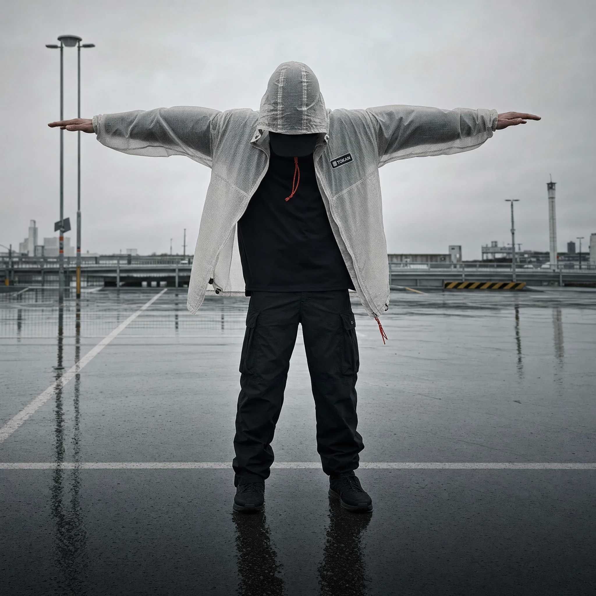
The single chromatic accent, Rope Red
#C8391A, appears once per frame. A zipper cord. A seam tape edge. A hem detail. Never as a graphic element. Always as a physical object. It references the climbing rope image I used as a visual anchor during development — the idea that one thread of color through a monochrome construction is more powerful than a palette.THE WORK
LOGO SYSTEM
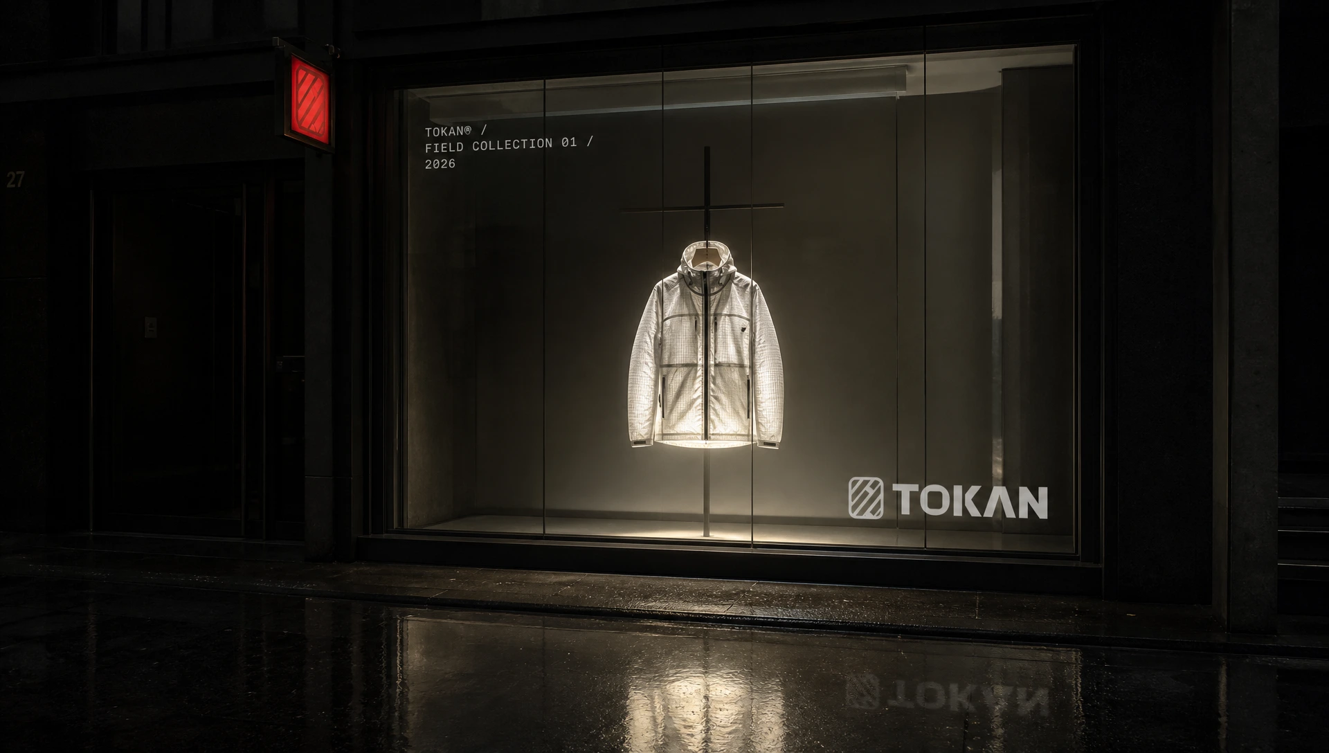
The primary mark is a rounded rectangle containing the TK weave — two letterforms built from identical-weight perpendicular strokes, referencing the structure of woven technical fabric. Paired with TOKAN in a heavy condensed grotesque, all-caps, tight tracking. The mark scales from woven garment patch at 18mm to billboard at 2m without losing its logic. On dark grounds, the internal weave geometry recedes; on light grounds, it reads as constructed object. One mark, two states.
COLOR SYSTEM
Ghost White
#F0EFEB is the primary ground — the color of raw technical fabric before finishing, not pure white, not clinical. Sumi #141412 is the primary dark — near-black with warmth, the color of Japanese ink on uncoated stock. Mist #C8C9C7 and Dust #9A9189 handle supporting information, annotation text, and secondary surfaces. Rope Red #C8391A is the accent — used once per composition, as a physical garment element only. The system has no secondary palette. Discipline is the palette.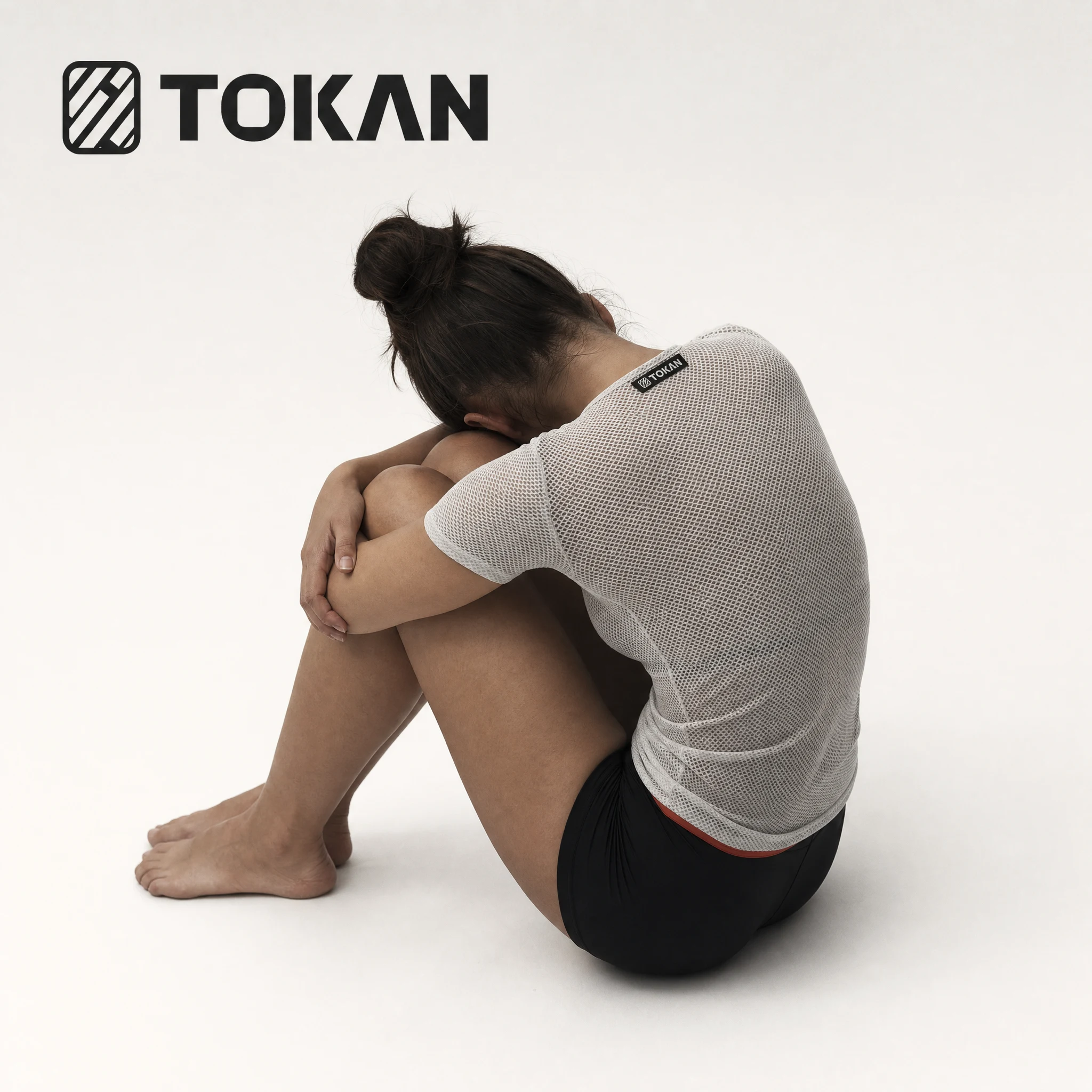
TYPOGRAPHY
Primary: a heavy condensed grotesque, all-caps, zero letter-spacing — institutional, not fashionable. Used for the wordmark and all primary display. Secondary: monospaced technical font, fixed-width, used for product references (TK-FS-01), spec callouts (87g/m² RIPSTOP NYLON), interior label printing, and annotation typography within imagery. This font reads as typed, not designed. It's the voice of the product, not the brand. Tertiary: a light humanist sans for long-form body copy at small sizes — barely present, barely needed.
PRODUCT NAMING SYSTEM
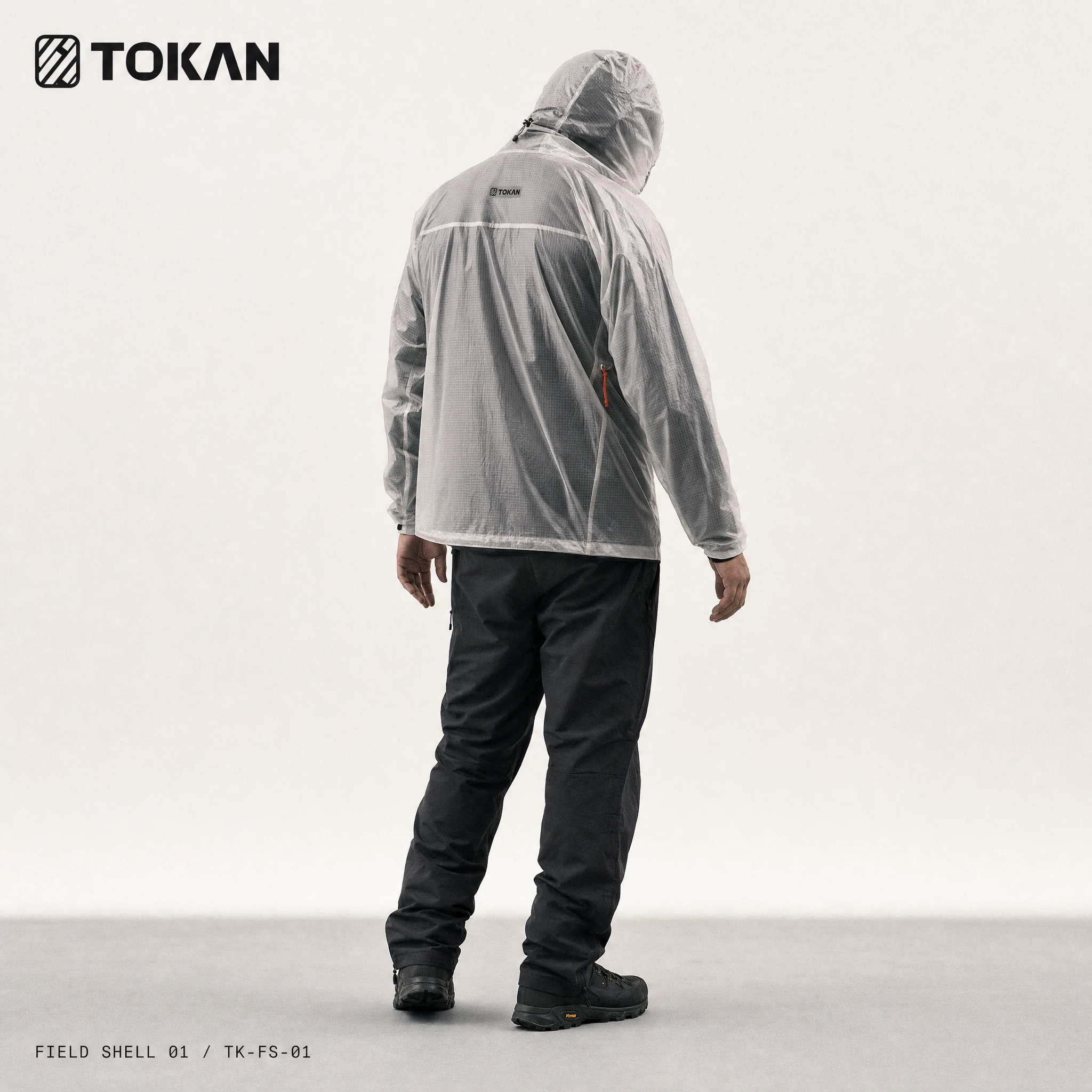
Every product carries a two-part code: category abbreviation + sequential number. FIELD SHELL 01 / TK-FS-01. FIELD BASE 02 / TK-FB-02. The name describes the function. The code identifies the object. There is no marketing name, no season, no collection subtitle. The system is designed to scale to 200 SKUs without breaking.
CAMPAIGN DIRECTION
Figures are always faceless — head cropped, hood up, or turned fully away. No eye contact. The body is the subject: posture, tension, weight, geometry. Single light source. Wet asphalt. Raw concrete. The only warm element in every frame is the Rope Red accent, appearing once as a physical garment detail. The campaign reads as documentation, not aspiration.

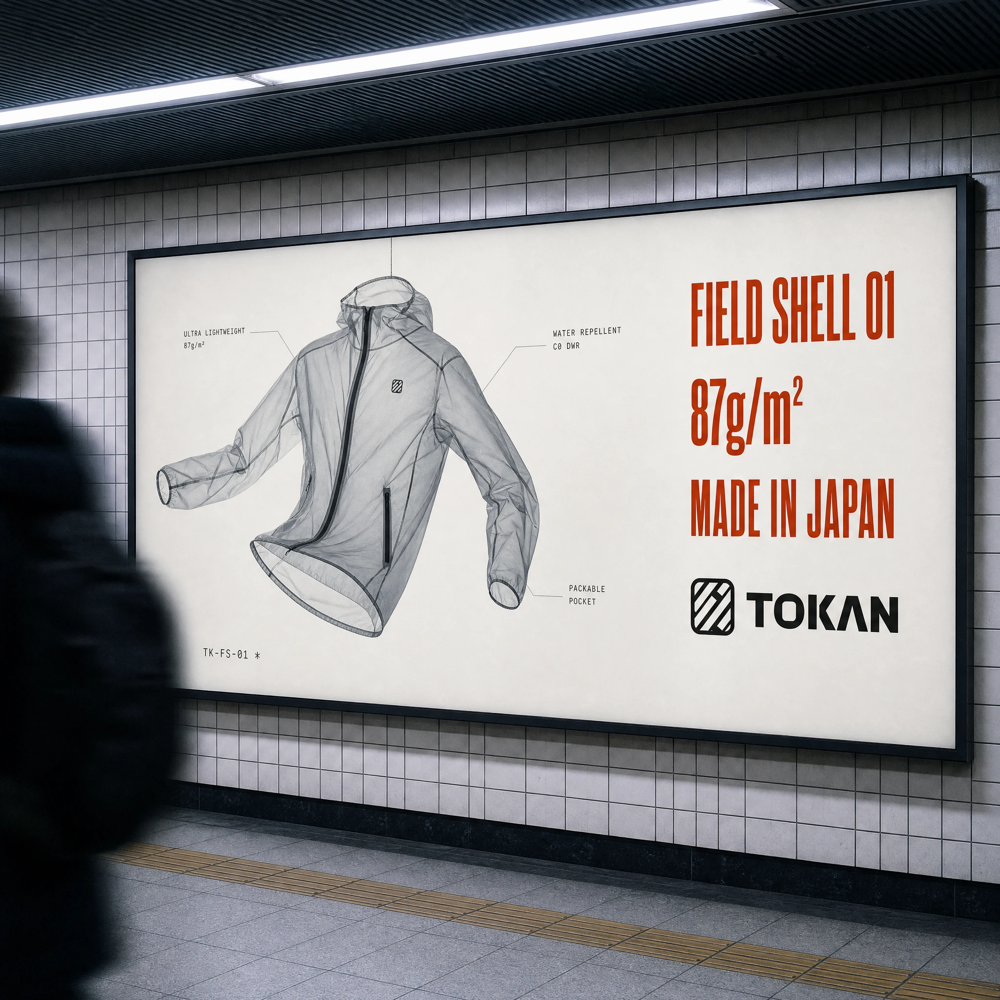
OOH / BILLBOARD
The metro billboard format carries the floating product shot — translucent shell against Ghost White — with annotation callouts in monospaced type, and the product spec stack in heavy condensed grotesque: FIELD SHELL 01 / 87g/m² / MADE IN JAPAN. Technical data treated as headline copy. The spec is the sell.
PACKAGING / HANG TAGS
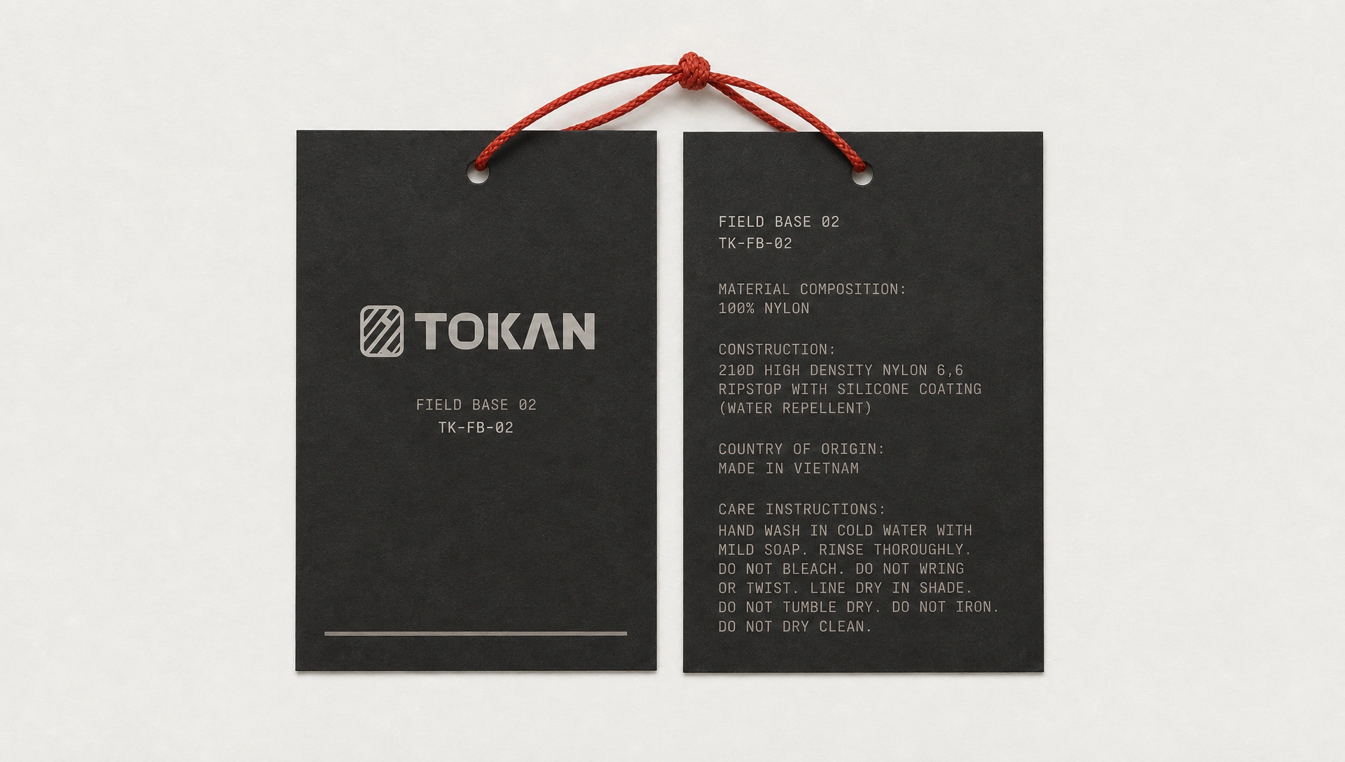
Tags are printed on dark uncoated card stock — Ghost White type on Sumi ground. Front: logo lockup, product name, reference code. Reverse: full material specification, construction method, care instructions written as complete sentences. A Rope Red braided cord passes through the punch hole. The tag reads like a component certificate of authenticity.
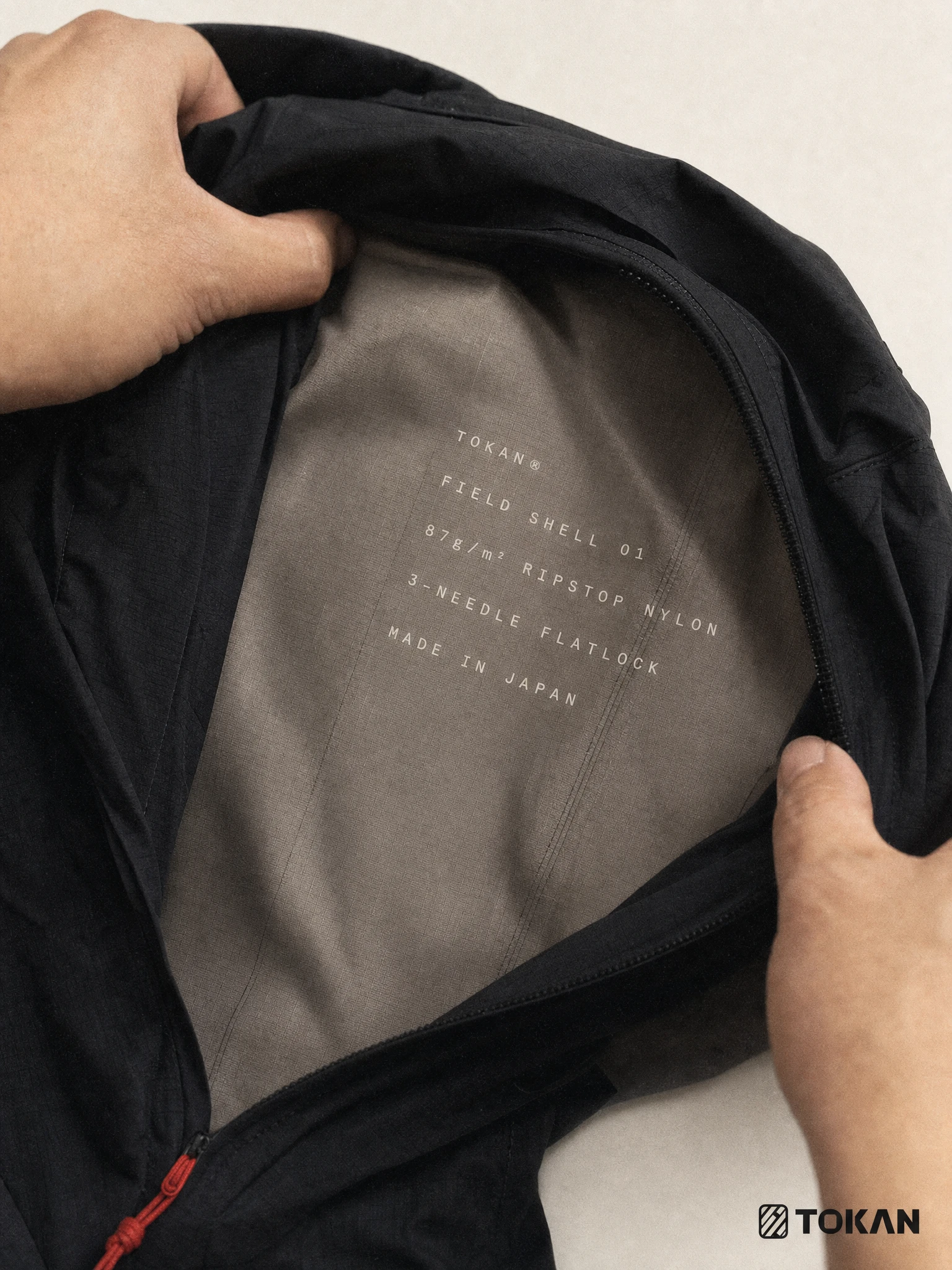
INTERIOR LABEL
Printed directly onto the garment lining in Ghost White monospaced type — no woven label, no sewn patch. The spec reads: TOKAN® / FIELD SHELL 01 / 87g/m² RIPSTOP NYLON / 3-NEEDLE FLATLOCK / MADE IN JAPAN. The interior of the garment tells its own story to the person wearing it, not to anyone watching.
THE RESULT
TOKAN is a self-initiated brand identity built to prove one thing: restraint is not minimalism. Every element in the system has a structural reason to exist. The logo comes from fabric geometry. The color accent comes from material selection. The typography comes from product engineering. The campaign comes from who the athlete actually is — alone, before dawn, with no audience.
What I arrived at is a brand that functions as evidence. Not of a lifestyle. Of construction. The product is the protagonist. Everything else is a label.

Studio: Revolte — revolte.design
Project: TOKAN
Year: 2026
Scope: Brand Identity, Naming, Logo Design, Visual System, Creative Direction, Campaign Direction, OOH, Packaging
Industry: Technical Athletic Apparel

See more at revolte.design
Like this project
Posted May 23, 2026
TOKAN: a technical apparel brand where the garment is the argument: no lifestyle, no faces, no manifesto. Just fabric weight and one red cord
Likes
0
Views
13
Timeline
Jan 13, 2026 - May 23, 2026

