Built with Lovart
Mnemex Brand Identity and System Design
Révolté
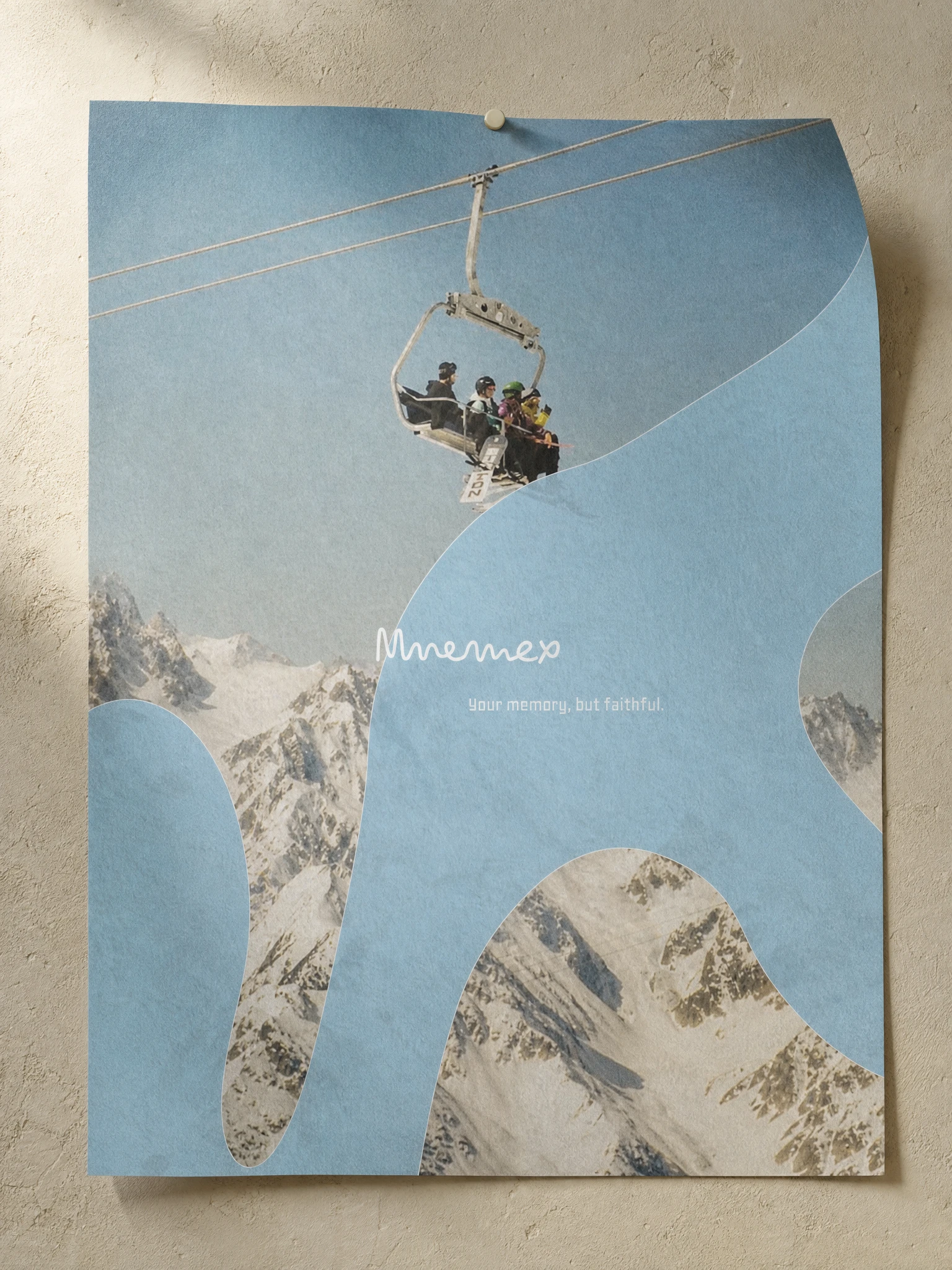
MNEMEX — Memory Without the Search
A productivity tool that needed to feel like the last photograph in a box you'd almost thrown away. Not a notes app. Not an AI dashboard. Something closer to the texture of how thinking actually feels — incomplete, sensory, layered, and just out of reach.
THE BRIEF
The brief was simple on paper and slippery in practice. Build a brand for a personal memory OS — an app that captures your decisions, ideas, and notes, then resurfaces them using AI when they become relevant again. The product was intelligent. The category was crowded with apps that looked like productivity tools: grids, dark modes, database logic made visible.
The tension wasn't in the product. The product was genuinely different. The tension was in making a brand that matched the feeling of what it actually does — not the mechanism, but the experience. Memory doesn't feel like search. It surfaces. It drifts. It comes back when you weren't looking for it. That was the real brief.
I took on the full identity: visual system, typographic logic, copywriting, advertising campaign, digital and print. Everything from a billboard to a phone wallpaper.
THE APPROACH
My first instinct was wrong. I started exploring directions that were too clean — Swiss precision, operating system aesthetics, an archival coldness. All of them were defensible. None of them were true to the feeling I kept coming back to: the way a photograph found years later holds more weight than the moment it was taken.
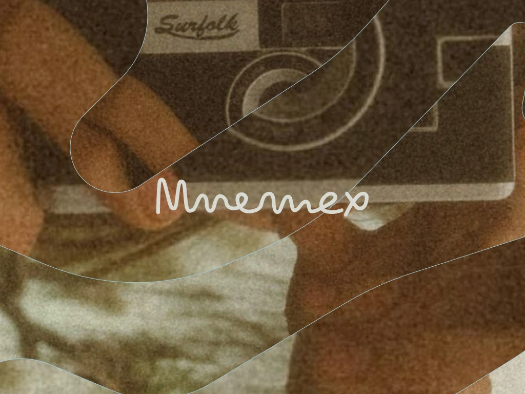
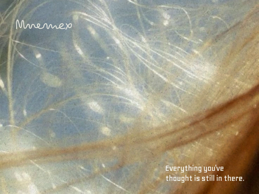
What unlocked the system wasn't a shape or a color. It was a decision about photography. Every image in this brand is analog, blurred at the edges, slightly faded — as if shot on film and discovered in a drawer. Not nostalgic for nostalgia's sake. Purposeful. The blur isn't an aesthetic choice. It's an argument: memory isn't sharp. Treating it like a database is the wrong metaphor. Treating it like a photograph — something that captures the feeling of a moment more than its facts — is closer to true.
From there the visual system built itself around one structural idea: fluid organic blob shapes as UI containers. Not as decoration. As architecture. The shapes appear as frosted glass layers over photography — revealing and concealing simultaneously. They're the structural signature of the brand, the thing that makes it recognizable from across a room. And they carry the right meaning: incomplete, drifting, present but not fixed. The shape memory takes when it surfaces.
I rejected every direction that looked like a productivity tool. I also rejected anything that looked like a wellness app — rounded buttons, gradients, meditation-adjacent softness. Mnemex had to be serious and quiet and slightly melancholic, without ever collapsing into sentimentality.
THE WORK
VISUAL IDENTITY SYSTEM
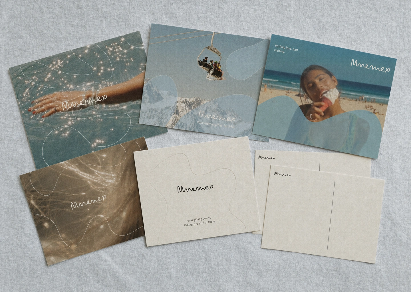
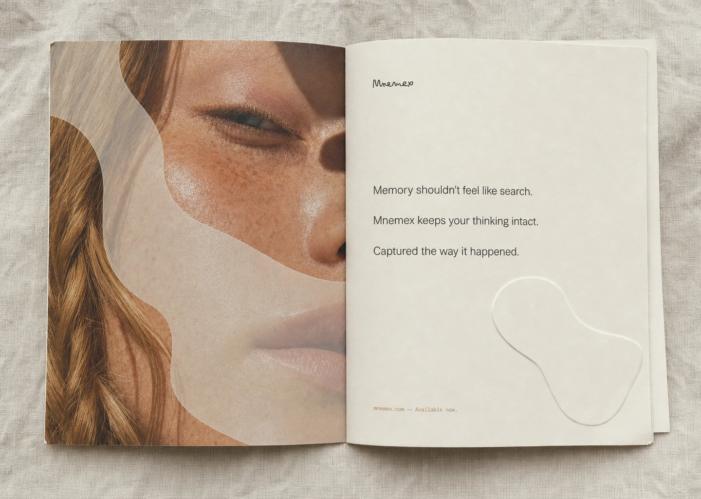
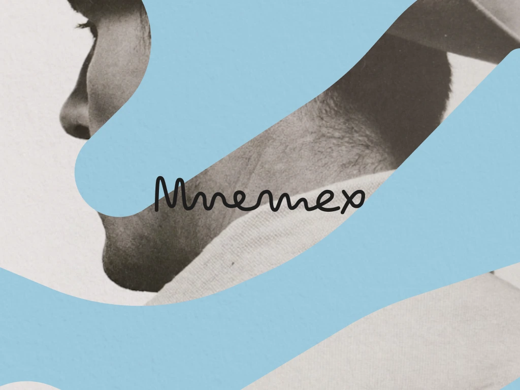
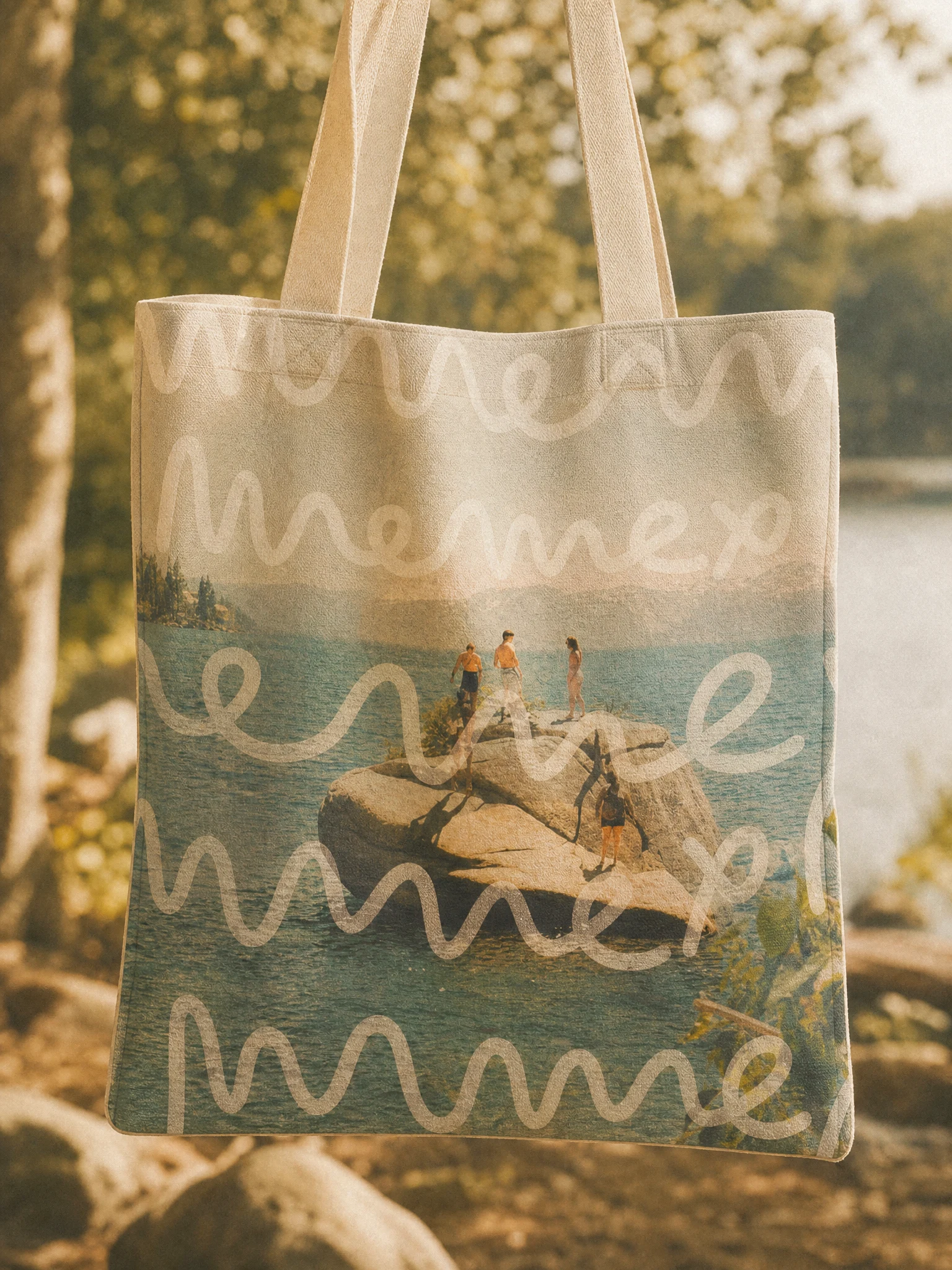
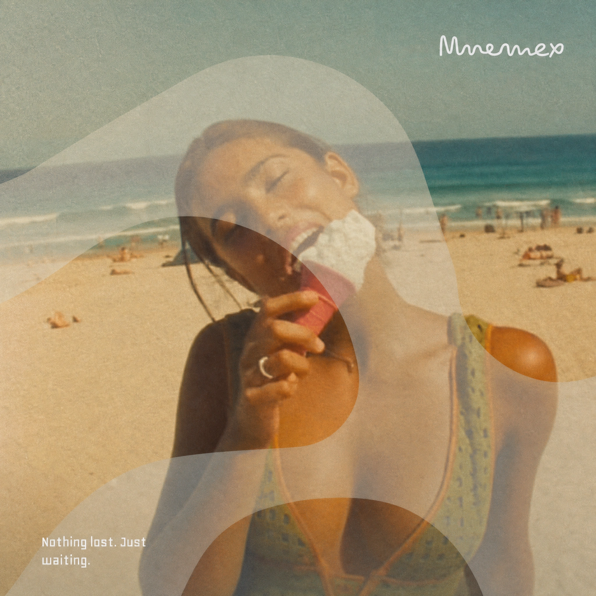
The entire system runs on two emotional poles — warm and cool — never mixed in a single composition. Warm pole: extreme close-ups of human skin, hands, faces, sepia and amber tones. Cool pole: open landscapes, water, sky, pale blue-green fields. Every photograph operates at one temperature. The blob shapes shift to match — cream linen on cool backgrounds, teal wash on warm ones.
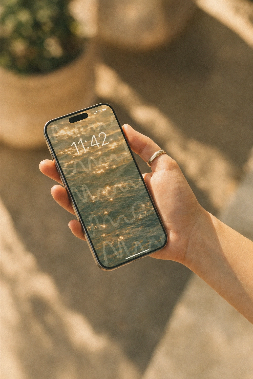
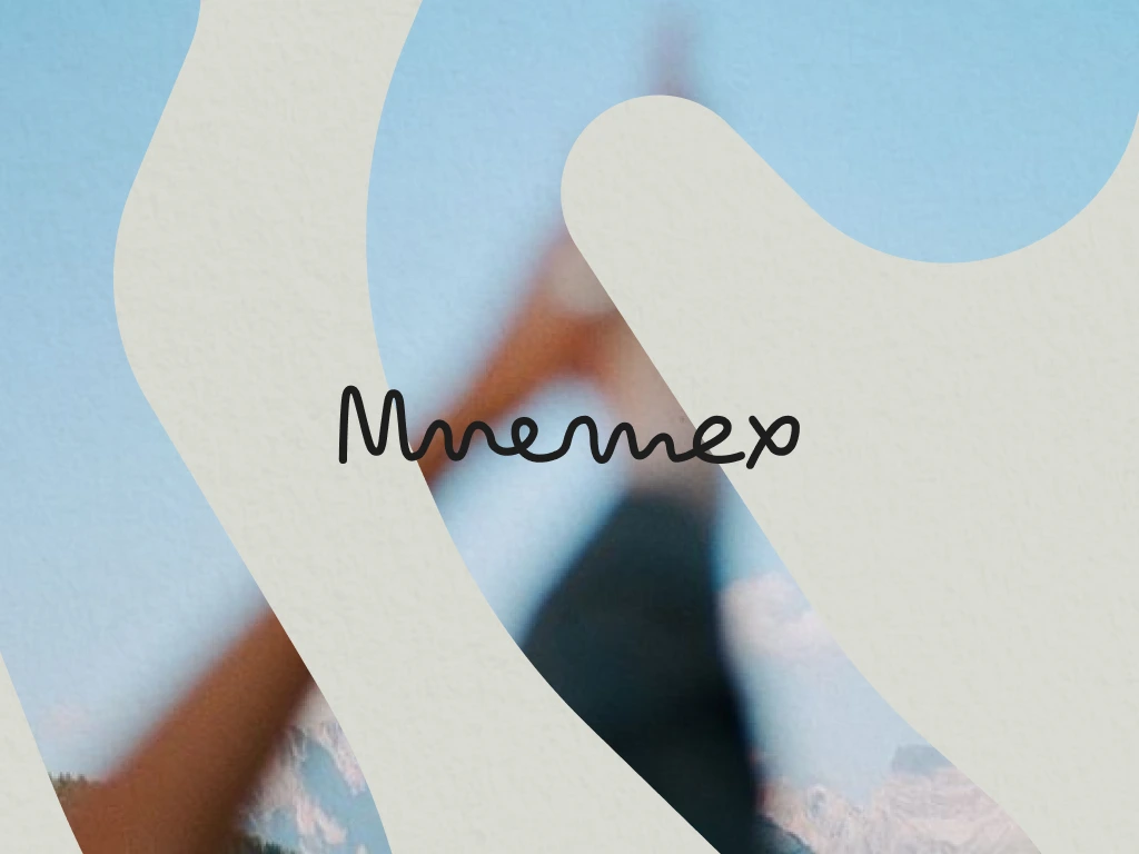
The organic blob shapes are SVG paths with fill at approximately 35% opacity and backdrop-filter: blur(6px). They're never symmetric, never geometric, never constructed-feeling. In UI they function as frosted glass content containers. In print they operate as translucent color fields masking photography. In the wallpaper and lockscreen, they appear as hairline outlines only — barely visible. The shape is always the same logic, never the same form.
WORDMARK AND TYPOGRAPHY
The wordmark is a loose connected cursive script — handwritten-feeling, slightly imperfect, as if written by someone who reads a lot. It carries the same hand across every scale from billboard headline to postcard stamp. One critical decision I held throughout: the display headline on the landing page hero uses the same script as the wordmark, set at 64px. The headline font IS the logo font. This was non-negotiable — it makes every headline feel authored, not set.
Body and UI copy runs in Söhne Light at 1.7 line height, never bold, hierarchy through size and spacing only. Timestamps and metadata in JetBrains Mono Thin — precision without coldness.
COLOR SYSTEM
Sky Linen
#EAF0F4. Warm Cream #F2EDE4. Sumi Ink #1A1A1A. Teal Wash #7BADA8. Sepia Dust #C4A882. Ghost White #FFFFFF at 18% — the frosted blob layer. Five colors plus a transparency value. The palette was pulled entirely from the photography — not chosen and then imposed, but extracted from the images the brand was already using. That's why it holds.COPYWRITING
I wrote the entire copy system as part of the identity — taglines, billboard headlines, in-app microcopy, email subjects, app store descriptions. The brand voice rule was simple: prefer the concrete image over the abstract claim. "The moment you changed your mind" over "decision intelligence." Never seamless, never powerful, never smart.
The locked campaign line — "Memory shouldn't feel like search." — went on the landing page hero, inside the same cursive script as the wordmark, at display scale, set dark ink on the frosted blob surface. It reads as both headline and product philosophy at the same time.
CAMPAIGN AND PRINT
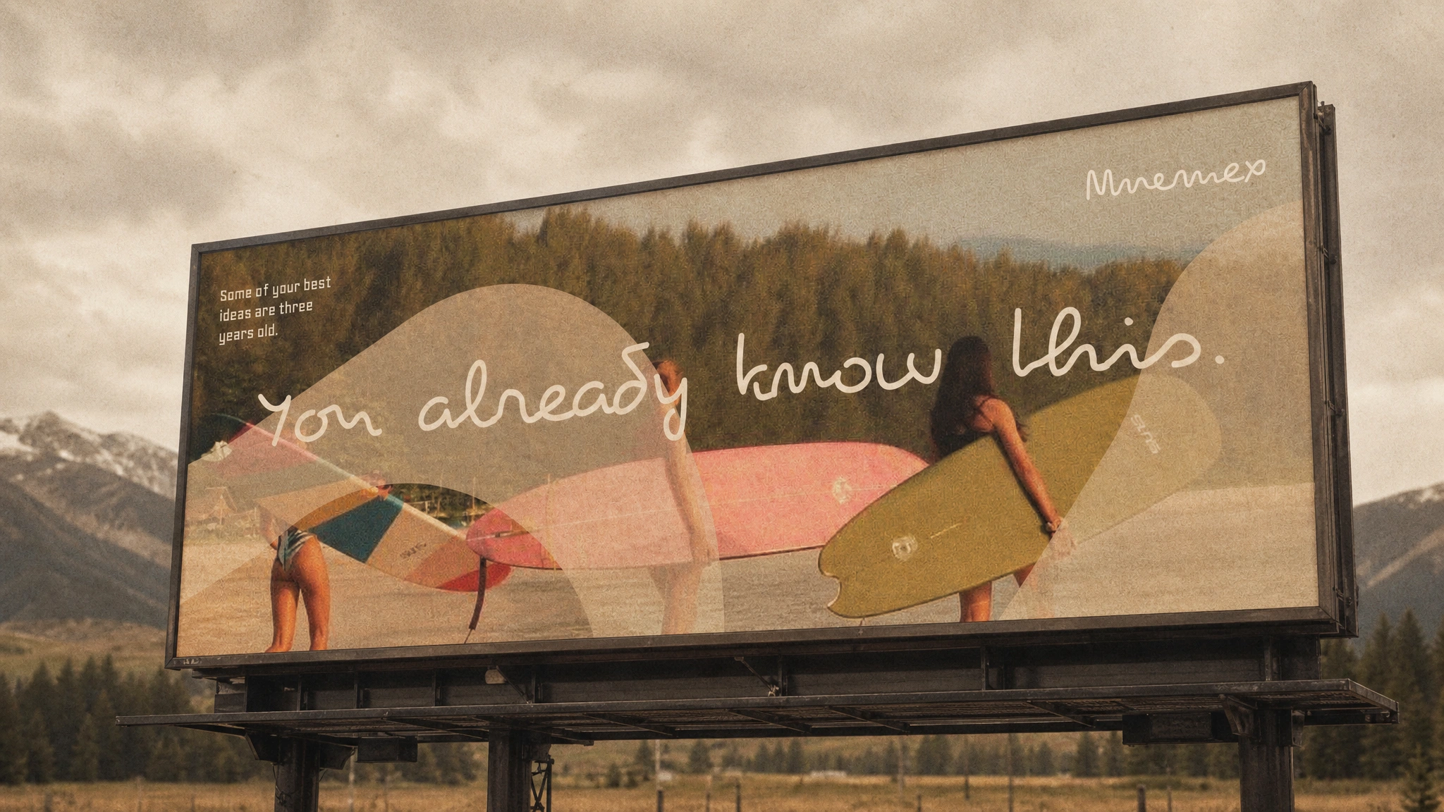
Billboard: the surfer photograph, blob shapes in warm cream, "You already know this." in the cursive script at massive scale across the lower third. Shot into a real highway environment — overcast mountain sky behind the structure. The grain and the faded warmth of the photography make it look like the billboard has been there for years.
Print campaign spread: left page is the face close-up, full bleed, one blob shape in cream linen drifting across it. Right page is clean cream paper — wordmark in Sumi Ink, three lines of copy in Söhne Light 18px, a blind-embossed blob shape in the lower right visible only through surface relief. Feeling on the left. Clarity on the right. That contrast is the campaign idea.
DIGITAL AND PRODUCT
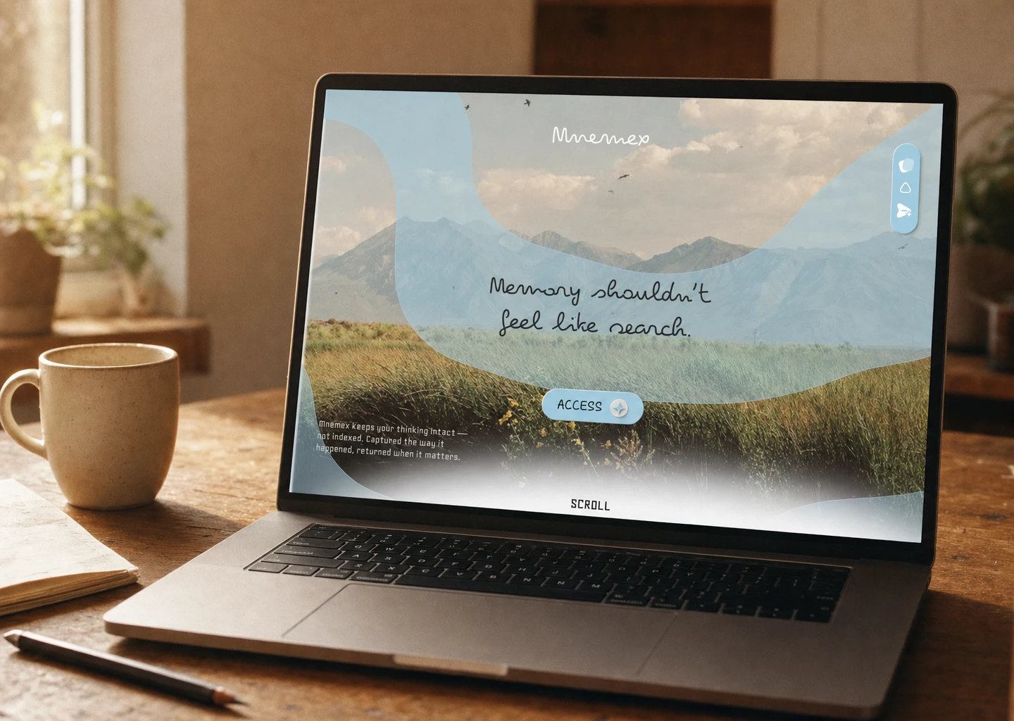
Two hero landing pages — warm pole (face, skin tones) and cool pole (mountain field) — identical layout, opposite emotional register. Full-bleed photography, frosted blob shapes as UI containers, cursive headline, frosted glass CTA pill labeled ACCESS with a sparkle icon, floating right-side icon tray, fine-weight body copy lower-left, SCROLL cue bottom center. The UI system is the brand system — there's no gap between how it looks on a billboard and how it looks on screen.
Phone lockscreen: the wordmark tile treatment — the script repeated at large display scale, staggered, ghost white at 20% opacity — over the water photograph at golden hour. The system UI clock sits above the brand layer, unbranded. It feels like something you'd set as your own wallpaper without realizing it was an ad.
THE RESULT
Everything shipped as a complete speculative system — identity, campaign, digital, print, and product UI — coherent across every surface from a roadside billboard to a phone lockscreen. The work makes one argument consistently: that a tool for memory should feel like memory. Soft at the edges, layered, sensory, honest about the fact that the past is never fully retrievable.
What I'm most satisfied with is that nothing in this system looks like a tech product. That was the hardest thing to hold. Every surface pulled in the direction of legibility, clarity, UI convention. The work holds its position every time — it's recognizable at distance and intimate up close, which is exactly what it needed to be.
Révolté — revolte.design
Project: Mnemex
Year: 2026
Scope: Brand Identity, Visual System, Copywriting, Campaign Design, Print Collateral, Digital / Web Design
Industry: Productivity / Cognitive Tools
Like this project
Posted May 22, 2026
Mnemex — a memory OS brand built to feel like a photograph found in a drawer, not a productivity tool
Likes
1
Views
13
Timeline
May 11, 2026 - May 22, 2026