Built with Lovart
Rogue Meridian Brand Identity Project

Révolté


ROGUE MERIDIAN — The Line That Doesn't Follow The Map
A brand for people who plan obsessively, then abandon the plan. One mark. One conceptual tension. A complete system built around the moment the route ends and instinct begins.
THE BRIEF
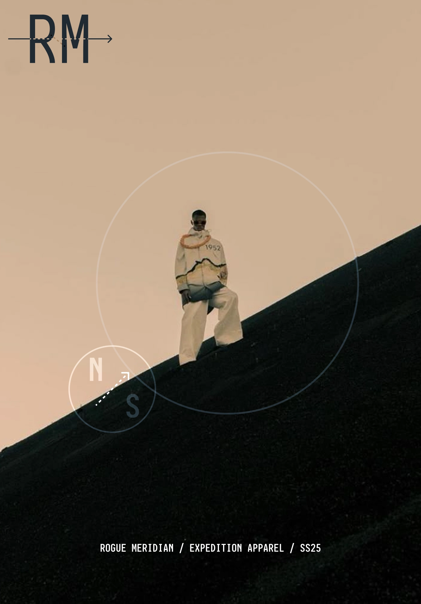
I wanted to build an outdoor apparel brand that didn't exist yet — not in the obvious sense, but in a specific gap I kept noticing. On one side: technical performance brands, cold and premium, Arc'teryx minimalism, every seam a statement of engineering authority. On the other: gorpcore streetwear, gear-as-aesthetic, hiking logos on oversized drops. Neither of them was for the person I had in mind.
The person I was designing for plans every elevation change and packs every contingency — then deviates the moment conditions change. They are not performing outdoorsmanship. They are not ironically wearing hiking gear in the city. They are somewhere between a military intelligence officer and someone who got lost on purpose. The brand needed to speak to that psychology without naming it directly.
The tension in the brief was this: military influence without military signaling. Technical credibility without premium detachment. Worn-in authority without fake distressing. Everything had to feel like it had already been used, without looking like it was designed to look used.
THE APPROACH
I started with the name. Rogue Meridian came fast — a meridian is a fixed navigational line, rogue is the decision to leave it. The tension between those two words was already the brand. I didn't need to resolve the tension. I needed to make it visible.
The first logo directions I explored were too resolved. A topographic contour mark, clean and outdoor-readable. A field stamp badge with coordinates. A stencil wordmark. All correct, all too comfortable. The stencil felt closest but still read as an aesthetic choice rather than an operational one — it looked like someone chose stencil because it's cool, not because it's the right mark for this product.
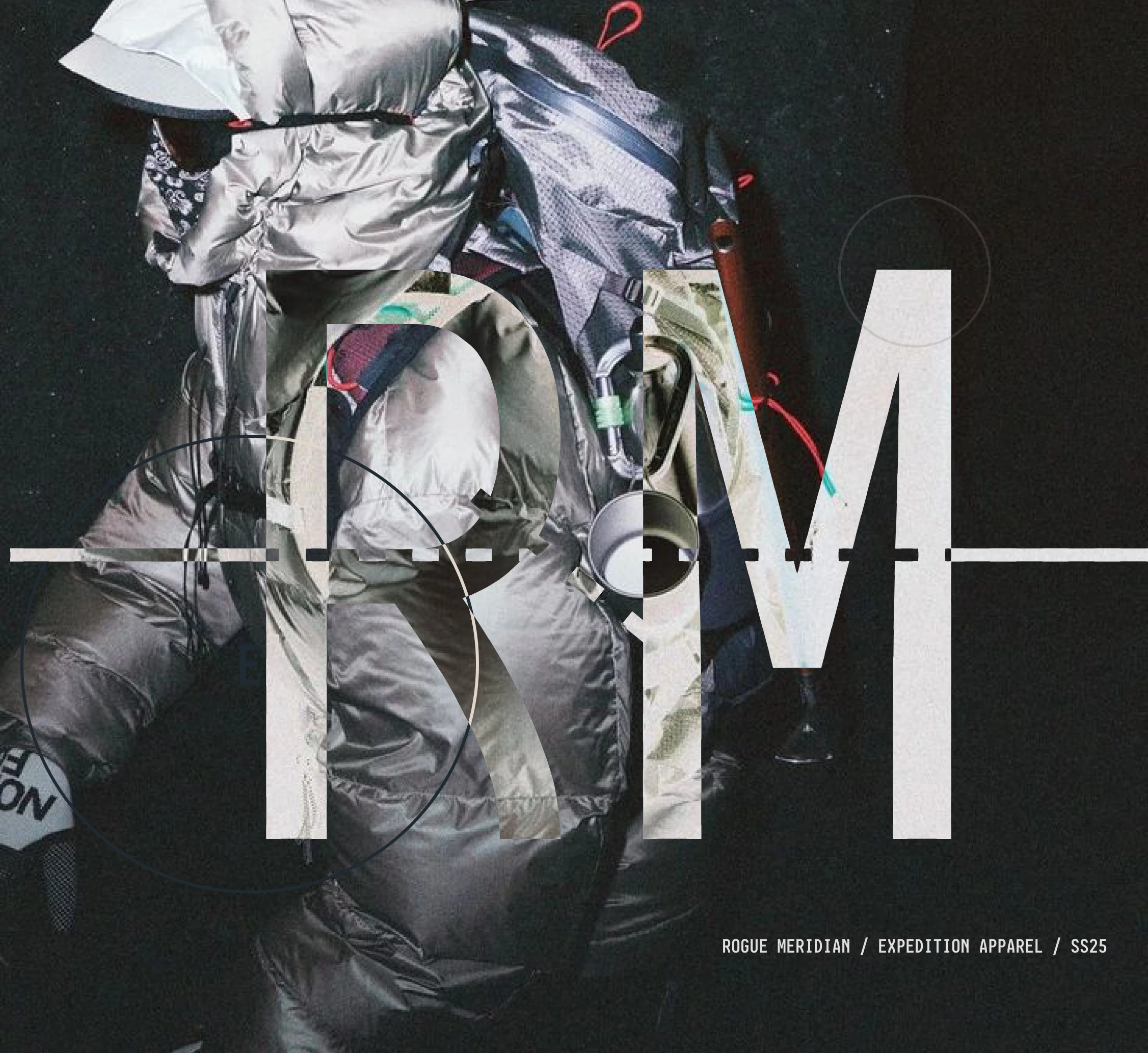
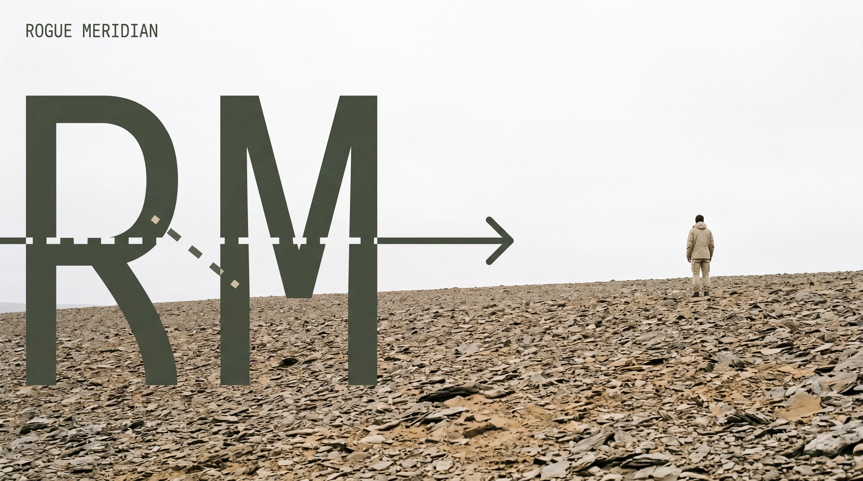
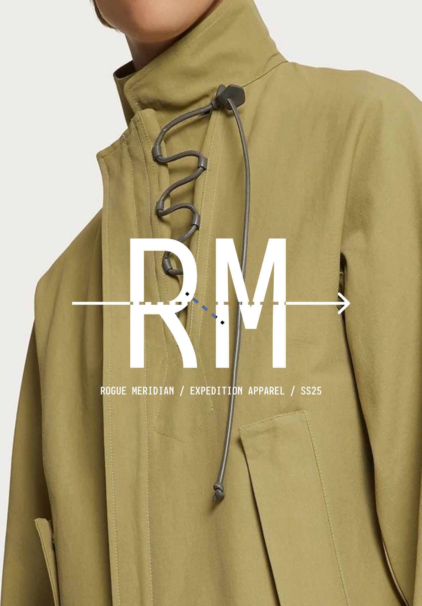
What I kept coming back to was the meridian line itself. Not as a decorative element but as a structural one — a line that cuts through the letterforms and carries meaning in its behavior. Solid on entry. Dashed through the letters — the unmapped zone, the deviation, the rogue section. Arrow on exit. The mark doesn't just identify the brand. It diagrams the brand's philosophy in a single vector. Entry, disruption, forward movement. That was the unlock.
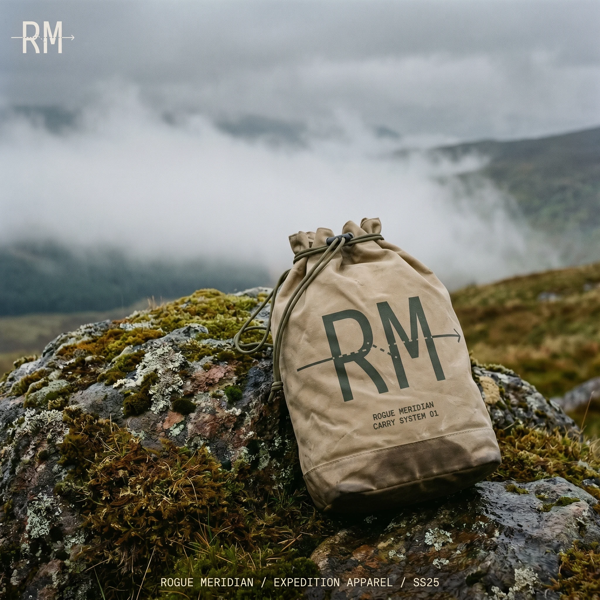
The secondary system followed directly from the logo logic. If the mark is a navigational instrument, the supporting graphics should be navigational instruments. The compass reticle — two concentric circles, cardinal markers, a dashed arrow pointing off-axis, never at true north — became the second signature element. It appears at every scale from a 6cm embroidered patch on a hoodie back panel to an 80cm screen-print on a concrete retail wall. The OCR-B field notation system completed the language: coordinates instead of addresses, spec ratings instead of marketing copy, "FIELD USE ONLY" instead of care instructions.
THE WORK
LOGO
The RM monogram in a condensed grotesque, bisected by a full-width horizontal line. The line enters solid from the left edge, converts to a dashed segment through the letter counters — the gap where the plan ends — and exits as a solid arrow pointing right. One stroke, three behaviors. The mark works at 5mm on a woven label and at billboard scale across a scree field. Primary color: Slate Field
#4A5240, a desaturated olive that reads as grey in low light. Not military green, not premium forest — something older, already worn.COLOR SYSTEM
Five tones, all functional. Slate Field
#4A5240 as the primary — the garment color, the main mark application, the anchor of every composition. Raw Canvas #C8BFA8 for contrast applications — labels, lining, reversed prints, the hang tag stock. Meridian Blue #5B6E7C for hardware details, the compass reticle on darker garments, and the aluminum flask body. Ash #2B2B2B as near-black for type-heavy contexts. Chalk #E8E4DC for reversed applications and the website hero type. No brand color is warm. Nothing is aspirational.TYPOGRAPHY SYSTEM
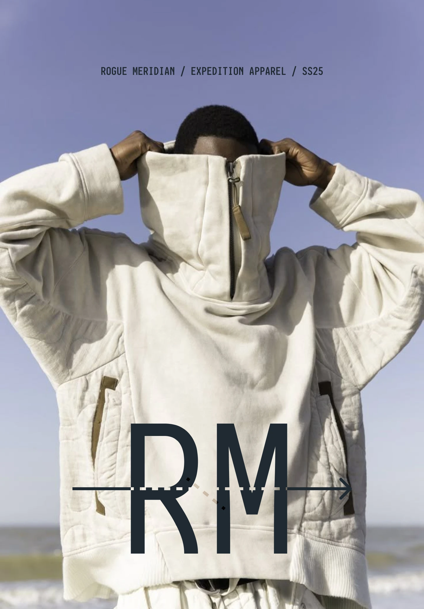
Display type in an ultra-condensed grotesque — all caps, tight tracking, medium weight. Never decorative. OCR-B monospace for all secondary and label text: spec sheets, coordinates, care language, website CTA, hang tag backs. The contrast between the two typefaces does structural work — condensed grotesque for identity, monospace for documentation. Together they establish that Rogue Meridian produces garments the way a government contractor produces equipment: with precision, without sentiment.
GARMENT APPLICATIONS
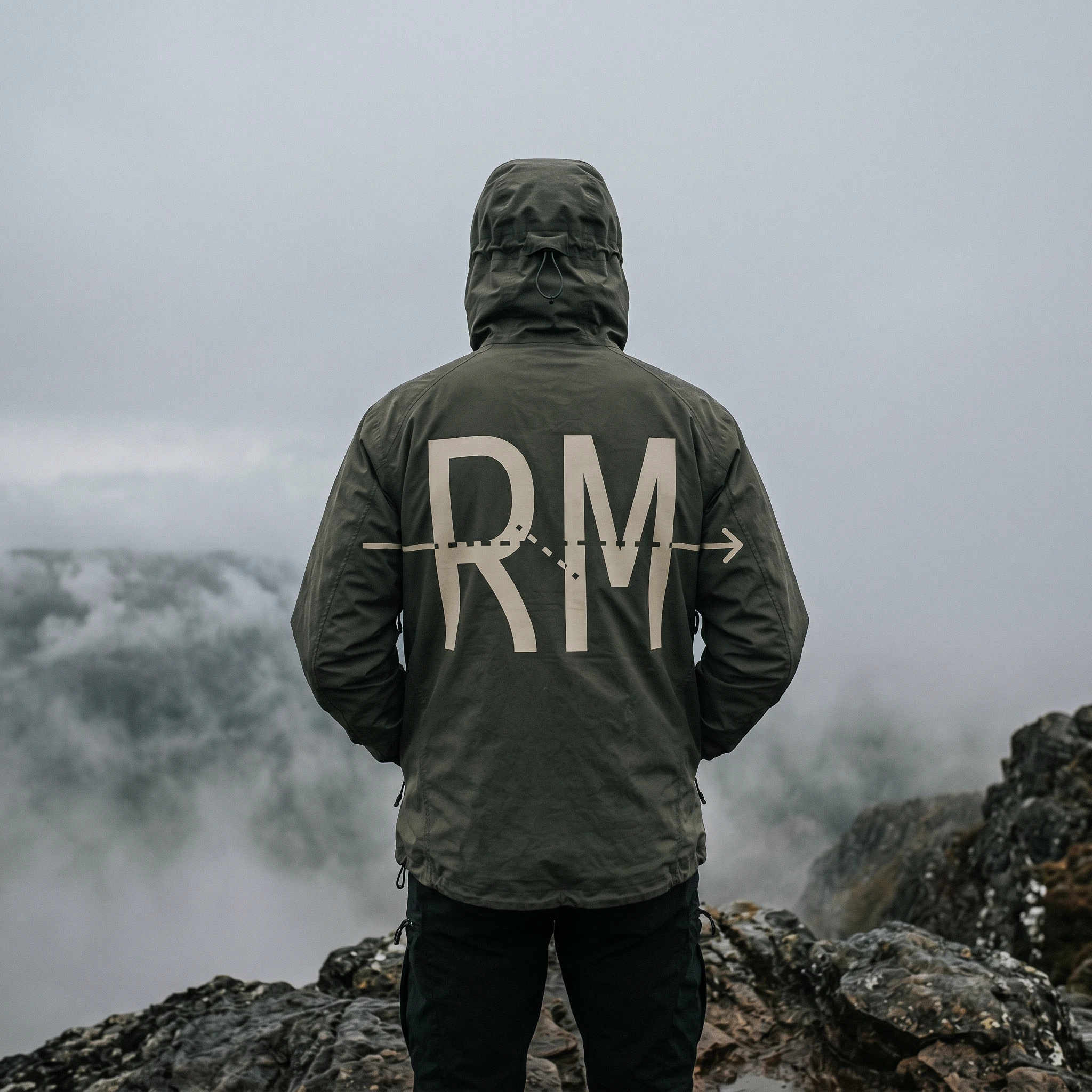
The shell jacket back print runs the full RM mark at 20cm width — the meridian arrow extends almost edge to edge. In Raw Canvas on Slate Field, it reads as a navigational instruction, not branding. The cargo pant rotates the mark 90 degrees down the outer thigh seam, arrow pointing toward the boot. The garment-dyed hoodie carries both the full RM mark in chain-stitch embroidery across the upper back and the compass reticle in Meridian Blue thread below it. The wrist label — 3cm by 1cm, woven in Raw Canvas — carries the RM mark and the coordinates "46.2°N 011.8°E / FIELD USE ONLY" in OCR-B. The hang tag back is a spec sheet: weight, packability rating, temperature range, material composition.
PACKAGING AND OBJECTS
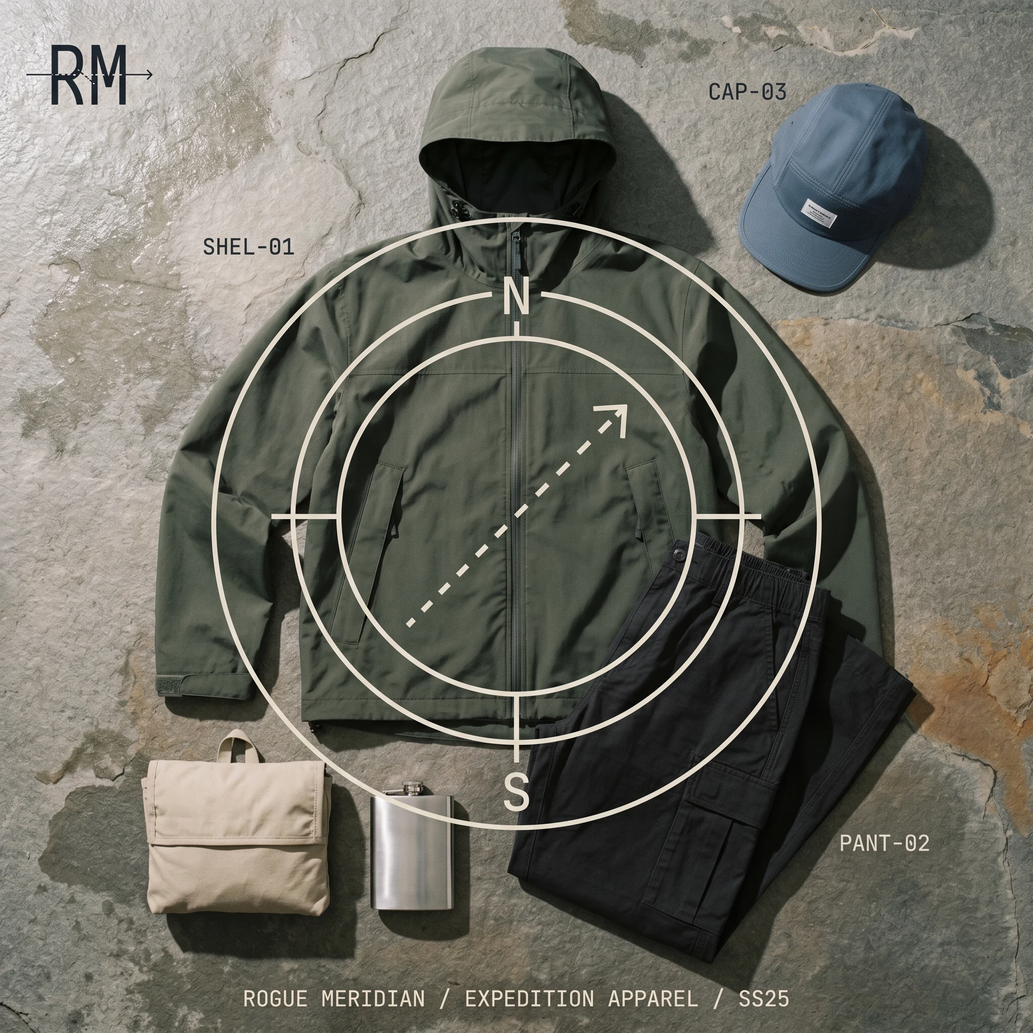
The packable garment bag in Raw Canvas carries the mark screen-printed large with "ROGUE MERIDIAN / CARRY SYSTEM 01" in OCR-B below. The field document — "FIELD DOCUMENT 01" — is blind-debossed on Slate Field card stock over old topographic maps. The aluminum flask in Meridian Blue has the mark laser-etched to raw silver. The five-panel camp cap in Meridian Blue ripstop carries the mark in Raw Canvas embroidery, centered low.
WEBSITE
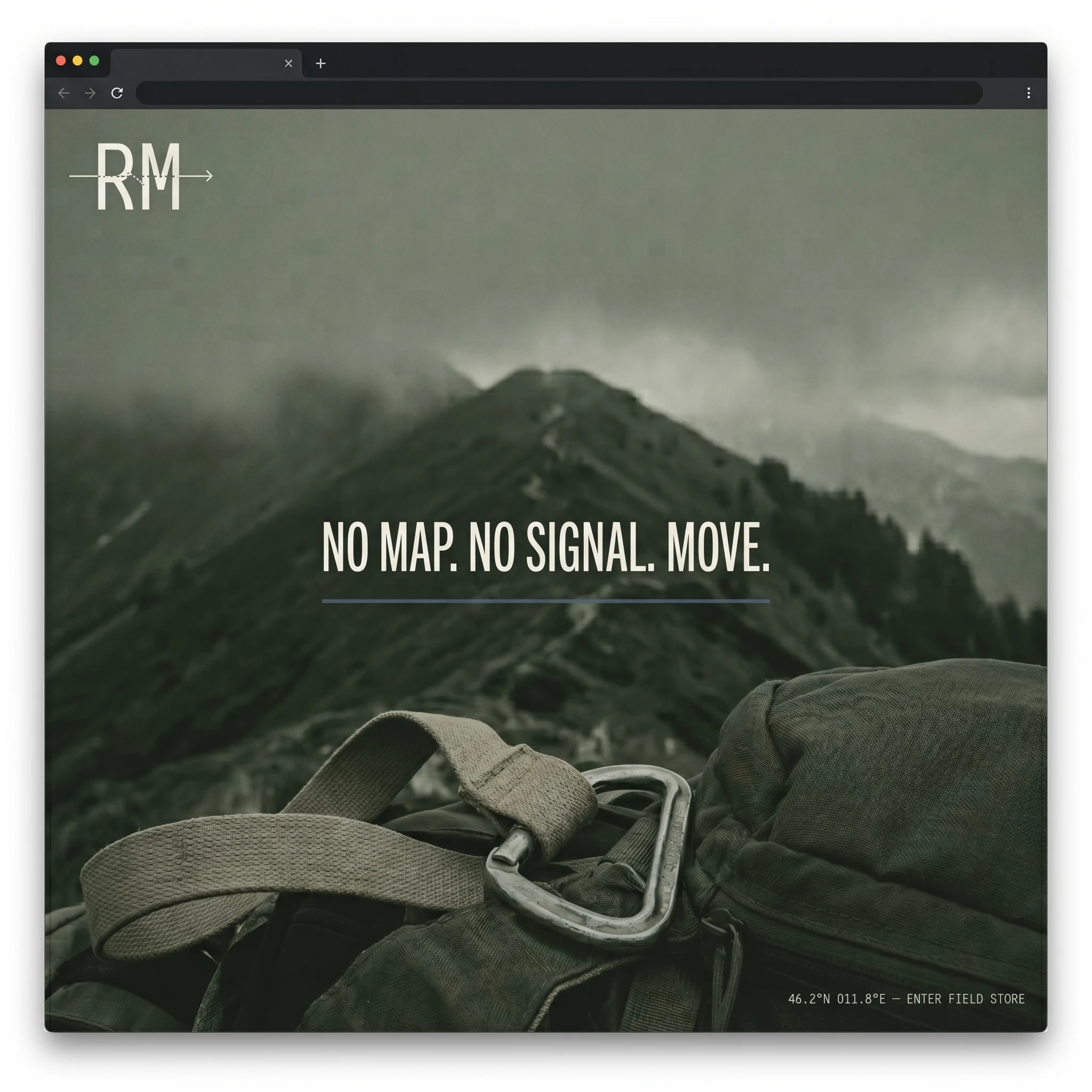
The hero screen states the entire proposition in six words: "NO MAP. NO SIGNAL. MOVE." A thin Meridian Blue rule below the headline — the meridian line, stretched to full width — separates the tagline from the terrain photograph. Bottom-right in OCR-B: "46.2°N 011.8°E — ENTER FIELD STORE." The RM mark sits top-left at nav scale. The page operates as a document, not a landing page.
CAMPAIGN
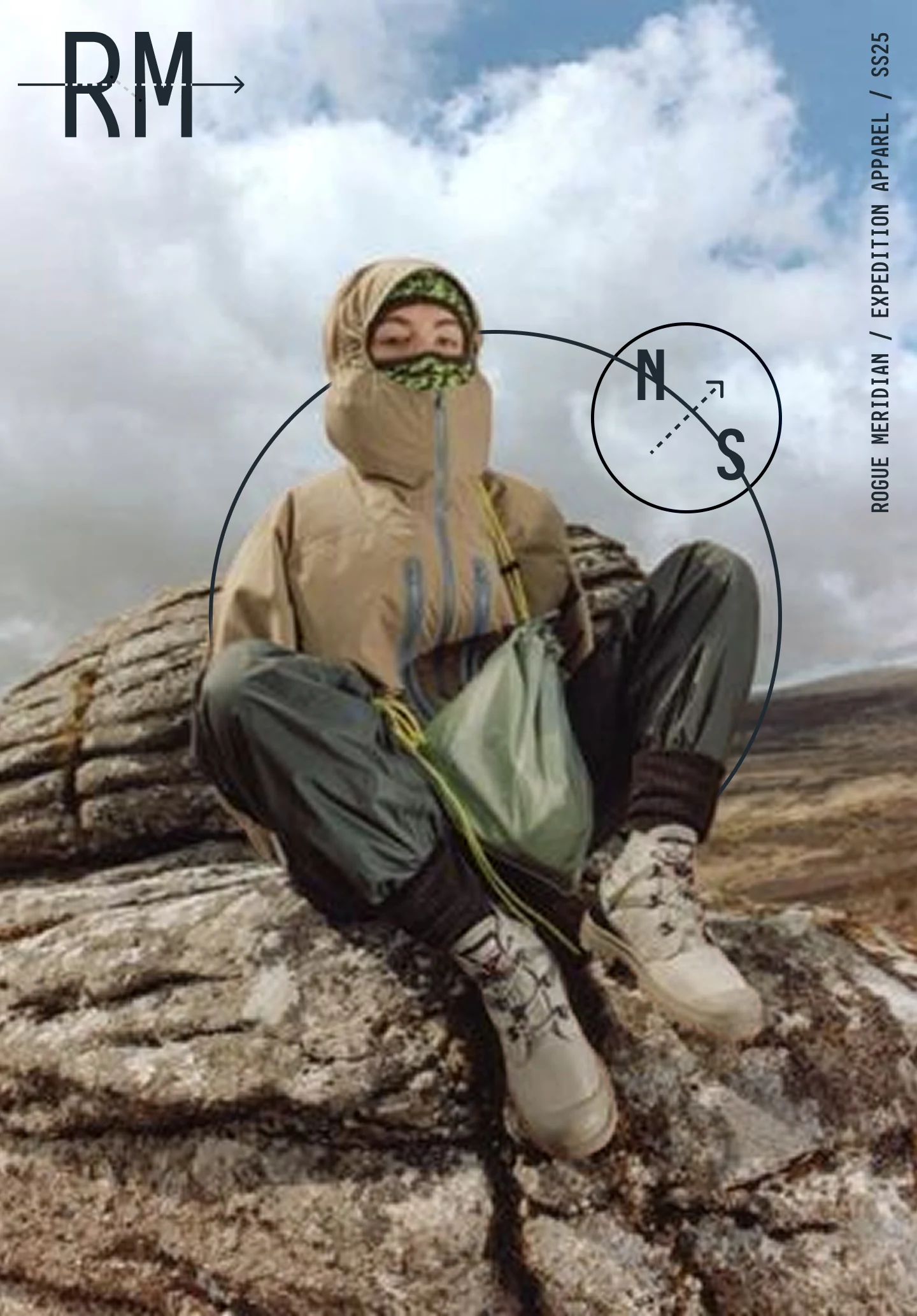
The poster tagline — "THE LINE ENDS HERE." — arrived from the logic of the mark, not from a copy session. The meridian line ends. That is not failure. It is the coordinate where the route stops and the person continues. Printed on cold-press uncoated stock, pinned to raw concrete with exposed bolts, the poster is the most direct statement of the brand in the entire system.
THE RESULT
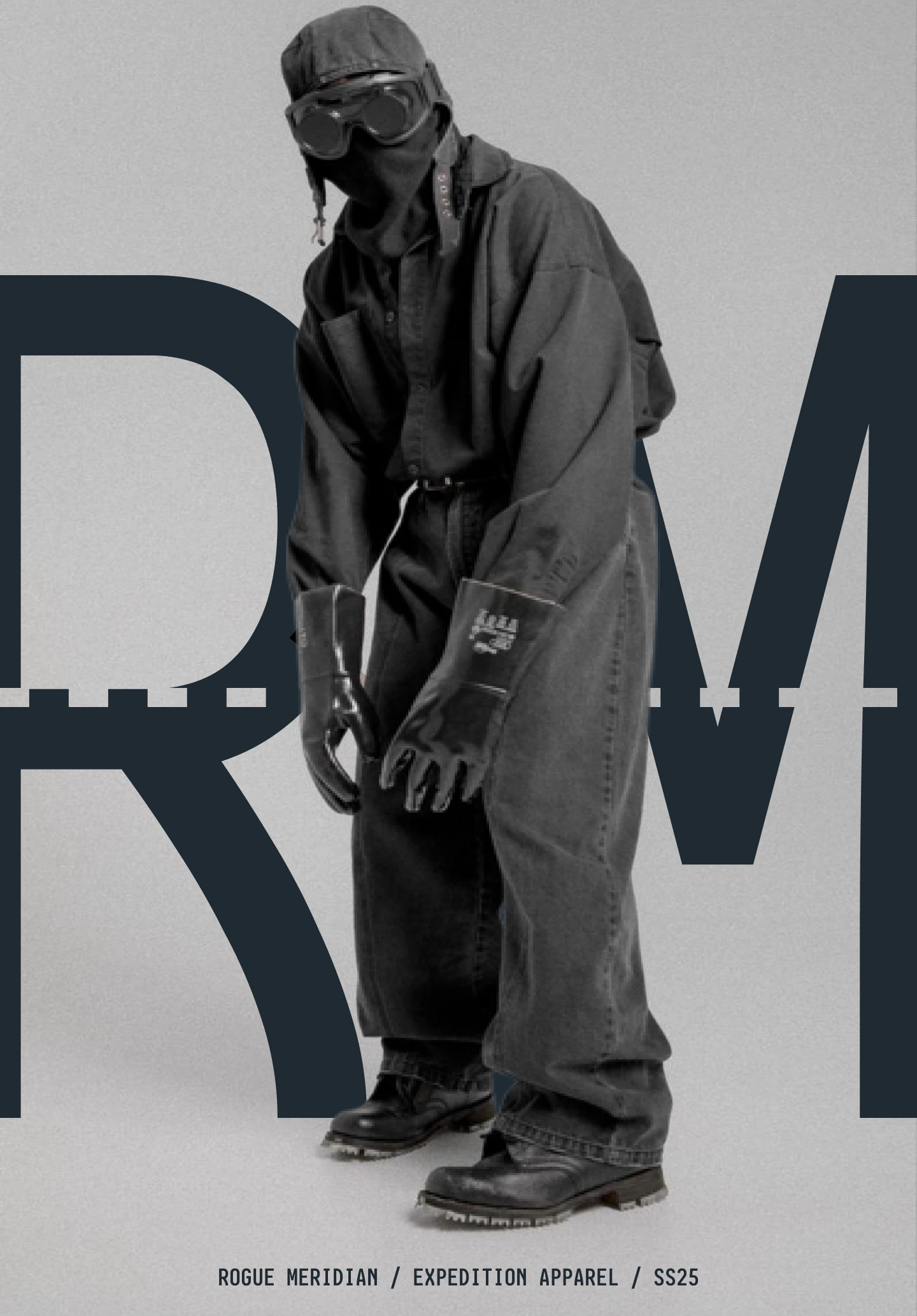
Rogue Meridian doesn't exist yet as a product company. What exists is a complete identity system that could ship tomorrow: logo, secondary graphics, color and type, garment application rules, packaging, retail, digital, and campaign. Every touchpoint was tested at real scale before being included.
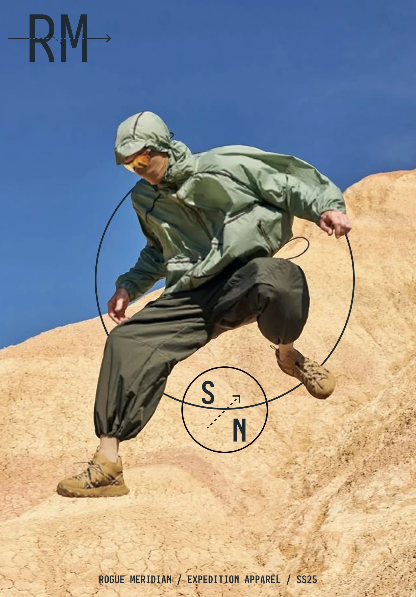
The work proved one thing clearly: when the brand concept is genuinely structural — when the mark diagrams the idea rather than decorating it — the system builds itself. Every subsequent decision had a criterion: does this read as field documentation or as marketing? The answer to that question resolved every ambiguity from hang tag copy to website CTA to the direction the compass arrow points.
Révolté — revolte.design
Project: Rogue Meridian
Year: 2026
Scope: Brand Identity, Visual System, Garment Application, Packaging, Web Design, Campaign
Industry: Expedition / Technical Outdoor Apparel
See more at revolte.design
Like this project
Posted May 30, 2026
Expedition apparel identity built around one navigational idea — the mark diagrams the brand's philosophy in a single vector: entry, deviation, forward movement
Likes
0
Views
34
Timeline
Mar 27, 2026 - May 30, 2026