Built with Lovart
OSMIUM Brand Identity & Product Design Project

Révolté


OSMIUM — Matter Before Market
A DeFi derivatives brand built from the wrong material entirely. The brief was on-chain synthetic assets. The answer was geological specimens dissolving into live order books.
THE BRIEF
OSMIUM is a synthetic asset trading protocol — on-chain derivatives, perpetuals, the kind of DeFi infrastructure that serious traders use and retail never finds. The category has a visual problem: everything looks the same. Dark interfaces, blue gradients, rocket emoji energy. The entire space is racing toward the same Bloomberg-adjacent aesthetic and executing it with varying degrees of competence.
The brief I set myself was harder than it sounds: build a DeFi brand that sophisticated traders would take seriously, that had zero in common with the rest of the space, and that communicated density, precision, and permanence — without defaulting to the cold-tech visual language everyone else was already using.
The tension was this: the product is digital, on-chain, intangible. But the name — Osmium — is the densest naturally occurring element on Earth. That gap between the name's physical weight and the product's immateriality felt like the entire brand brief compressed into one sentence.
THE APPROACH
I started in the wrong place. My first instinct was to lean into the precision-instrument direction — calibrated, Swiss, financial-grade. It was credible. It was also boring. Every DeFi brand with institutional ambition already lives there. I needed something that couldn't be copied by a team running a Figma template.
The unlock came from the reference images I was working with. A crystal specimen dissolving into a spectral data feed. Parametric white plastic lattice growing like coral. Glitch and chromatic aberration not as visual noise but as structural logic — the moment matter starts behaving like data. I stopped trying to design a trading brand and started designing a synthetic mineral world.
The conceptual framework became: everything OSMIUM produces exists at the collision point between geological matter and financial data infrastructure. The resin specimen is the brand object — cast, dense, filled with embedded copper wire and iridescent film, photographed with the same clinical precision as scientific documentation. The data is always present but always secondary. The material comes first.
What I kept coming back to was one specific visual idea: a crystal specimen with its right edge dissolving into a live order book, separated by a prismatic seam. Physical matter becoming market. That one image became the test for every subsequent decision — does this feel like it belongs in that frame?
THE WORK
LOGO SYSTEM
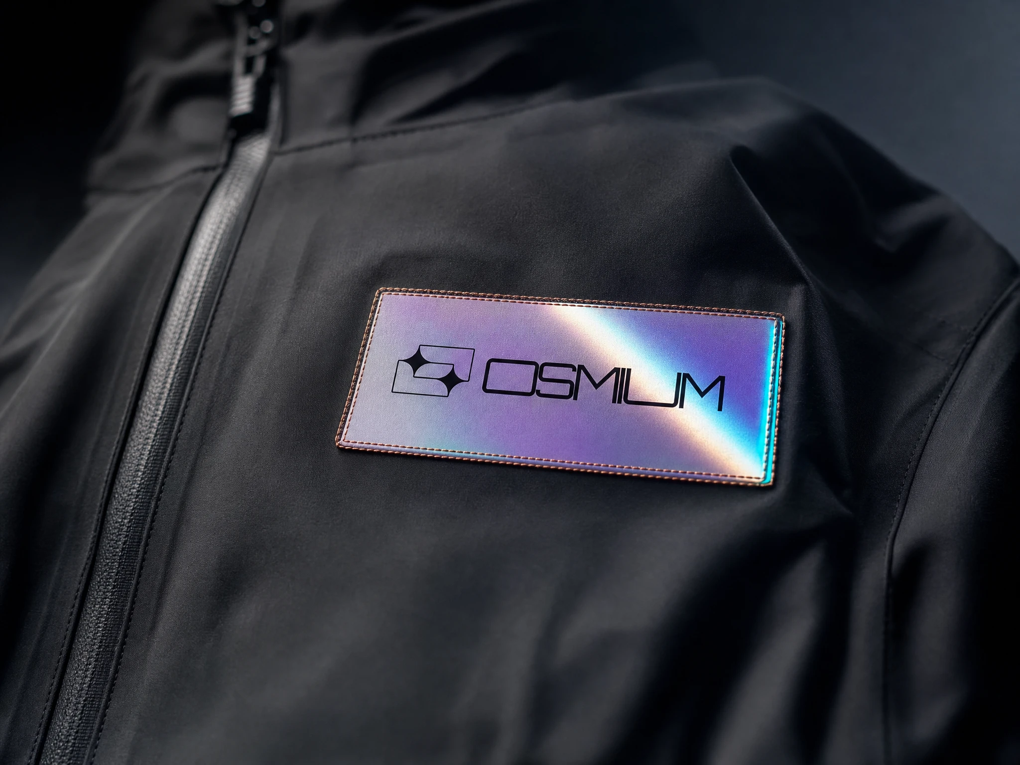
The mark is a rounded rectangle containing two four-pointed stars — one large, bleeding outside the container; one smaller, contained within. The negative space between them creates a third implied form. Geometric and slightly cosmic, it has the construction logic of a crystalline structure and the proportional precision of an instrument component. The wordmark is set in Orbitron — modular, geometric, every letterform a constructed object — with custom spacing that makes it read as a single mechanical unit. The two elements function as a lockup and are never separated.
VISUAL IDENTITY SYSTEM
Color language runs five values: mineral black
#0D0D0F as the void all objects float in; prism white #F0EEF2 for primary type and light-facing surfaces; chromatic violet #9B5FE0 for the iridescent material layer; spectral cyan #00E5FF for live data states and positive indicators; copper trace #C4804A for physical detail — wire, foil, etch. Chromatic aberration — cyan splitting left, violet splitting right — is used as a compositional device at object edges only, never as a global filter. Typography is exclusively Orbitron throughout the system. It functions as the data layer: clinical, precise, in direct tension with the organic, iridescent material world it sits against.CAMPAIGN VISUALS
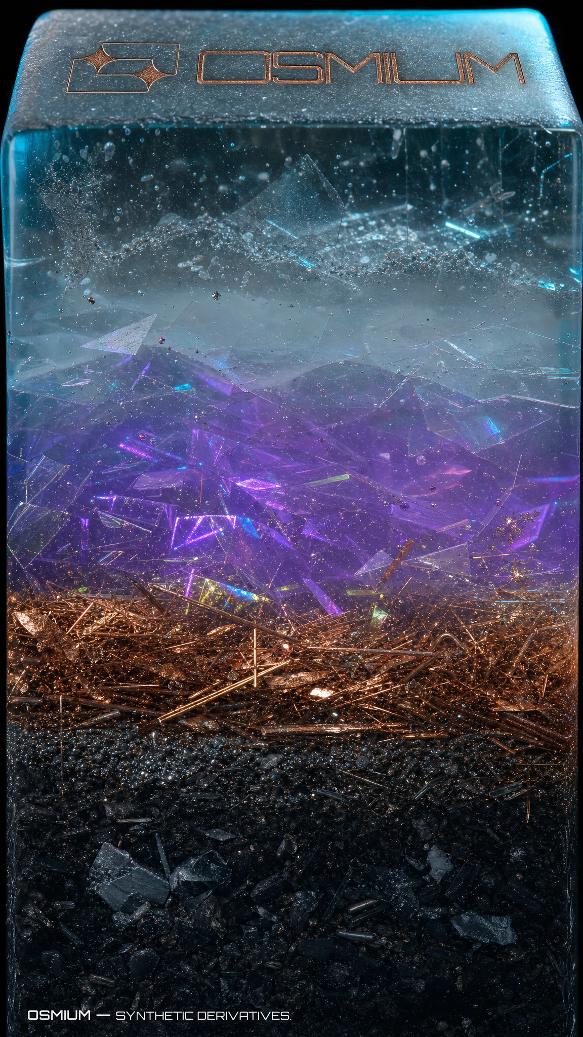
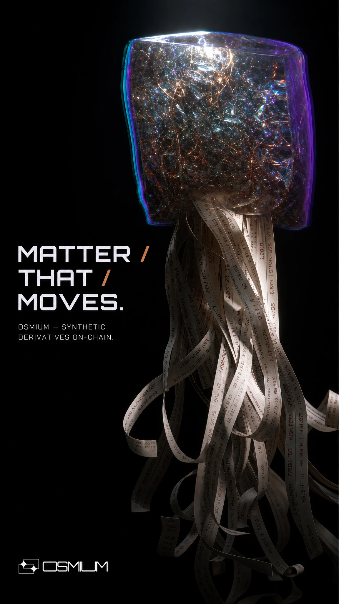
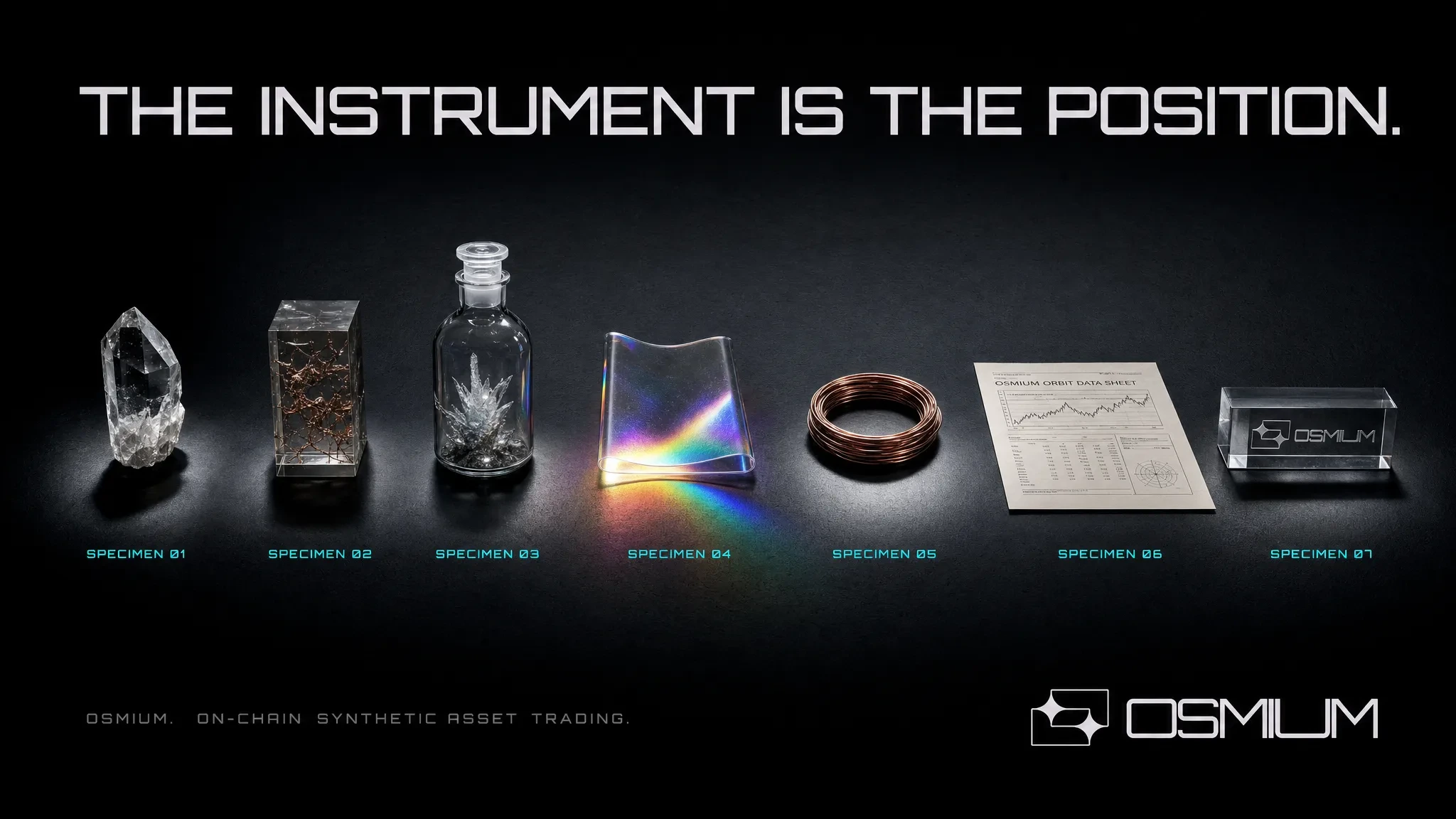
Five campaign pieces, each treating a different dimension of the synthetic mineral concept. MATTER THAT MOVES is the hero — a dense resin specimen suspended in space with ticker tape cascading from its base like tentacles, financial data as physical anatomy. THE INSTRUMENT arranges seven brand objects in a scientific taxonomy row, treating each specimen with identical clinical lighting and a specimen number label in cyan. PHASE TRANSITION is the core brand image: a smoky quartz crystal with its right half dissolving into a physically engraved copper order book, separated by a full-height prismatic seam. SYNTHETIC NATURE shoots the resin core sample end-on, filling the frame with stratified geological layers of cast synthetic material — no headline, just the OSMIUM logo etched into the top face. DENSITY renders the word in wire-frame Orbitron letterforms filled with macro mineral photography, the copper geometry bleeding prismatic aberration at every stroke edge.
PHYSICAL COLLATERAL
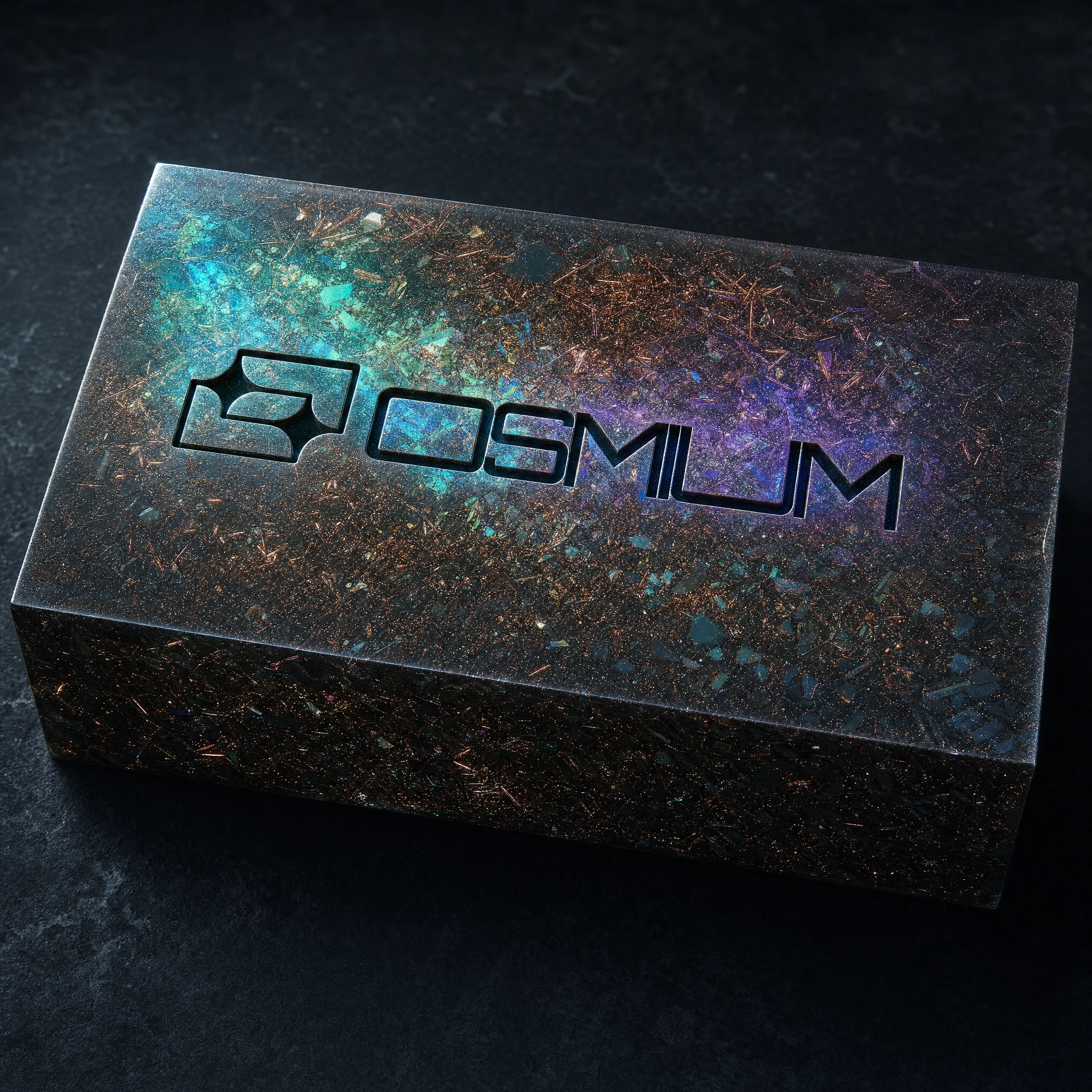
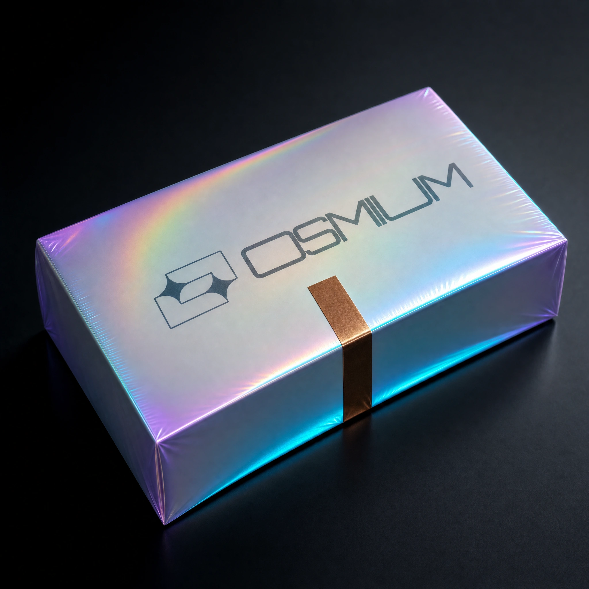
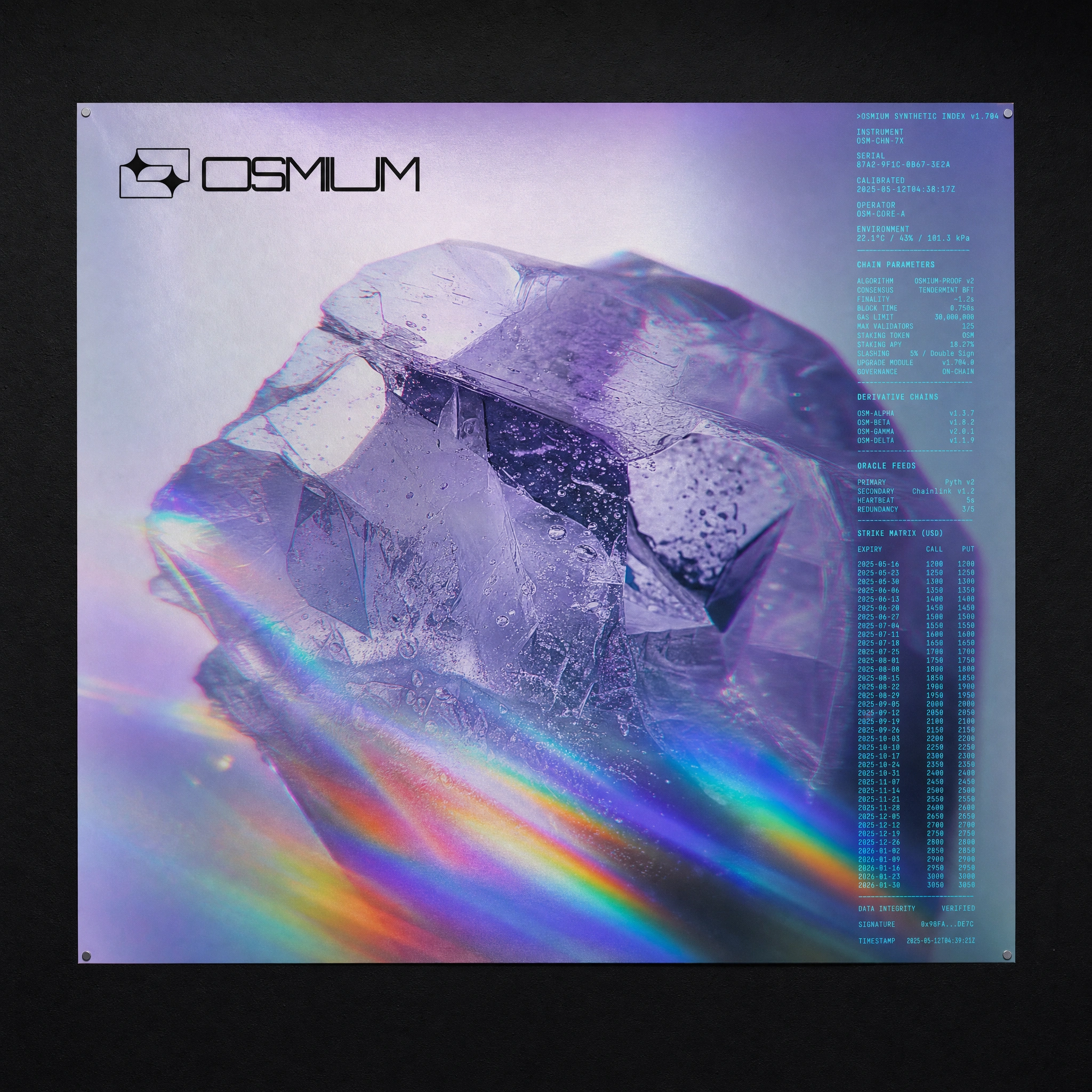
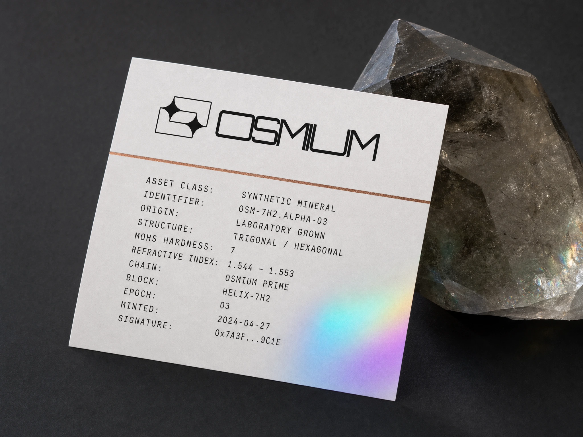
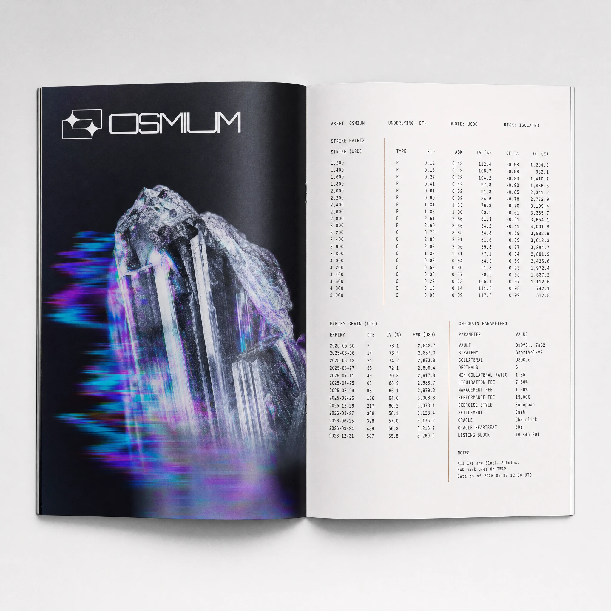
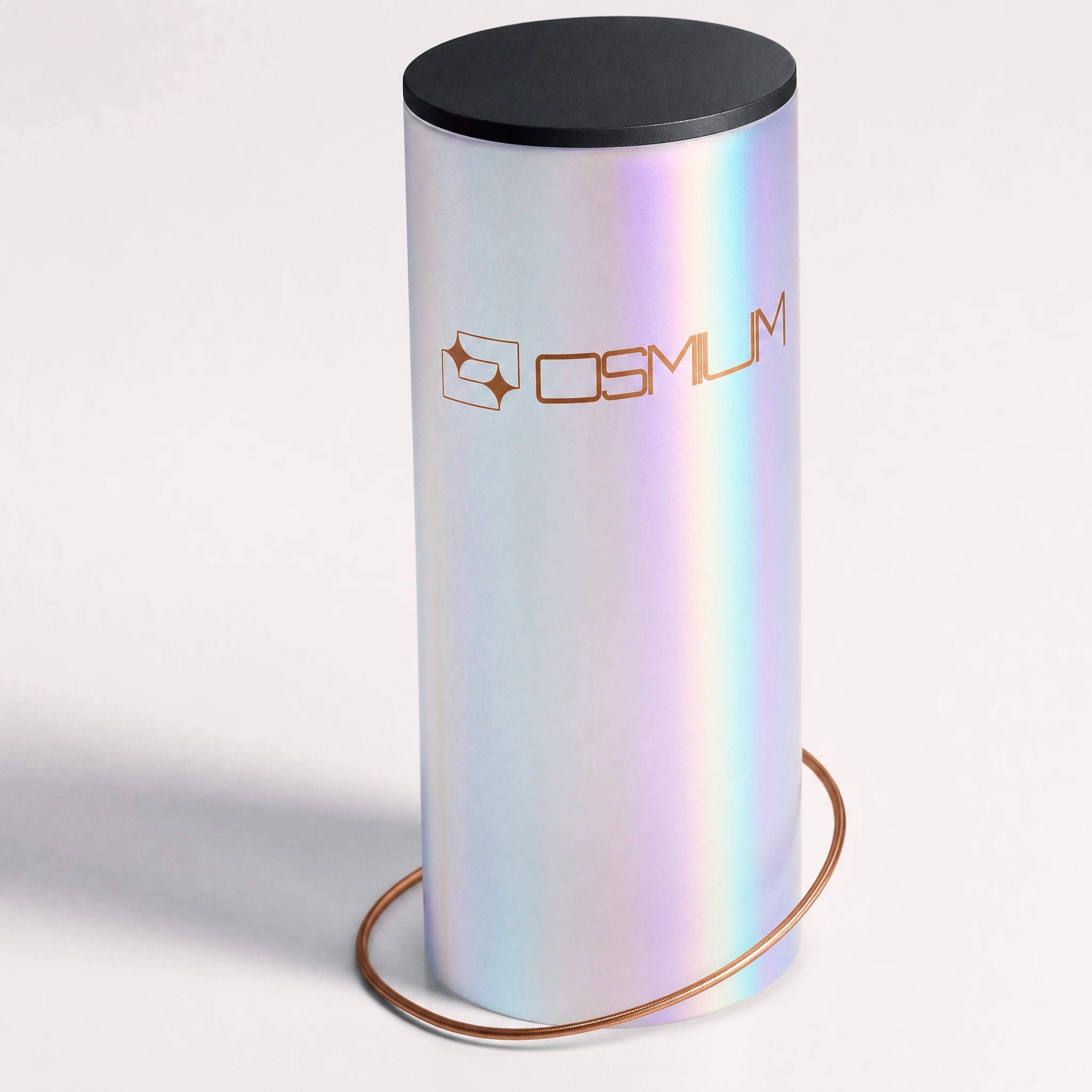
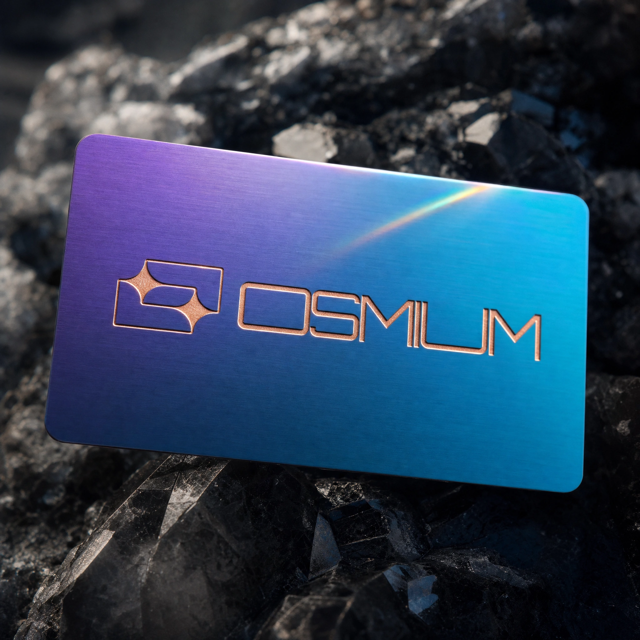
The resin specimen brick is the definitive brand object: a solid palm-sized cast block, dense with suspended copper wire fragments, iridescent film shards, and metallic particulate — the logo recessed as a negative cavity in the top face, not printed. The crystal growth chamber (a sealed Erlenmeyer flask with iridescent crystal clusters growing from a copper wire scaffold) is the strangest and best piece in the system. The parametric packaging uses a PETG diamond-lattice wall structure so the interior resin specimen remains partially visible through the geometry. The iridescent poster carries a full derivative strike matrix alongside macro crystal photography — scientific instrument documentation formatted as editorial print. The specimen label card — the brand's most unexpected piece — classifies OSMIUM as a synthetic mineral, lists its Mohs hardness, refractive index, chain parameters, and on-chain signature. It rests against a raw smoky quartz specimen in the photograph.
DIGITAL SYSTEM
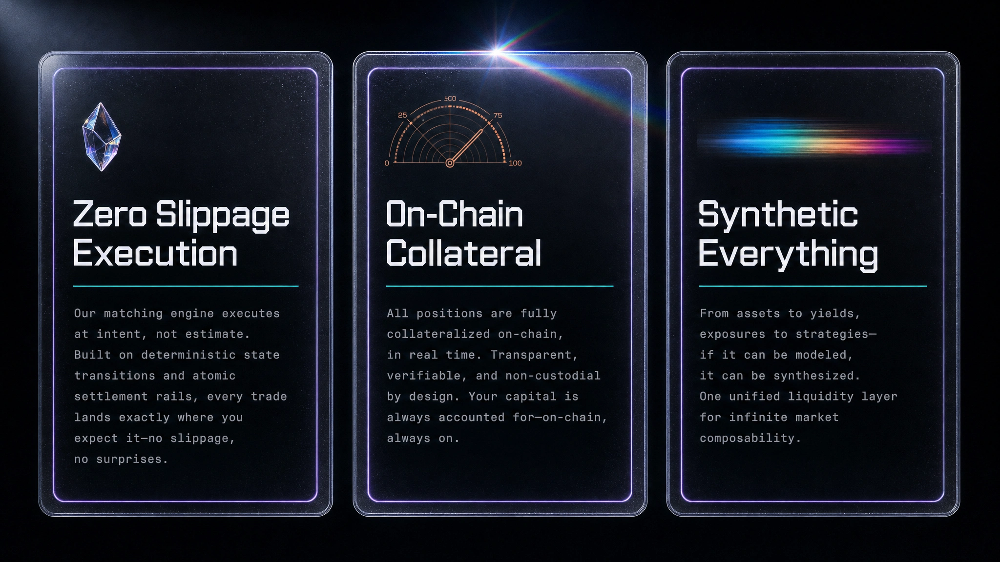
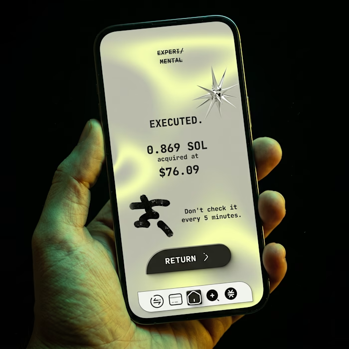
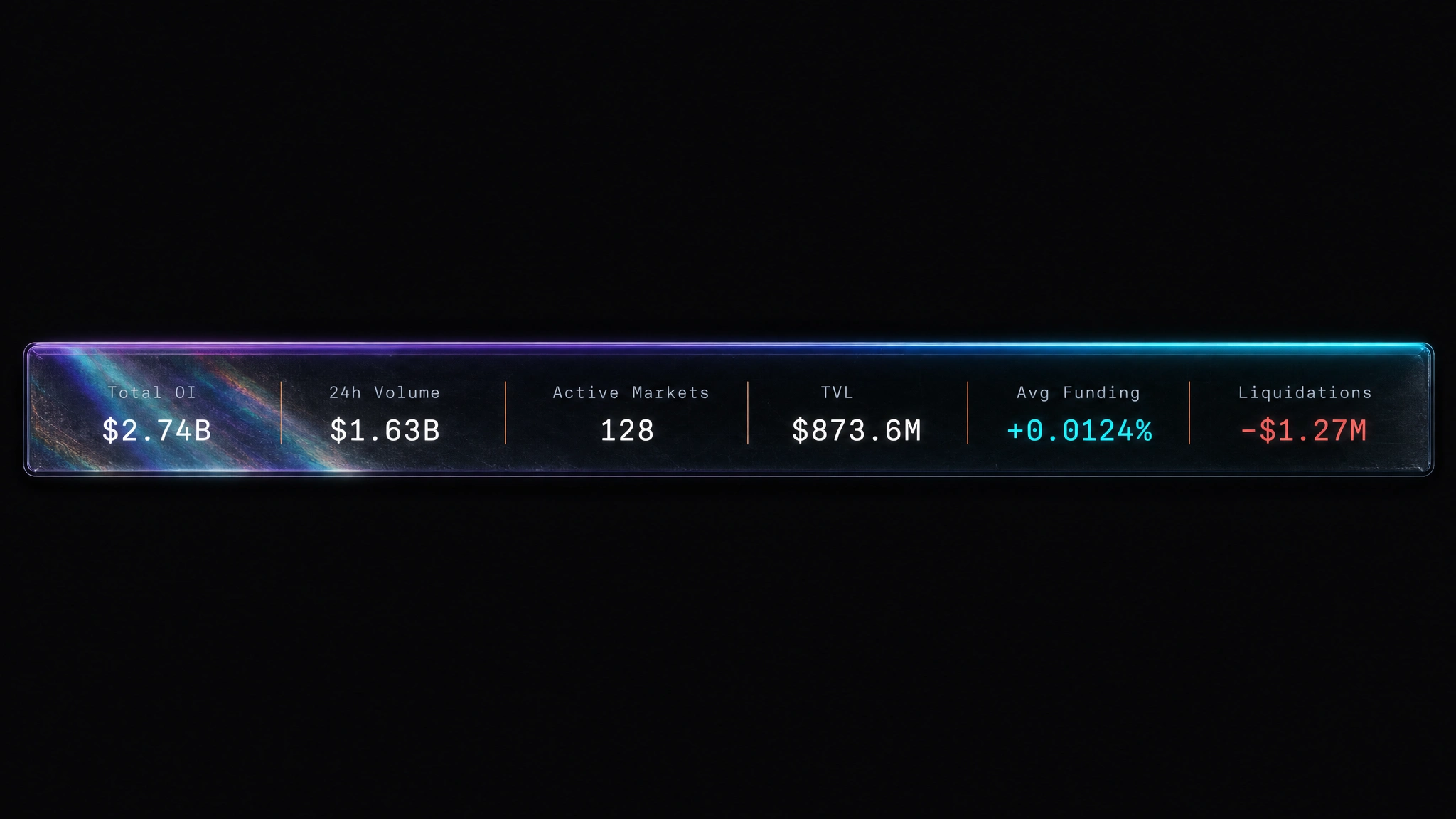
The trading interface carries the same material logic into screen — the stat bar has the iridescent resin specimen world visible through its surface, not as decoration but as the brand's presence inside the data. The mobile app pair and landing page cards use PETG-border framing and iridescent edge glows to maintain material continuity across digital surfaces. The hero section grounds the "Synthetic Assets. On-Chain." headline against a crystal specimen dissolving into a spectral data feed — the same visual tension that started the whole project.
THE RESULT
This is a speculative project built entirely for portfolio, and I treated it that way — no compromises toward safety, no concessions to what DeFi brands typically look like. What I wanted to prove was that a category with genuine visual poverty could be broken open with a strong enough conceptual logic.
The system holds at every scale, from a 3px logo etch in a resin brick to a full-bleed campaign poster. It has objects no other DeFi brand has — a crystal growth chamber, a synthetic mineral specimen label, a copper wire taxonomy — because it started from a world, not from a brief. That's the only way to build something that doesn't already exist.
Révolté — revolte.design
Project: OSMIUM
Year: 2026
Scope: Brand Identity, Campaign Design, Digital UI, Physical Collateral, Print
Industry: DeFi / Web3 — Synthetic Asset Trading
See more at revolte.design
Like this project
Posted May 25, 2026
A DeFi derivatives brand built from geological specimens and synthetic resin: where matter dissolves into market and data bleeds prismatic light
Likes
0
Views
31
Timeline
Jan 16, 2026 - May 25, 2026