Built with Lovart
Helix Protocol Brand Identity for Bio-Futurism

Révolté


HELIX PROTOCOL — Nature's Algorithm
A supplement brand built to look like neither supplements nor branding. The brief was to create something for elite performers that didn't speak the language of the wellness industry at all.
THE BRIEF
They came with a direction called Bio-Futurism — the idea of a brand set ten years forward, where biohacking and performance science had merged into something clinical and otherworldly. The target wasn't gym-goers. It was the person who thinks of their body as a system to be optimized, not a silhouette to be chased.
The tension in the brief was a familiar one: precision vs. warmth. Sci-fi aesthetics tend to read cold and inaccessible. Pharmaceutical aesthetics read institutional. Neither was right. What they actually needed was something that felt alive — the kind of precision that comes from nature, not from a lab designing against it.
I took on the full brand identity: visual system, color, typography, and a 20-piece mockup suite covering packaging, apparel, OOH, editorial, digital, and accessories. The scope was wide enough that the system had to be bulletproof — every surface needed to hold the concept without explanation.
THE APPROACH
The first instinct was clinical white with electric blue — the obvious bio-futurism palette. I rejected it within an hour. Electric blue reads as tech-startup, not advanced biology. It pointed in the wrong direction.
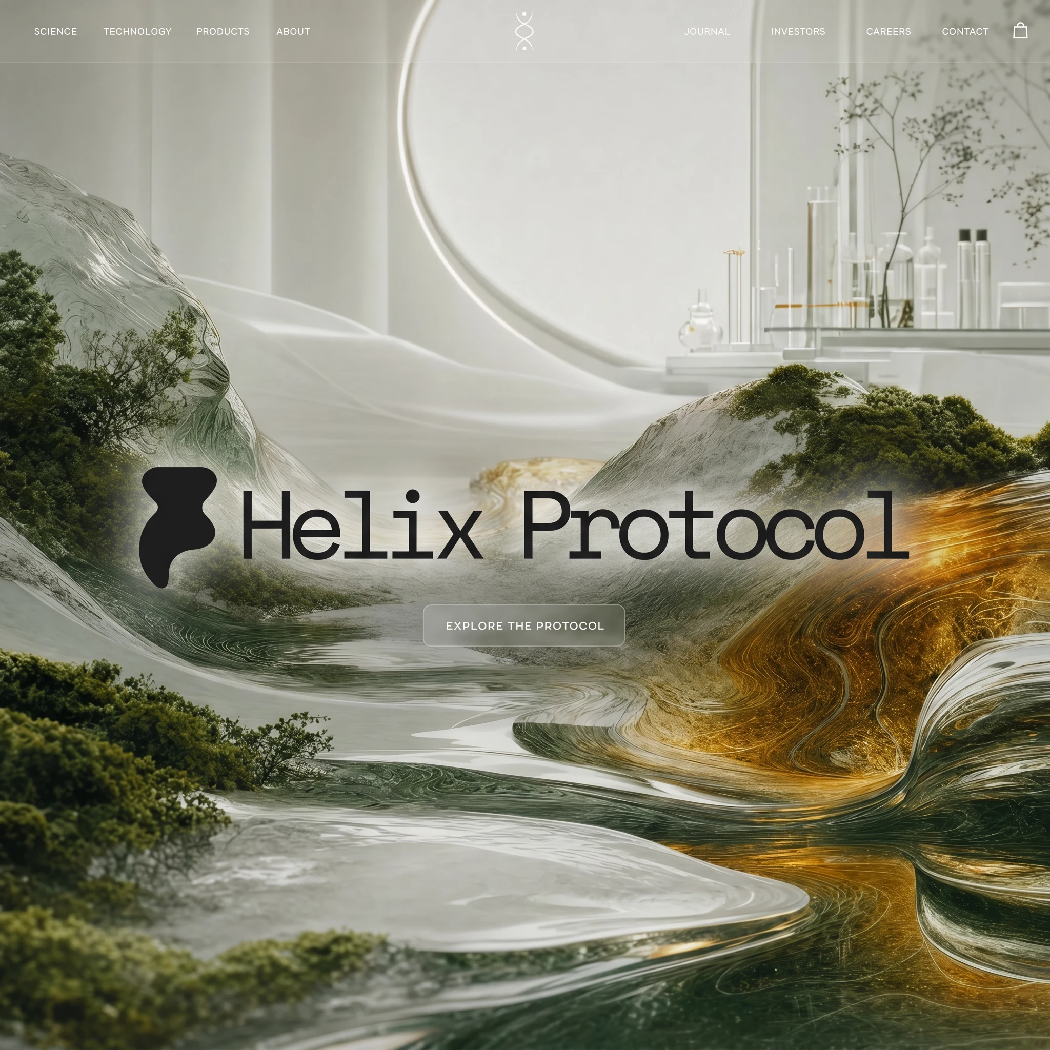
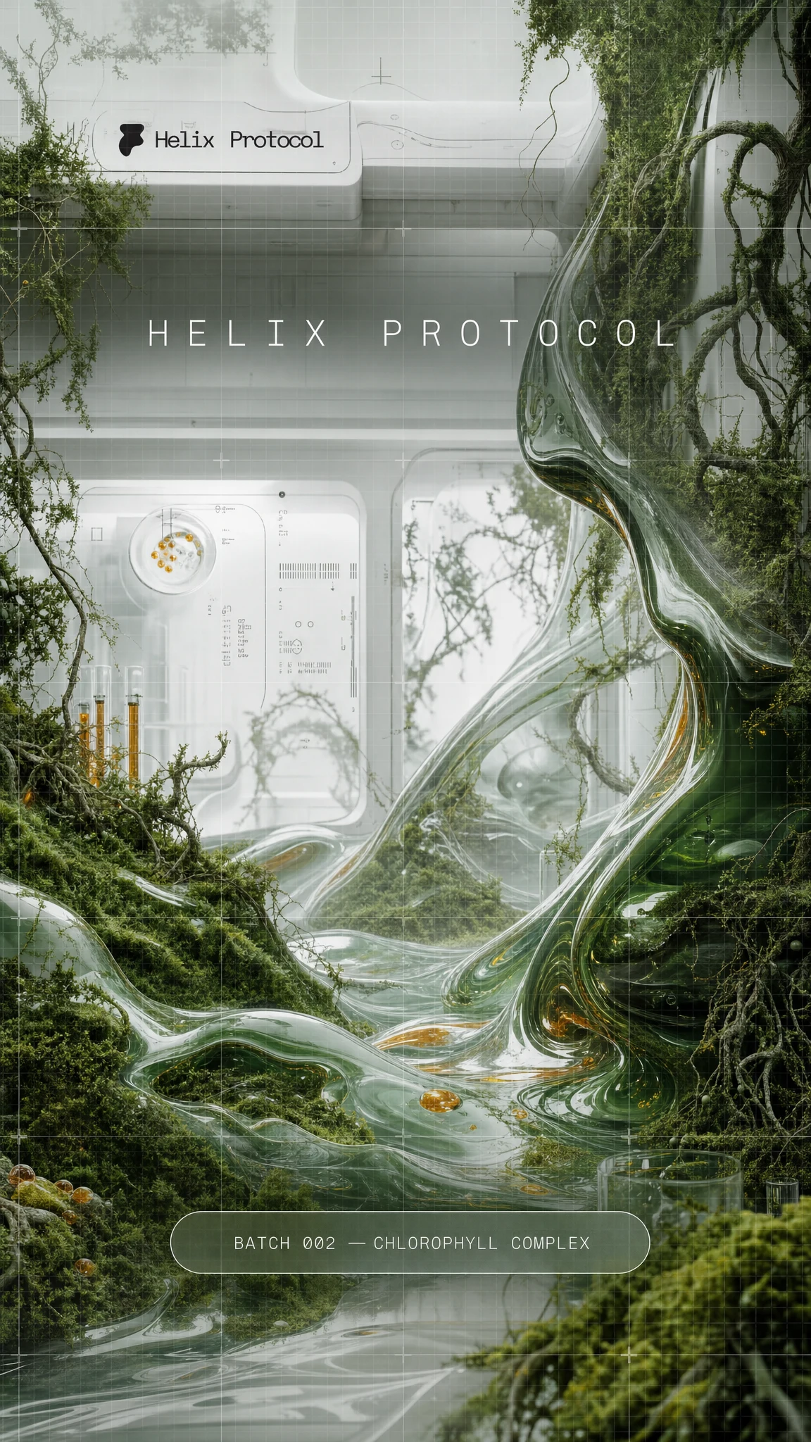
What unlocked it was a set of reference images the client sent — specifically, a photograph of moss erupting through a wireframe grid, roots cracking through architectural geometry. That image reframed the entire direction. This wasn't a brand about synthetic engineering. It was a brand about nature being the most sophisticated technology that already exists.
From that single tension — clinical structure being colonized by living organic matter — everything else followed. The palette wrote itself:
#F4F6F2 (clinical white), #2D5A27 (deep moss green), #C8CEC8 (wireframe grey), and #C8860A as a rare warm amber accent. Translucent glass became the fifth "color" — a material, not a hex code.Typography was the last piece. Space Mono was the only answer. Monospaced, slightly mechanical, it reads like data output from a biological scanner. Set at small scale on packaging it becomes a data readout. Set large in editorial it becomes a manifesto. One typeface, infinite registers.
THE WORK
VISUAL SYSTEM
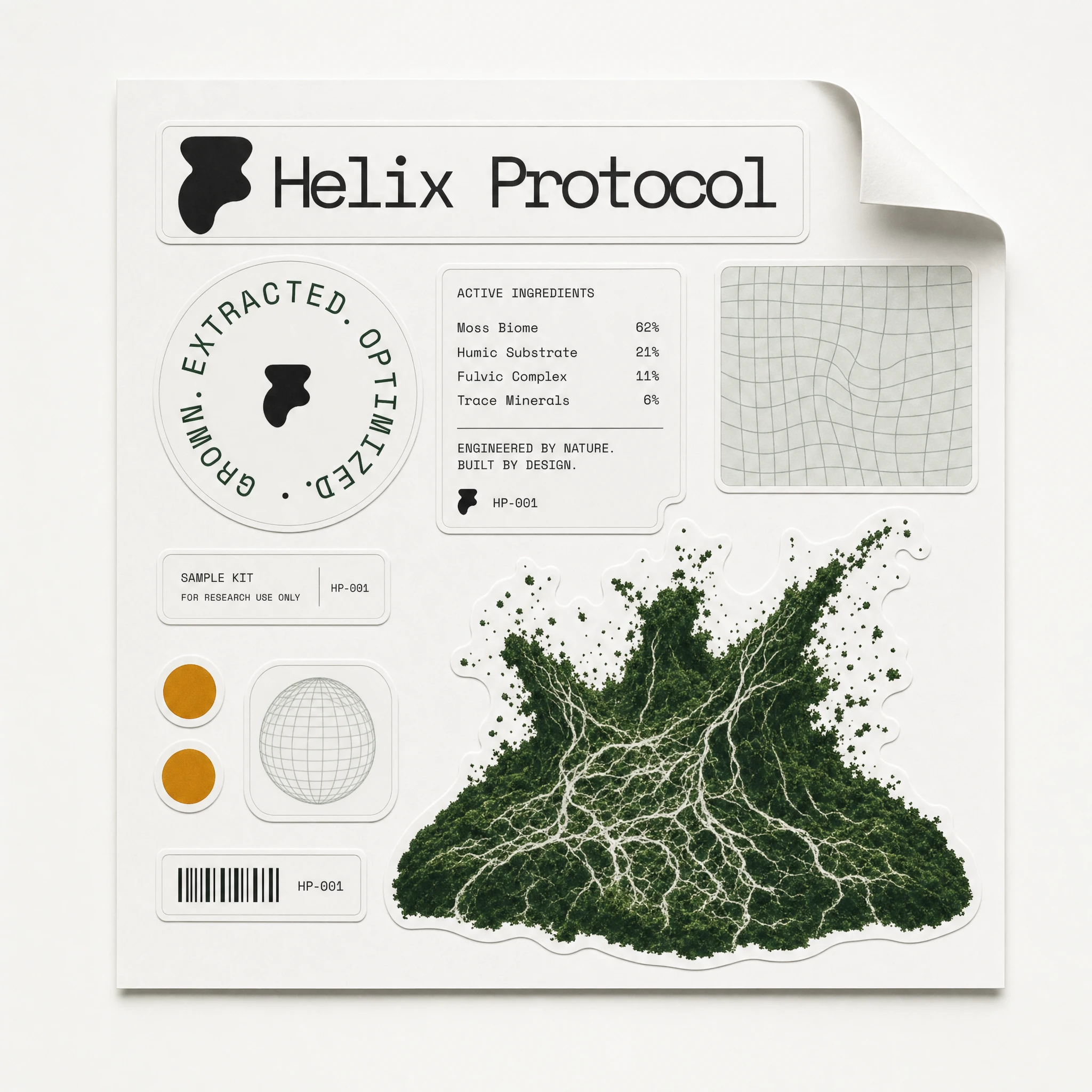
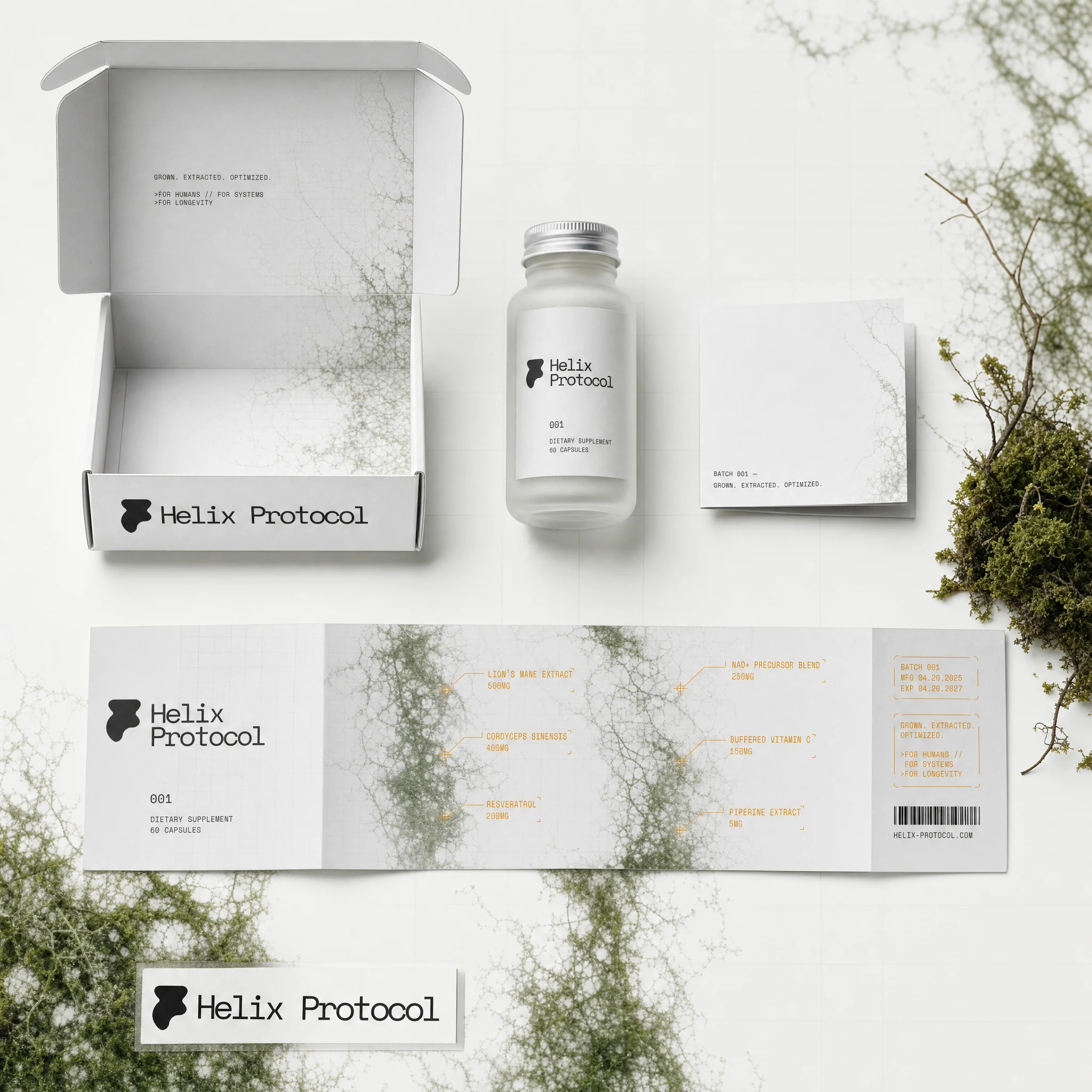
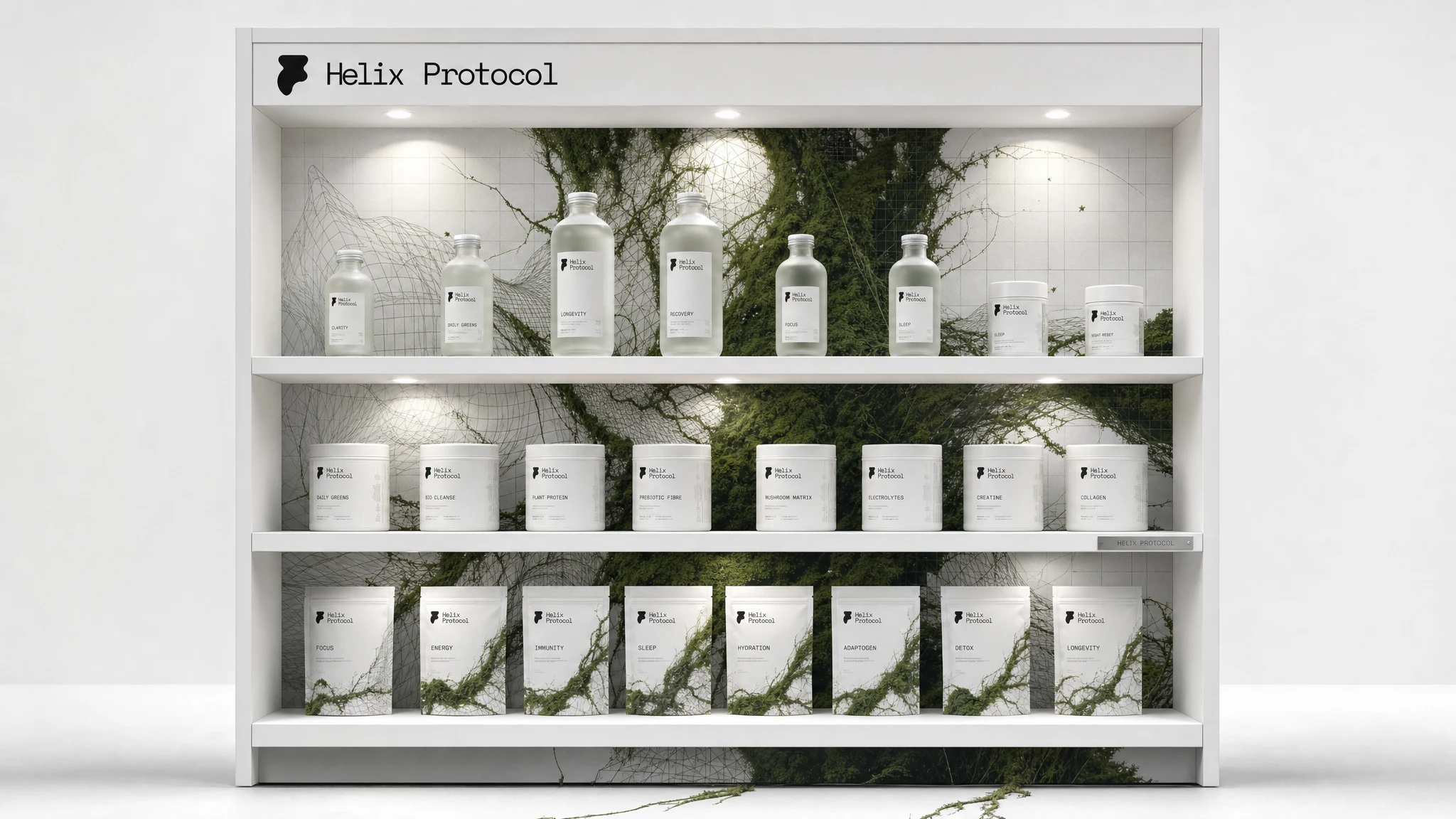
The core motif is clinical white surfaces — grids, geometric forms, architectural precision — being overtaken by dense living green matter: moss, roots, vines, tendrils. The two never fully merge. There's always a moment where the grid is still visible, where the organic hasn't won yet. That threshold is where the brand lives.
LOGO
The existing mark — an abstract organ-form icon paired with the "Helix Protocol" wordmark in Space Mono — was treated as a fixed asset throughout. It was placed exactly as provided across every surface. The logo's character is strange enough that restraint is the right call: it doesn't need interpretation, only precision in placement.
COLOR SYSTEM
Five-part system:
#F4F6F2 as the dominant field — cooler and more complex than pure white, closer to greenhouse glass. #2D5A27 as the primary graphic element — deep enough to feel biological, not botanical. #C8CEC8 for structural grid lines that read as technical overlay. #C8860A deployed sparingly as an amber data-annotation accent, the way HUD overlays mark measurements on a scan. Translucent glass as a material — used for vessel forms, product containers, and UI elements.TYPOGRAPHY
Space Mono, exclusively. No size hierarchy beyond scale — small for data, large for declaration. Letter-spacing pushed open at display sizes. Never centered except in editorial contexts where symmetry earns its keep. Used for everything from ingredient callouts to campaign headlines.
PACKAGING
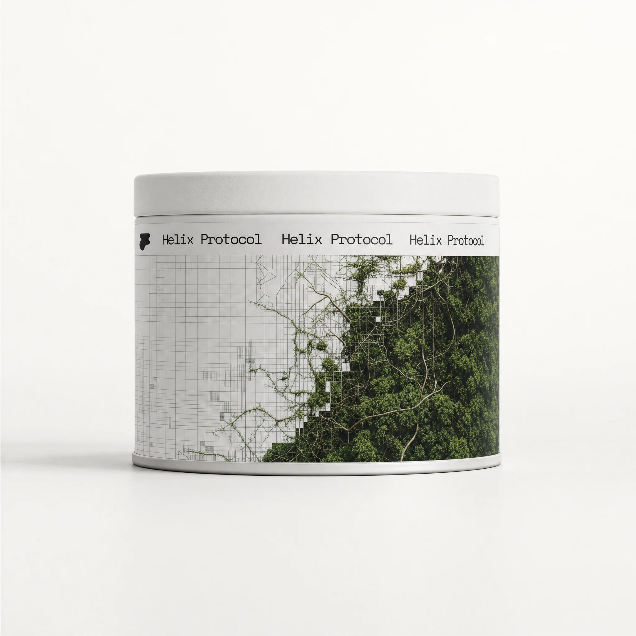
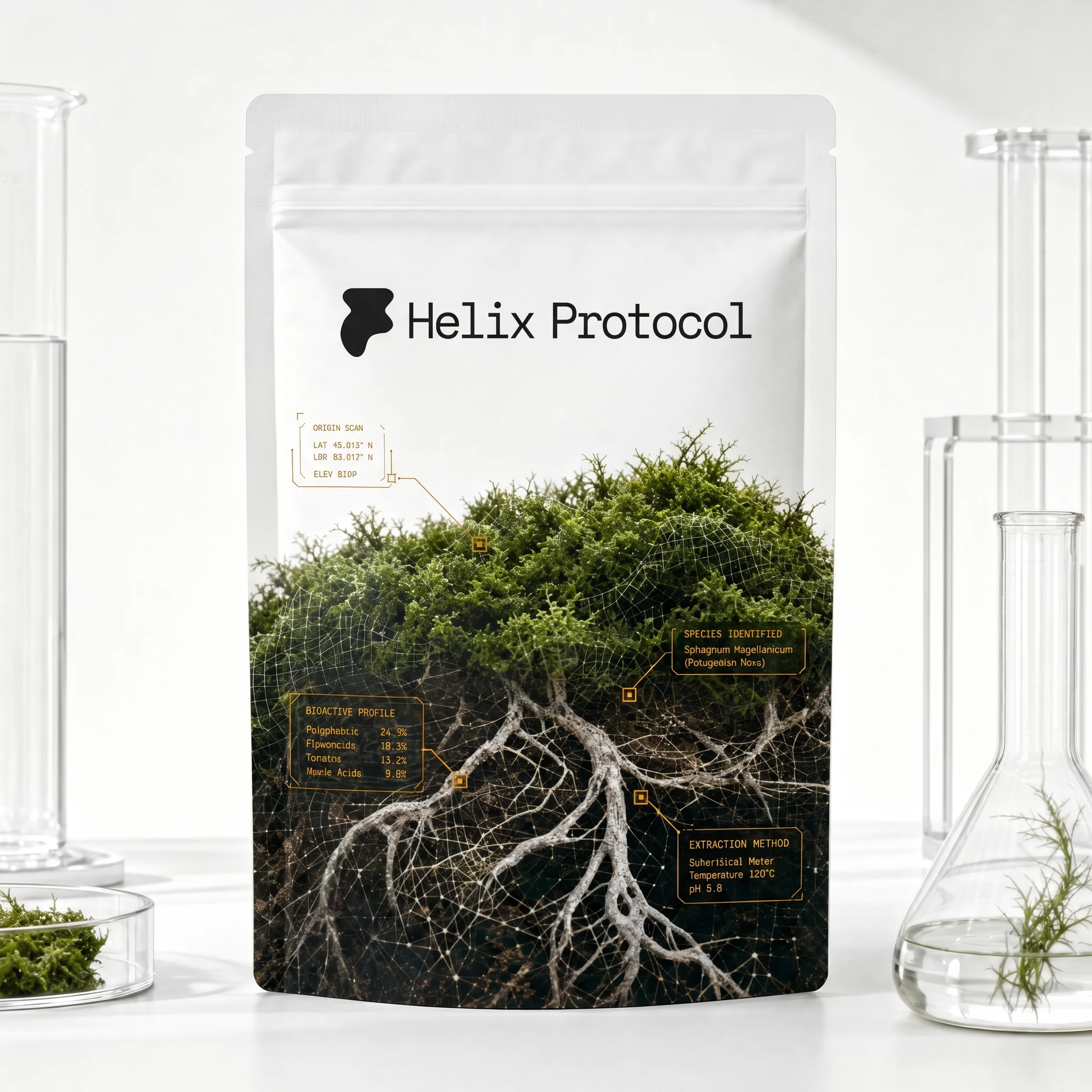
The supplement tin wraps a full 360-degree label — precise wireframe grid on the left side dissolving into dense organic green texture on the right. The sachet pouch carries large-scale botanical root imagery annotated with amber HUD callouts as if scanning ingredient origin. The frosted glass bottle holds visible plant matter inside it, the product as terrarium. Every container treats the product as a biological specimen.
APPAREL
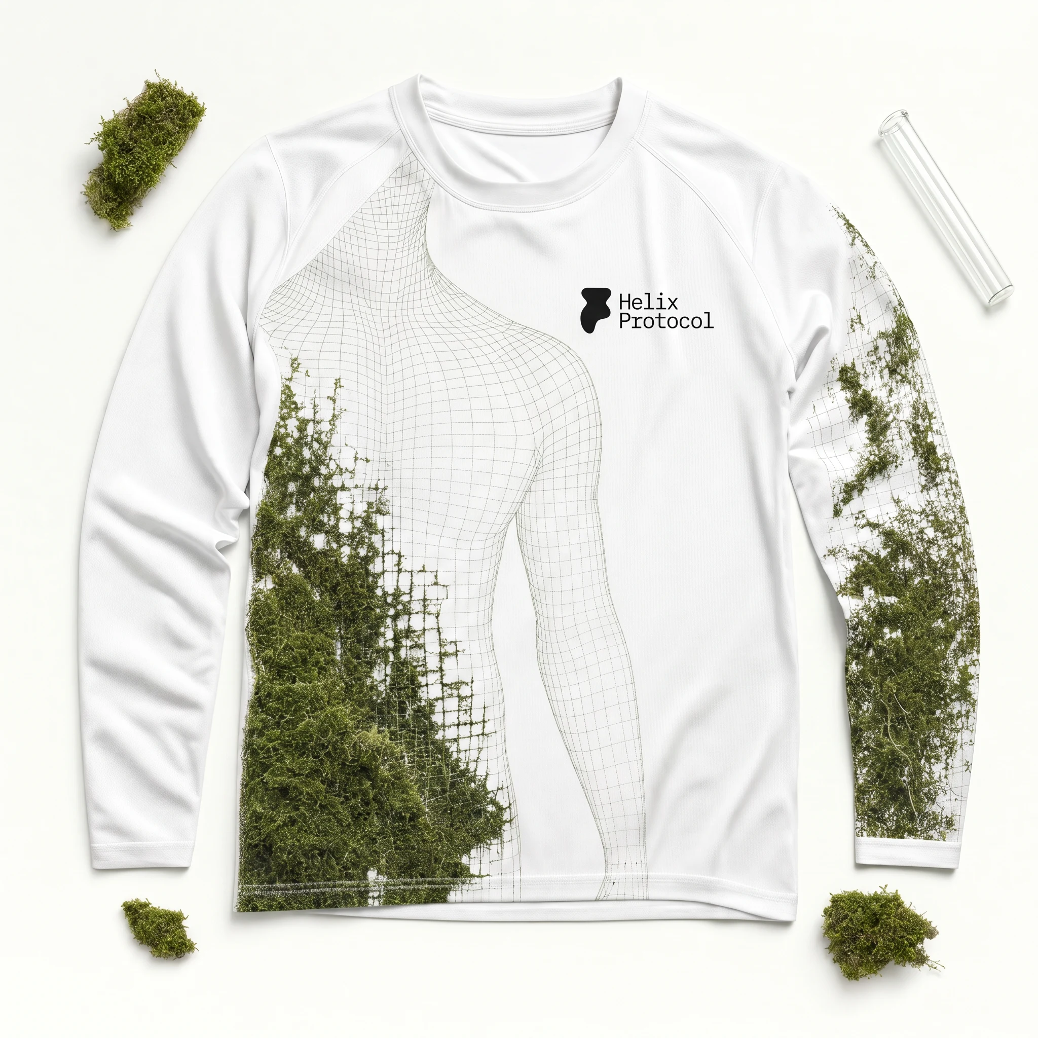
The performance top prints a wireframe body-scan overlaid with moss and vine growth across chest and sleeve — the body rendered as system, nature growing through the map of it. The gym towel uses a woven moss-green border stripe with an embroidered corner patch. The cap carries only "HX" in moss-green thread on white, with the wireframe-moss print hidden beneath the brim.
CAMPAIGN / EDITORIAL
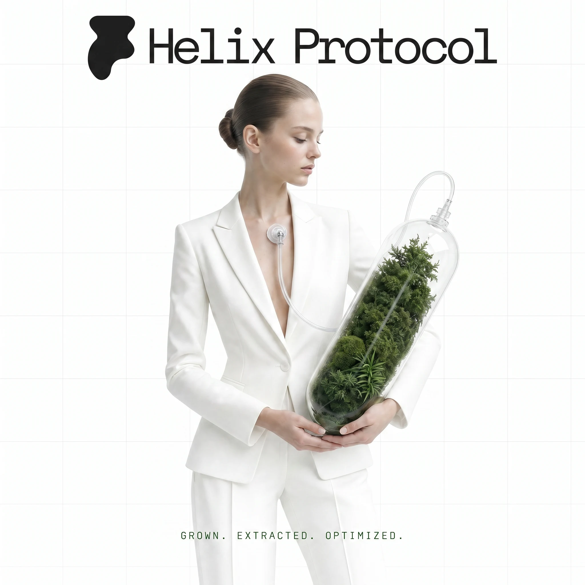
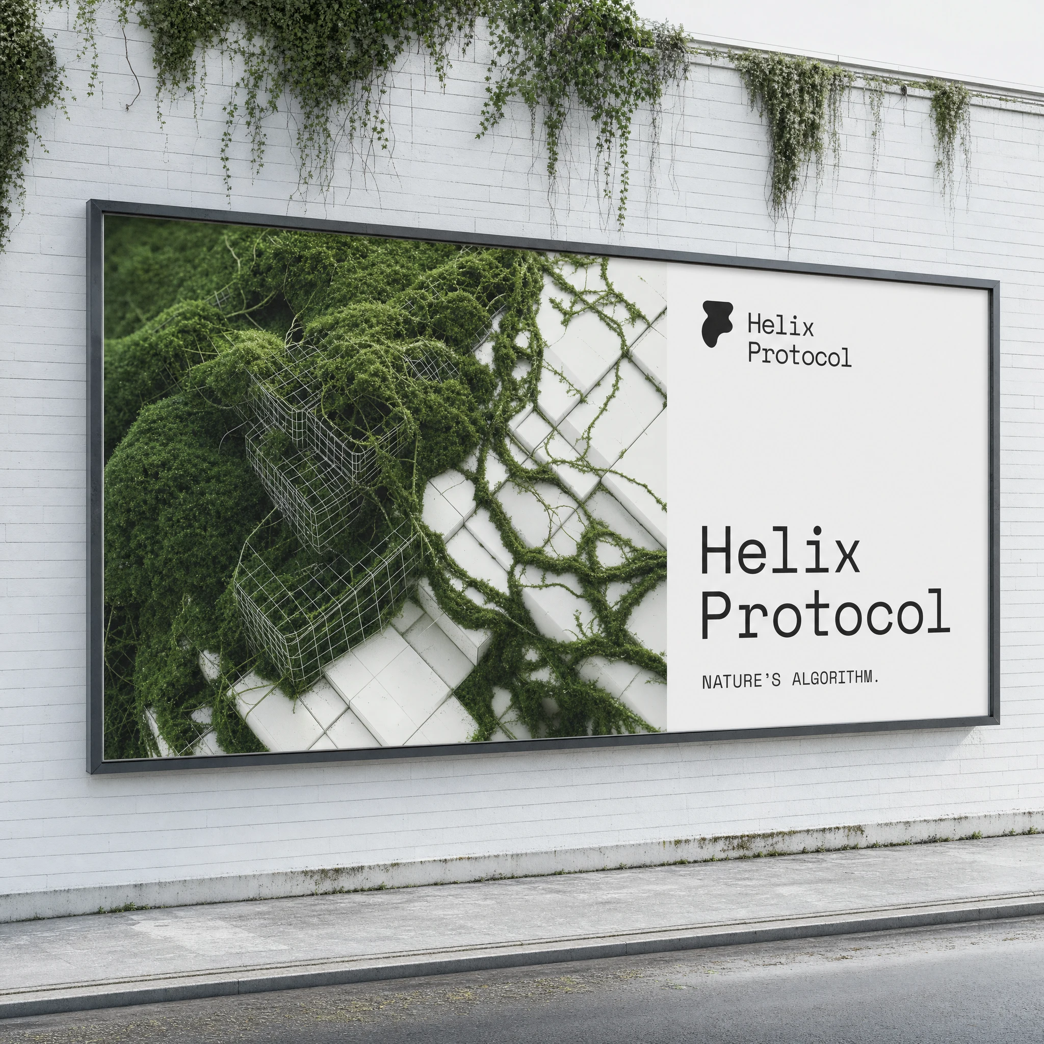
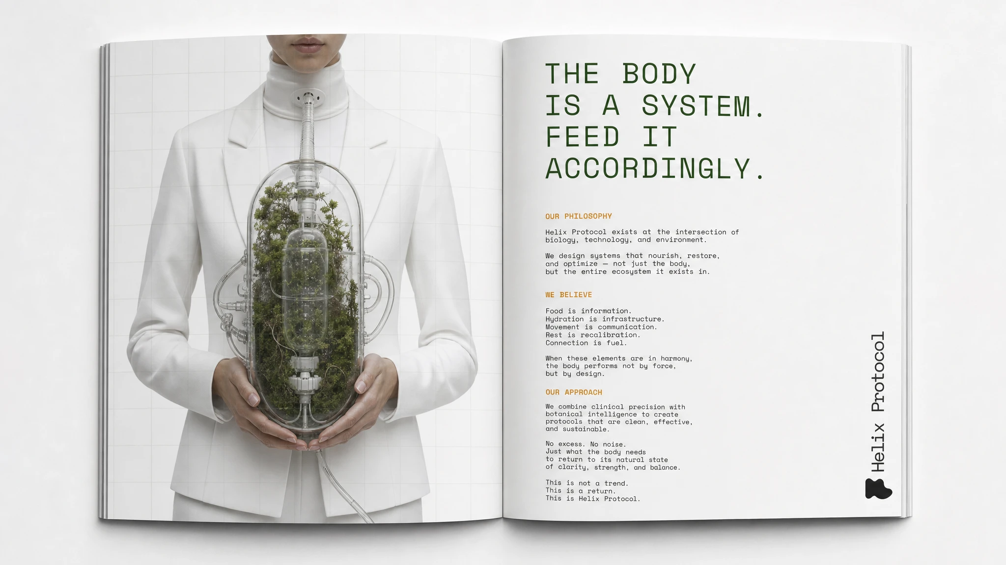
The poster places a figure in a white tailored suit holding a glass capsule vessel filled with dense plant matter, connected to her via a clear tube. Background: pure white with a faint architectural grid. Tagline: "GROWN. EXTRACTED. OPTIMIZED." — set in Space Mono at the bottom. The billboard splits the same imagery: two-thirds organic grid eruption, one-third white space with the wordmark and "NATURE'S ALGORITHM." The editorial spread runs the same figure against the manifesto copy — "THE BODY IS A SYSTEM. FEED IT ACCORDINGLY." — in deep moss green, body text in Space Mono, amber for subheadings only.
ACCESSORIES / EXTENDED BRAND
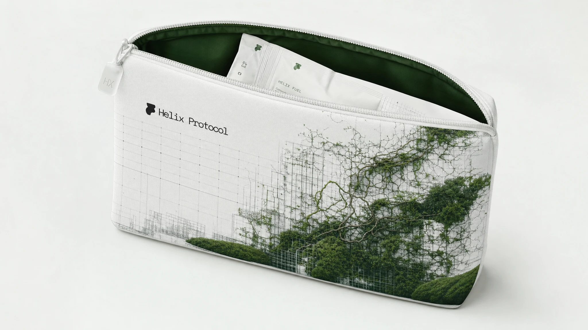
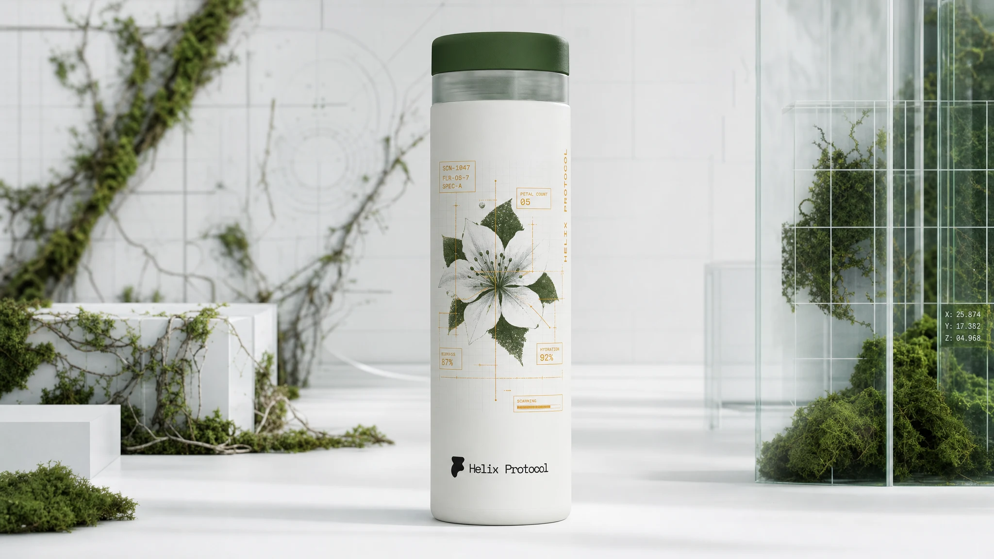
The sticker sheet functions as a scientific sample kit — die-cut badges, ingredient callout labels, a wireframe-grid patch, the moss eruption rendered as a collector graphic. The zip pouch carries the wireframe-moss print at full scale across technical fabric, with a frosted HX zipper pull and moss-green lining. The insulated flask maps a botanical specimen — a white flower with HUD-overlay data callouts in amber Space Mono — as if the vessel is actively analyzing its contents.
THE RESULT
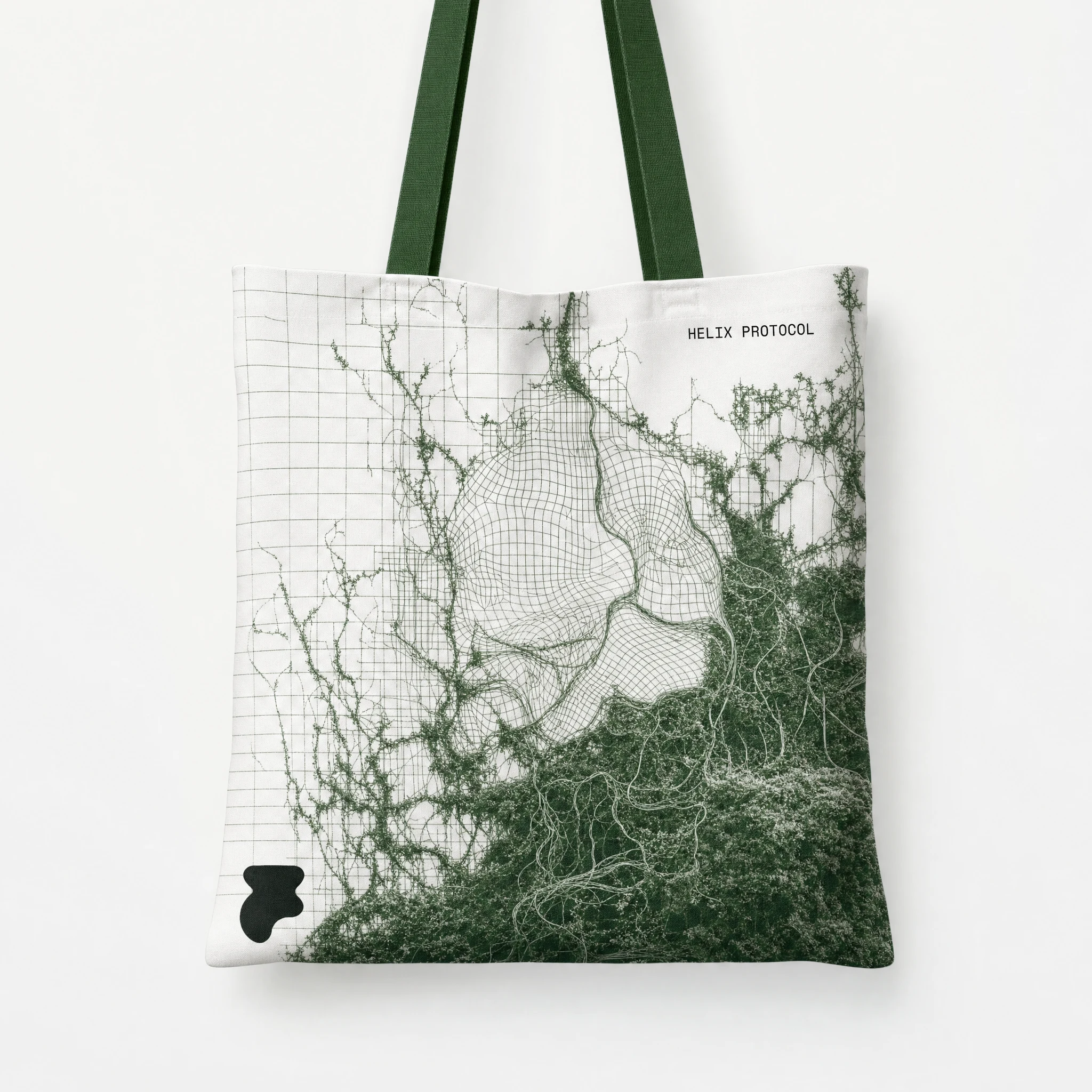
Twenty mockups delivered across every major brand surface. The system held at every scale — from a small embroidered "HX" on a cap to a full-bleed OOH billboard — because the concept was simple enough to survive translation and specific enough to not dilute. Clinical white colonized by deep moss green. Nature rendered as data. One typeface. One tension. Everywhere.
The work reads as nothing else in the supplement space, which was the point. It belongs in a design journal as easily as on a shelf.
Studio: Révolté — revolte.design
Project: Helix Protocol
Year: 2026
Scope: Brand Identity, Visual System, Packaging Design, Apparel, Campaign, Editorial, Digital
Industry: Performance Nutrition / Biohacking
See more at revolte.design
Like this project
Posted May 28, 2026
Performance supplement brand built on the collision of clinical white geometry and living green matter, nature rendered as the most advanced technology
Likes
3
Views
39
Timeline
May 12, 2026 - May 28, 2026