Built with Lovart
Yonk: Play Loud - A New Gaming Brand Identity
Révolté
YONK — The Cartoon That Refused to Lose
A gaming and entertainment brand built on a single bet: that the loudest, most joyful thing in the room wins. Not despite the cartoon. Because of it.
THE BRIEF
Gaming brands have a look. You know it before you see it: dark gradients, metallic type, a shield or a crest, aggressive energy dressed up as identity. The brief I set myself was the direct opposite of all of that. A gaming and entertainment brand that refused the genre entirely. Something loud and ownable and warm — built around a mascot, not a logo, and designed to exist equally on a controller dock, a laundromat wall, and a subway platform at 1am.
The tension was real from the start. In a category that mistakes darkness for seriousness, building something genuinely joyful felt like a risk. The question I kept asking was whether cartoon maximalism could carry the same authority that the dark aesthetic borrows from esports. I decided the answer was yes, and then I had to prove it.
The scope I defined was total: brand identity, logo, visual system, campaign, digital product UI, and a full lifestyle photography direction. Not a logo with some applications. A world.
THE APPROACH
The first instinct was right and I knew it immediately: the mascot has to be the brand, not an asset of the brand. Every gaming brand with a mascot treats it as decoration — a character that sits beside the logo at a comfortable distance. I rejected that completely. In Yonk, the mascot IS the logo. The yellow circle, the rubber-hose figure mid-jump, the YONK arc above it — it's all one mark, inseparable.
The figure came from Fleischer Studios logic — rubber-hose limbs that follow no anatomical rules, a head that's 40% of the total body height, a grin that never closes. The proportions are wrong in exactly the right way. I built the character from flat shapes only: no shading, no gradients, consistent 3px outline weight throughout. The orange body against sky blue limbs against the sunshine yellow circle creates the full palette in a single mark.
What I kept coming back to was the outline. Every element in the Yonk system — type, UI components, illustration, stickers — shares the same
#1A1A1A outline weight. That single rule unifies a system that could otherwise feel chaotic. The outline is the skeleton. The color is the personality. The two in combination are the brand.The campaign name came late and locked everything: PLAY LOUD. Two words that describe the visual system, the product world, and the brand's entire reason for existing. From that point, every mockup, every UI screen, every photography brief was a different answer to the same question: what does playing loud look like here?
THE WORK
LOGO
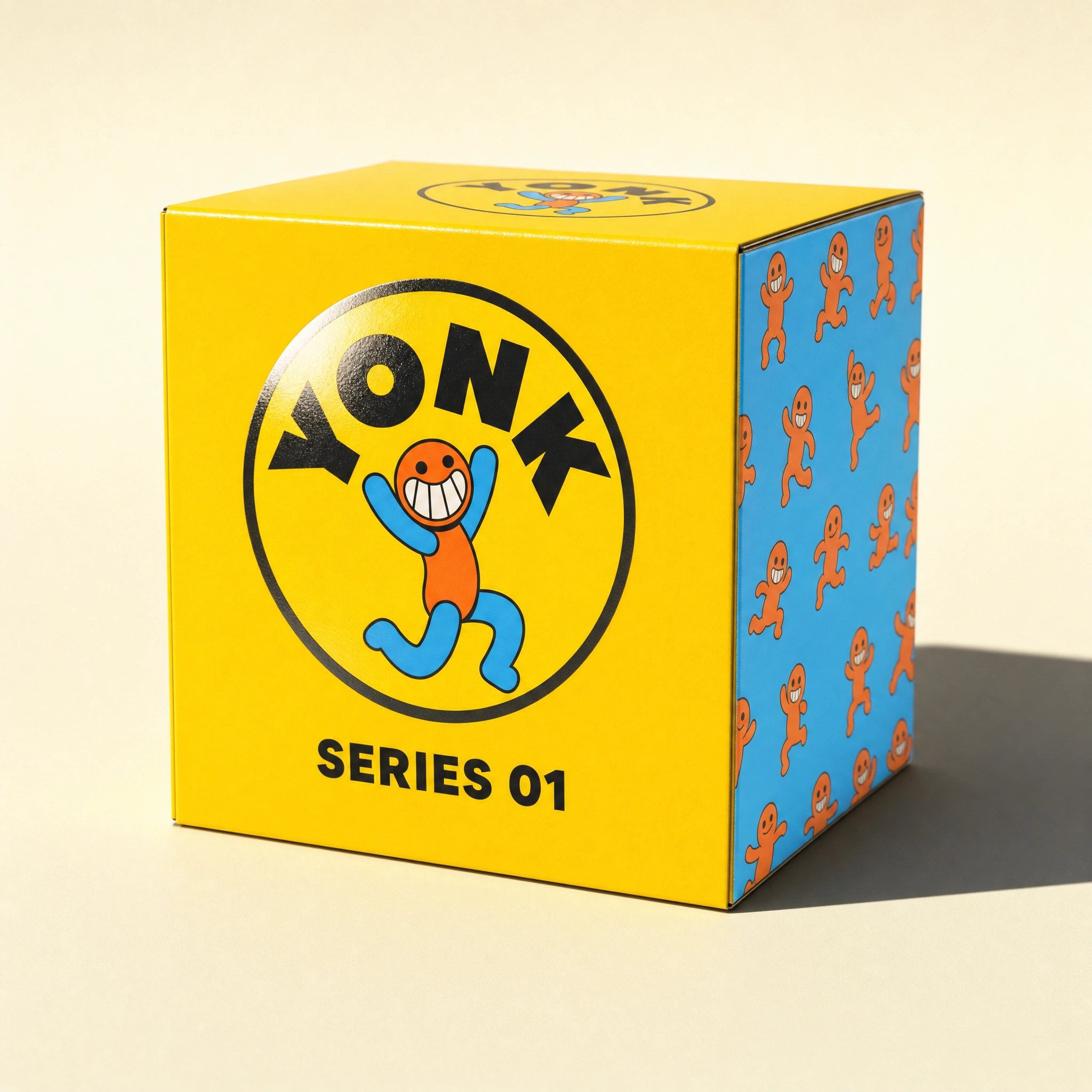
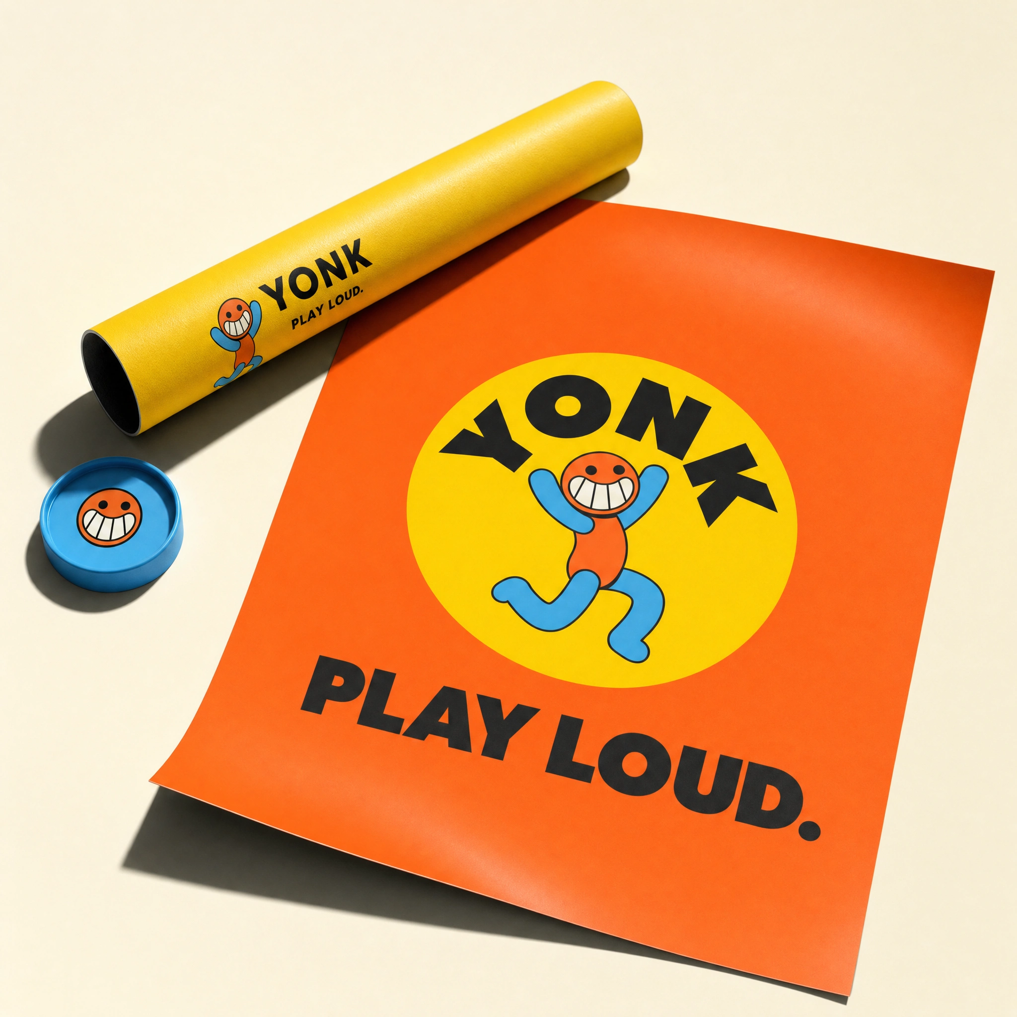
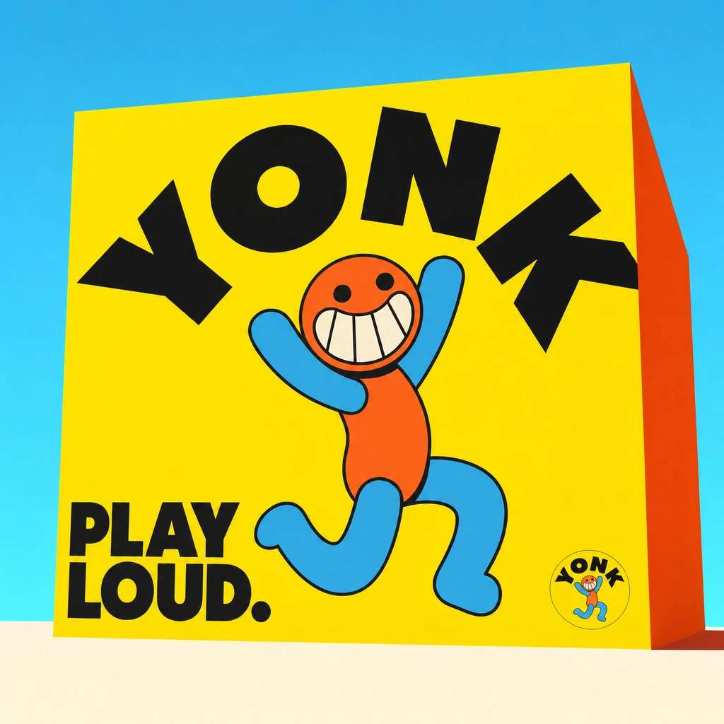
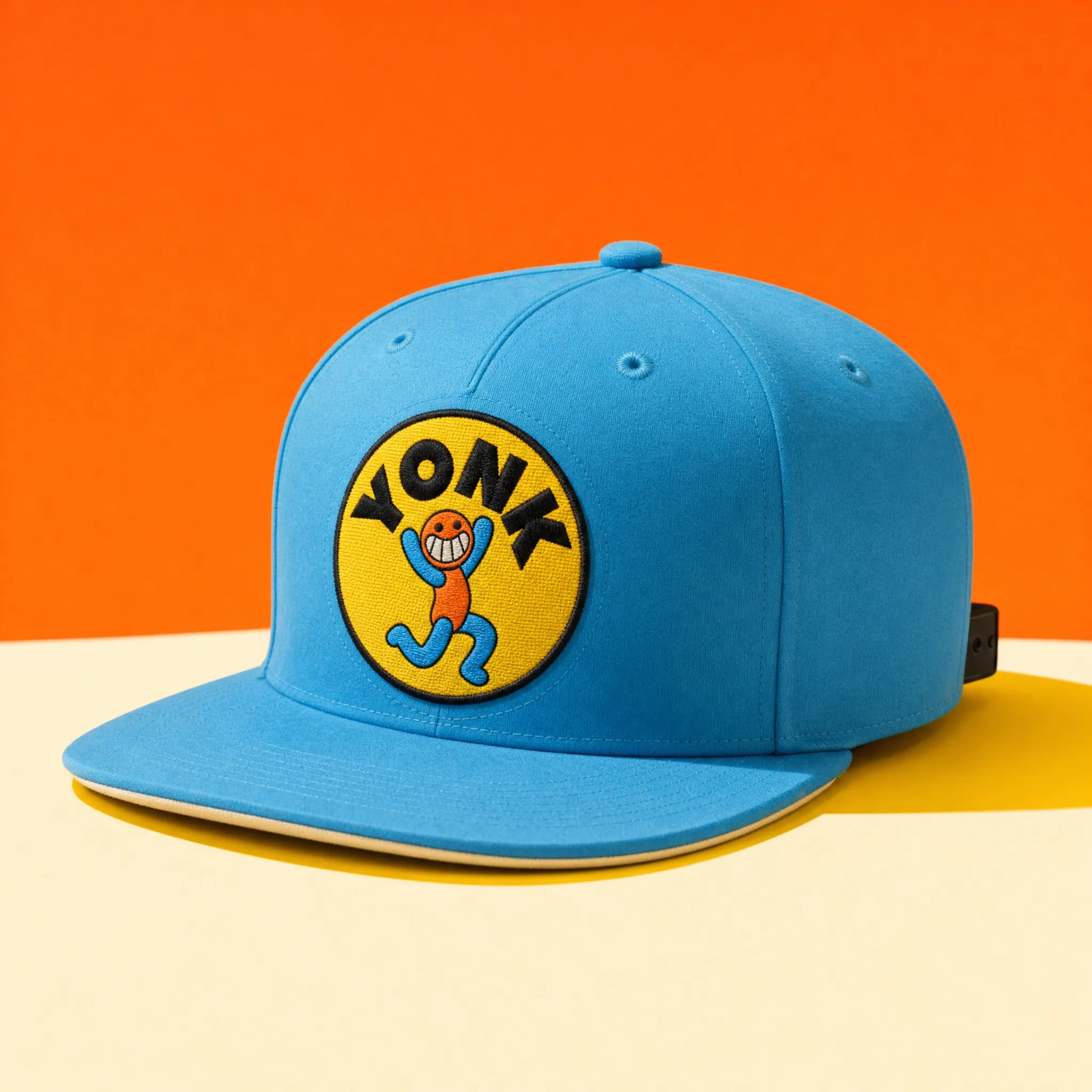
The Rubber Hose mark is a circular badge — Sunshine Yellow
#FFE000 fill, the mascot figure centered and large, YONK set in a customized Grandstander ExtraBold arc above it, thick #1A1A1A outline wrapping the whole system as one unified shape. The figure is orange body, sky blue limbs, dot eyes, maximum grin. At favicon size it reads as a face. At wall-wrap scale it reads as a character. The outline weight scales with it at every size — it was tested at 16px and 4 storeys tall and held both times.VISUAL SYSTEM
Five colors, one rule. Flame Orange
#FF5722 is the primary — every CTA, every key fill, every moment that needs to shout. Sky Blue #42B4E6 is the counter-color: backgrounds, surfaces, the space the orange shouts into. Sunshine Yellow #FFE000 is the structural accent — used exclusively for hard drop shadows and badge fills, never as a background color in extended layouts. Cream #FFF8E1 is the breath: warmer than white, easier on screen, the default base for light contexts. #1A1A1A is the skeleton that holds all of it together.Orange and blue never appear in equal proportion. One always dominates. The yellow is the hinge. The cream is the pause. The black is non-negotiable.
TYPOGRAPHY
Grandstander ExtraBold for all display: headlines, game names, UI labels, campaign copy. Set tight, slightly condensed, always at a weight that matches the outline logic of the illustrations. DM Sans Medium for everything else — body copy, UI text, legal. No thin weights anywhere in the system. The minimum weight is Medium. Type can rotate, stack, or sit at an angle. It cannot whisper.
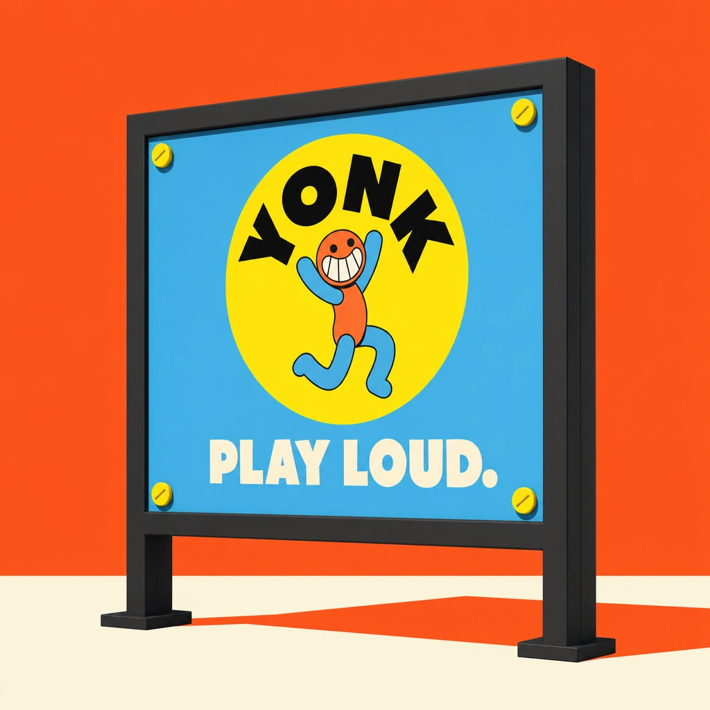
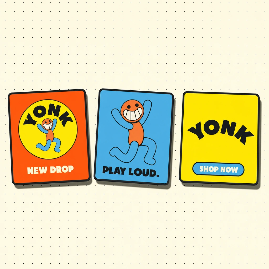
CAMPAIGN — PLAY LOUD
The campaign runs across five formats: hero poster, street billboard, merch flat lay, social card row, and a full-building OOH wall takeover. Every frame shares the same cartoon-logic physics: hard Sunshine Yellow drop shadows with clean edges, no diffusion, no gradients. The wall takeover is the campaign at full volume — the mascot at architectural scale, YONK arcing across four storeys, PLAY LOUD in the lower left large enough to read from across the street.
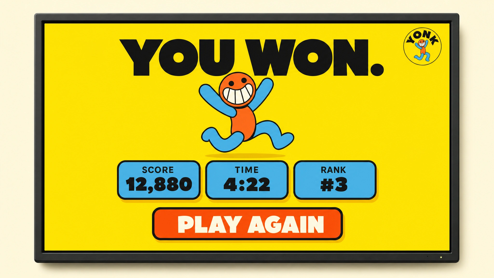
DIGITAL UI
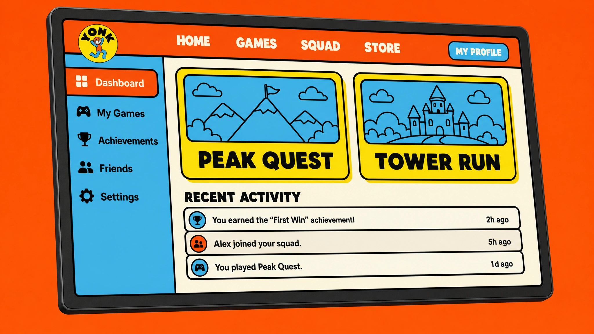
Five screens built on the same system logic as the physical brand. The platform dashboard carries the full component library: Flame Orange navigation bar, Sky Blue sidebar, Cream content area, Sunshine Yellow drop shadows on every interactive element, Grandstander ExtraBold for display hierarchy, DM Sans Medium for UI copy. The victory screen is the emotional peak: an enormous PLAY LOUD. centered on a full-bleed yellow background, the mascot mid-celebration below it, stat badges and a CTA completing the layout. All screens were designed to be shippable — not conceptual, not decorative.
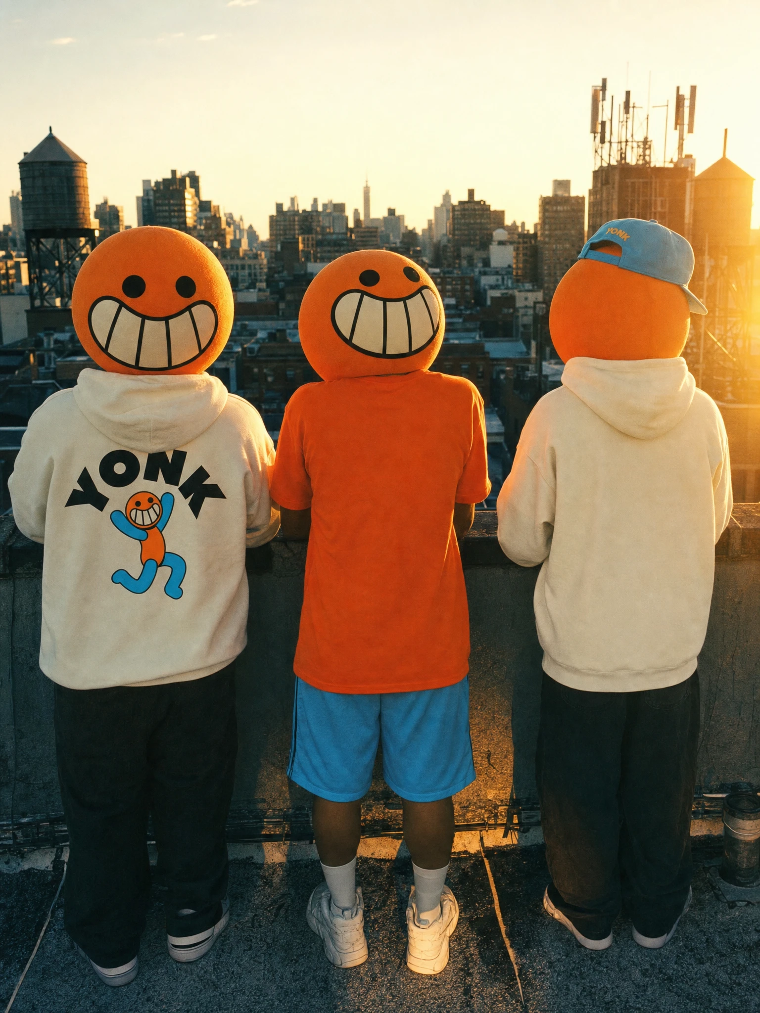
LIFESTYLE CAMPAIGN
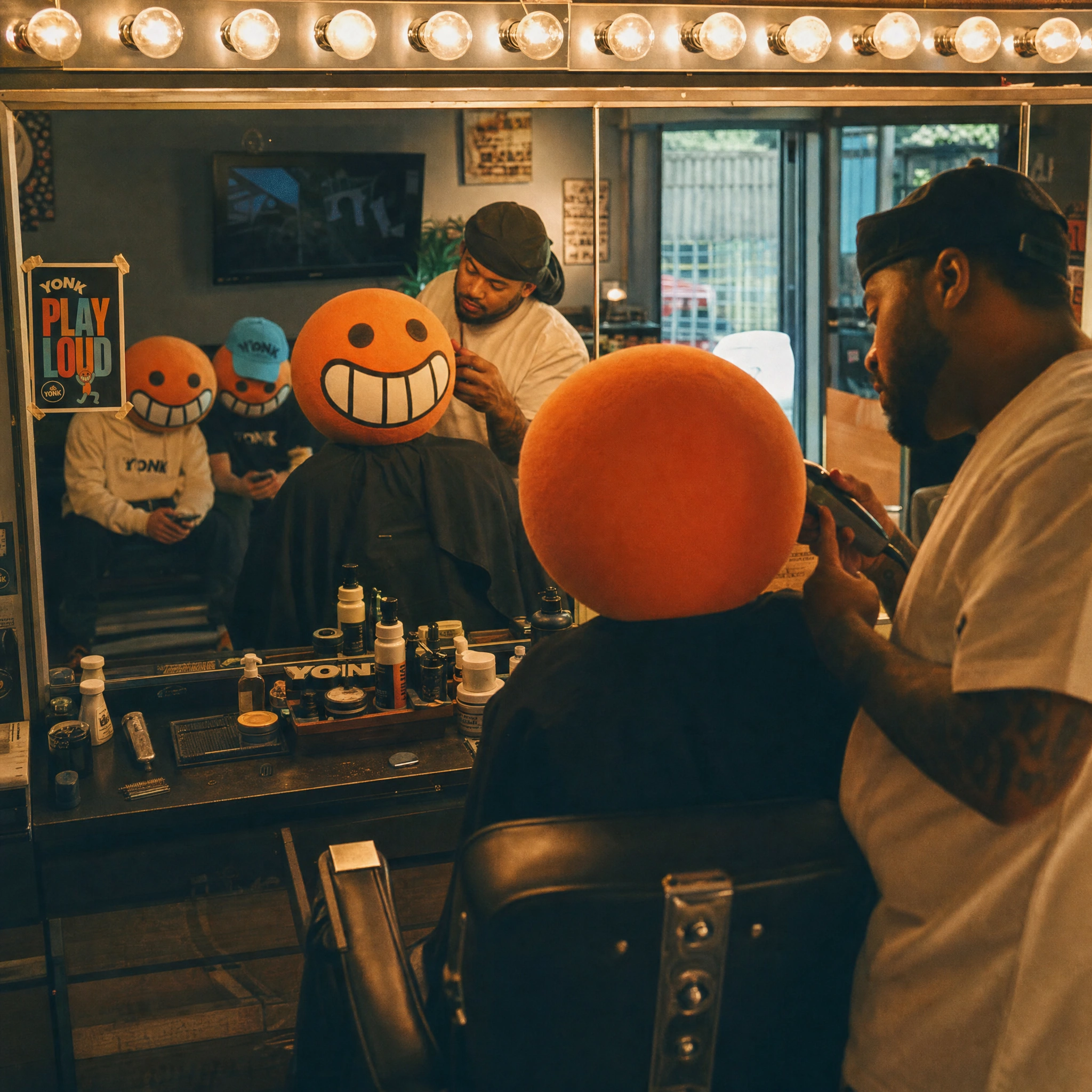
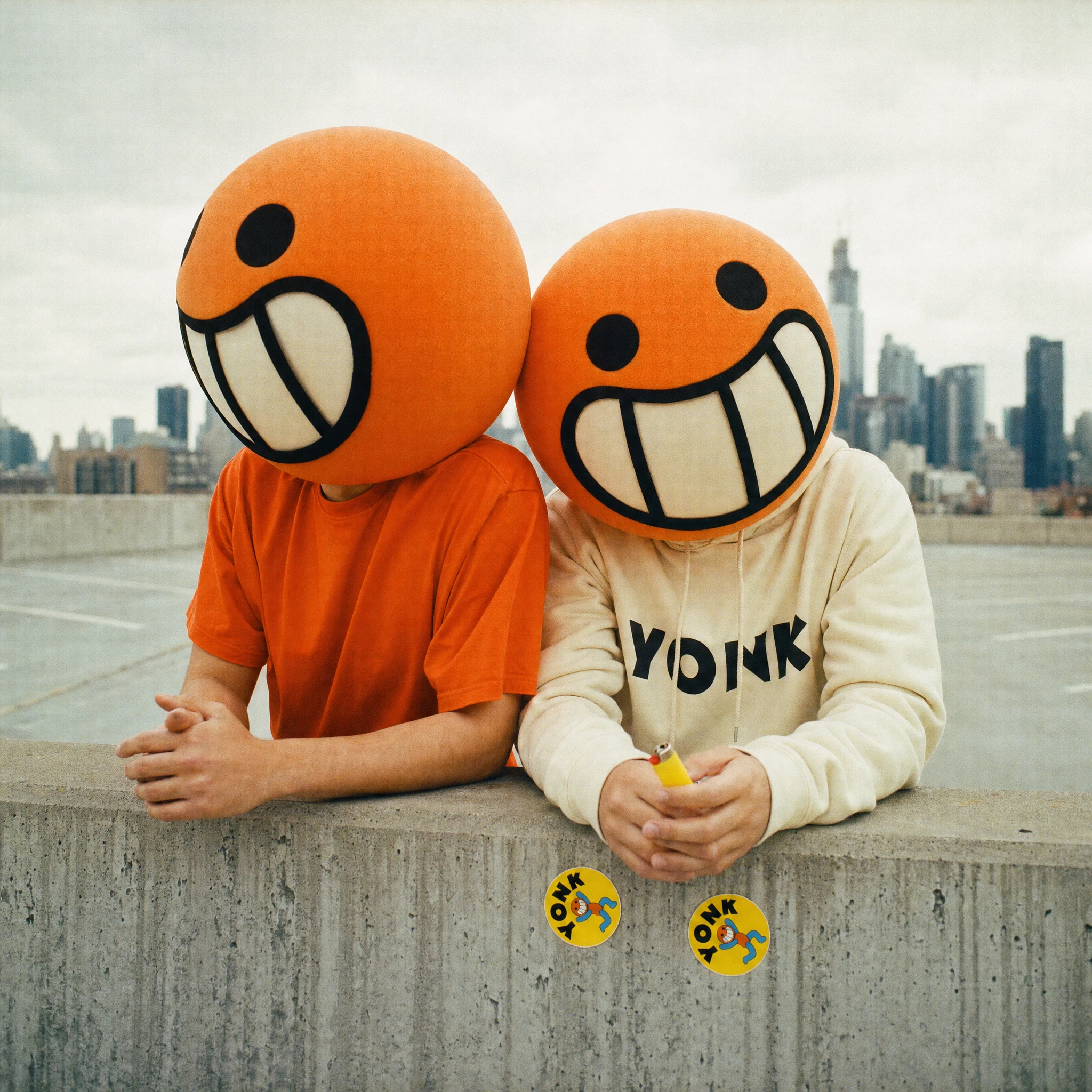
Fifteen frames across three chapters. The concept: every human figure wears an oversized physical mascot head — orange foam sphere, dot eyes, maximum grin, thick painted outlines — on a completely normal body in Yonk merch, in completely real environments. A laundromat at dawn. A hospital waiting room. A bus window in the rain. A record store on a Saturday afternoon. The photography style references Wolfgang Tillmans for intimacy, Jurgen Teller for rawness, Stephen Shore for flat American light. 35mm film, warm grain push, slightly crushed blacks. The idea is simple and absolute: the cartoon exists in the real world, fully committed, no irony. The permanent grin in every situation — the skatepark, the 3am parking lot, the waiting room chair — is the whole campaign. Yonk doesn't adapt to the world. The world adapts to Yonk.
THE RESULT
Thirty mockups. A complete brand world. The work proves the original bet: cartoon maximalism carries real authority when the system behind it is airtight. Yonk doesn't look like any gaming brand that exists. It doesn't want to. The outline weight, the palette logic, the mascot-as-logo decision — every choice compounds into something that's immediately, aggressively itself.
The lifestyle campaign is where it landed hardest. A cartoon head in a hospital waiting room, a cartoon head reading a vinyl sleeve, a cartoon head watching rain streak a bus window — that's not a brand execution. That's a character with a life. That's what PLAY LOUD actually means.
Studio: Révolté — revolte.design
Project: YONK
Year: 2026
Scope: Brand Identity, Logo, Visual System, Campaign, Digital UI, Lifestyle Photography Direction
Industry: Gaming & Entertainment
See more at revolte.design
Like this project
Posted Jun 1, 2026
YONK — a gaming brand that replaced esports aesthetics with cartoon maximalism, a rubber-hose mascot, and 15 real-world campaign frames with a permanent grin
Likes
3
Views
25
Timeline
May 18, 2026 - Jun 1, 2026