Creation of 3rd Floor Brand Universe
Révolté
3RD FLOOR — A Hotel That Remembers You
A fashion house built around one idea: luxury hospitality still running after the guests are gone.
THE BRIEF
3rd floor started as a constraint I gave myself. I wanted to build a fashion brand for my portfolio that functioned as a real label — one with a worldview, a mythology, rules it followed even when no one was checking. Not a visual exercise dressed in fashion. A world.
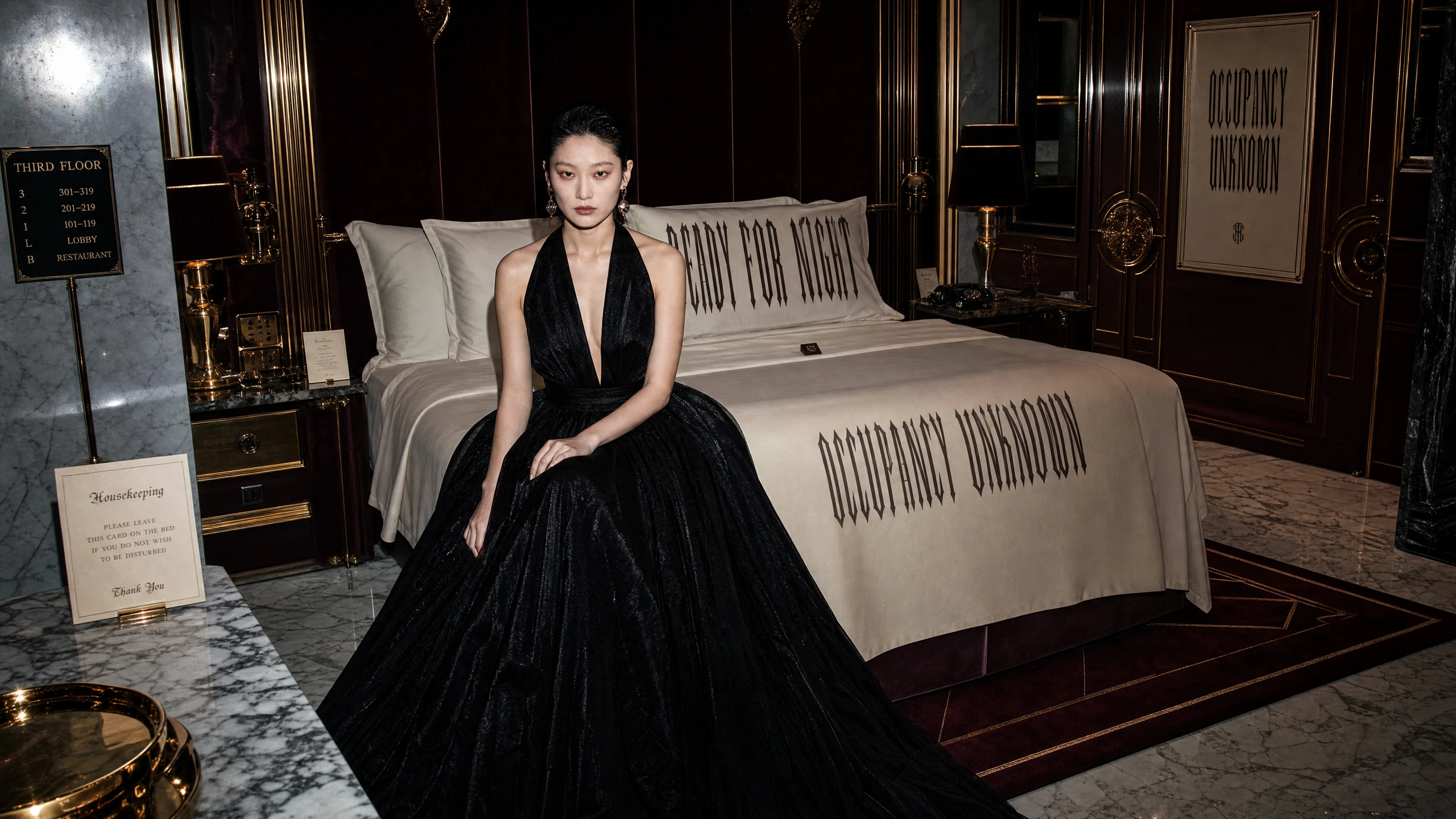
The brief I wrote for myself was specific: every image should document an event that just happened, or is about to happen. Never during. The discomfort had to come from recognition — these are places you know, doing things they shouldn't. A luxury hotel is the right location for that. Not because of horror-corridor references, but because of something more precise: the texture of five-star service infrastructure operating independently of the guests it was designed for. The elevator that always shows the same floor. The room service cart outside the door that hasn't opened. The concierge who has been at that desk since the building was constructed, with recommendations for destinations that no longer exist.
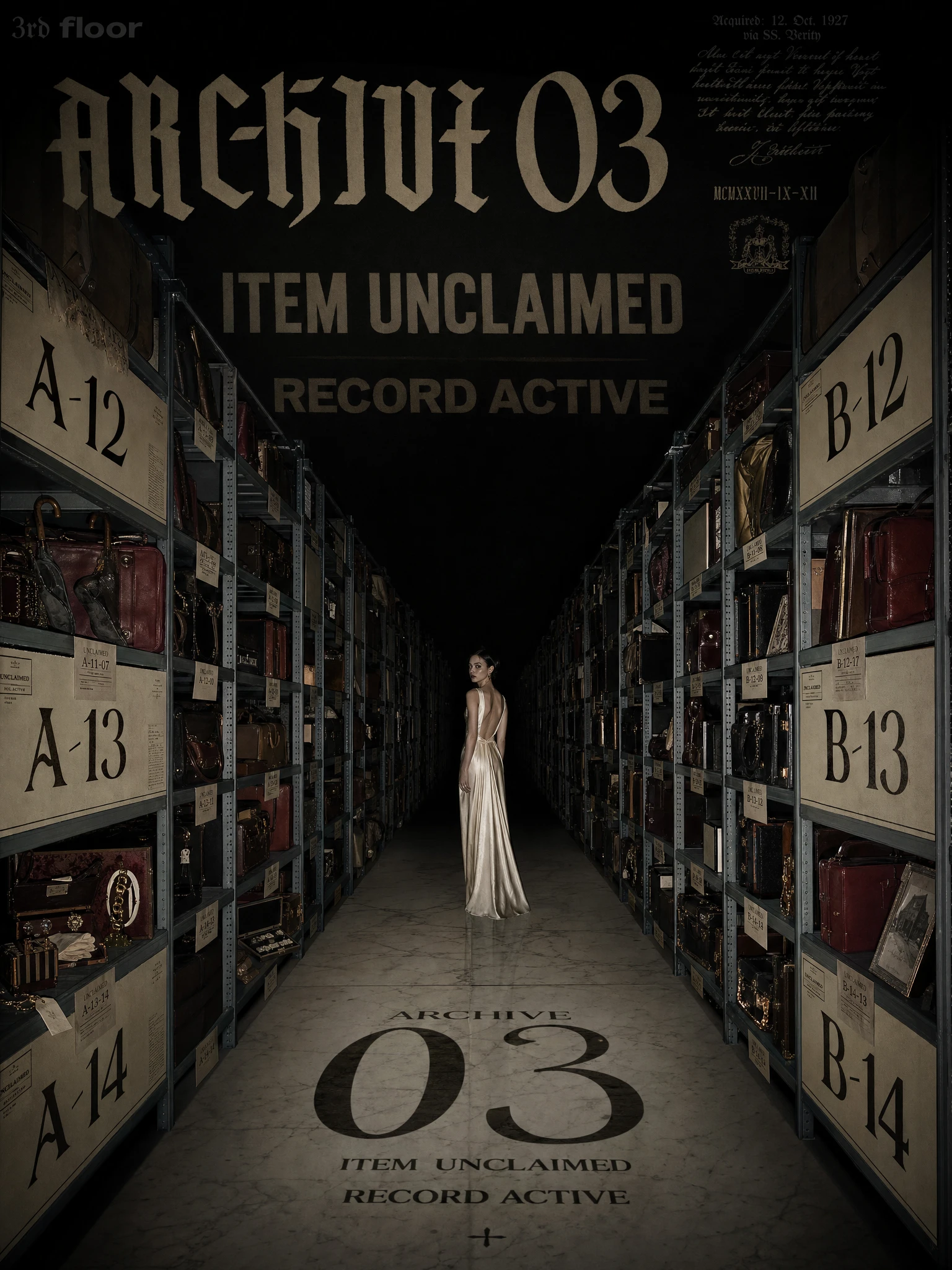
The name came fast: 3rd floor, lowercase, mixed typography. Floor numbers are everywhere in hotels. Three is the floor you're always sent to. The name doesn't explain itself. That's the job.
THE APPROACH
My first direction leaned too far into liminal space aesthetics — the internet has consumed that genre and what remains produces dread by recognition, not by logic. I needed luxury first. Wrongness second. The discomfort had to emerge from familiar things pushed just past their own logic: too many DO NOT DISTURB signs in a single room, a time that covers every surface, a ballroom set for five hundred with one person dancing to nothing.
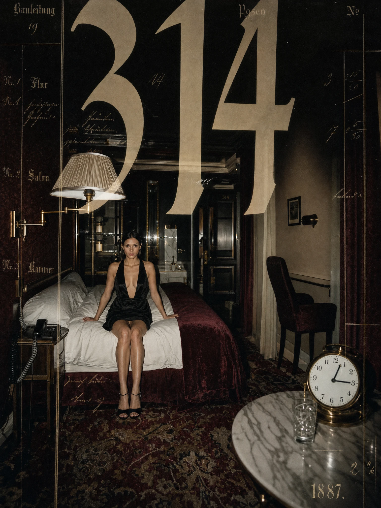
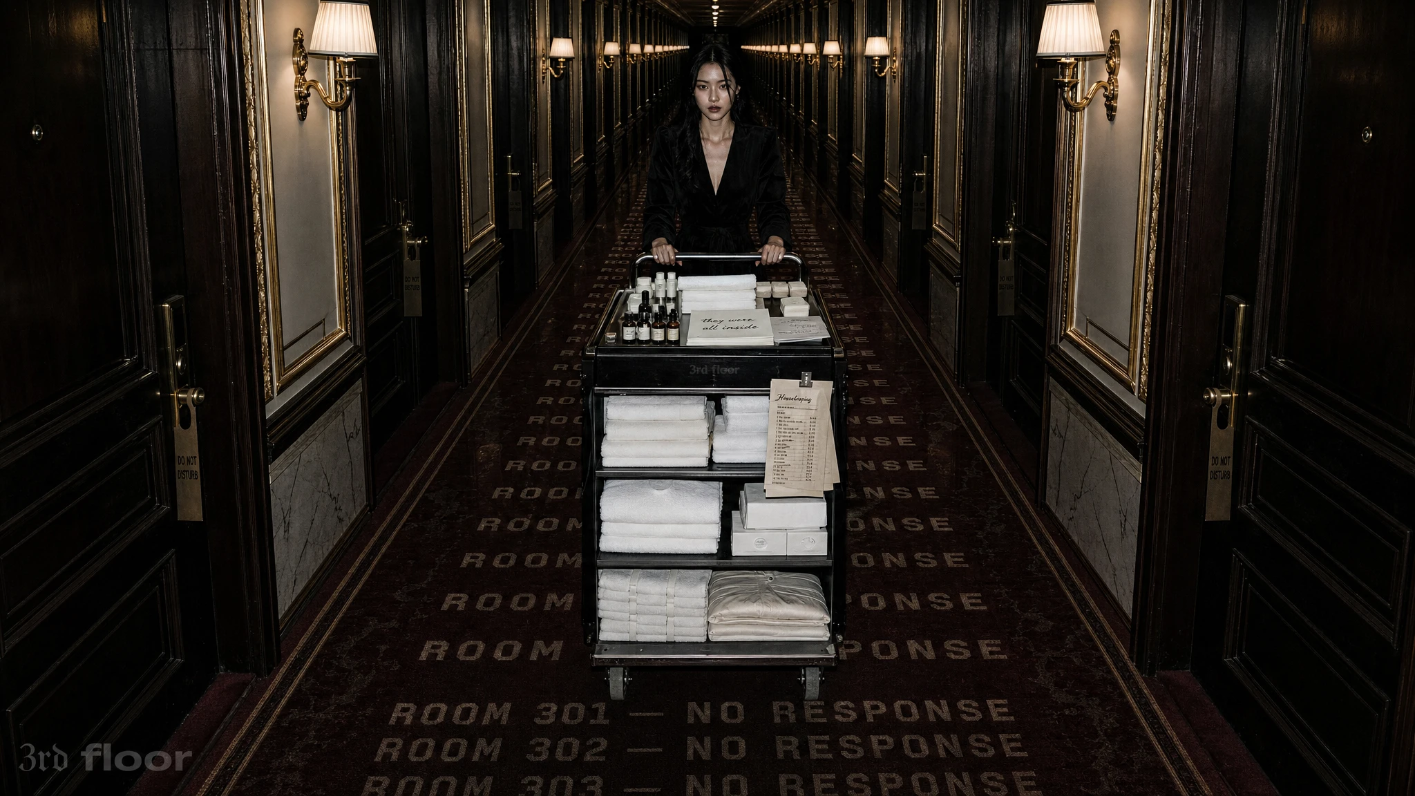
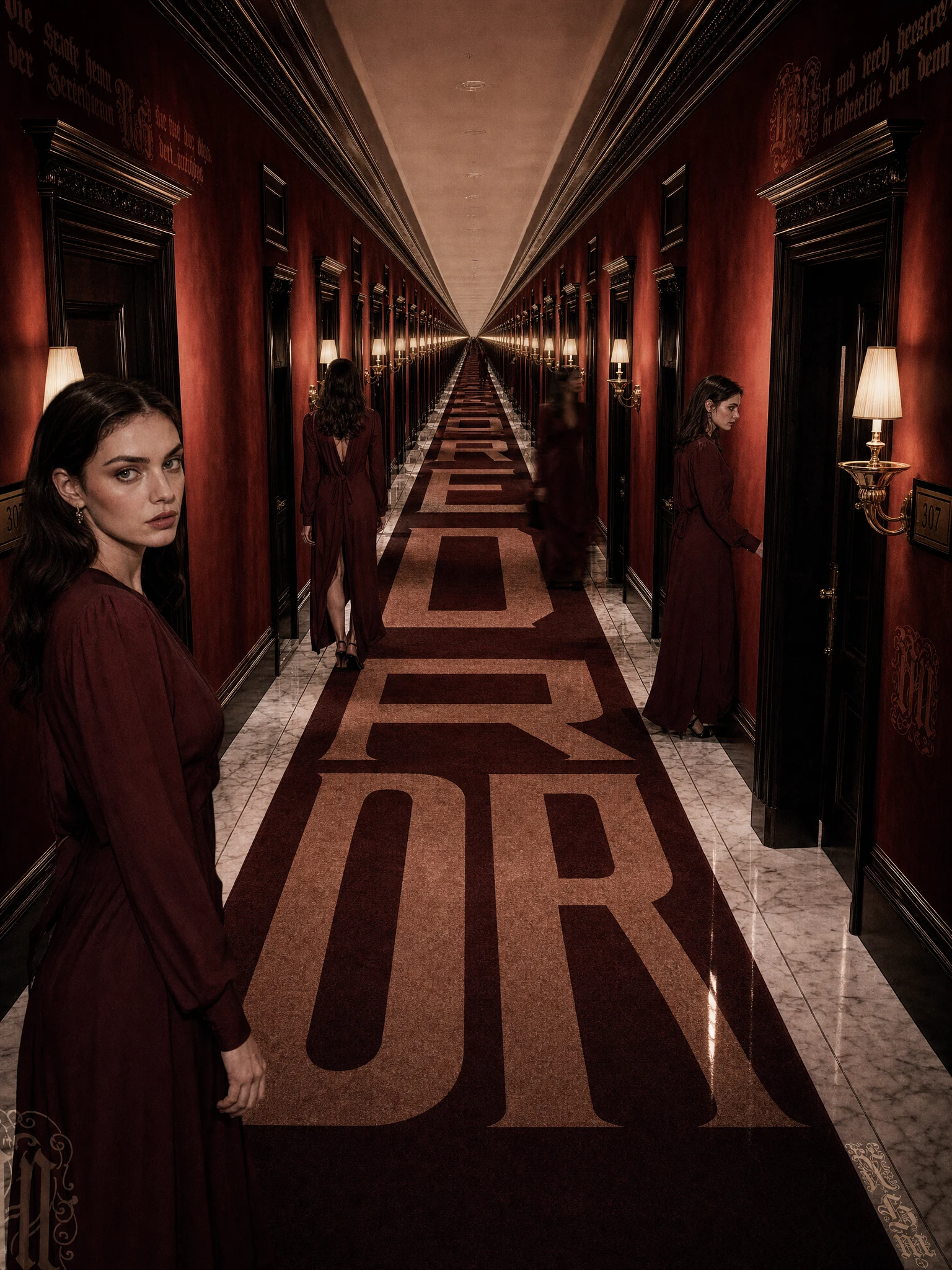
The unlock was treating typography as architecture rather than overlay. In real hotels, words exist in the fabric of the space — embossed in carpets, carved in marble, printed on stationery. I extended that logic until it became surreal. Numerals painted across entire ceilings in every scale simultaneously. Phrases running the full length of corridor carpets until they vanish at the vanishing point. Sentences written across the surface of a swimming pool that the water doesn't disturb. The building speaks. What it says is always slightly wrong.
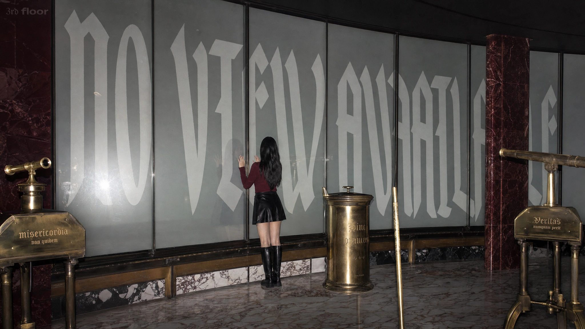
I structured the typography around three distinct institutional registers that never merge. Hurricane operates as the emotional declaration layer — large-scale script burned into mirrors and walls, handwritten in scale but architectural in presence. IBM Plex Mono operates as the procedural layer — clinical, monospaced, running along floors and edges like instructions or inventory lists, stating things that shouldn't be stated. UnifrakturMaguntia operates as the archival fragment — appearing in plaques, documents, and objects in the language of something centuries old that is still in operation. Each system has its domain. The collisions between them are where the unease concentrates.
THE WORK
CAMPAIGN I — THE HOTEL
Twenty images built around luxury hospitality rituals, each broken in a specific and deliberate way. Check-In opens: a single figure behind a reception desk, the key board holding hundreds of brass keys behind her, the room status indicators reading Occupied, Absent, Unknown, Do Not Disturb. The lobby is empty. The occupancy status is never resolved.
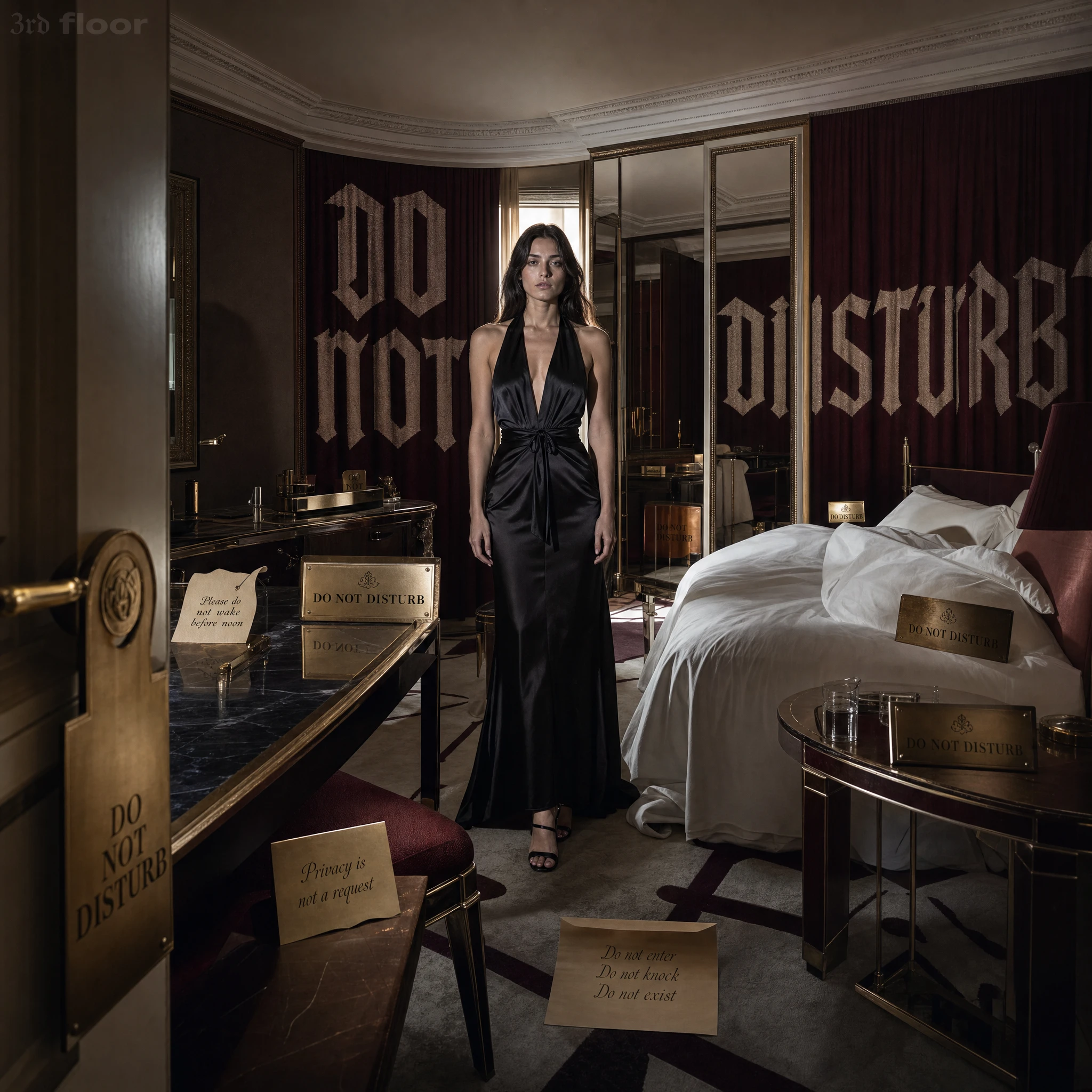
Do Not Disturb is the image that most efficiently demonstrates the system: a guest suite where every surface — walls, mirror, bedside table, door handle, scattered notes on the floor — carries the same instruction in different forms. The brass plaques. The handwritten notes. The typography burned into the curtains. The floor note reads: Do not enter / Do not knock / Do not exist. The room has made its position clear.
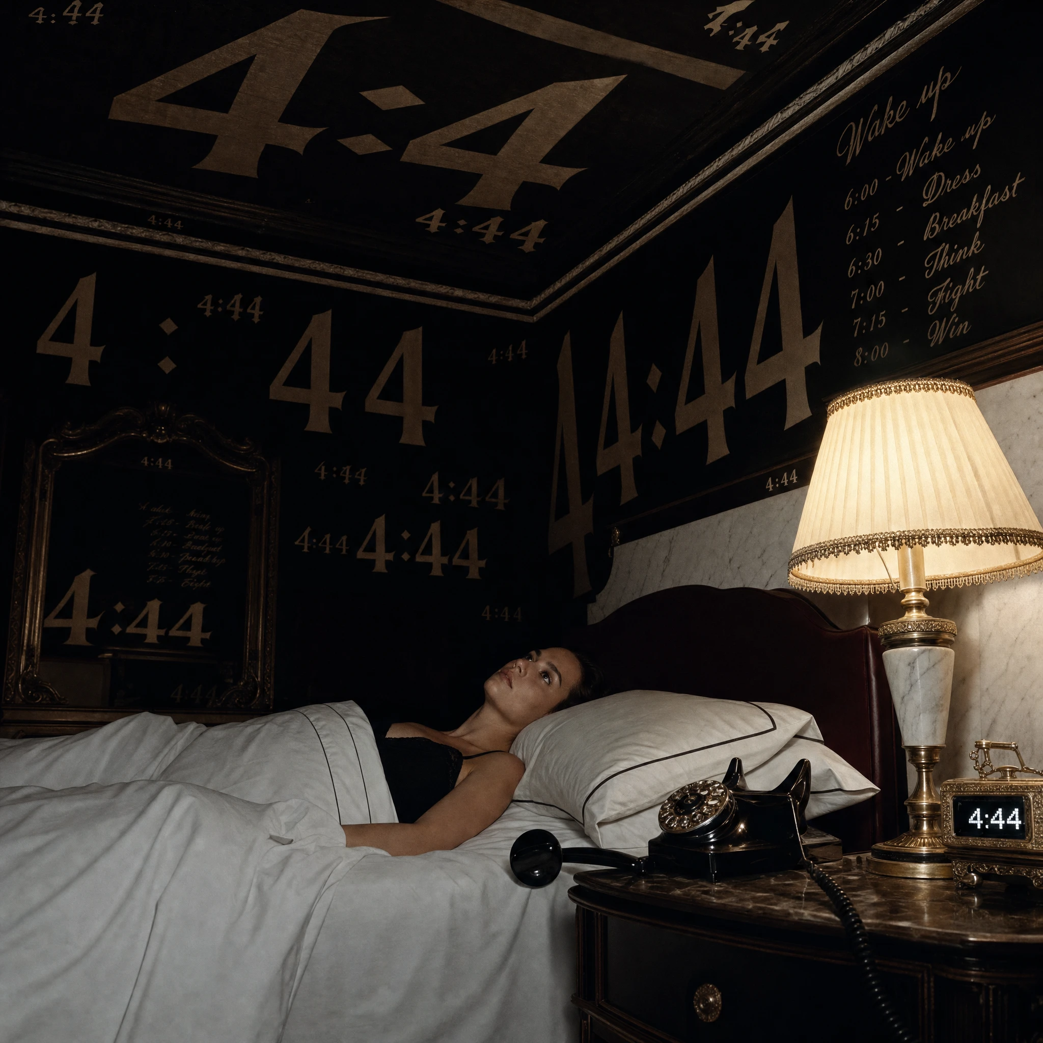
Wake-Up Call is the strongest single image. 4:44 covers every surface — ceiling, walls, mirror, digital clock — rendered simultaneously in every scale from tiny repeating type to enormous painted numerals. The model lies in bed, eyes open, not sleeping, not rising, the phone receiver off the hook beside her. A schedule on the wall reads: Wake up / Dress / Breakfast / Think / Fight / Win. The instructions are present. The day will not begin.
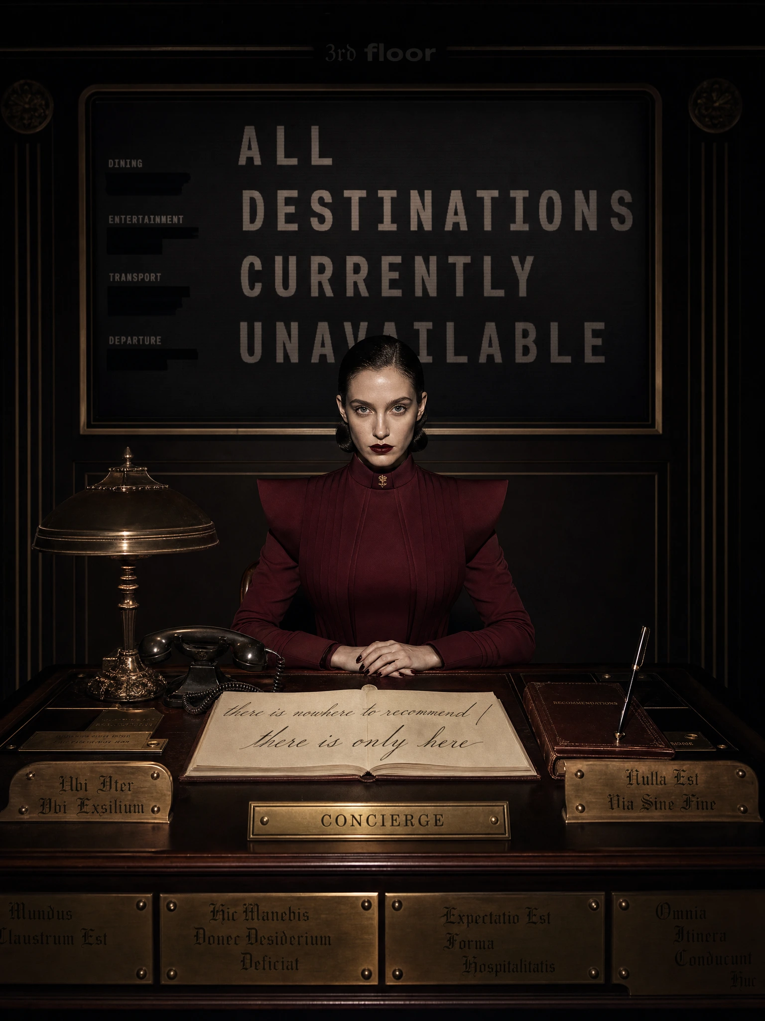
The Concierge is the image that shifts the campaign's register from eerie to genuinely unsettling. A figure in a severe burgundy structured suit sits behind a concierge desk, hands folded, facing the camera directly. Behind her: ALL DESTINATIONS CURRENTLY UNAVAILABLE, every recommendation category listed with its entry blacked out. The recommendations journal on the desk is open to: there is nowhere to recommend / there is only here. She is not absent or vacant — she is present, composed, and completely prepared to help you go nowhere. That's a different kind of dread than the other images achieve, and it's the best one.
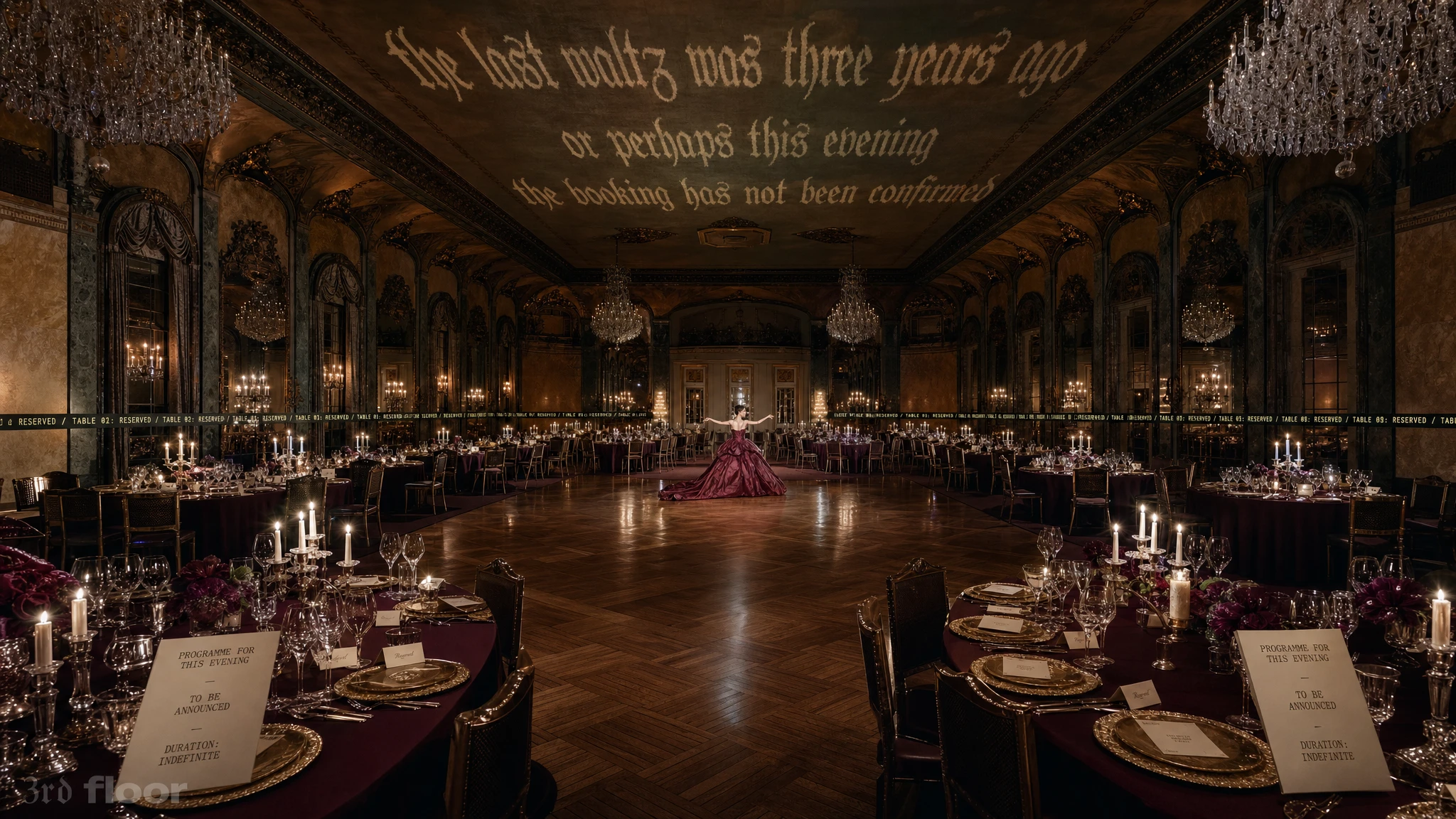
The Ballroom is the most cinematic image in the project. A grand ballroom set for hundreds — every table laid, every candle lit, every glass filled. One figure in an enormous sculptural burgundy gown stands alone in the center of the dance floor, arms slightly raised, in the position of someone mid-dance. There is no partner. The ceiling inscription reads: the last waltz was three years ago / or perhaps this evening / the booking has not been confirmed. The IBM Plex Mono text runs continuously around the base of all four walls: TABLE 01: RESERVED / TABLE 02: RESERVED, without stopping. The programme cards on every table read: TO BE ANNOUNCED / DURATION: INDEFINITE.
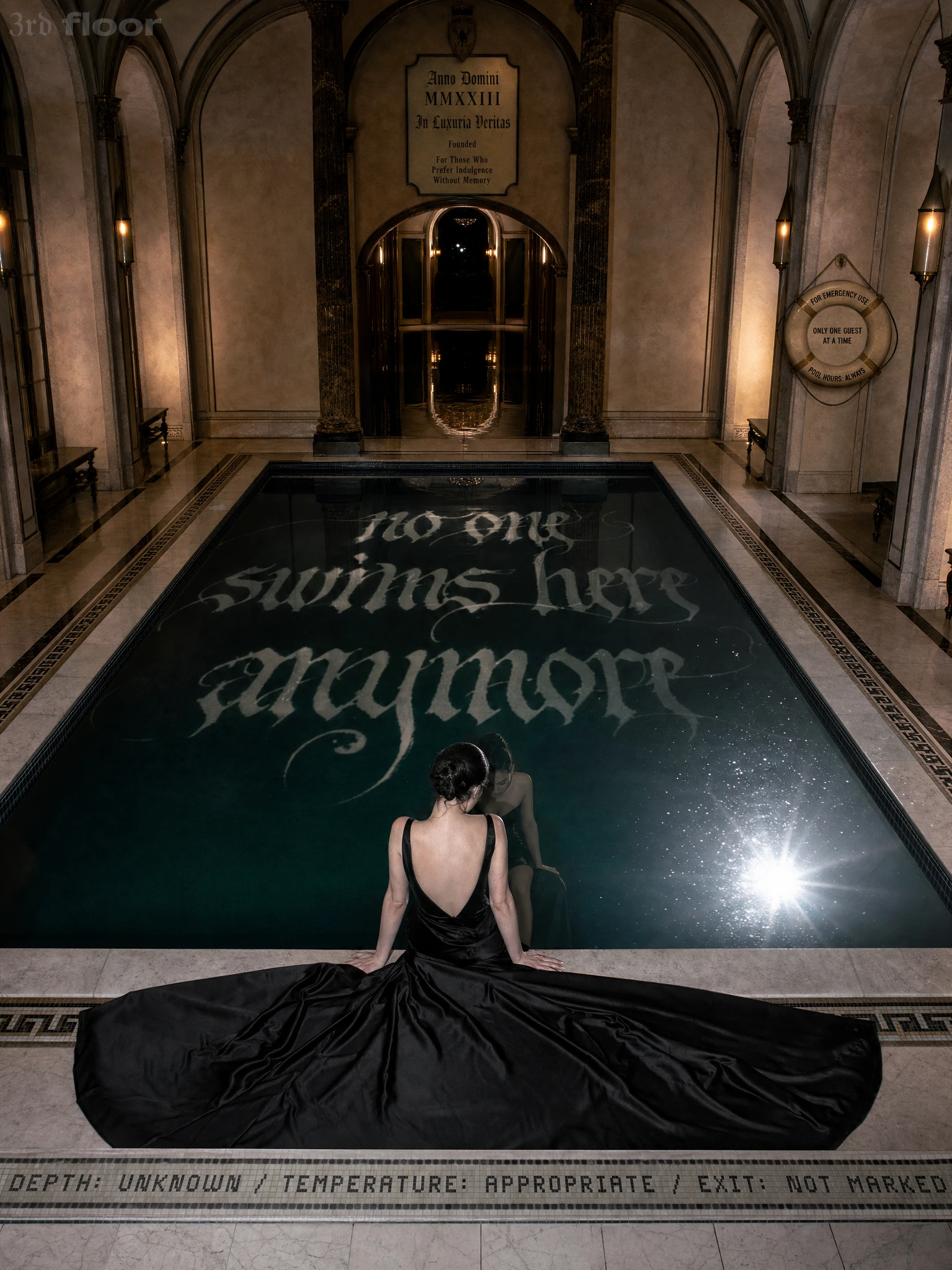
The Pool is Closed gives the pool campaign its sharpest execution. POOL CLOSED / NO SWIMMING in enormous type across the walls, TEMPORARY NOTICE running along the pool's tiled edge — with the figure in a floor-length burgundy gown standing at the water's edge, her reflection in the perfectly still surface. The notice was issued on 14.10. No year. The temporary closure has been in effect for longer than anyone can determine.
CAMPAIGN II — THE INSTITUTION
Five images that move into the hidden bureaucracy behind the guest experience: The Approval Office, The Waiting Room, Night Audit, Records Destruction, The Observers. The logic here is that 3rd floor has its own government — a department responsible for administering events before they are permitted to occur, a surveillance system that has been watching the building watch itself, an archive disposal facility that operates with religious ceremony. Records Destruction and The Observers are the standout images: the former for the sculptural beauty of organized destruction, the latter for the cold precision of the surveillance notation — Subject seated. Subject standing. Subject aware?
THE WEBSITE EXPERIENCE
The website was designed as an extension of the brand world rather than a traditional fashion e-commerce experience. Instead of presenting 3rd floor as a label, the site presents itself as the digital infrastructure of the hotel.
Drawing from luxury hospitality systems, architectural wayfinding, guest directories, and occupancy records, the interface transforms navigation into a spatial experience. Visitors move through the website as if moving between floors, suites, and restricted areas of the building.
Custom interactions built with GSAP, Framer Motion, and Three.js use geometric architectural systems inspired by hotel floor plans, room occupancy grids, and elevator logic. Typography functions as signage, directories, and institutional records, reinforcing the feeling of navigating an operational luxury hotel suspended somewhere between memory and reality.
The result is a website that feels less like a portfolio piece and more like entering a place that already existed before the visitor arrived.
THE MERCH
Five pieces, each presented as a campaign image. This is the decision that elevates the merch beyond product line into something more interesting: the objects exist inside the mythology, not outside it.
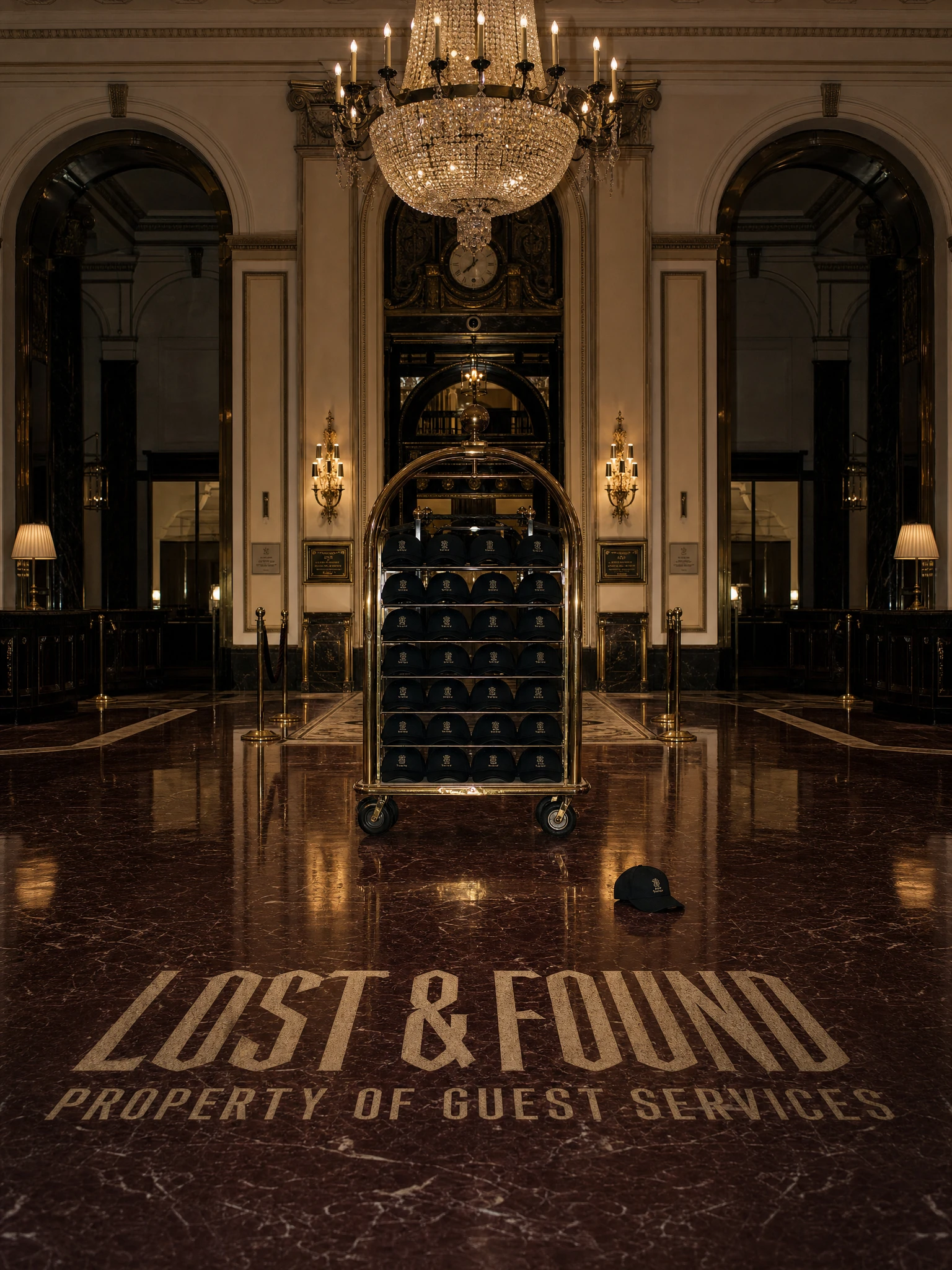
The Bellhop Cap appears on a brass luggage trolley stacked with identical caps in an empty hotel lobby, one cap fallen on the marble floor in the foreground. LOST & FOUND / PROPERTY OF GUEST SERVICES is inlaid in the floor. The cap belongs to no one. The trolley has been waiting.
The Housekeeping Crewneck is folded on a prepared bed — ROOM PREPARED at the top of the image in large display type, the status line reading STATUS: READY / PREPARED BY HOUSEKEEPING / OBSERVED BY SECURITY, and OCCUPANCY UNKNOWN at the base. The sweatshirt has been placed for a guest who has not arrived and may not. The bed is ready. The occupant is not confirmed.
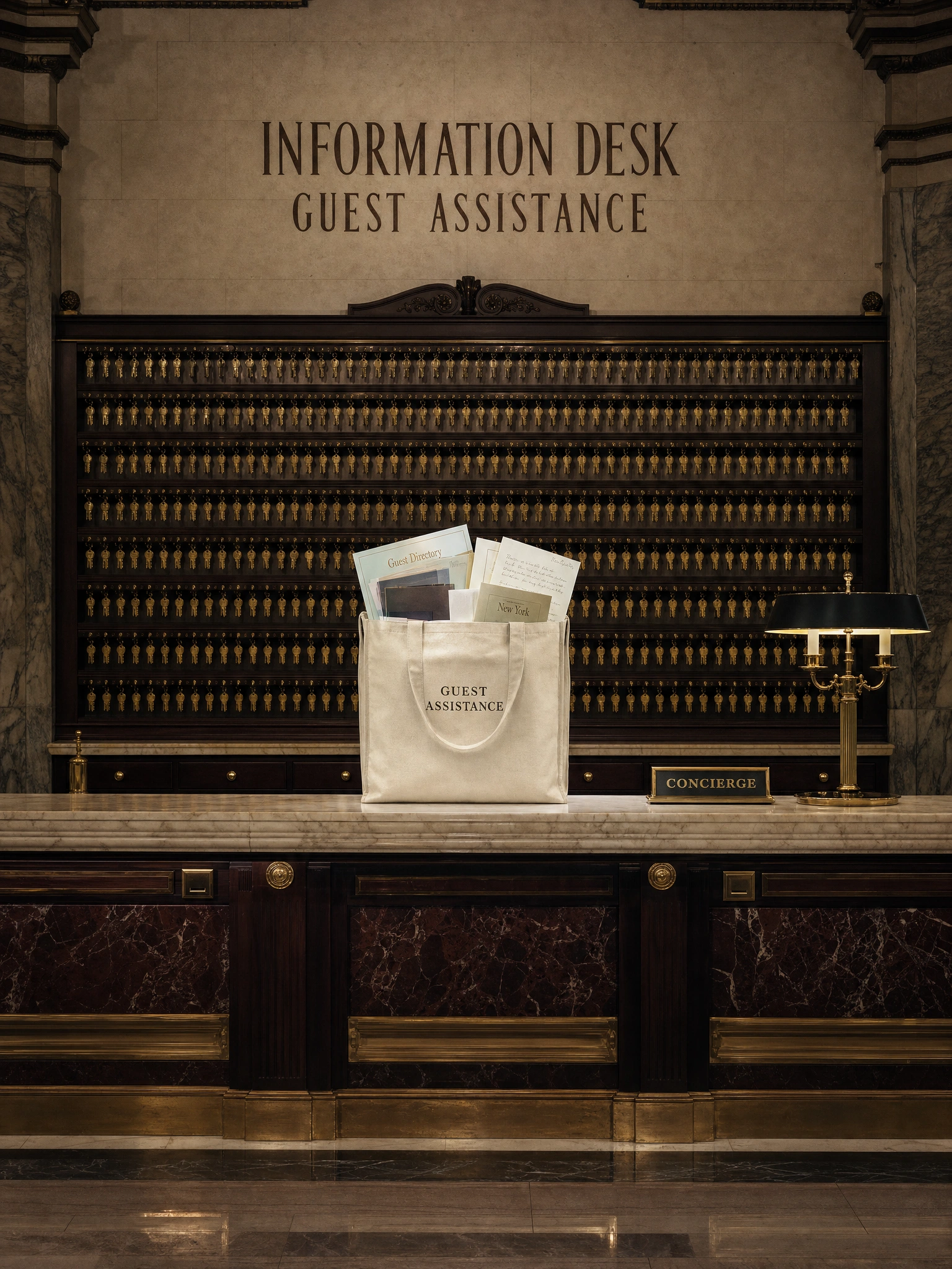
The Concierge Tote sits on the concierge desk in front of a wall of hundreds of identical brass keys. INFORMATION DESK / GUEST ASSISTANCE is carved into the stone above. The tote is labelled GUEST ASSISTANCE and is filled with maps, letters, a guest directory — resources for a journey the guest has not yet decided to take, from a building they have not yet decided to leave.
The Penthouse Hoodie is draped over a velvet armchair in an observation lounge, VIEW UNAVAILABLE / SUITE ACCESS ONLY printed across frosted windows behind it. Through the frosted glass, the faintest suggestion of a city skyline that may or may not be real. The hoodie is there. The occupant is not.
The Hotel Key T-Shirt is displayed in a glass case in a black marble anteroom, alongside a brass room key. ROOM 314 / AUTHORIZED ACCESS / ONE OCCUPANT is inlaid in the floor. A guest registry lists names in roman numerals: I. MMXIX through VII. MMXXV. The t-shirt is the current occupant. The key is waiting to be claimed.
THE RESULT
3rd floor is a complete fictional brand universe: a fashion identity with a visual language, a typographic system, a colour palette, a campaign mythology, and a product line — all operating according to the same internal logic. Thirty images. Three registers. One hotel that cannot stop running.
The merch campaign is the proof of concept the editorial campaign sets up. If the images establish that 3rd floor's world is real enough to be frightening, the objects establish that it's real enough to own. The Housekeeping Crewneck folded on a bed for a guest who isn't coming. The tote filled with maps for destinations the concierge can no longer recommend. These aren't ironic fashion products — they're artifacts from a specific place, with a specific history, presented as such.
The brand reads as real. That was always the brief.
Révolté — revolte.design
Project: 3rd floor
Year: 2026
Scope: Brand Identity, Creative Direction, Typography System, Campaign Concept, Merch Art Direction, Website
Industry: Fashion / Luxury / Editorial
See more at revolte.design
To my muse
Like this project
Posted Jun 6, 2026
3rd floor: a luxury fashion house haunted by its own hospitality — campaigns, merch, and a website built inside a hotel that never closed
Likes
2
Views
20
Timeline
May 26, 2026 - Jun 6, 2026

