Built with Lovart
HELDER: Chrome in the Soil - A Speculative Brand Exploration
Révolté
HELDER — Where Chrome Learns to Be Still
A luxury brand built entirely around one contradiction: the hardest material in the softest world.
THE BRIEF
HELDER didn't come from a client brief. It came from a question I couldn't stop asking — what happens when chrome stops belonging to technology and starts belonging to the earth?
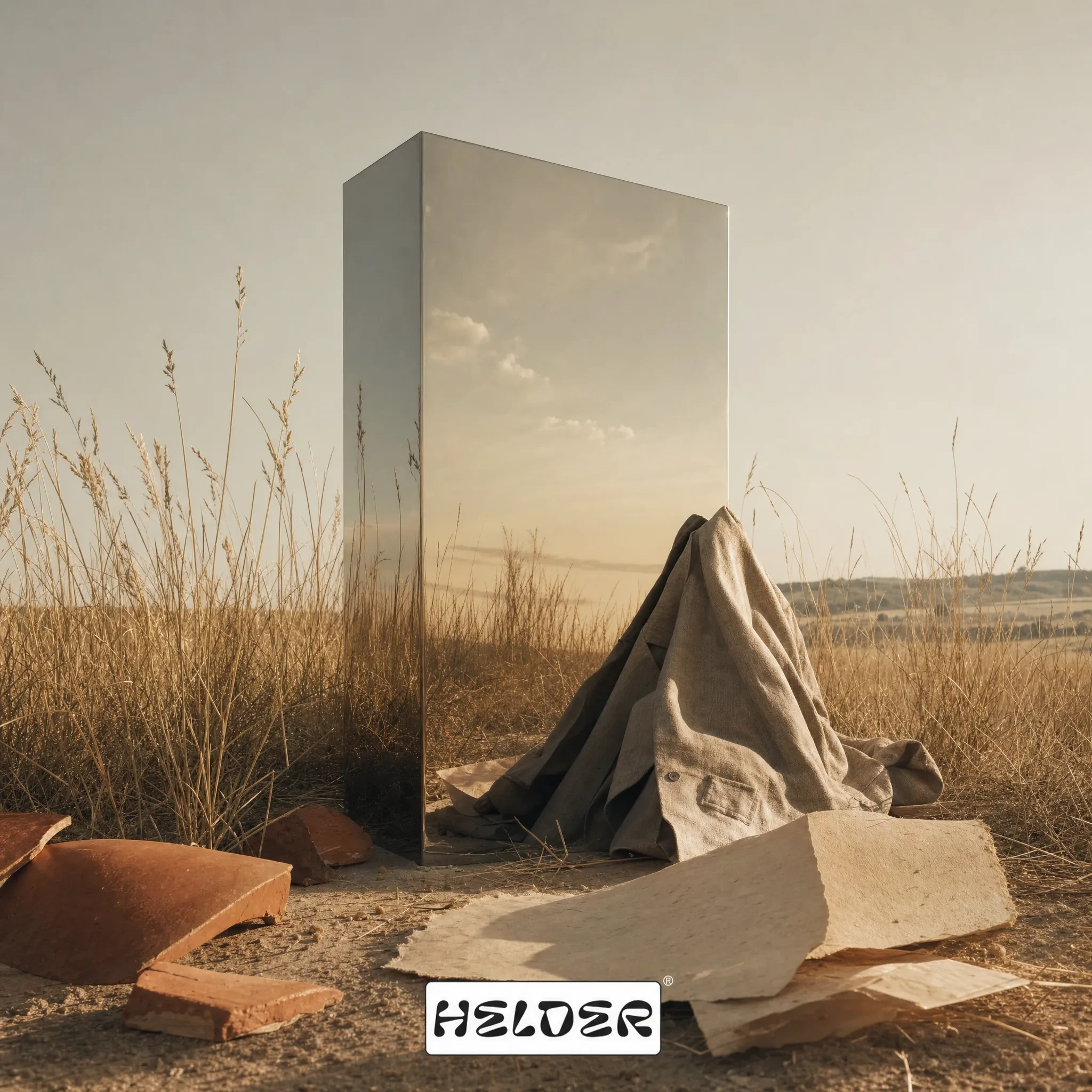
The starting point was Direction 6 out of ten I developed for a portfolio exploration: Chrome Pastoral. A world where mirror surfaces reflect dry grass instead of city glass. Where liquid metal rests on terracotta. Where the future isn't cold — it's warm, slow, and inevitable. Most brands in this territory go one of two ways: either they lean into the industrial and lose all warmth, or they go full organic-luxury and abandon anything alien. HELDER was built to refuse that choice.
The scope I set for myself was complete: brand strategy, visual identity, a full mockup system, and a website. The constraint was the interesting part — everything had to hold the contradiction. Every surface, every material, every typographic decision had to carry both registers at once.
THE APPROACH
The first instinct was cold. The original palette was iron-grey and desaturated — flat overcast skies, mirror chrome against
#CDD4C0 fog-green. Technically coherent but emotionally closed. When I put the first batch of campaign images together, I noticed they felt like a brand about surfaces, not about living. The photography was beautiful and inert.The pivot happened when I looked at what the images actually needed to do: they needed to make chrome feel found, not placed. Found in a field, found on a table next to honeycomb and raw terracotta, found in a warm room with linen hanging from wooden pegs. The shift wasn't conceptual — it was atmospheric. The color temperature moved from iron-grey to warm-neutral. The sky went from flat to hazy. The grass went from
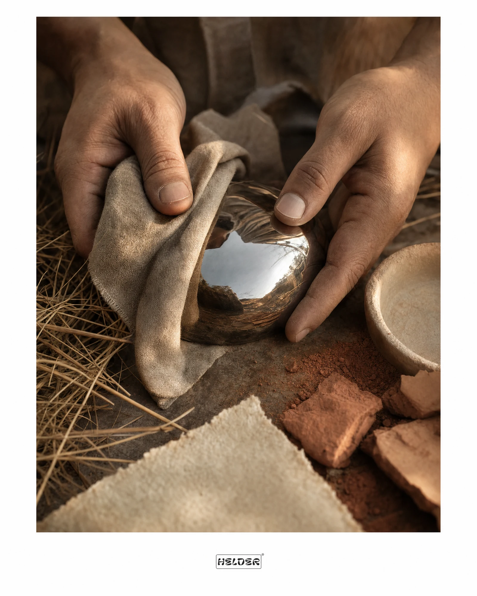
#CDD4C0 desaturated fog to #D4B483 straw gold dry heat. Same contradiction, completely different feeling.What I kept coming back to was a specific image: hands holding a chrome sphere against dry straw and terracotta dust. The chrome reflecting the landscape. That image became the brand's internal test. If a mockup could generate that same feeling — something impossibly precise resting in something ancient and worn — it passed.
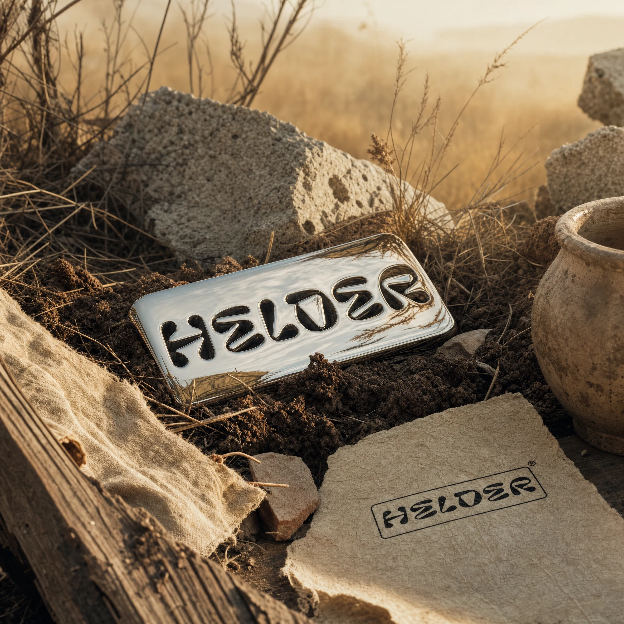
The logo took longer to resolve. Early AI-assisted explorations kept producing a rounded bubble-letter wordmark that read streetwear. The visuals were demanding something with more craft and restraint. The final mark is a heavy grotesque in a tight rectangular border — direct enough to work on a woven label or a chrome emboss, specific enough to feel authored rather than templated.
THE WORK
BRAND IDENTITY / VISUAL SYSTEM
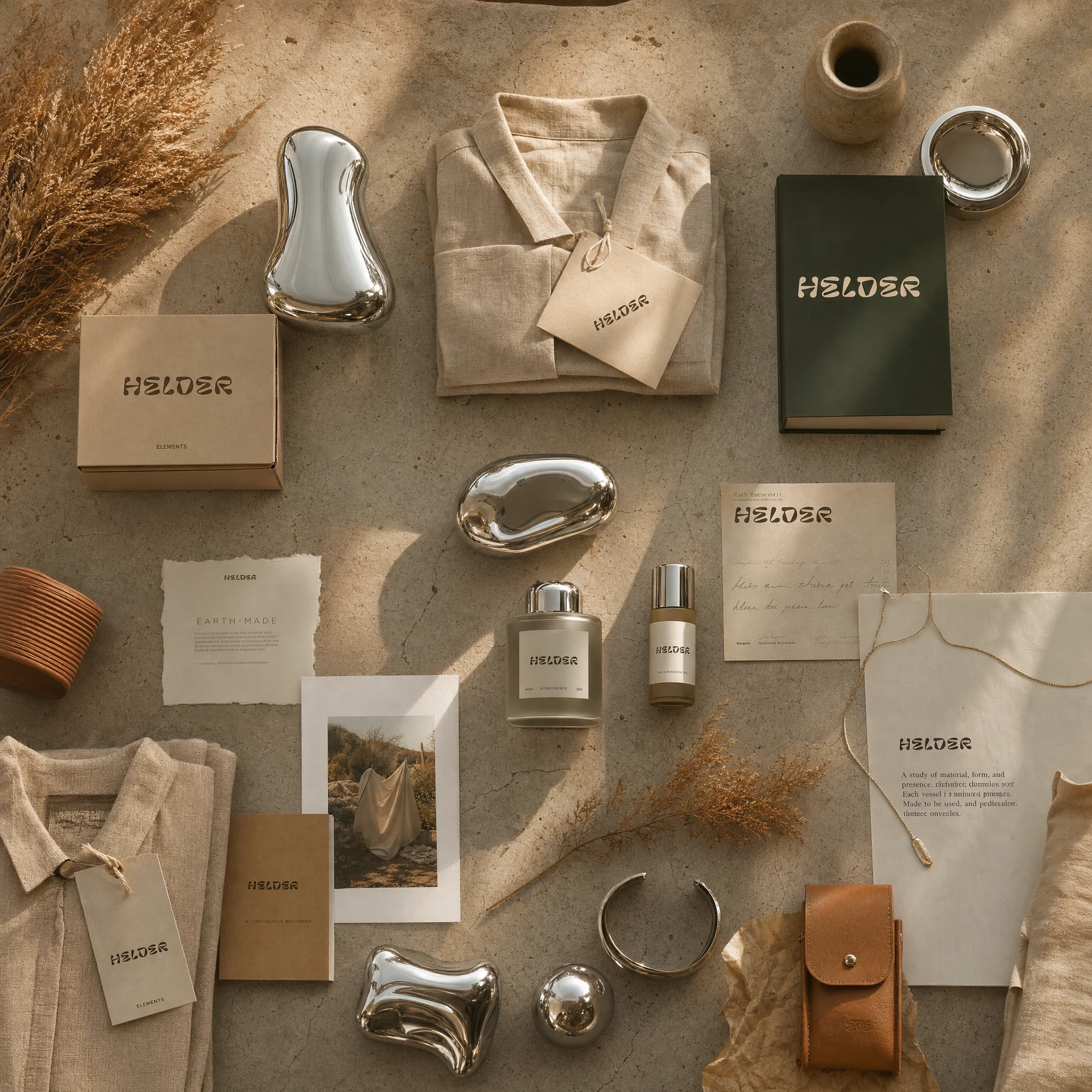
The system runs on material contrast as its primary design logic. Chrome (
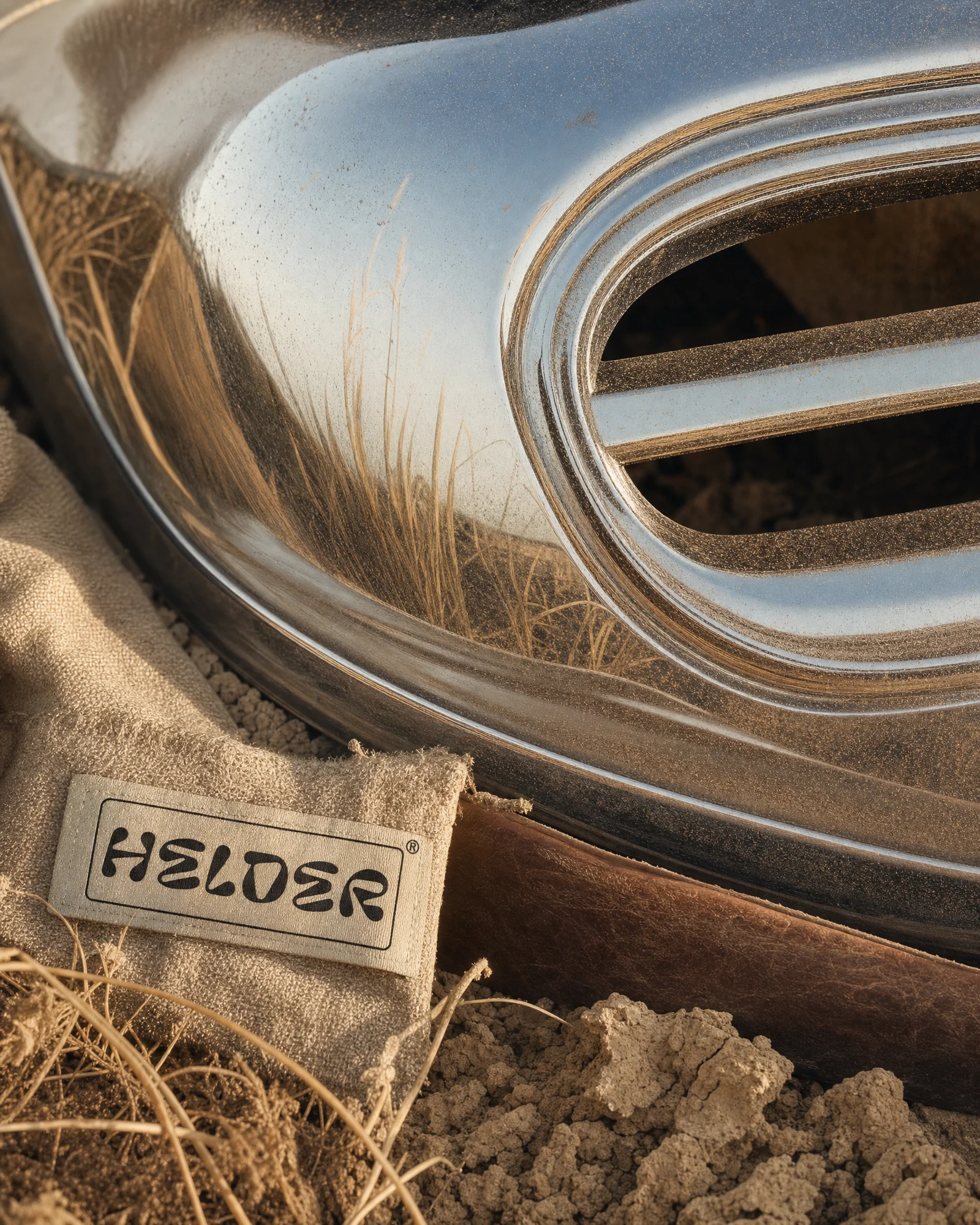
#D4D6D8) is always the alien, always the hero. Everything else — parchment (#F5F0E6), warm stone (#C4B8A8), terracotta dust (#C17A56), deep field (#1C2B1A) — is the world that receives it. No surface in the system is neutral; everything is either organic or chrome, and the tension between them is where the brand lives. The warm-neutral color temperature is held across every image — no golden hour, no studio white, no tech blue.LOGO
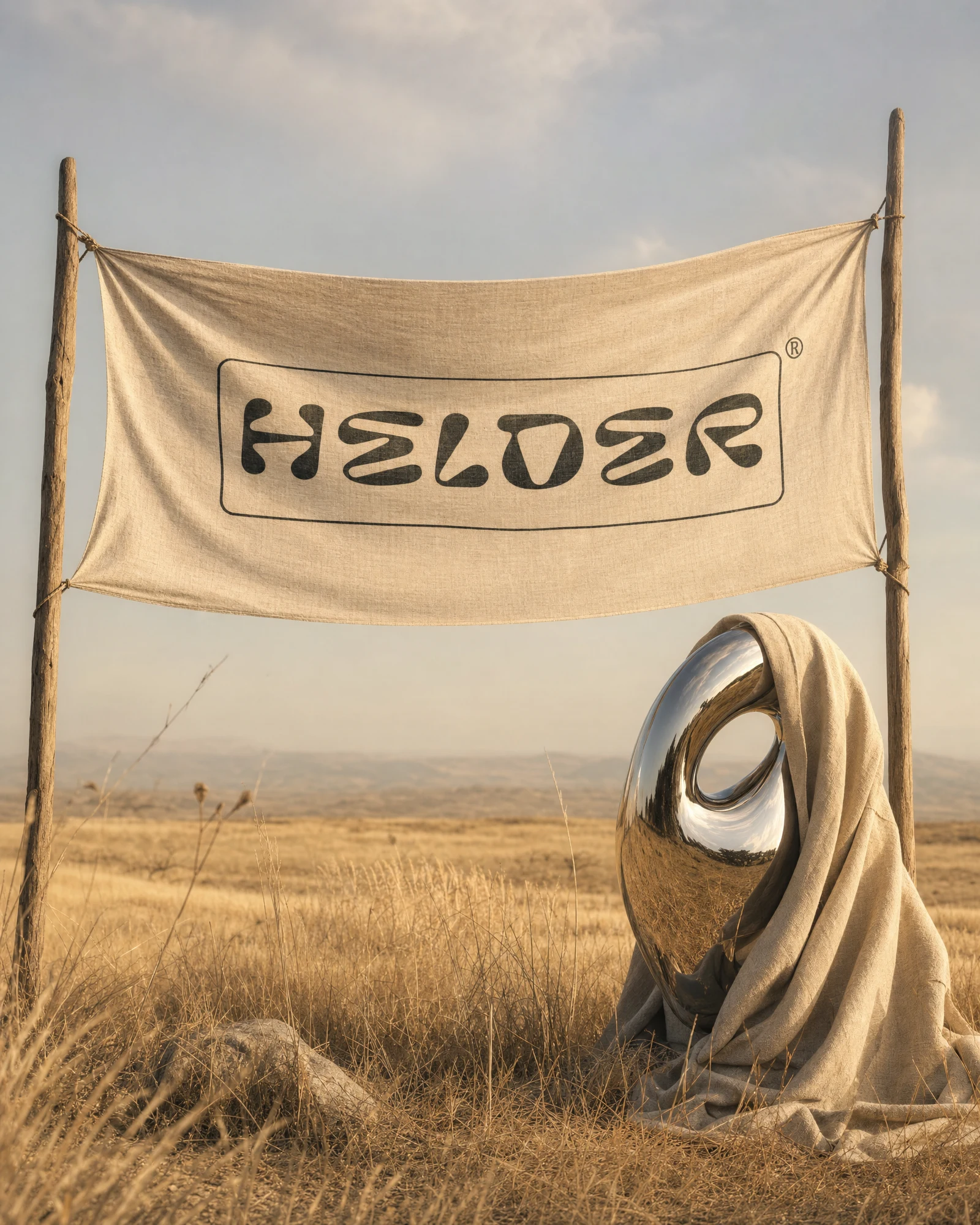
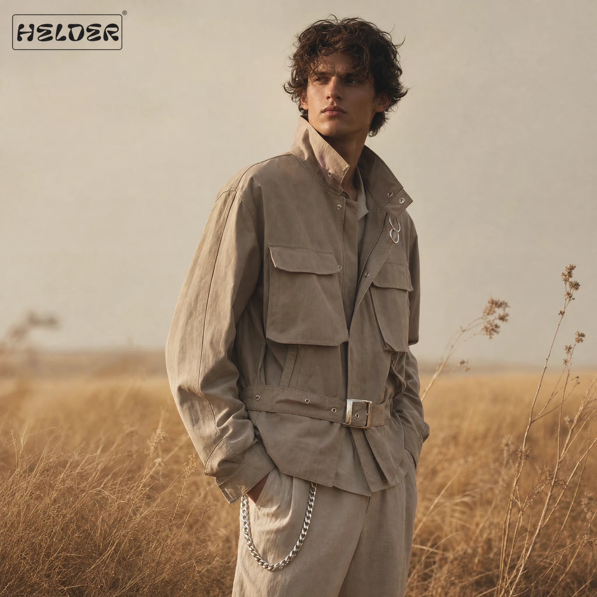
The wordmark is set in a heavy rounded grotesque, all-caps, contained within a rectangular border with a ® mark. The border is structural, not decorative — it makes the wordmark behave like a hardware stamp, a woven label, a cast mark. It appears on canvas bags, sewn into jacket cuffs, debossed into kraft paper, and printed large on linen flags. The same mark at 8mm on a hang tag and 2 meters on a retail sign — it holds both.
PHOTOGRAPHY DIRECTION
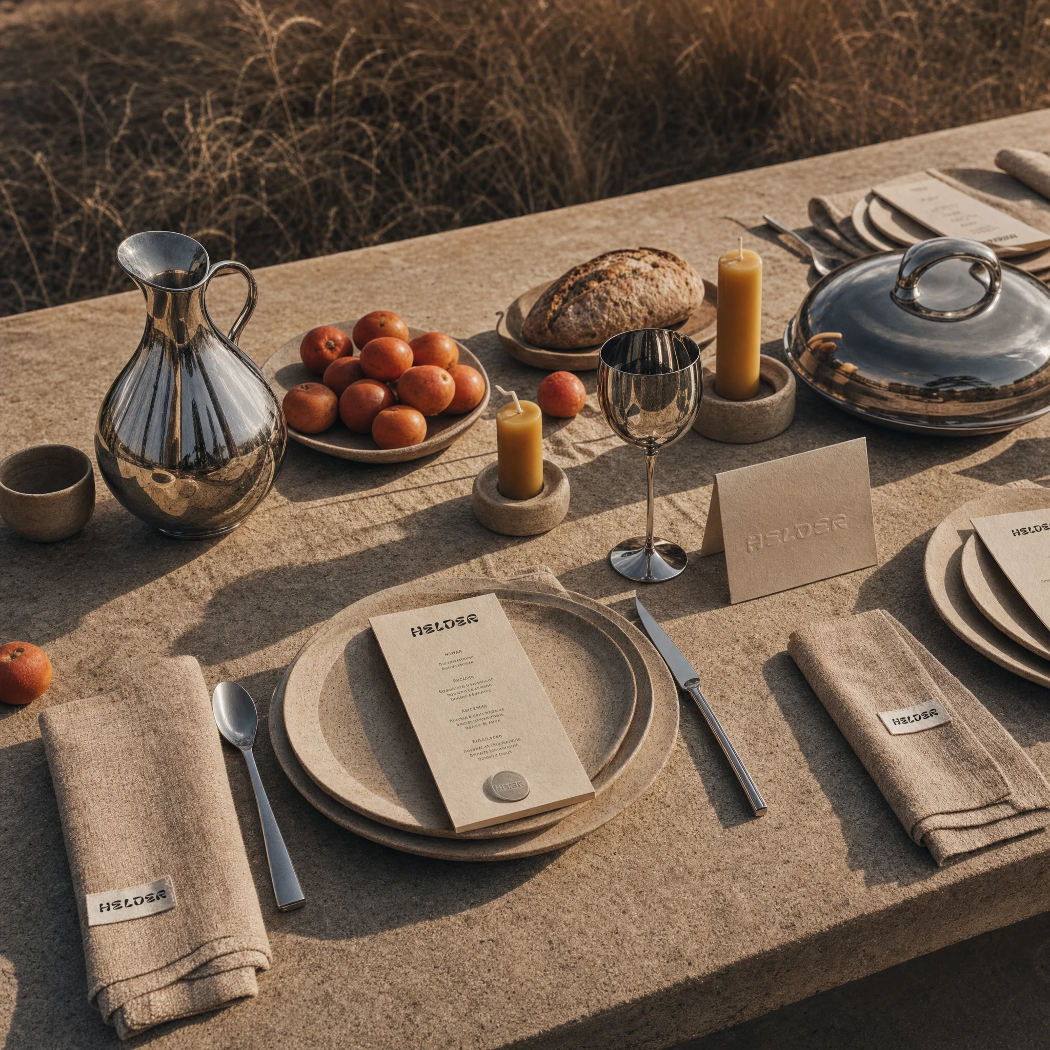
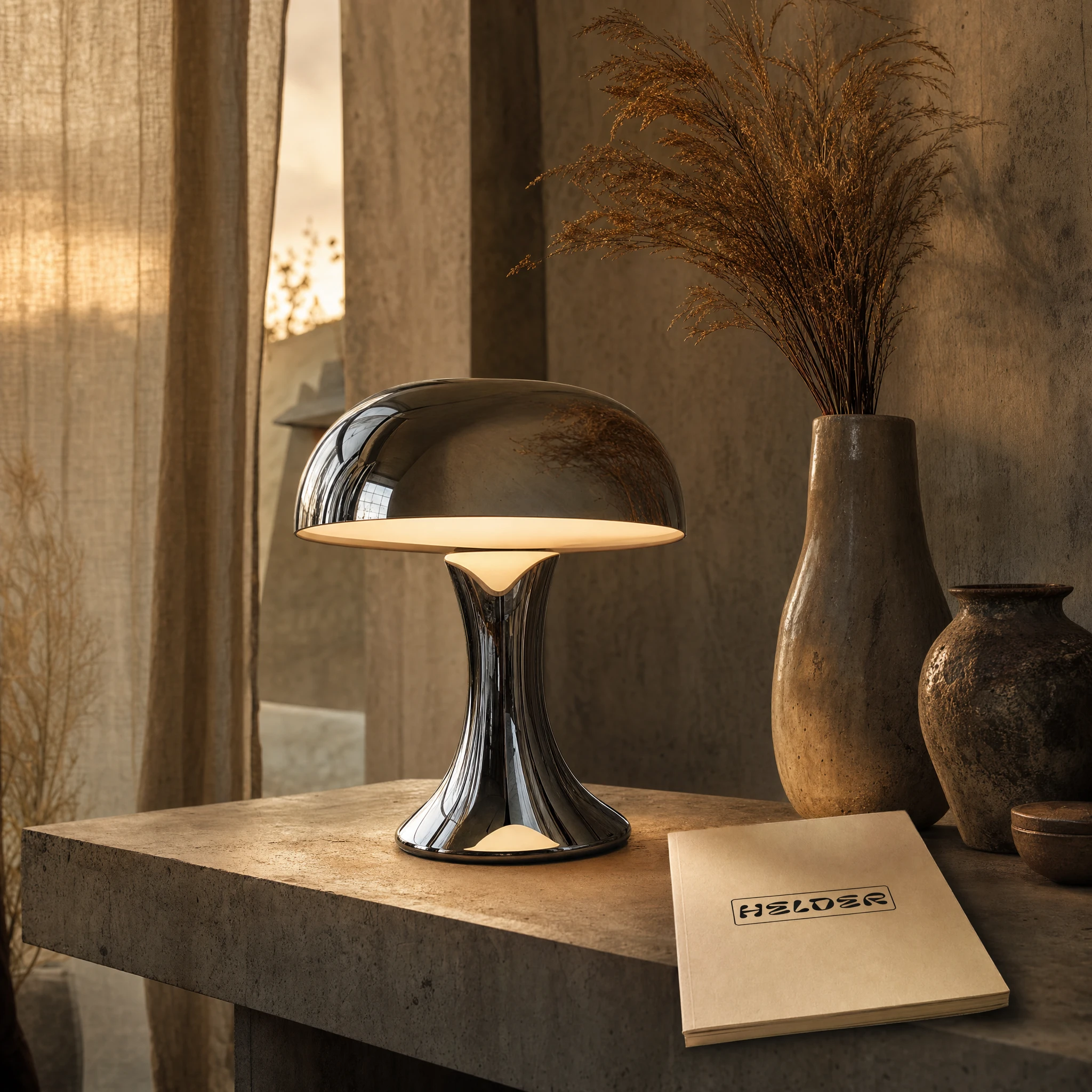
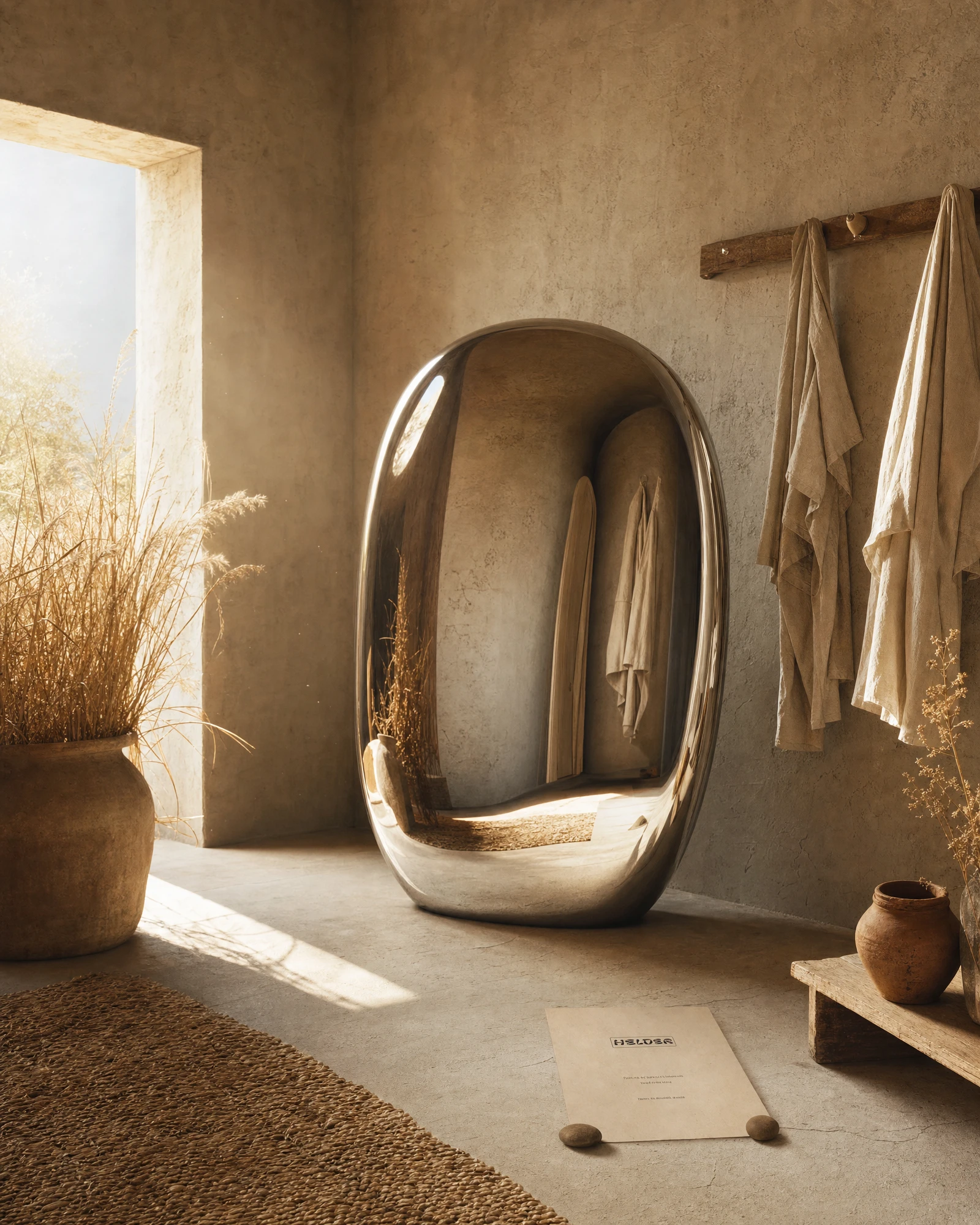
All photography uses a warm-neutral color grade: late afternoon haze at roughly 4pm, not golden hour. Medium format lens feel with peripheral softness. Chrome objects are placed in natural environments — dry grass fields, stone rooms with linen hanging from wooden pegs, outdoor dining tables in open land — without explanation. They are never staged. The 3D objects (sphere, oval mirror, monolith, chrome chair, mushroom lamp) are rendered with a liquid-mirror material, reflections always showing the pastoral environment around them.
MOCKUP SYSTEM
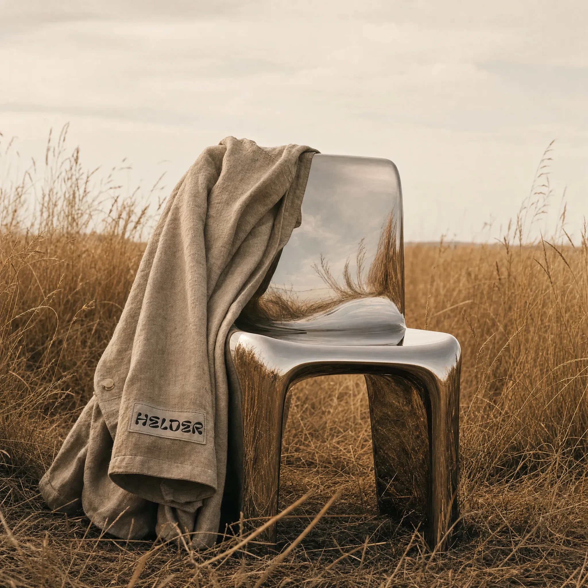
Twenty mockups across: editorial campaign, apparel (field jacket portrait, workwear editorial), packaging system, fragrance (Terre d'Ombre), interior objects (chrome lamp, oval mirror), dining scene, retail installation, jewelry and accessories flat lay, archival product table, travel objects in landscape. Each mockup was art-directed to the same atmospheric brief — chrome as found object, organic materials as context, no studio, no white cyc.
COPYWRITING SYSTEM
The brand voice runs through every piece of printed matter in the mockup system. The fragrance campaign reads: "the warmth that remains when the sun has left." The packaging booklet opens with: "Thoughtful form. Honest materials. Made to be kept." The editorial copy reads like captions from somewhere you've never been — short sentences, no sentimentality, declarative.
WEBSITE
here the link
The website carries the same material logic into digital. Typography, spacing, and image sequencing all built to the same brief — wide margins, warm background, photography that bleeds, chrome as the only thing that doesn't belong.
THE RESULT
HELDER ended up being the most complete speculative brand I've built. Twenty mockups, a website, a fragrance sub-brand, a retail installation concept, and a visual system coherent enough to hand to a manufacturer tomorrow. The brand world is specific enough to generate new decisions on its own — when I look at a new surface or material, I know immediately whether it belongs.
The contradiction held. Chrome in these images doesn't feel technological or cold. It feels like it was always there, like it grew out of the earth alongside the straw and the terracotta. That was the test. The work passed it.
Révolté — revolte.design
Project: HELDER
Year: 2026
Scope: Brand Strategy, Brand Identity, Visual Direction, Photography Art Direction, Copywriting, Web Design
Industry: Contemporary Luxury Fashion and Lifestyle
See more at revolte.design
Like this project
Posted Jun 3, 2026
HELDER is a fictional luxury brand built on one rule: chrome belongs to the earth, 20 mockups, a fragrance, a retail world
Likes
2
Views
15
Timeline
May 22, 2026 - Jun 3, 2026

