Built with Lovart
Last Known Location: A Fragrance Archive Identity
Révolté
LAST KNOWN LOCATION
A Fragrance Archive Built From Places
Révolté — revolte.design
Year: 2026
Scope: Brand Identity, Logo Design, Typography System, Campaign Direction, Art Direction, Website
Industry: Fragrance / Luxury / Conceptual Fashion
A speculative fragrance house that catalogs places instead of people. Complete identity system. Two distinct campaign modes — architectural renders and real-location documentary photography. A brand world that operates like an institution rather than a product.
The Brief
This started as one name on a list of ten. The prompt was simple: a portfolio fashion brand built around unsettling photography. Most directions on that list pointed toward the obvious — horror aesthetics, crime scene documentation, true-crime visual systems. Technically coherent, conceptually shallow.
Last Known Location was different. The emotional register wasn't fear — it was displacement. Not investigation, but documentation. The tension wasn't in what happened. It was in what remained.
I set myself one constraint: the concept couldn't be decoration sitting on top of a product. It had to be the architecture — a complete system where every visual decision, every typographic choice, every campaign image followed the same internal logic. The brand would function like an institution that catalogs places suspended in time. Not people. Not stories. Coordinates.
The Approach
The first direction was wrong.
The initial instinct was mystery-and-disappearance — torn photographs, investigation boards, missing-person aesthetics. Obvious read of the name, and wrong before it started. The moment you show the narrative, the tension disappears.
The logo changed everything.
I designed the identity around Cakra — an architectural, geometric typeface with the quality of institutional signage — and the symbol read nothing like a fashion brand. It looked like a transit authority. A cartographic service. Something that catalogs rather than communicates.
That shift unlocked the system. Instead of evidence: archives. Instead of crime scenes: coordinates. Instead of missing persons: missing places. The brand became an organization dedicated to preserving locations where human presence remains — not as nostalgia, not as narrative, but as indexed data.
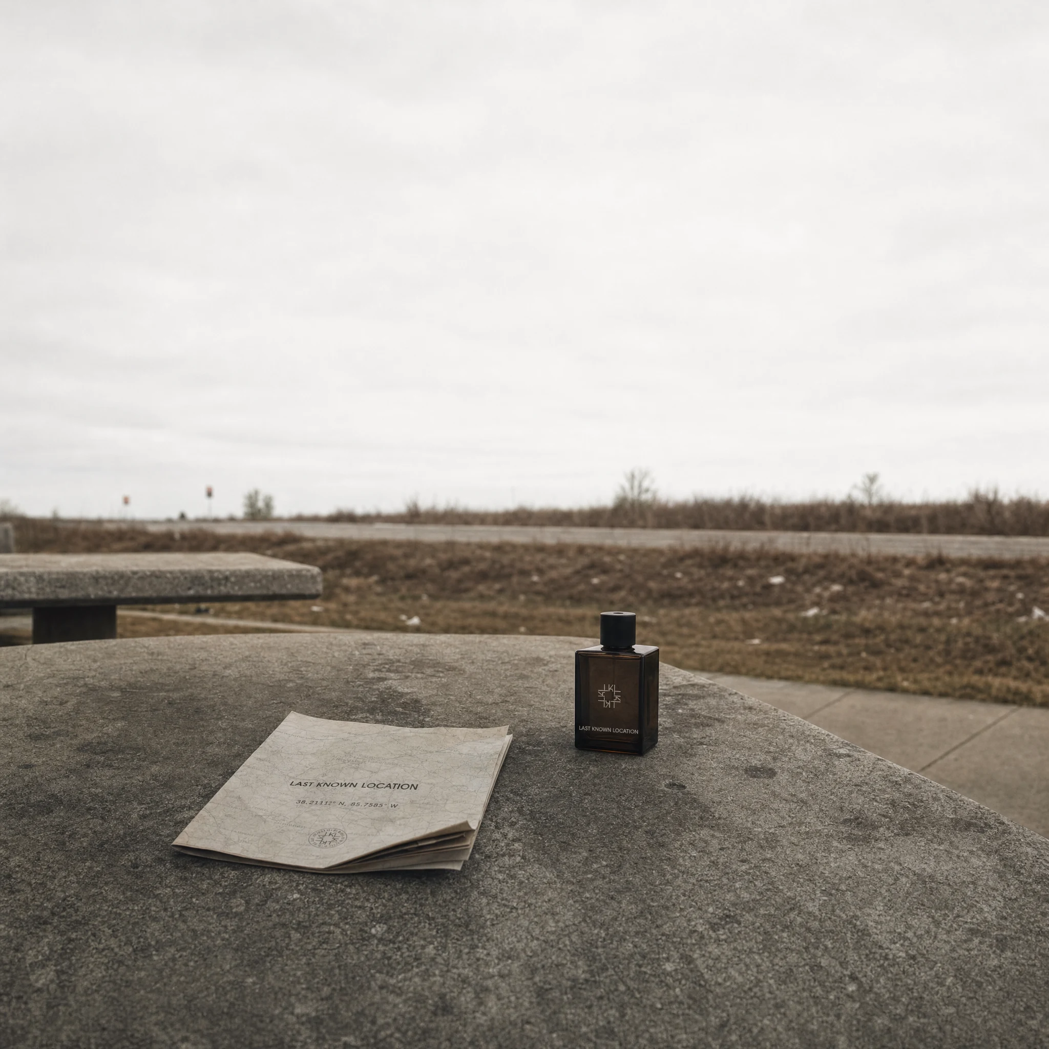
The master aesthetic language built itself from there: architectural minimalism, museum-grade art direction, brutalist infrastructure, traces of human presence without explanation. The rule I kept returning to was restraint. With unsettling imagery the temptation is always to make the unsettling thing visible. This brand needed something colder — departure boards showing coordinates instead of destinations, archive drawers full of places instead of people, a desert monument with no explanation and no plaque.
The brand never tells you what the locations mean. It only documents that they existed.
The Work
Identity System
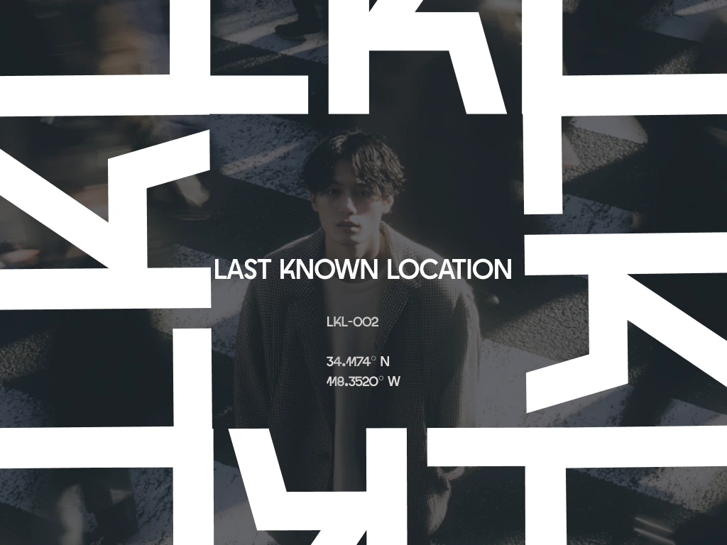
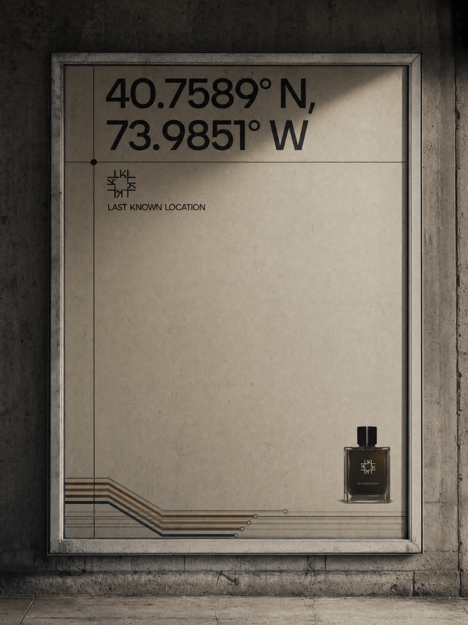
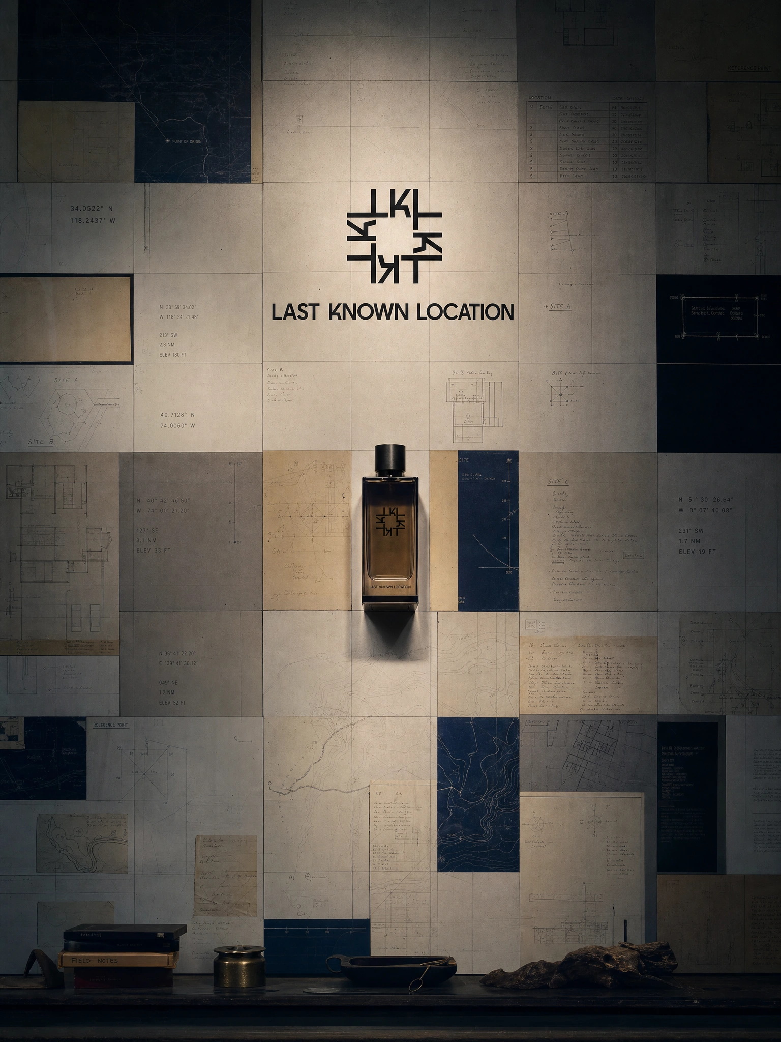
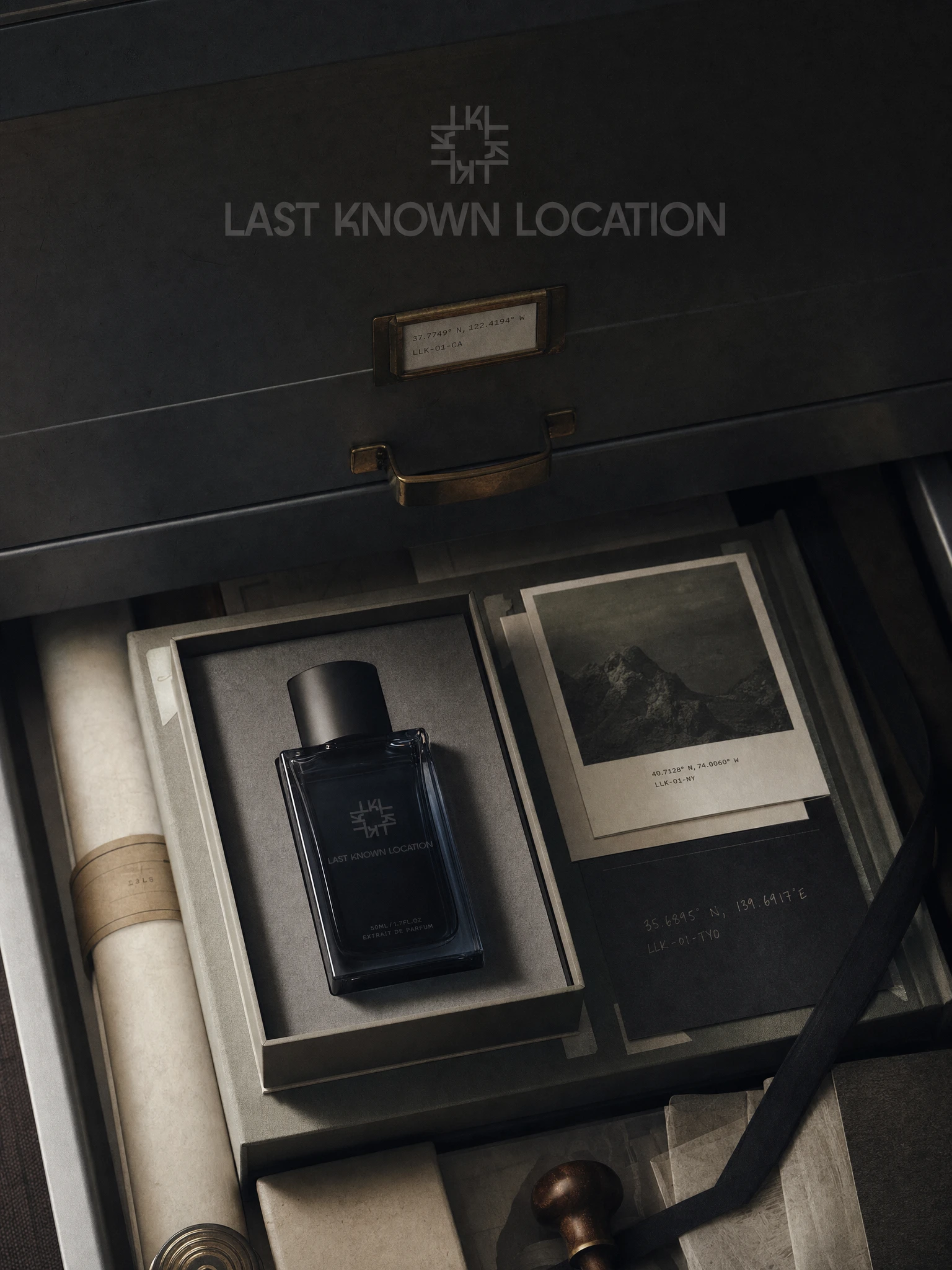
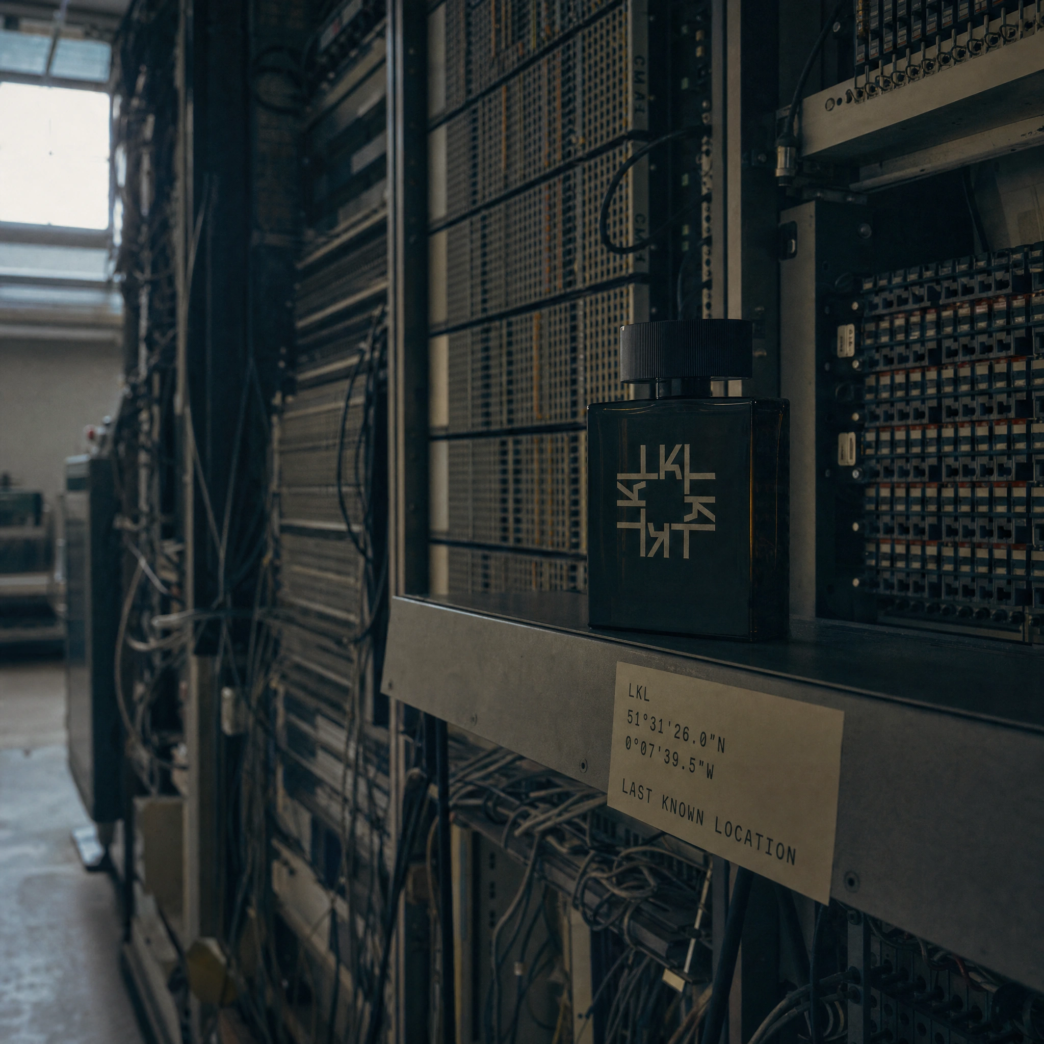
The mark operates on two registers simultaneously. The primary — geometric symbol paired with Cakra wordmark — functions as an institutional seal, the kind that belongs on government infrastructure or museum signage rather than a fragrance counter. Beneath it, a secondary data layer: coordinates in both decimal and DMS formats, LKL batch codes, elevation readings, archival section references. The system looks like it has been cataloging locations long before any product existed.
The symbol is built from fragmented letterforms in rotational geometry — legible as an abbreviation at small scale, readable as a wayfinding marker at large scale, ambiguous enough to feel institutional rather than designed. It holds with equal authority against dark bottle glass, pale archival paper, and raw concrete.
Typography runs on a dual system: Cakra for all brand-facing text; IBM Plex Mono and Geist Mono for data — coordinates, batch codes, archival labels, elevation markers — at reduced sizes with expanded tracking. The effect is a brand that appears to generate its own information rather than curate it.
Campaign — Two Modes
The campaign split into two distinct visual registers, which ended up being the most interesting design decision in the project.
The first mode is architectural and rendered — monumental environments built to house the brand: a satellite atlas overlaying the bottle against dark-matter cartography, a brutalist observation deck at dawn, an archival repository that extends to infinity, a desert coordinate monument that looks like it predates the brand. These images position the bottle as a found and cataloged object within environments that exist outside of time.
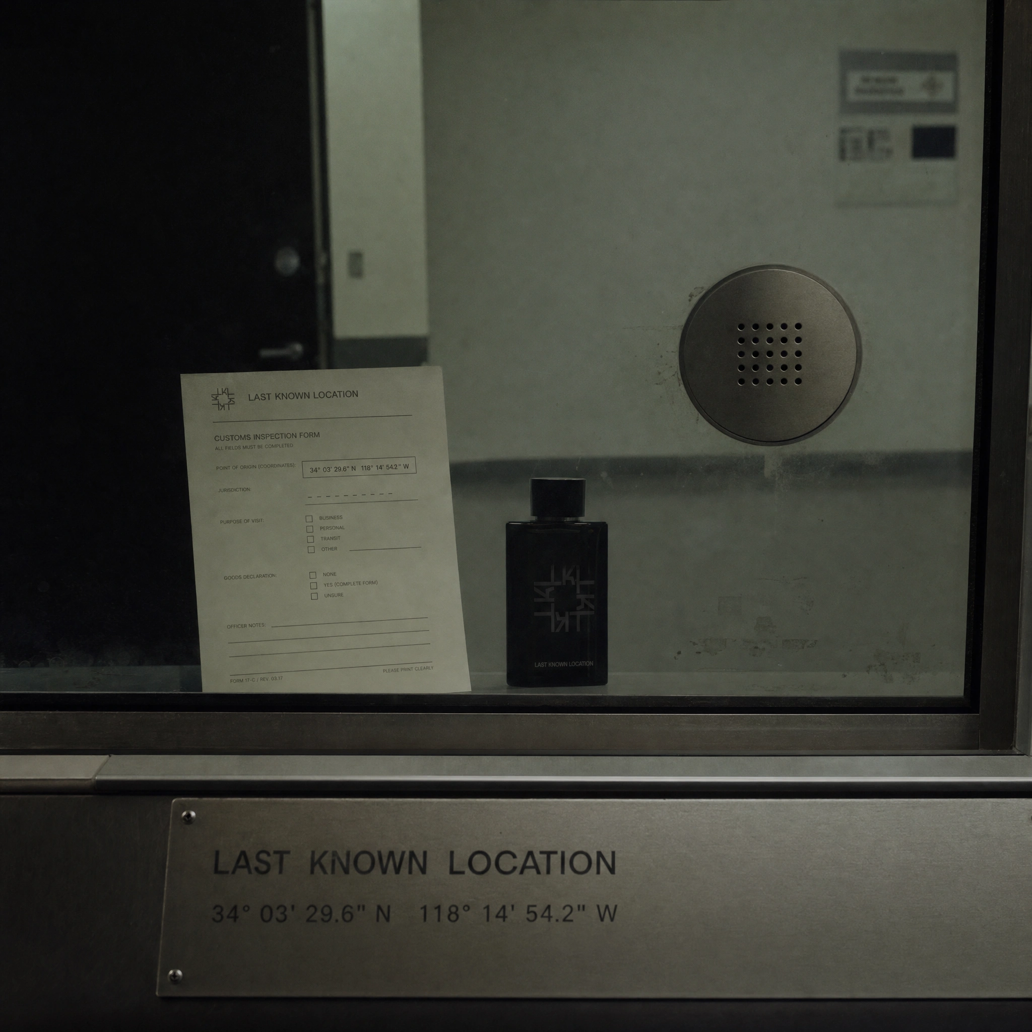
The second mode is real-location documentary photography — no CGI, no compositing, everything present in the actual scene. A concrete motorway rest stop table with a folded map and the bottle abandoned alongside it. A ferry terminal window with grey water beyond and the timetable branded in monospaced type. Analogue telephone exchange equipment with an LKL coordinate label affixed to the shelf. A customs inspection booth with a branded inspection form pressed against the glass partition, the bottle on the other side. This second mode brought the brand into the actual world — and made it feel more unsettling than any render could, because the places are real.
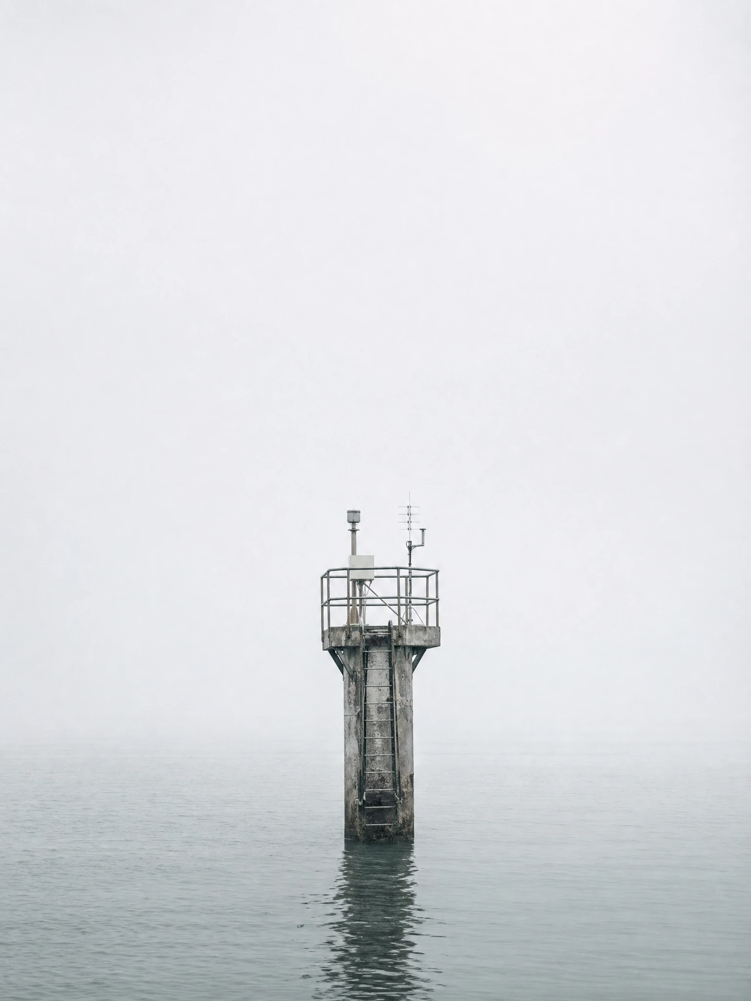
The unbranded campaign visuals — the survey tripod alone in a flat field at dusk, the flood marker wall with the undated top line, the abandoned train platform still showing departures, the decommissioned control room with screens still running, the tide station alone in flat grey water — extended the world without the product present at all. These function as the brand's editorial layer: proof that the visual logic holds without any commercial object in frame.
Website
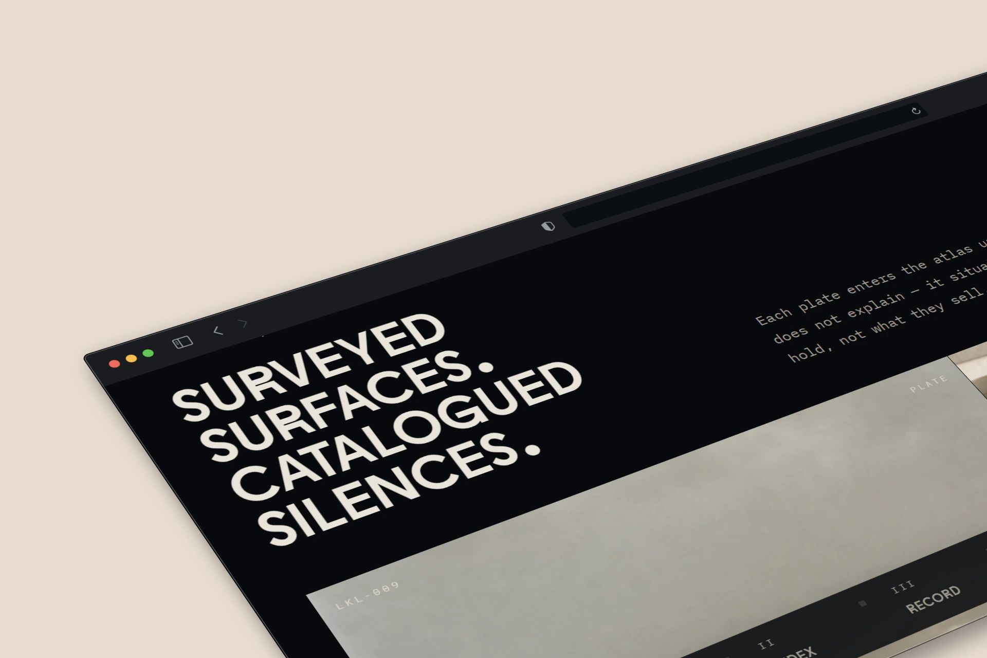
The brand has a live web presence, continuing the archival-institutional logic into digital — coordinate-indexed navigation, monospaced data typography, the same palette of asphalt grey, aged cream, and midnight blue carrying across every screen.
The Result
No client, no launch, no physical product. What exists is a complete brand world operating at institutional scale: a geometric identity system with internal typographic logic, a campaign spanning 20+ images across two visual modes, a website, and a conceptual framework that holds the entire system together without requiring explanation.
The work sits alongside brands like Byredo, Aesop, and Le Labo — not because it mimics their aesthetics, but because it applies the same degree of systematic restraint. Every coordinate is legible. Every archival code follows real indexing logic. The absence of narrative explanation is not ambiguity — it is the primary design decision.
The system is the story. The location is never identified. The bottle is the only proof anything was ever there.
See more at revolte.design
Like this project
Posted Jun 8, 2026
A fragrance house that indexes scents as coordinates — complete identity system, 20+ campaign images across architectural and documentary modes, live website.
Likes
4
Views
16
Timeline
May 20, 2026 - Jun 8, 2026

