Built with Lovart
PATINE: Beauty Brand Development
Révolté
PATINE — The Beauty of What Remains
A beauty brand built on the opposite of every promise the industry makes. No reversal. No restoration. No glow. Just the honest intelligence of a surface that has been lived in.
THE BRIEF
There was no client. That's what made it interesting.
I wanted to work in beauty — one of the most visually oversaturated categories in branding — and find a position so contrary that it couldn't be confused with anything already on a shelf. Every brief I'd seen from the category was the same sentence rewritten: make people feel less afraid of time. Sell the reversal. I wanted to build the brand that refused that premise entirely.
The constraint I set for myself: no before/after logic, no transformation language, no softness used as a selling tool. If the brand had anything to say, it had to say it about what remains — what deepens under pressure, what becomes more itself after exposure, what a surface looks like when it stops pretending to be something it was twenty years ago.
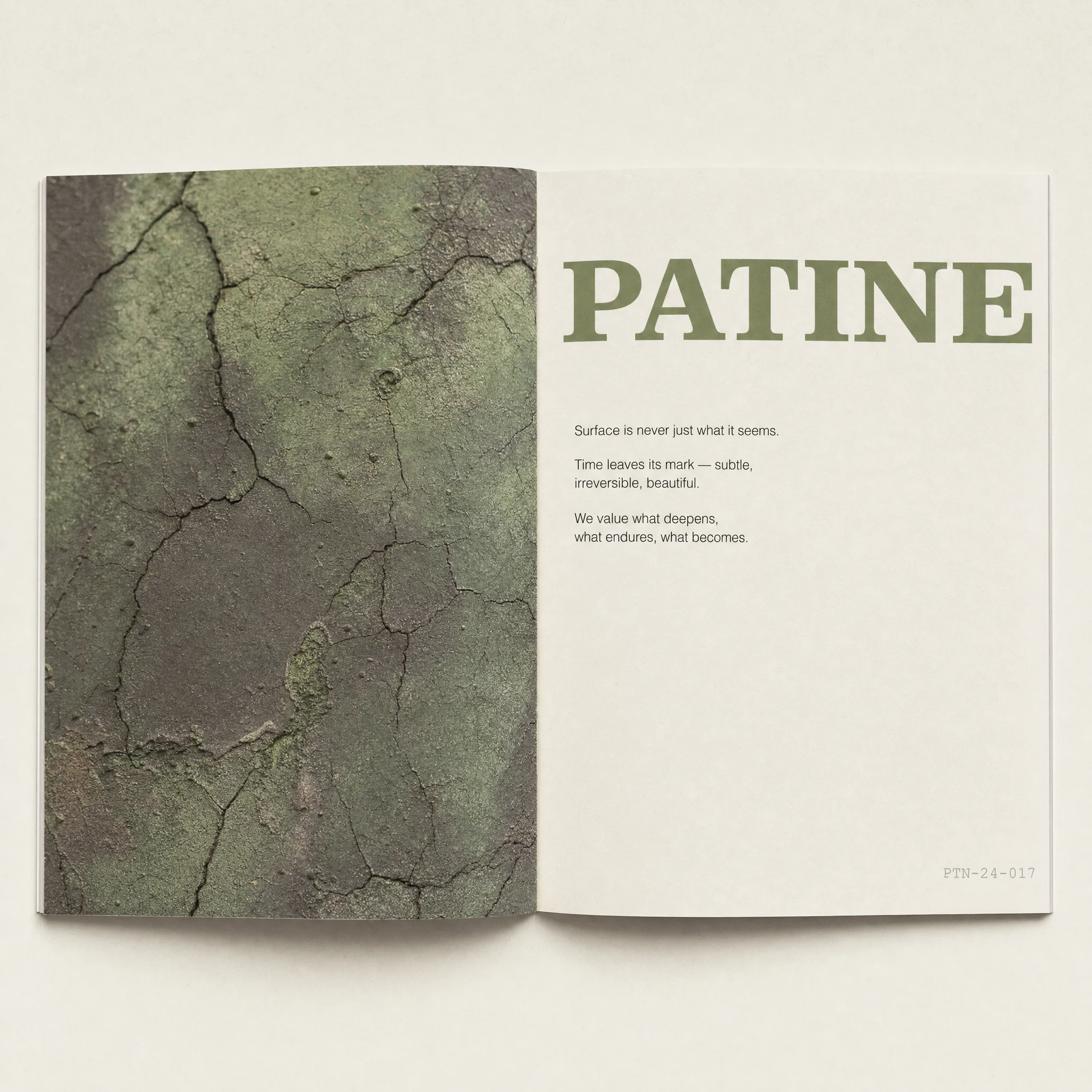
That's PATINE. French for patina. The beauty of age on a surface.
THE APPROACH
I started where most beauty brands end: the skin as a surface, not a problem.
The first instinct was to look at how materials behave over time — copper oxidizing to green, clay cracking under heat, fresco walls absorbing decades of damp air. These aren't failures. They're processes. Each one follows a logic, and each one produces something that couldn't exist without duration. I wanted the brand to think about skin the same way.
The visual world came before the verbal one. I needed to know what this brand looked like before I knew exactly what it said. I started building with photography references — macro shots of cracked terracotta, close-ups of aged skin treated the same way a geologist photographs rock strata: with attention, without judgment. Flat light. No retouching. No warmth added artificially. The images had to feel like documentation, not aspiration.
The tension I kept working through was how to be honest about decay without being morbid about it. The answer was in the copy register: declarative, not consoling. "You are not failing. You are becoming material." That line did more to define the brand than anything in the visual system. It's not gentle. It's not an affirmation. It's a statement of fact — and that made it feel more respectful than anything I'd have written if I was trying to comfort.
The color system followed the same logic: nothing pristine. Oxidized Copper (
#7A8C5E) as the primary — the green of old bronze, earned not designed. Faded Clay (#C4876B) for warmth that doesn't apologize for being weathered. Bleached Blue (#A9BCC5) in the shadows and architectural surfaces. Iron (#4A4847) replacing black throughout — warm, slightly dull, not aggressive. Dust White (#F0EBE3) as the base — never pure, always slightly contaminated, like paper left near a window for a season.THE WORK
BRAND IDENTITY / VISUAL SYSTEM
The brand's visual logic runs on a single principle: imperfection as evidence, not accident. Every surface that appears in the system — packaging, campaign imagery, retail environment — shows age. Not stylized nostalgia, not distressed-for-effect, but the actual material behavior of objects left to oxidize, crack, absorb, and settle. The color palette was pulled from those processes directly: copper patina, dried clay, bleached linen, iron shadow.
TYPOGRAPHY
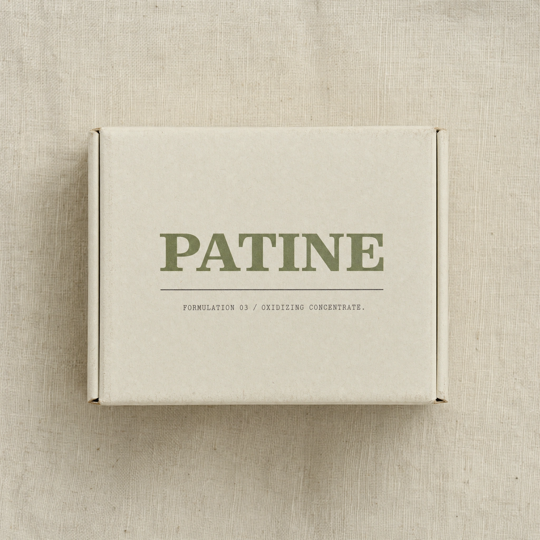
Display moments use a weathered serif — ink-trapped, high contrast, slightly antiquated — set large and sparse, never in sentences. The wordmark PATINE operates like a stamp rather than a logotype: present, heavy, not decorative. Neue Haas Grotesk Light handles all body copy and product information — the contrast between the aged serif and the neutral grotesque is the brand's primary typographic tension. Courier New appears exclusively in batch codes and formulation numbers: small, grey, bureaucratic by design.
PACKAGING
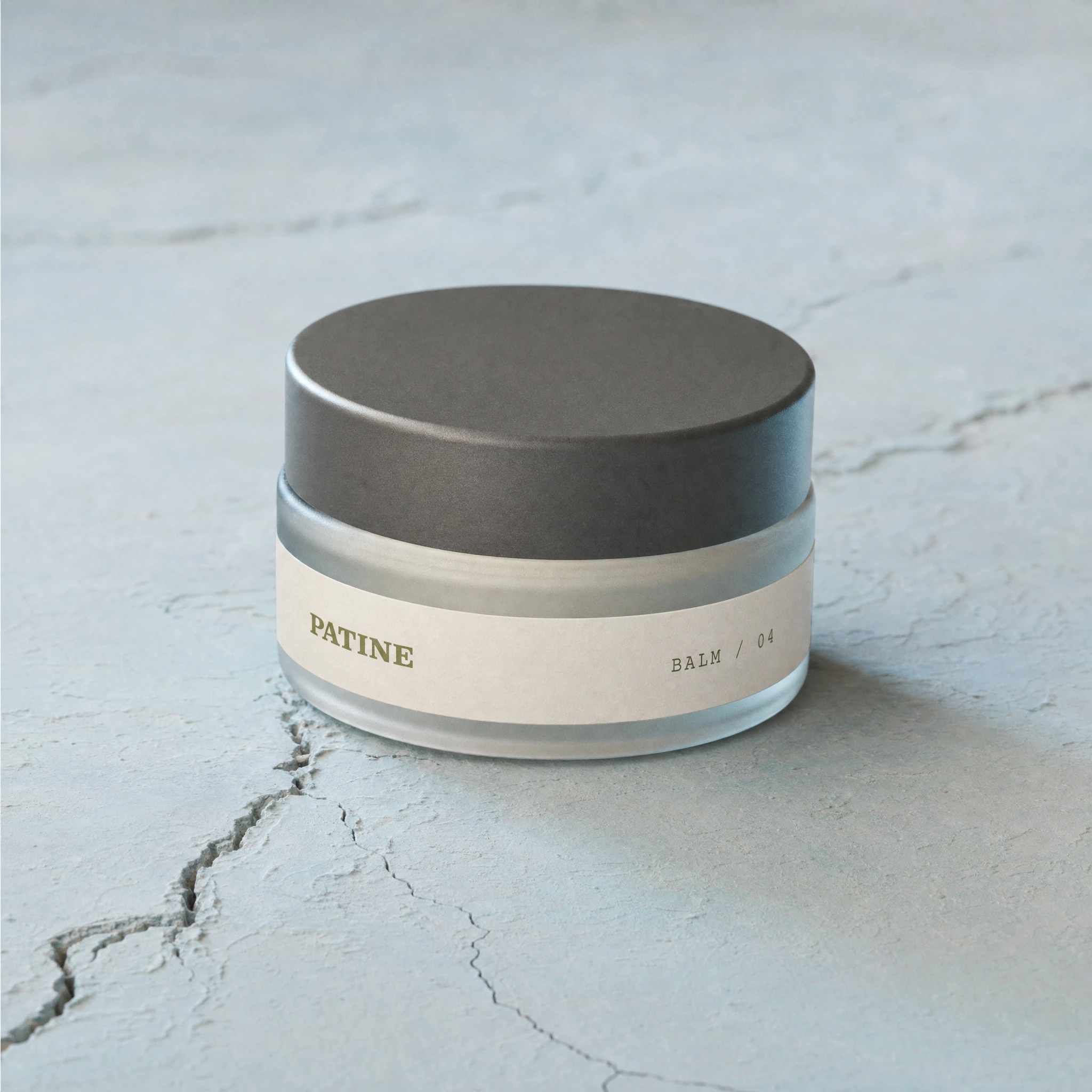
Two hero formats: an amber dropper bottle on a cracked terracotta slab, oxidized brass hardware, no polished surfaces; and a frosted glass jar with an Iron-toned aluminum lid, sitting on a fractured Bleached Blue plaster surface. Both labels are uncoated Dust White paper — the PATINE wordmark in Oxidized Copper, formulation code in Courier below. Nothing is pristine. The packaging looks like it's already been somewhere.
CAMPAIGN
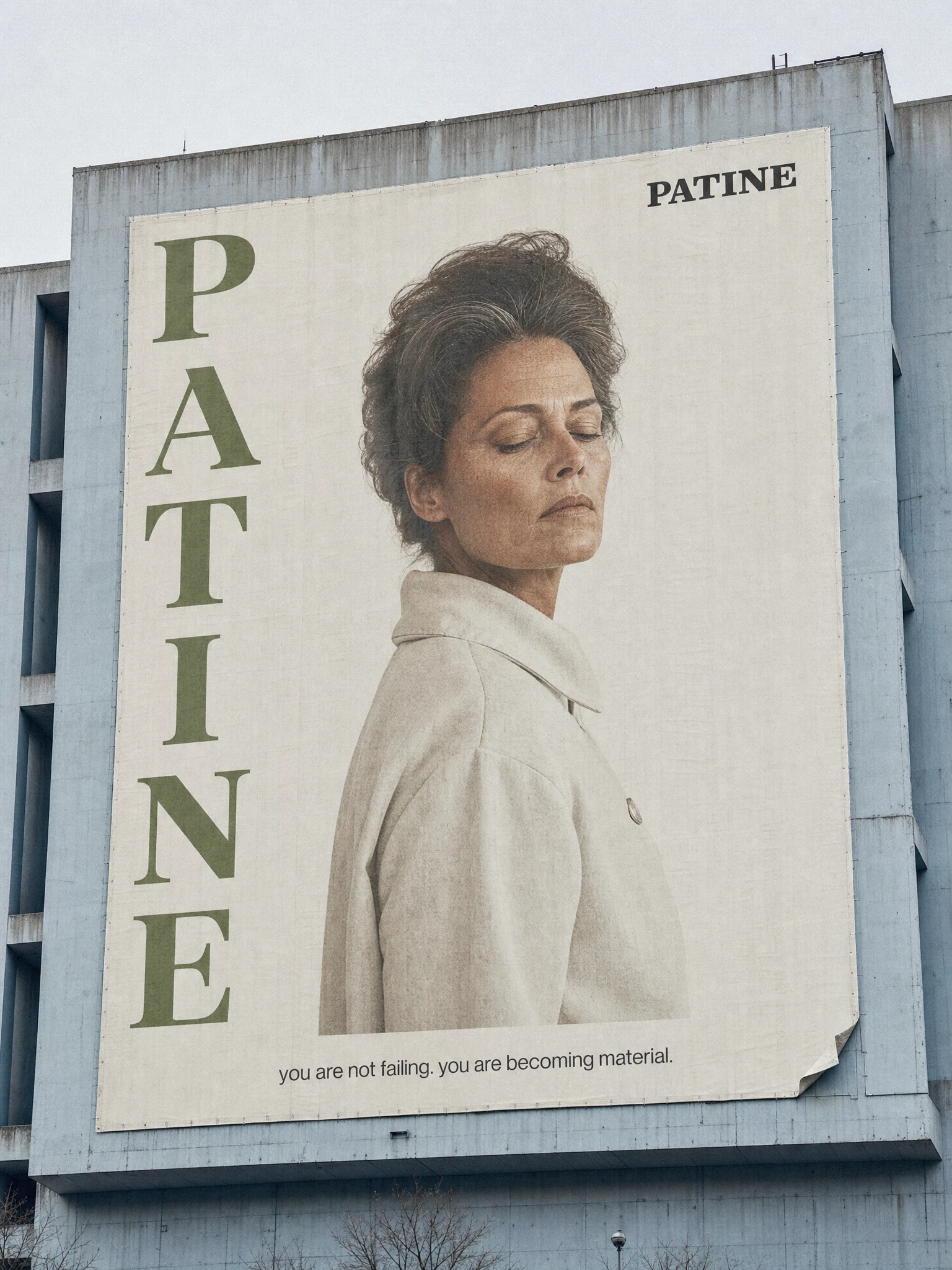
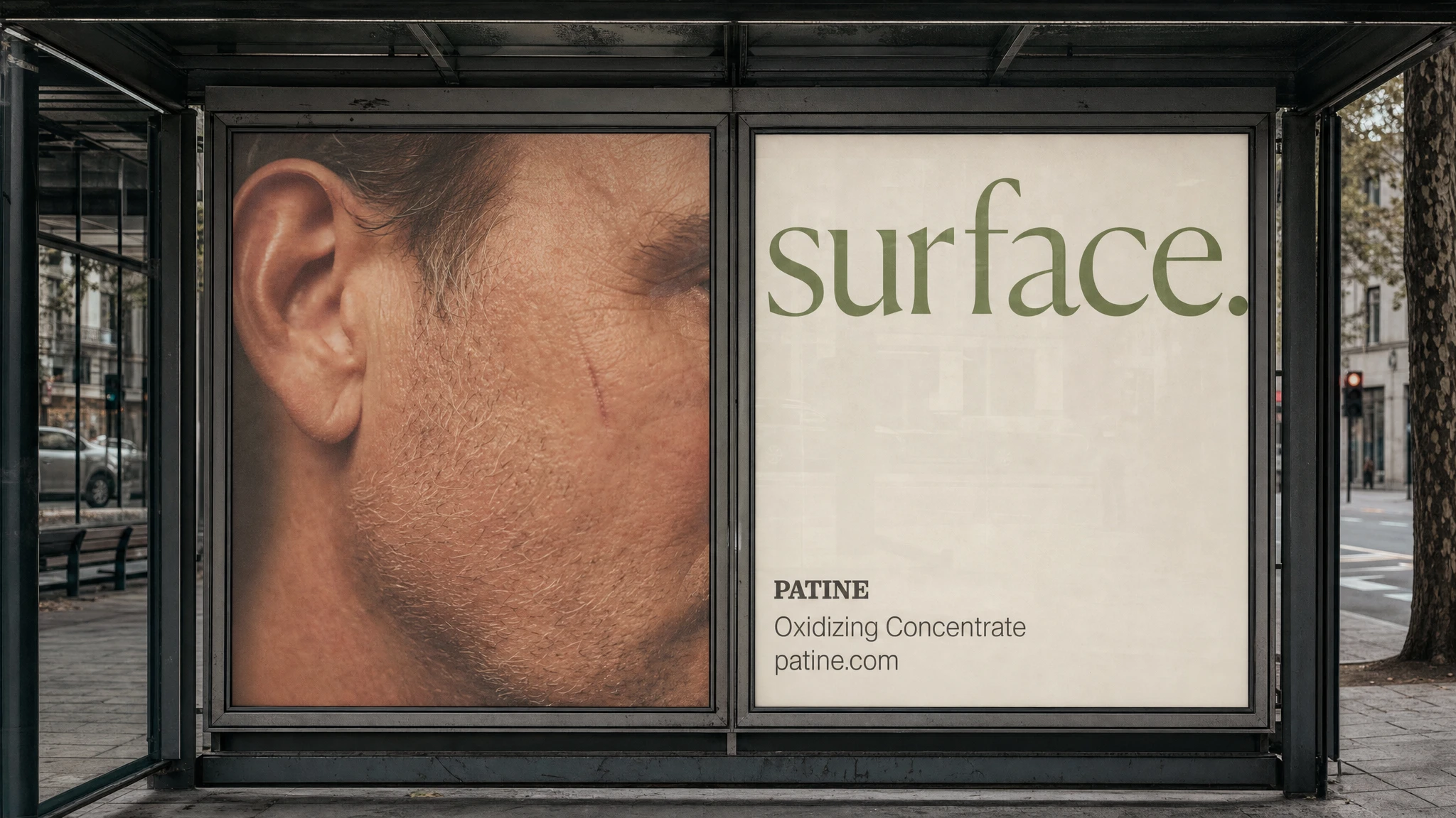
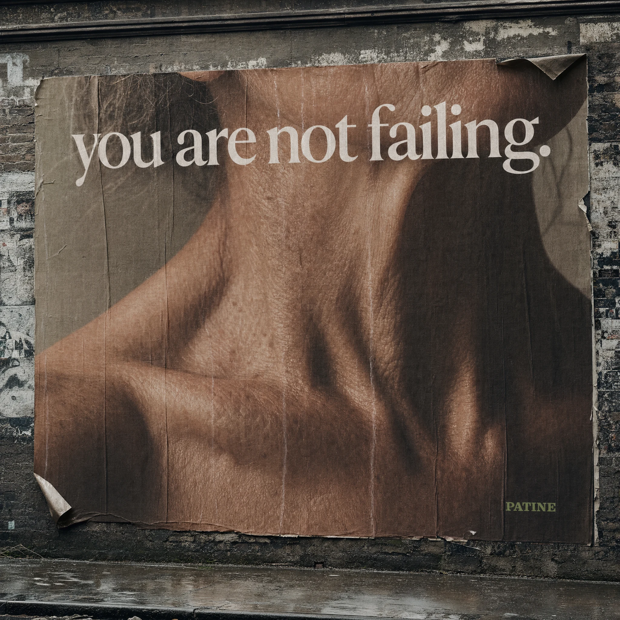
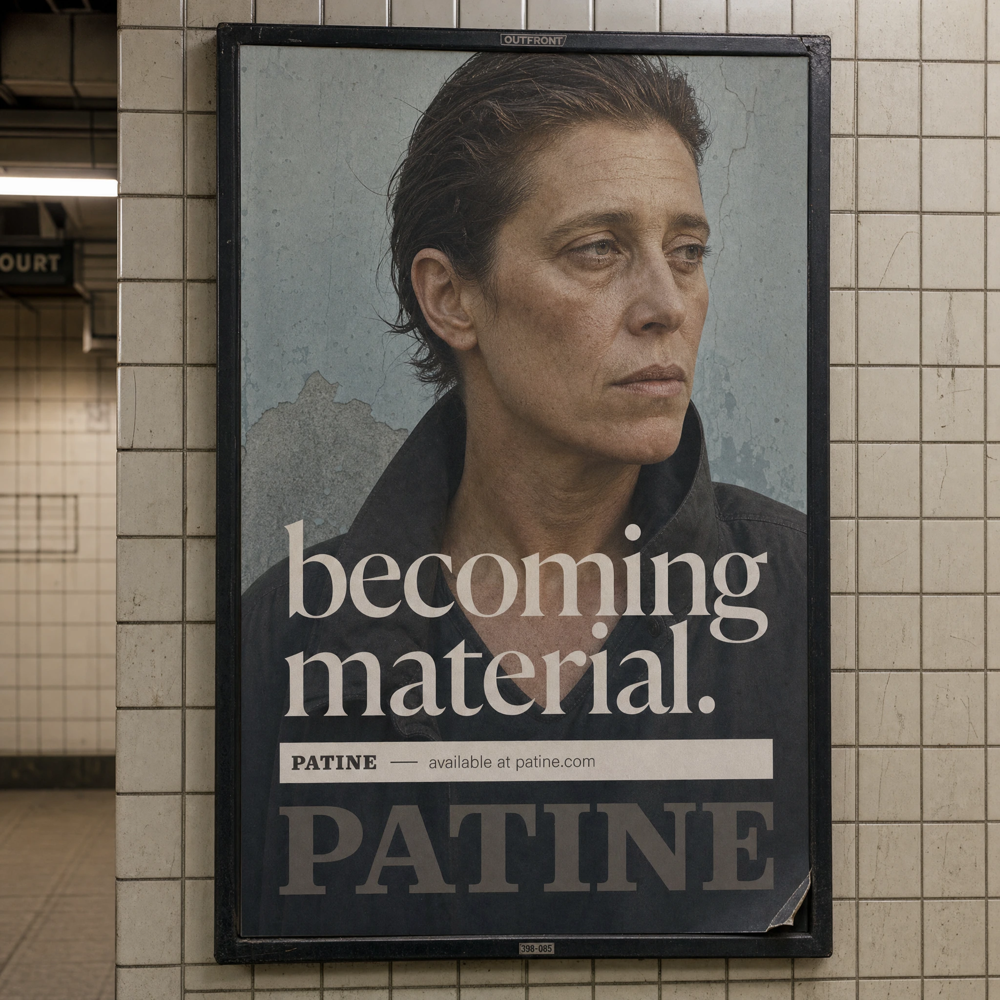
The campaign is built around three words — remain, surface, material — deployed across OOH, print, and campaign portrait. Models are in their 40s, 50s, 60s, photographed on medium format film with flat diffused light. Skin texture is always fully visible: lines, pores, marks, the natural history of a face. Nothing retouched. The images are not glamorous — they are precise. The bodies are documented the way a specimen is documented: with complete attention, without correction.
The building wrap carries the campaign line at scale: "you are not failing. you are becoming material." The wheat-paste billboard runs "you are not failing." on a full-bleed skin close-up against weathered brick. The bus shelter diptych splits the image and the word — a man's face in raw macro on the left, "surface." in Oxidized Copper on the right. The subway poster places "becoming material." across the subject's chest in Dust White, the model looking slightly off-frame with an expression that isn't performing anything.
EDITORIAL
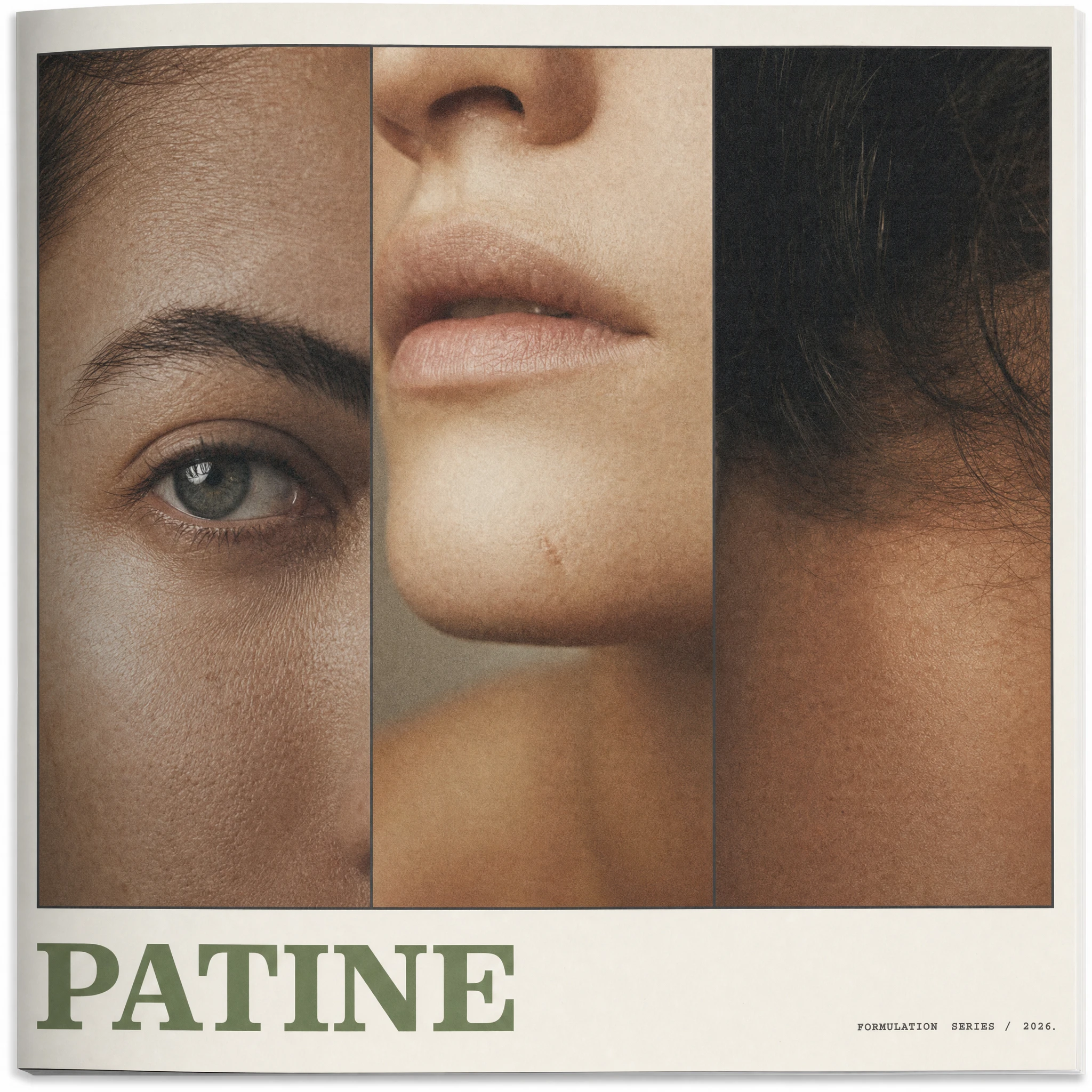
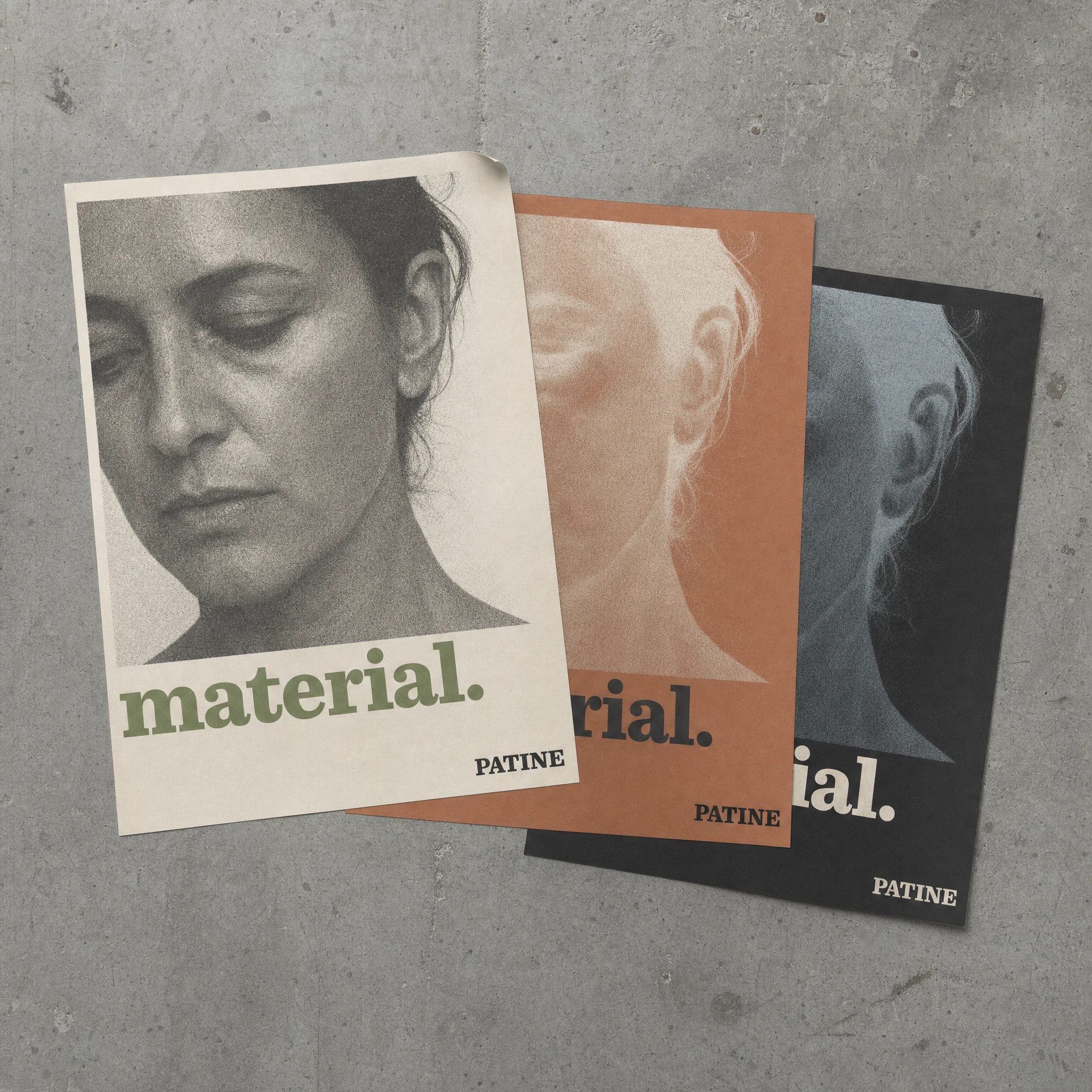
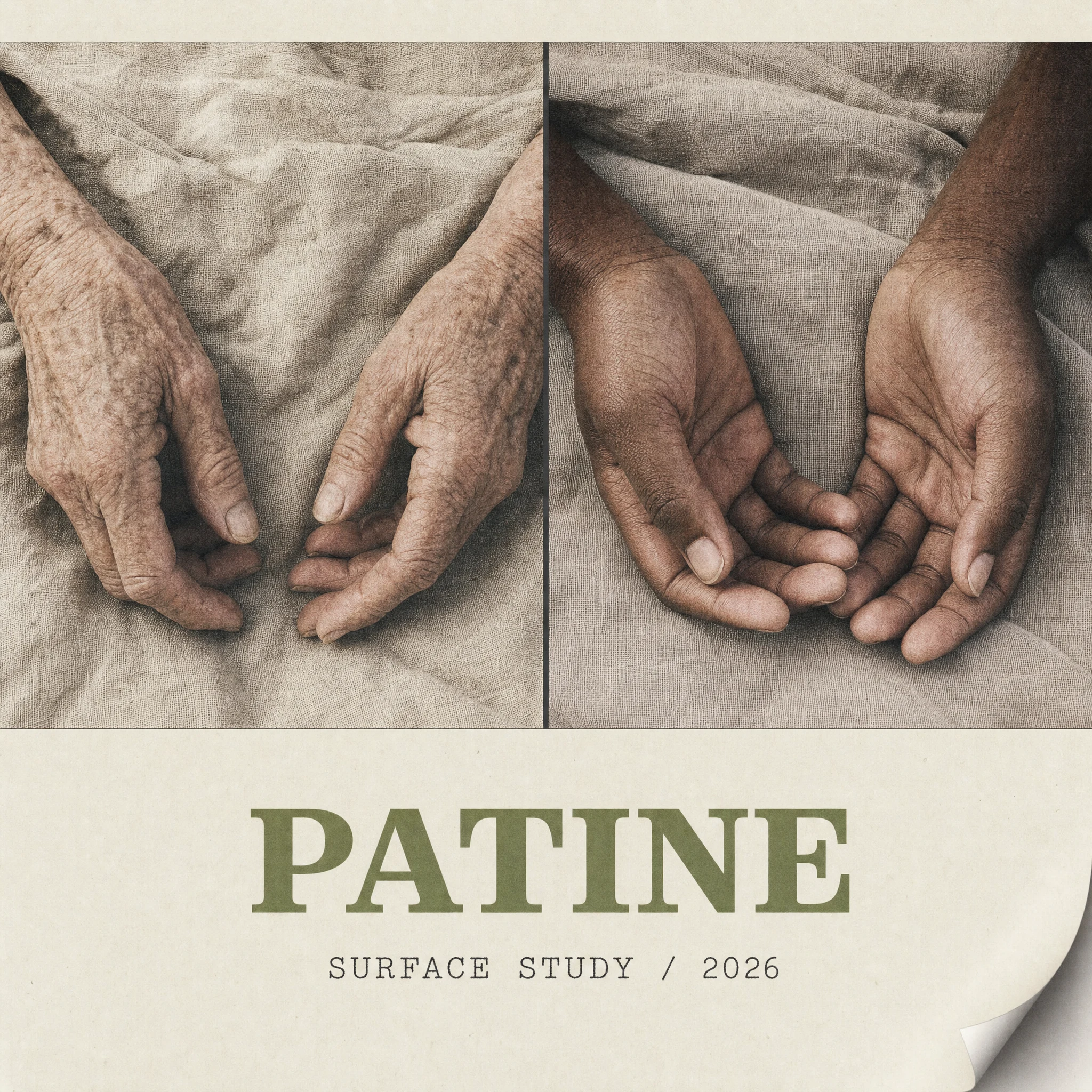
The editorial spread pairs a full-bleed macro of oxidized copper on the left page with a sparse right page: the wordmark at display size, three short declarative sentences in light grotesque, a batch code in Courier at the lower right. The magazine triptych breaks three models into specimen panels — eye, mouth, neckline — each fragment documented with identical crop logic and light. The poster series runs three colorways of the same portrait: cream/iron, clay/white, iron/blue. Same face, same light, different material state.
RETAIL / ENVIRONMENTAL
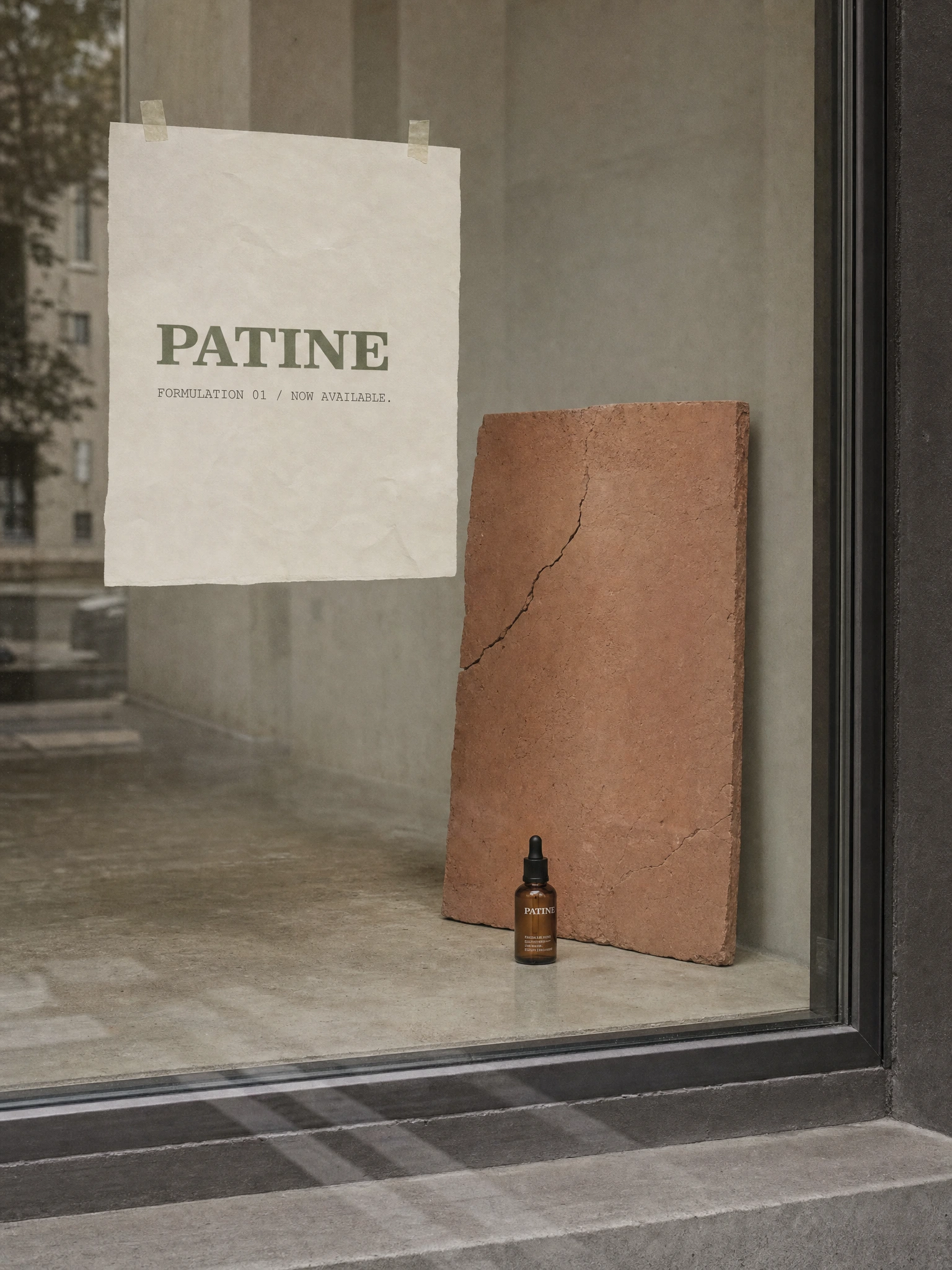
The window display reduces everything to three elements: a cracked terracotta slab propped against the back wall, one amber dropper bottle on the floor at its base, and a sheet of uncoated paper taped directly to the glass with two visible pieces of tape. No plinth. No lighting. No styling. The paper reads "PATINE / FORMULATION 01 / NOW AVAILABLE." in plain serif and Courier. It looks like a gallery announcing a show, not a shop announcing a product.
THE RESULT
PATINE shipped as a complete speculative brand system — identity, packaging, campaign, OOH, editorial, and retail environment — built to demonstrate what a beauty brand looks like when it refuses the category's foundational promise.
The work sits in a gap that doesn't get explored often: beauty as material intelligence rather than beauty as aspiration management. That gap is real, and this is what it looks like when someone actually builds inside it. The visual system is coherent from building wrap to dropper bottle. The copy is consistent across fifteen executions without ever repeating itself. The brand has a position sharp enough to make someone uncomfortable — which means it has a position.
Studio: Révolté — revolte.design
Project: PATINE
Year: 2026
Scope: Brand Identity, Creative Direction, Campaign Design, Packaging, OOH, Editorial
Industry: Beauty / Skincare
See more at revolte.design
Like this project
Posted Jun 22, 2026
Beauty brand that rejects anti-aging entirely. Built on cracked clay, oxidized copper, and one line: you are not failing.
Likes
0
Views
12

