Built with Lovart
Tally Brand and Product Design Project
Révolté
Tally — Brand Identity, Product Design, Campaign & Website
Financial tools for people who hate financial tools.
Overview
Tally is a financial planning app built for freelancers and creatives — the invoicers, the self-employed, the people who are brilliant at what they do and quietly terrified of their own taxes. The brief was simple and total: build everything from zero. Name, identity, voice, product UI, campaign, merch, OOH. A brand that could sit on a subway wall and a desk pad and a dryer porthole and feel like exactly the same thing every time.
The challenge wasn't making a fintech product look good. It was making a fintech product feel human — without softening it into a wellness app, without hardening it into a bank.
The Name
Tally. A count. A mark on a wall. Five strokes and a cross. The most ancient form of financial record-keeping, predating spreadsheets by several thousand years. The name does three things simultaneously: it describes the product literally, it carries a personality (dry, precise, slightly wry), and it generates a logomark almost automatically.
The Logo
The Tally mark — five tally strokes arranged as a triangular composition — became the primary symbol. The strokes aren't geometric abstractions: they read as the thing they are. Count marks. The wordmark was set in a rounded geometric grotesque with just enough warmth to avoid feeling cold. Together they form a logo that earns its cleverness on second look rather than announcing it immediately.
Visual Identity
The system was built on four principles:
Flat color blocking, never gradients. Depth comes from contrast and overlap. Tally Green (
#2D6A4F), Yolk (#F4A226), Ink Black (#1C1C1A), Ledger White (#F7F4EE), Redline (#D94F3D) — each color carries semantic weight. Green is positive, earned income, good news. Yolk is attention, pending, the thing you need to see. Redline is overdue, urgent, the thing you've been avoiding. Ledger White is the base — the color of receipt paper, of uncoated stock, of a page that hasn't been filled yet.Hand-annotation as brand texture. Ballpoint circles around figures, thin underlines, arrow callouts drawn at slight angles — these are real UI elements and real print elements, not decorations. They signal that a human has already reviewed your finances. Someone has been here. Someone noticed.
Typography as personality. Syne for display — confident, slightly unusual, unforgettable at large scale. DM Mono for all data — numbers, labels, microcopy. The mono choice is deliberate: financial data deserves the precision of a typewriter, not the warmth of a sans-serif. The combination creates the brand's fundamental tension: expressive at the headline, rigorous at the detail.
Cards as the primary UI and visual motif. Chunky rounded rectangles — each one a self-contained data module — stack vertically in the app and appear across every touchpoint: print ads, merch packaging, sticker sheets, landing page sections. The card is the atom of the Tally world.
Product Design
The app UI was designed around a single insight: freelancers don't need more data, they need the right data presented with enough personality that they'll actually look at it. Five core screens were built around this principle.
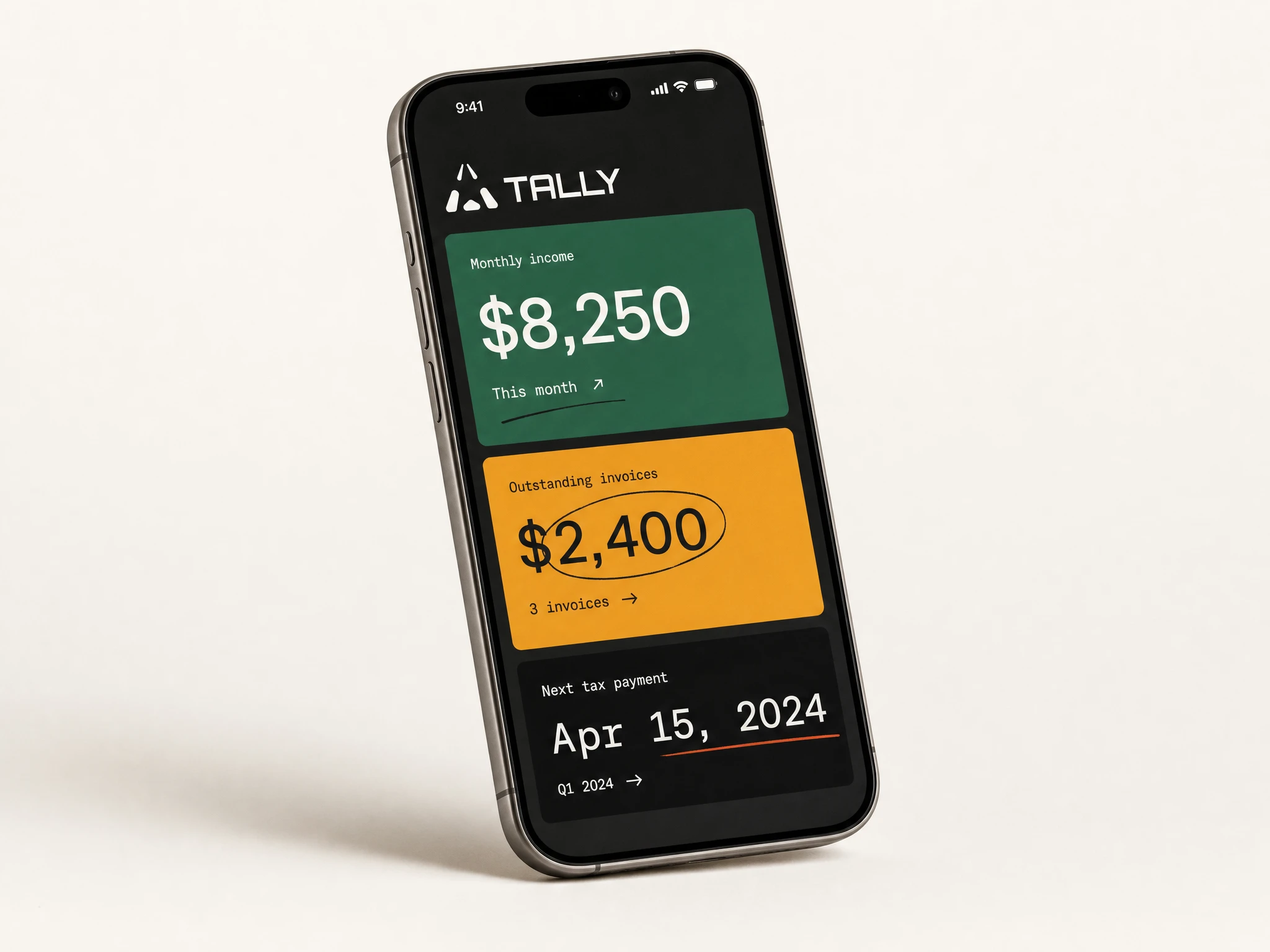
The home dashboard greets the user by name — "hey, Sofia." — and presents three stacked cards: net monthly income in Tally Green, outstanding invoices in Yolk with a hand-drawn circle around the amount, and the next tax deadline in near-black. The sparkline at the bottom is annotated with a single word: "best." No chart title. No legend. Just the thing the user needs to know.
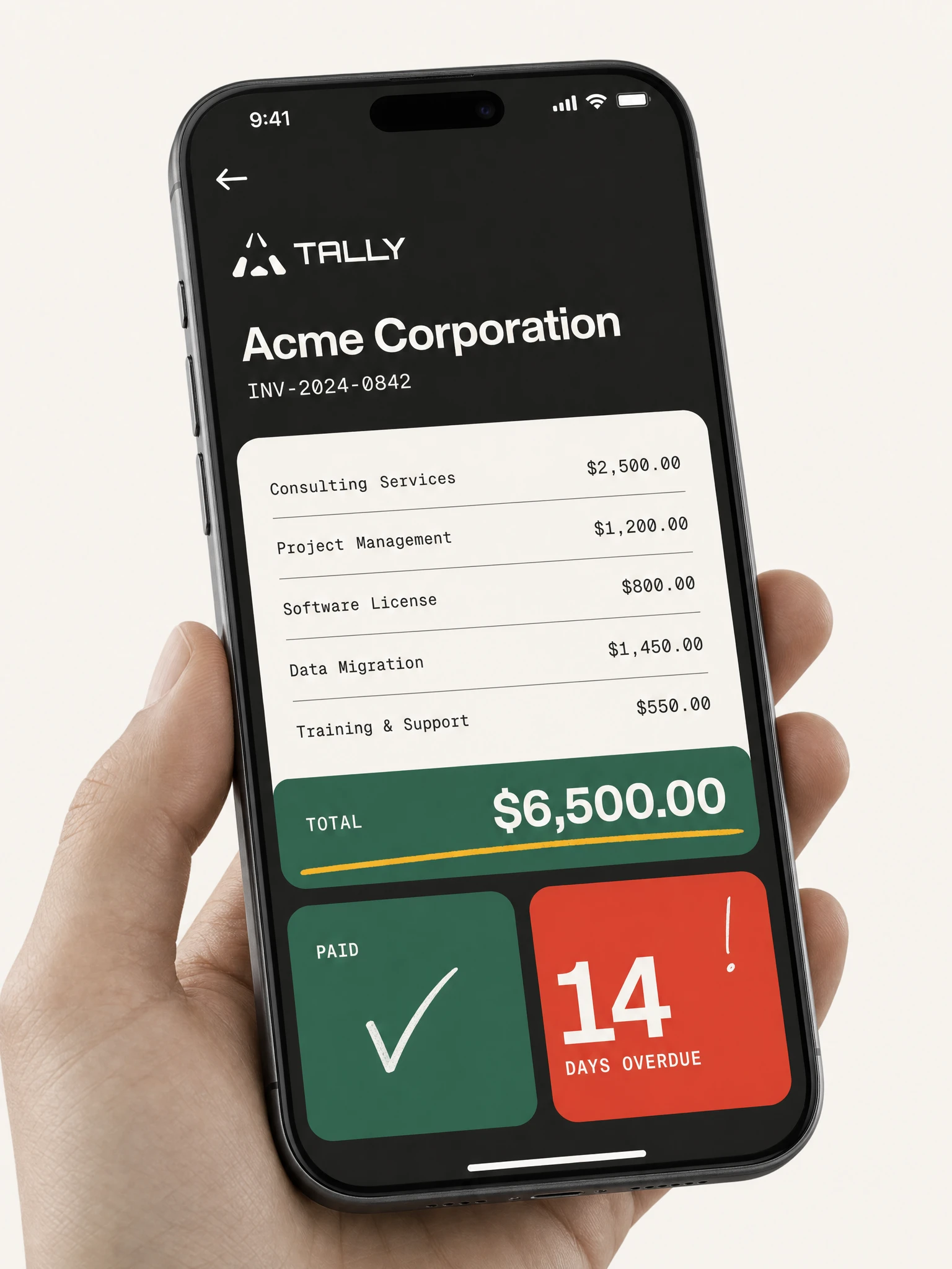
The invoice detail screen uses DM Mono for line items — clean, clinical, precise — until the Tally Green total row, which breaks the rhythm with scale and color. A Yolk underline marks the total, as if someone has already approved it in ballpoint. The overdue card in Redline doesn't explain itself. It says "14 days overdue" in large numerals and lets the number do the work.
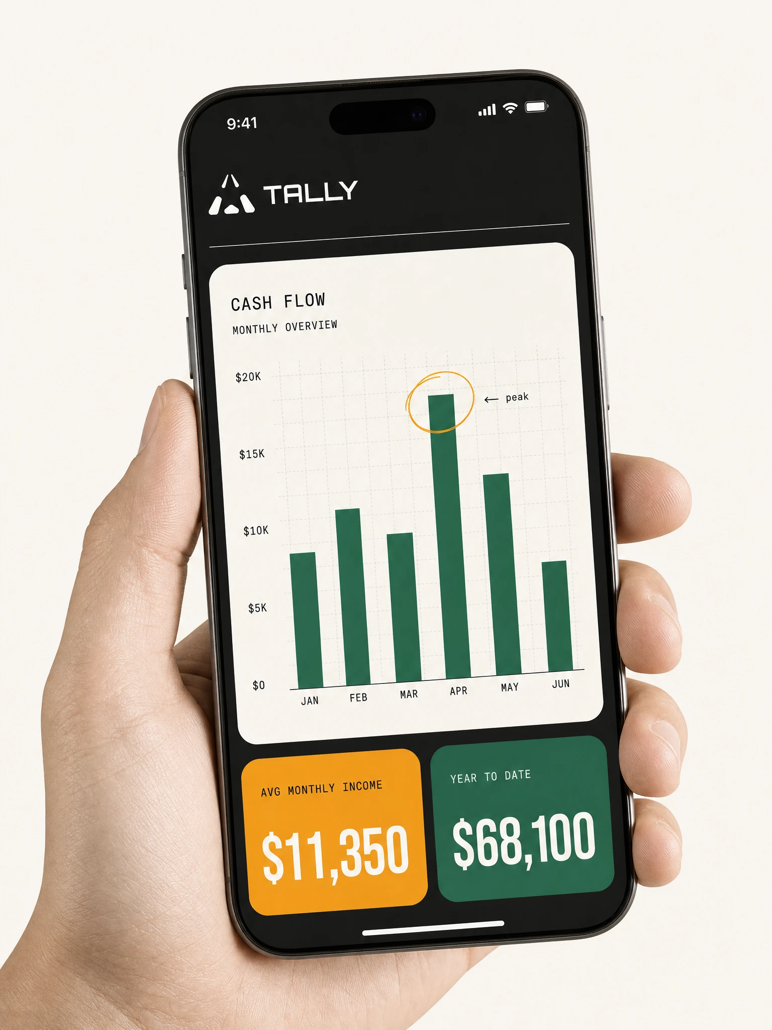
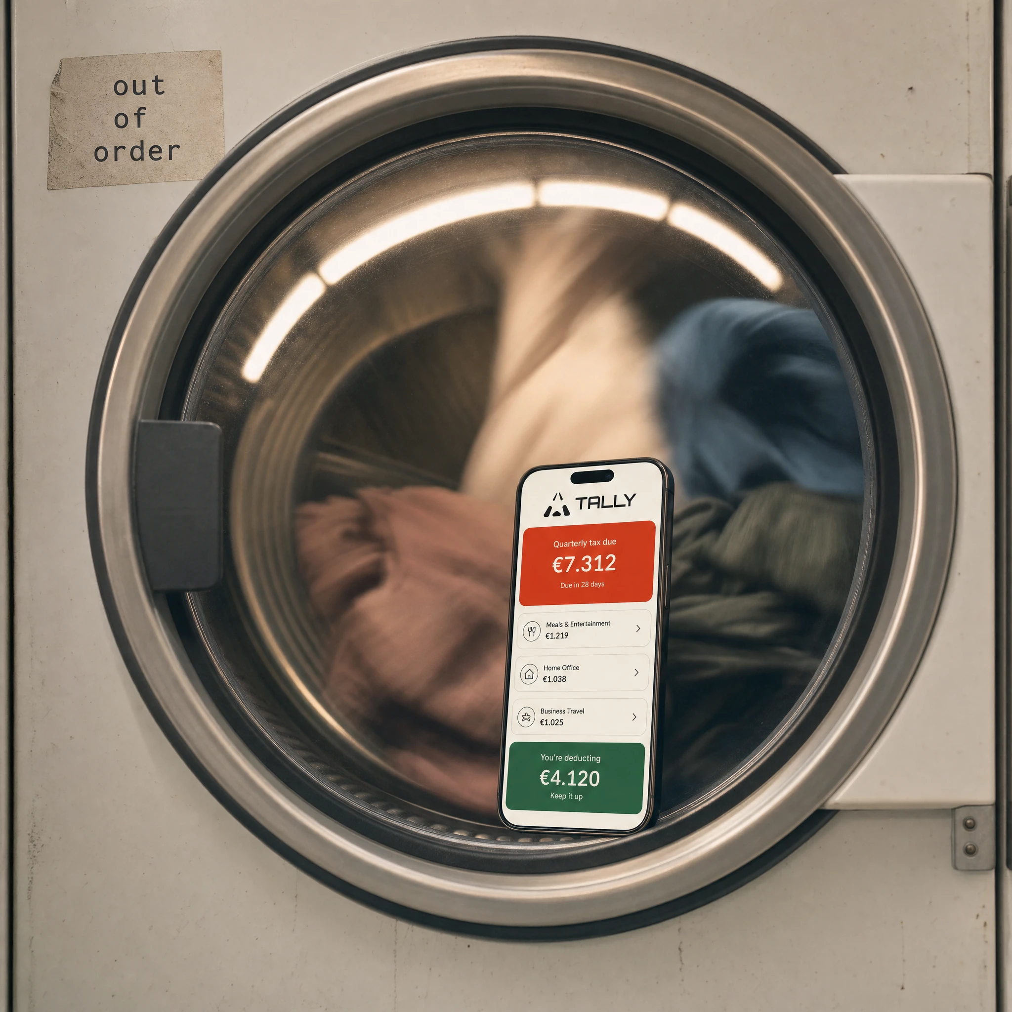
The cash flow screen adds the Yolk circle annotation around the peak bar — the highest earning month, marked by hand, pointing right. The tax prep screen leads with the Redline quarterly estimate — urgent and large — then lists deduction categories in calm Ledger White cards with green progress bars. The bottom card in Tally Green reads "you're deducting €4.120 — nice." The "nice." is the whole brand in a single word.
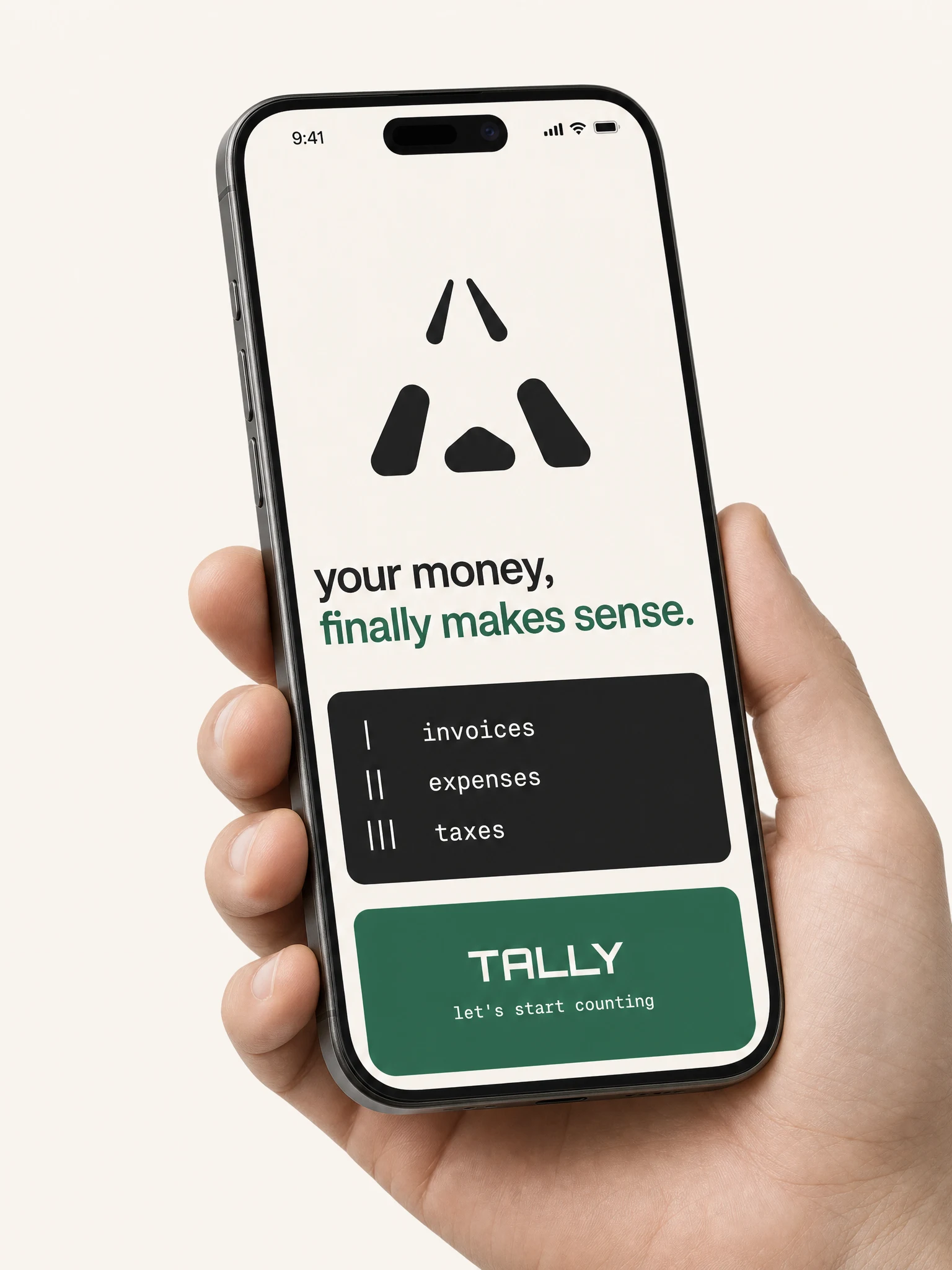
The onboarding screen inverts the base — Ledger White background instead of Ink Black — and strips everything back to the mark, a two-line headline ("your money, / finally makes sense."), and three items listed with tally marks as bullets: one stroke for invoices, two for expenses, three for taxes. The CTA button is a full-width Tally Green block with "TALLY" centered and "let's start counting" below it in mono. It's the only screen that feels like a breath before the work begins.
Campaign
The campaign was built on a single voice principle: Tally talks to freelancers the way a very organized friend talks, not the way a bank talks. Every headline assumes the reader is intelligent, busy, and slightly behind on something.
The OOH series ran across three formats with three different headlines, each one a different kind of permission:
The billboard — "you did the work. do the invoice." — speaks to the gap between completing work and getting paid for it. The split layout (Ink Black headline field, Tally Green logomark panel) makes it readable at 80km/h and memorable for the rest of the drive.
The bus shelter — "got paid. great. invoice the next one." — is quieter and more intimate. The Yolk background glows in the city dusk. The ballpoint circle around "the next one" is the detail that makes someone look twice.
The metro card — "OVERDUE? same." — is the most blunt and the most loved. Two words on a Yolk field. The word "same" does everything. It acknowledges the reader's reality without judgment. It creates solidarity. It makes Tally feel like it was built by someone who has also been late on a follow-up.
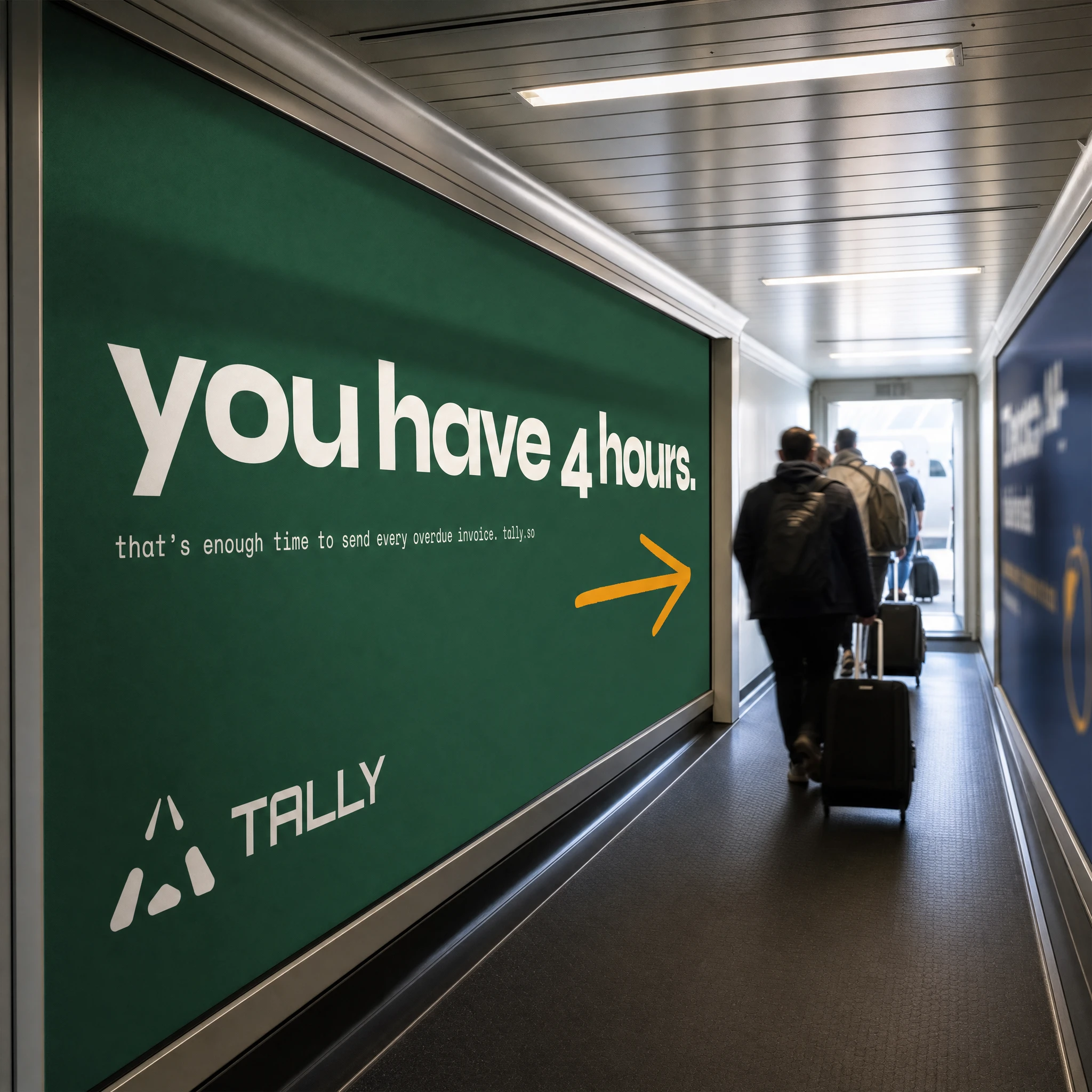
The airport jetway — "you have 4 hours." — uses the boarding context as the joke. Four hours of dead time, a phone with Tally on it, and every overdue invoice cleared before landing. The Yolk arrow pointing toward the gate does the rest.
The pavement stencil — "SEND THE INVOICE." — is the most direct execution in the campaign. No explanation. No product name at first glance. Just an imperative in Tally Green on wet city stone, the mark above it, pedestrians stepping around it without quite stopping. The pigeon in the corner of frame was not directed.
The newspaper spread committed fully to print culture — three-column editorial body copy, massive headline in newsprint black, the yellow and dark panel cards at the bottom. It looks like it belongs in that newspaper. The brand is confident enough not to announce itself loudly.
Merch
The merch range was designed to be genuinely wanted, not just branded. Every item carries its own deadpan tagline.
The Ink Black tote — "file later." — is the most worn piece in the range. Photographed in context, over the shoulder of someone walking through a studio, the Tally Green embroidery visible, the screen behind them showing the Tally mark. The bag is the product and the ad simultaneously.
The natural canvas tote variant reads "do your taxes. eventually." — a different register, slightly softer, for users who want the humor without the Ink Black commitment.
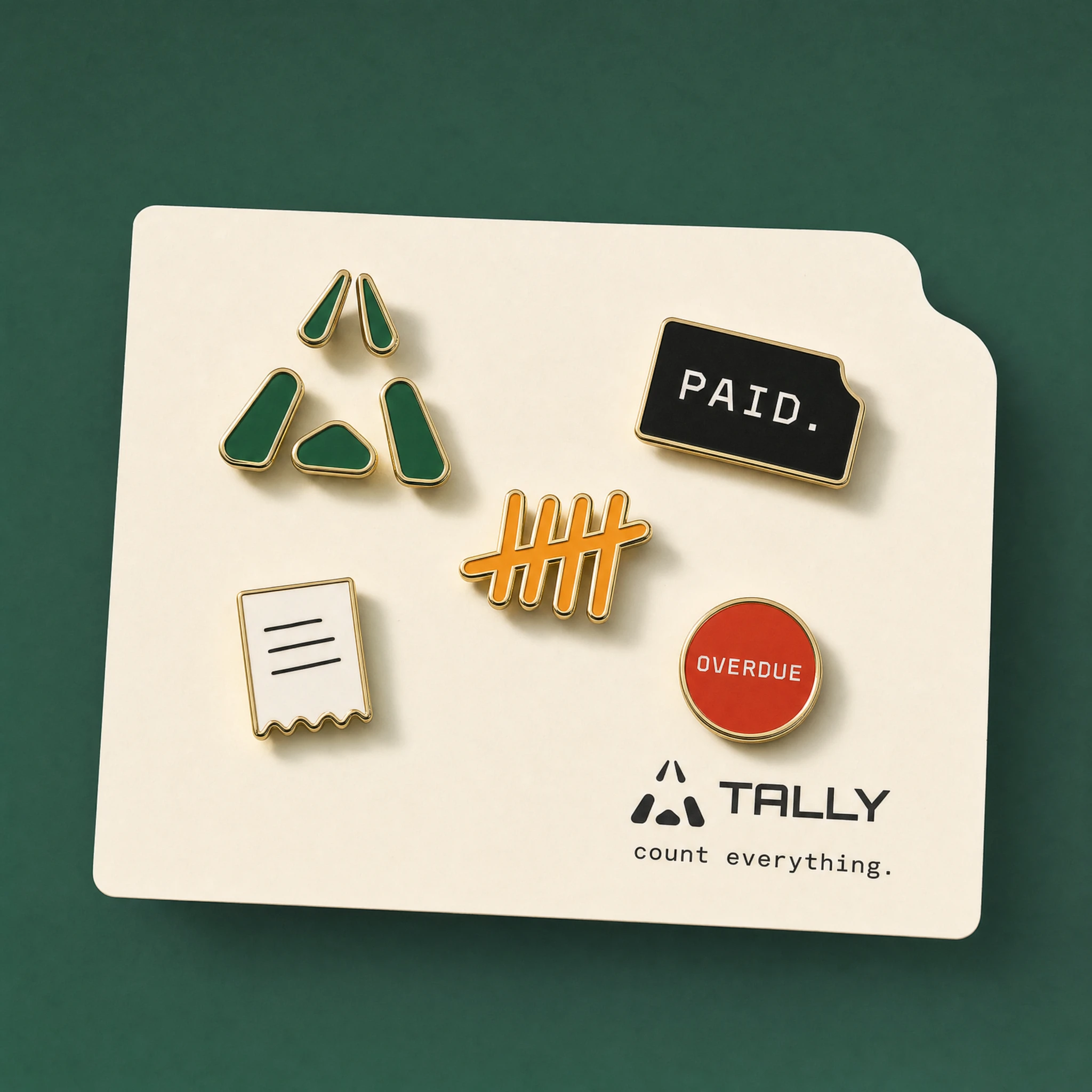
The enamel pin set is the most crafted item: five pins on a Ledger White card with a concave top-right corner. The logomark in Tally Green, PAID. on a concave Ink Black rectangle, the tally count in Yolk, the receipt stub in white with a perforated bottom edge, the OVERDUE circle in Redline. Together they read as a complete vocabulary of the brand in miniature.
The desk pad is the most functional piece and the most fully Tally: a pre-printed invoice template on 100gsm uncoated stock, with the graph paper grid background at 5% opacity, DM Mono column headers, a Tally Green footer band, and a Yolk tear tab at the edge. The one photographed has handwritten annotations — "Thanks for being one of the good ones." in Tally Green ballpoint, a circled total, "You're all set." with an arrow. The desk pad is the brand's physical product: an invoice, made by Tally, filled out for Tally, returned to Tally.
The baseball cap — black structured cotton, Tally Green embroidered mark on front, green brim underside, "file later." on the back strap label — is photographed in two angles: front 3/4 showing the mark, rear showing the tagline. Both angles tell the whole story.
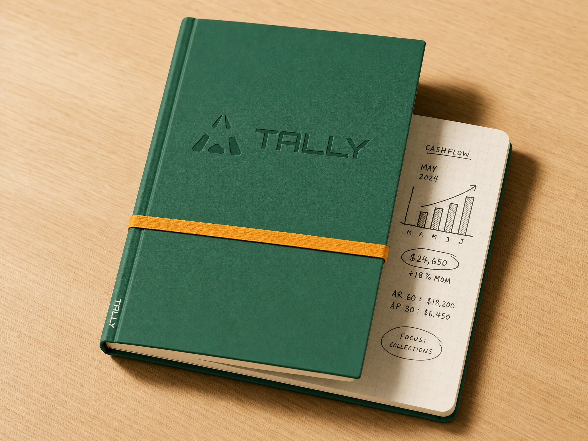
The brand journal — Tally Green hardcover, debossed logo, Yolk elastic band — is photographed open to the first page: a hand-annotated cashflow sketch for May 2024, bar chart in pencil, circled figures, "Focus: Collections" in an oval. The journal is the analog version of the app. Same information, different instrument.
What This Brand Is
Tally is for the person who sent a great piece of work last Tuesday and has been meaning to invoice for it since then. It's for the person who estimates their tax by staring at the ceiling. It's for the person who knows exactly how much they made this year and has no idea how much they're supposed to pay on it.
The brand doesn't lecture them. It doesn't simplify by hiding complexity. It makes money legible by making it feel like something a person — a specific, warm, slightly wry person — has already looked at and marked up on their behalf.
Every invoice, every overdue card, every "nice." is the brand saying: I've been here. I counted it. You're all set.
Deliverables
Brand naming and positioning — Logo design (mark + wordmark, 5 concept directions) — Color system and typography — Brand voice and tone guidelines — App UI design (5 screens) — OOH campaign (billboard, bus shelter, metro, airport jetway, motorway gantry, pavement stencil) — Print campaign (newspaper full-page) — Social campaign (Instagram Story) — Merch design (tote bags ×2, baseball cap, enamel pin set ×5, desk pad, brand journal) — Landing page specification (full GSAP/Lenis/GSAP ScrollTrigger prompt) — 25+ campaign mockups across all touchpoints
Like this project
Posted Jun 10, 2026
Tally: a fintech brand built from zero — name, logo, app UI, OOH campaign, and merch — for freelancers who'd rather be doing anything else.
Likes
0
Views
14
Timeline
Jun 2, 2026 - Jun 10, 2026
Clients
Tally

