KATACHI: The Structure Beneath
Révolté
KATACHI — The Structure Beneath
A fictional Web3 protocol brand built entirely around the idea that the most important infrastructure is the kind nobody sees. No token iconography, no gradient, no hype. Thirty-plus outputs spanning identity, print, OOH, UI, physical hardware objects, merch, and a Three.js landing page — all held to a single manufacturing standard.
THE BRIEF
The brief was self-imposed, which made it harder. No client to push back against, no timeline forcing decisions — just a question I kept returning to: what does a Web3 brand look like if you strip away everything the category depends on? No purple gradients. No upward arrows. No "next-generation" anything. The visual culture of blockchain protocols has collapsed into a single aesthetic and I wanted to build something that existed in a completely different register — something that could appear on a Tokyo Metro wall or a construction hoarding and make no immediate reference to blockchain at all.
The constraint I gave myself: treat the protocol as if it had been running for forty years and would run for forty more. Japanese industrial manufacturing culture. The visual grammar of JIS specification documents. The quiet authority of a megacorporation's internal engineering division — not its public face, its press floor.
THE APPROACH
The name came first. 形 — katachi — Japanese for "form." Specifically, the form that gives shape to something formless. That felt exactly right for a layer-zero infrastructure protocol. You never interact with KATACHI directly. You depend on it.
My first instinct was dark-dominant — black ground, white type, the obvious industrial reference. I killed it after two sessions. It would have looked like every serious crypto project ever made. The inversion was the unlock: make warm off-white the dominant surface.
#F2F0EB — the color of aged technical paper, anodized polymer casing, titanium in diffuse light. Let it be the material, not the background. Put the darkness only where it carries structural load.The blueprint emerged two-thirds through the process. Working on the technical manual, I noticed the fine tolerance grid on its back cover was doing more visual work than anything I'd deliberately designed. That grid —
#8C8C8C lines at 0.25pt, registration crosses, dimension annotations, JIS specification document language — became the primary graphic element of the entire campaign system. Not decorative. Structural. It communicates that the protocol was engineered, not marketed.The one rule I held without exception across every single execution:
#C8391A warning red appears once per composition, always as a functional mark. A grade stamp. A sealed-case dot. A critical dashboard indicator. Never decorative, never at low opacity, never used twice in the same scene.THE WORK
BRAND IDENTITY
The wordmark is KATACHI in Barlow Condensed ExtraBold, all-caps, 0.02em tracking — mechanically spaced, zero optical correction. The 形 kanji sits at matching cap height as a co-mark, functioning as an authentication stamp rather than a translation. In the stationery system the pairing reads as a corporate letterhead from a company with forty years of history. On the construction hoarding it reads as a mark that continues beyond the frame of the wall. The identity holds at every scale because it was built as a stamp, not a logo.
TYPOGRAPHY SYSTEM
Two typefaces, one role each, no overlap. Barlow Condensed ExtraBold handles all display — headlines, the wordmark, OOH type, poster typesetting. IBM Plex Mono handles everything else: data labels, annotations, UI copy, addresses, activation instructions, dashboard readouts, wayfinding data strips. The monospace is the human voice of the system — it appears wherever precision matters more than expression.
COLOR SYSTEM
Four values only.
#F2F0EB is the material — 70–80% of every composition. #1A1A1A is the stamped mark. #8C8C8C is the ghost layer — all secondary information, annotation, ghost rules. #C8391A is the warning: functional, singular, irreplaceable.PRINT COLLATERAL
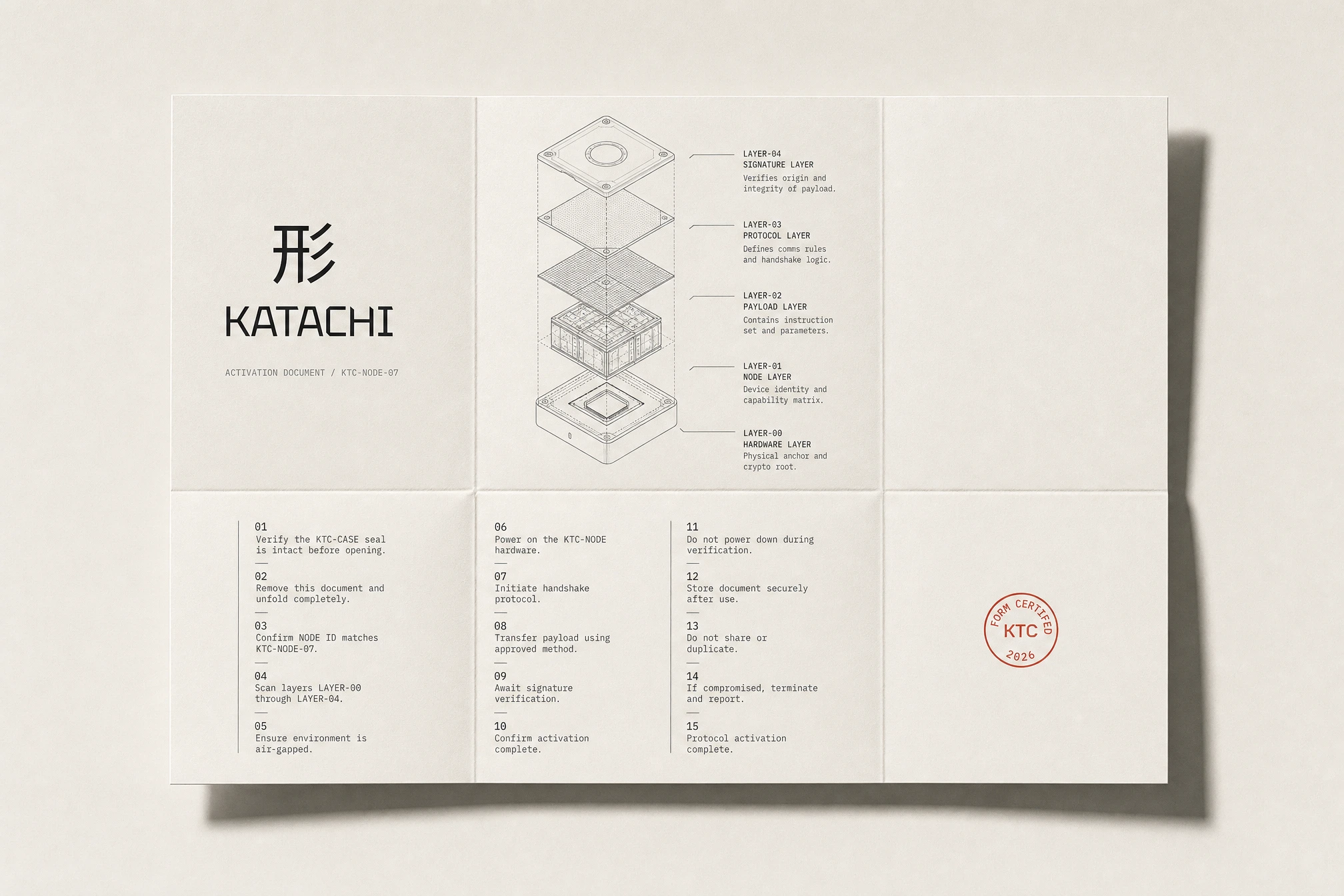
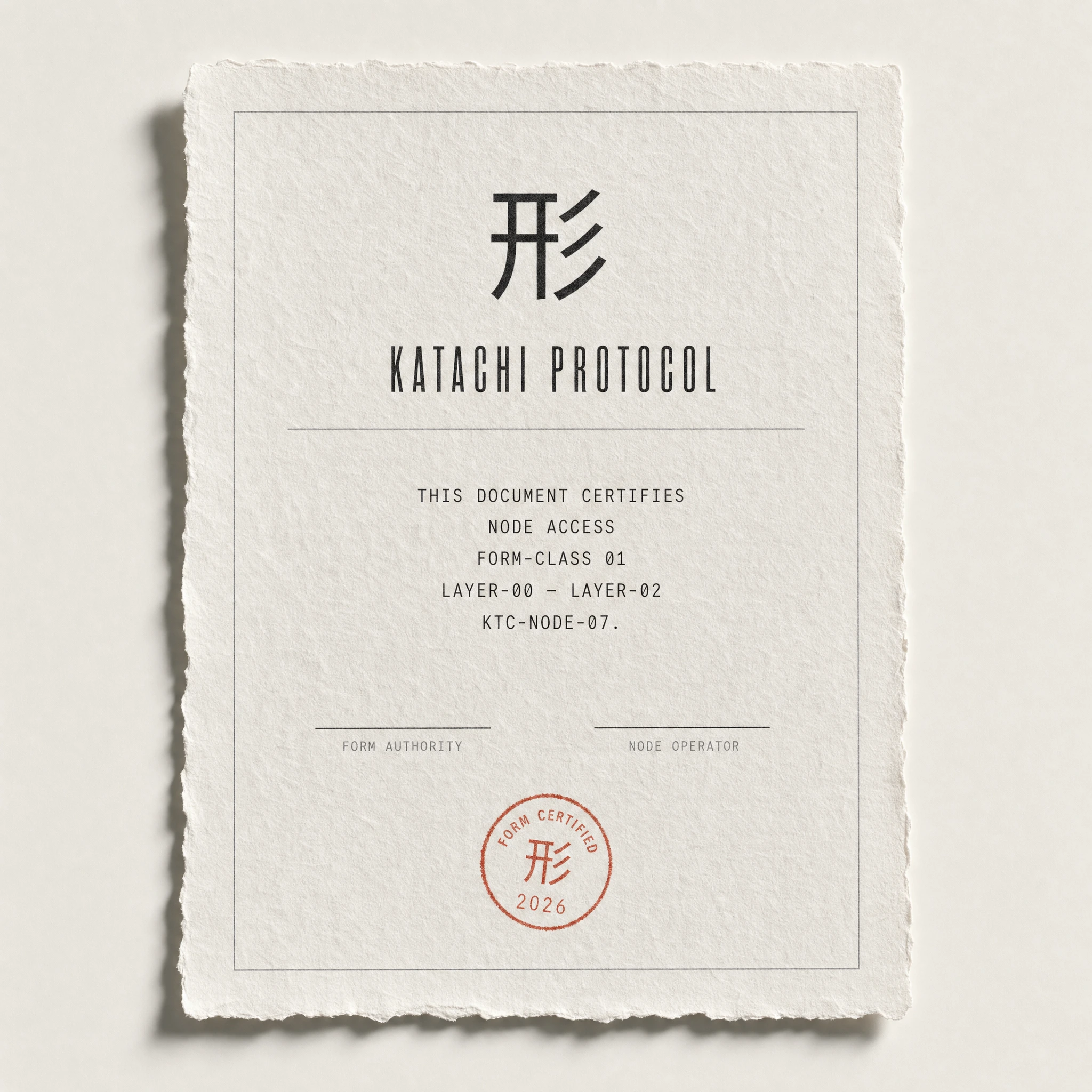
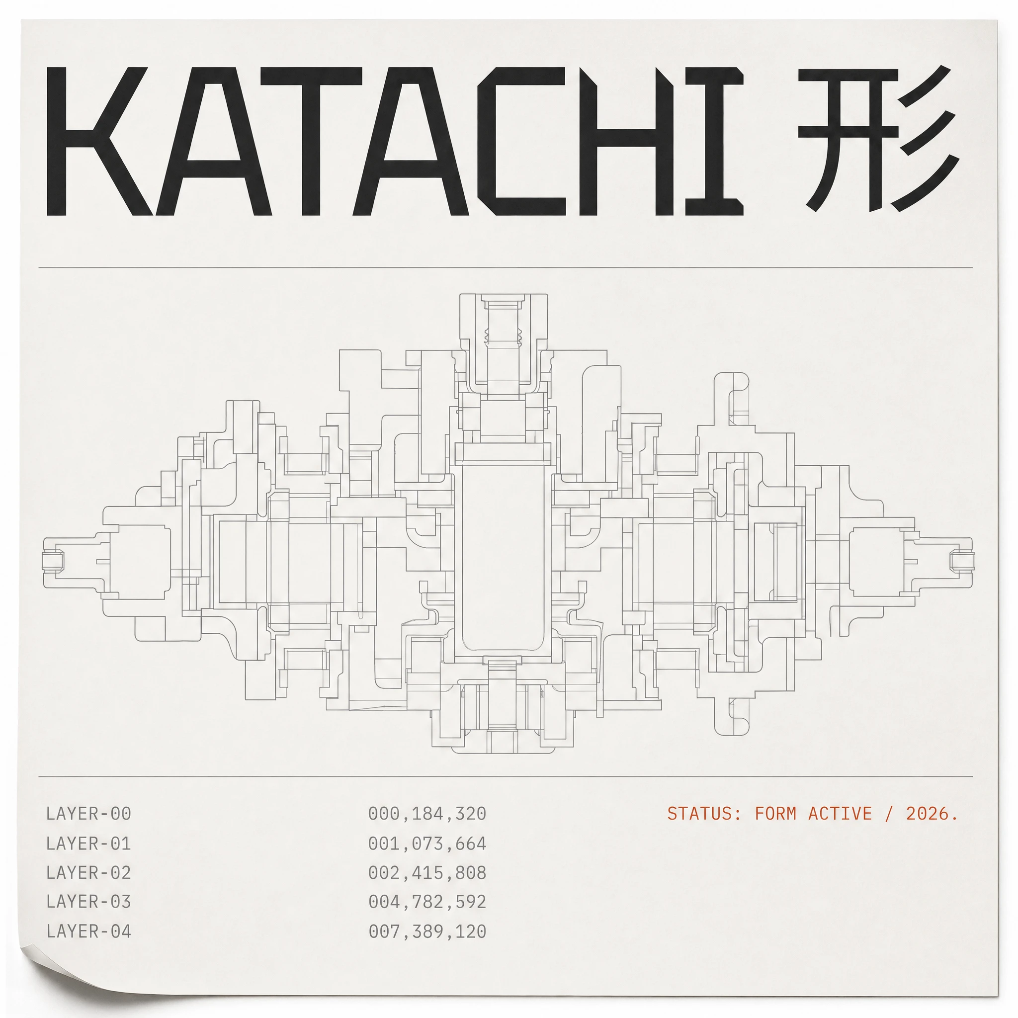
The stationery system — letterhead, business card, DL envelope — establishes the brand at desk scale. The card carries the wordmark alone on the front face, a red grade stamp on the lower right, and nothing else. The technical field manual is the most resolved print object in the system: section-cut diagram on uncoated cover stock, 形 FORM CERTIFIED stamp pressed over the diagram in
#C8391A, interior spread opening to a full dark page with a single line of warm white monospaced type centered vertically — "ALL STRUCTURES ARE PROTOCOL." The activation document folds to DL for insertion into the hardware case, carrying the protocol layer stack exploded diagram across the interior and closing with only the grade stamp on the back face. The hardcover specification book goes furthest: cloth-bound linen, KATACHI and 形 debossed with no ink, catching shadow only. The only color: a single #C8391A bookmark ribbon.HARDWARE & PHYSICAL OBJECTS
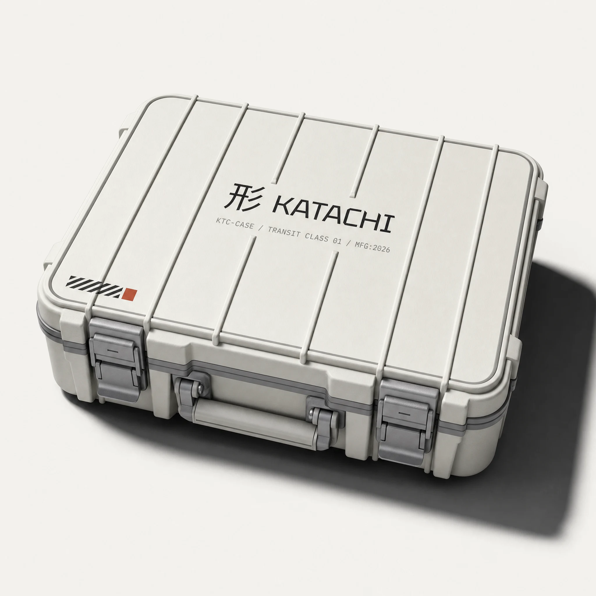
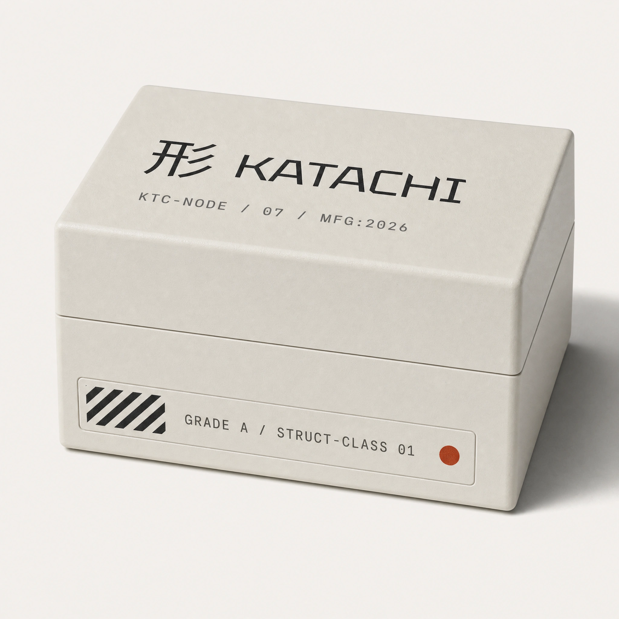
The hardware enclosure box — matte cold-rolled polymer, panel seam at one-third height, diagonal hazard hatching on the front face, grade label, red status dot — reads as something you'd find in a network equipment cabinet, not a product box. The transit case takes the same language to field-deployment scale: structural ribbing across the top face, matte aluminium latches, the 形 KATACHI wordmark centered, serial code in IBM Plex Mono, diagonal hatch in the lower-left corner, one red sealed-status square at its edge.
UI
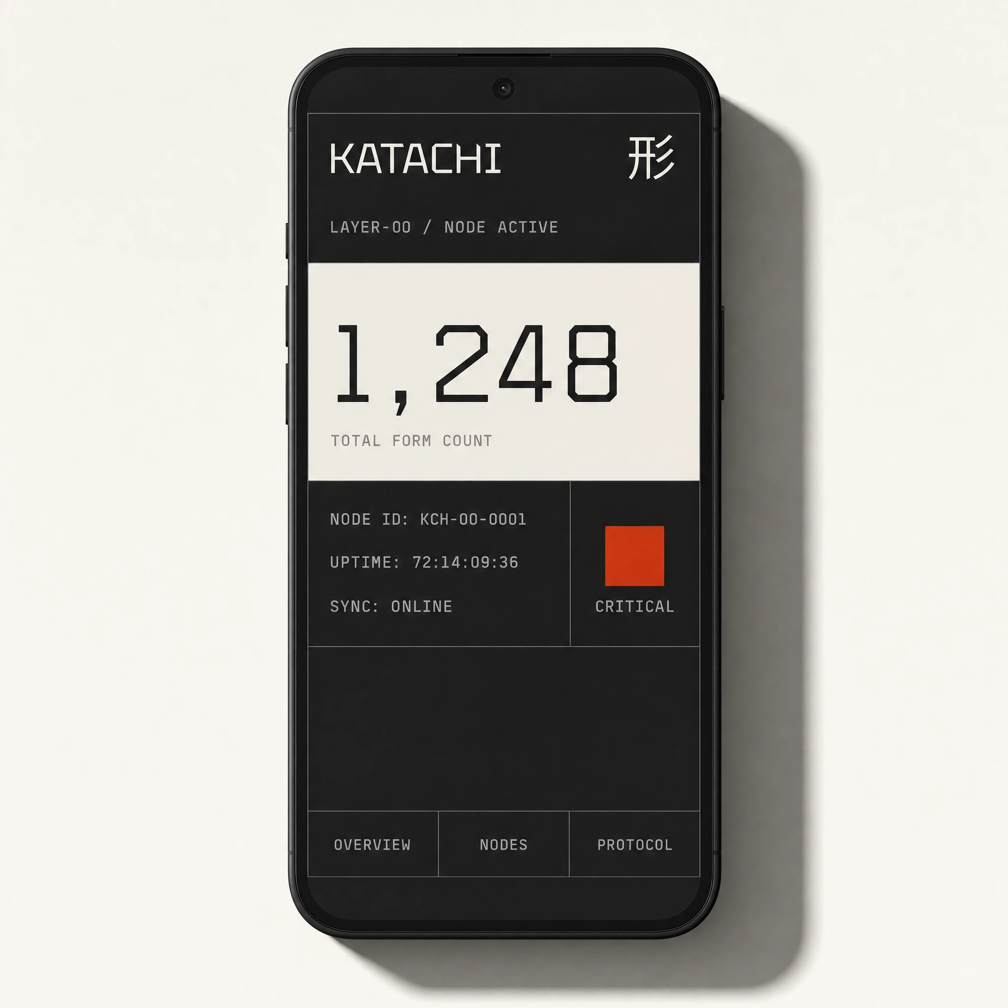
The protocol node status app on mobile maps directly to the brand palette:
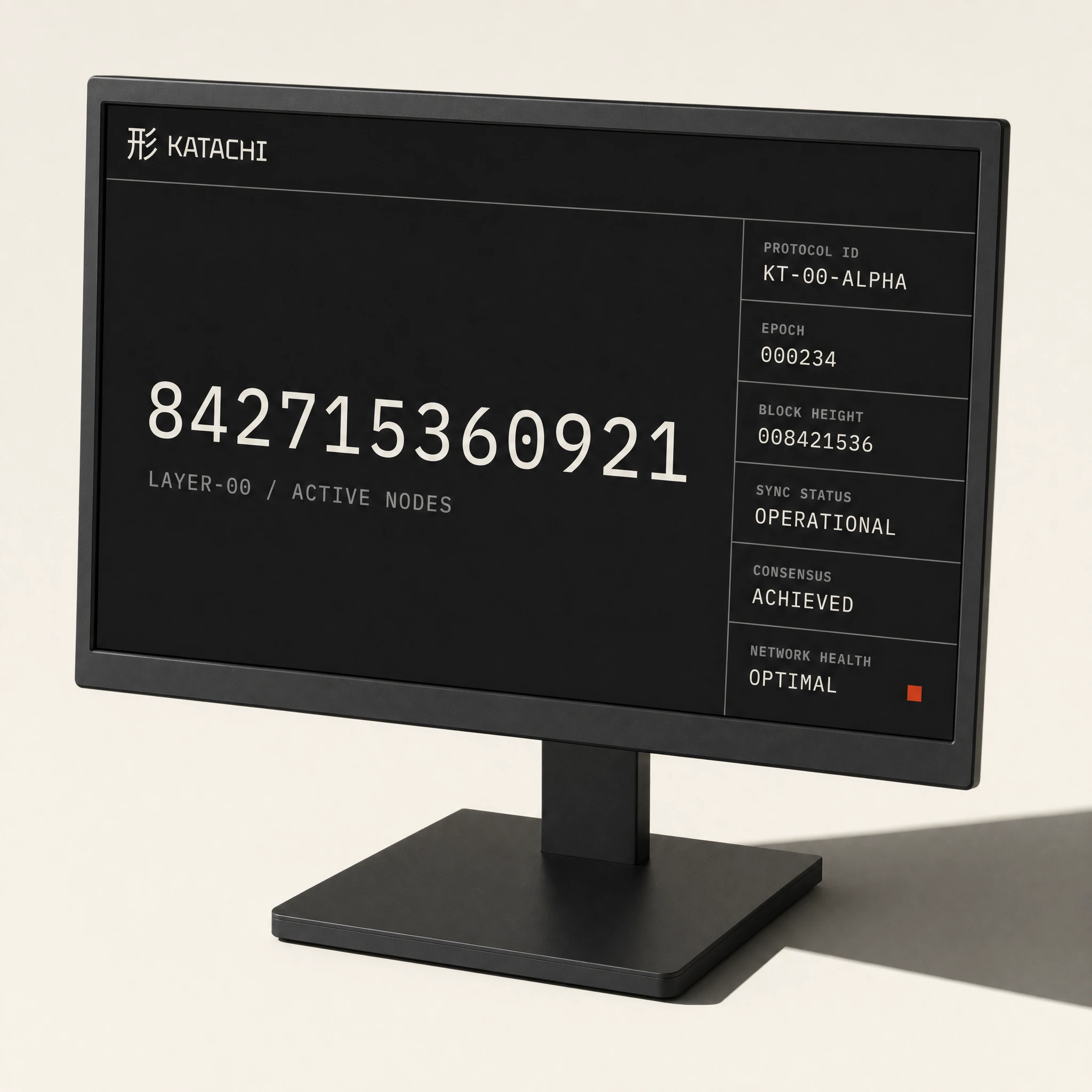
#1A1A1A top panel with the wordmark and kanji, a warm white #F2F0EB card for the primary metric — 1,248, TOTAL FORM COUNT — IBM Plex Mono tabular throughout, and one red filled square labeled CRITICAL. No rounded corners anywhere. Every panel edge is 90 degrees. The desktop operations dashboard extends the same logic to a 65-inch wall-mounted panel: a 12-digit active node count at display scale on the left, six protocol metrics in a 3×2 grid on the right, a 24-hour epoch timeline at the bottom with a single #C8391A vertical rule marking current time. The UI reads as a JIS-compliant industrial monitoring terminal, not a SaaS dashboard.OOH CAMPAIGN
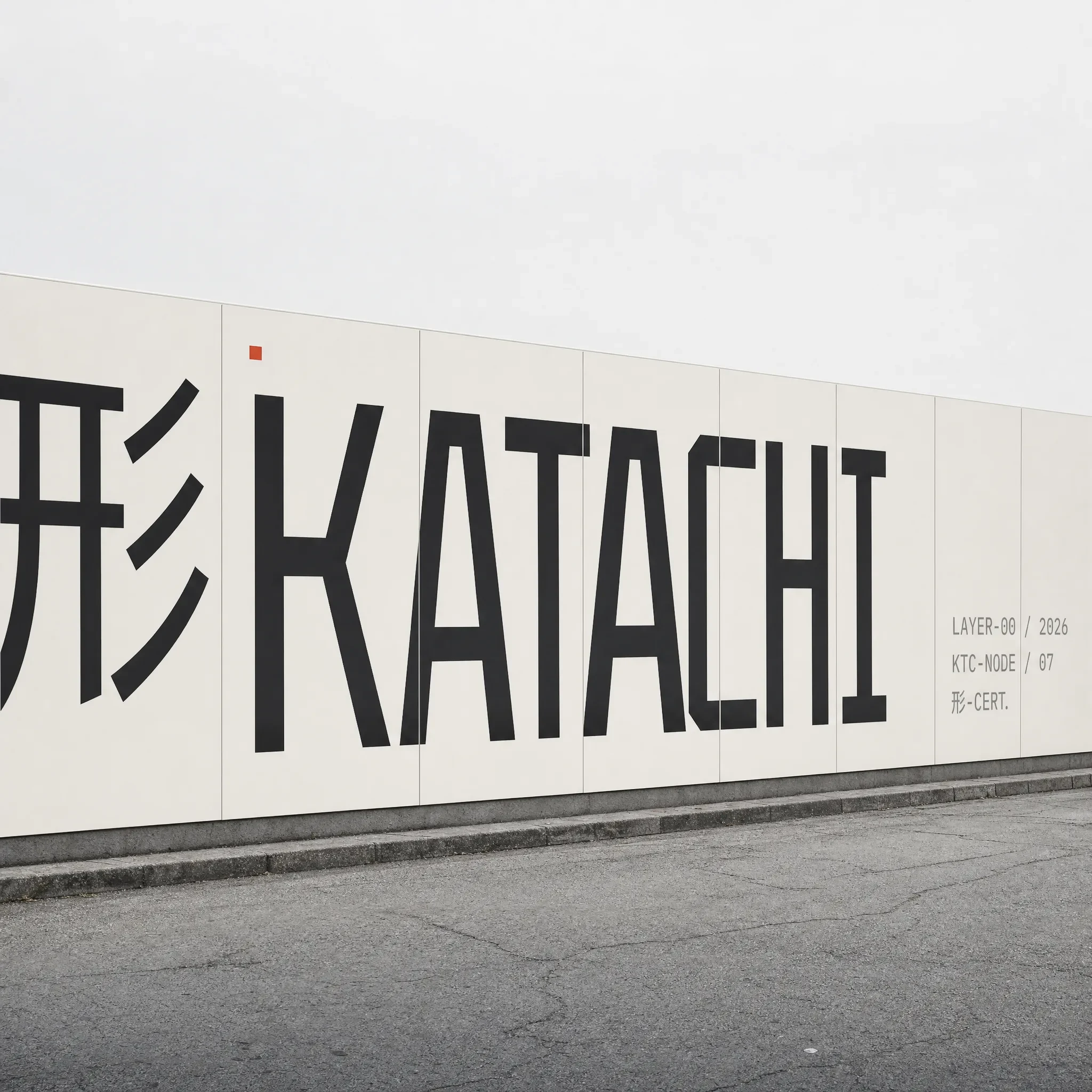
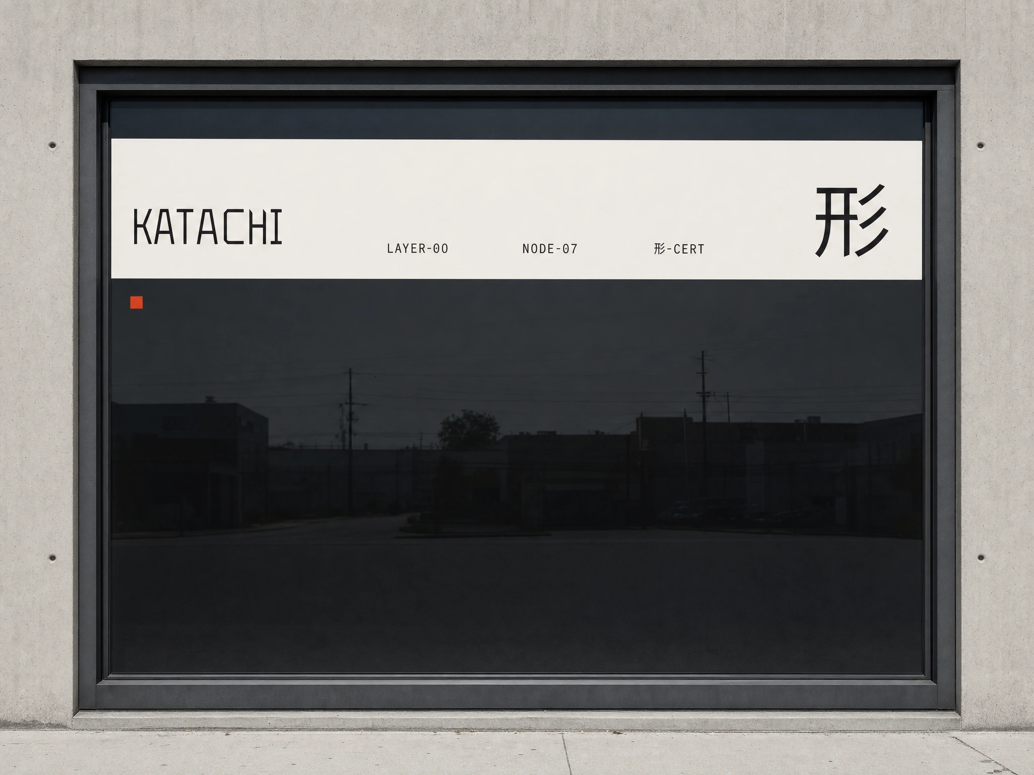
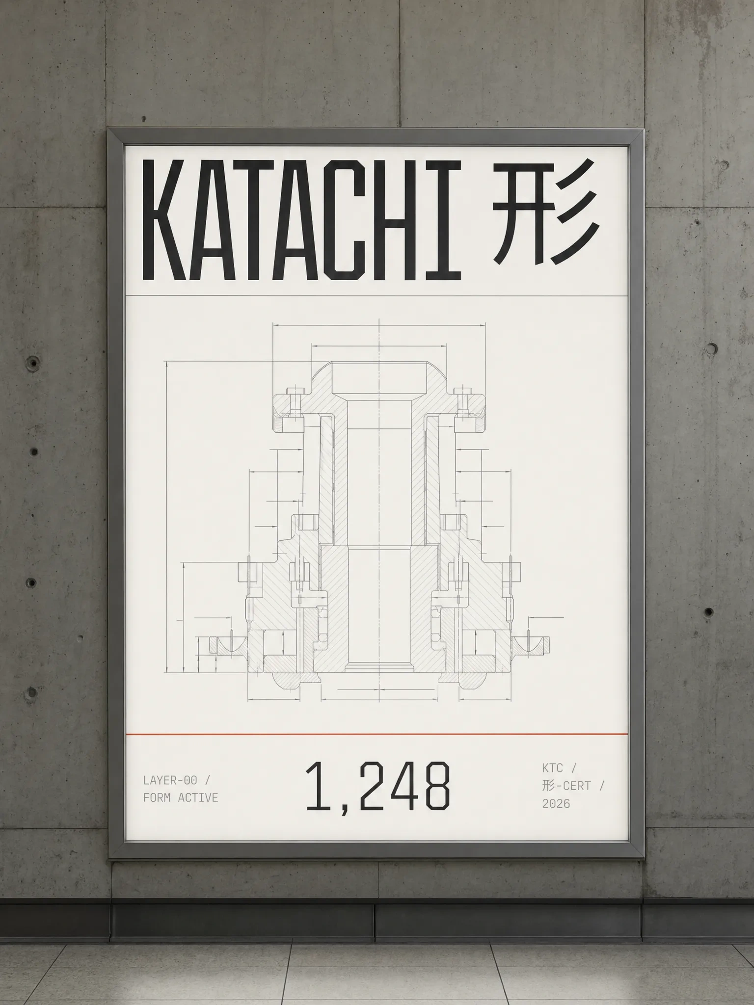
The Tokyo Metro B1 lightbox installs flush in raw concrete tunnel wall, the section-cut diagram occupying the middle 55% of the panel under cold fluorescent backlight, the wordmark and kanji at display scale across the top zone, a red horizontal rule marking the boundary above the data strip — "1,248" in monospaced tabular figures at 48pt centered in the bottom zone. The freeway billboard flips to dark: 形 KATACHI in
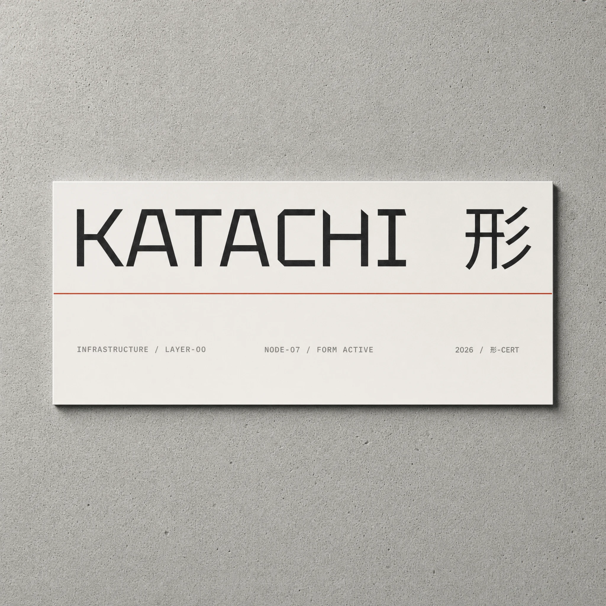
#F2F0EB at maximum scale for the face, data stack right-aligned in #8C8C8C, one 20mm red square at the lower-right corner. Under an overpass, against grey concrete and empty sky, it reads as infrastructure that forgot to be advertising. The window vinyl pulls back to restraint — a single horizontal #F2F0EB band across a dark glass facade, wordmark flush left, kanji flush right at larger scale, three columns of data between them, and one isolated red square adhered directly to the glass below the band. The wayfinding panel on concrete wall is the quietest execution: KATACHI 形 at display scale, one #C8391A horizontal rule dividing wordmark from data strip, three columns of IBM Plex Mono metadata. Everything it needs to say. Nothing else.MERCH
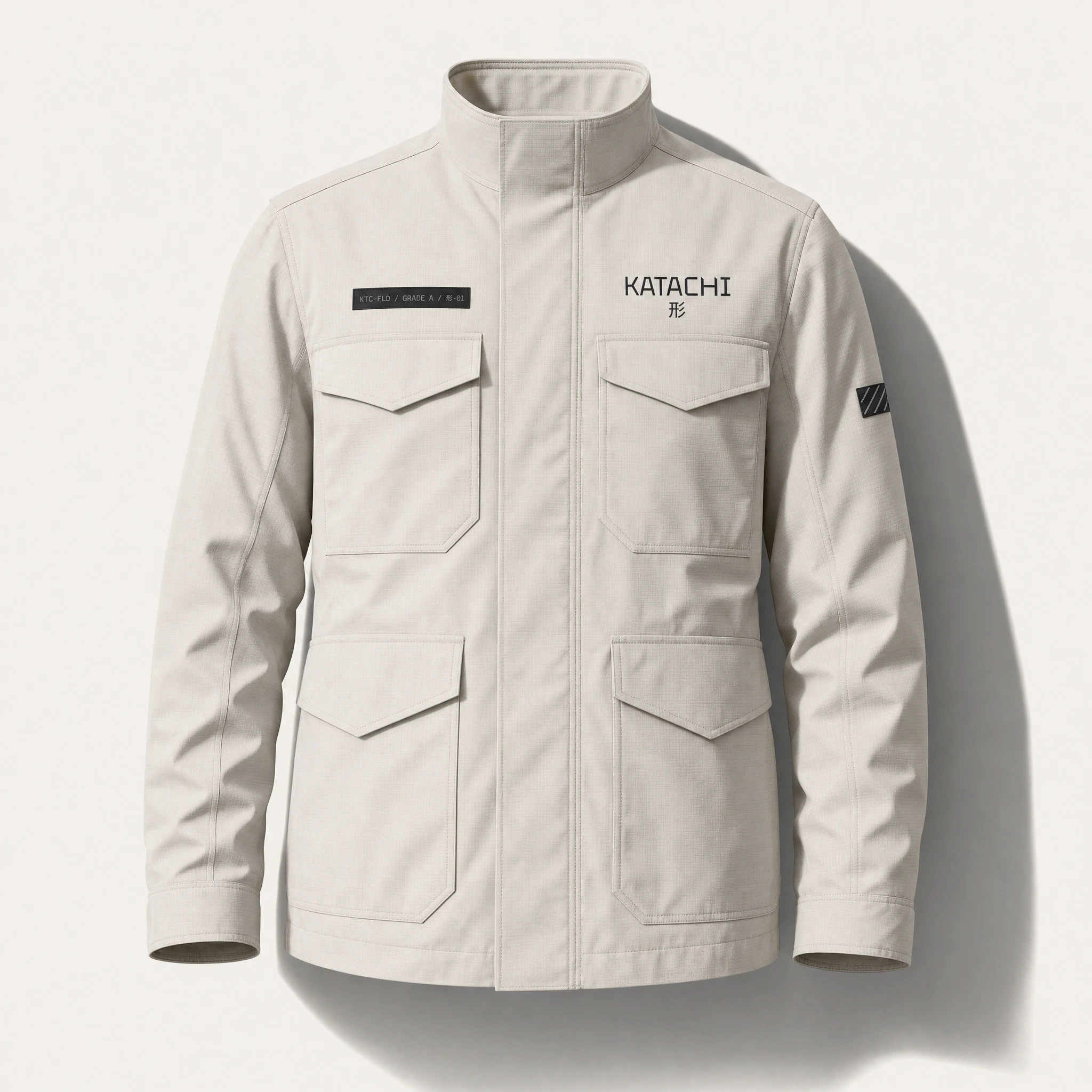
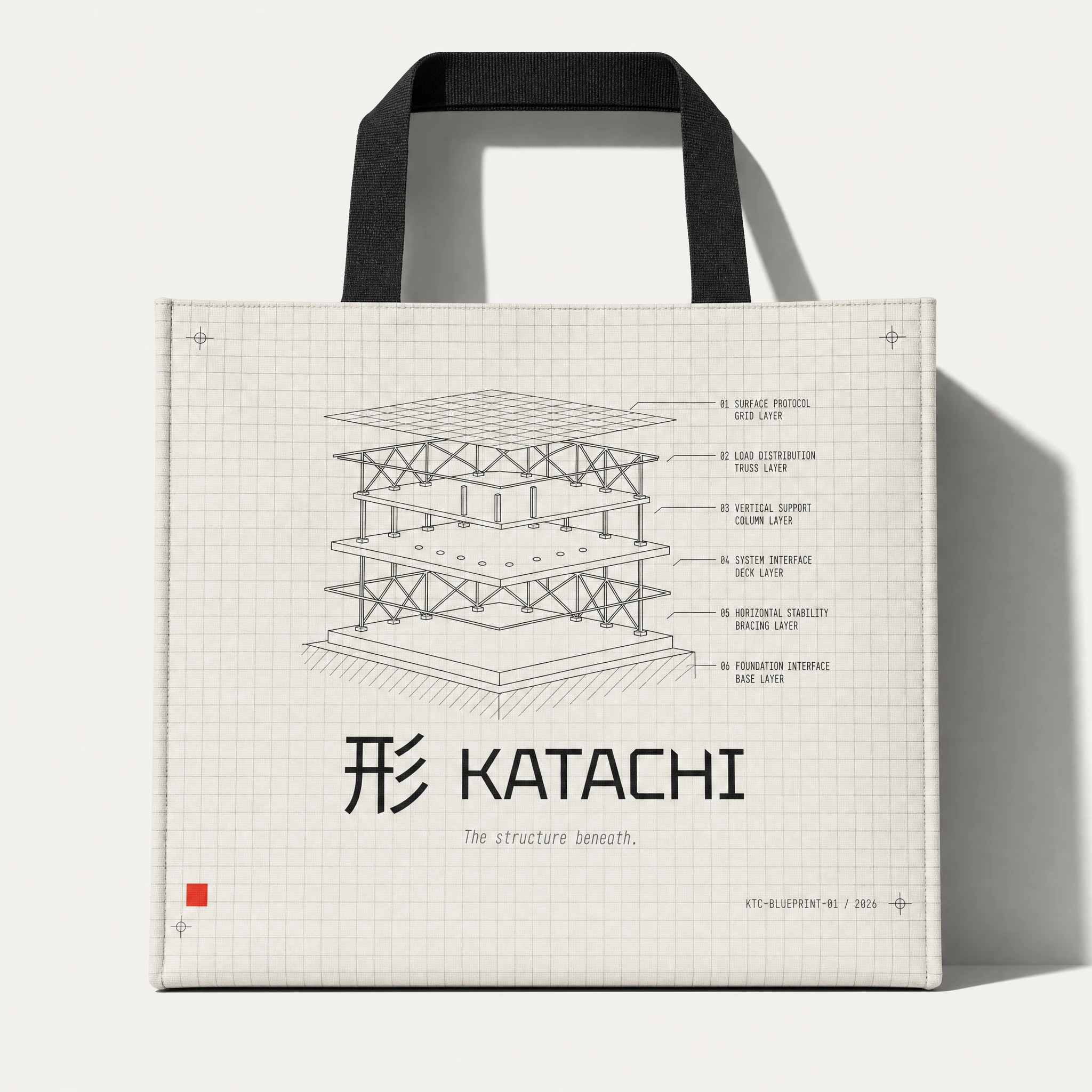
The field jacket, transit case, and blueprint tote form a complete kit in the same
#F2F0EB ripstop material family — same label system, same hazard patch logic, same red status square at a consistent position on every object. The jacket reads as issued equipment. The poster reads as a technical specification sheet at A1 scale. The baseball cap is the only place italic type appears in the entire identity: "The structure beneath." embroidered in #8C8C8C beneath the 形, 9mm cap height — the only italic in the system, reserved for this phrase, in this position, at this scale.WEBSITE
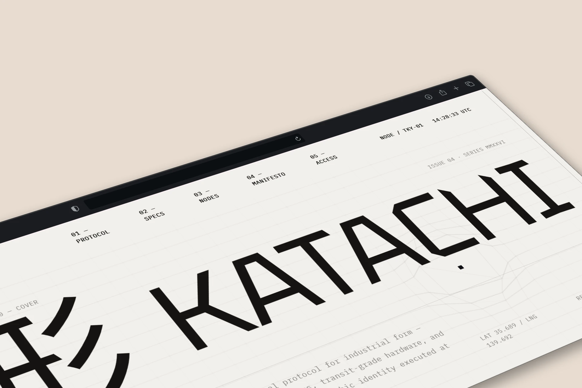
The landing page uses a Three.js vertex shader to deform a PlaneGeometry of 80×50 segments rendered as LineSegments — a wireframe tolerance grid that folds like cold-rolled sheet metal being pressed by an industrial die as the user scrolls. Three fold lines sequence across the surface, each driven by a separate ScrollTrigger sub-range with 2.4 scrub. The camera is orthographic and fixed at all times. The KATACHI wordmark reveals via stroke-dashoffset draw on each letter path, 形 snapping in 0.06s after completion like a physical stamp pressed onto paper. No CSS workarounds. No particles. No glow. No rotation.
THE RESULT
KATACHI is speculative. It has no client, no launch date, no token. What it has is a complete system — identity, print, hardware objects, OOH, UI, merch, and a working website — all held to one standard: everything in this world was manufactured, not designed.
The work holds because the constraint was structural. Warm white dominant. Red once per scene. Monospace for data. Blueprint grid as campaign ground. Italic only on the tagline. These aren't style preferences — they are rules that produce consistent outputs across unpredictable situations. The wayfinding panel and the transit case and the freeway billboard are each completely different objects. They are unmistakably the same brand.
Révolté — revolte.design
Project: KATACHI
Year: 2026
Scope: Brand Identity, Visual System, Print Collateral, OOH Campaign, UI Design, Hardware Objects, Merch, Web Design & Development
Industry: Web3 / Decentralized Infrastructure
See more at revolte.design
Like this project
Posted Jun 9, 2026
Full-system Web3 protocol brand,Japanese industrial precision, blueprint grids, grade stamps, sheet metal physics. Zero gradients. Thirty outputs, one rule set
Likes
3
Views
13
Timeline
May 23, 2026 - Jun 9, 2026

