Built with Lovart
Isobar Brand Identity and Campaign Design
Révolté
ISOBAR — Invisible Force Made Legible
A SaaS brand for people who live inside the gap between data and the decision that depends on it. The brief was simple and impossible: make financial infrastructure feel like the air pressure before a storm — something you don't see until it's already changed everything.
THE BRIEF
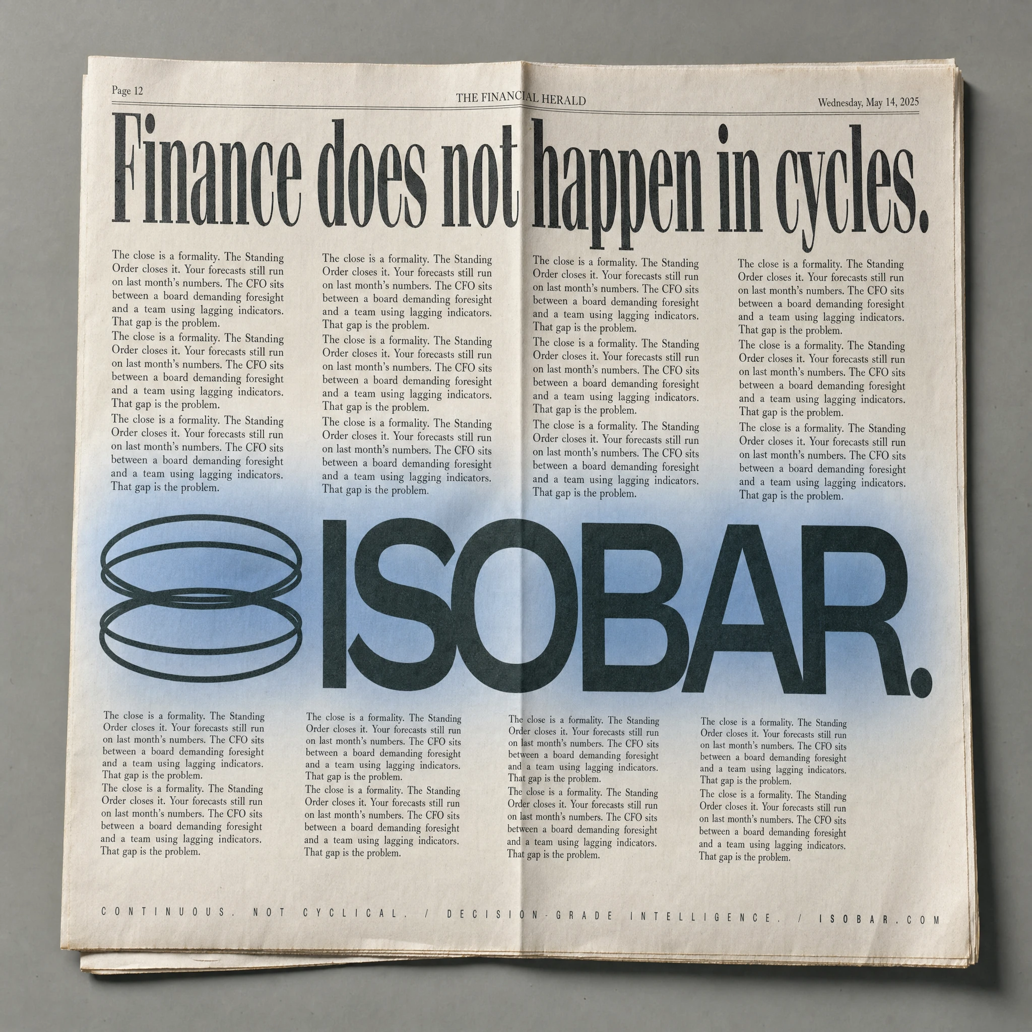
The starting point wasn't a client deck. It was a sentence: "Finance does not happen in cycles." That one line contained everything — the product's argument, the target's frustration, and the visual tension I wanted to build the brand around. Isobar is a continuous financial intelligence platform built for CFOs and finance teams who can't afford to wait for month-end to know where they stand. The product runs underneath a business the way atmospheric pressure runs underneath weather — shaping outcomes before anyone names the cause.
The tension I was working with: most financial software brands either look like enterprise legacy systems (dark navy, icon-heavy, dashboard maximalism) or try to humanize themselves with rounded corners and friendly gradients. Neither was right. Isobar needed to feel like the room where decisions actually happen — composed, demanding, institutional without being cold.
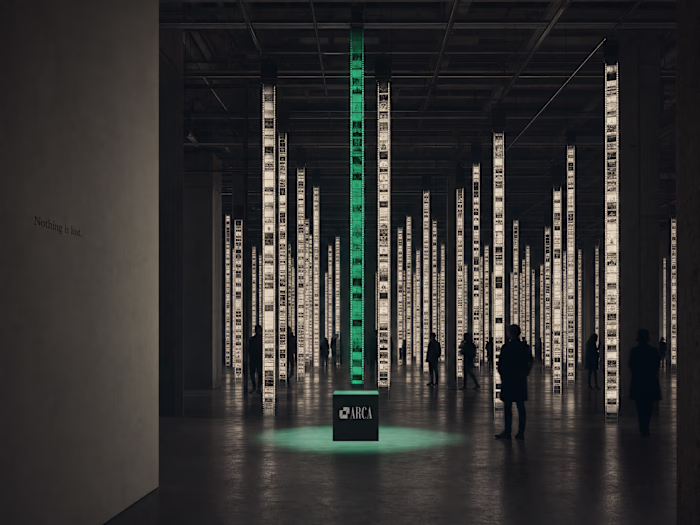
The scope covered the full brand identity and a campaign system: visual language, typography system, color logic, campaign copy, OOH executions, editorial formats, environmental applications, and a web hero.
THE APPROACH
I started with the meteorological concept not as decoration but as structural logic. Isobar lines on a weather map connect points of equal atmospheric pressure — they're invisible forces made visible by measurement. That's exactly what the product does. It takes the invisible pressure of financial reality and makes it legible in real time.
The first instinct was to lean hard into the weather system aesthetic: contour lines, synoptic chart grids, isobar patterns as graphic elements. I rejected it fast. It was too literal, too illustrative. The brand needed to communicate pressure — not depict it.
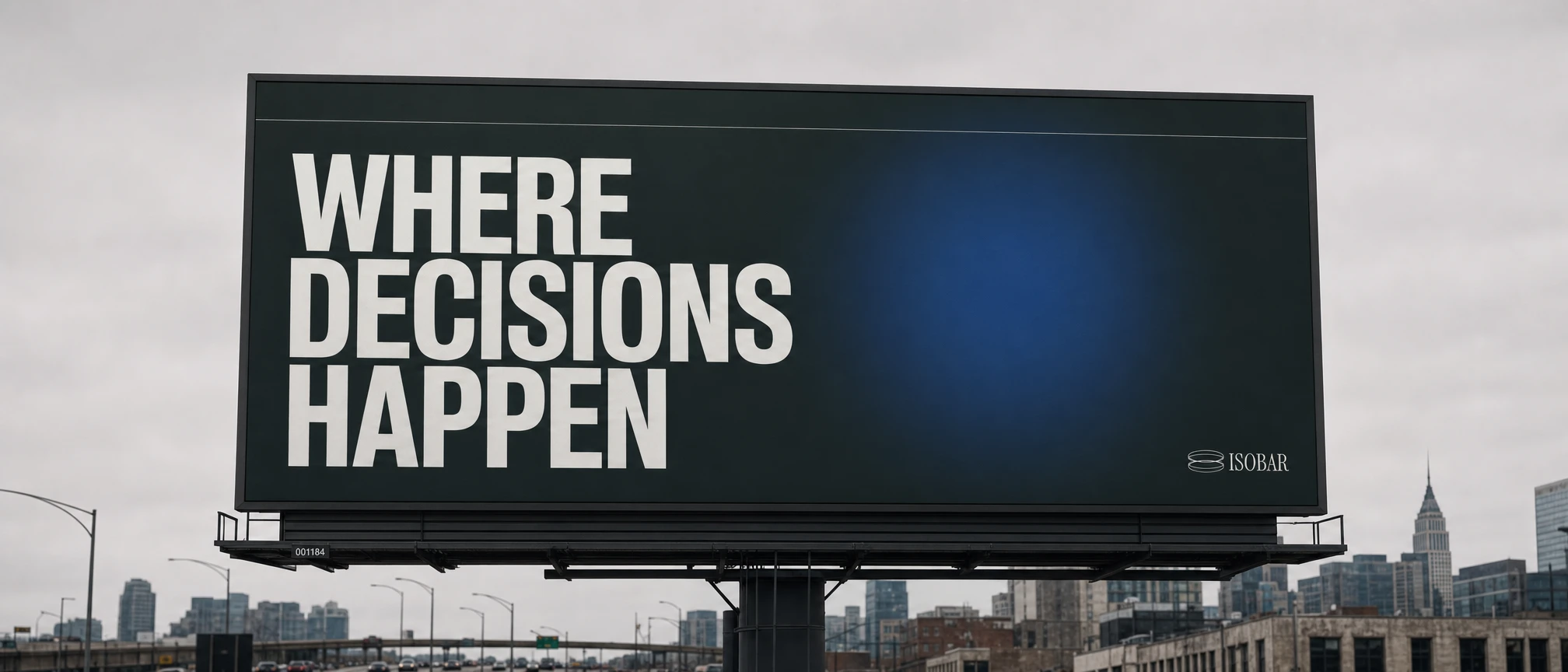
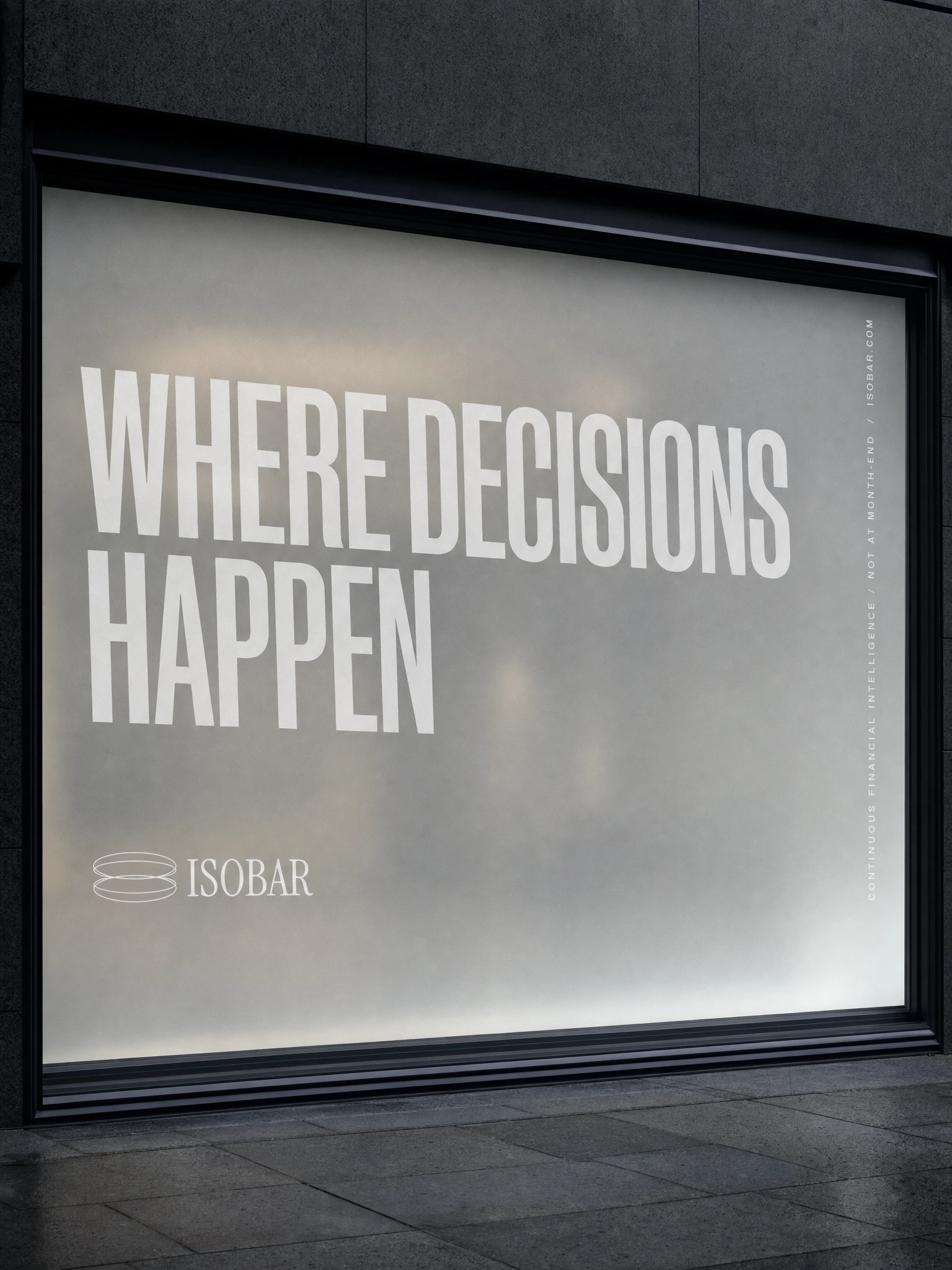
What unlocked the direction was a simpler rule: one atmospheric element per composition, maximum. A single large gaussian glow. A single enormous piece of type. A single micro-label column against vast negative space. Nothing competes. Everything is load-bearing. The visual system runs on that restraint.
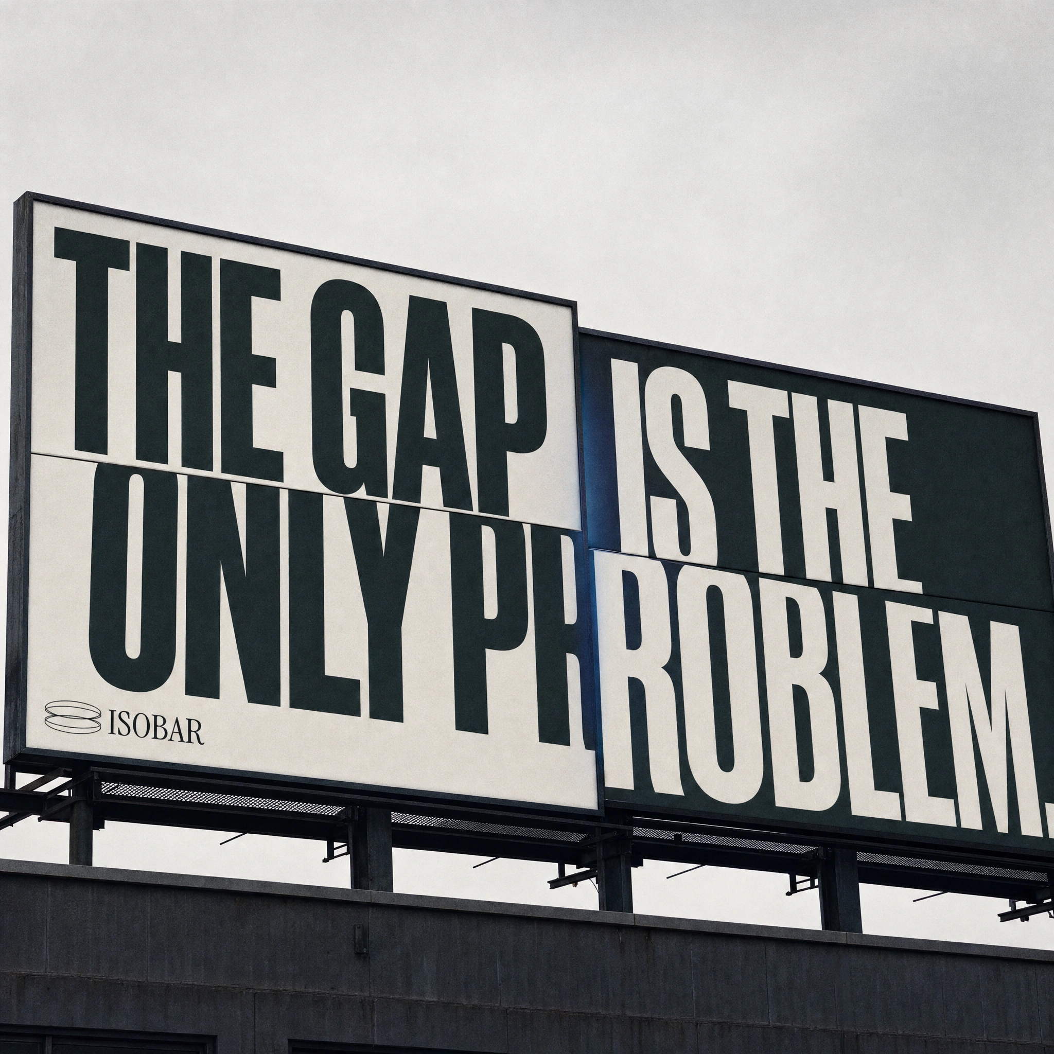
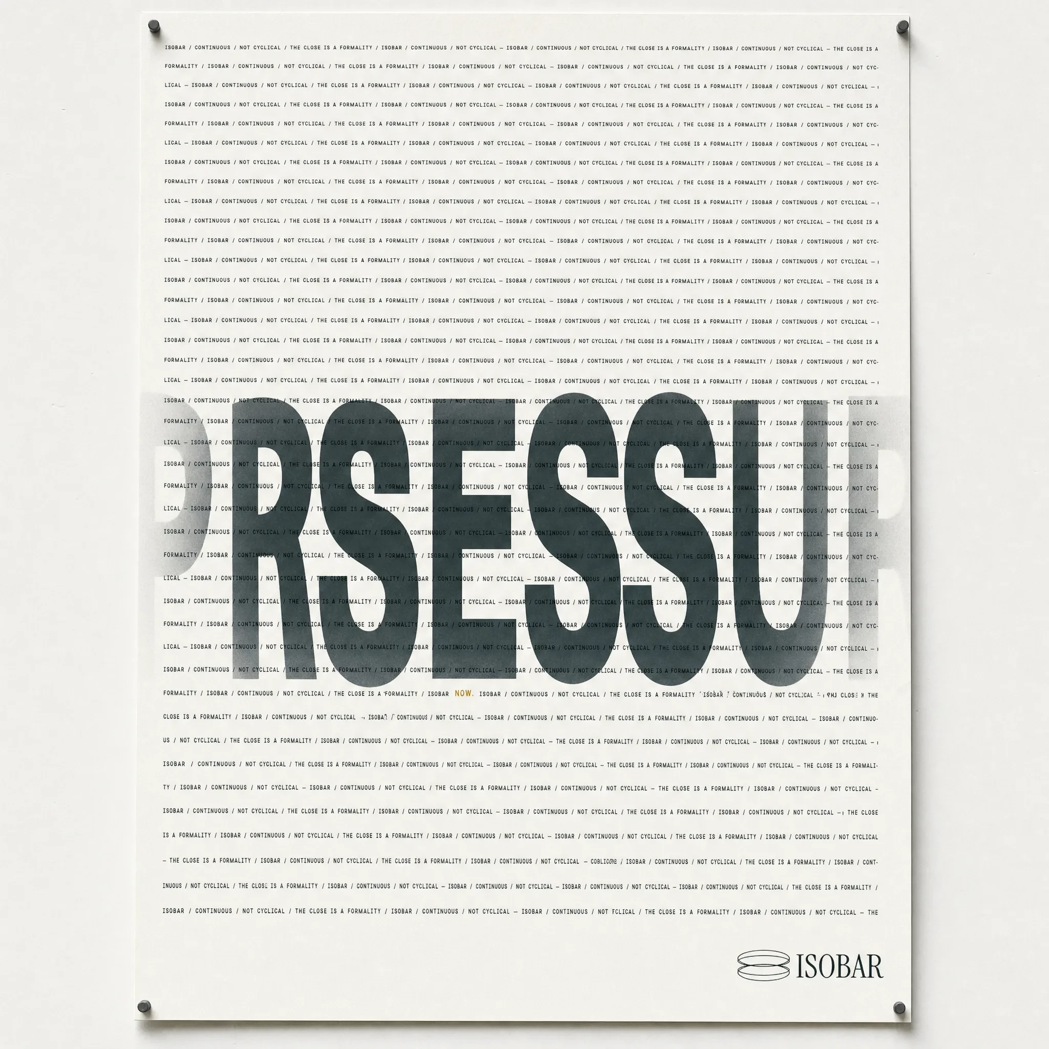
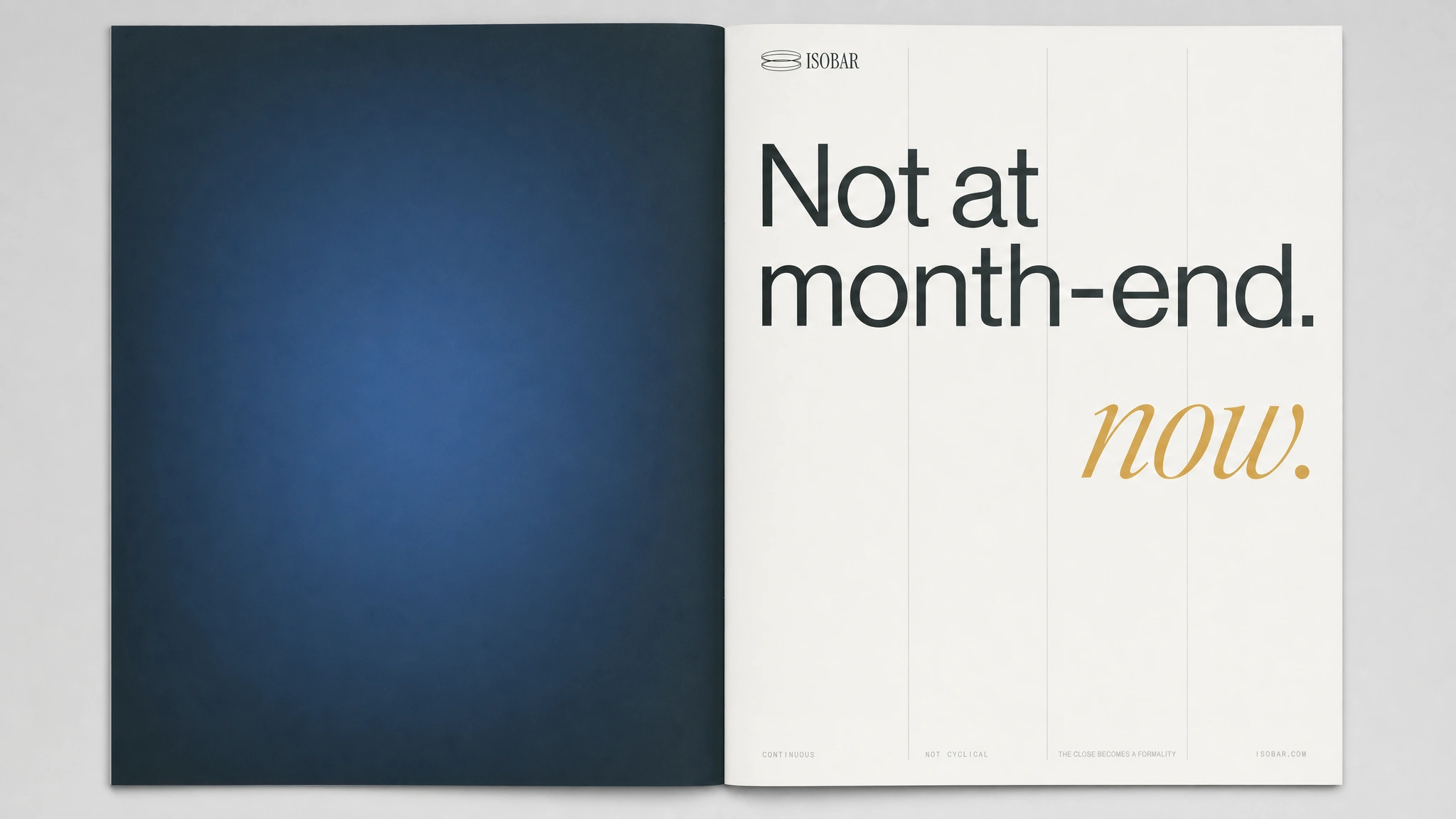
The campaign copy came from the same logic. Short declarative sentences that state the gap without explaining it. "The gap is the only problem." "Not at month-end." "Continuous. Not cyclical." The brand doesn't argue its case — it states conditions. That's how pressure works. It doesn't ask permission.
THE WORK
VISUAL IDENTITY SYSTEM
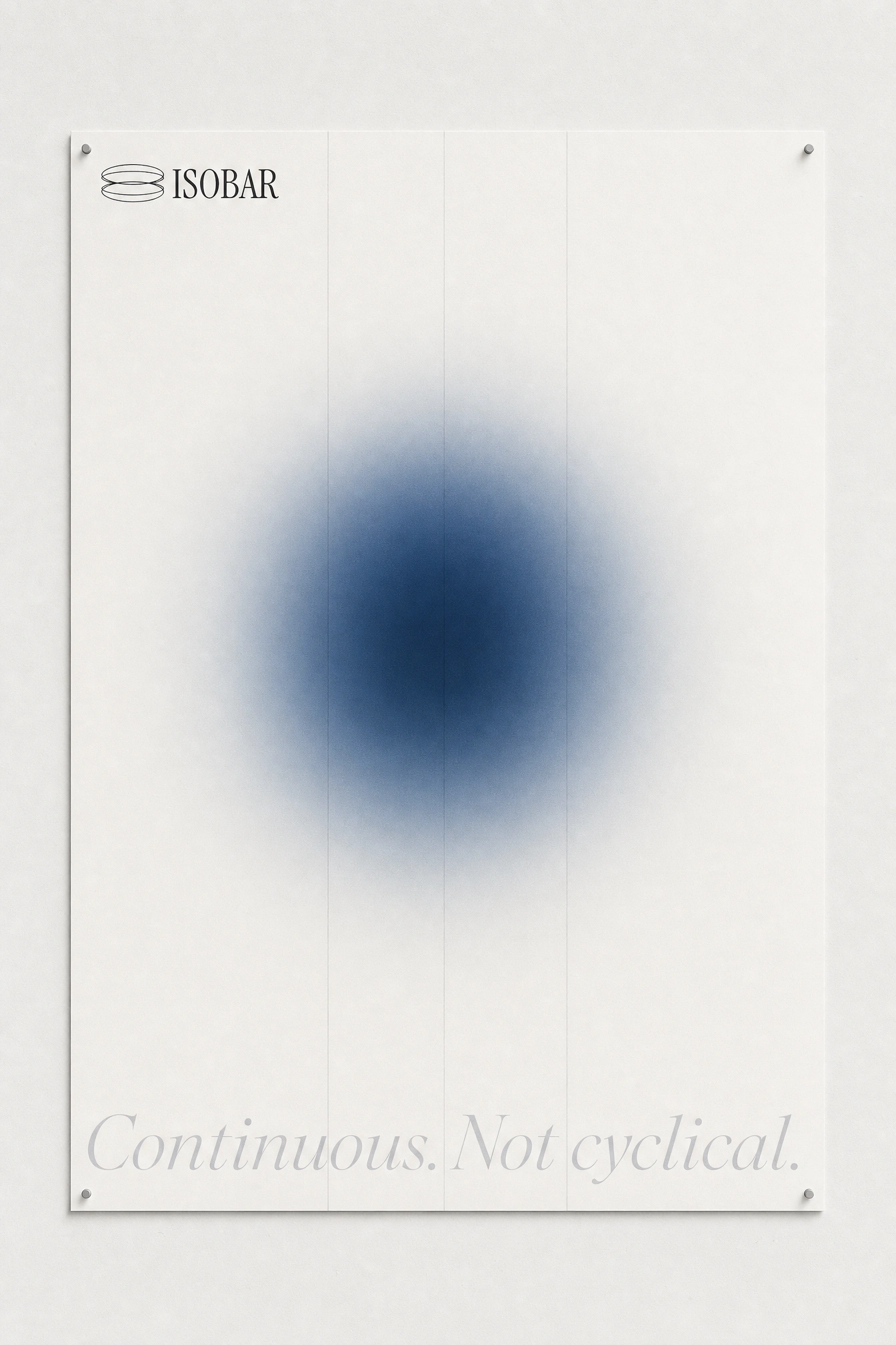
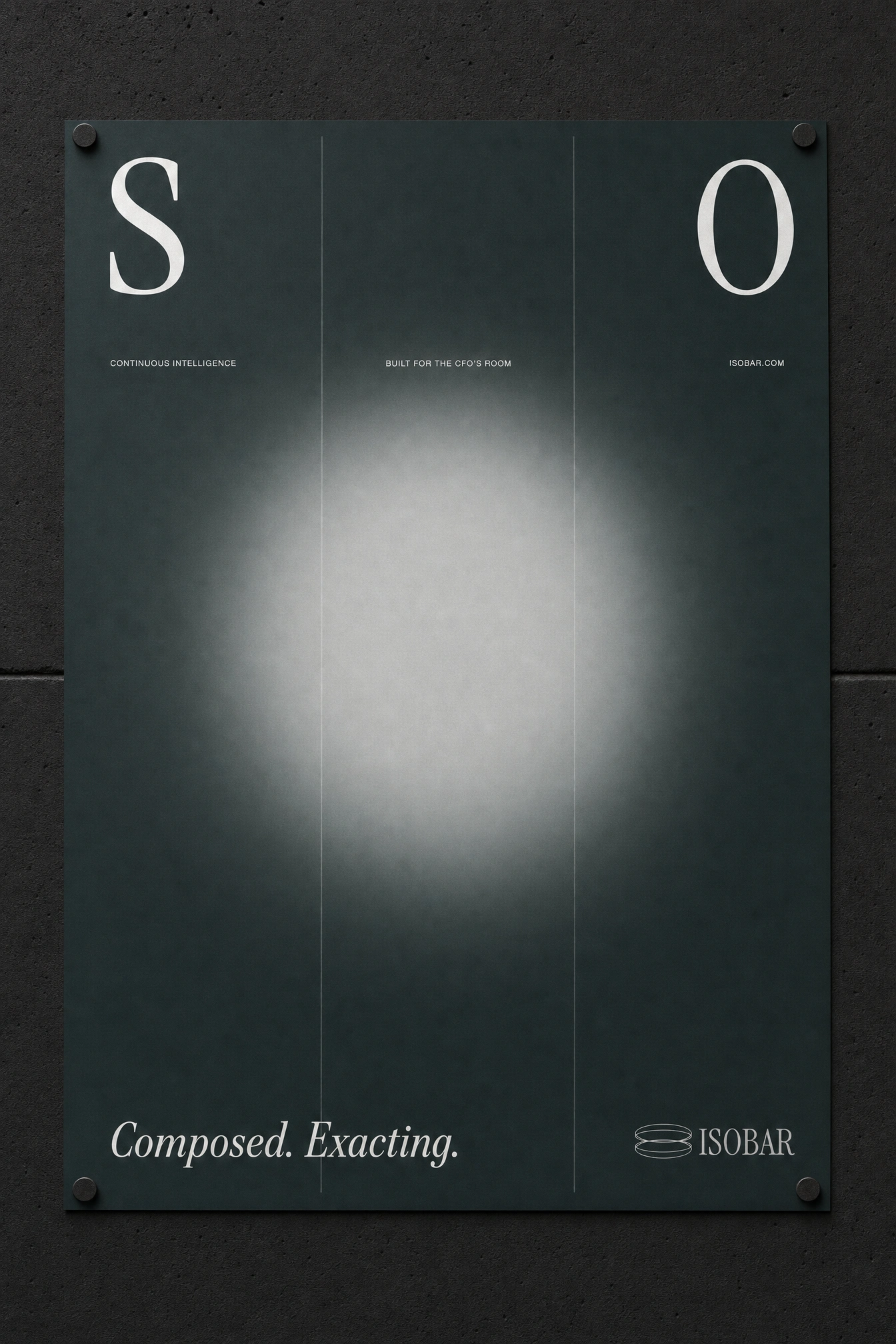
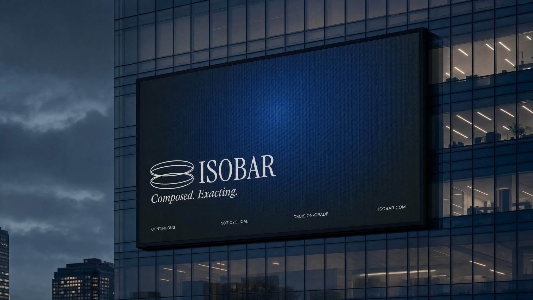
The system runs on three registers: display type at enormous scale, micro-label copy at 7–9pt with +120 tracking, and a single atmospheric element — the gaussian glow in Pressure Blue
#1D3557. Nothing lives in between. The gap between the display type and the micro-copy is the design. Column rules in Atmosphere Grey #D6D8DA at 0.5pt run the full height of every composition — the grid is always visible, never hidden.TYPOGRAPHY SYSTEM
Neue Haas Grotesk Display Extended carries all headline and campaign work — never condensed, never rushed, always mixed case at maximum width. An italic serif accent (used once per composition, maximum) provides the only expressive moment in the system: "now." in Thermal Amber
#D4A843 on the magazine spread; "Composed. Exacting." on the dark field posters. The contrast between the extended grotesque and the italic serif is the brand's typographic argument — structure and atmosphere in the same frame.COLOR SYSTEM
Five values, strict hierarchy. Pressure White
#F4F4F0 as the ground for all light-field work. Deep Slate #1D2B2A as the near-black that reads atmospheric rather than stark. Atmosphere Grey #D6D8DA for rules, secondary type, and glow mid-tones. Pressure Blue #1D3557 reserved for the single atmospheric element per composition. Thermal Amber #D4A843 used once — for the word that means something is live.CAMPAIGN SYSTEM
The OOH system was built around one compositional rule per execution, pushed to its structural limit. The sheared split billboard — "THE GAP IS THE ONLY PROBLEM." fracturing across two misaligned panels — is the campaign's most direct piece: the copy and the format are the same idea. The newspaper takeover disguises itself as editorial until "ISOBAR." slams across all four columns at 120pt. The brutalist building projection lets the concrete surface bleed through the letterforms — the architecture and the type become one surface. The conference room vinyl runs "CONTINUOUS." floor-to-ceiling, rotated 90 degrees, the word itself becoming an architectural element. Every execution applies one formal idea at its maximum pressure.
THE RESULT
Isobar is a speculative brand built to answer a real question: what does institutional financial software look like when it refuses to make itself approachable? The answer isn't cold — it's exacting. The visual system is complete enough to deploy across every surface a B2B SaaS brand touches, and disciplined enough that every application immediately reads as the same thing. That's the test I run on every speculative project: can I place any single asset in any context and have it hold? Every piece in this system passes.
Révolté — revolte.design
Project: Isobar
Year: 2026
Scope: Brand Identity, Campaign Design, OOH, Editorial, Web Design
Industry: B2B SaaS / FinTech
See more at revolte.design
Like this project
Posted Jun 17, 2026
SaaS brand for CFOs who can't wait for month-end. Atmospheric pressure as visual logic. One glow, one sentence, maximum force.
Likes
1
Views
10
Timeline
May 19, 2026 - Jun 17, 2026