Built with Lovart
MUSCL: The Body as Evidence
Révolté
MUSCL — The Body as Evidence
A recovery app brand built on the premise that the body is not a machine to be optimized — it is a specimen to be documented. Designed for athletes who want data, not motivation.
THE BRIEF
I set myself a brief that most wellness brands would refuse. No gradients. No motivational copy. No soft-launch photography of someone running at sunrise. The prompt was simple: build a performance recovery brand for serious athletes — and treat the body the way a pathologist would. With precision. With distance. With respect for what's actually there.
The tension built in immediately. Recovery as a category is dominated by either aggressive sports branding or spa-soft wellness. Both feel dishonest to what recovery actually is — a biological process. Tissue breaks down. CNS load accumulates. Sleep is not rest, it is reconstruction. I wanted a brand that said that out loud, without flinching.
The scope I gave myself was full: name, logo, identity system, app UI, campaign, OOH, merch. If the idea couldn't hold across all of it, it wasn't strong enough.
THE APPROACH
The first name I landed on was FASCIA — anatomical, visceral, completely distinct in the wellness space. I held it for a while. Then I dropped it. Too soft in the mouth. The concept needed a name that felt like a cut, not a tissue. MUSCL was that. Missing vowel, deliberate. It reads incomplete — which is exactly what an athlete mid-recovery is.
The visual direction came from a question I kept returning to: what does the body look like when you're inside it? Not the body performing. Not the body achieving. The body at the cellular level — muscle fiber cross-sections, fascia weave geometry, biopsy slide color. I took that world and made it the brand's primary aesthetic material.
The logo had to carry the same tension the brand was built on — organic meets systematic. The wordmark uses inflated, rounded letterforms: soft in form, heavy in weight. The slash-dot symbol beside it operates differently — three diagonal strokes, three descending dots — precise, directional, almost surgical. Together they shouldn't work. They do.
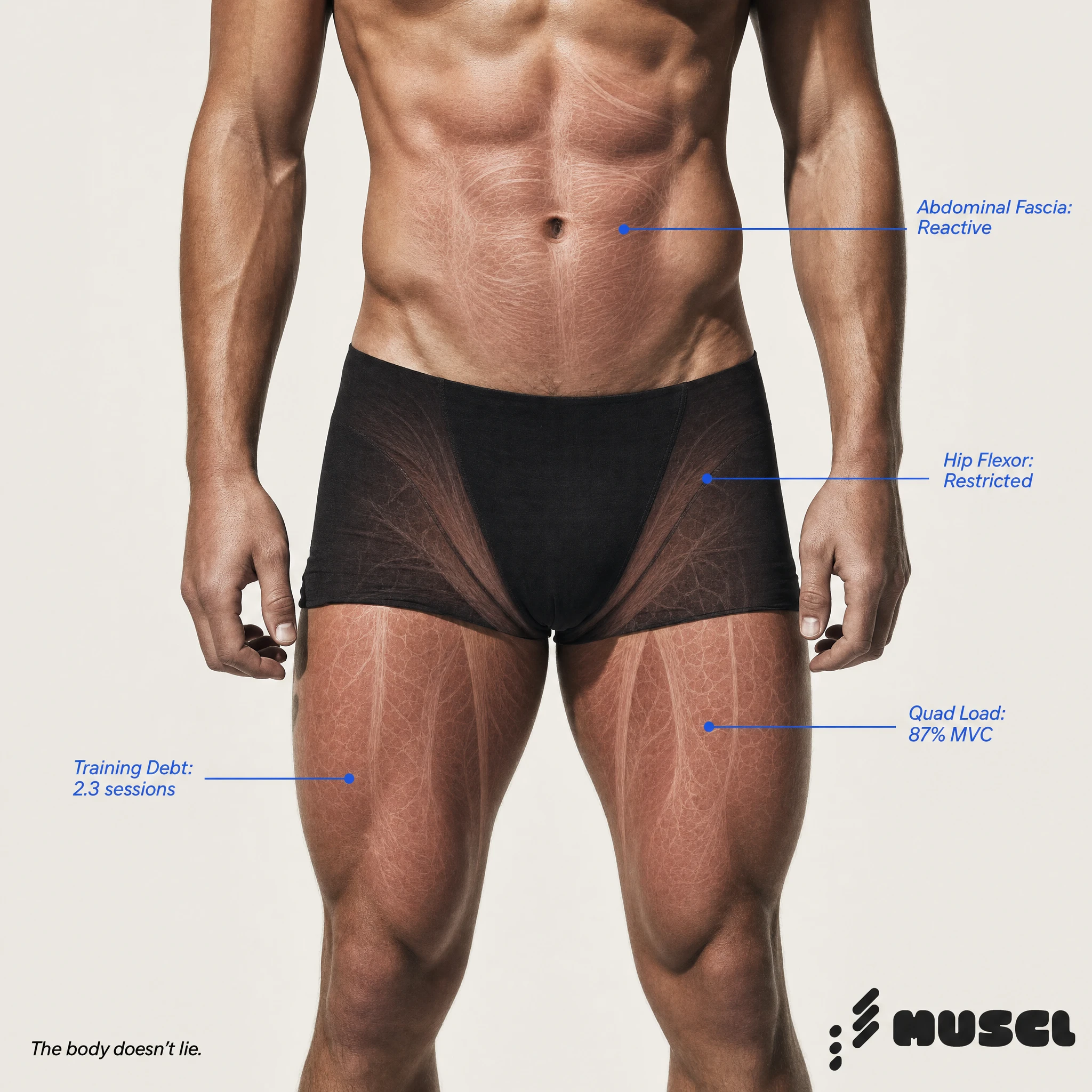
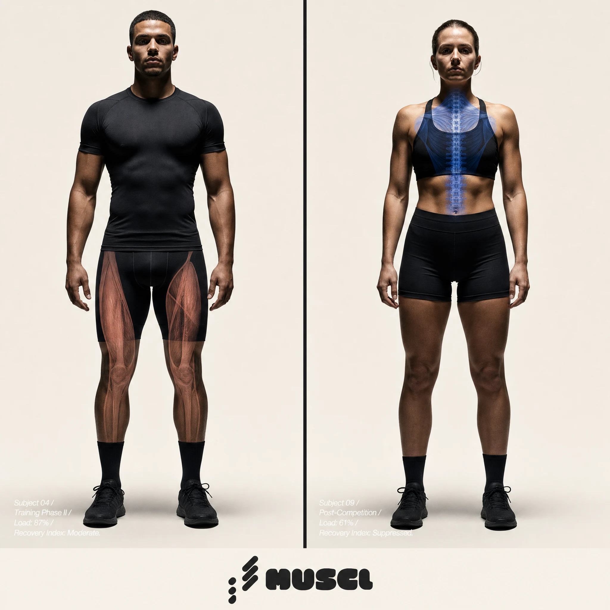
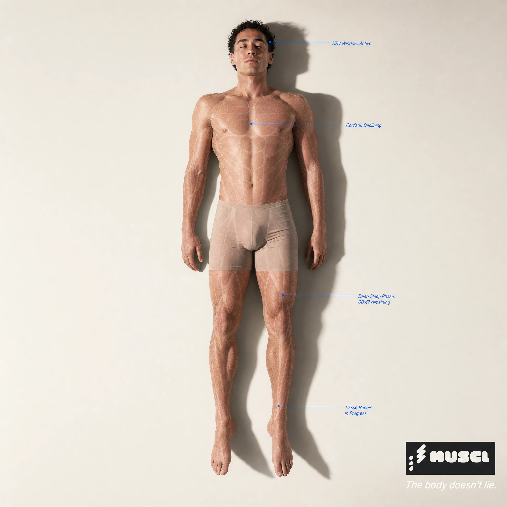
The campaign system came from a single device I developed and ran across every piece of media: the anatomical overlay. Athlete photography — real, unsentimental, close — with tissue pink muscle maps or lab blue annotation lines rendered over the living tissue. It turns a campaign image into a diagnostic image. The body becomes both subject and data source simultaneously.
THE WORK
LOGO SYSTEM
The MUSCL mark is a rounded, inflated bold wordmark in deep charcoal #1C1C1C, paired with a diagonal slash-dot symbol to its left — three angled strokes and three descending circular dots in vertical rhythm. The inflation in the letterforms creates organic weight; the symbol provides angular counterpoint. The mark functions at every scale from app icon to building wrap without modification.
COLOR SYSTEM
Four colors, none negotiable. Bone white #EDE9E1 as the primary ground — warm, uncoated, aged paper rather than clinical white. Deep charcoal #1C1C1C for structure, text, and primary UI elements. Tissue pink #D4937A for organism-level data, active states, and anatomical overlays — the color of stained muscle cross-section under H&E stain. Lab blue #2C5FD4 for system-level indicators, annotation lines, and data architecture.
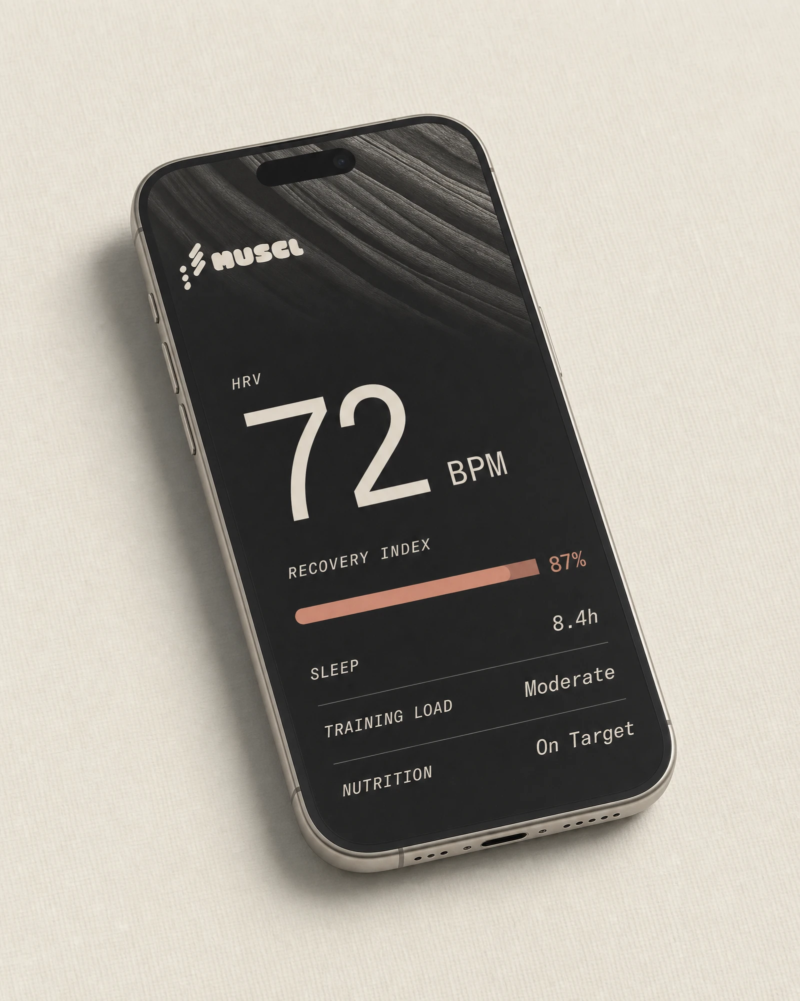
APP UI
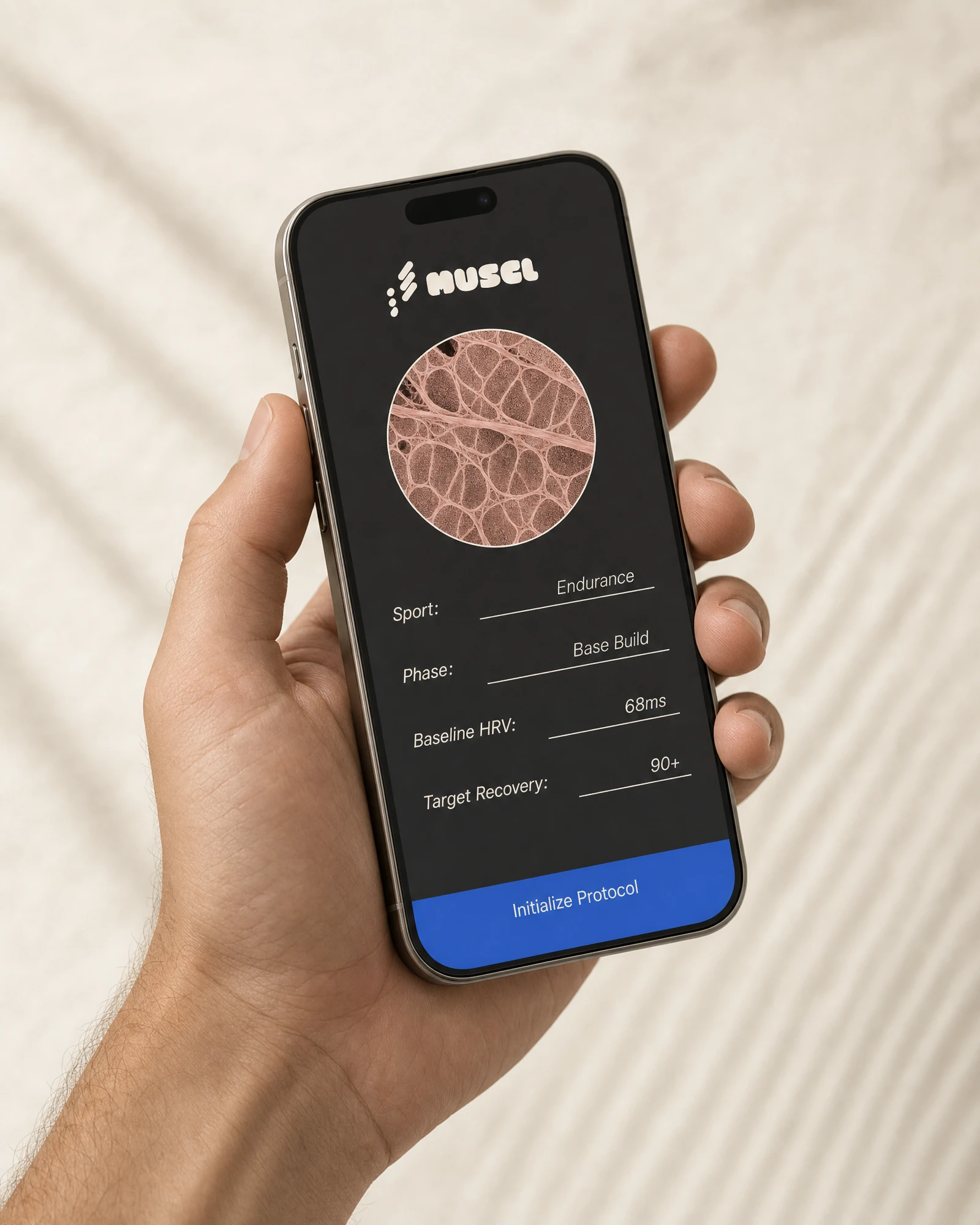
The home screen leads with a single large HRV readout in tabular grotesque numerals — the number is the hierarchy. A tissue pink recovery index bar sits below it. Sleep, training load, and nutrition populate as compact data rows labeled in italic scientific notation. The background runs macro muscle fiber texture at the top edge, full-bleed, as both aesthetic and reminder of what the data refers to. The recovery detail screen surfaces a full-width HRV waveform in tissue pink across the upper half, with six specimen-style data tiles below: Cortisol Load, Sleep Efficiency, Muscle Readiness, Hydration Index, CNS Status, Recovery Score. Onboarding frames the profile setup as a lab form — fields for Sport, Phase, Baseline HRV, Target Recovery. One lab blue CTA at the bottom: Initialize Protocol.
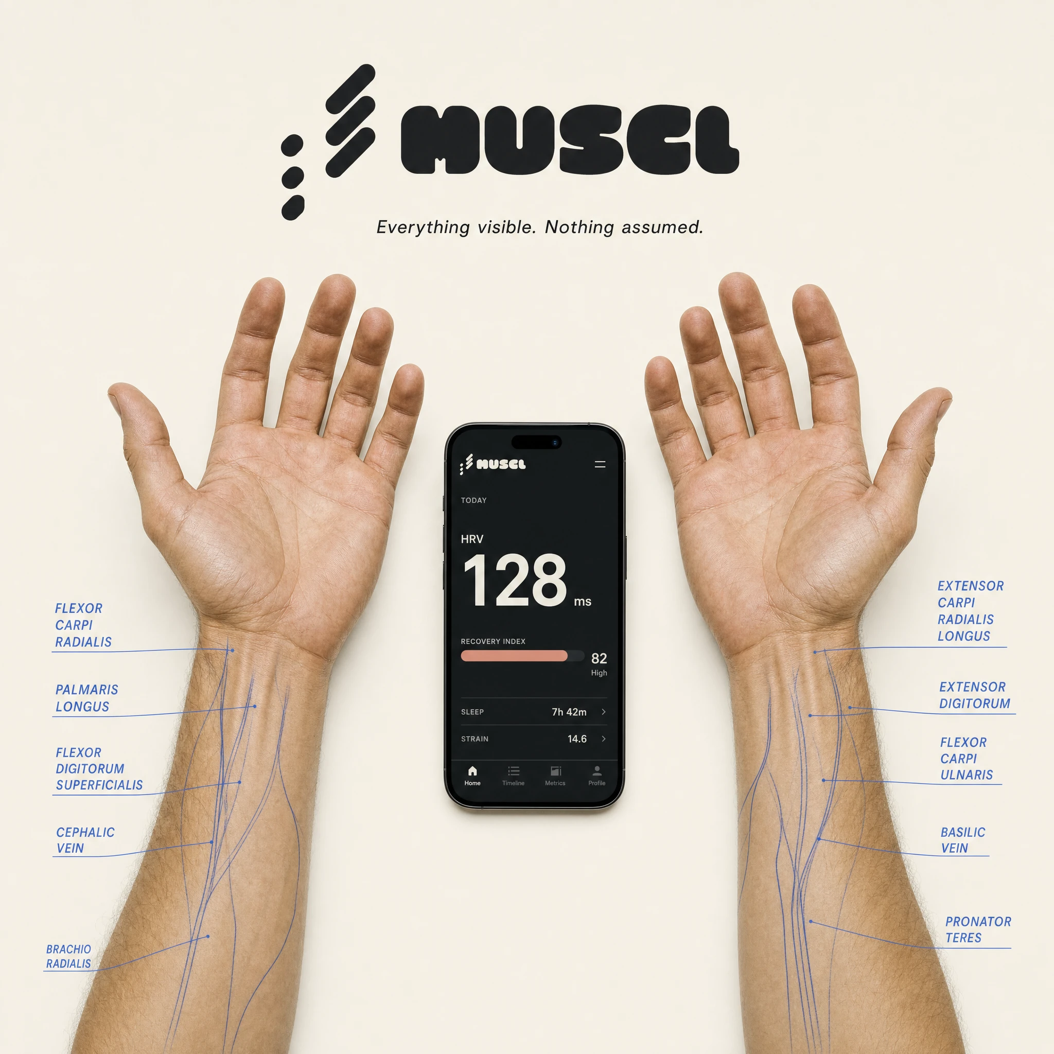
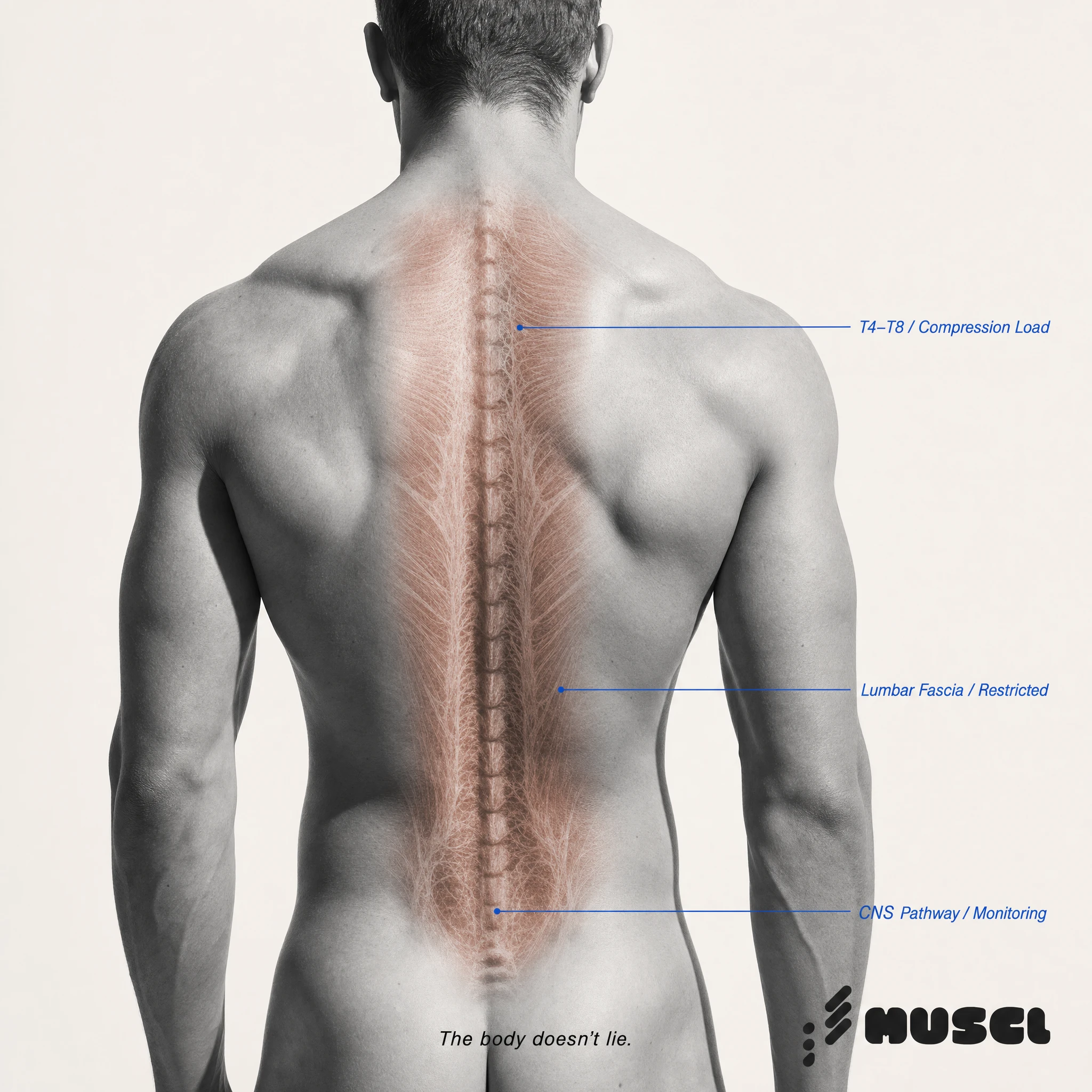
CAMPAIGN SYSTEM
Five primary campaign images, each a study of a specific body zone: The Spine, The Hand, The Threshold (neck/SCM), The Load (legs/hip flexor), The Sleep (full body, overhead, eyes closed). Each uses the anatomical overlay device — tissue pink muscle reveals rendered over monochrome or desaturated photography, lab blue callout lines annotating specific structures with clinical precision. Tagline across all executions: "The body doesn't lie." The language is third-person observational throughout: "Lumbar Fascia / Restricted", "Recovery Window: 48h", "Cortisol: Declining."
OOH
The subway poster runs dense cellular bundle photography full-bleed on near-black with the MUSCL wordmark centered in bone white and the line "Your tissue doesn't lie." The bus shelter splits the format: upper two-thirds cellular macro image, lower third bone white with the logo and "Reconstruction begins now." The night billboard renders the wordmark in tissue pink across an extreme-scale muscle cross-section halftone with the line "Recovery is not rest. It is reconstruction." The building wrap scales the cellular geometry to architecture — eight stories of muscle fiber pattern above the full logo and "The body does not forgive incomplete data." in tissue pink. The pavement decal annotates the logo itself with lab blue surgical measurement lines, labeled Fascia Depth, Load Threshold, CNS Recovery, Tissue Index. Ground Level / Protocol Active.
MERCH
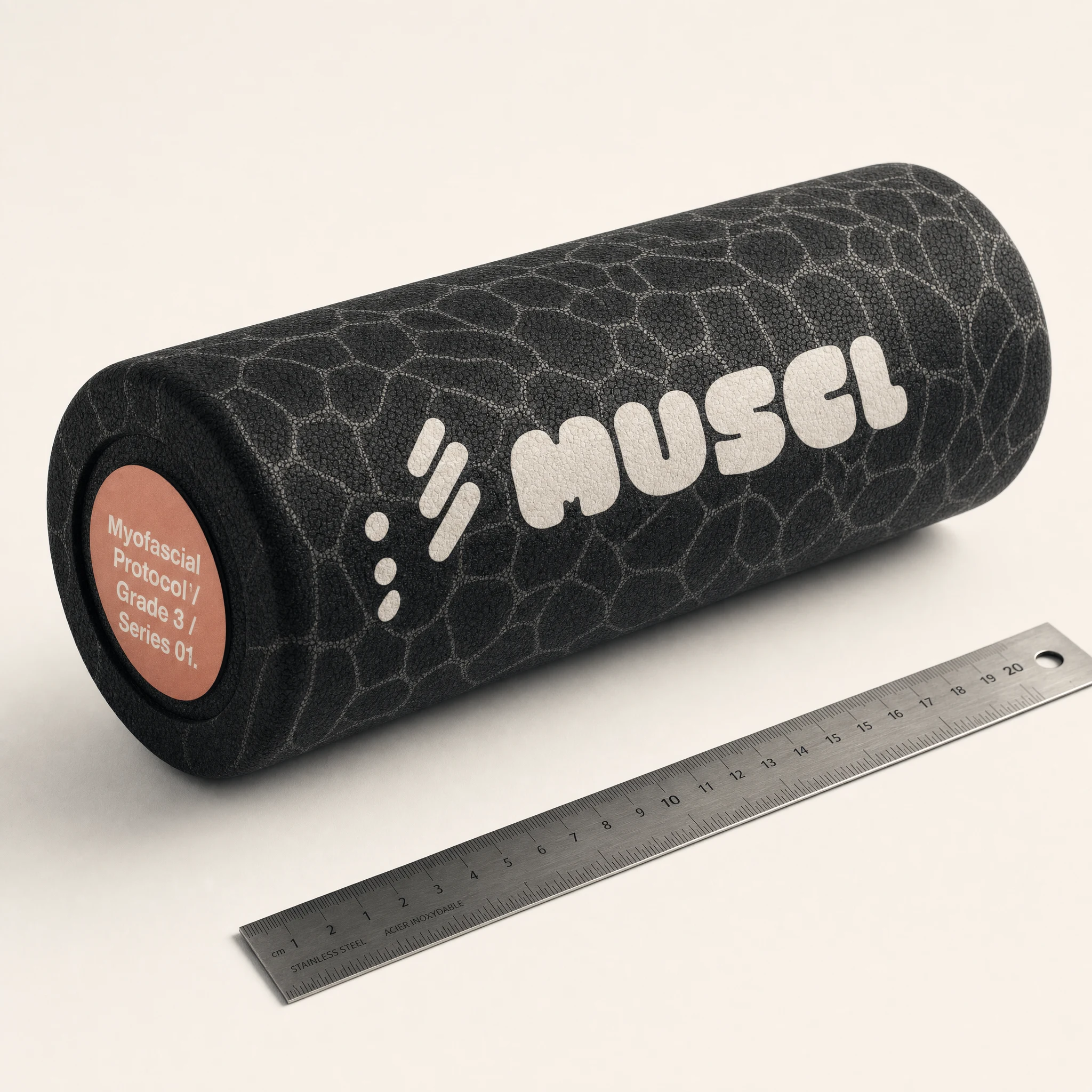
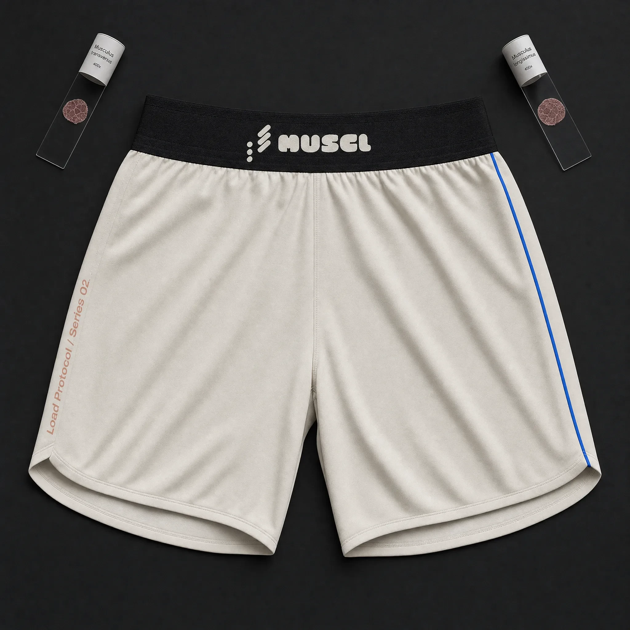
Every product was documented, not styled. The tee — charcoal, wordmark in bone white chest-center, italic tissue pink sleeve annotation: "Specimen 01 / Recovery Protocol." The notebook — charcoal cover, halftone cellular cross-section watermark, tissue pink brim annotation on the inside: "Field Log / Specimen Series 02." The water bottle — bone white matte finish, cellular texture debossed into the surface, wordmark vertical, tissue pink italic annotation below: "Hydration Index / Track. Recover. Repeat." The foam roller — charcoal with full-surface cellular bundle pattern, tissue pink circular end-cap label: "Myofascial Protocol / Grade 3 / Series 01." The field kit box — charcoal rigid matte, bone white logo on lid, lab blue edition stamp on the inside lid: "Ed. 01 / 500."
THE RESULT
MUSCL is a speculative project and that's exactly what gave it room to be complete. No client approvals, no market softening, no requests to make the copy friendlier. The brief held from the first direction conversation to the last mockup. The anatomical overlay system proved durable — it worked on a subway poster, a building, a campaign portrait, and a pavement decal without ever feeling like a one-trick device. What emerged was a brand that genuinely occupies a space nothing else in the recovery category does: clinical intimacy. Precise but not cold. Biological but not grotesque. Built for athletes who are serious enough to want the truth about what's happening inside.
Studio: Revolte — revolte.design
Project: MUSCL
Year: 2026
Scope: Brand Identity, Logo, App UI, Campaign, OOH, Merch, Packaging
Industry: Health & Wellness / Athletic Performance
See more at revolte.design
Like this project
Posted Jun 16, 2026
Recovery brand that treats the body as clinical evidence. Identity, app UI, campaign, and city-scale OOH built from biological texture and unsentimental data
Likes
2
Views
14
Timeline
May 27, 2026 - Jun 16, 2026