Built with Lovart
Fracture Brand Identity & Visual System

Révolté


FRACTURE — Your Data, Constantly Reassembling Itself
LOGLINE
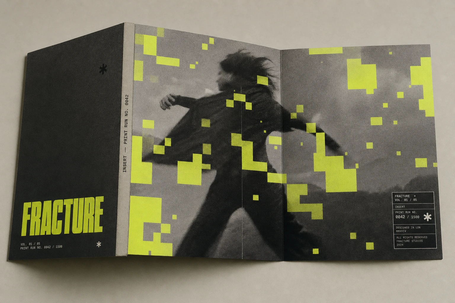
A SaaS brand built on the idea that data isn't corrupted, it's mid-render. I built an identity system where every photograph looks like it's being reconstructed in real time, one pixel-block at a time.
THE BRIEF
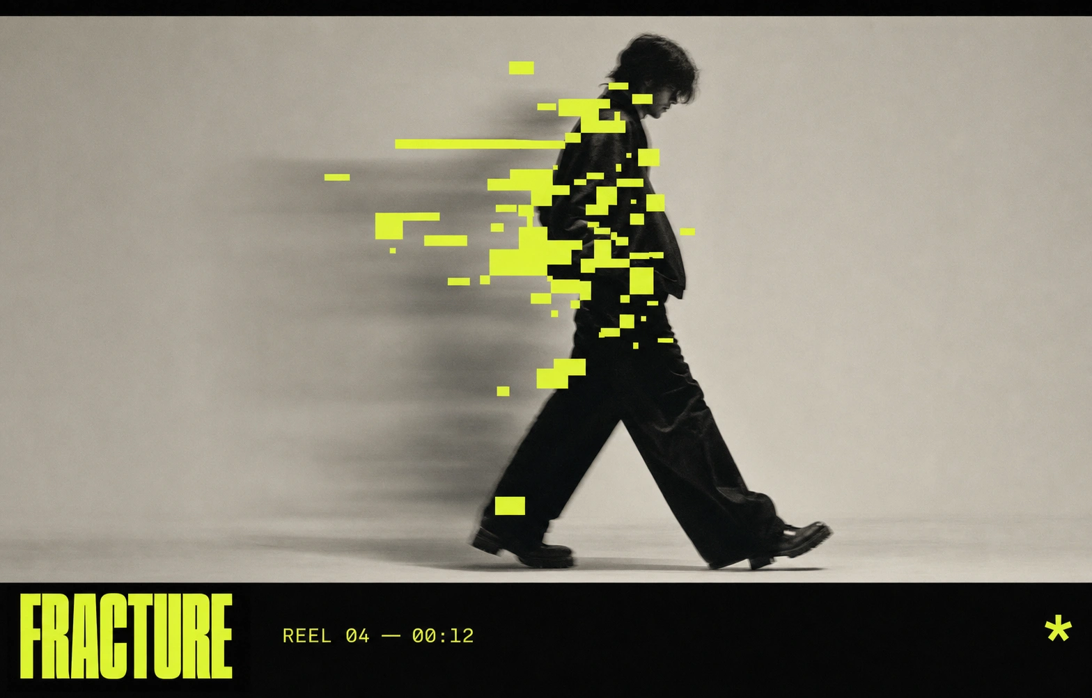
This one started as a reaction. Most SaaS brands treat noise as something to apologize for — soft gradients, calm blues, copy that promises everything is under control. I wanted to build a brand for a company that does the opposite: it takes the mess and shows you exactly where it's happening.
The problem I set for myself was simple to state and hard to solve. How do you make "chaos" feel premium instead of broken? Every reference I had — glitch art, error diffusion, dithering — reads as either a bug or a gimmick. I needed it to read as intentional, editorial, almost couture.
What I took on was the full system: identity, campaign, packaging, product UI. Not just a logo and a palette — a visual language that had to survive a bus shelter, a phone screen, and a tote bag without losing its logic anywhere.
THE APPROACH
I started from a dither plugin interface, of all things — sliders labeled Threshold and Levels, an algorithm dropdown set to Floyd-Steinberg. That UI had more brand personality in it than most finished identities I'd seen. The idea of "error diffusion" as a literal design principle stuck with me.
My first instinct was to lean fully into the glitch-art cliché — scan lines, RGB channel splits, the works. I rejected that fast. It read as decoration, not concept. Glitch-for-glitch's-sake has no story behind it.
The unlock came from a poster reference with a face fragmented by hard-edged yellow pixel-blocks. That wasn't glitch, it was occlusion — deliberate, graphic, almost architectural. The blocks weren't destroying the image, they were standing in front of it, mid-assembly. That's the whole brand in one image: the product doesn't fix your data, it shows you the reassembly happening live.
From there the system built itself around one rule: acid yellow
#E4FF3A blocks always occlude, never distort. No warping, no color-shifting the photography itself — just hard, confident blocks sitting on top of a desaturated image. That constraint is what makes the system feel controlled instead of chaotic, even though "chaos" is the whole pitch.THE WORK
BRAND IDENTITY / VISUAL SYSTEM
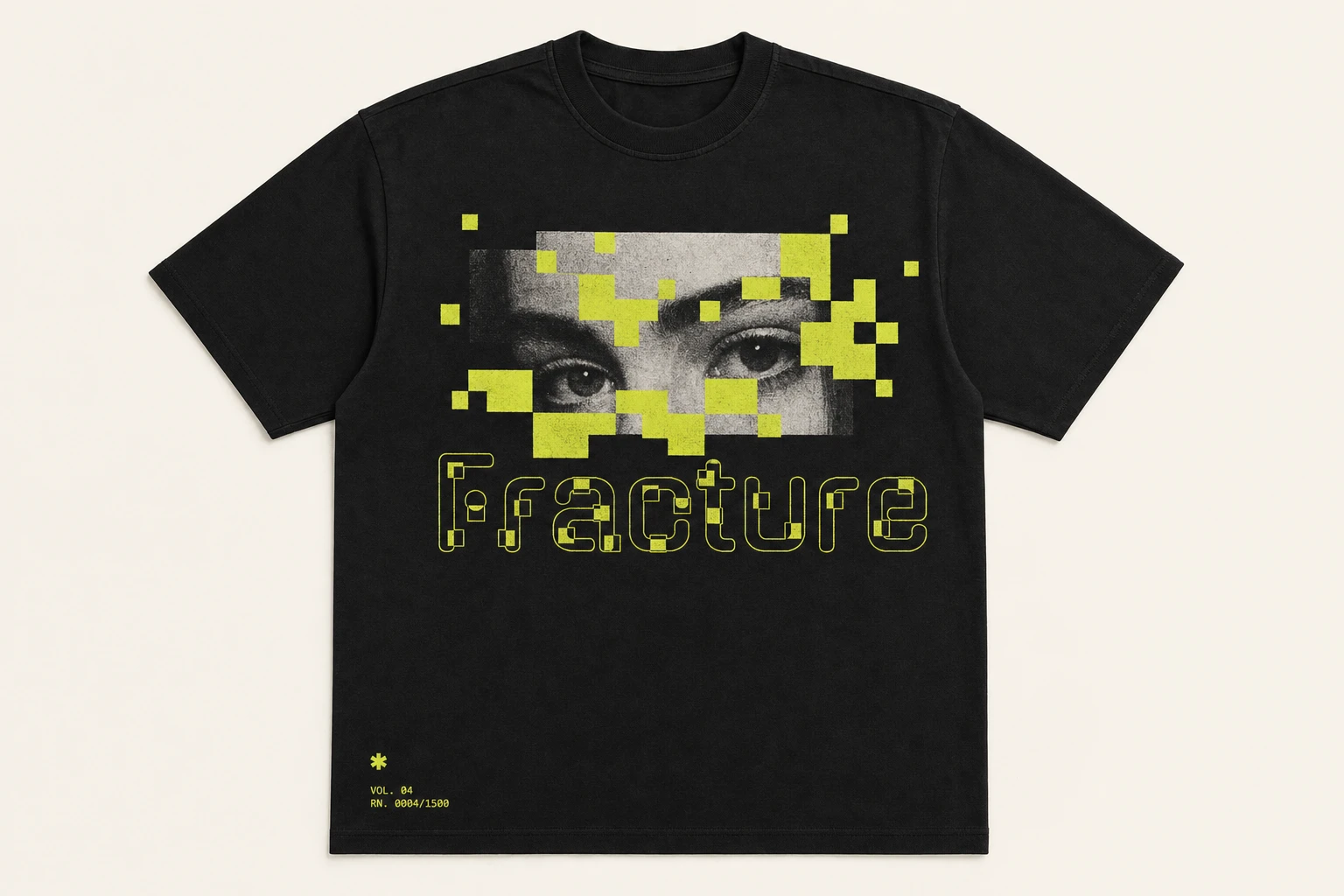
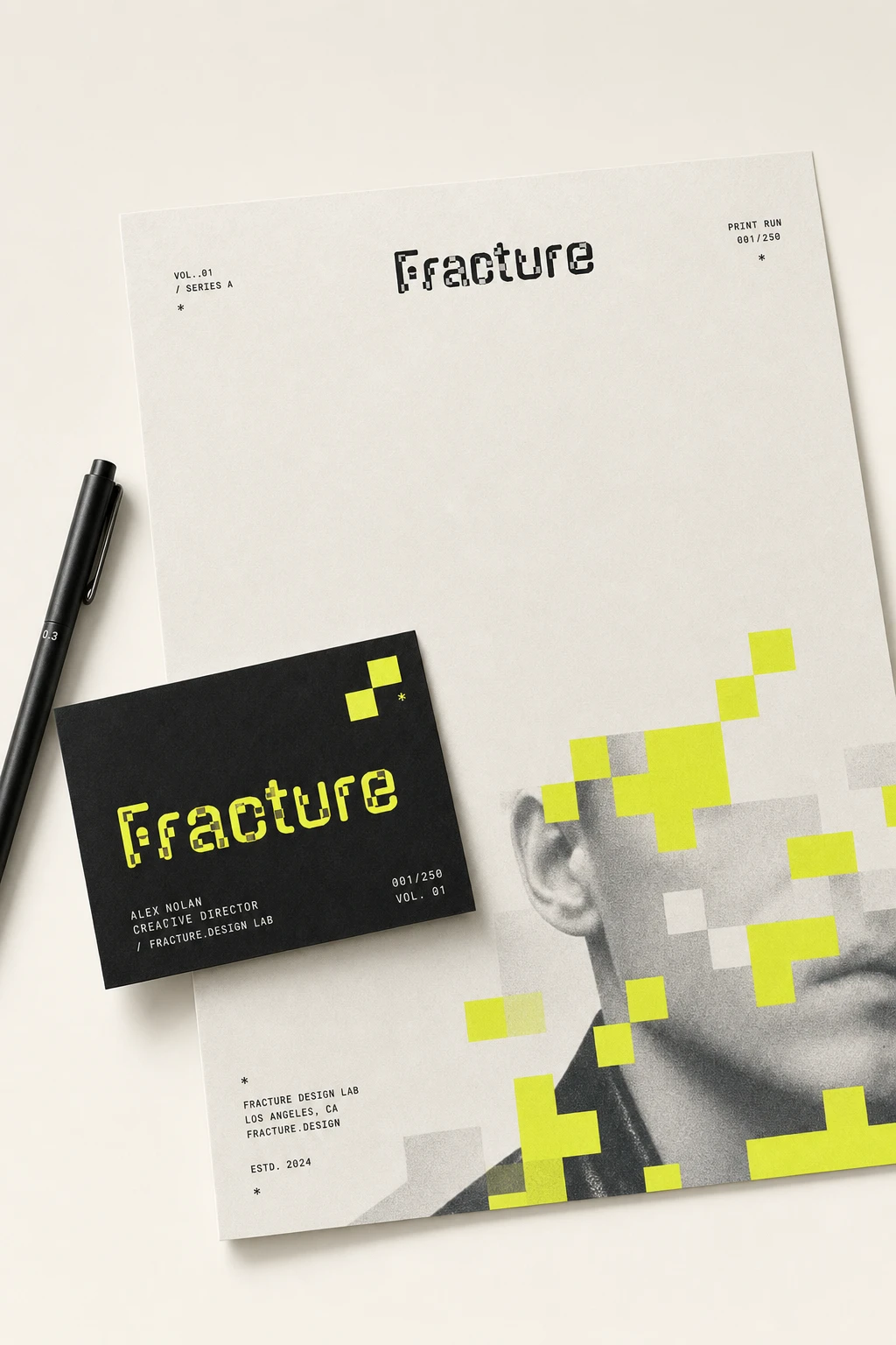
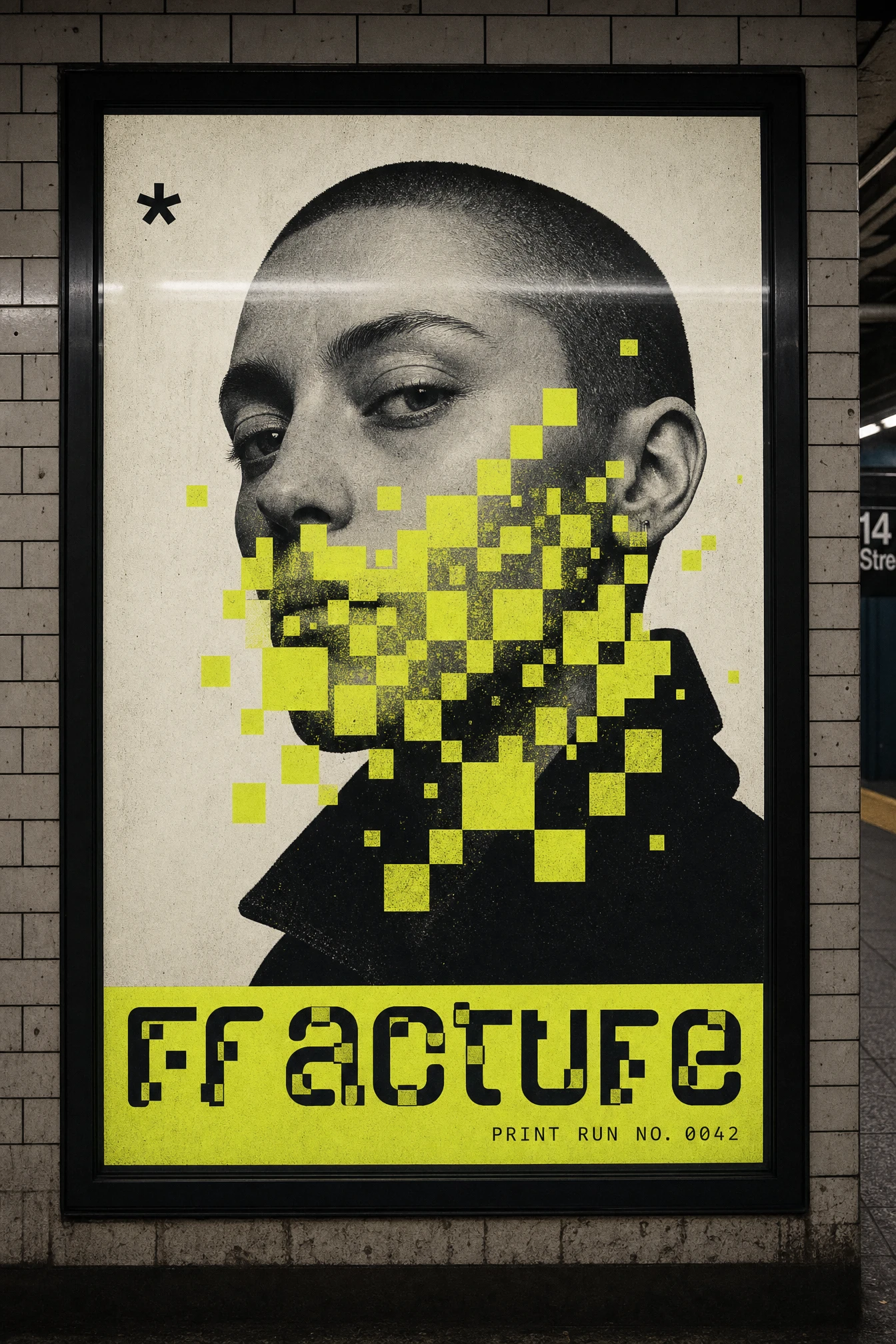
Built around a single occlusion rule applied consistently across every touchpoint: desaturated or black-and-white photography, interrupted by irregular clusters of acid yellow
#E4FF3A pixel-blocks. A recurring black asterisk mark and a vol./print-run numbering system (e.g. "VOL. 116," "PRINT RUN NO. 0042") borrow language from limited-edition print runs, giving a SaaS brand the collectibility of a poster series.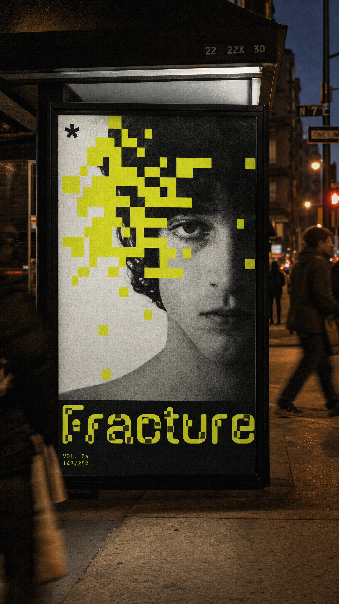
TYPOGRAPHY SYSTEM
An ultra-bold condensed grotesque carries every headline and wordmark instance, set in all-caps for maximum poster-weight impact. Metadata, series numbers, and UI labels drop into a small-caps monospace, keeping the "technical readout" feeling present wherever the display type isn't.
COLOR SYSTEM
Acid Yellow
#E4FF3A is the single accent color, used only for occlusion and never diluted into gradients or tints. Ink Black #111111 grounds every structural element — type, edges, UI frames. Warm Paper Grey #C9C4B8 and Off-White #F2F0E9 do the quiet work as backgrounds, keeping the yellow as the only thing allowed to shout.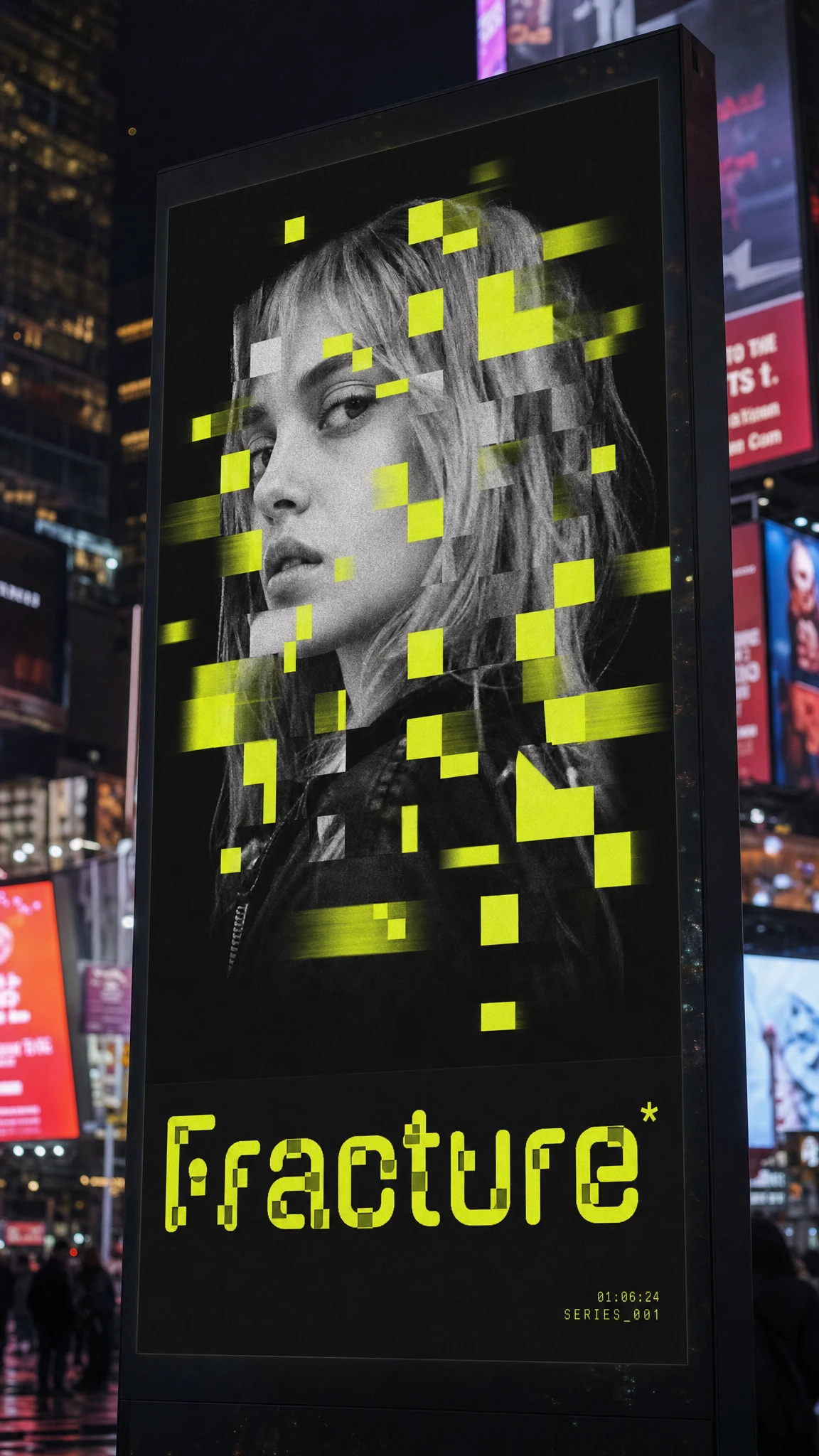
CAMPAIGN / OOH
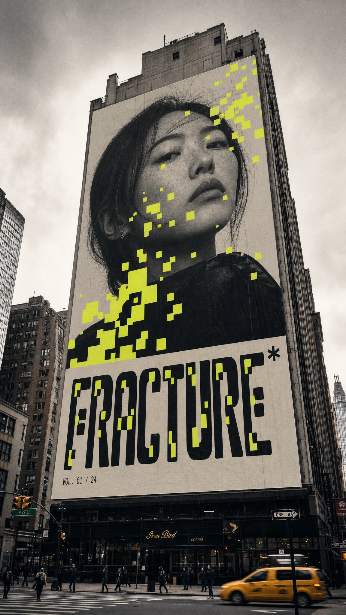
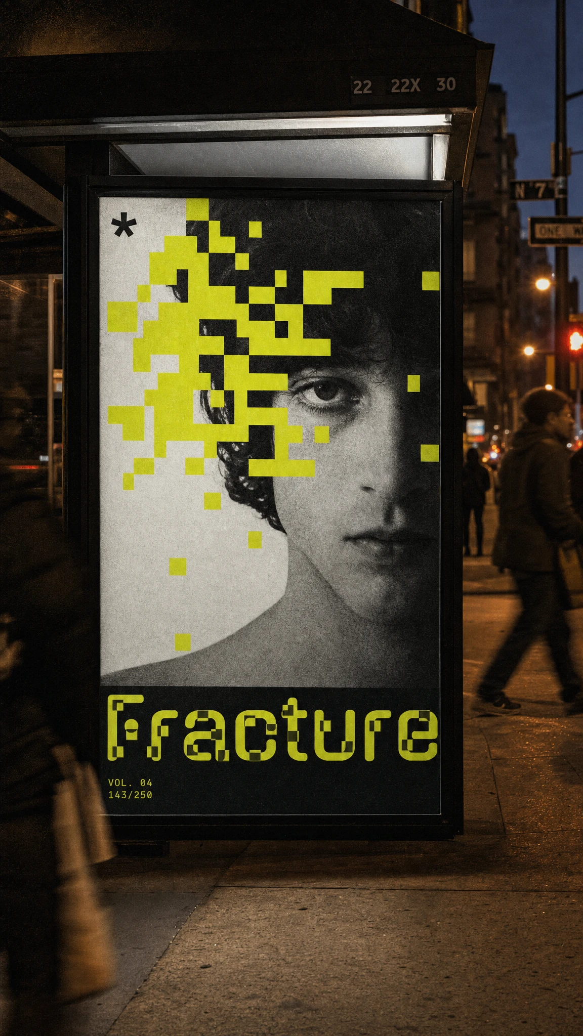
The system was stress-tested across a bus shelter panel, a building-wrap billboard, a subway light-box, and a vertical digital screen in a dense plaza. Each execution uses the same occlusion logic on a different photographic crop — a jaw, an eye, a full three-quarter portrait — proving the system reads at both poster and building scale.
PRINT / COLLATERAL
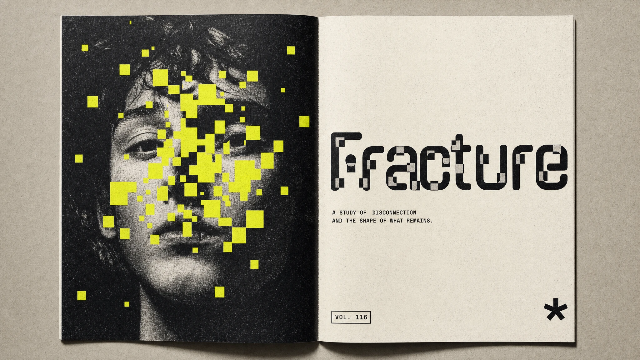
A magazine double-page spread and a tri-fold poster insert pushed the print-run concept further, treating the fold itself as a reassembly point — pixel-blocks shift position from panel to panel as if the image is rebuilding itself across the crease.
PACKAGING
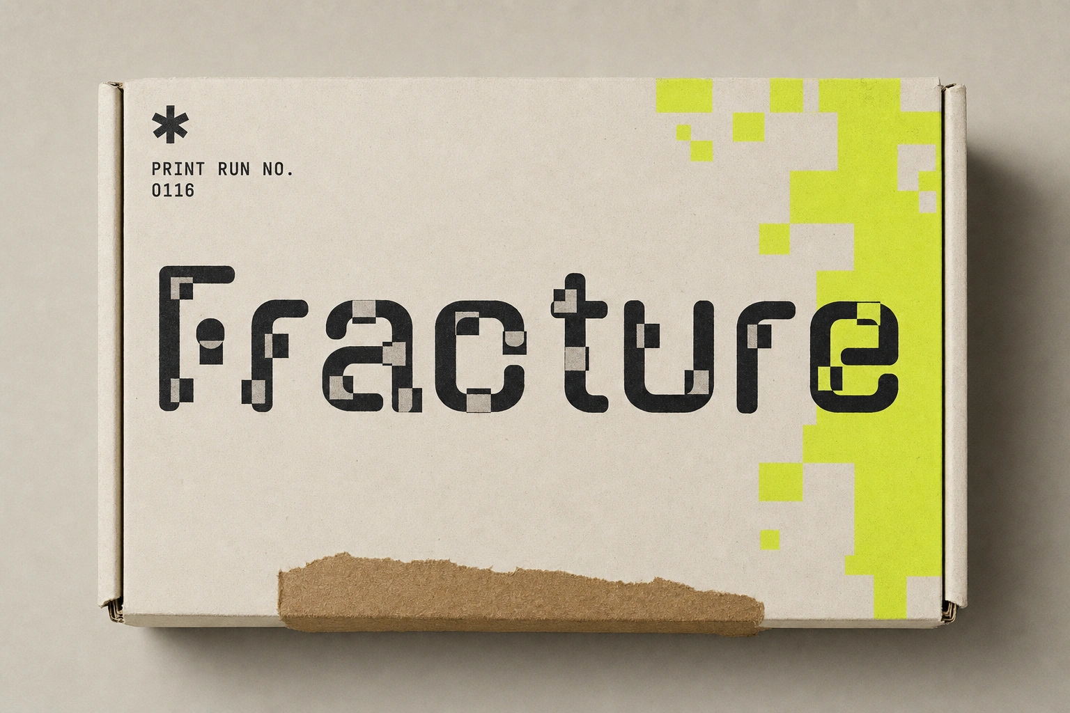
A kraft mailer box carries the wordmark interrupted by a single yellow block cluster in one corner, with a print-run stamp opposite it — small enough to feel like a detail, not a decoration.
PRODUCT / DIGITAL
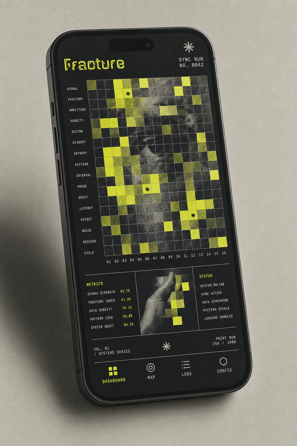
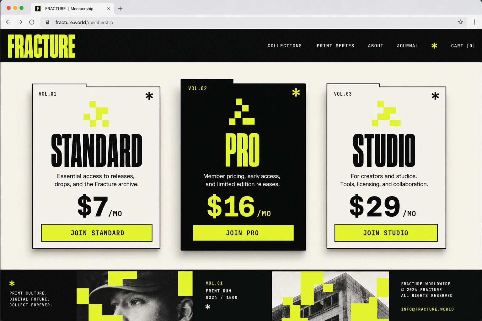
The app dashboard takes the occlusion pattern and turns it into an actual data visualization — yellow blocks of varying opacity standing in for data density over an ink black grid. The landing page pricing row inverts the palette on the emphasized tier, proving the system holds even when the hierarchy flips.
MERCHANDISE
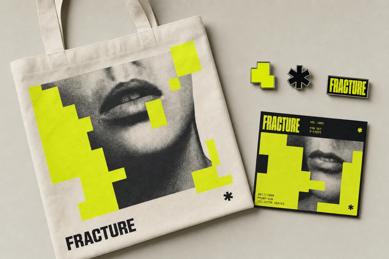
A canvas tote and a 3-piece enamel pin set translate the graphic system into physical objects — one pin is just a single yellow block, distilled down to the brand's smallest possible unit.
THE RESULT
The system holds at every scale I threw at it, which is the real test for something built on a single visual rule. It survives a building wrap and a lapel pin without needing a different logic for either one. The next step is locking the actual logo constructions — everything so far has run on the wordmark as a placeholder, which is proof the system doesn't depend on the mark to read as "Fracture." That's usually the sign a brand's ready to name its logo, not the other way around.
Révolté — revolte.design
Project: Fracture
Year: 2026
Scope: Brand Identity, Art Direction, Campaign Design
Industry: SaaS
See more at revolte.design
Like this project
Posted Jul 6, 2026
A SaaS identity where data doesn't glitch, it reassembles — pixel-block occlusion turns chaos into a collectible print-run system
Likes
2
Views
52
Timeline
Jun 17, 2026 - Jul 6, 2026