Built with Lovart
Saint Error Portfolio Brand System

Révolté


SAINT ERROR — Devotion Rendered in Corruption
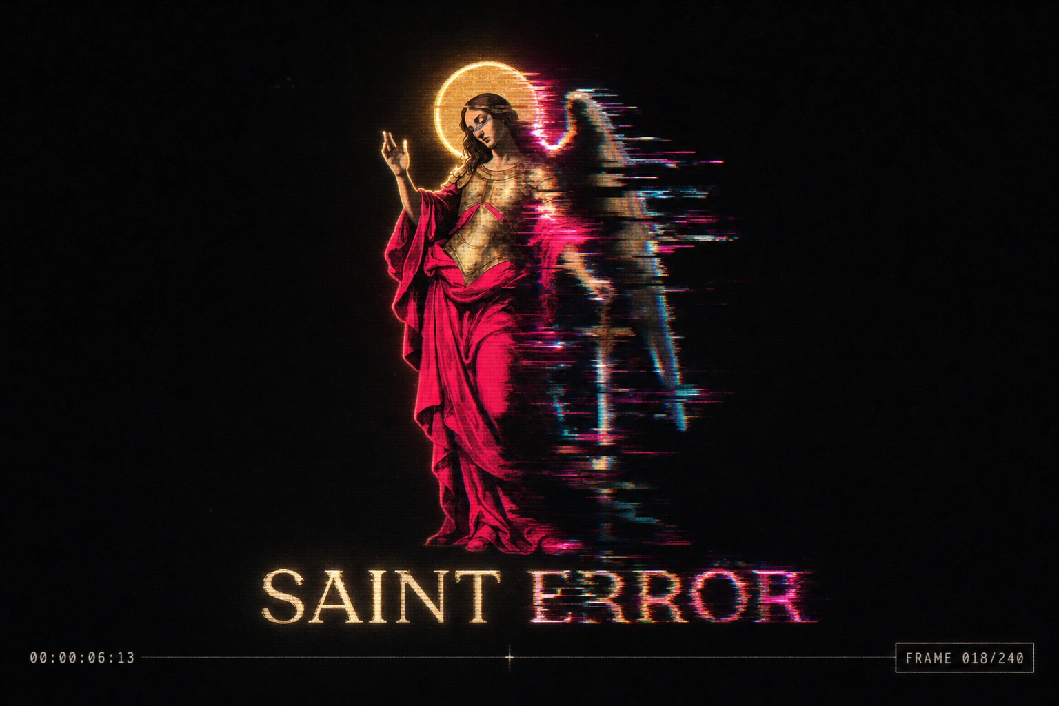
I wanted a portfolio brand that didn't apologize for the mess. Most self-branding chases polish. I built one around failure as the actual subject — a portfolio that treats every corrupted file, every broken render, as something worth kneeling in front of.
THE BRIEF
This wasn't a client. It was me, trying to solve a problem every designer eventually hits: your portfolio has to say something about how you think, not just show what you made. I didn't want another minimal grid with my name in a grotesque typeface. That's not chaos, that's just quiet.
What I actually wanted was a brand that argued for something — that treated the glitch, the error, the broken export, as sacred material instead of a mistake to hide. I wanted reverence and profanity sitting in the same frame.
The hard part wasn't the concept. It was making "chaos" hold together as a system instead of collapsing into noise. Chaos with no structure is just mess. I needed chaos with liturgy.
THE APPROACH
I started in the wrong place — full glitch-art abstraction, no figure, no narrative anchor. It looked cool for about ten minutes and then it looked like every other glitch-aesthetic Dribbble shot from 2019. I killed it.
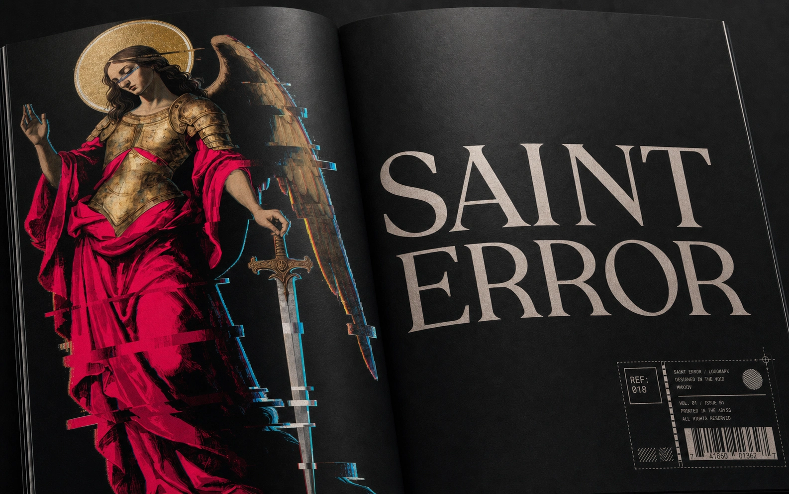
What unlocked the project was going backward instead of forward: Renaissance devotional painting. An archangel, rendered with real oil-painting weight — classical contrapposto, drapery, halo, the whole vocabulary of sacred art — and then letting the corruption live inside that reverence instead of replacing it. One wing fully resolved, the other dissolving into scan-lines and datamosh. A halo flickering between gold leaf and static. That asymmetry became the whole logic of the brand: half devotion, half signal loss, never fully one or the other.
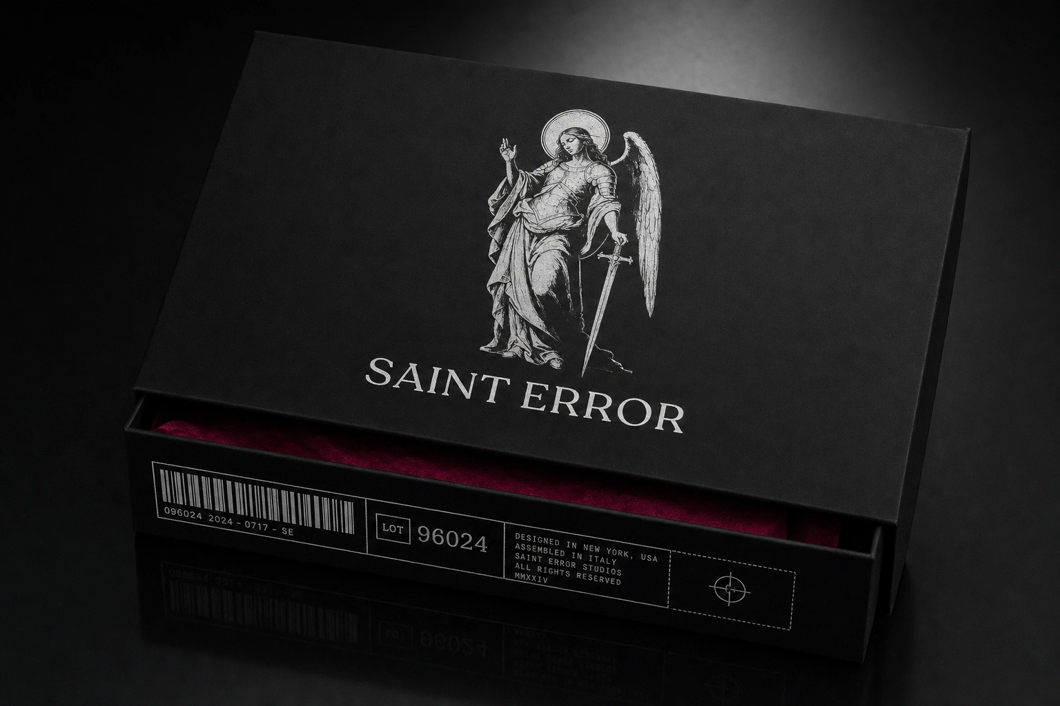
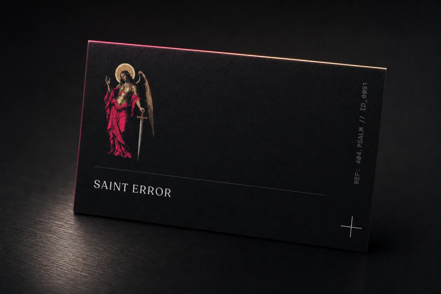
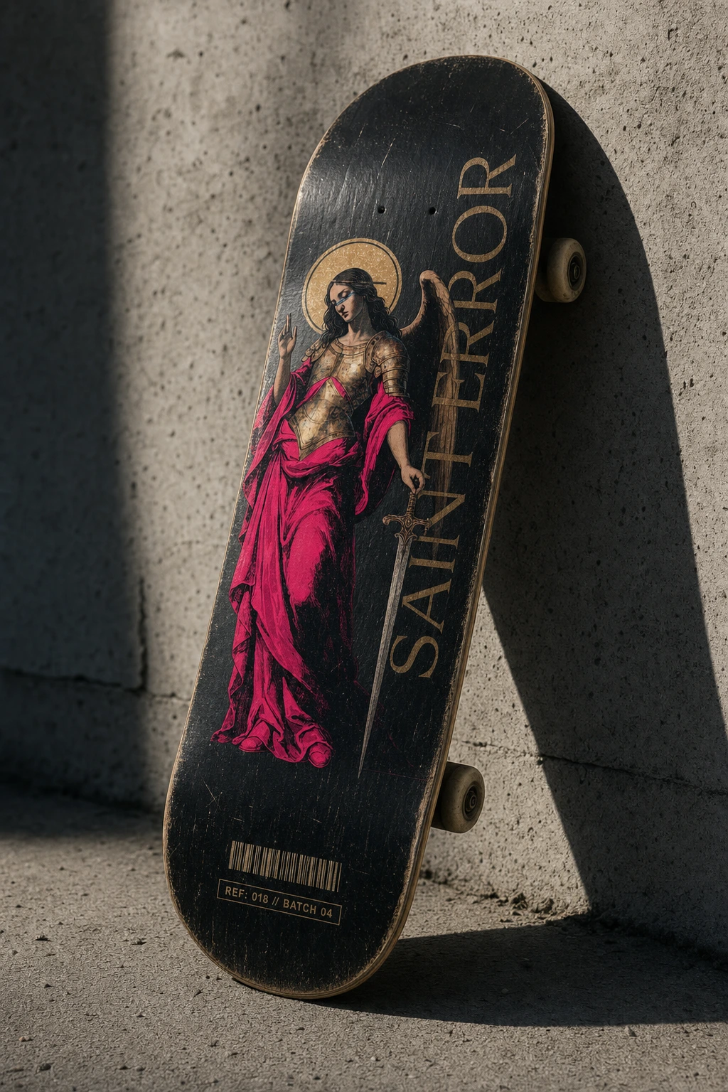
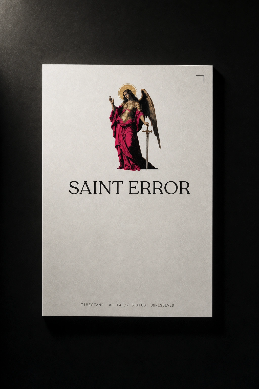
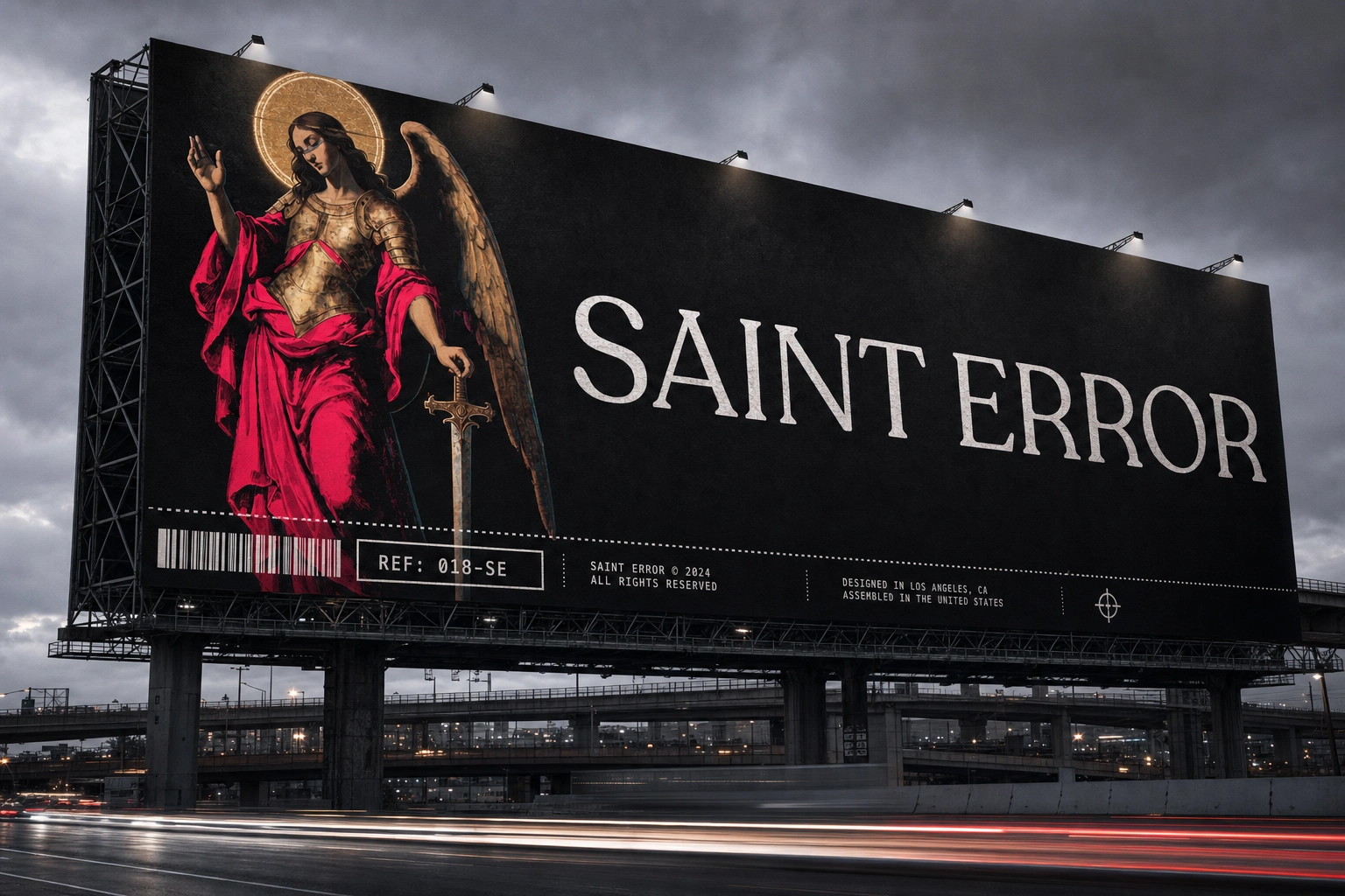
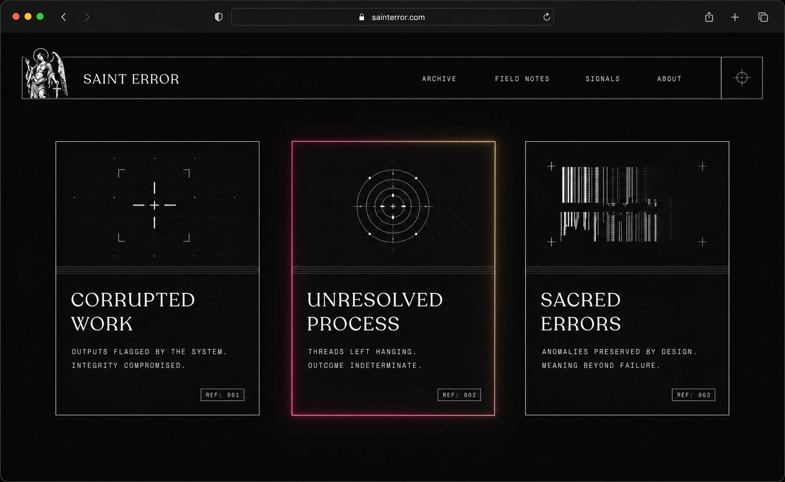
Once the figure existed, the rest of the system had a rule to follow. I paired the glitched saint with Recoleta Alt for the wordmark — warm, human, slightly ecclesiastical in its curves — so the logotype wouldn't fight the illustration's ornateness. Then I built a second, colder layer underneath everything: an industrial label system lifted from shipping and asset-pack documentation. Barcodes, boxed reference codes, crosshair marks, dotted borders. That layer is what stops the brand from tipping into pure romanticism — it's the bureaucracy quietly logging the miracle.
THE WORK
BRAND IDENTITY / VISUAL SYSTEM
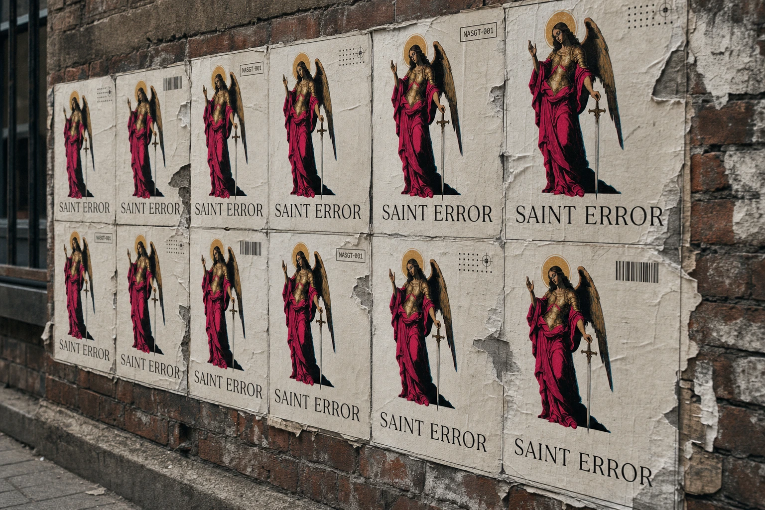
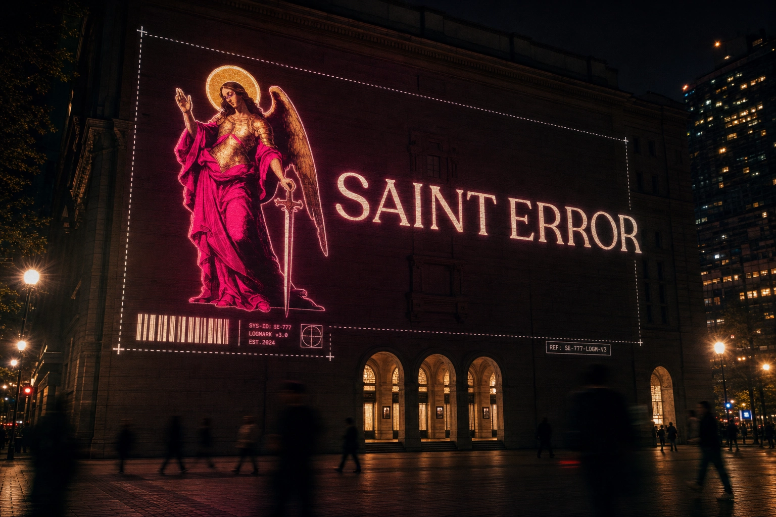
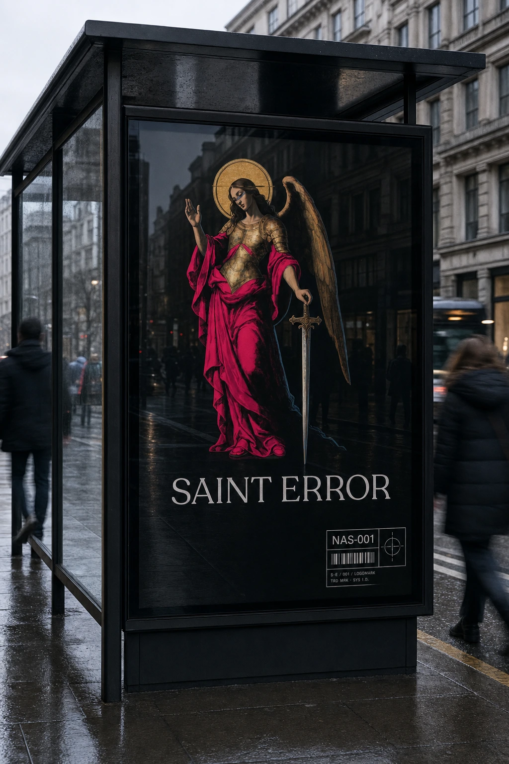
Built around a single tension: ornate devotional illustration against clinical technical labeling. Every application carries both — the saint never appears without the label system running underneath it, like debug data logging a religious event.
LOGO
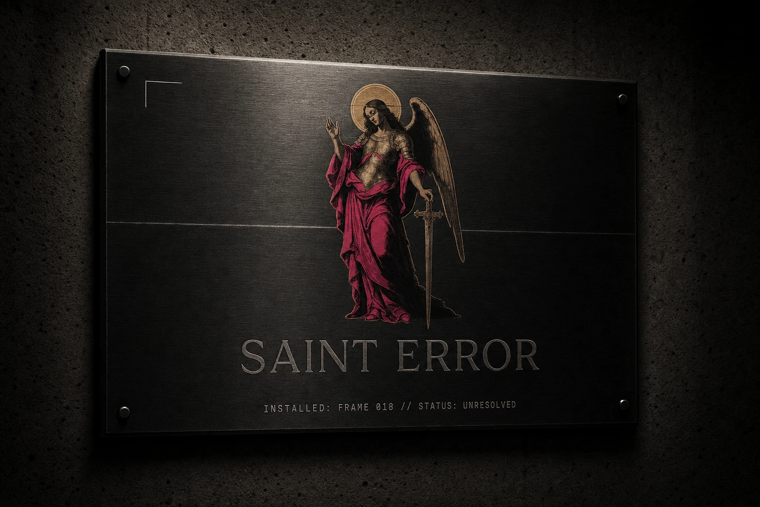
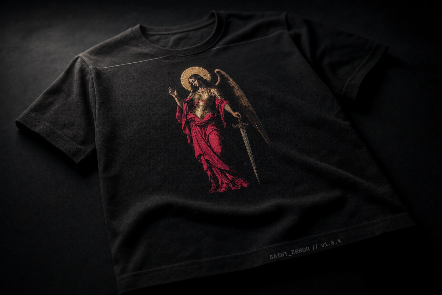
A Renaissance-style archangel in a magenta robe and tarnished gold armor, holding a longsword with a gothic-tracery crossguard. One wing rendered in full painterly detail, the other fractured into scan-line bands and chromatic-aberration smearing. Halo rendered as gold leaf, glitching intermittently into a thin ring of static.
TYPOGRAPHY SYSTEM
Recoleta Alt for the primary wordmark — warm serif structure that keeps the mark legible and human against the illustration's density. A gothic/blackletter display face, glitch-distorted at irregular intervals, reserved for hero moments. A clean monospace carries all functional and label copy, keeping the system readable under the chaos.
COLOR SYSTEM
Void Black as the dominant ground. Static White for legibility. Magenta and gold — pulled directly off the robe and armor — as the only saturated colors permitted in any application, so they read as sacred rather than decorative.
APPLICATIONS
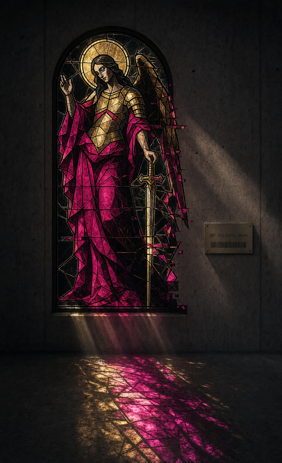
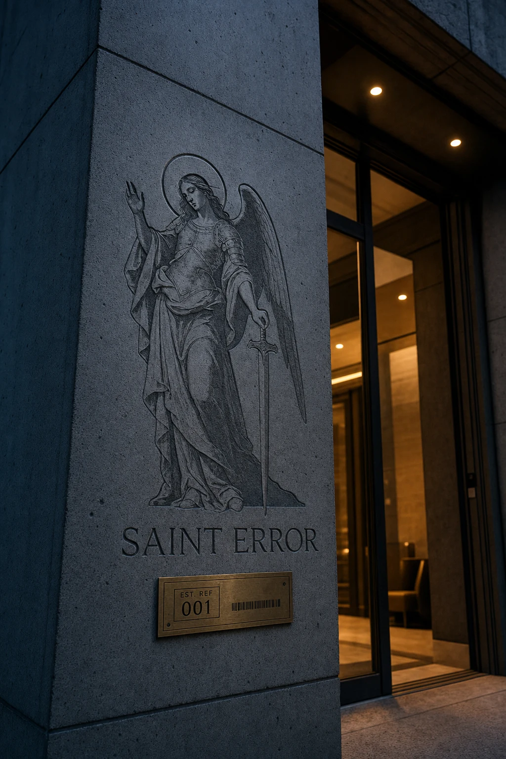
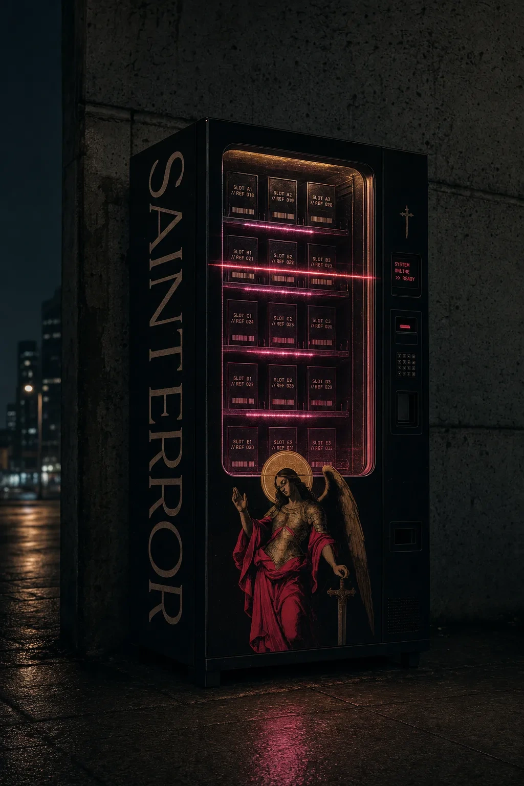
Extended across OOH (billboard, bus shelter, building-scale banner, fly-posted walls, night projection mapping), packaging, apparel, a landing page card system, social carousel, and a set of unconventional physical objects — a wrapped vending machine, a leaded stained-glass installation, a skateboard deck, an architectural etching at a building entrance. Each carries the same industrial label cluster: barcode, boxed reference code, dotted border, crosshair mark — grid-locked and consistent regardless of scale.
THE RESULT
The system holds up across a genuinely wide range of surfaces — from a business card to a building facade — without the chaos ever feeling arbitrary. That was the actual test. Anyone can make something look broken. Making the breakage follow its own internal logic, consistently, at every scale, is the harder problem, and it's the one this project was built to solve.
Saint Error now functions as the brand my own creative work sits under — a portfolio that argues its point before you've read a single case study.
Révolté — revolte.design
Project: Saint Error
Year: 2026
Scope: Brand Identity, Logo Design, Typography System, OOH Campaign, Packaging, Digital/UI, Environmental Design
Industry: Personal Portfolio / Creative Studio Branding
See more at revolte.design
Like this project
Posted Jul 14, 2026
A glitched Renaissance saint anchors a portfolio brand that turns creative failure into sacred, system-driven ritual
Likes
0
Views
21
Timeline
Jun 30, 2026 - Jul 14, 2026