Built with Lovart
Brutalist Brand Identity for LOAD Nutrition

Révolté


LOAD — Nutrition Built Like a Structure, Not a Lifestyle
LOGLINE
A nutrition brand for people who find wellness branding condescending. I stripped out every soft edge the category relies on and built the identity like load-bearing infrastructure instead.
THE BRIEF
This one started as a reaction, not a request. Every nutrition brand I looked at was speaking the same language — pastel gradients, plant illustrations, words like "nourish" and "glow." None of it was for someone who just wants their body to function like a well-built machine. I wanted to design for that person instead.
The tension I set for myself was simple: what if a supplement brand refused to comfort you. No wellness-speak, no soft color story, no metaphor doing the emotional labor a real product should be doing on its own. The brand had to feel like it belonged next to concrete and rebar, not next to a yoga mat.
I took this on as a full speculative system — naming, identity, typography, packaging, and a full campaign — because a brutalist concept only proves itself once you push it into every touchpoint. A logo that looks tough on a screen is easy. A logo that still looks tough stencilled onto a subway pillar at 2am is the actual test.
THE APPROACH
I started by mapping ten completely divergent creative territories before committing to anything — clinical, ritualistic, blueprint-driven, museum-still, naturalist-journal. Brutalist Fuel won because it was the only direction with zero overlap with anything already in the category. Everyone else was fighting over "clean." Nobody was fighting over "unglamorous."
The name came before the logo. LOAD isn't a metaphor for anything — it's the literal function. Load-bearing. Load your system. No qualifier needed, which is rare and worth protecting once you find it.
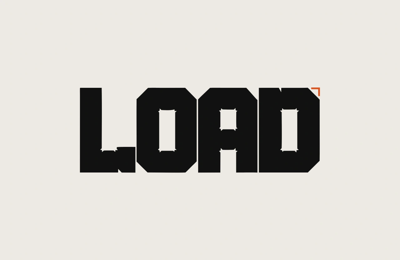
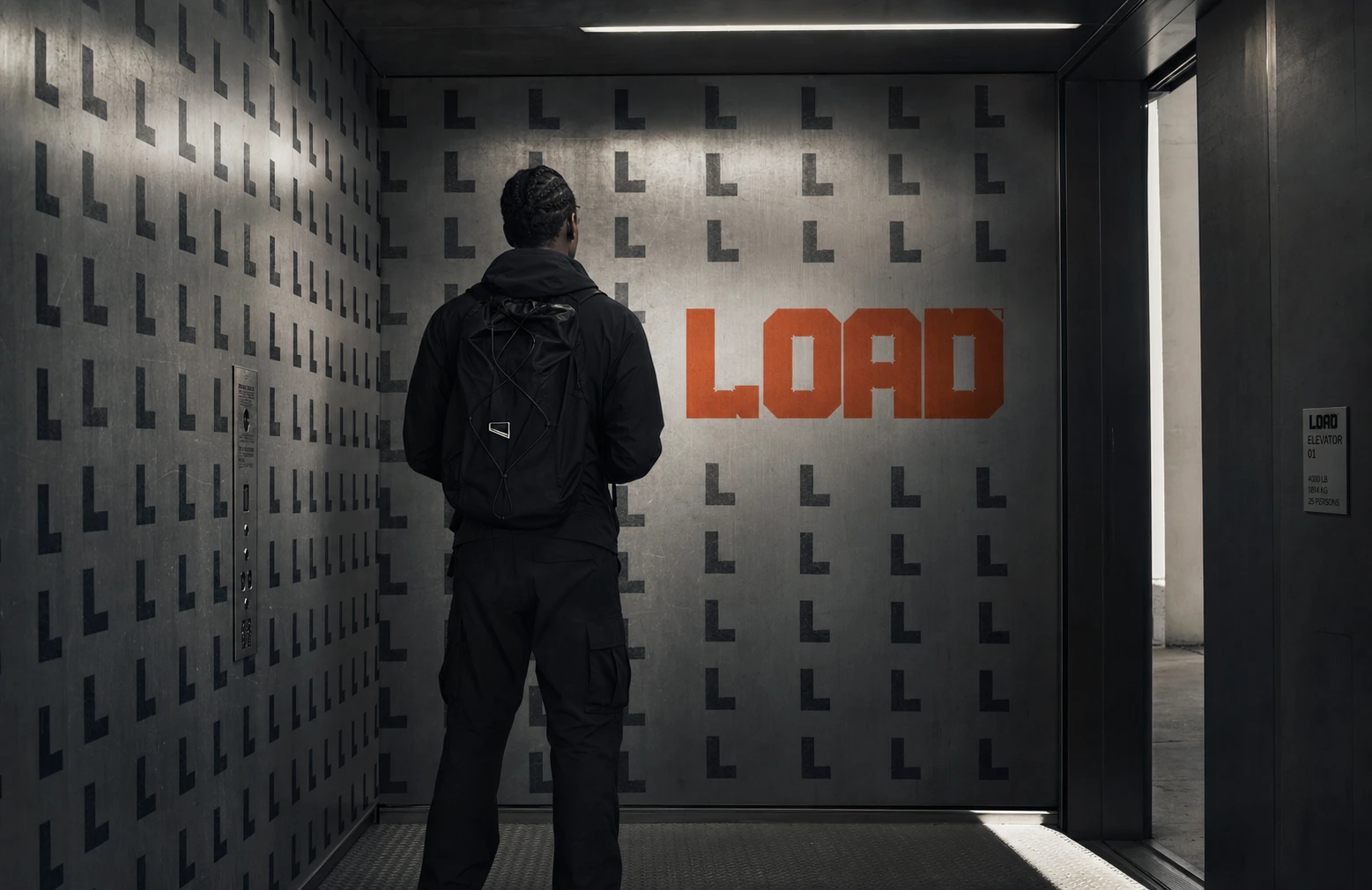
The real unlock was the girder-cutout wordmark — punching small rectangular reliefs through the thickest part of each letterstroke, the way a steel I-beam is relieved to save weight without losing strength. That single formal idea became the system's spine: it shows up as the wordmark, as a repeating pattern on packaging, as the vinyl wrap inside the freight-elevator OOH execution. One geometric rule, reused at every scale, is what kept a "brutalist" concept from collapsing into just looking rough for its own sake — the roughness had to be structurally justified every time.
Color was the other discipline point. I gave myself exactly one warm accent — Safety Orange
#D9531E — and forced everything else into cool concrete and black. The instinct in most food brands is to add more color to feel appetizing. I did the opposite: the less color the palette had, the more the one orange mark read as a warning label, a stamp of authority, not a flavor cue.THE WORK
BRAND IDENTITY / VISUAL SYSTEM
Built around the girder-cutout construction logic — every core asset (wordmark, packaging pattern, environmental wrap) traces back to the same punched-relief geometry, so the system reads as engineered rather than decorated.
LOGO
Five concepts explored, from a stamped monolithic wordmark to a rebar-cross symbol mark. Shipped concept: the girder wordmark, extra-bold grotesque with consistent rectangular cutouts at matching stroke height across all four letters — a mark that visibly looks like it's holding weight.
TYPOGRAPHY SYSTEM
A heavy-weight grotesque (Neue Haas Unica Bold-equivalent) set exclusively in caps, near-zero tracking for the wordmark, wider tracking for supporting copy, with a stencil-cut variant reserved for stamped and spray-applied applications.
COLOR SYSTEM
Concrete Grey
#A8A39A and Raw White #EDEAE3 as the neutral base, Black #111111 for all primary type, Safety Orange #D9531E as the single warm accent — capped at one appearance per composition to preserve its authority.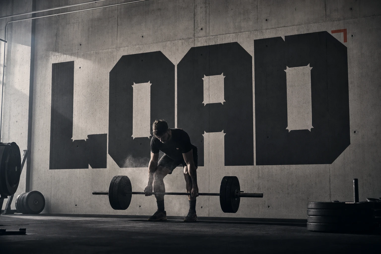
PACKAGING
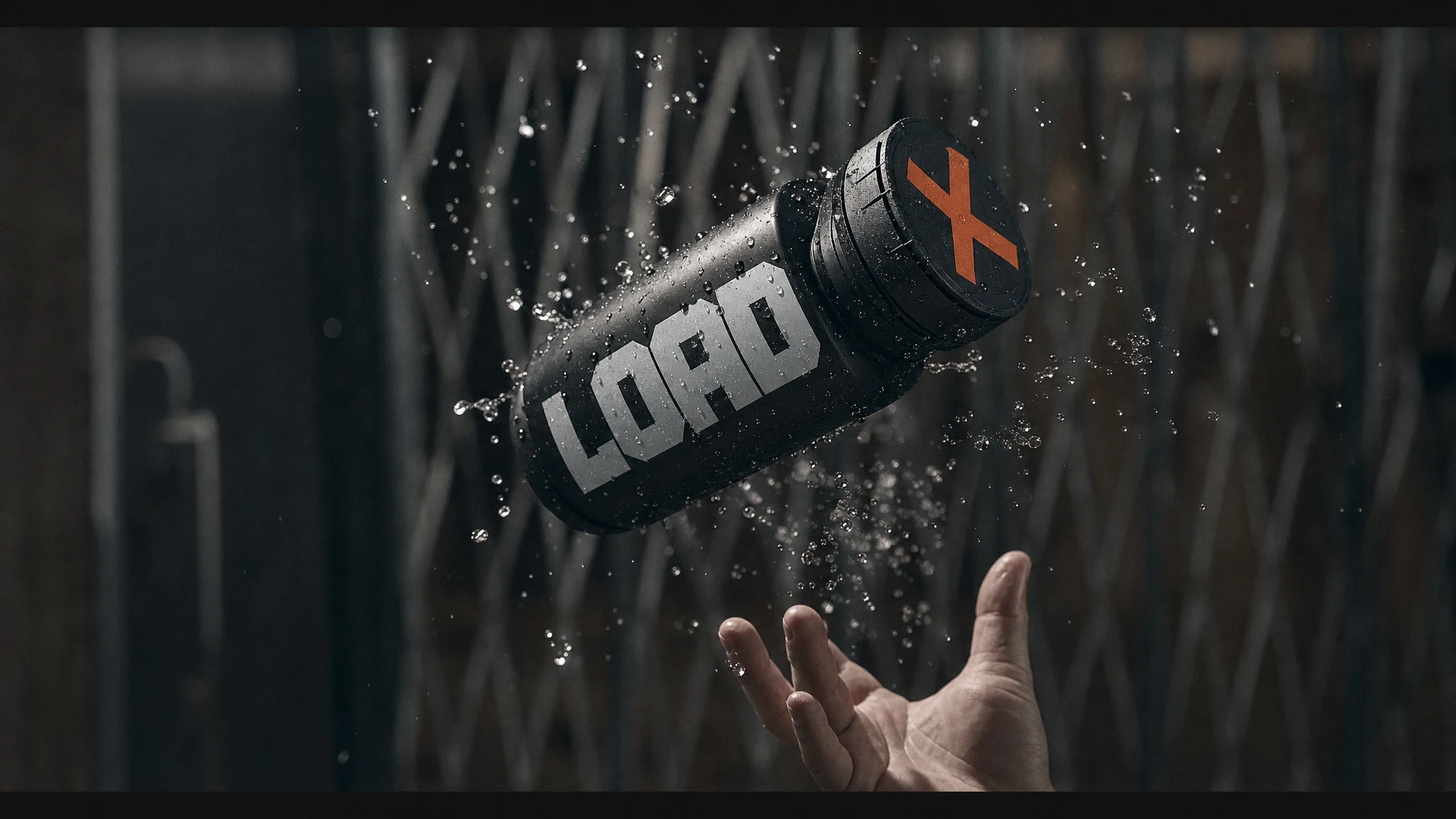
Matte black cylindrical canisters, wordmark stamped in Safety Orange, product names (Fuel, Recover, Sustain) set in the same grotesque with zero decorative elements — spec-sheet energy over shelf-appeal energy.
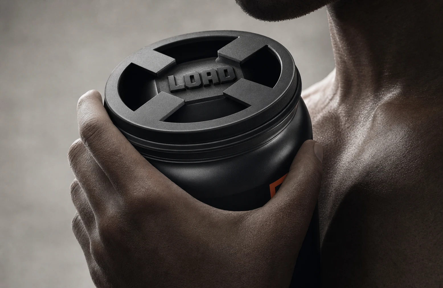
CAMPAIGN PHOTOGRAPHY
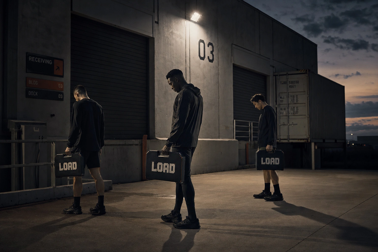
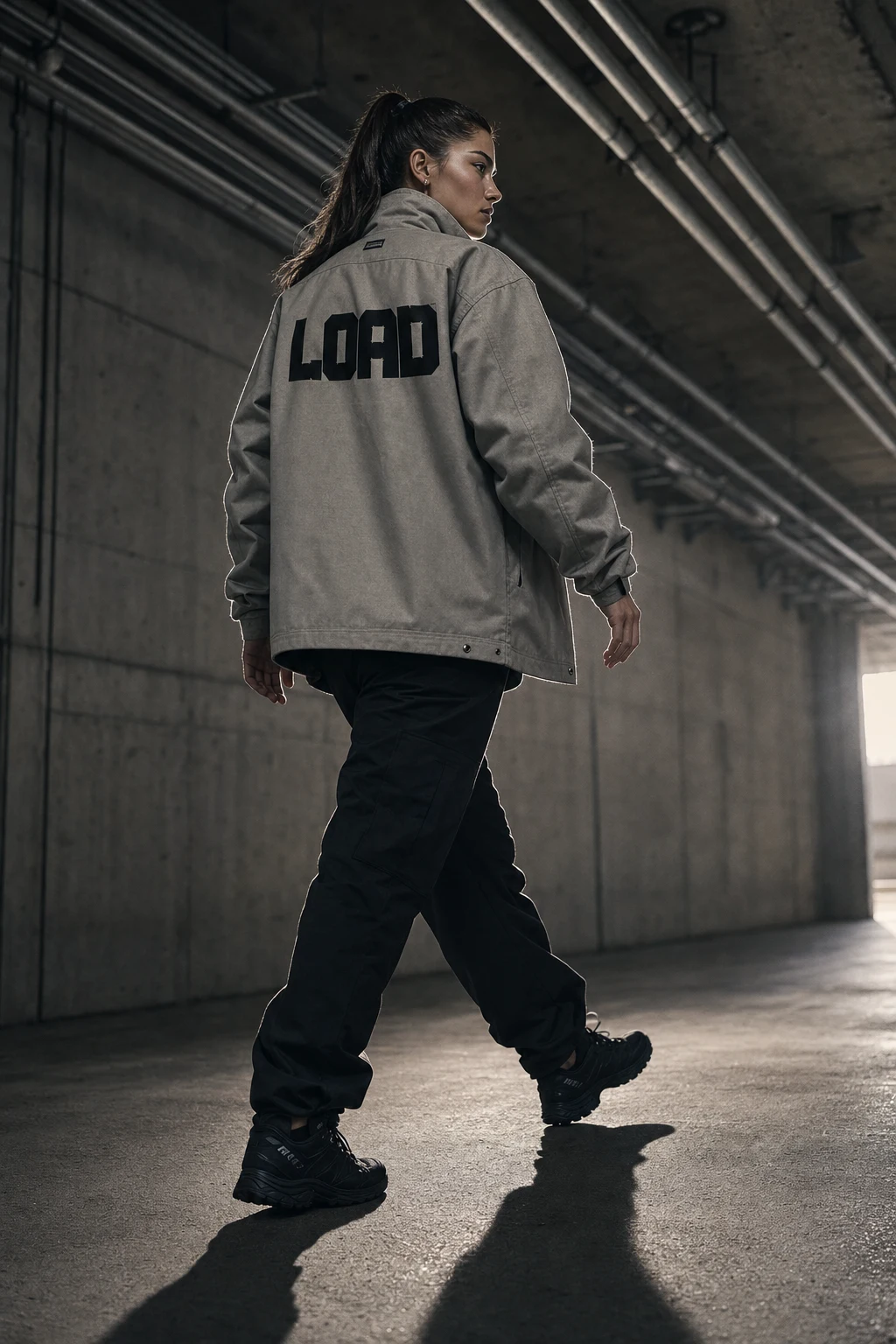
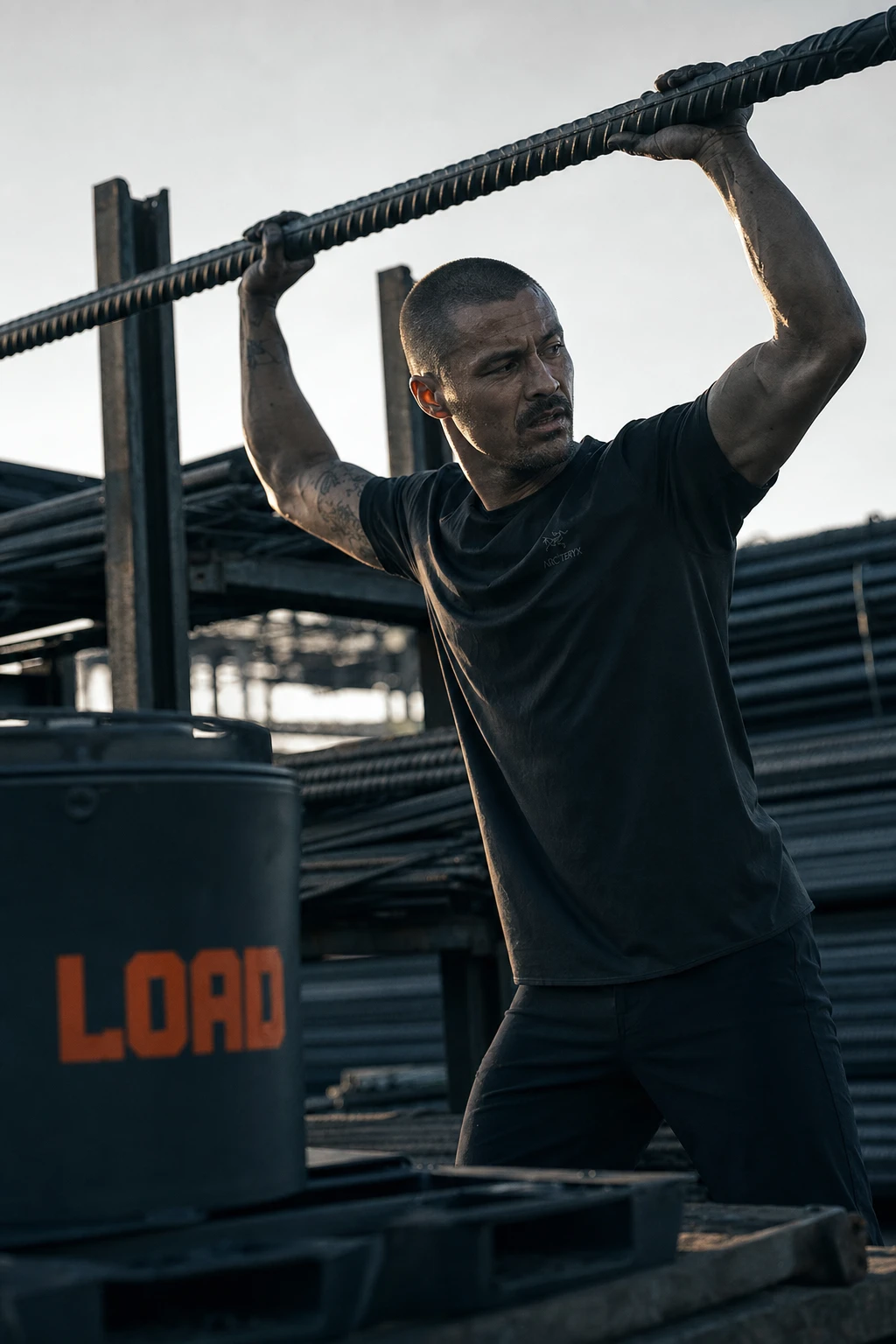
Shot in a Nike/Arc'teryx-grade industrial-athletic register — hard single-source lighting, cool-grey desaturated grade, real athletic models in neutral-to-serious expressions, always in raw concrete or steel environments, never a clean studio set.
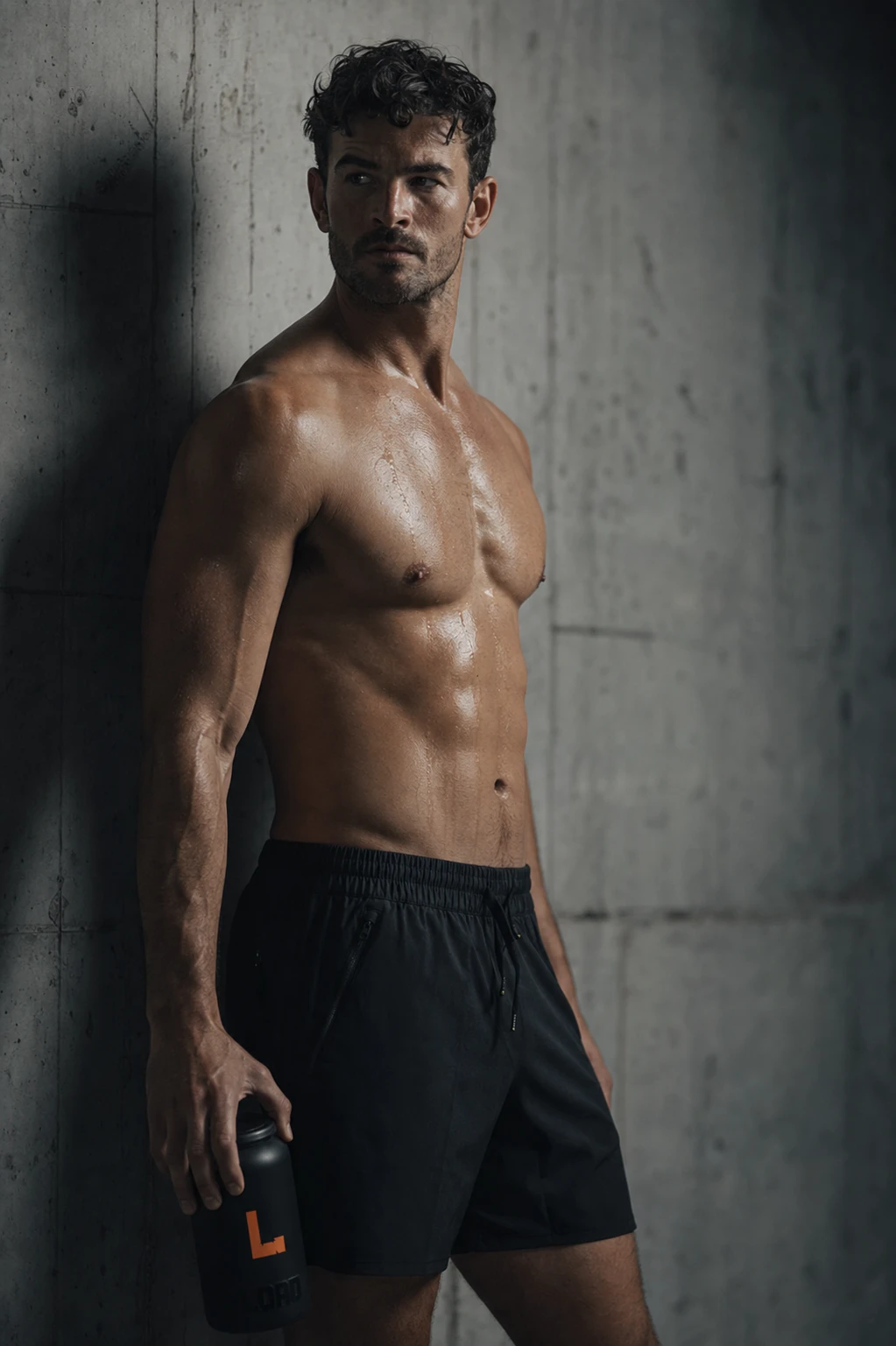
OOH / ENVIRONMENTAL
Billboard, subway wild-postings, a full freight-elevator interior wrap, and a hand-painted gym mural — the same wordmark tested at radically different scales and material contexts to prove the mark holds up whether it's ten stories tall or taped to a subway pillar.
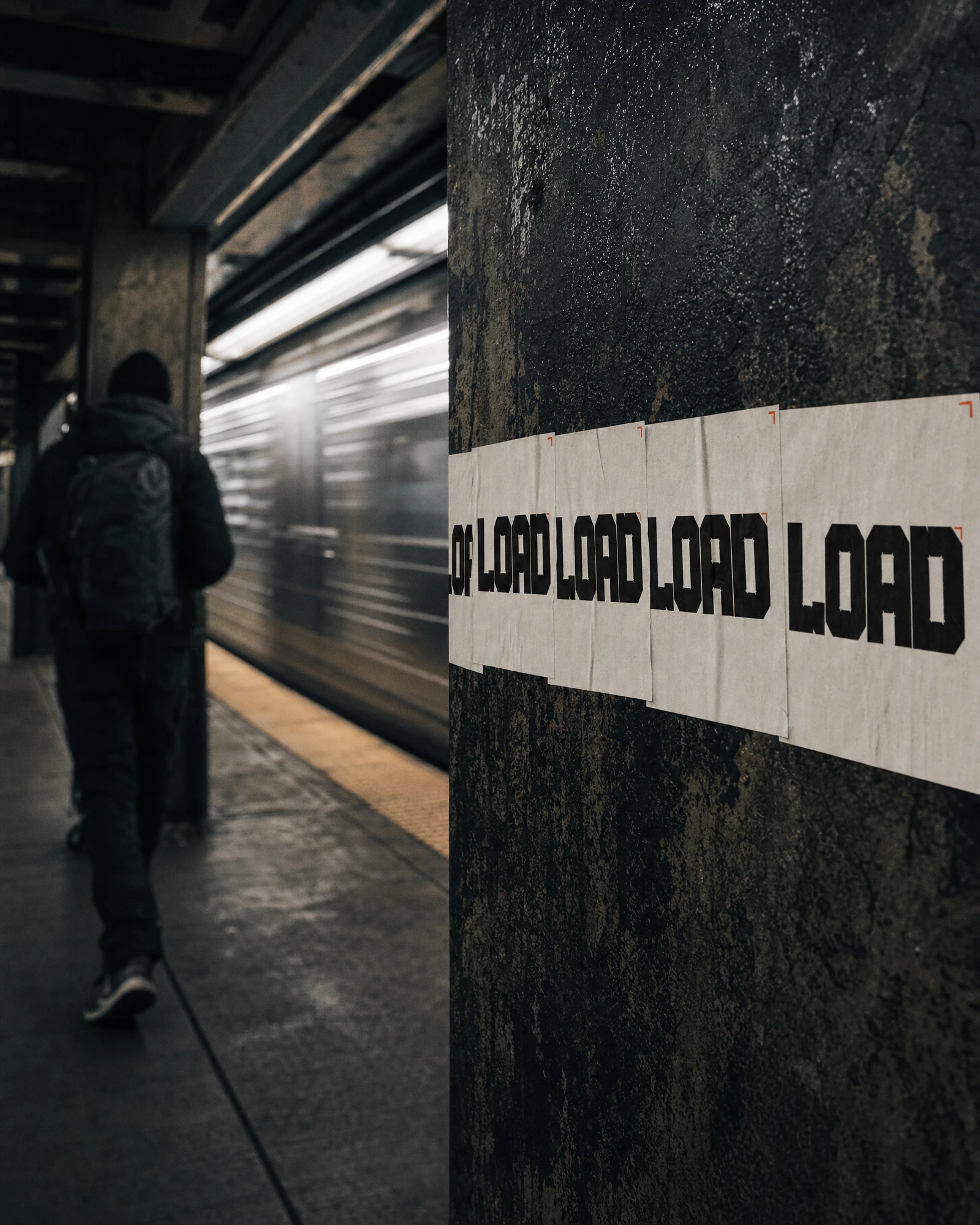
DIGITAL
A landing page card system with zero border-radius and hairline dividers instead of shadows, plus an app interface built around a single "Load Score" metric in oversized Safety Orange numerals against a blueprint-style grid.
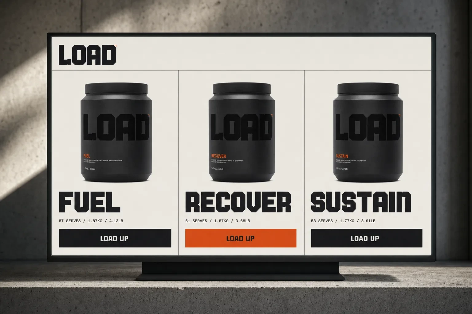
BRANDED OBJECT
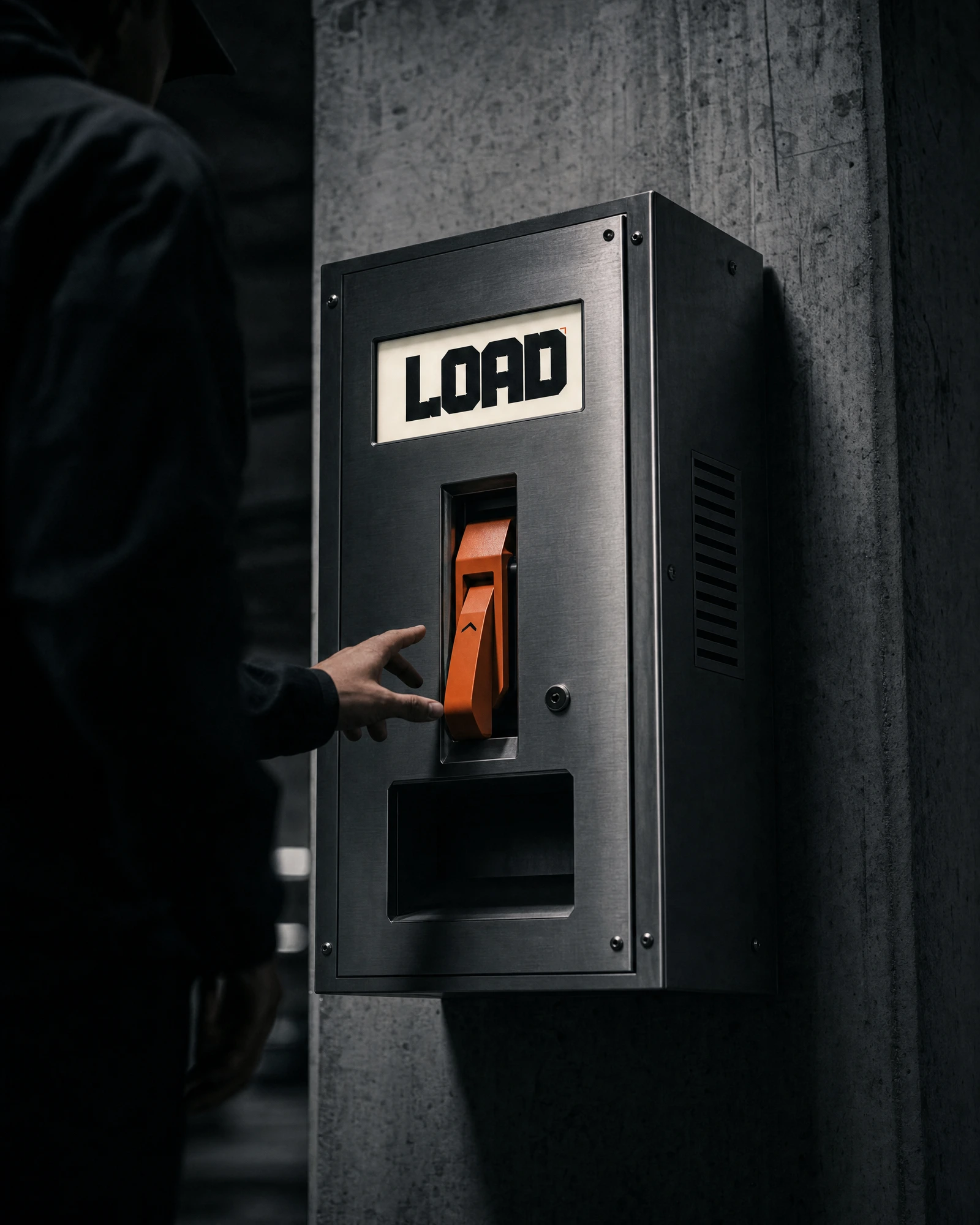
A custom vending/dispensing unit designed to look like real industrial hardware — brushed steel housing, a single orange lever, a backlit wordmark panel — turning the product touchpoint itself into brand architecture.
THE RESULT
What shipped is a system that holds its nerve across every format I threw at it — packaging, apparel, a ten-story billboard, a subway pillar, an app screen. That consistency was the actual goal: proving a genuinely anti-wellness nutrition brand could be built with the same rigor as an athletic or industrial brand, not as a novelty bit.
As a self-initiated system, LOAD now functions as the reference point I point to whenever a client says they want to feel "different" from their category but can't articulate what that costs. This is what it costs: giving up softness entirely and replacing it with structural logic at every single touchpoint.
Révolté — revolte.design
Project: LOAD
Year: 2026
Scope: Brand Identity, Naming, Packaging, Campaign Photography, OOH, Digital Design
Industry: Nutrition / Sports Supplements
See more at revolte.design
Like this project
Posted Jul 11, 2026
LOAD strips nutrition of every soft edge — a brutalist identity built like load-bearing structure, not a lifestyle brand
Likes
1
Views
41
Timeline
Jun 25, 2026 - Jul 11, 2026