Built with Lovart
WILD ARMS: A Monarchy Overthrown by the Wild Itself

Révolté


WILD ARMS — A Monarchy Overthrown by the Wild Itself
LOGLINE
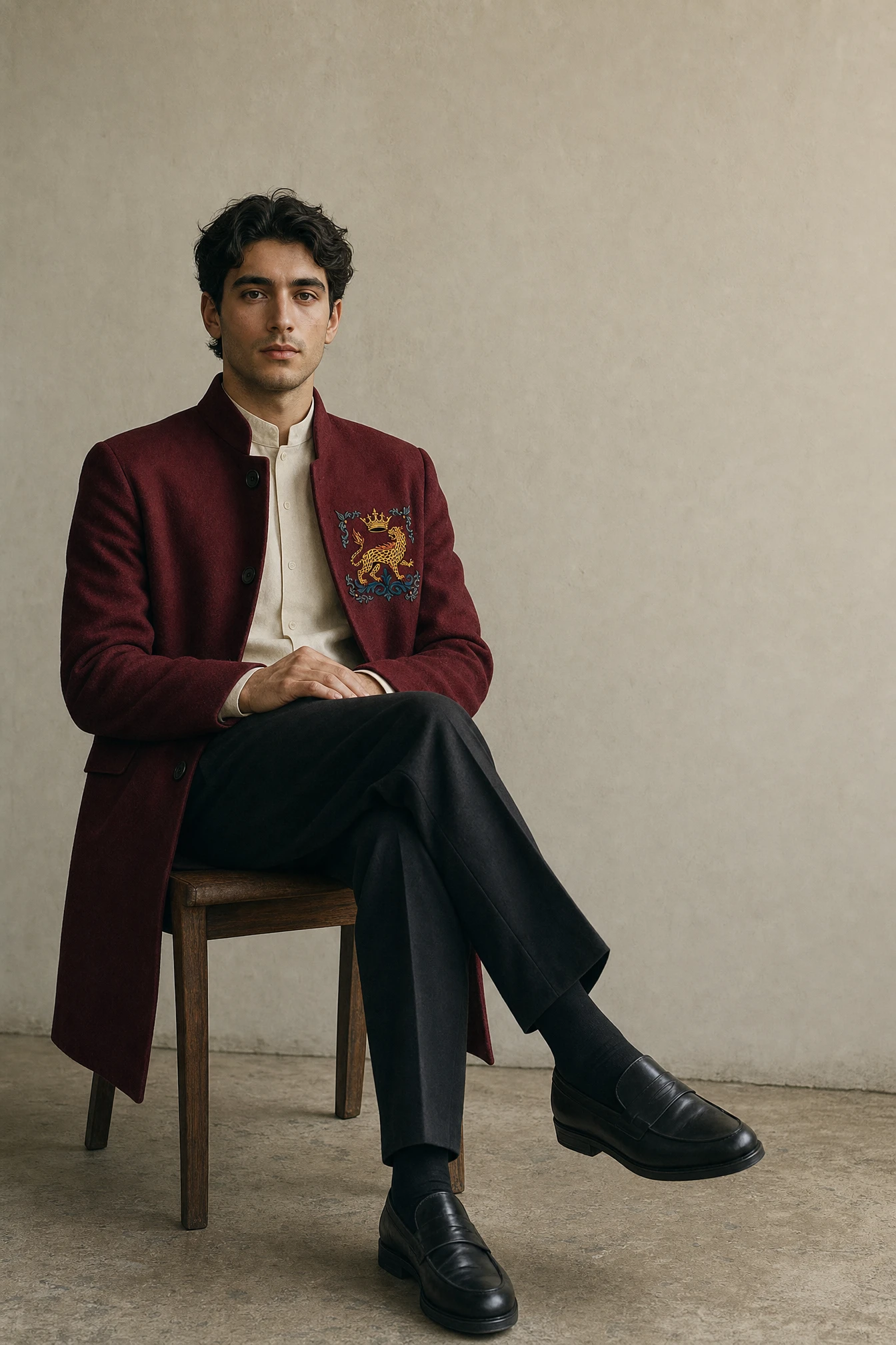
A heritage fashion house that never existed, built on one premise: what if the crown didn't fall to revolution, but to instinct. I designed the full identity, crest, and campaign for a brand whose nobility comes from bloodline, not bureaucracy.
THE BRIEF
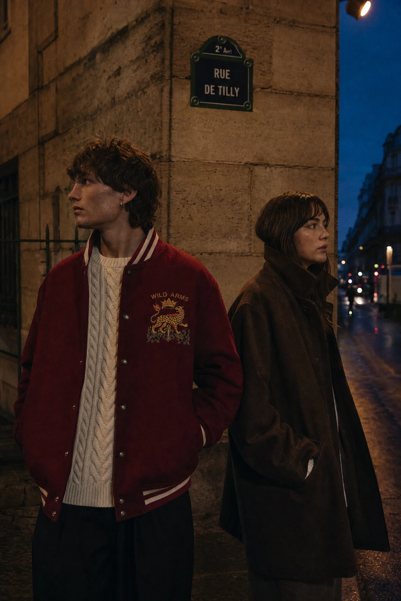
This one started as a personal exploration, not a client brief — which meant I had to invent the tension myself. I wanted to build a fashion house that lived entirely inside the language of heraldry: crests, crowns, Latin mottos, the whole apparatus of old European nobility. But I didn't want another brand cosplaying royalty. I wanted royalty that had already been replaced.
The idea I kept coming back to was simple and a little absurd: a monarchy overthrown not by its people, but by its own wildlife. The crest stays. The crown stays. The animals just stopped answering to anyone.
What made it hard was restraint. Heraldry is easy to wreck — crack it, distress it, melt the gold, and you get costume jewelry. I wanted something that could hang in a real archive.
THE APPROACH
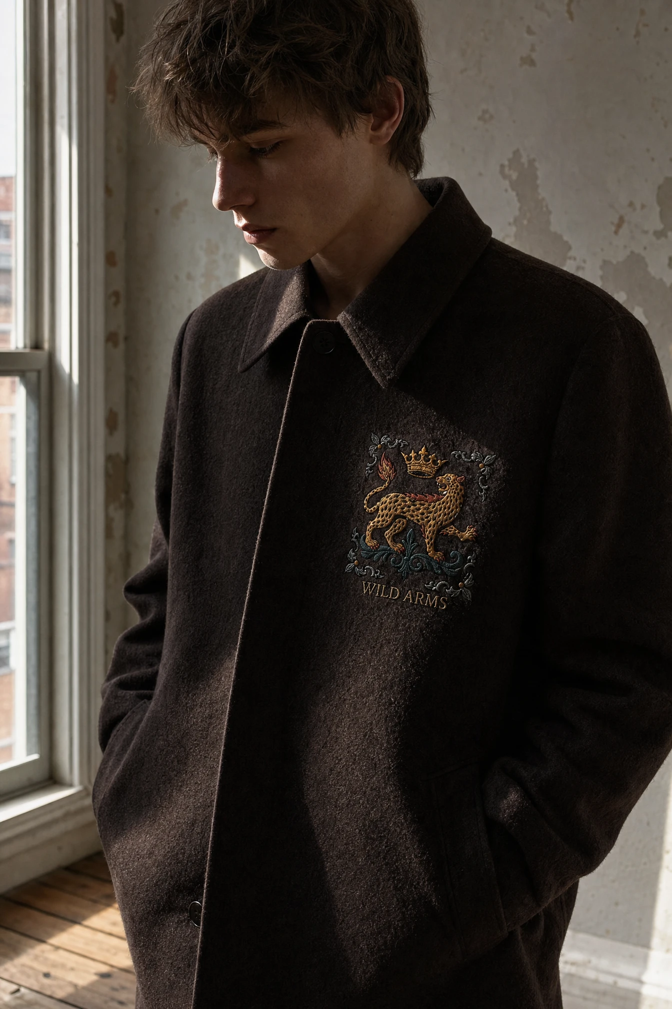
My first instinct was to literally damage the crest — cracked linework, scorched edges, a paw print crushing the crown. It read as cosplay almost immediately. The wildness needs to live in what the crest depicts, not in how broken the crest looks. That single correction reshaped the entire project.
I also tried building the mark as a fine-line engraved seal, like old currency plates — elegant, but it didn't have enough graphic punch to survive at apparel scale, especially on streetwear silhouettes like hoodies and varsity jackets. The unlock was switching to bold, flat-color illustration: even line weight, no gradients, color blocking instead of shading. That register let the crest sit comfortably on a wax seal and on a screen-printed tee without ever looking like two different brands.
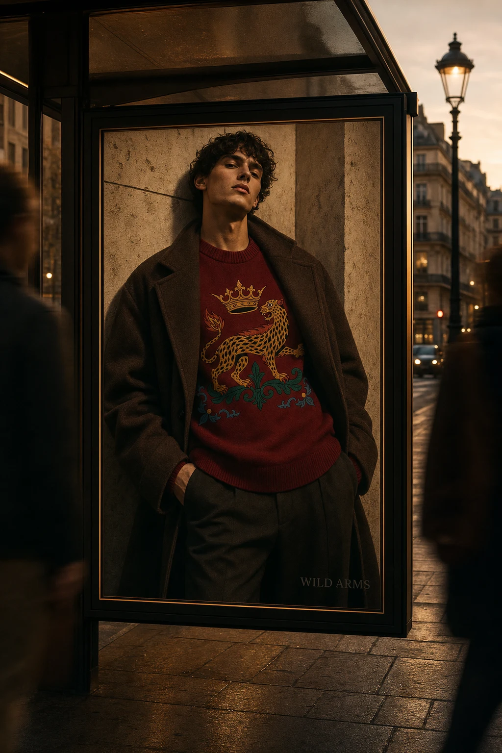
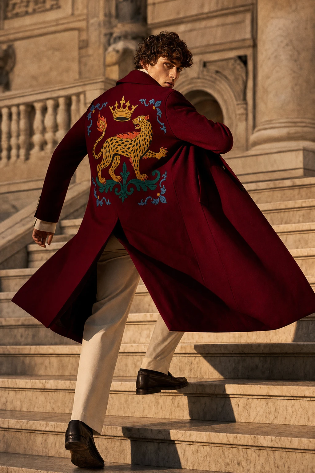
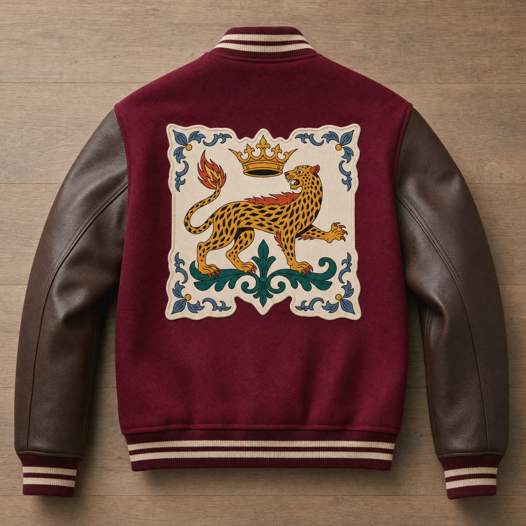
From there the system built itself around one animal: a crowned leopard, rosette-spotted, tail ending in a small flame, framed by classical acanthus scrollwork. Every other decision — palette, typography, photography — exists to support that one figure staying legible at any scale, from a 5cm hangtag to a 26cm back patch.
THE WORK
Brand Identity / Visual System
The full identity runs on a single illustrated heraldic mark rather than a shield-and-quartering system, which kept the brand world legible across categories that have nothing in common — perfume glass, wool melton, kraft paper, satin lining.
Logo
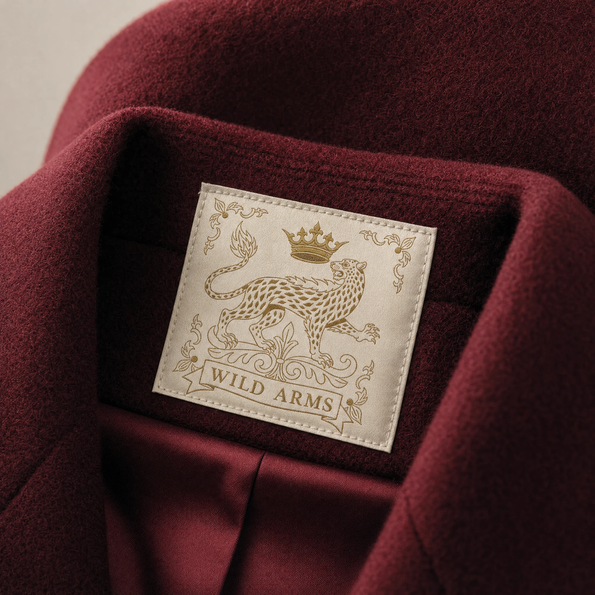
A crowned leopard in profile, mid-stride, rendered in flat color with uniform black outline (
#1A1A1A) — gold body, Pelt Brown rosette spots, Royal Crimson mouth and tail-flame, Deep Pine scrollwork base, Slate Blue corner flourishes. No distress, no cracking — the wildness lives in the subject, not the surface.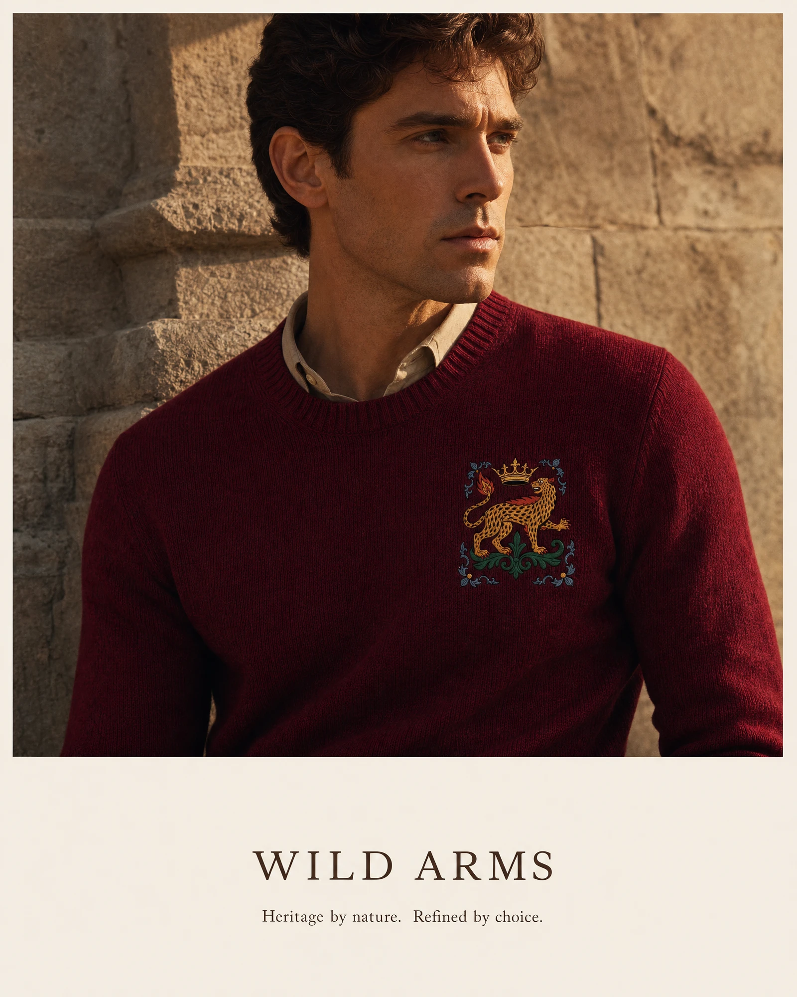
Typography System
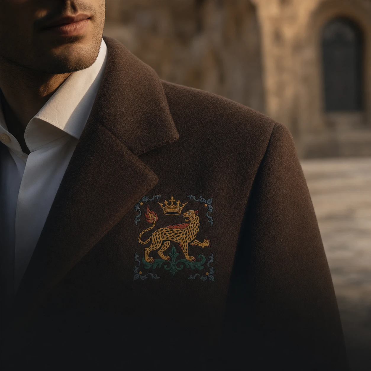
A refined serif in small caps carries the wordmark across all applications — sweater chest embroidery, perfume labels, storefront signage — keeping the crest as the only illustrated element in any given composition.
Color System
Royal Crimson
#7A0C2E and Tarnished Gold #A88B3C carry the brand's dominant identity; Pelt Brown #4A372E and Bone Ivory #EFE6D8 handle materials and backgrounds; Deep Pine #1F4D3D and Slate Blue #5B7A92 live only inside the crest itself, never as standalone brand colors.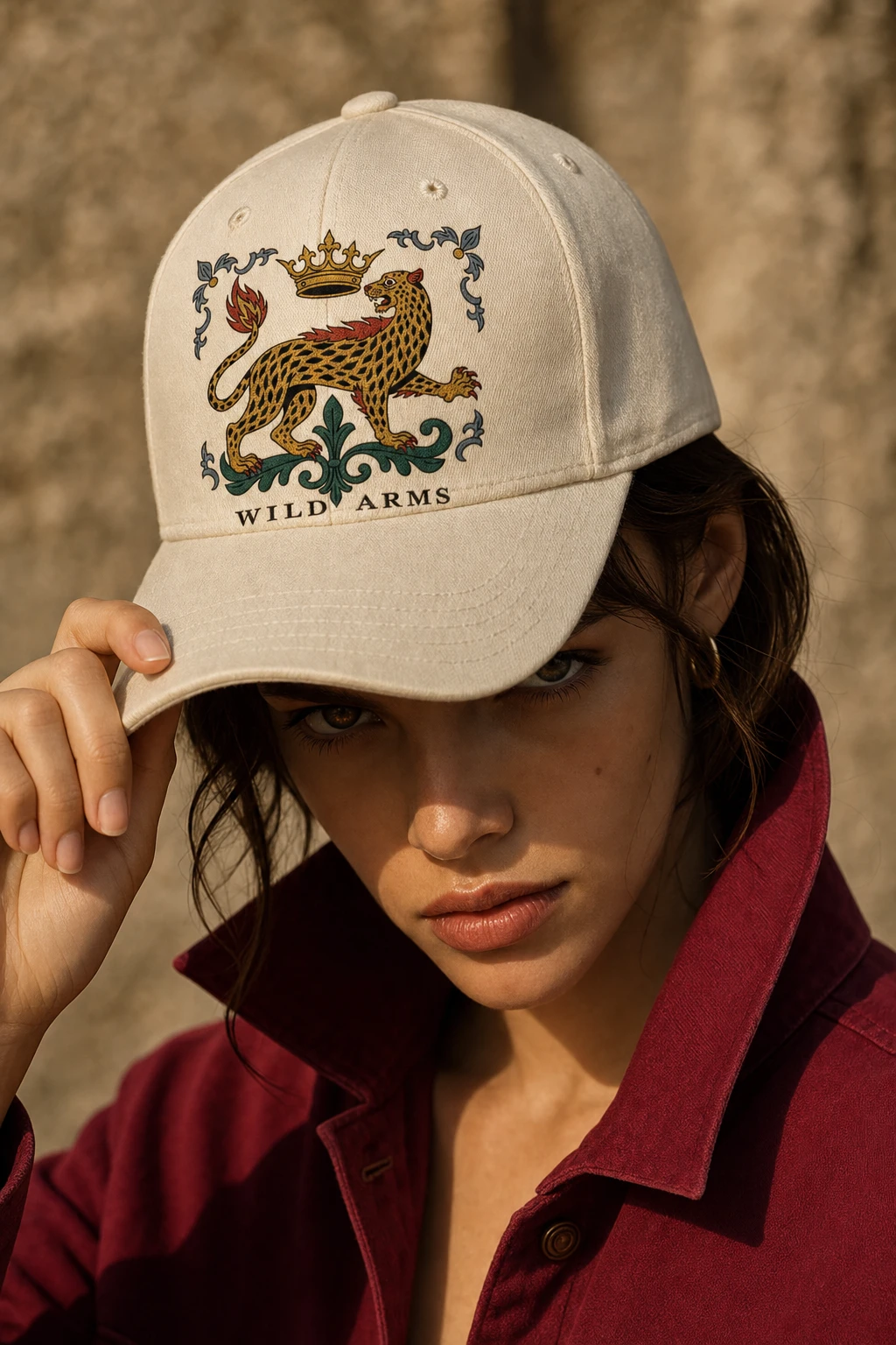
Packaging
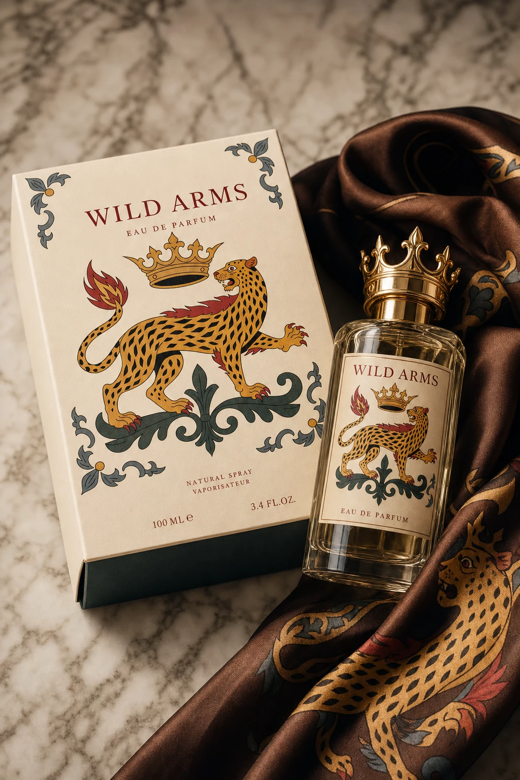
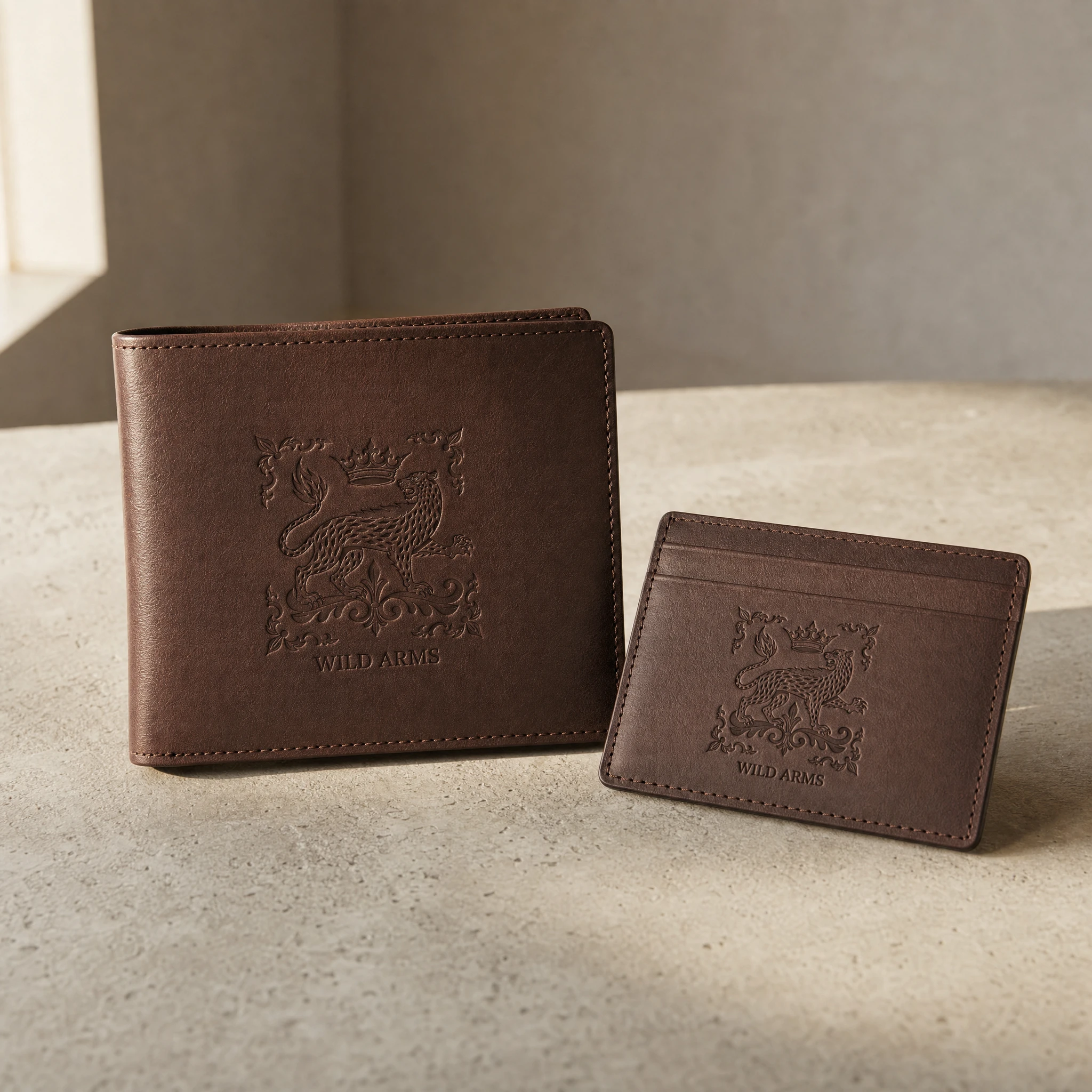
Garment boxes in Bone Ivory with Royal Crimson ribbon, foil-stamped crest on the lid; perfume packaging carries the same mark with a crown-shaped bottle cap; leather goods get the crest debossed with no ink, readable through shadow alone.
Campaign Photography
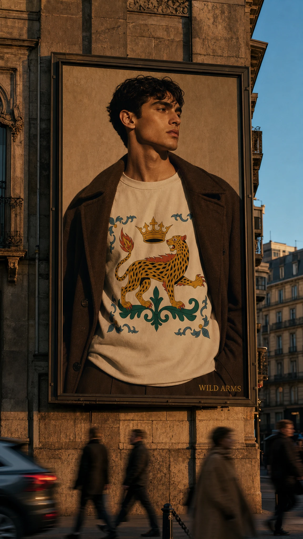
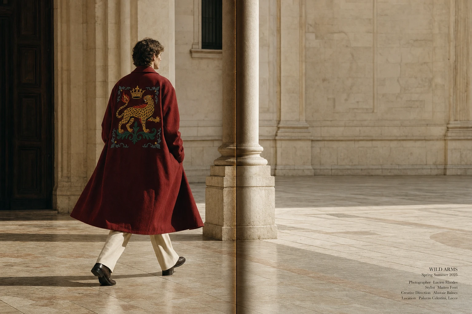
Shot in a heritage-editorial register — stone courtyards, marble staircases, golden hour — with the crest appearing at every scale from a small chest emblem to a building-sized OOH portrait, always legible, never the loudest thing in the frame.
THE RESULT
What shipped is a brand that reads as inevitable rather than invented — the kind of crest you'd believe predates the company by a century. The flat-illustration register solved the project's hardest problem: making "feral nobility" feel earned rather than costumed, and making one mark work identically well on a wax seal, a varsity patch, and a city billboard.
Révolté — revolte.design
Project: WILD ARMS
Year: 2026
Scope: Brand Identity, Logo Design, Packaging, Campaign Art Direction
Industry: Fashion
See more at revolte.design
Like this project
Posted Jul 9, 2026
Fashion house where the monarchy fell to instinct, not revolution — one crowned leopard, one feral bloodline
Likes
2
Views
25
Timeline
Jun 15, 2026 - Jul 9, 2026