Built with Lovart
Slab: Bold Identity for Energy Drink Brand

Révolté


SLAB — Concrete Poured Into a Character
LOGLINE
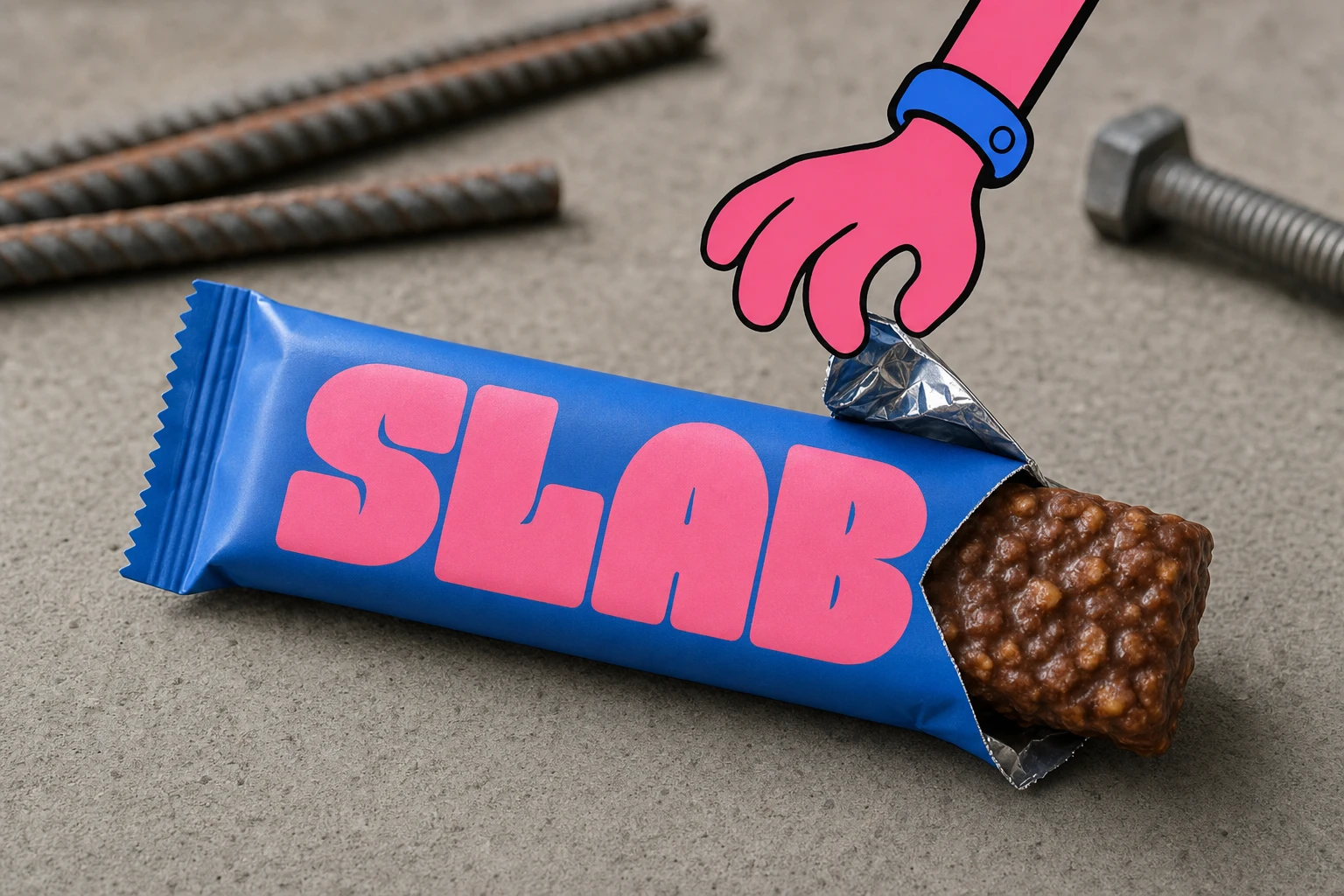
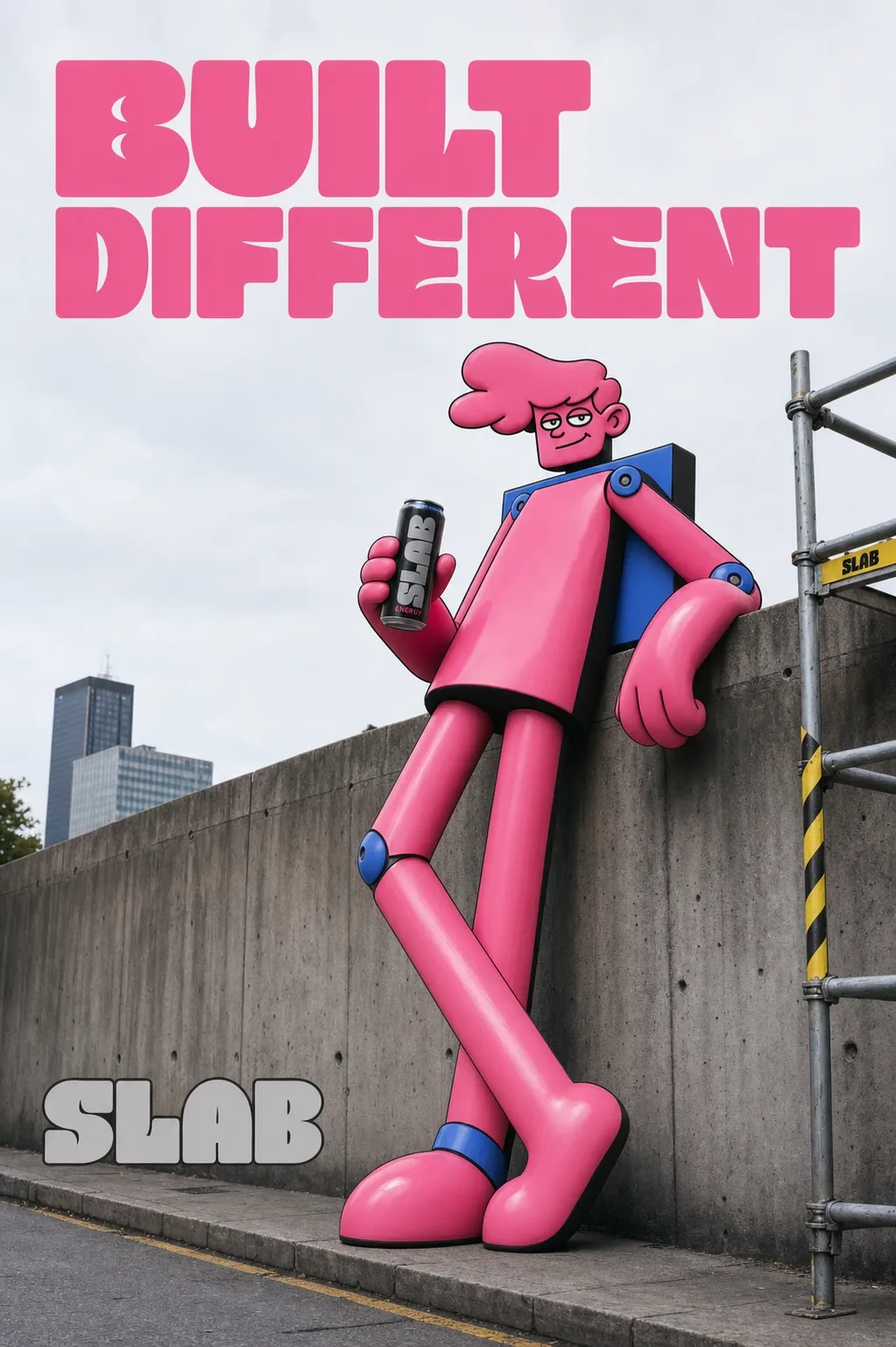
An energy drink brand needed to stand out in a category that's either all neon-gamer-chaos or all clean-girl-minimalism. I built the whole identity around a single collision: raw poured concrete and a giant, loose-limbed cartoon that looks like it just climbed out of the pavement.
THE BRIEF
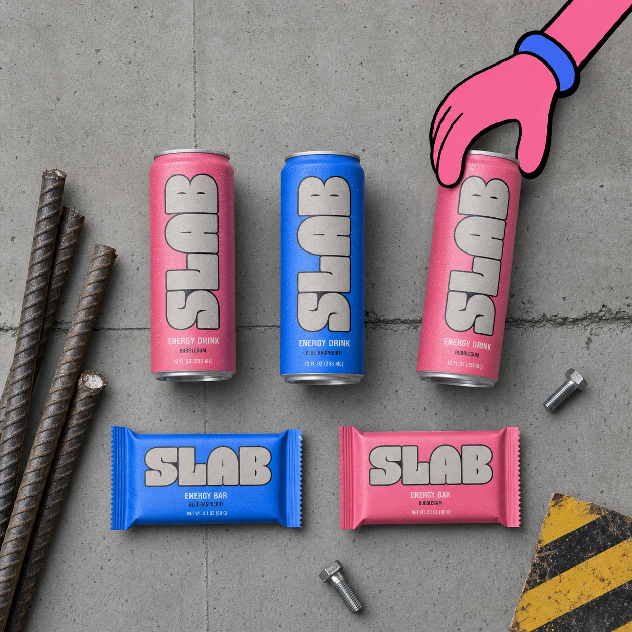
They came to me wanting something "bold and disruptive" for a new energy drink and bar line — which is the brief every energy brand gets, and it usually produces the same three moves: chrome gradients, lightning bolts, or an extreme-sports guy mid-jump. None of that. I wanted a brand that didn't look like it was trying to be loud, but was structurally loud — the way a brutalist building is loud without a single bright color on it.
The real tension was scale versus warmth. Brutalist architecture reads as cold, institutional, heavy. Energy drink buyers want a character they'd want on their can — something with personality, something they'd screenshot. I had to make those two things share one body.
What I took on was the full system: mascot, logotype, color system, and a packaging and campaign line convincing enough to prove the identity actually works in the world, not just on a moodboard.
THE APPROACH
My first instinct was a blob creature — one continuous soft shape, no joints, built from the same rounded-rectangle "slabs" as poured concrete. It looked good as a standalone mark. It looked wrong the second I put it next to a real building. It read as a mascot for a candy brand, not a brand that was supposed to be inhabiting brutalist architecture the way giant illustrated figures do in the Chinese street-art-meets-photography work I was referencing. The blob had no legs to speak of, no stride, no way to physically occupy a scene.
So I killed the blob logic and rebuilt the figure as a proper cartoon human — distinct head, torso, arms, legs — but kept every limb built from the same slab-module construction, just assembled like a person instead of fused into one shape. First pass came out squat and dinosaur-proportioned, which undercut the whole point: this figure needed to be tall enough to drape an arm across a twelve-story building. I stretched the proportions to a lean, gangly 3:1 height ratio and that's when it clicked — a figure that looks like it's always mid-lean or mid-stretch, casually enormous.
The detail that ties the whole concept together came almost as an afterthought: instead of soft cartoon joints, I gave the mascot visible bolt and rivet circles at the shoulders and knees, rendered in Electric Blue. It's a small thing, but it's doing the real conceptual work — it's the one piece of the character that says "built," not "born," without a single line of copy needed. Once that was locked, the legs became the character's signature: every pose had to show them doing something specific — mid-stride, crouched, splayed, leaning — because a static stance would've killed the "giant casually inhabiting the city" feeling the whole brand depends on.
The logotype needed to argue the same point typographically. I didn't want a typeface applied to the word SLAB — I wanted letterforms built from the same slab module as the mascot, thick uniform strokes, tight counters, near-touching baseline connections, so the word reads as one poured, load-bearing object rather than four separate characters.
THE WORK
LOGOMARK / MASCOT
A tall, lean cartoon-human figure at roughly a 3:1 height-to-width ratio, built from rounded-rectangle slab modules for head, torso, and limbs, with rounded overlap "joints" at the shoulders, elbows, hips, and knees rather than hinges. Rendered flat in Bubblegum Pink
#FF6FA5 for the body with an Electric Blue #2D7DFF strap/overall detail and matching bolt-circle joints at the shoulders and knees. Thick, unbroken black outline throughout, single flat highlight per shape, zero gradients. Face kept minimal — two dot-and-oval eyes, one thick curved mouth line, a half-lidded confident expression that reads at favicon scale.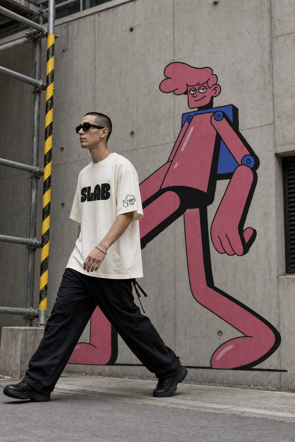
LOGOTYPE
An all-caps custom wordmark built from the same slab module as the mascot: extreme bold weight, heavily rounded corners with occasional flat-cut terminals, tight counters, near-zero tracking so the word reads as one continuous poured form. Rendered in Concrete Grey
#B7B3AC for architectural and print contexts, with a Bubblegum Pink #FF6FA5 alternate for digital and social placements.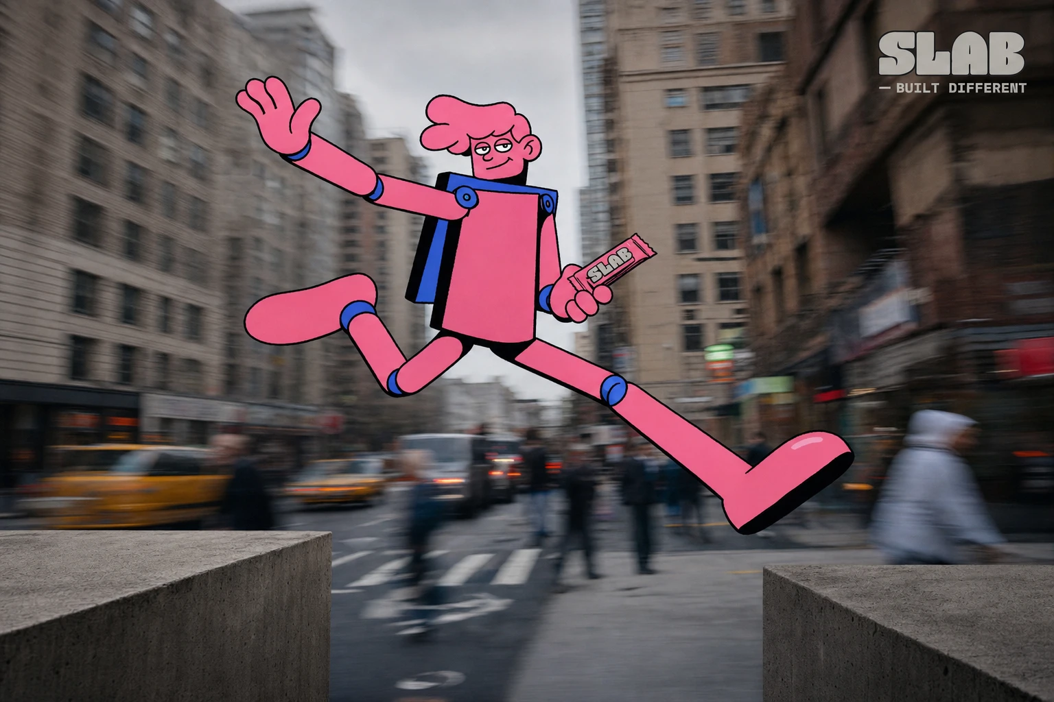
PACKAGING
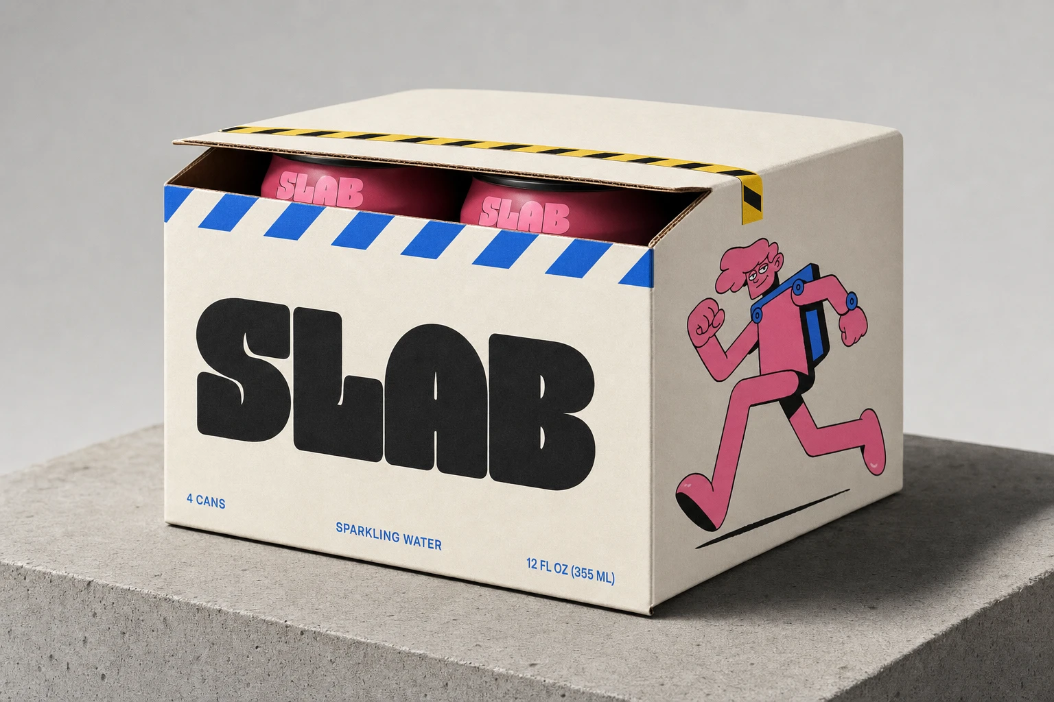
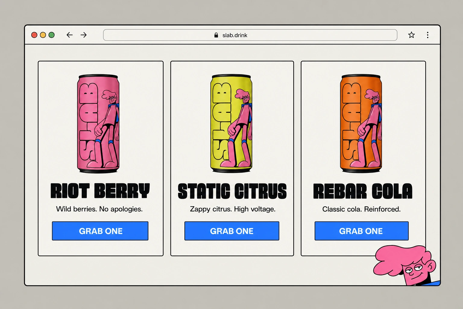
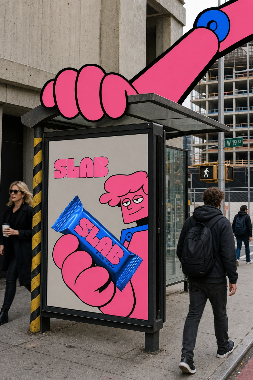
The core can system runs three flavors — Riot Berry, Static Citrus, Rebar Cola — each on a different flat background color with the Concrete Grey logotype running vertically up the can body, a small cropped mascot detail (face, thumbs-up hand) as a corner mark. The multipack box uses Off-White cardboard stock, an Electric Blue hazard-stripe band along the top edge doubling as the tear-strip, and a full-body running mascot pose printed on the side panel. The energy bar wrapper flips the palette — Electric Blue foil, Bubblegum Pink logotype — with a torn-open corner used consistently across product photography as a recurring "mascot hand mid-action" device.
OOH / CAMPAIGN
The system's real test was scale. A building-takeover billboard has the mascot's arm draped down a twelve-story concrete facade, handing a giant can to street level. A metro platform backlit panel shows the mascot crouched low, pushing a can overhead, under the line "FUEL THE GRIND." A bus shelter panel pairs a cropped mascot-and-bar close-up with the full figure's arm reaching in from off-panel, as if the character is interacting with its own ad. A two-mascot split poster — one figure mid-stride handing off a can, the other crouched to catch it — carries the line "PASS IT ON" and doubles as the clearest proof that the leg-posing rule holds up across multiple figures in one frame.
WEB / DIGITAL
A flavor-comparison card row for slab.drink uses sharp-edged, minimal-radius cards on Off-White backgrounds, Ink Black all-caps headlines in the slab wordmark style, and solid Electric Blue rectangular CTAs reading "GRAB ONE" — deliberately flat and grid-locked rather than soft or shadowed, with a small mascot face tucked into the corner as the only playful UI element.
APPAREL / STATIONERY / SIGNAGE
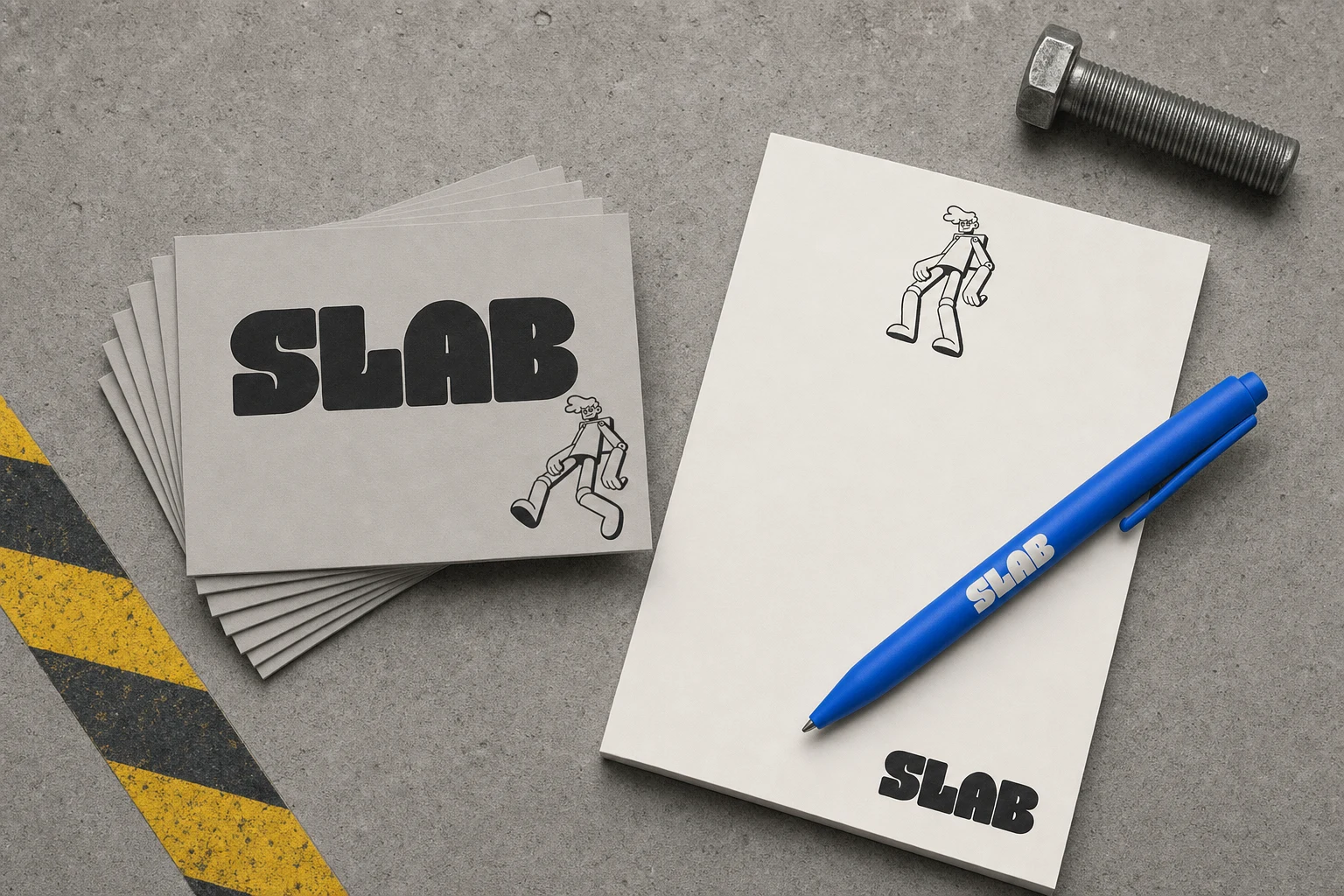
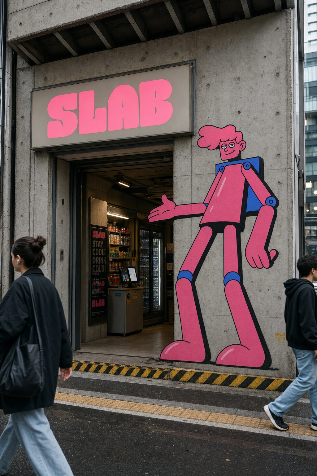
An oversized Off-White t-shirt carries the logotype on the chest and a small mascot print on the sleeve, worn against a matching wall-mural version of the mascot mid-stride for a deliberate real-world/illustrated echo. Business cards and a notepad system in Concrete Grey and Off-White use a small jumping-pose mascot as a consistent corner mark. Storefront signage backlights the logotype in Bubblegum Pink against a Concrete Grey panel, with a full-scale mascot painted directly onto the adjacent concrete facade gesturing customers inside.
THE RESULT
What shipped is a system that holds its logic at every scale — from a favicon-sized mascot face to a mascot arm wrapped around an entire building. The bolt-joint detail and the leg-posing rule turned out to be the two small decisions that made the whole thing cohere; without them, this was just another candy-colored mascot brand. With them, it's a character that's unmistakably made of the same material as the city it's standing in.
Révolté — revolte.design
Project: SLAB
Year: 2026
Scope: Brand Identity, Logo & Logotype, Packaging, Campaign / OOH, Web Design
Industry: Food & Beverage (Energy Drinks & Bars)
See more at revolte.design
Like this project
Posted Jul 20, 2026
A giant cartoon mascot built from the same slab logic as the brutalist city it climbs — energy drink branding with bolted joints and no soft edges
Likes
2
Views
30
Timeline
Jan 1, 2026 - Dec 31, 2026