Built with Lovart
Ferrous Cookware Brand Identity

Révolté


FERROUS — Cookware Built From What's Behind the Pass, Not On the Table
LOGLINE
Most cookware brands sell the finished dinner. Ferrous sells the fifteen minutes before it — the dark, brass-lit chaos of a professional kitchen mid-service. I built the entire identity around the idea that this brand should look like it belongs in the hands of the person plating, not the person eating.
THE BRIEF
I started this one with a completely different premise: minimalist, anti-lifestyle industrial cookware for people who hated the beautiful-kitchen category. Function over form, no color, no story.
Then I looked at four photos from actual Michelin kitchens — Capella Hanoi, a Provence dining room, a London pass mid-plate — and the premise fell apart. These weren't clean, bright, or even legible half the time. They were dark on purpose. Underlit on purpose. One light source, everything else surrendered to shadow. That's not the absence of production value — that's the actual visual language professional kitchens run on.
The tension became: how do you brand a product for people who work in rooms this unglamorous-looking, without making the brand itself look unglamorous?
THE APPROACH
My first instinct was to keep the industrial premise and just darken the photography. That didn't hold — it read as moody home cookware cosplaying as professional gear, which is exactly the category Ferrous needed to sit outside of.
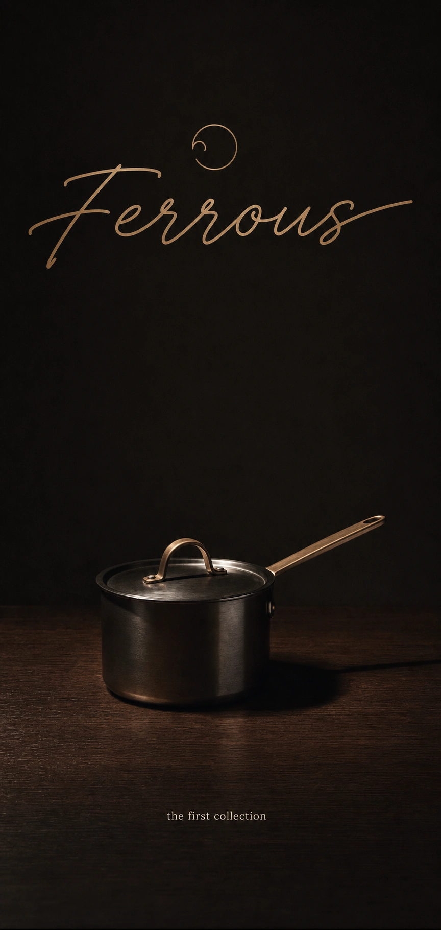
What unlocked it was separating the name from the mark. Ferrous is a hard, mineral, industrial word. So I gave it a wordmark that argues with that — a fine, monoline cursive, upright rather than swung wide, one restrained flourish on the final "s". Not romantic. Controlled. Like it was engraved once and never re-touched.
The logomark carries the rest of the concept: a broken ring, open at one point, reading as a hook or handle mid-forge — always in process, never finished. It's the same idea as the photography: nothing about this brand is staged as complete. It's caught mid-service.
From there the whole system followed one rule — every surface behaves like the materials it's printed on. Brass catches light instead of sitting flat. Nothing is pristine. Wear is a feature, not a flaw to retouch out.
THE WORK
LOGO
A broken brass-gradient ring (C9A272 to 7C5430) paired with "Ferrous" set in Pinyon Script. Used at full lockup scale only on packaging and digital surfaces; reduced to the logomark alone, stamped or engraved at true scale, on physical products.
TYPOGRAPHY AND COLOR SYSTEM
Pinyon Script for the wordmark only — never used for body copy. Supporting type is a restrained cream serif for digital and print. Palette locked to four colors across every touchpoint: charcoal black 1A1714, aged brass gradient, oxblood 5C1F18, cream F4F1E8. No fifth color anywhere in the system.
PACKAGING
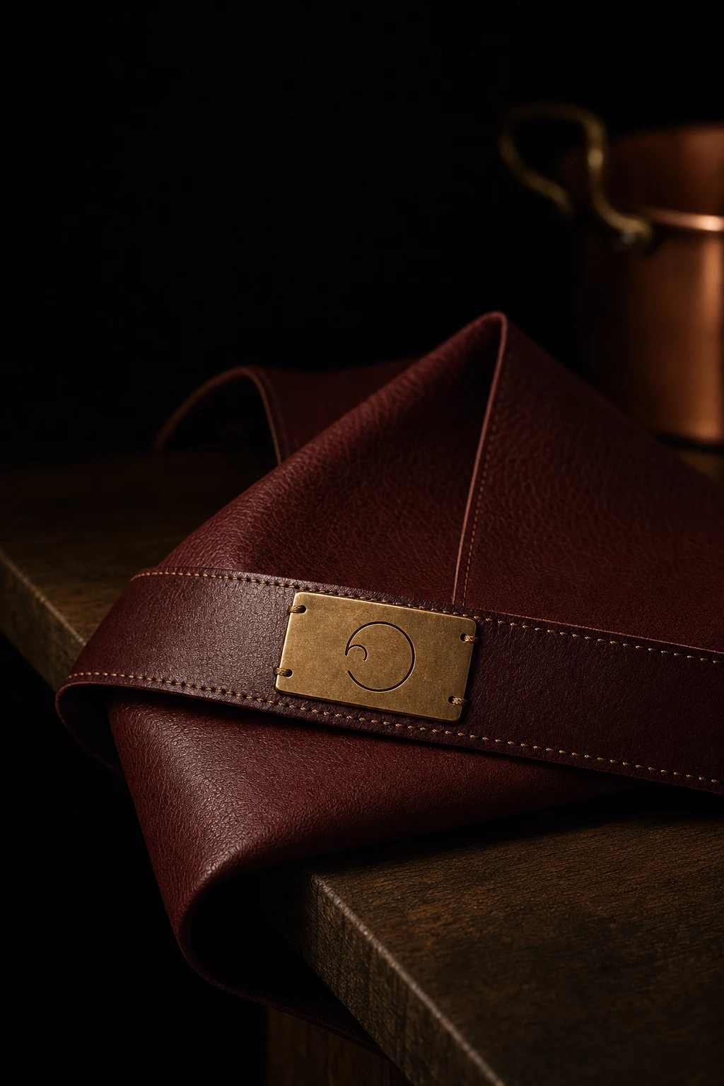
A rigid charcoal presentation box with a foil-stamped brass wordmark, oxblood felt interior, brass corner reinforcements. The gift box and knife case both repeat this exact material logic — dark exterior, warm interior reveal — so unboxing functions as the brand's one guaranteed moment of full-color payoff.
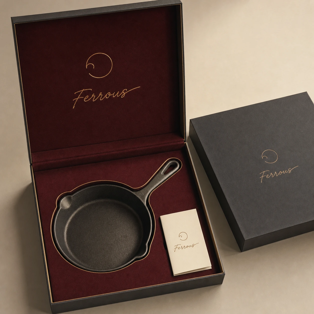
BRANDED OBJECTS
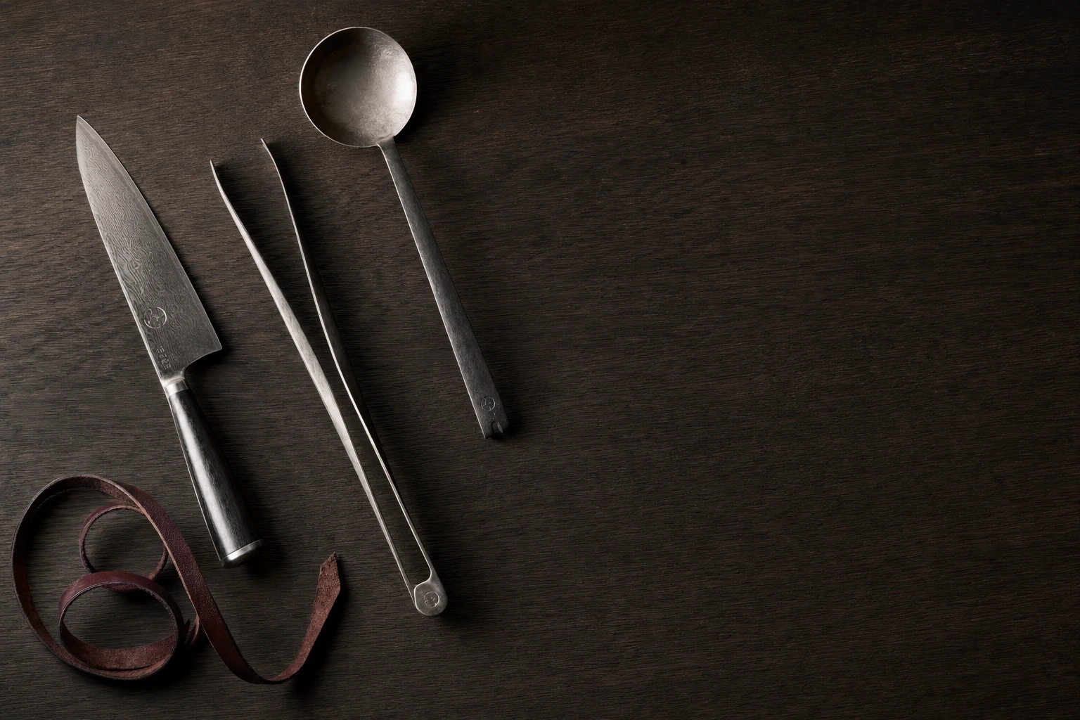
The logomark is engraved directly into steel — pan handles, knife bolsters, tool roll clasps — at a scale small enough that you have to be close to the object to see it. That was deliberate: this isn't a brand that needs to announce itself from across the kitchen.
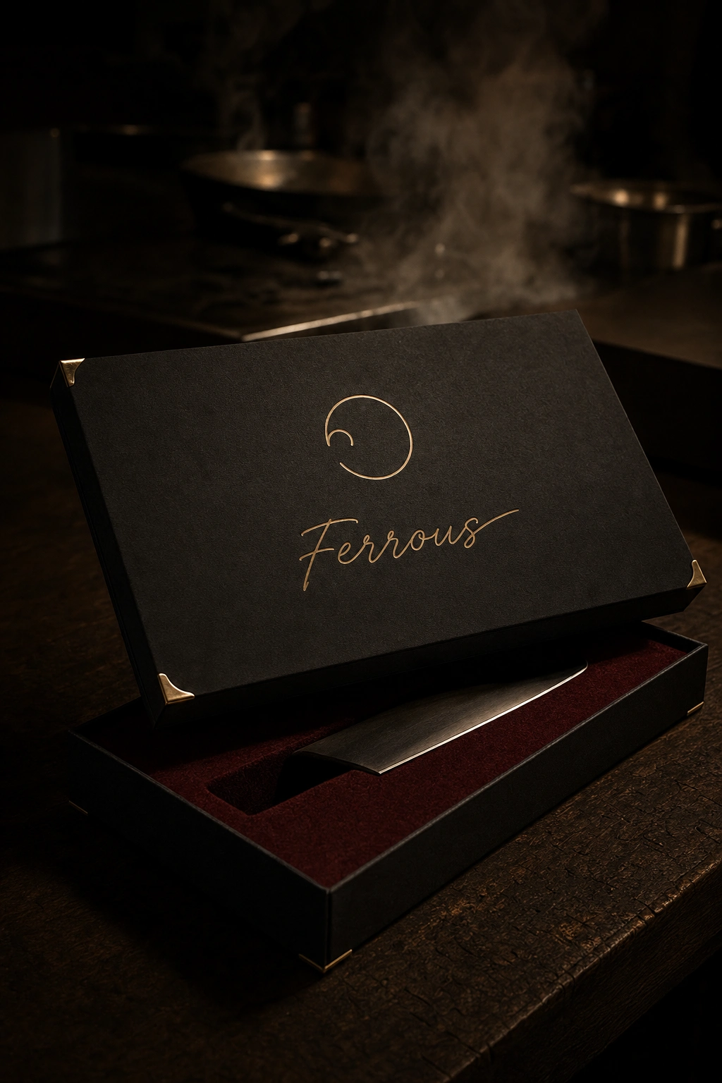
CAMPAIGN AND OOH
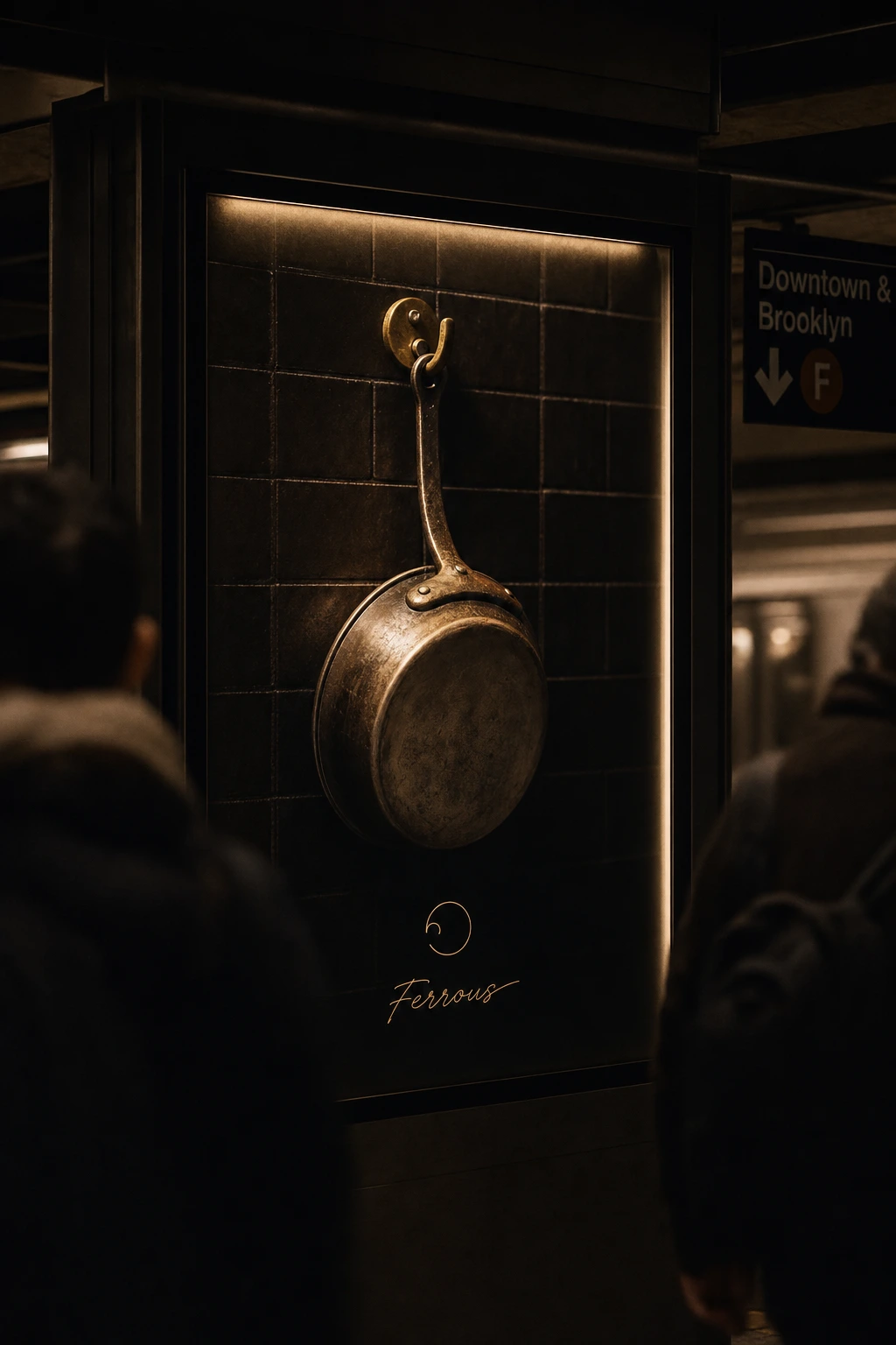
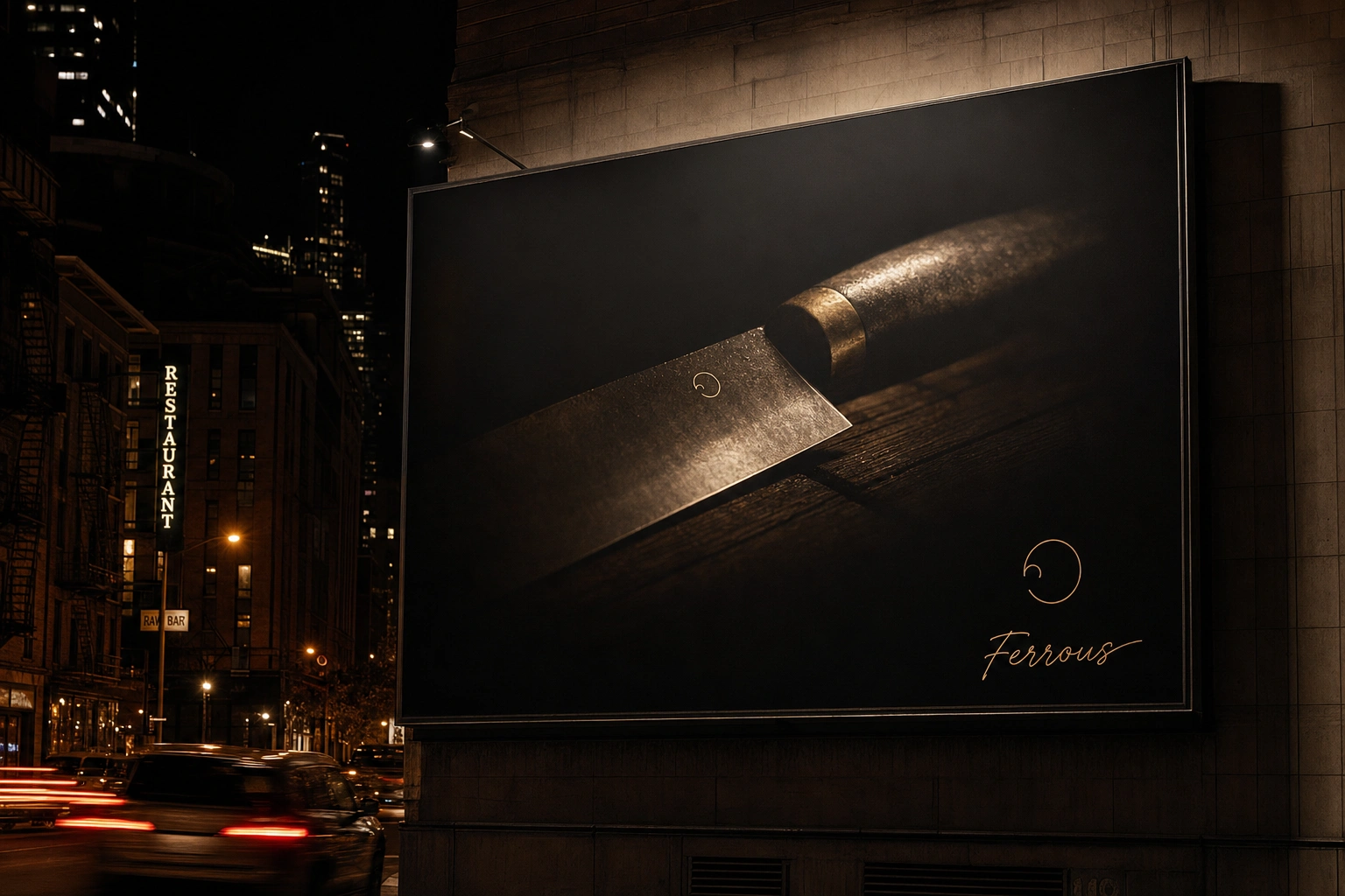
Every campaign image follows the master lighting rule from the four reference photos: one hard light, everything else in shadow, shallow focus, steam and motion blur doing the work that graphic elements would in a less confident system. The billboard and subway placements carry a single product image and a small brass wordmark — no tagline, no additional copy.
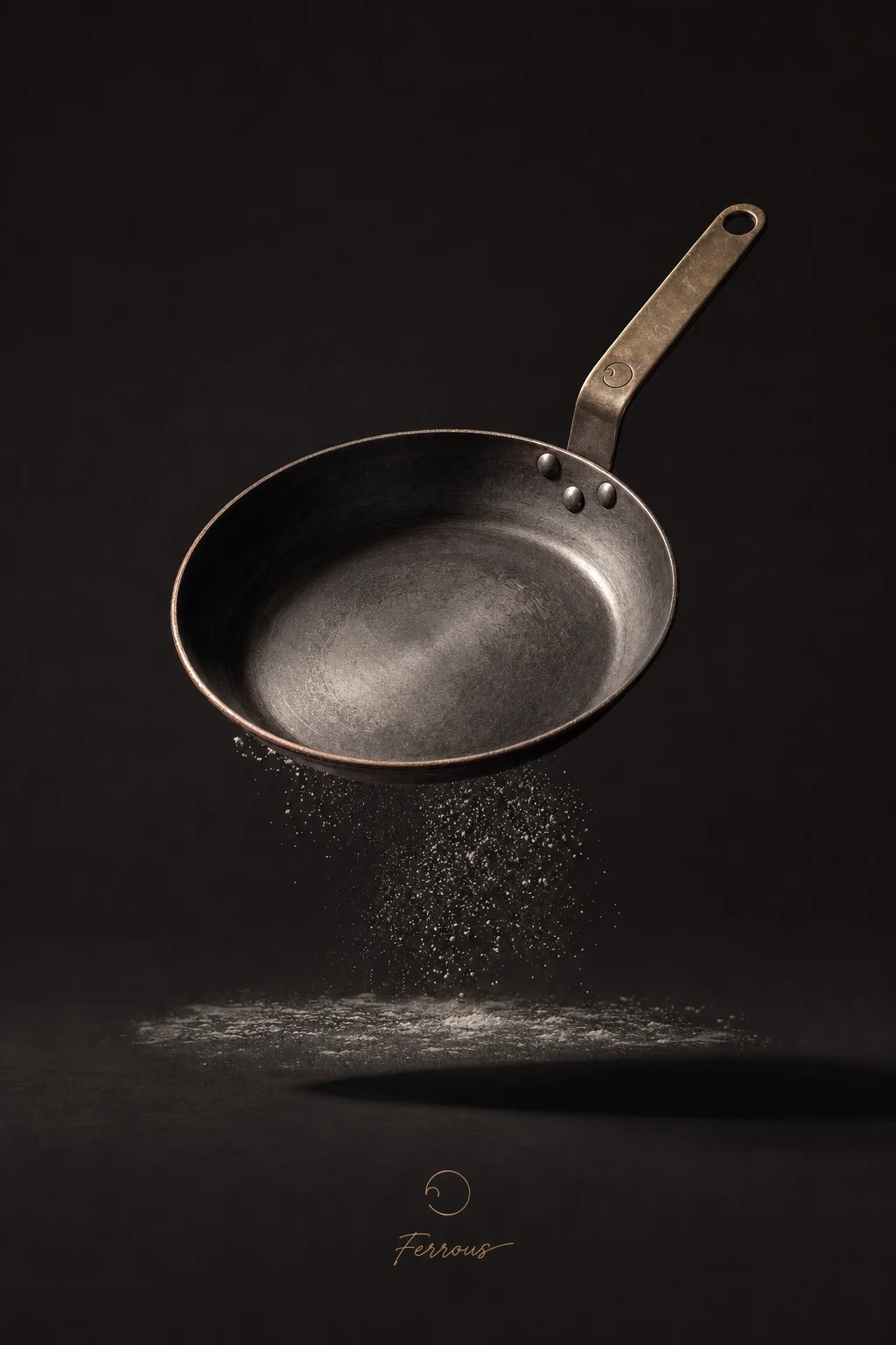
DIGITAL
The landing page hero and product card row extend the same charcoal-and-brass system to screen: flat dark cards, thin brass hairline borders, no drop shadows. The site doesn't try to look "clean" the way most cookware DTC sites do — it looks like an extension of the kitchen it's photographed in.
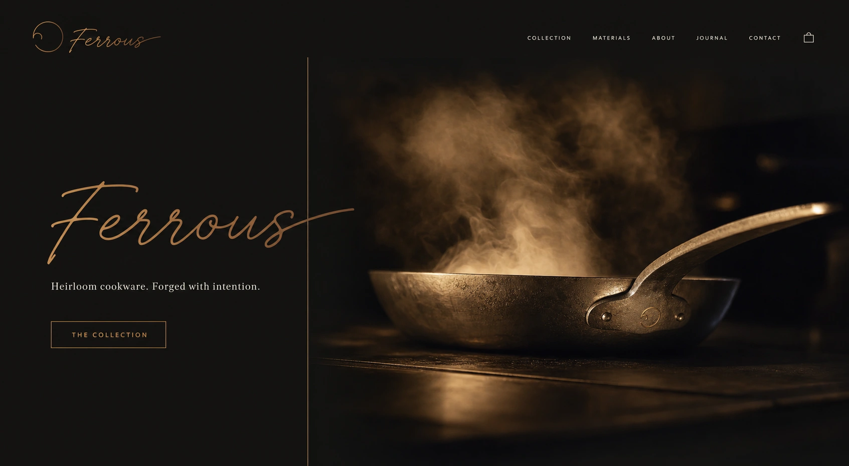
THE RESULT
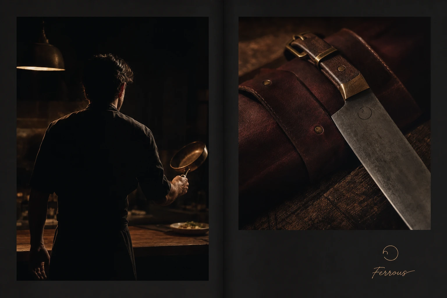
Twenty mockups in, the system holds without a single color exception — which is the real test of whether a four-color palette was disciplined enough to earn. The photography language pulled directly from real Michelin-kitchen references gives Ferrous something most cookware brands in this price tier don't have: an aesthetic that reads as earned rather than art-directed. Next is extending the system into motion for the campaign work and finalizing the full digital site beyond the hero and card row.
Révolté — revolte.design
Project: Ferrous
Year: 2026
Scope: Brand Identity, Logo Design, Packaging, Campaign Photography Direction, OOH, Web Design
Industry: Professional Cookware
See more at revolte.design
Like this project
Posted Jul 23, 2026
A cookware brand forged for the pass, not the pantry — one broken ring, one hard light, four colors, zero exceptions
Likes
0
Views
16
Timeline
Jul 2, 2026 - Jul 23, 2026