Built with Lovart
CIPHERGRAPH Brand Identity and Data Visualization

Révolté


CIPHERGRAPH — Trust Rendered as Data
A hardware wallet brand for people who don't want to be sold to. I took the aesthetic restraint of Paradigm and Linear and pointed it at the one product category that never stops shouting — crypto hardware — to see what self-custody looks like when it stops performing security and starts just showing it.
THE BRIEF
This one started with two reference links and a complaint. Every hardware wallet on the market looks the same — dark mode, neon glow, a coin rendered in 3D like it's advertising a mobile game. Paradigm and Linear don't do any of that. They look like research tools. Instrument panels. Places where the interface itself is the evidence of competence.
The problem I set for myself: build a wallet brand that earns trust through information density instead of reassurance copy. No "your keys, your crypto" taglines. No padlocks. The system had to prove security was real by showing the actual mechanics — signing paths, verification states, network topology — the way a lab publishes its raw data instead of a press release.
THE APPROACH
My first instinct was a serif-and-editorial direction — something closer to a research paper than a product. It read smart, but it also read slow. A wallet needs to feel fast and precise, not academic. I dropped the serif entirely once I saw the mark: a bold geometric diamond, split into a solid chevron against a hairline outline. That logo told me the whole system needed to be heavier, more architectural, less bookish.
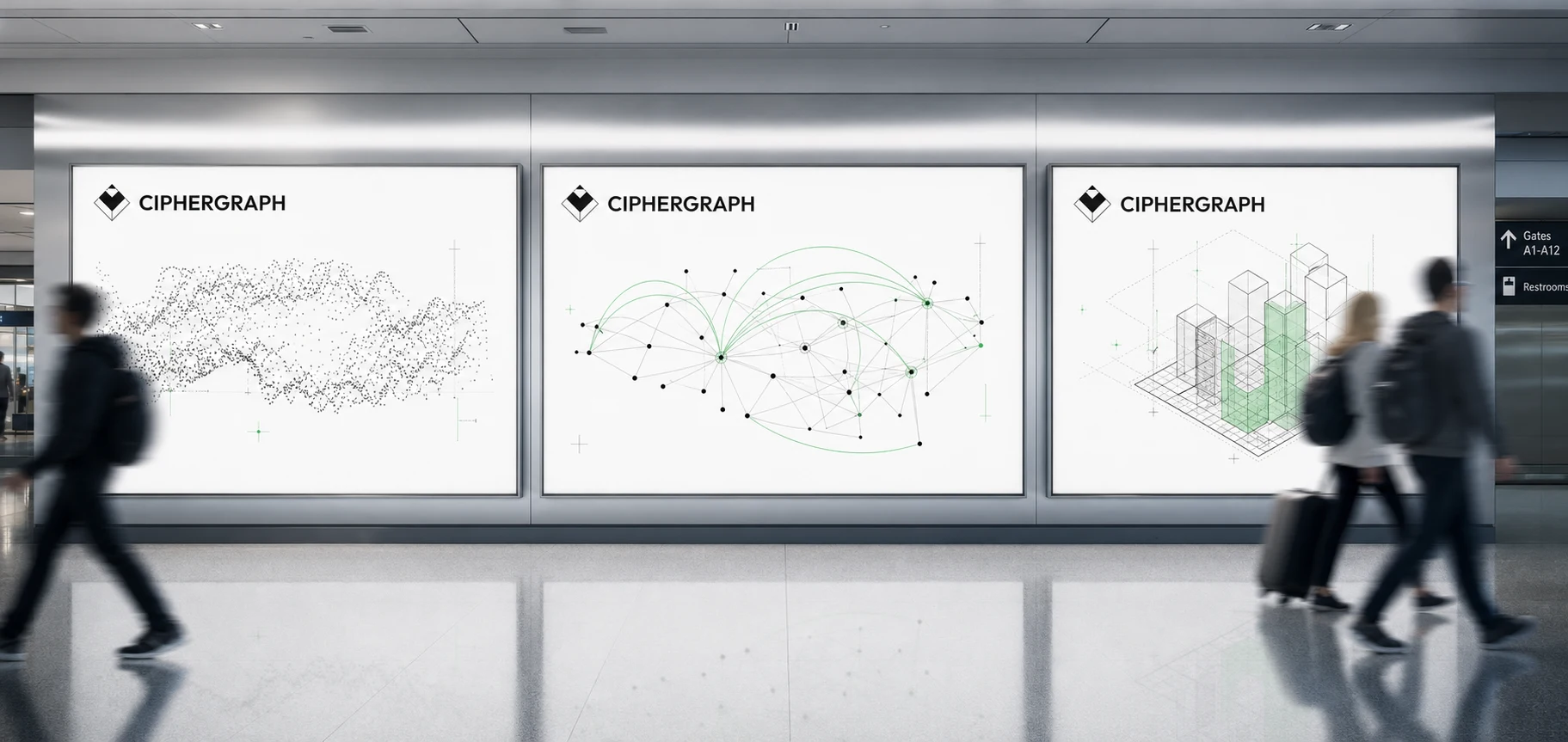
The unlock was treating every visualization as literal, not decorative. A point cloud isn't texture — it's a signing session. A network graph isn't a background pattern — it's peer connectivity. Once I committed to that rule, the palette basically wrote itself: everything achromatic except one color, signal green, and that color only ever appears on a live or verified data point. Never a hero shot. Never a background. It has to mean something every time it shows up, or it means nothing.
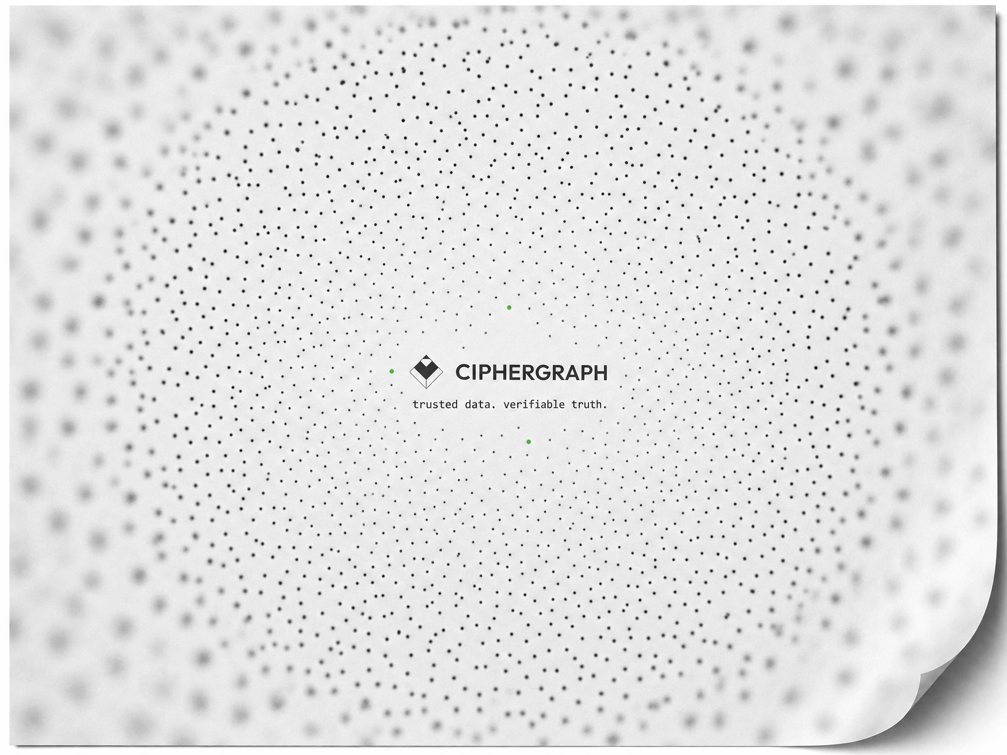
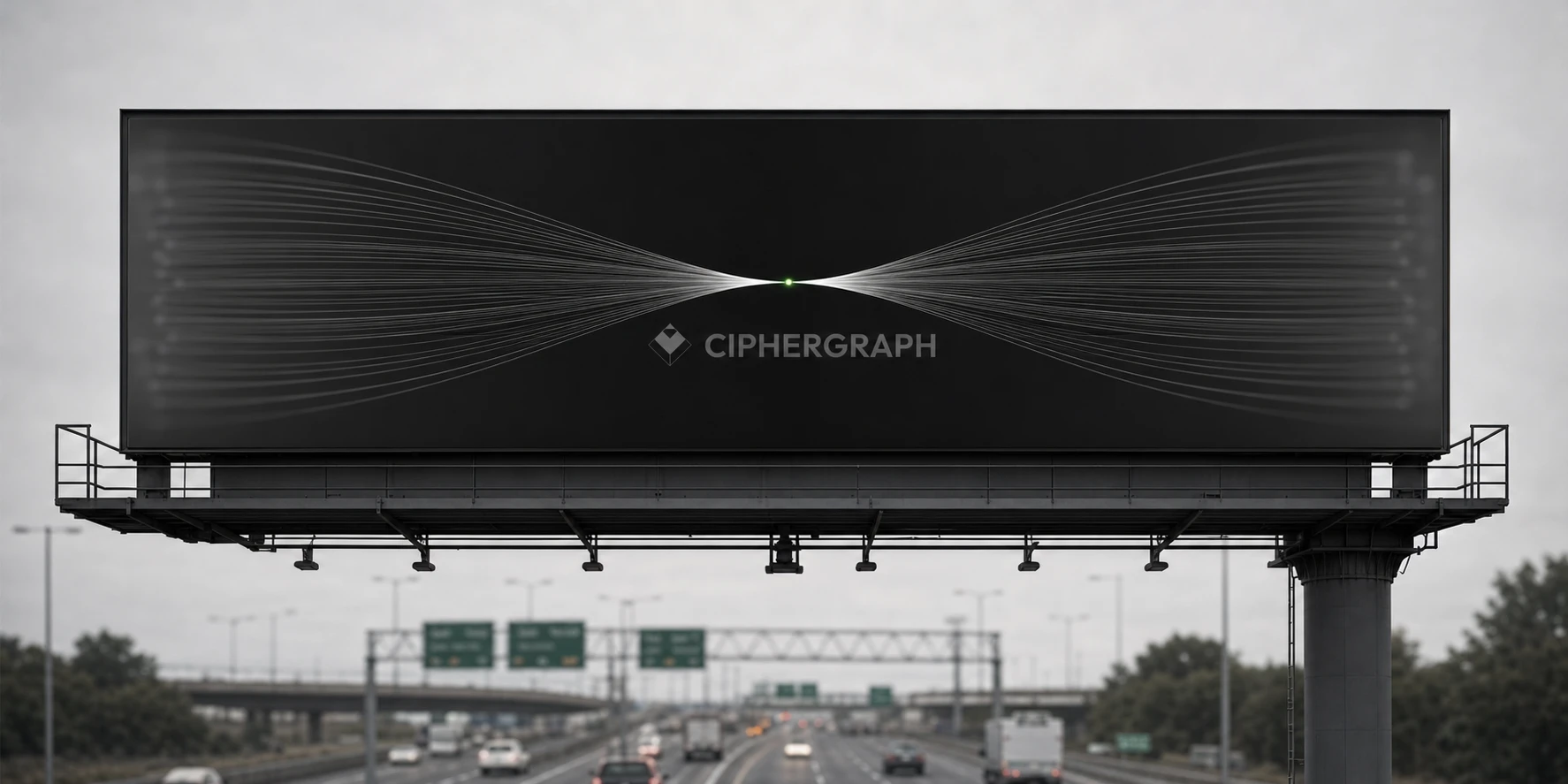
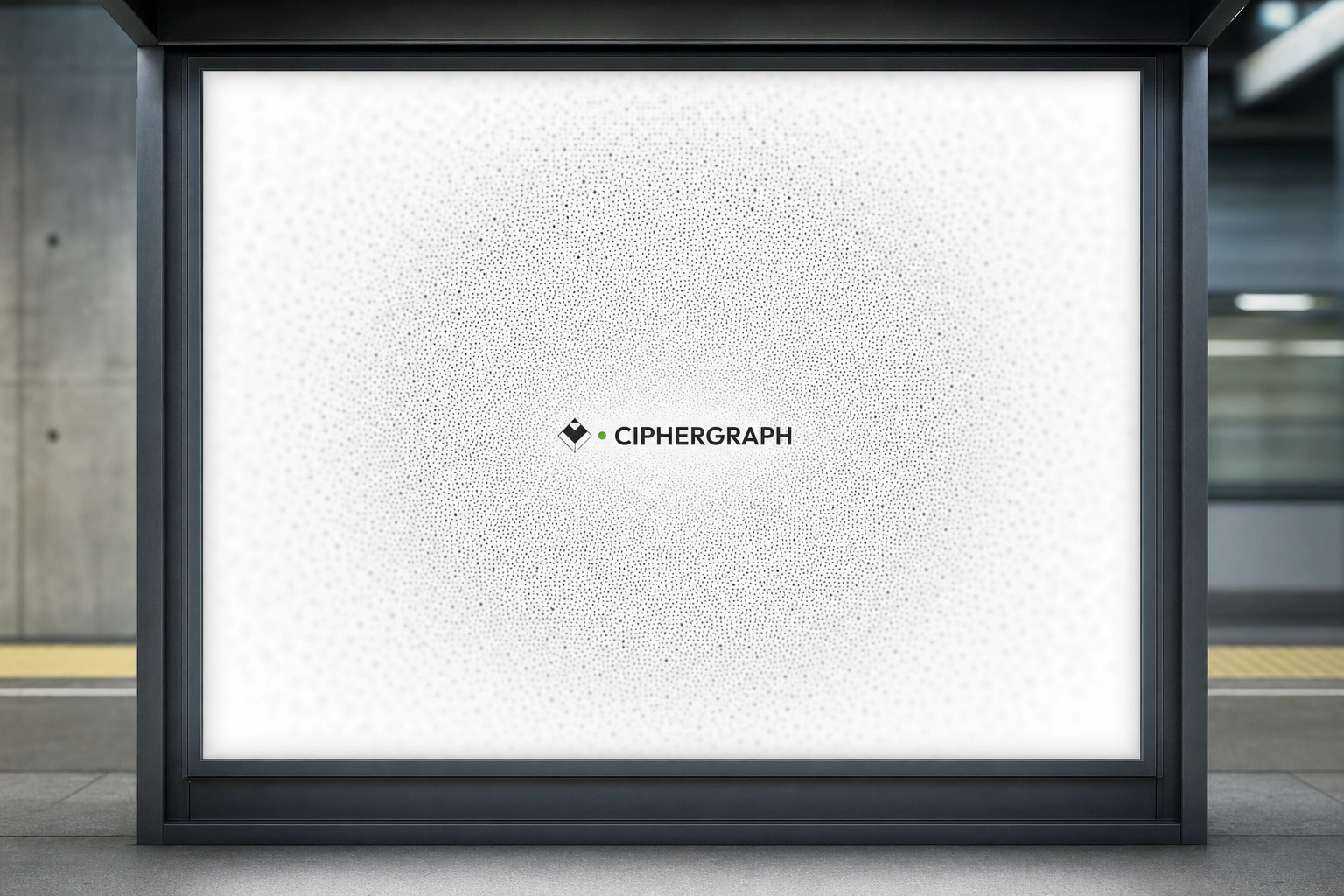
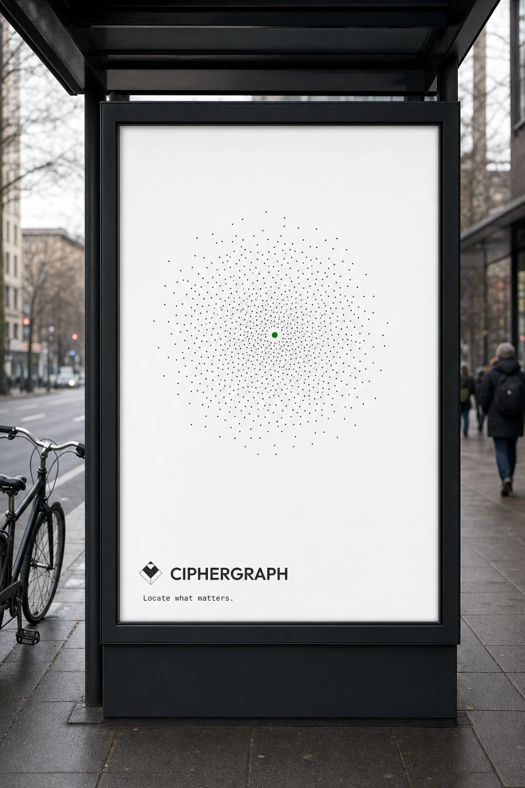
The second unlock came late, when I started testing a frosted-edge treatment — blur creeping in from all four sides of a frame, sharpening only at dead-center, where the mark always sits. It gave every single placement, from a subway panel to an app splash screen, the same optical logic: your eye has nowhere to land except the one point of total clarity. That became the system's signature move.
THE WORK
Logo & Identity Core
A geometric diamond mark — a solid chevron form set against a thin outlined diamond — paired with a bold, tight-tracked grotesque wordmark. The mark is never rescaled or reinterpreted across applications; it holds pixel-perfect fidelity from a laser-etched device face to a 60-foot highway billboard.
Color System
Near-black (
#0E0E0F), paper white (#FCFCFB), hairline grey (#C9C9C7) for all structural line work, and a single signal green (#2ECC71) locked exclusively to live-state indicators — a verified transaction, an active node, a confirmed signing path.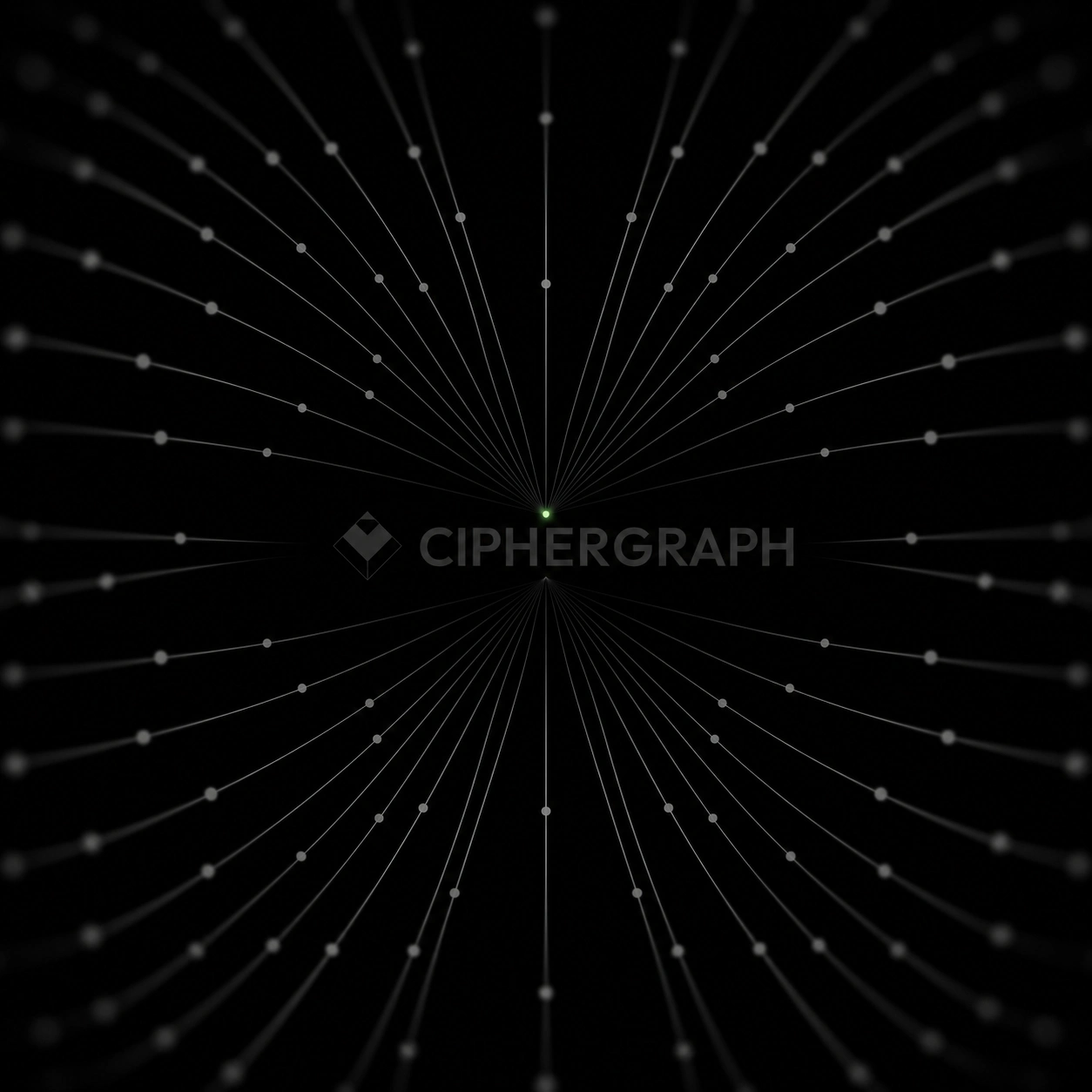
Data Visualization System
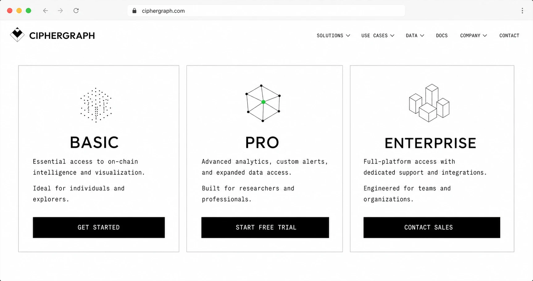
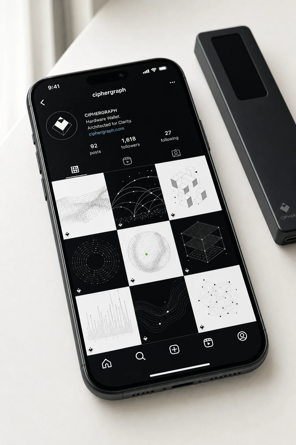
Three recurring motifs carry the entire brand: point-cloud distributions, network graphs with arcing great-circle-style connections, and isometric block/volume charts. None are decorative — each maps to something the wallet actually does.
Hardware & Packaging
The device itself is machined in matte black anodized aluminum, its small display rendering the same hairline data language mid-signing. Packaging is a near-black rigid box, wordmark in white, no secondary graphics — the restraint of the box is the pitch.
Out-of-Home
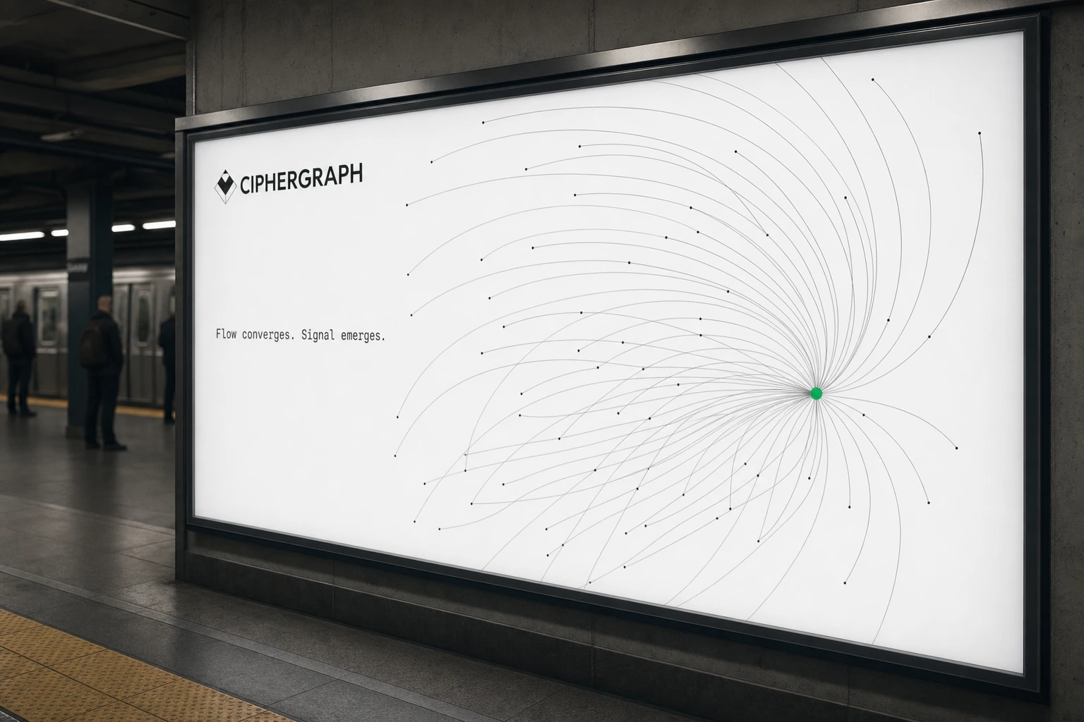
Subway transit panels, elevated highway billboards, airport lightbox trios, bus shelters, and a full building facade wrap — all built on the frosted-edge/centered-mark rule, so the campaign reads as one continuous system no matter the format or city.
Digital & App
A verification screen showing the signing path as a single arcing line terminating in a green confirmation node; a landing page with three flat, hairline-bordered pricing cards (Basic, Pro, Enterprise), each fronted by one of the three core data motifs; a dashboard home screen where the mark sits above the balance figure, one verified transaction traced beneath it in green.
Stationery & Editorial
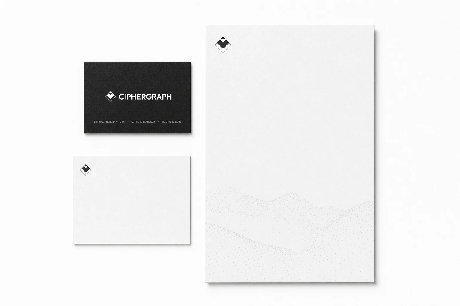
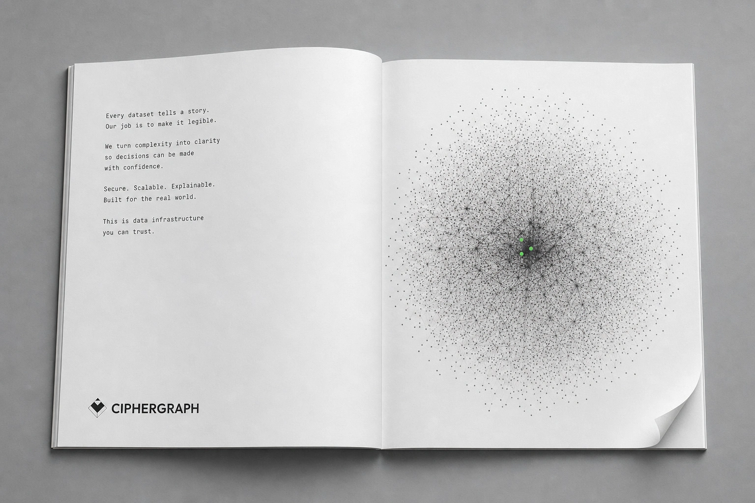
Business cards, letterhead, and notecards in the same black/white system, and a print spread built around a single spherical point-cloud with three green nodes at its center — the only color on the page.
THE RESULT
The system holds together across seventeen distinct formats without a single deviation from the core rule: one mark, one accent color, data instead of decoration. That's the actual test for a brand like this — not whether one hero shot looks good, but whether a billboard, a business card, and a phone splash screen all clearly belong to the same company without needing the wordmark to prove it.
As a speculative case study, CIPHERGRAPH stands as a working answer to a category that's been visually stagnant for years: the wallet doesn't need to look like the future. It needs to look like it already works.
Révolté — revolte.design
Project: CIPHERGRAPH
Year: 2026
Scope: Brand Identity, Logo Design, Data Visualization System, OOH Campaign, Packaging, Digital/App UI, Print Collateral
Industry: Hardware Crypto Wallet / Consumer Security Hardware
Like this project
Posted Jul 21, 2026
CIPHERGRAPH: a hardware wallet brand that replaces crypto clichés with real data — signing paths, verified nodes, one rule held everywhere
Likes
0
Views
23
Timeline
Jul 8, 2026 - Jul 21, 2026