Built with Lovart
The Unclimbed: Brand Identity and Visual System Design

Révolté


THE UNCLIMBED — Apparel for the Peak You Never Reach
LOGLINE
A technical apparel concept that refuses the entire visual language of outdoor achievement — no summits, no golden hour, no conquest. Just the threshold, the waiting, and the light of something that hasn't happened yet.
THE BRIEF
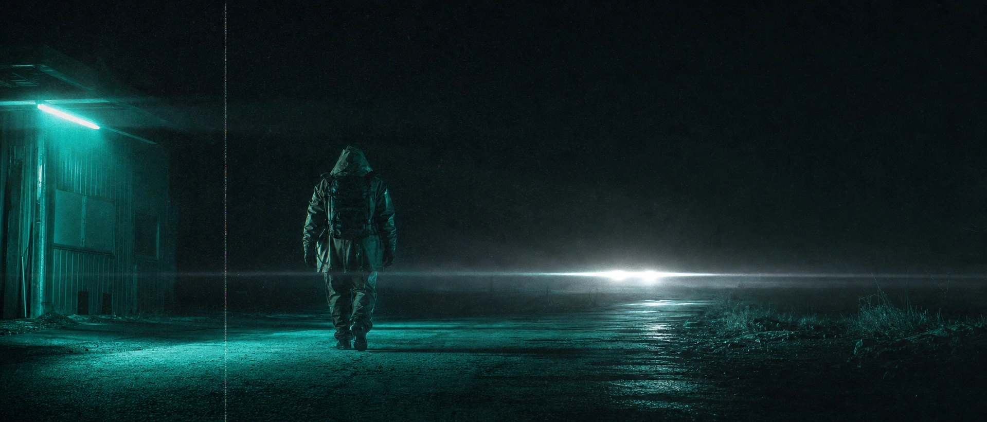
I didn't start this with a client or a brief. I started with a feeling I couldn't shake off a Phoebe Bridgers video still — a lone silhouette at a gas station at night, lit by a single sick fluorescent teal tube, motion-blurred like the frame itself was struggling to stay resolved. That image had nothing to do with mountains. But it had everything to do with the emotional register I wanted for a high-altitude apparel brand: dread, suspension, the sense that something is about to happen or just did, and you'll never know which.
Technical outdoor apparel almost always sells you the summit. The wide shot, the golden light, the flag planted. I wanted the opposite. A brand built entirely around the mountains people never climb — because they're closed, because they're sacred, because the weather never clears, because the permit gets denied. The tension I was chasing wasn't performance. It was refusal.
THE APPROACH
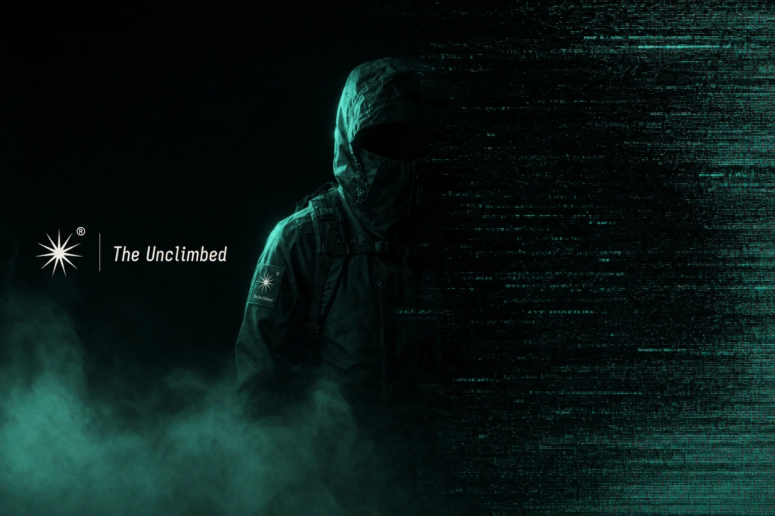
My first instinct was to treat this like every other technical-apparel brand — contour lines, topographic data, alpine palettes. I rejected that almost immediately. It's the same visual vocabulary every outdoor label reaches for, and it says nothing about waiting, which was the actual emotional core I was after.
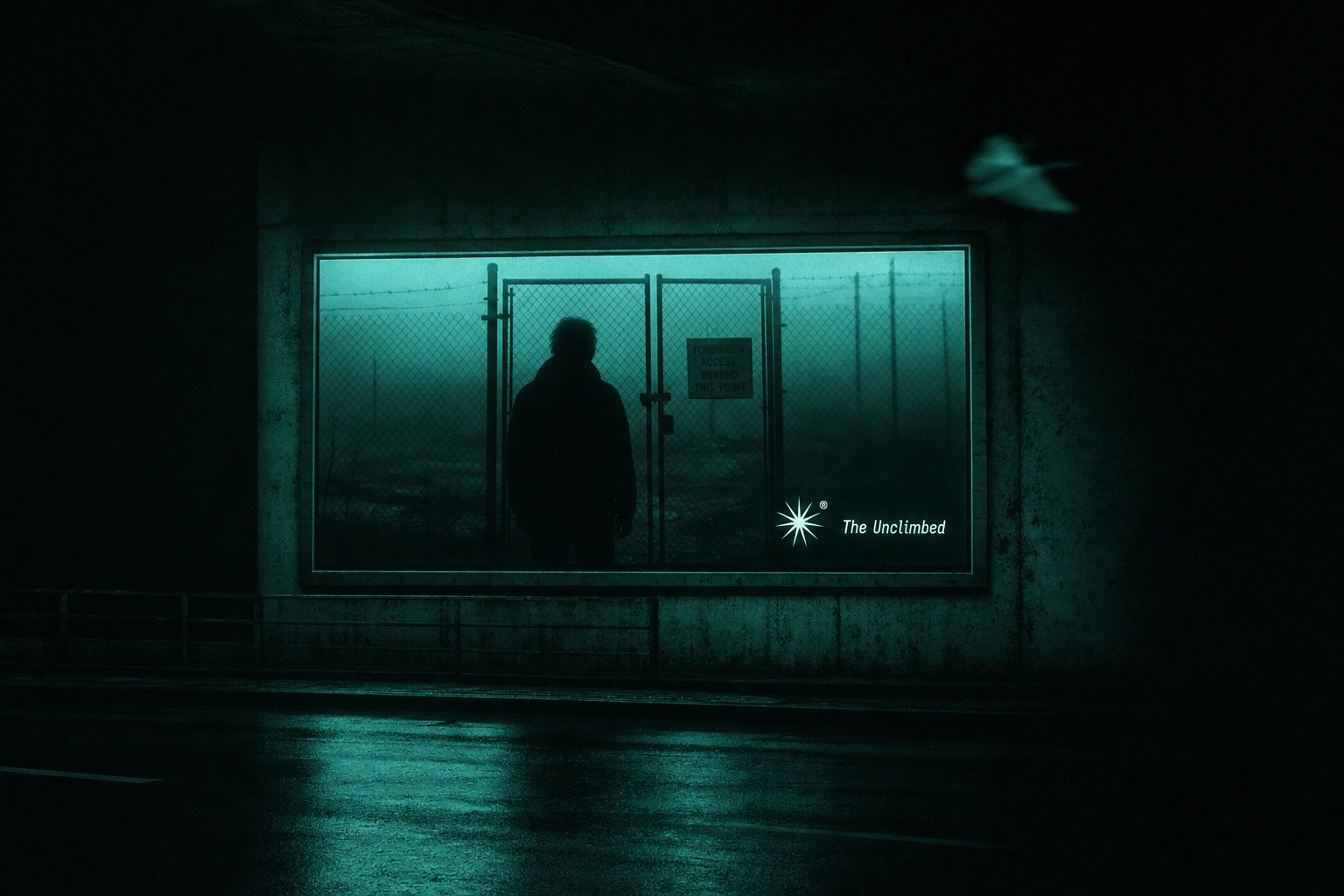
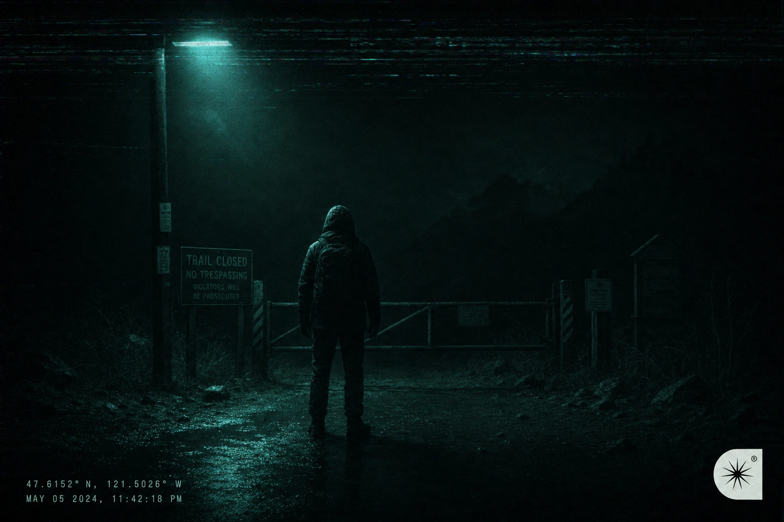
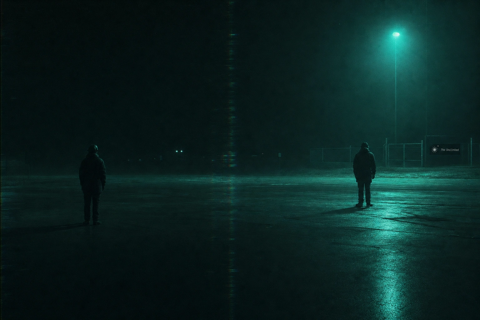
The unlock came from committing to a single rule: never show the summit. Not once, across any deliverable. Every image had to live in the threshold instead — a locked gate, a checkpoint, a fogged-out mountain in the far background that never resolves into a peak. Once I had that rule, the rest of the system followed almost mechanically. If the brand never shows arrival, then the photography has to communicate suspension instead — motion blur that never fully clears, a single unexplained light source, objects caught mid-fall and never explained.
I built the entire color system around light-as-emission rather than light-as-print. Fluorescent Teal (
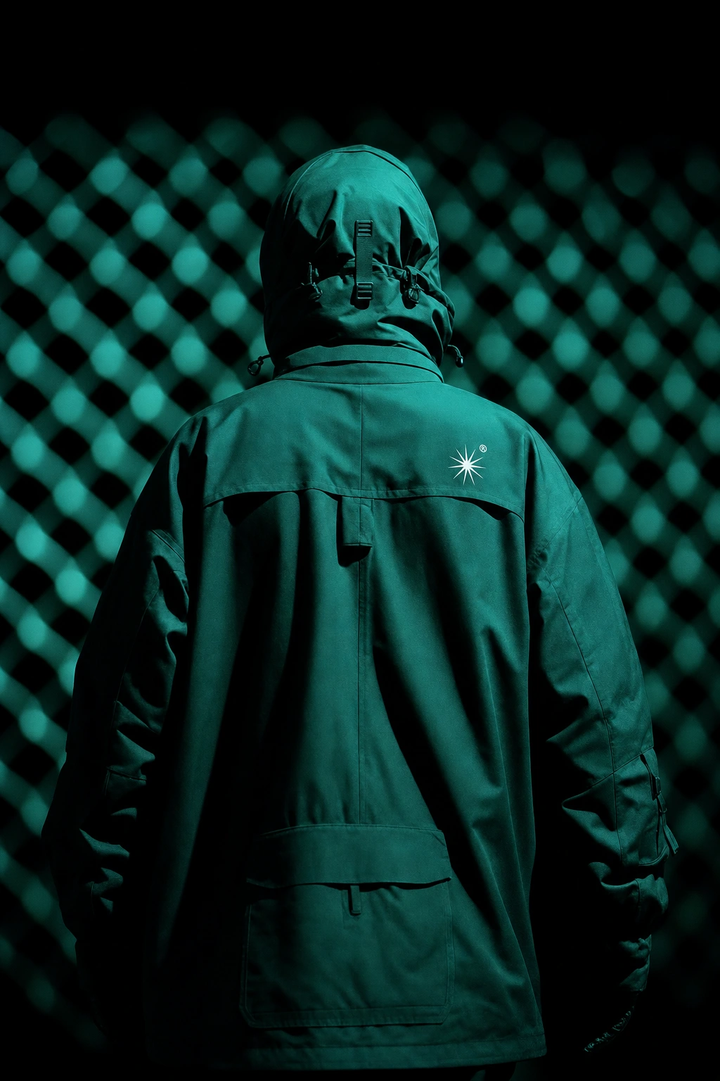
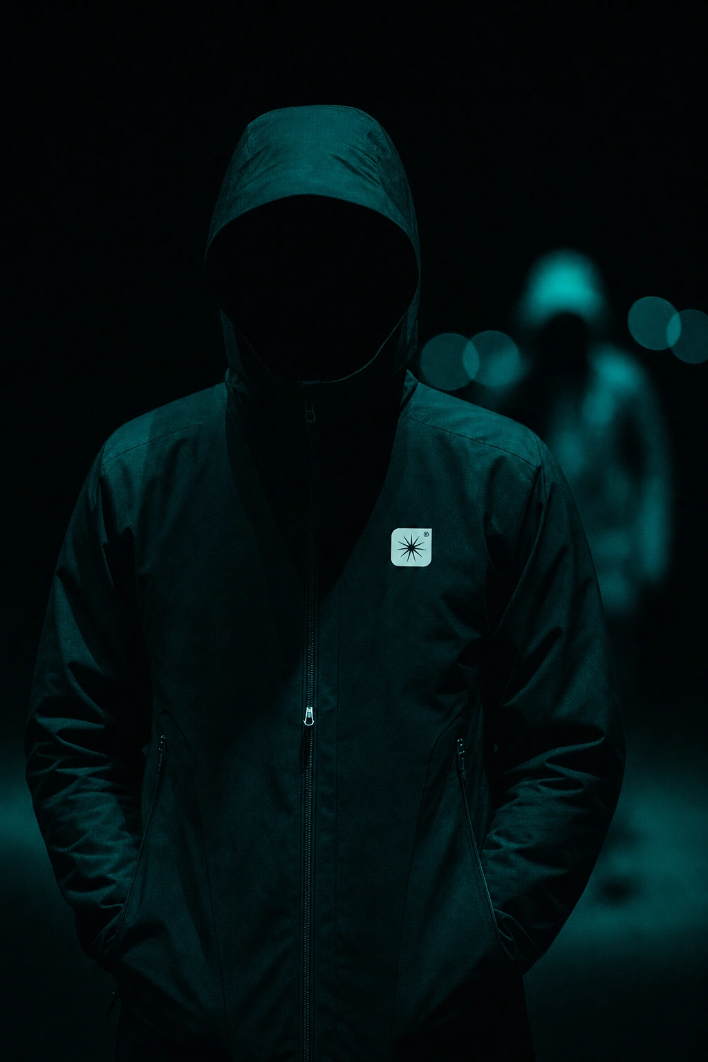
#4EE2C4) isn't a brand color in the traditional sense — it's treated as the only light source in every image, the way a single failing streetlamp would actually light a scene. Void Black (#060B0A) does the heavy lifting, dominating 80%+ of every composition. Warning White (#E8FFF8) is rationed to one small highlight per image — a stitch line, a zip pull, a sliver of text — so it never stops feeling scarce.THE WORK
Brand Identity / Visual System
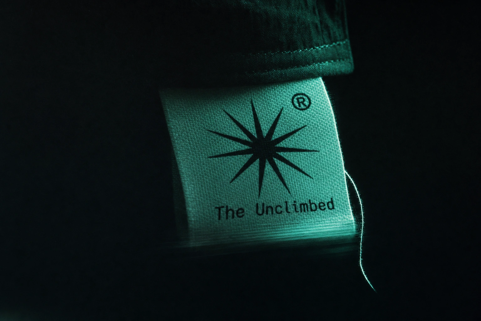
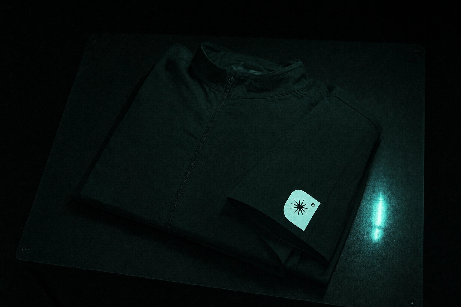
A nine-point star burst mark paired with the wordmark in Iosevka Charon, alternating italic and normal weights at a medium cut — a deliberately unstable typographic rhythm that mirrors the brand's refusal to resolve into something clean. Both a black-field and an inverted cream-field lockup exist, used contextually across garment tags, packaging, and OOH.
Color System
Fluorescent Teal
#4EE2C4 as the sole light source across every application. Void Black #060B0A as the dominant field. Sickroom Green #1F3D38 as the only permitted midtone. Warning White #E8FFF8 rationed to a single highlight per image — never a fill color, always a scarcity signal.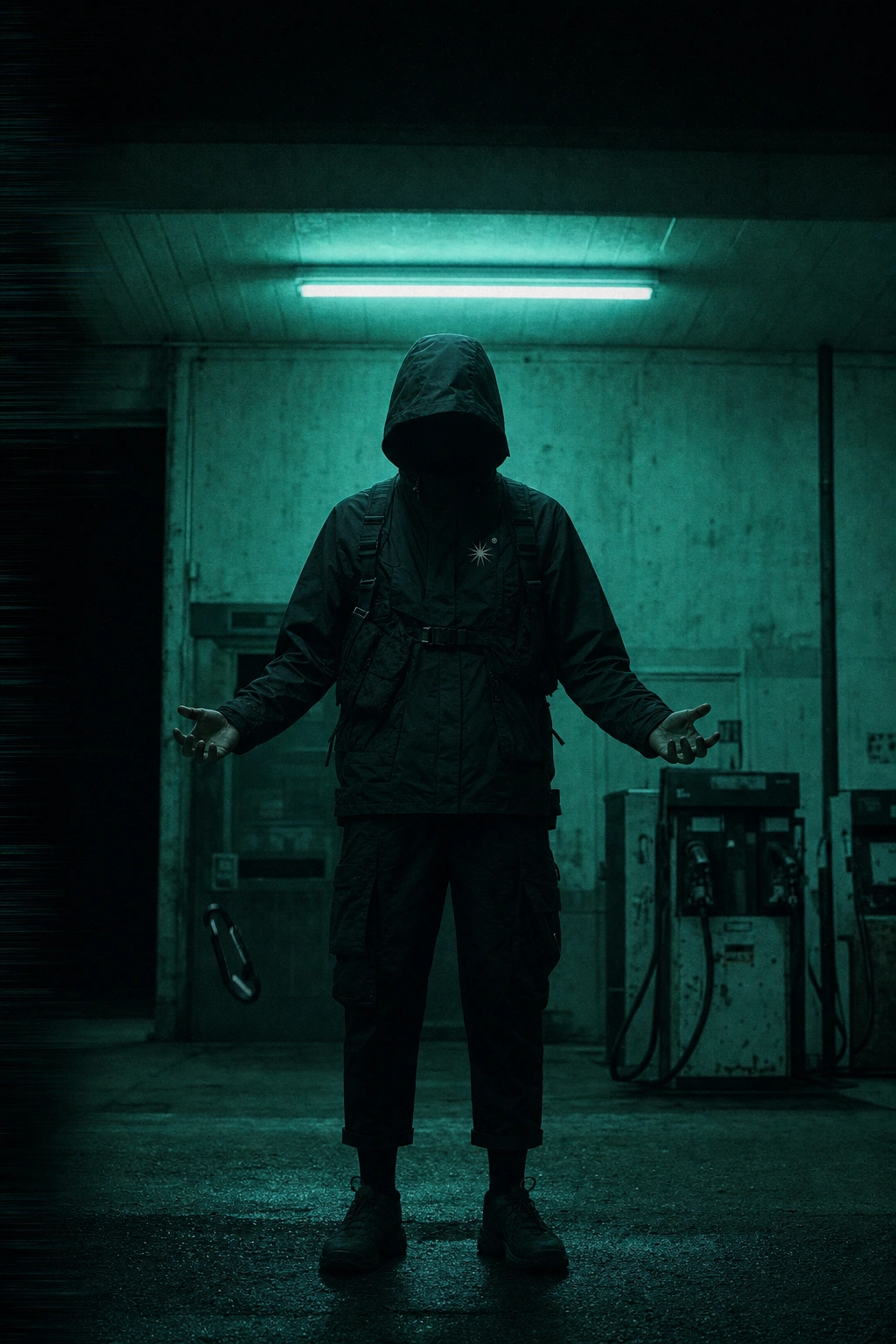
Photography System
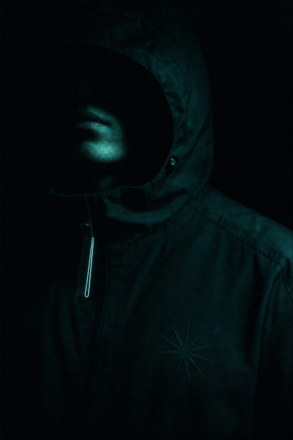
Every image shot at night, lit by one unexplained fluorescent source, grain and VHS degradation applied uniformly. I ran two lens treatments across the campaign set — anamorphic, for the horizontal streak flares that read almost like a false horizon, and long telephoto, for the compressed, surveillance-like flattening that makes distant figures feel uncomfortably close. Both stayed inside the same color and grain system so the whole set reads as one continuous world rather than two different shoots.
Packaging
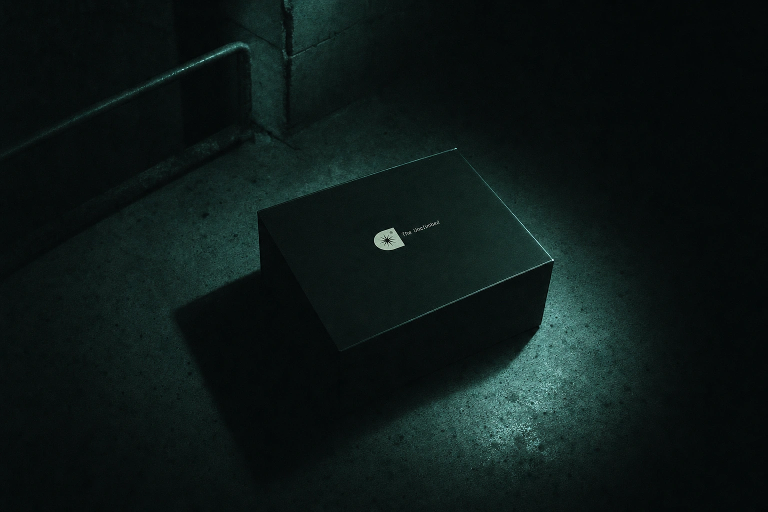
A single matte void-black box, logo lockup small and centered, no other markings — photographed alone on bare concrete, letting the environment do the storytelling instead of the object.
Campaign & OOH
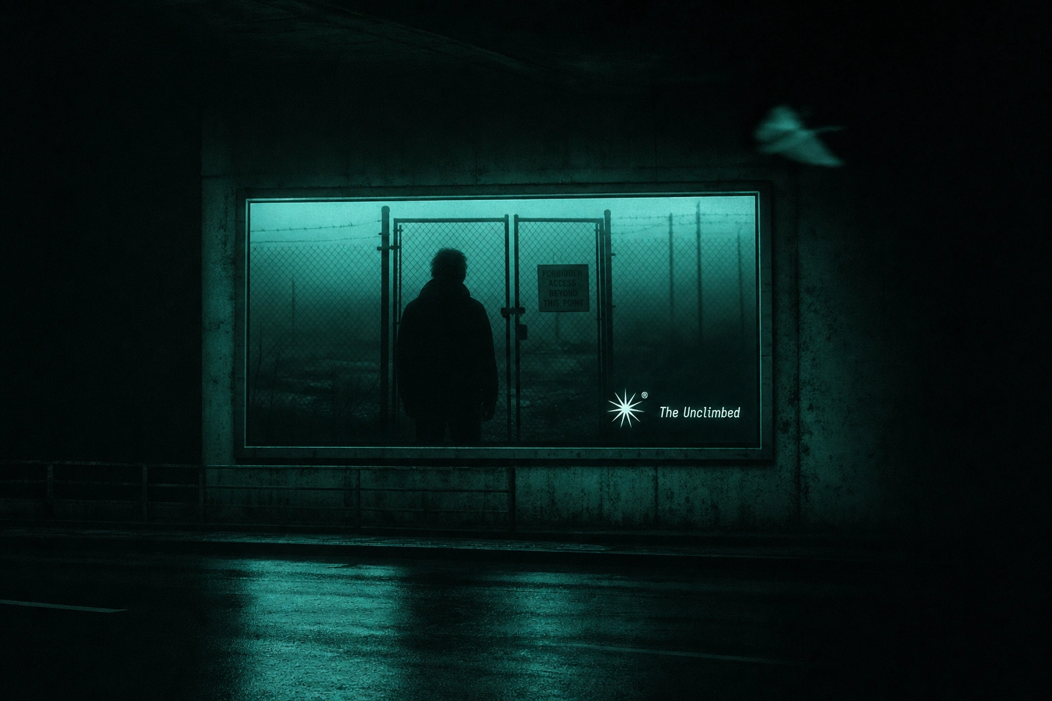
Billboards mounted in underpasses, lit only by their own panel — the medium becomes part of the liminal-space logic instead of sitting outside it. No copy beyond the logo lockup on any placement.
THE RESULT
Twenty-five mockups in, the system holds without a single crack — garment, packaging, OOH, and editorial all read as the same unresolved world, whether the shot is a macro detail on a garment tag or a wide billboard in an underpass. The project is currently at the tail end of the mockup phase, moving next into full case study visuals and campaign sequencing.
Révolté — revolte.design
Project: The Unclimbed
Year: 2026
Scope: Brand Identity, Logo System, Photography Direction, Packaging, Campaign/OOH
Industry: Technical Apparel / Editorial Fashion
See more at revolte.design
Like this project
Posted Jul 28, 2026
A high-altitude apparel brand that never shows the summit — only the closed gate, the fog, and the wait before it
Likes
0
Views
23
Timeline
Jul 13, 2026 - Jul 28, 2026

