Built with Lovart
Crin: Branding for Feral Grace

Révolté


CRIN — Branding for the Unbroken
A premium riding house that didn't want to sell tradition. It wanted to sell instinct. I built Crin around one idea: a horse before anyone puts a saddle on it.
THE BRIEF
Crin came to me as a premium riding house with no interest in the usual visual language of the sport — no brass, no tartan, no crests, no old-money signaling. The category is full of heritage clichés dressed up as prestige. That wasn't the brand.
The real brief was a contradiction. This had to feel premium enough to justify the price of admission, but raw enough to convince serious riders it wasn't just another lifestyle label playing dress-up. Polish and authenticity usually pull in opposite directions. I had to find the version of "premium" that lived in dirt, not in gloss.
What made it hard wasn't the aesthetic — it was resisting every reference point the category hands you for free. Anyone can make a horse logo look expensive. Making it look true was the actual job.
THE APPROACH
I started by mapping ten completely different creative territories for the brand — from monastic minimalism to old-money heritage to glass-and-steel modern arenas — deliberately pushing for contrast rather than ten versions of the same "elegant equestrian" mood. Crin's founders picked the rawest one on the board: Feral Grace. Wild horses before discipline is imposed on them.
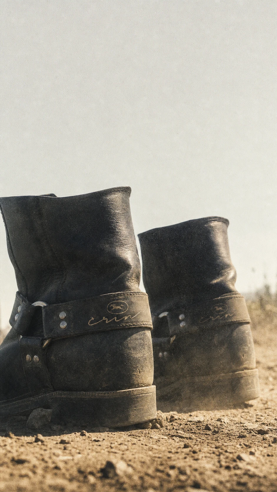
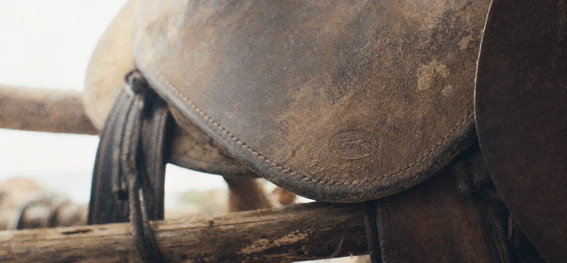
That single choice set every rule after it. If the brand was about instinct before training, nothing in the identity could look trained either. No clean vector illustration, no airbrushed campaign photography, no logo treated like a sticker placed on top of a product. The mark had to look like it was branded into something, not printed onto it.
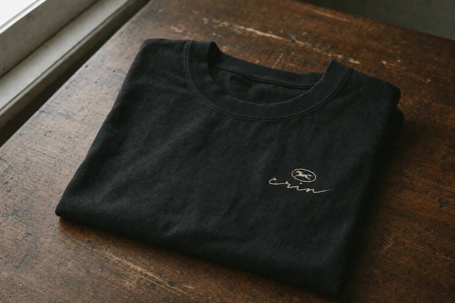
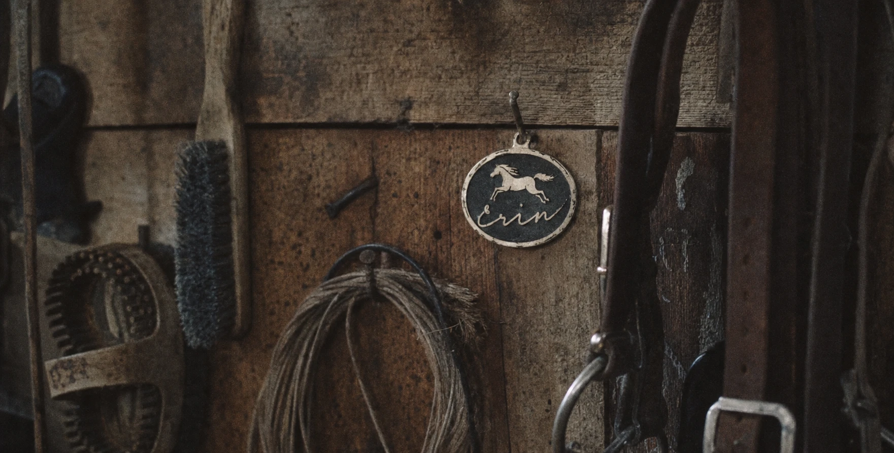
The first logo pass leaned too illustrative — a horse that looked designed rather than pressed. I pushed it toward the language of an actual branding iron: uneven linework, a mane rendered as torn strokes rather than clean curves, an outline with the slightly broken quality of a stamp used hundreds of times. Paired with a handwritten signature wordmark instead of a typeset name, the logo stopped looking like a logo and started looking like a signature burned into hide.
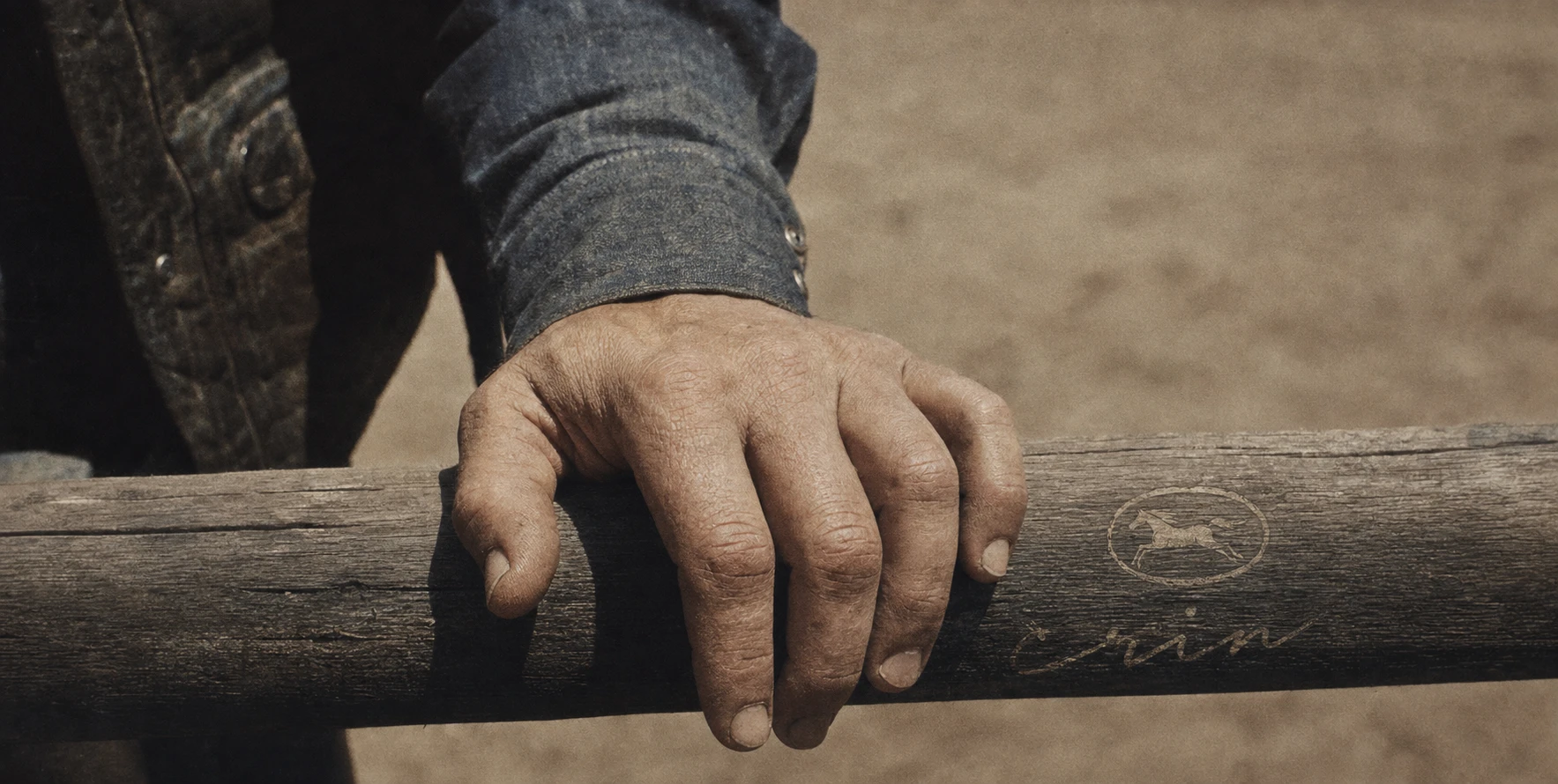
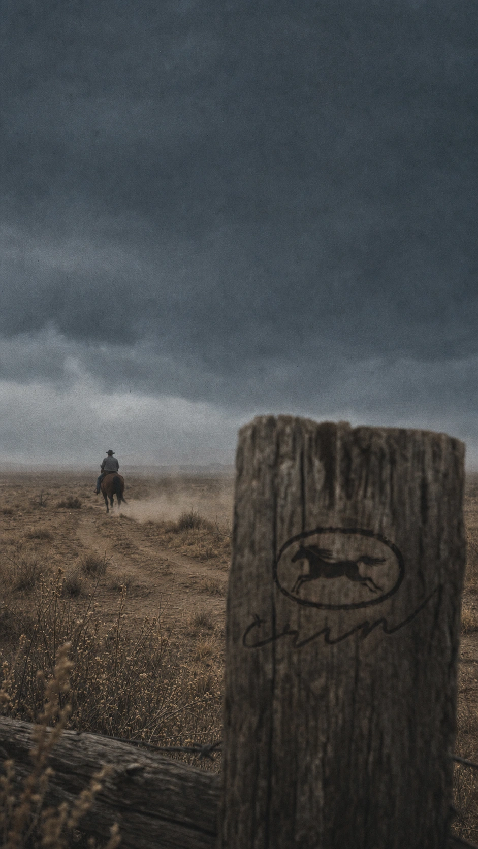
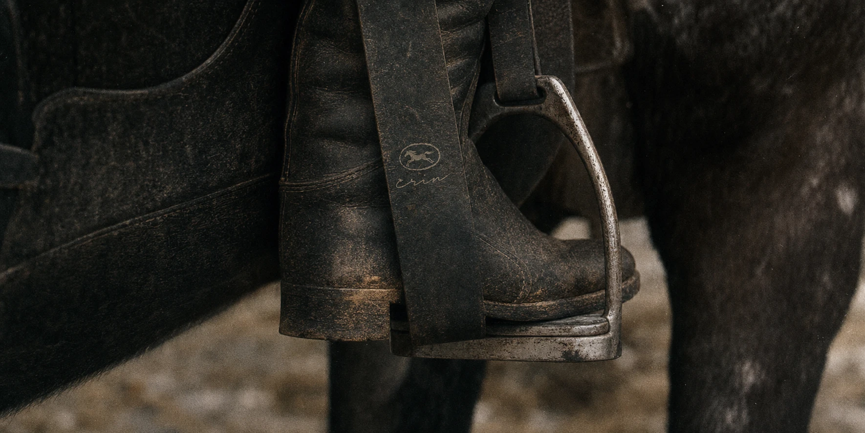
The photography direction needed the same correction, twice. My first mockup batch technically hit the brief but read as glossy AI-stock imagery — warm, cinematic, a little too art-directed, with hands gripping rope at anatomically impossible angles. I rebuilt the entire visual language around a documentary register instead: handheld 16mm grain, flat unflattering light, camera slightly off-level, logo application small enough to miss on first glance. I also wrote explicit anatomical constraints into every prompt going forward — five fingers, natural grip, crop tighter rather than render a hand wrong. The fix wasn't stylistic polish. It was discipline in the opposite direction: making the work look less considered, not more.
THE WORK
LOGO
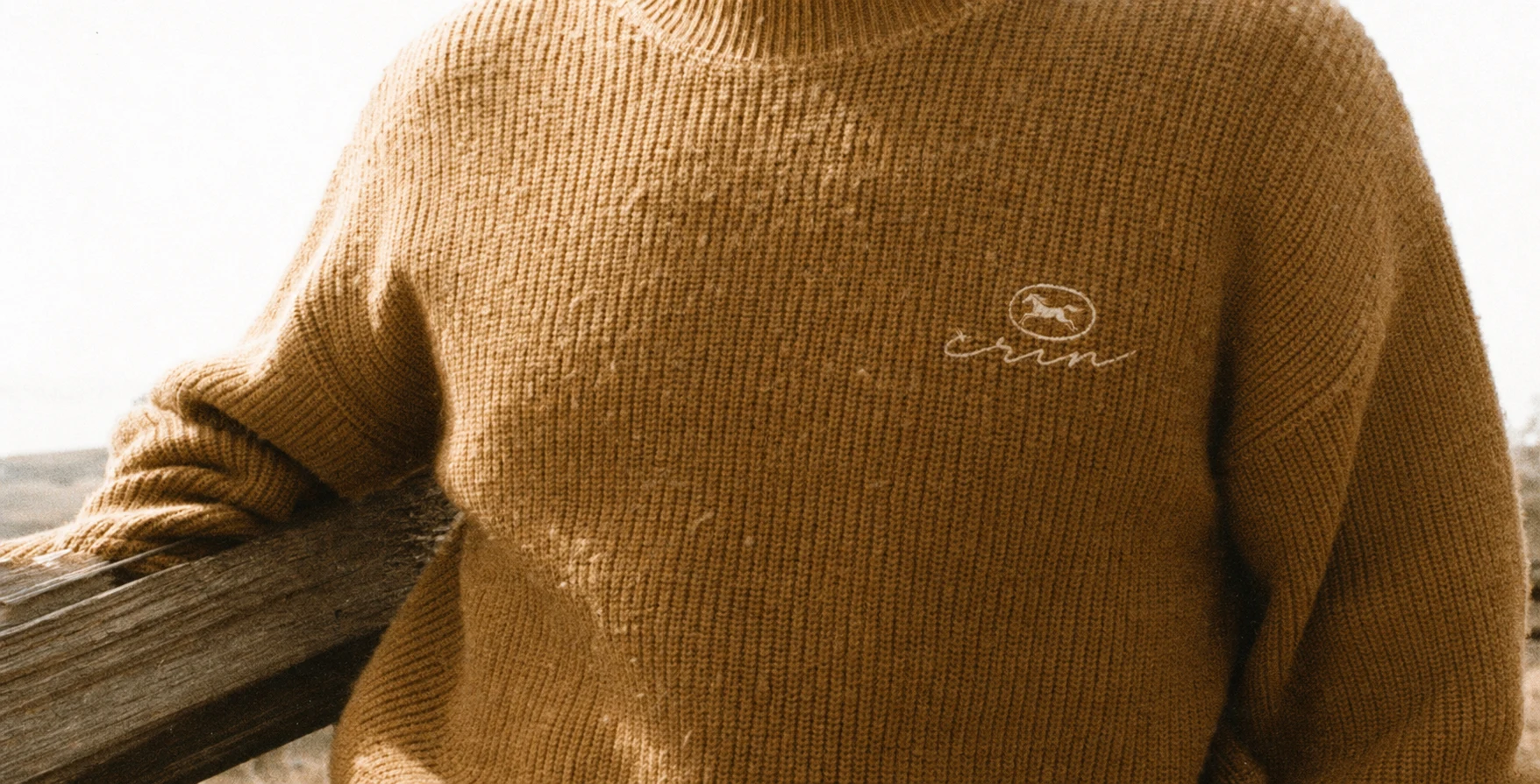
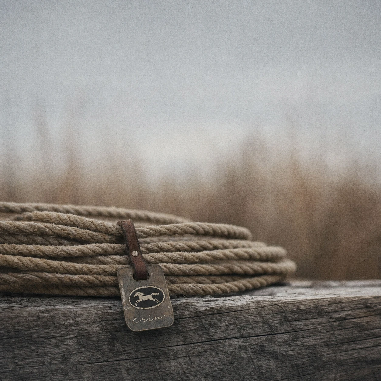
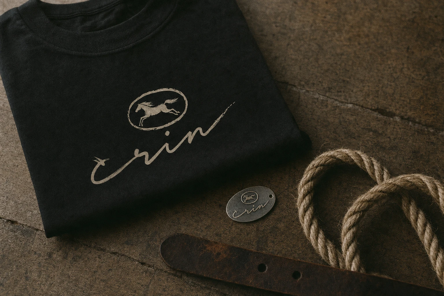
A two-part system: a running horse mark with no rider and no wings, rendered in raw, hand-cut linework at full gallop — mane and tail as a few aggressive torn strokes rather than clean illustration — paired with "crin" as a continuous handwritten signature with real pressure variation in the stroke. The two elements sit independently rather than locked into one frame, so either can carry the brand alone: the horse on hardware and brands, the script on leather goods and signage. A stamped oval variant exists for wax-seal-style applications — hardware caps, medallions, branding-iron heads.
COLOR SYSTEM
Iron Black
#16130F and Bone #E8E1D3 carry the primary contrast — logo and ground, inverted depending on surface. Dust Ochre #C08A3E and Storm Blue-Grey #4A5560 hold environmental texture — dirt, hide, distant sky. Blood Orange #B84B28 is rationed to one found detail per application: a strap, a stitched tag, a taillight. Never decorative, never dominant.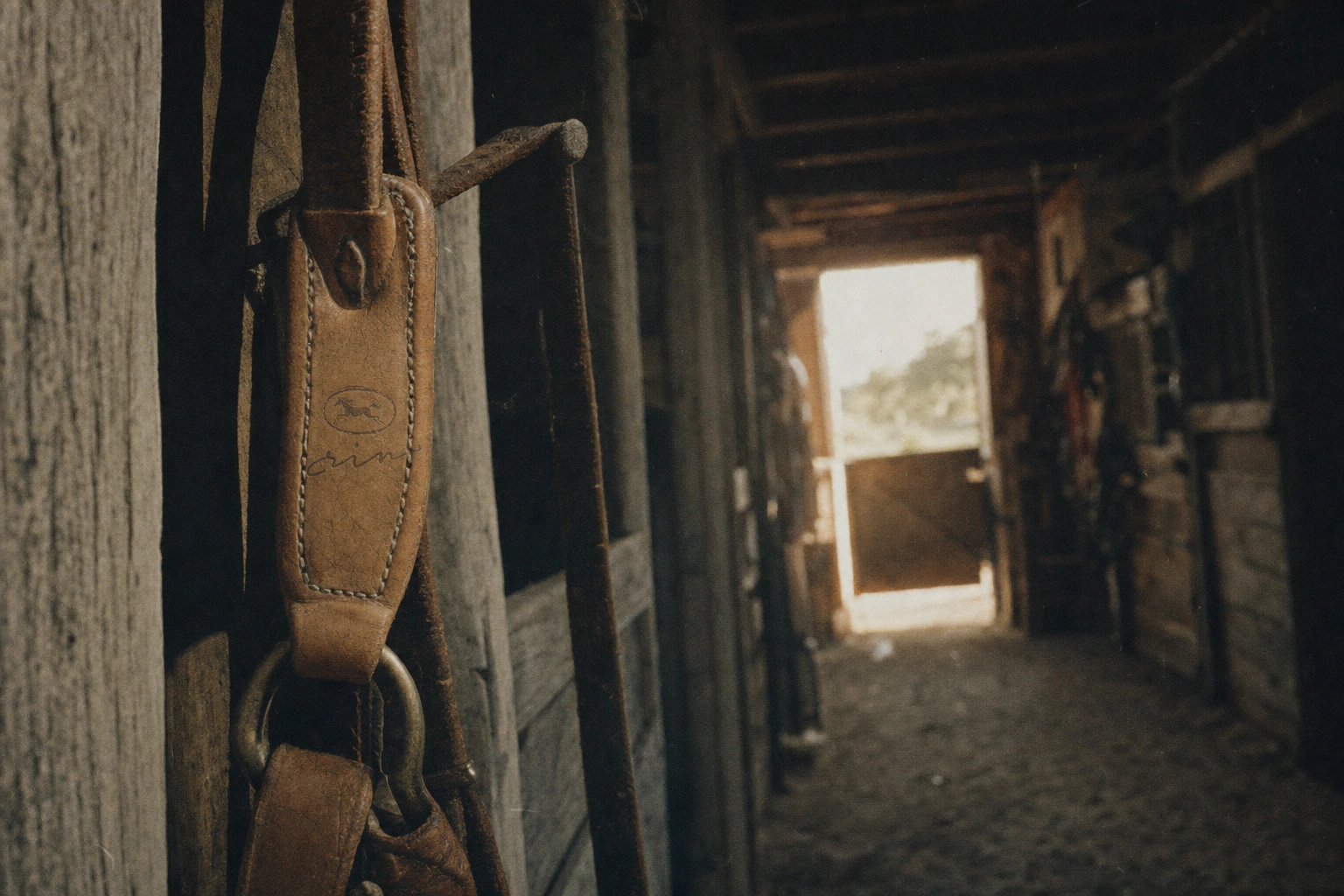
TYPOGRAPHY SYSTEM
A bold, slightly distressed slab serif carries display type, uneven ink edges by design. The handwritten signature script is reserved for the wordmark alone. A plain, sturdy grotesque sans handles body and functional text — the one undistressed element in the system, there so long-form copy stays legible against everything else.
CAMPAIGN AND OOH
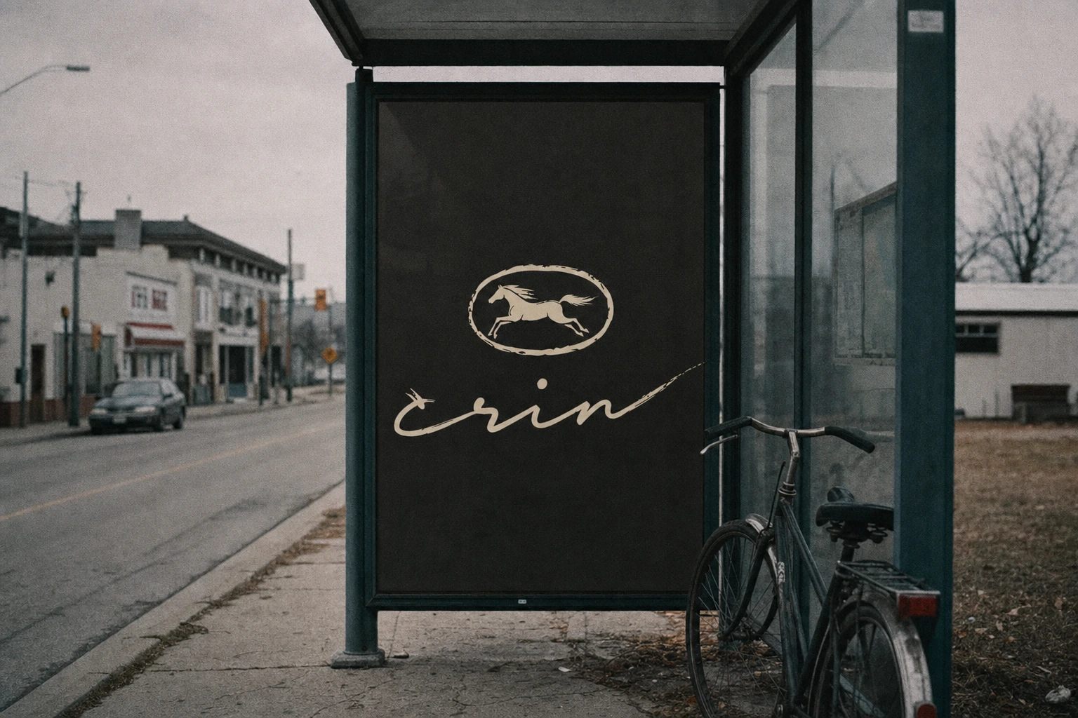
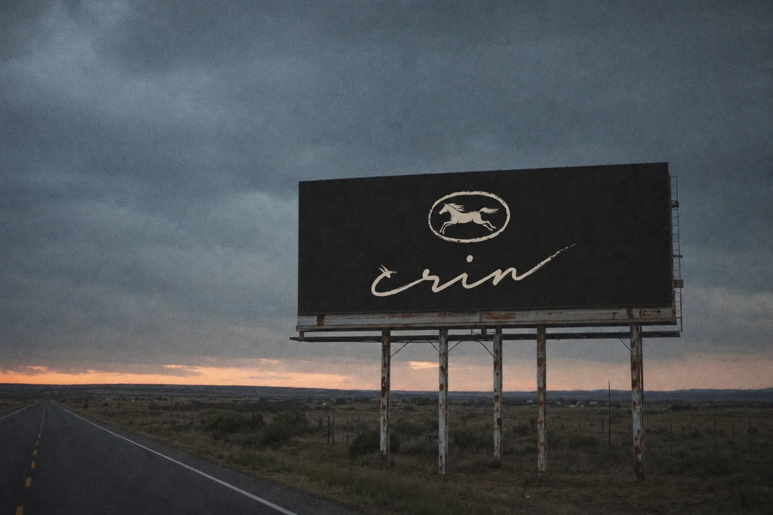
Roadside billboards, hand-painted wall ads, and bus shelter panels all carry the lockup at modest scale against enormous negative space — Iron Black ground, Bone mark, no tagline. The brand doesn't shout in these formats. It waits to be noticed the way a real ranch sign would be.
PRODUCT AND PACKAGING
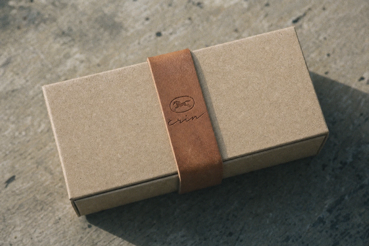
Kraft paper and raw twine over gloss and plastic. The mark appears tooled into leather straps, woven into knitwear, patched onto canvas jackets — always small, always positioned like a maker's mark rather than a logo lockup.
DIGITAL
Landing page
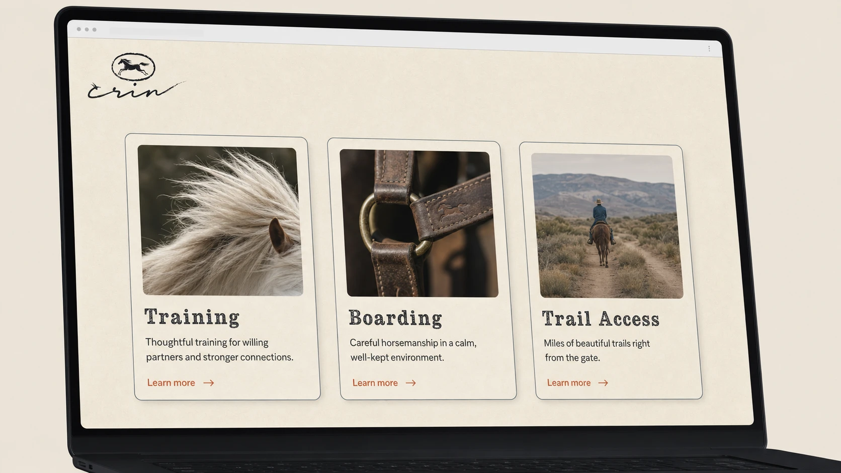
A landing page system built around three understated service cards — Training, Boarding, Trail Access — generous whitespace, a muted paper-toned background, and a text-only CTA in Blood Orange instead of a filled button. Restraint carried through to the interface, not just the photography.
THE RESULT
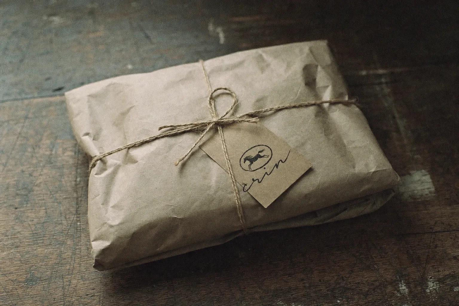
What shipped is a brand that photographs like it already existed before anyone designed it — signage that looks weathered rather than art-directed, a logo that reads as a brand mark in the literal sense, burned into leather and wood and hide rather than laid over it. The correction from glossy to documentary wasn't a step back from "premium" — it's what made the premium claim believable in the first place. Crin doesn't look expensive. It looks earned.
Révolté — revolte.design
Project: Crin
Year: 2026
Scope: Brand Identity, Logo Design, Art Direction, Campaign/OOH, Packaging, Digital (Landing Page)
Industry: Premium Equestrian / Riding House
Like this project
Posted Jul 27, 2026
Crin: a riding house brand built on instinct, not pedigree — a logo burned into hide, not printed on top of it
Likes
1
Views
15
Timeline
Jul 11, 2026 - Jul 27, 2026

