Built with Lovart
KAWAN — A Companion, Not an Itinerary

Révolté


KAWAN — A Companion, Not an Itinerary
Not an app. Not an agency. A network of people who know the way.
THE BRIEF
I set out to build a travel brand that had nothing to do with booking flows or curated itineraries. Every travel brand I looked at was selling the same thing — convenience, optimization, a perfectly planned trip. None of them were selling a person.
The idea I kept circling was simpler and harder to productize: what if the product was proximity? Not a guide performing local color for a camera, but someone who actually lives there, who knows the tide times and the family that makes the best broth, and who's willing to let a stranger walk alongside them for a day.
That's Kawan — Malay/Indonesian for "friend, companion." No packages. No itineraries. Just a roster of individually vetted companions across Southeast Asia, and a system built to get out of their way.
THE APPROACH
My first instinct was to build this like a marketplace — profiles, ratings, a booking flow that looked like every other service app. It fell flat immediately. The whole point of Kawan is that it resists being optimized. A five-star rating system turns a relationship into a transaction, which is exactly the thing I was trying to avoid.
What unlocked the project was deciding the brand should behave like a person who's fluent in a second language — a little imperfect, plainspoken, never oversold. That single idea ran all the way through: the wordmark had to look hand-set, not vector-perfect. The copy had to read like a note left by a friend, not a CTA written by a growth team. Even the photography had to reject the travel-brochure register — no golden hour, no smiling-at-camera, no drone shots.
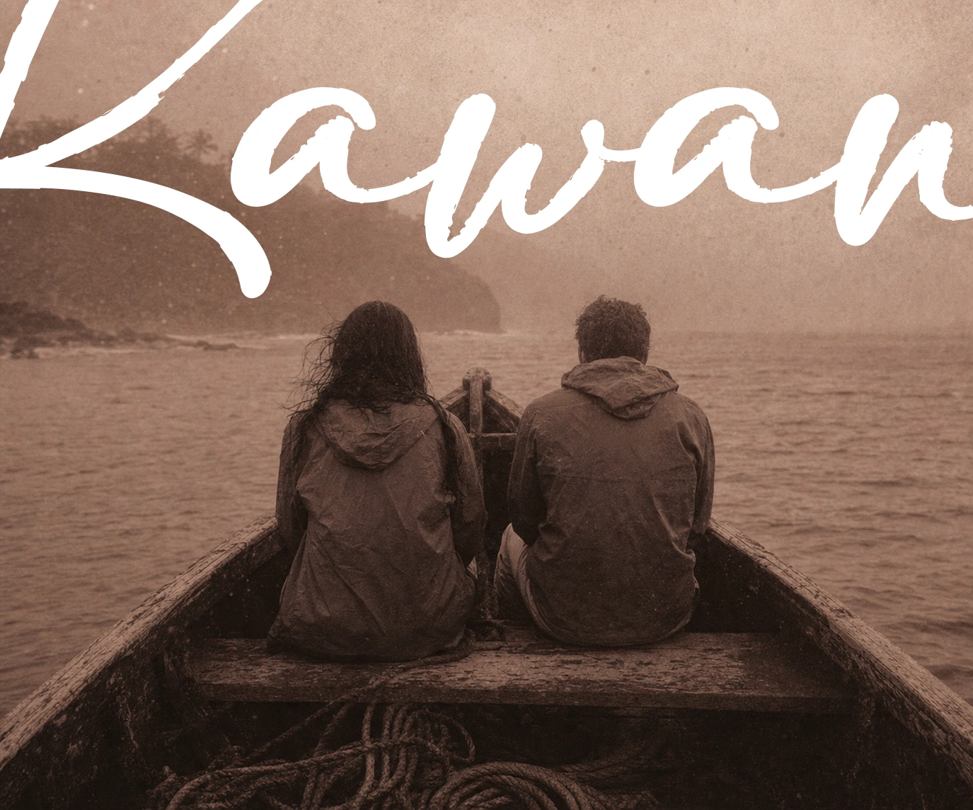
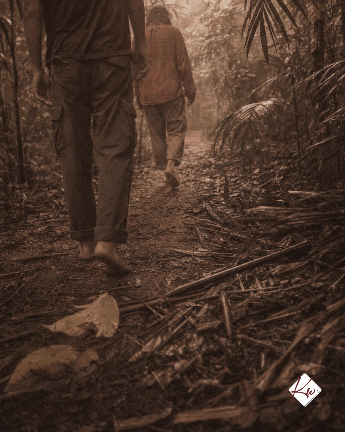
The other unlock was treating the camera itself as a companion rather than a hired photographer. Every campaign image is shot from behind, mid-motion, or partially obscured — dock fog, jungle canopy, market steam. Nobody performs for the lens. That constraint did more for the brand's credibility than any tagline could.
I also learned a practical lesson mid-process: early river and jungle shots that leaned too heavily into ambiguous framing got flagged by image-gen safety systems. The fix wasn't to soften the concept — it was to get more specific. Explicit wardrobe, explicit body language, same mood, same story. The brand didn't lose anything by being precise.
THE WORK
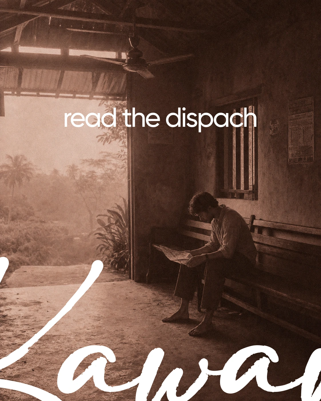
BRAND IDENTITY / VISUAL SYSTEM
Built around restraint: one hand-set mark shown once per composition, never doubled up with the diamond icon. The whole system trusts grain and haze to carry texture instead of layout tricks — no gradients, no drop shadows, nothing that looks applied rather than found.
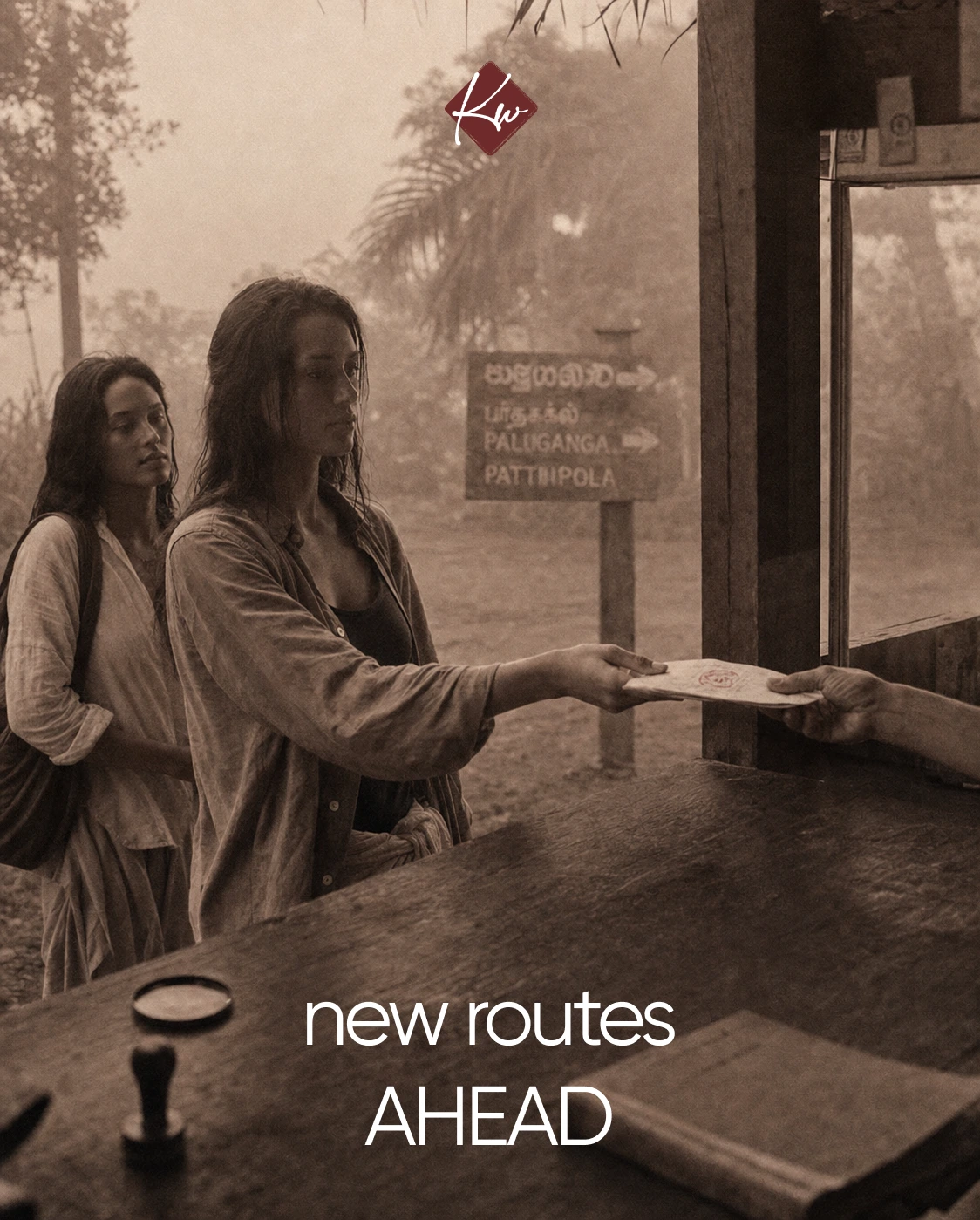
LOGO
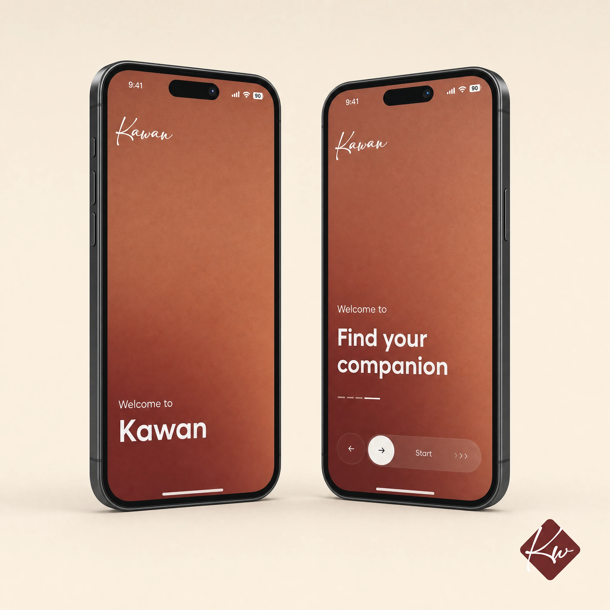
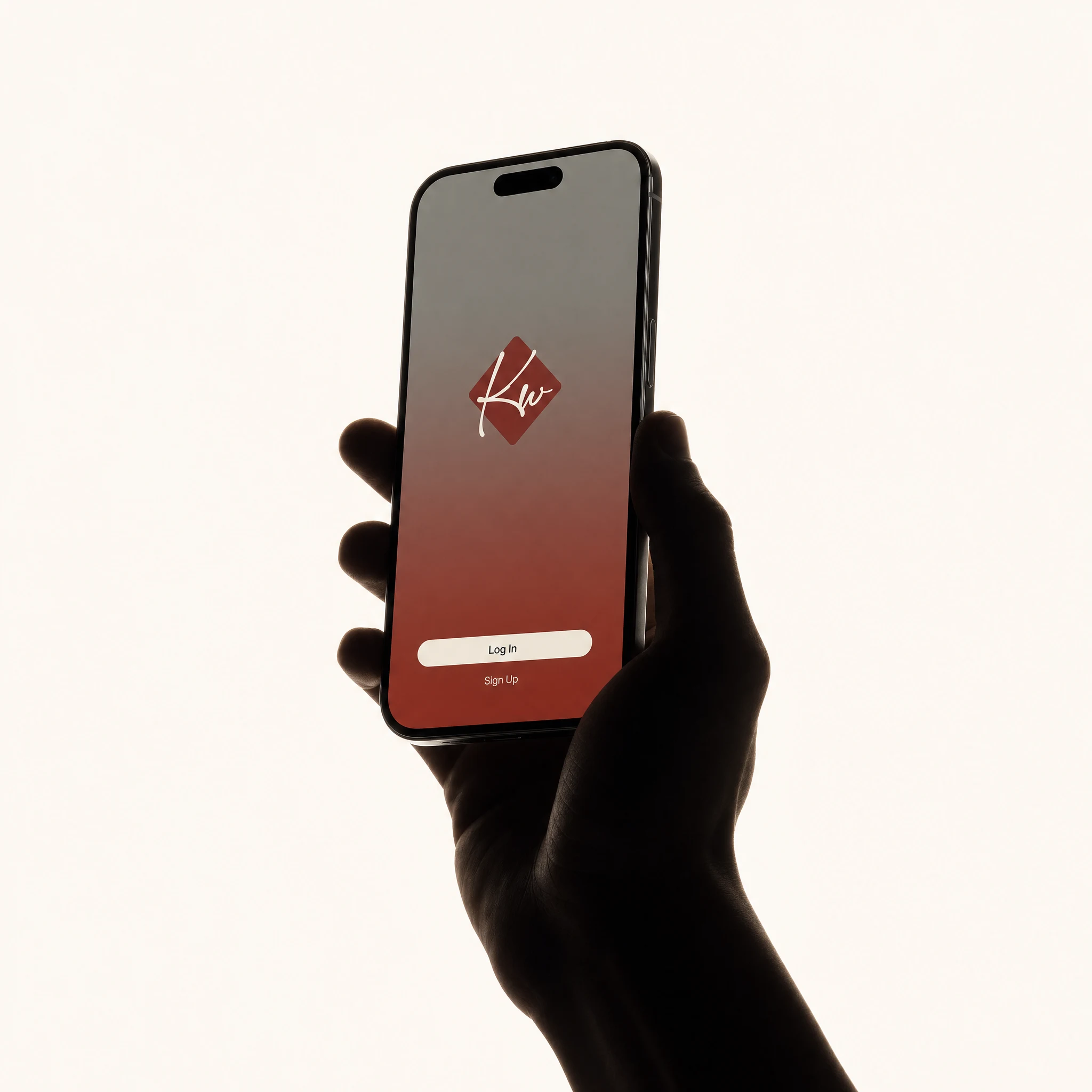
A hand-set script wordmark (modified Adelia alternate) paired with a secondary Kw diamond mark in two color variants — cream ground with oxblood ink for light/print contexts, oxblood ground with cream ink for dark/digital contexts. Both marks reproduced pixel-perfect across every application, treated as fixed objects rather than adaptable design elements.
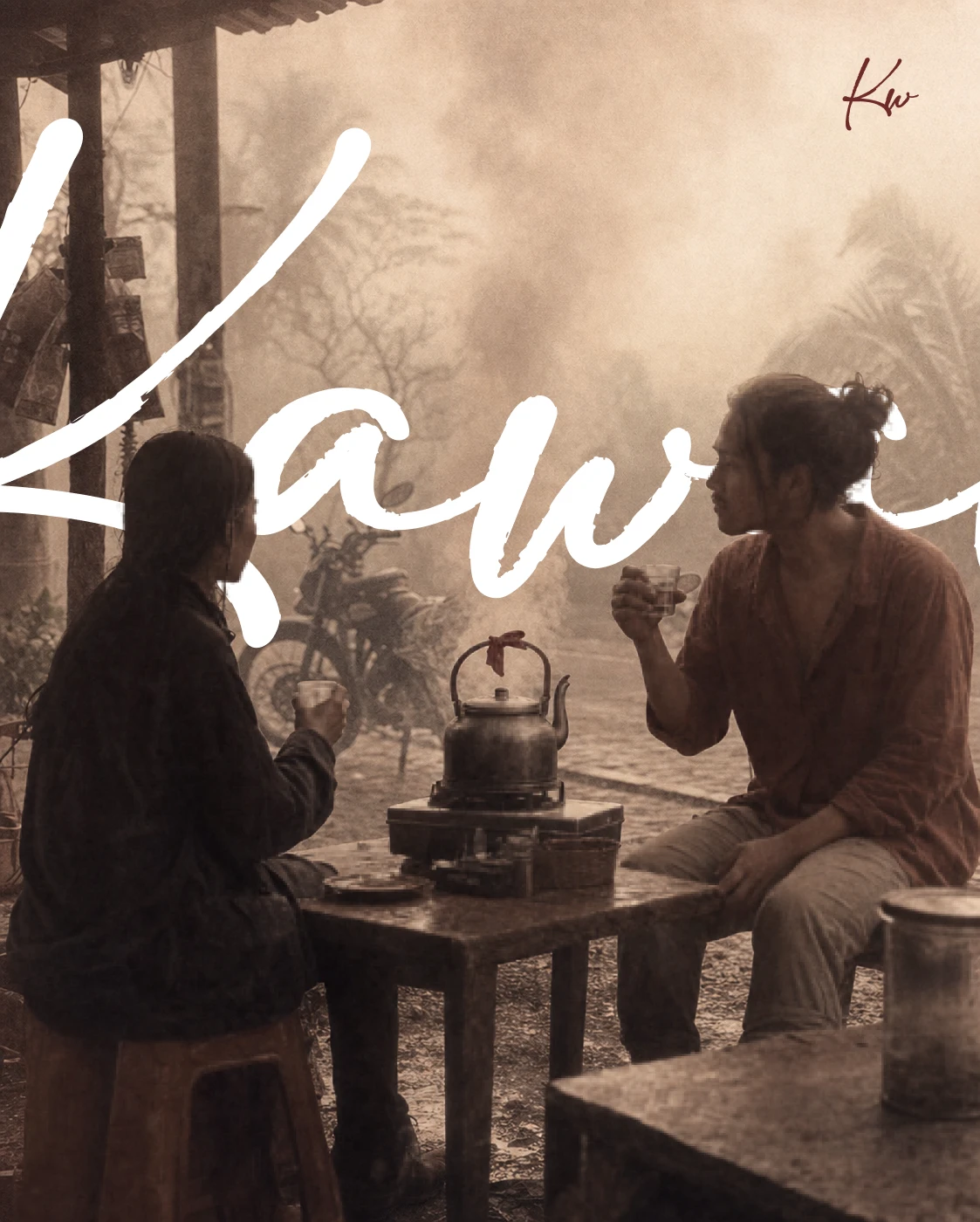
TYPOGRAPHY SYSTEM
Three-tier hierarchy: a soft, slightly uneven hand-set serif for the wordmark and headline moments (used once per screen, maximum); a plain utility sans for body copy and logistics; a typewriter-style monospace for incidental annotation — timestamps, coordinates, companion notes.
COLOR SYSTEM
Dust Rust
#8A4A32 as primary, Monsoon Grey #6E6A61 for structure and body text, Betel Red #7A2E22 as a rare, deliberate accent, Fog White #EAE1D3 as base. No pure black, no pure white — everything reads slightly aged, slightly humid.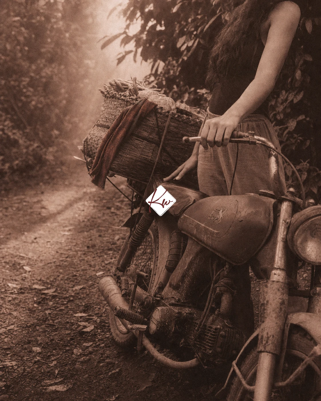
CAMPAIGN PHOTOGRAPHY
A full set of documentary-style images — dock departures, roadside waits, market exchanges, jungle trails, night-market walks, river crossings — shot on simulated medium-format film with heavy grain and low haze. Figures are never posed toward camera; the brand's entire visual credibility rests on that one rule holding across every image.
APP INTERFACE
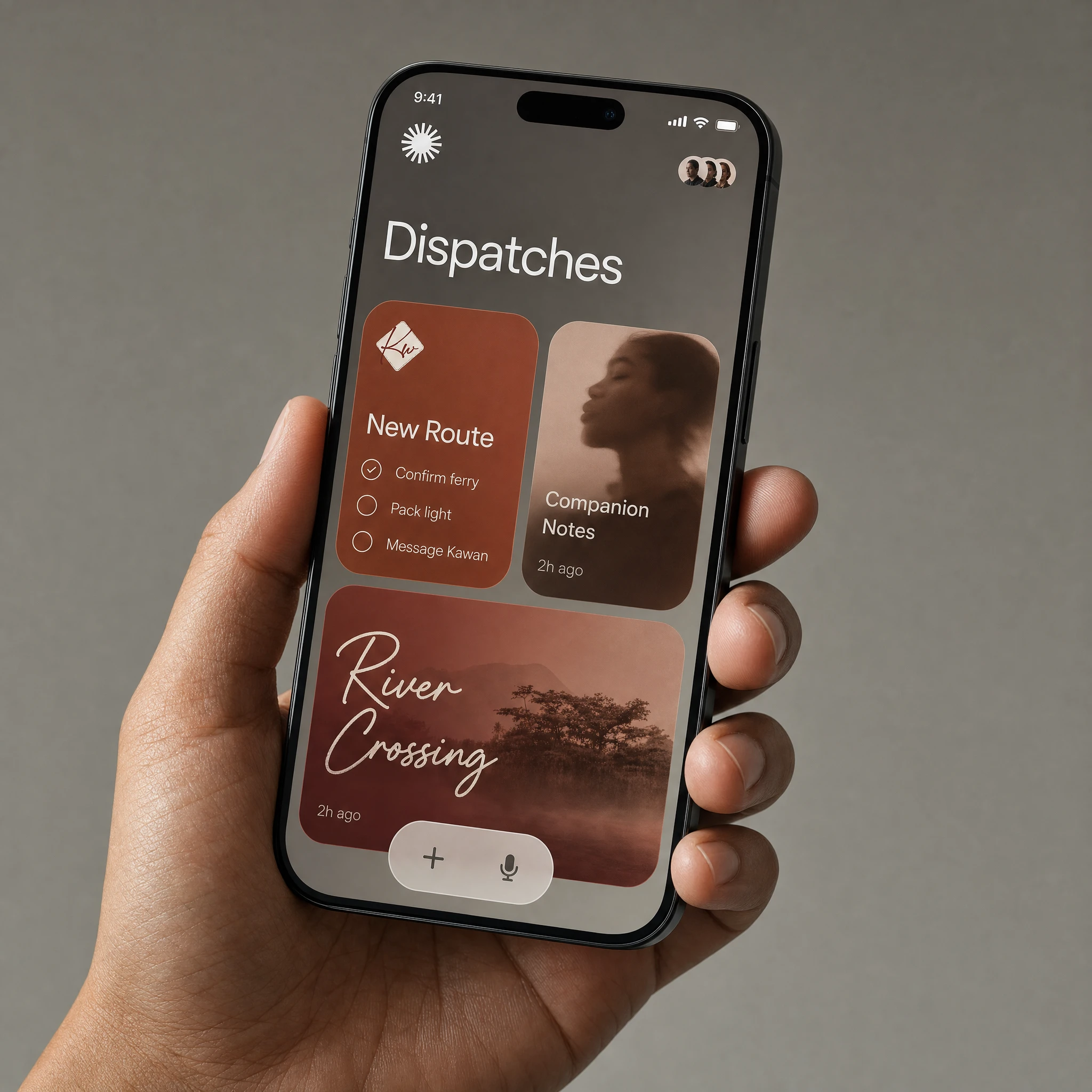
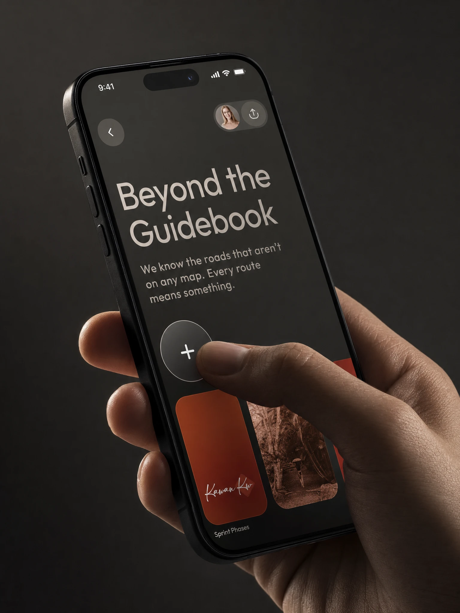
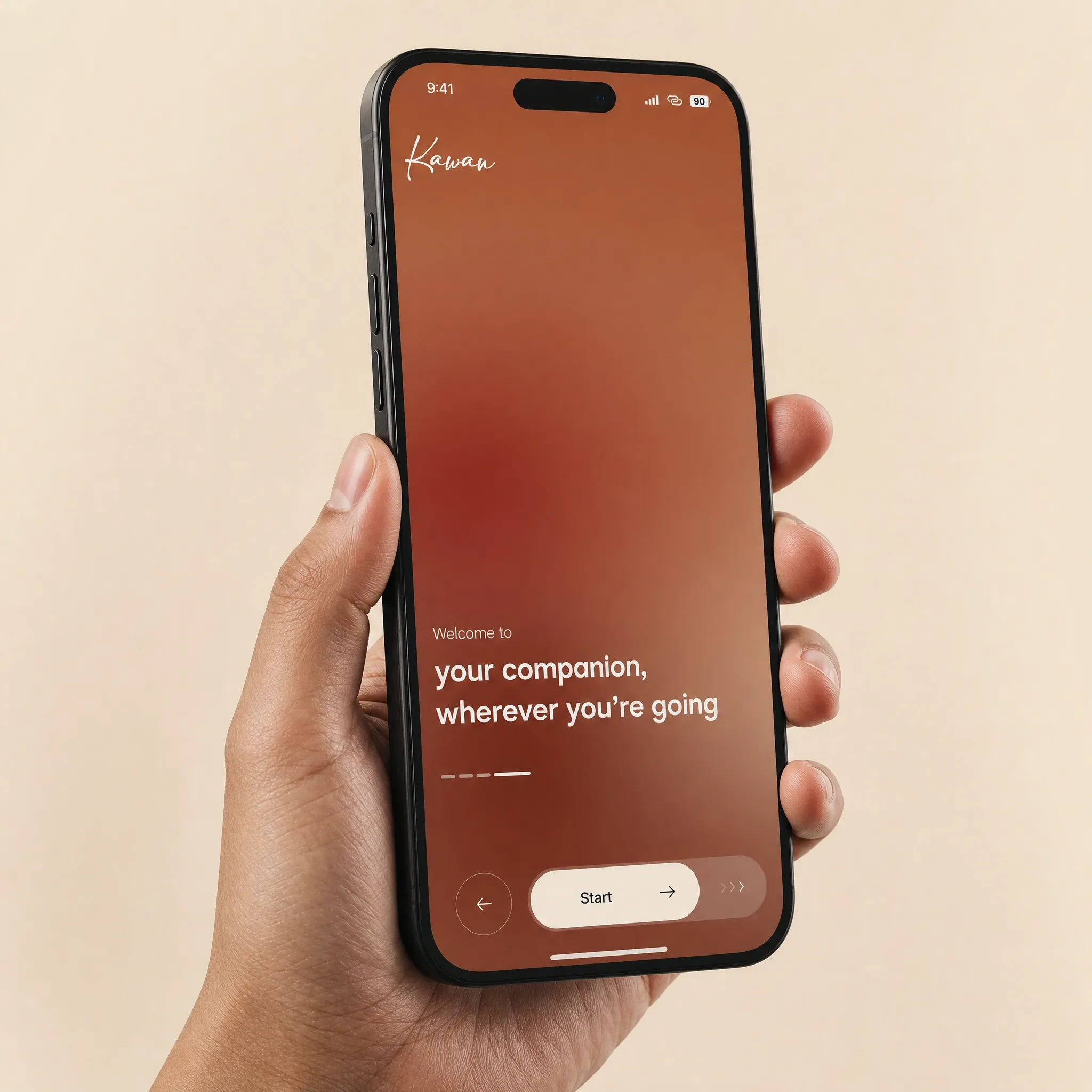
Onboarding, dispatch feed, profile, and login screens built in a distinct, cleaner register from the campaign photography — soft gradient UI in the brand palette, glass-morphism pill navigation, the wordmark appearing small and once per screen. The split was intentional: campaign photography documents the world, the interface serves the traveler inside it.
PACKAGING / PHYSICAL TOUCHPOINTS
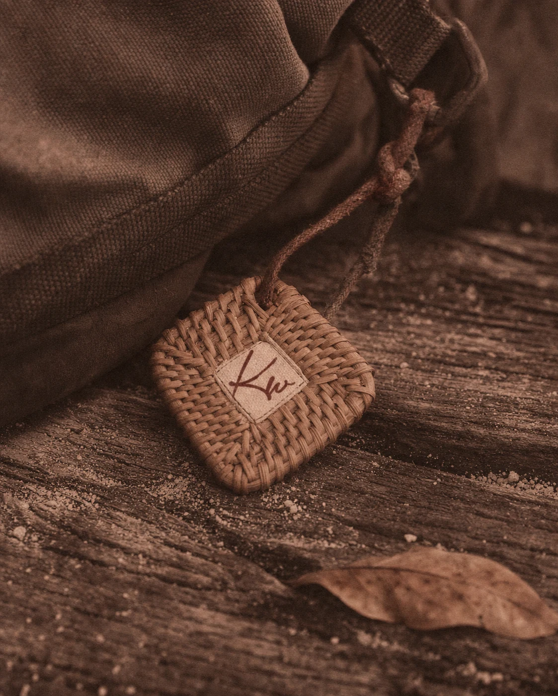
A woven rattan companion tag stamped with the Kw mark, designed to read as a functional travel object rather than branded merchandise — meant to be tied to a bag and worn down by actual use.
THE RESULT
What shipped is a full speculative identity system — logo, type, color, campaign photography, app interface, and physical touchpoint — all built around a single constraint: nothing in this brand should look staged. The system holds up across drastically different formats, from a hand-held phone mockup to a woven tag photographed on a dock, because the constraint was never aesthetic. It was behavioral. Every deliverable had to look like it belonged to someone's actual trip.
Révolté — revolte.design
Project: Kawan
Year: 2026
Scope: Brand Identity, Logo Design, Typography System, Campaign Photography Direction, App UI Design, Packaging
Industry: Travel Companionship, Southeast Asia
See more at revolte.design
Like this project
Posted Aug 13, 2026
One rule ran the whole system: nothing about Kawan is allowed to look staged: meet the travel brand built on it
Likes
1
Views
13
Timeline
Aug 1, 2026 - Aug 13, 2026

