FERAL — Intelligence, Undomesticated

Révolté


FERAL — INTELLIGENCE, UNDOMESTICATED
LOGLINE
An AI interface brand that had no business looking calm. I built FERAL around a single idea: intelligence that works like a pack, not a single obedient assistant — and let a photograph of an antelope's eye carry more authority than any dashboard ever could.
THE BRIEF
The brief was open on purpose, which is its own kind of hard brief. Someone wanted an AI interface brand and handed me a mood board instead of a business plan: a blurred-glass portfolio site, a drone-defense command dashboard, a minimalist notes app, a monochrome beat-generator called drrop. No product, no positioning, no name. Just a very specific visual temperature — cold, technical, editorial, allergic to anything soft or cute.
What I took on was the whole thing at once. Not "design a logo," but build the entire premise a brand like this would need to exist: the positioning, the personality, the voice, the color system, the copy library, and eventually the actual landing page logic. Ten directions, one chosen, then built out completely.
THE APPROACH
I started from the references themselves, not from "AI branding" as a category. Ten directions came out of that: VOID leaned into absence, CARTOGRAPH into old naval instruments, OVERSEER into pure surveillance authority. FERAL was one of ten — pitched as a rebellious counter-positioning, AI that behaved like something half-tamed, thermal and glitchy and slightly dangerous.
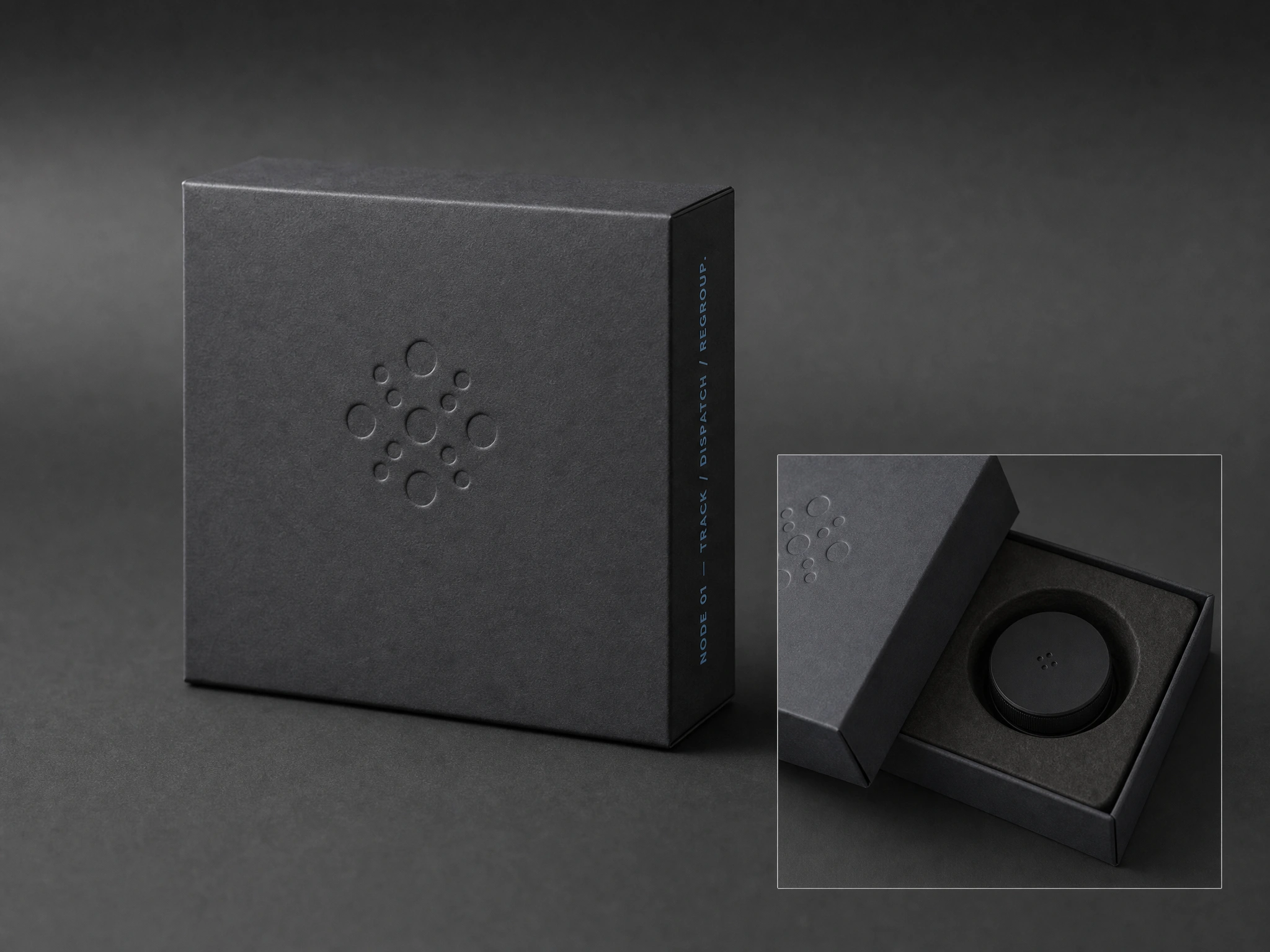
Then the client sent their own logo. A scattered cluster of dots, in a cool, controlled blue —
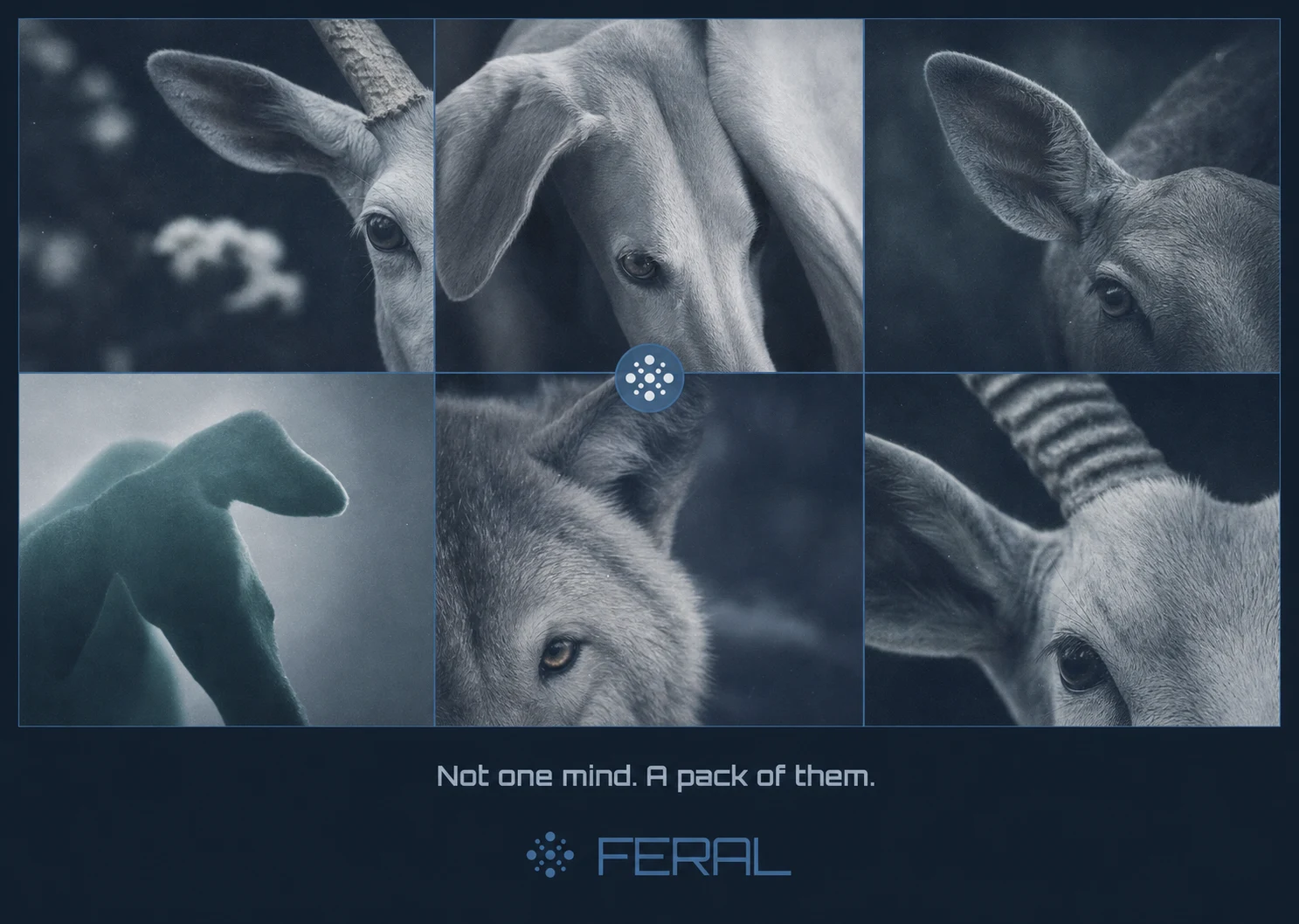
#47739D. Nothing about it was unstable or thermal. It looked like a formation. Like a pack regrouping, not a signal breaking up.That's the moment I rejected my own first draft of FERAL. Glitch-and-thermal was a good idea for a brand called FERAL, but it wasn't this FERAL. I flagged the mismatch directly instead of quietly forcing the client's asset into my original concept, and rebuilt the whole personality around what the mark actually showed: many small autonomous nodes moving in coordination. Not one wild mind. A pack of them.
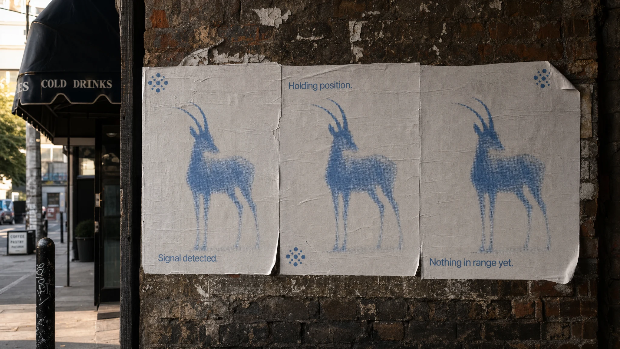
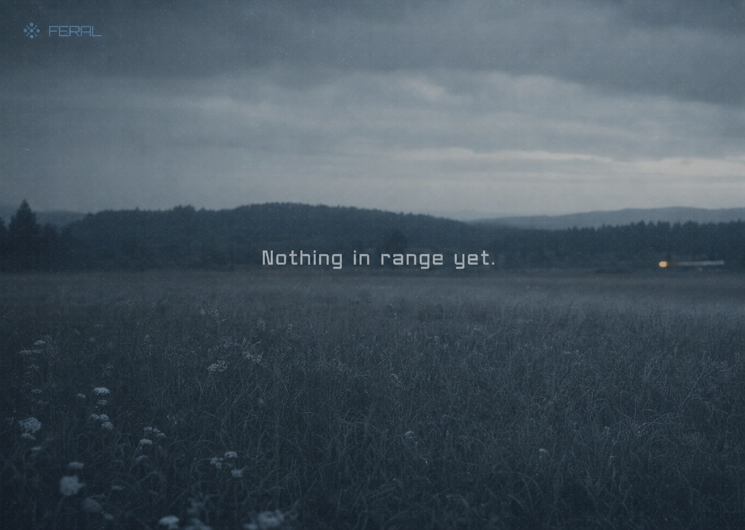
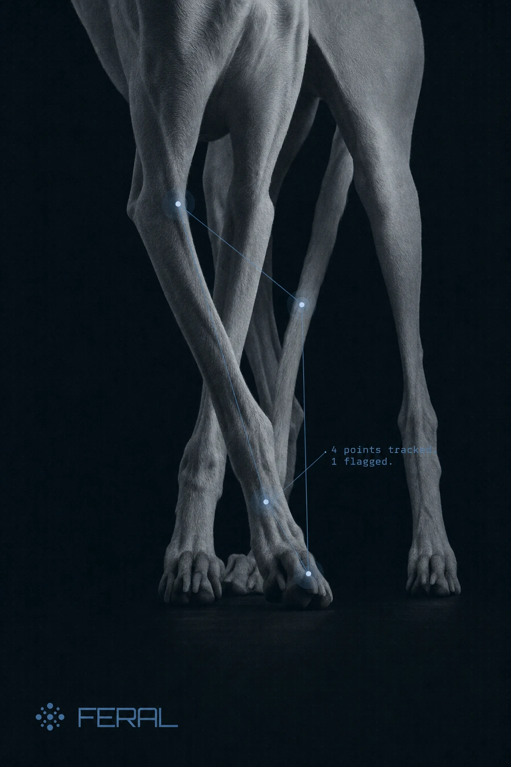
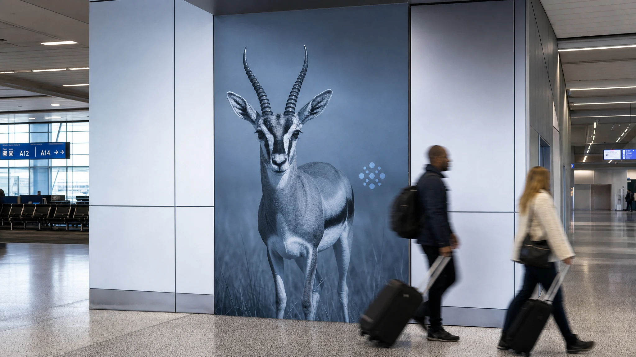
Everything downstream followed that correction. The voice became a field report, not a chat log — short, declarative, no exclamation points, no "I'd be happy to." The photography became long-lens wildlife-at-a-distance, animals alert but never mid-panic. The one color rule that made the whole system hold together: Alert Amber only appears when the pack has genuinely flagged something. Everywhere else, it's blue, slate, fog, mist. Restraint was the actual brand.
THE WORK
BRAND IDENTITY / VISUAL SYSTEM
Built around the client's existing dot-cluster mark, reframed as a functional UI element — a status badge that shifts color by state (Pack Blue for tracking, muted Confirm Green for resolved, Alert Amber for flagged), never rearranging or rotating. The system rule: one accent color, used exactly once per screen, or it stops meaning anything.
TYPOGRAPHY SYSTEM
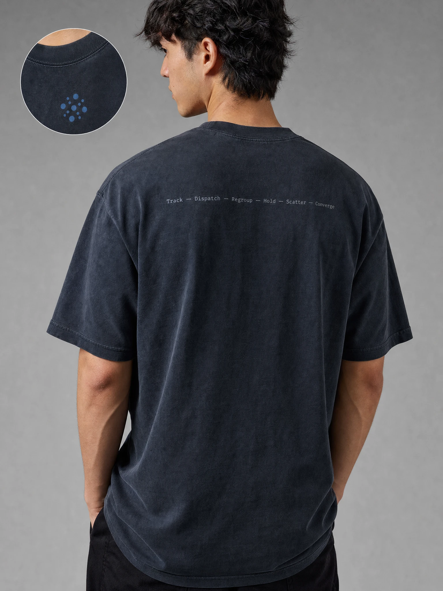
A condensed geometric sans reserved strictly for the wordmark and hero headlines, paired with JetBrains Mono as the workhorse face for every piece of interface copy, timestamps, and system state — sentence case throughout, no italics, no script, nothing rounded.
COLOR SYSTEM
Pack Blue
#47739D as primary, Night Slate #16222D as the near-black base, Fog Grey #A9B4BC and Mist White #EDF1F3 for text and negative space, Alert Amber #D98E3F held back as the single interruption color.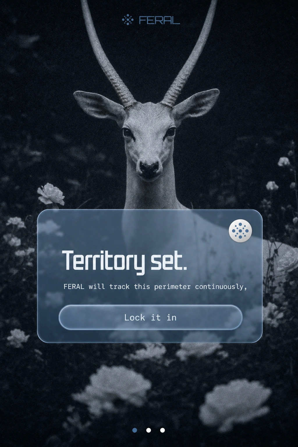
VOICE AND COPYWRITING
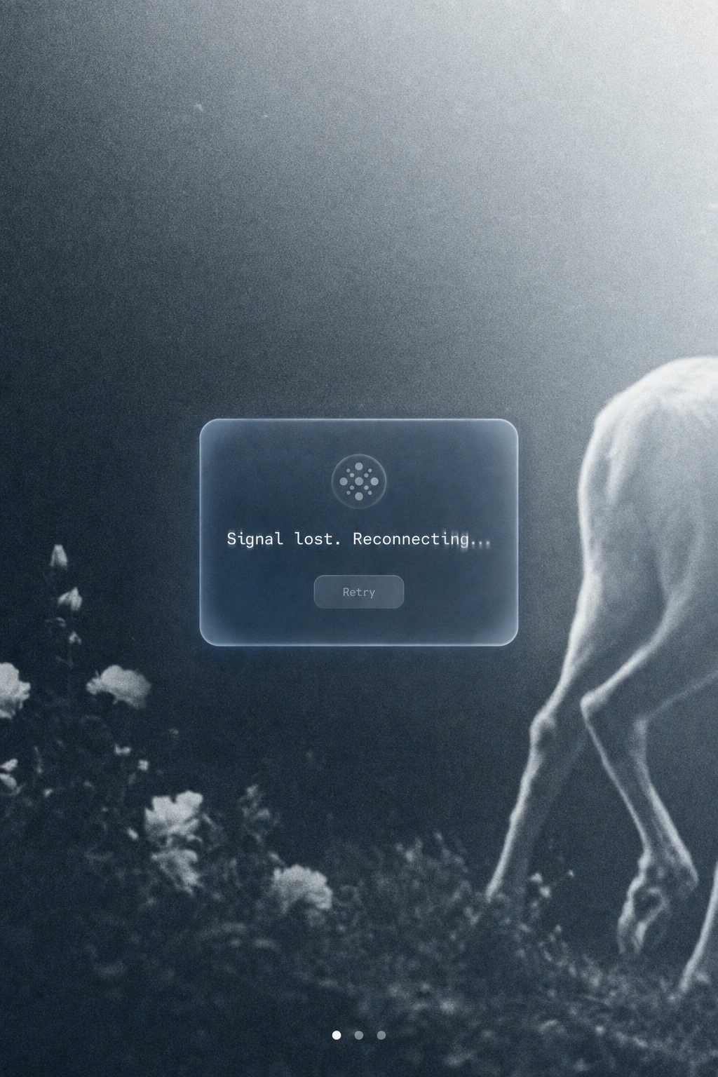
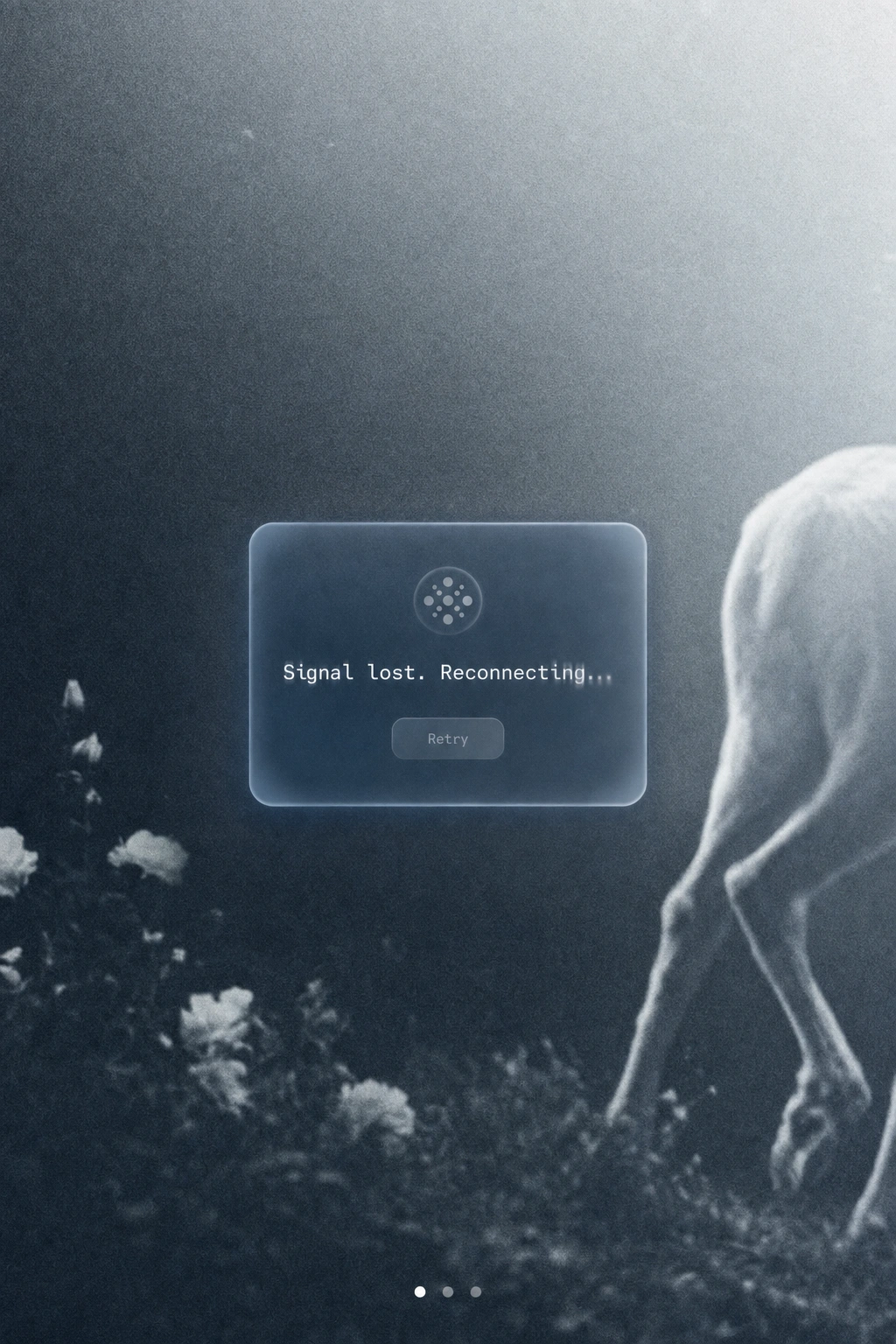
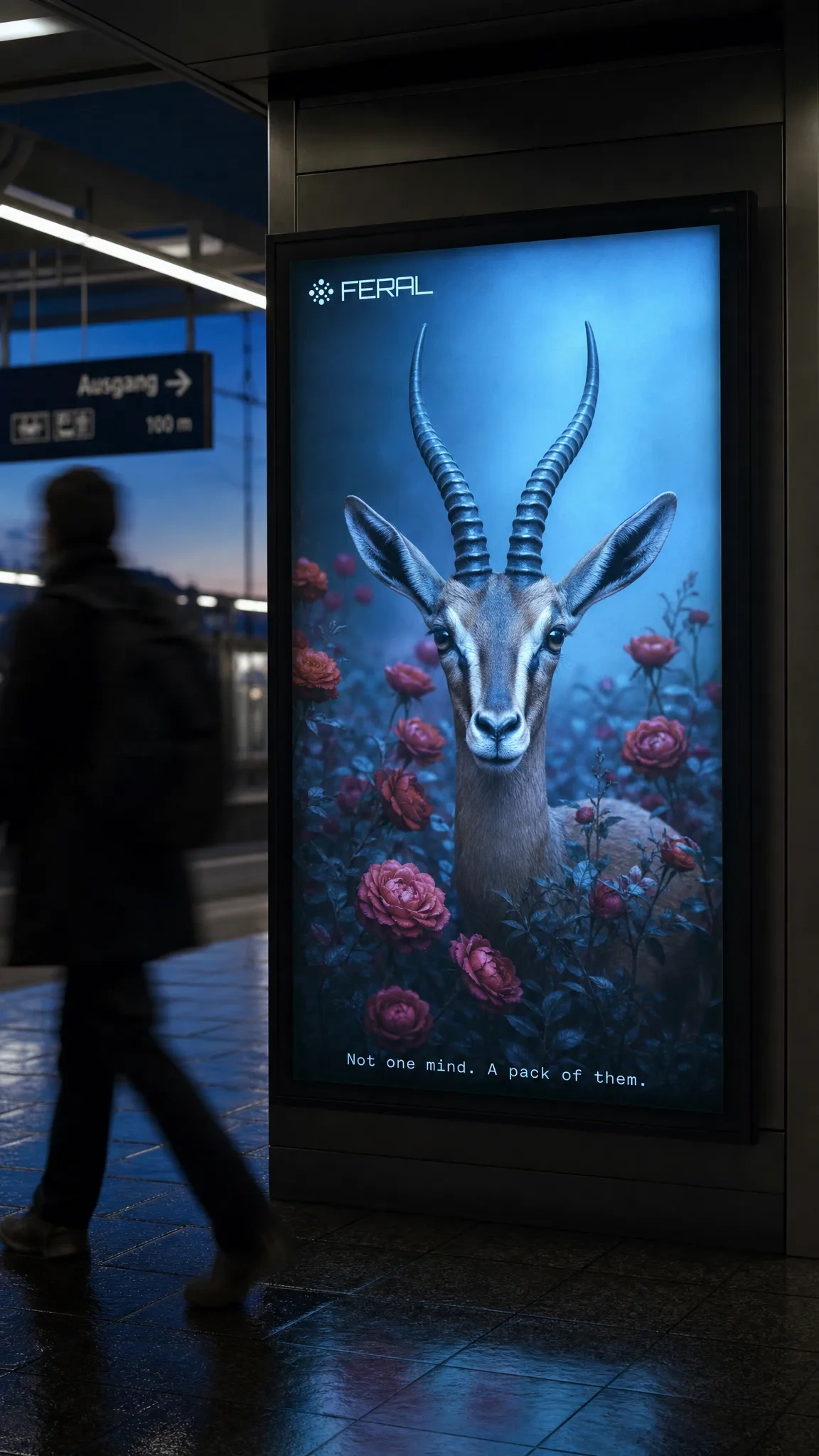
A full library written in the brand's "field report" register — taglines ("Not one mind. A pack of them."), button labels that replace generic actions ("Send it," "Stand down," "Cut loose"), system states ("3 nodes tracking. All quiet."), and error states that stay in-world instead of apologizing ("Signal lost. Reconnecting...").
PHOTOGRAPHY DIRECTION
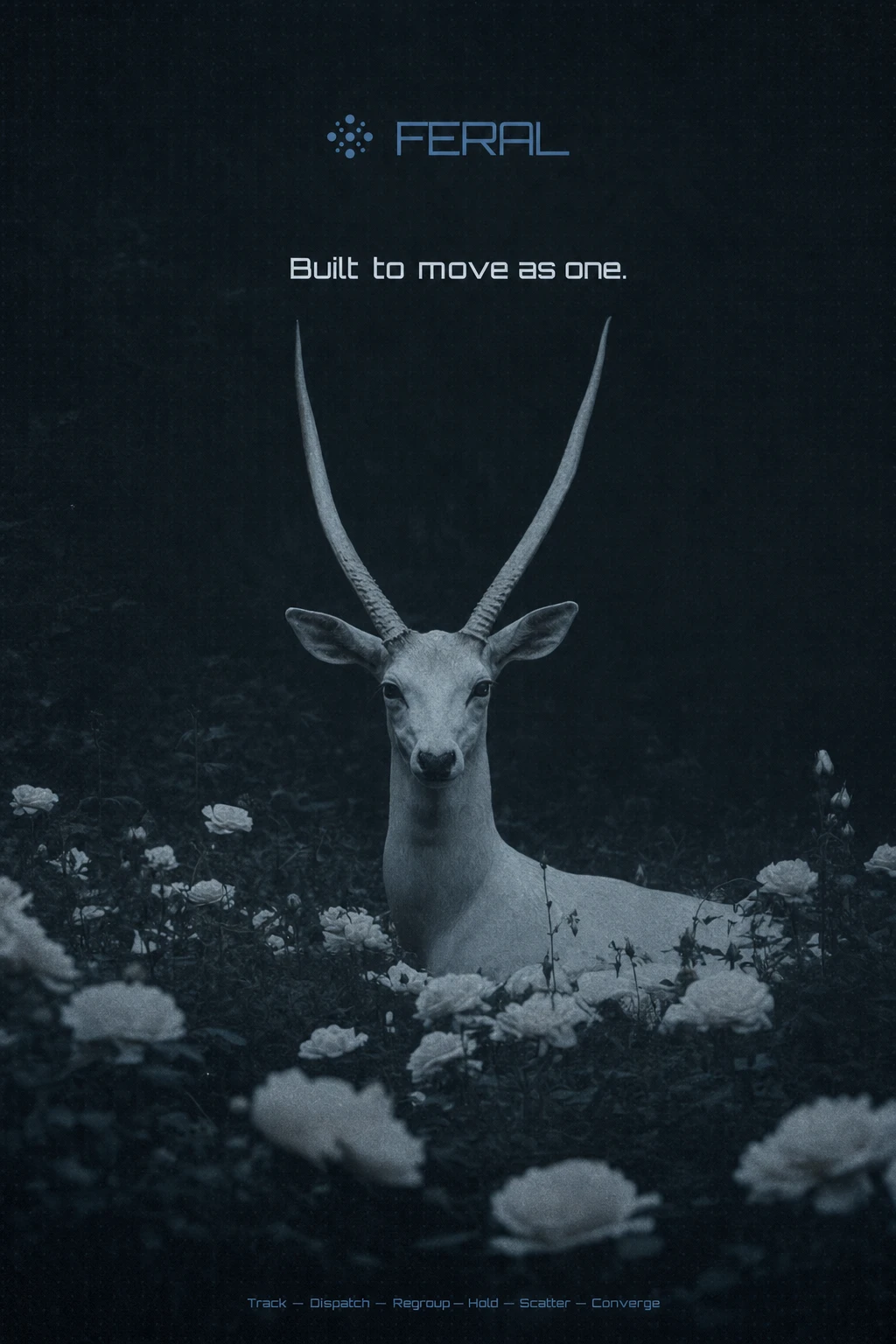
Full-bleed, cool-graded wildlife photography — antelope and whippet references, always long-lens, always alert-but-still, never mid-panic — with liquid-glass UI panels floated directly on top, no boxed cards, no drop shadows doing the depth work instead of the blur itself.
WEB DESIGN
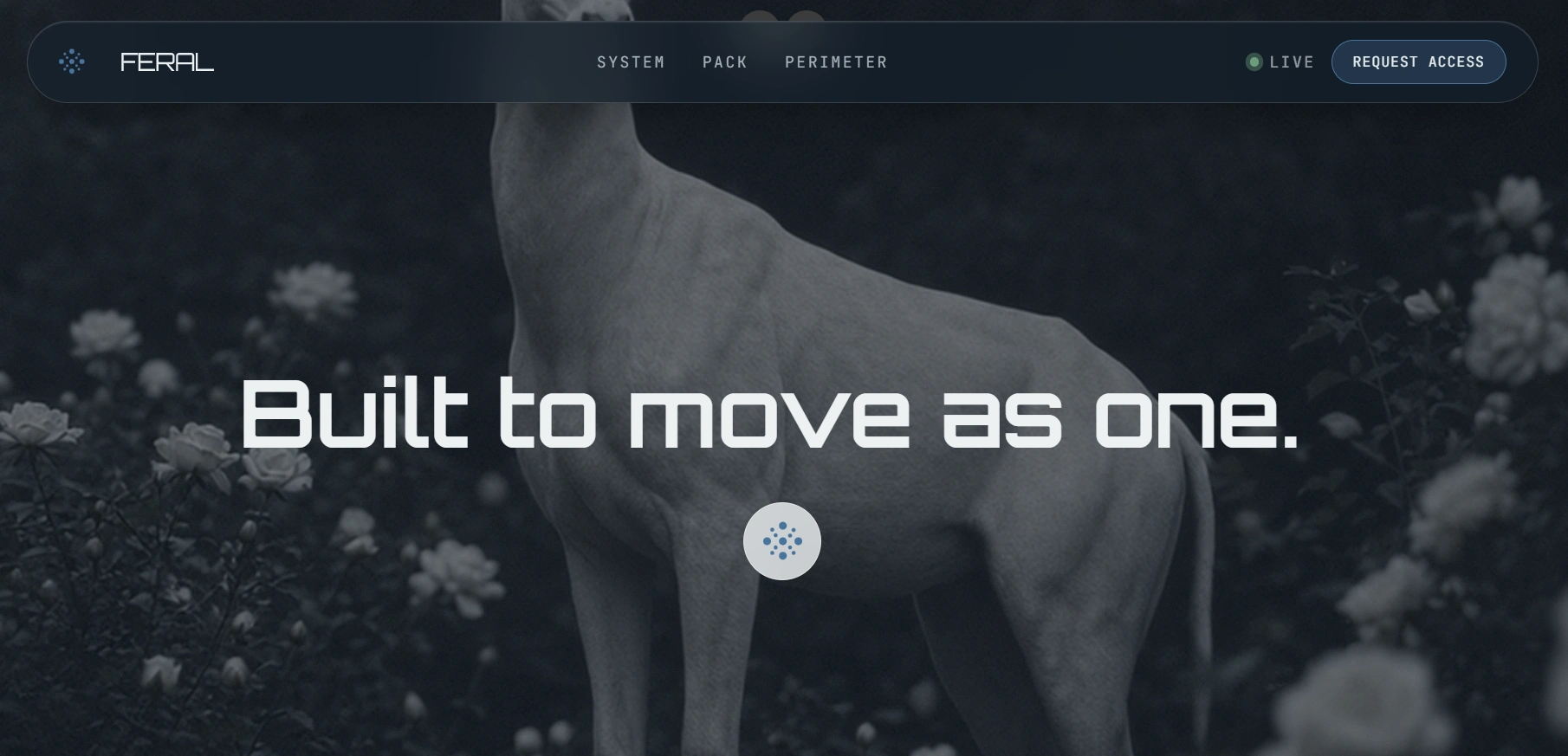
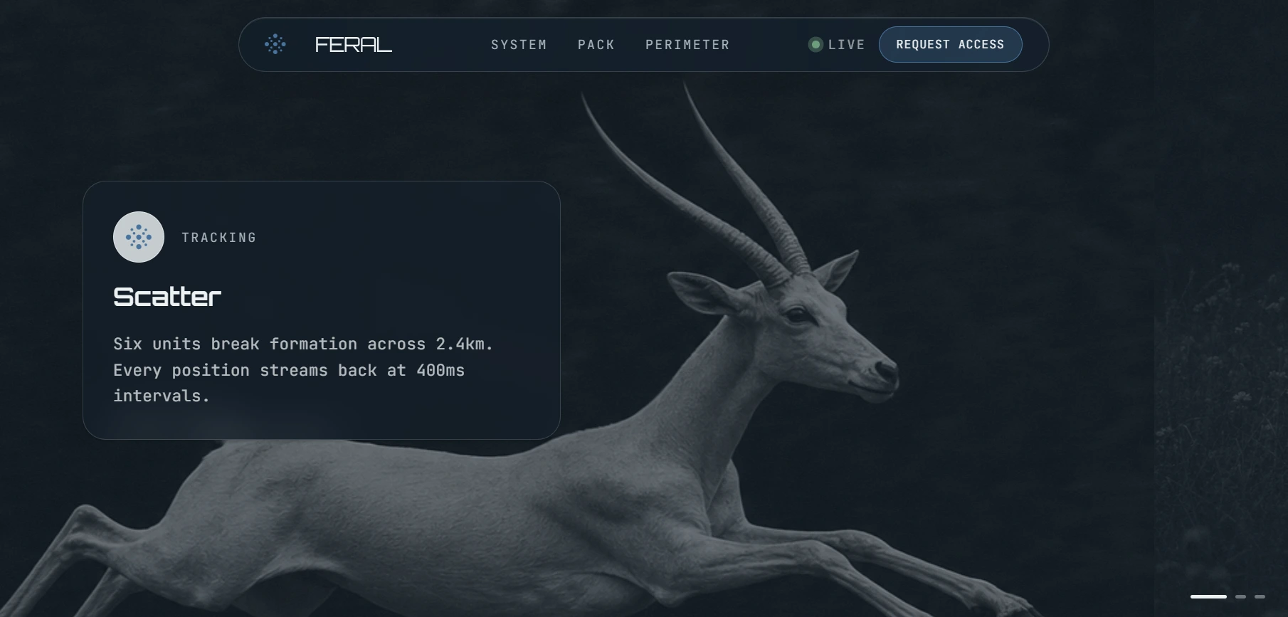
Full landing page here
A complete build brief for the landing page: seven-section architecture running from a full-bleed hero through a horizontal scroll-pinned "status showcase" to a final "Lock it in" conversion moment, plus a GSAP and Framer Motion animation system split deliberately by tool — GSAP for scroll-scrubbed photography, Framer Motion for state-driven UI transitions. No rotation anywhere in the system, no particle effects; the only signature motion is a blur-to-focus entrance on every glass panel, meant to read as a signal resolving into clarity.
THE RESULT
FERAL exists right now as a complete, buildable identity system — every color, typeface, voice rule, and animation spec locked before a single line of production code gets written. That's deliberate. The hardest part of a brand like this isn't making one good screen, it's making sure the fiftieth screen someone builds six months from now still sounds like the first one. The landing page build brief is the next phase, already speced and ready to hand to development.
Révolté — revolte.design
Project: FERAL
Year: 2026
Scope: Brand Identity, Voice and Copywriting, Visual Direction, Web Design (in progress)
Industry: Artificial Intelligence / Software Interface
See more at revolte.design
Like this project
Posted Aug 14, 2026
FERAL: an AI brand built on the idea that intelligence moves better as a pack than a single obedient assistant
Likes
1
Views
21
Timeline
Jul 9, 2026 - Aug 14, 2026