Built with Lovart
Pampa: Merging Nature and Geoglyph in Brand Identity

Révolté


PAMPA — What The Ground Remembers
A data-infrastructure brand built on the idea that the oldest markings on earth and the newest systems we build both come down to the same instinct: reduce everything to one honest line.
THE BRIEF
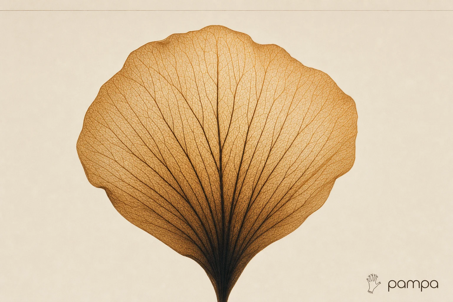
This one started with two images that had no business sitting next to each other. A laser-engraved pegasus — the kind of fine, hatched linework you'd find etched into a steel plate. And a macro shot of a glasswing butterfly, its wings nothing but translucent membrane and branching vein.
I wasn't hired to solve a business problem. I set myself one: build a brand where those two references aren't just mood — they're the entire operating logic. Not "inspired by nature." Not "inspired by ancient art." Both, literally, structurally, at the same time.
The hard part wasn't picking a direction. I generated ten. The hard part was refusing to let it become decorative — a tribal-pattern skin slapped on a SaaS template. Every mark had to earn its place in both worlds at once.
THE APPROACH
My first instinct was almost right and completely wrong. I built a geoglyph-style pegasus — engraved, gradient-lit, technically clean. It read as "cool metal object." It didn't read as anything a company would stand behind.
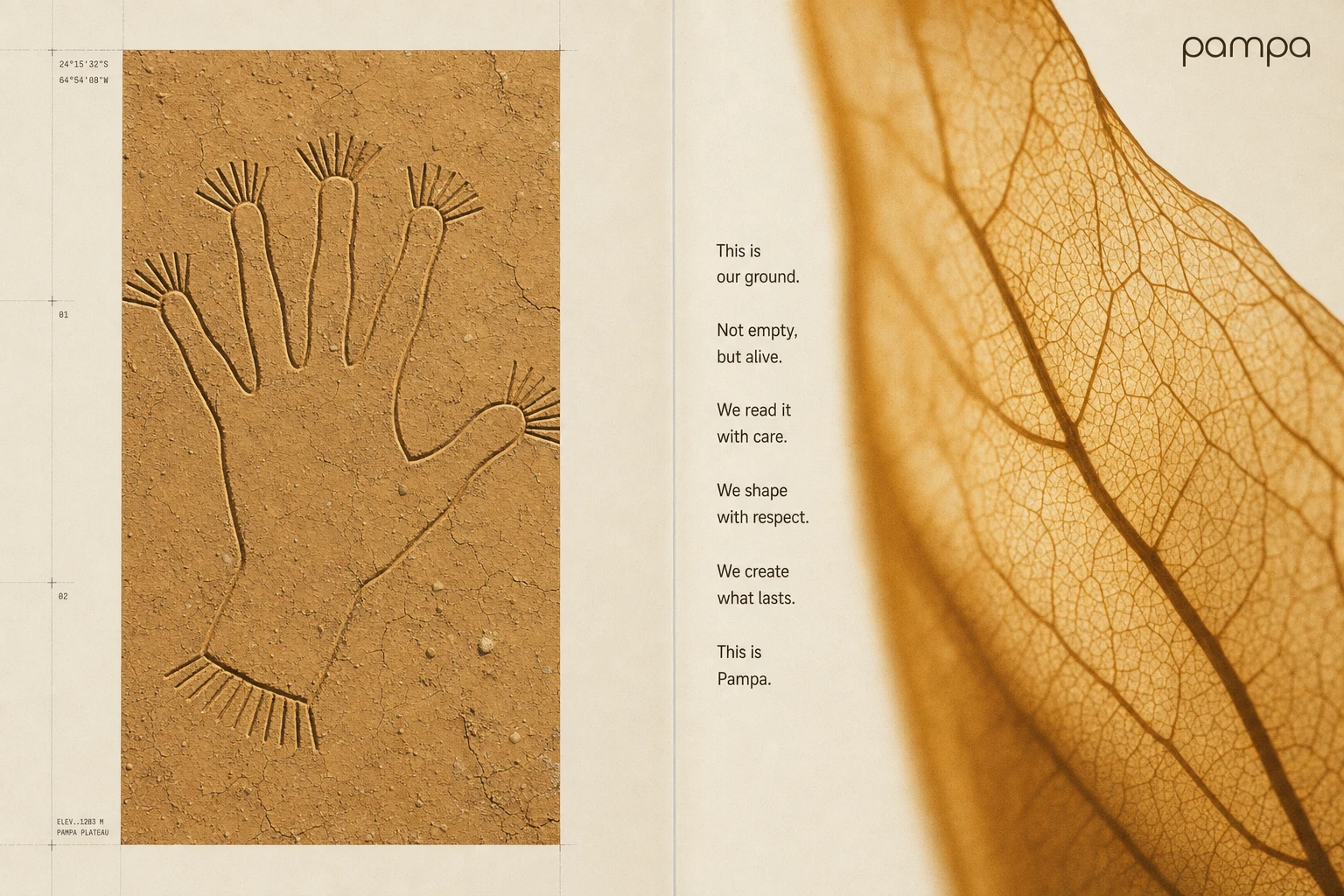
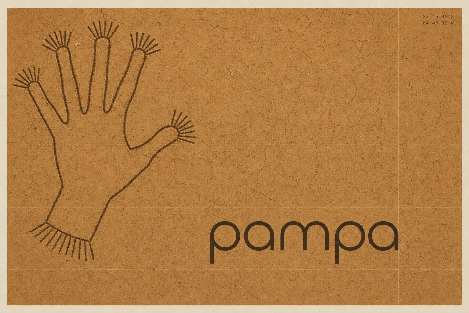
The unlock came from a name and a place: Pampa, the high desert plain the actual Nazca lines are walked into. Once I had the ground, I had the rule — every mark in this system has to behave the way a geoglyph behaves. One continuous line. No lifted pen. Legible as a whole shape from far away, and only readable as fine striated detail up close.
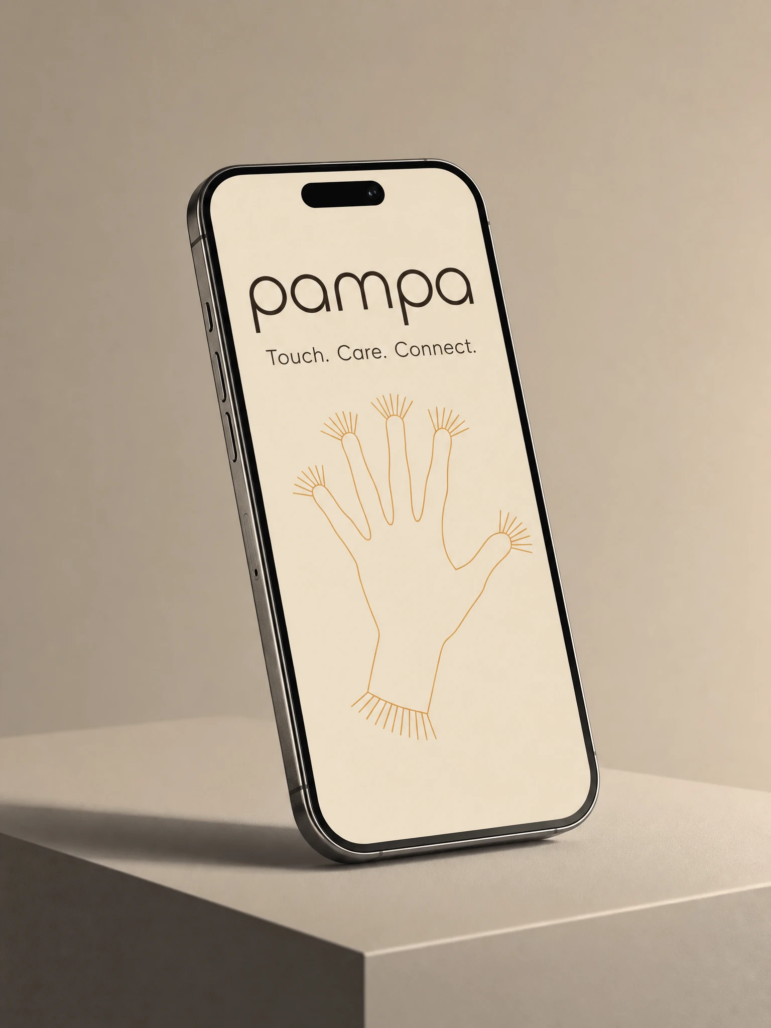
Then I broke my own rule on purpose. I generated a spider mark first and it failed the test I'd just set — eight independent limbs radiating from a center, not one traceable gesture. Multi-tone shading instead of a flat plane. It looked like an illustration wearing a costume. I flattened it, rebuilt it as one line, and swapped the subject entirely: a hand. Not decorative. There's a real "Hands" geoglyph in the Palpa region — open palm, fingers slightly wrong, thumb held at its own angle, a line that visibly had to travel out to each fingertip and back before it could move on. That imperfection is what makes it read as walked, not drawn.
The nature half of the system needed its own discipline. Wherever the hand mark shows "surveyed" — aerial light, ochre ground, hard shadow — the wing reference shows "grown": backlit, no shadow, veins lit from within. I made a rule that the two registers are never allowed to blend inside a single frame, except once, deliberately, where the collision is the entire point of the shot. Constraint became the argument: ancient and biological aren't the same idea wearing two outfits. They're two different proofs of the same conclusion.
THE WORK
LOGOMARK
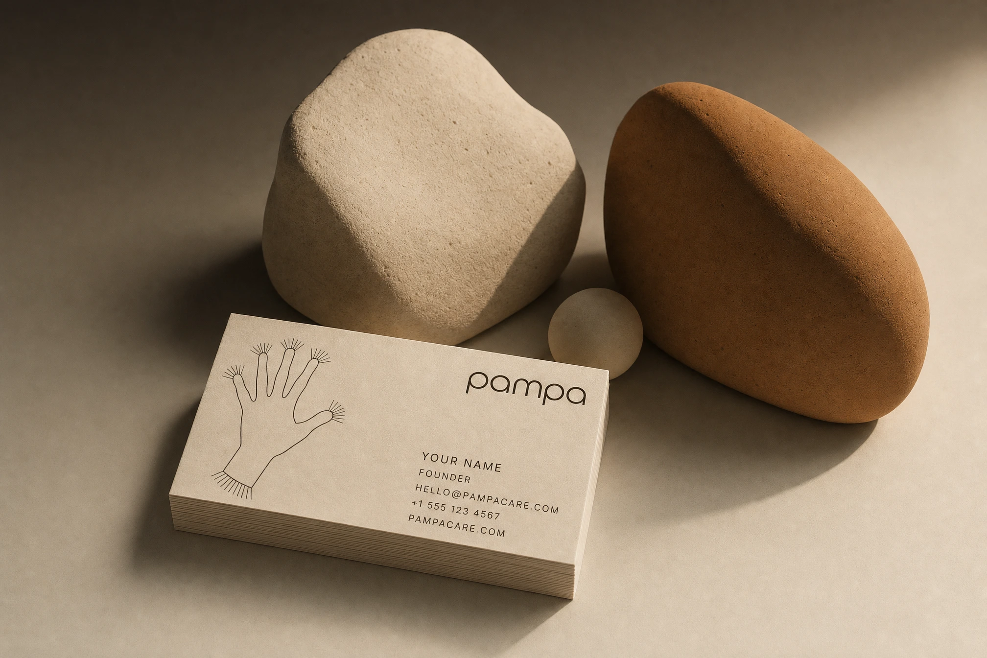
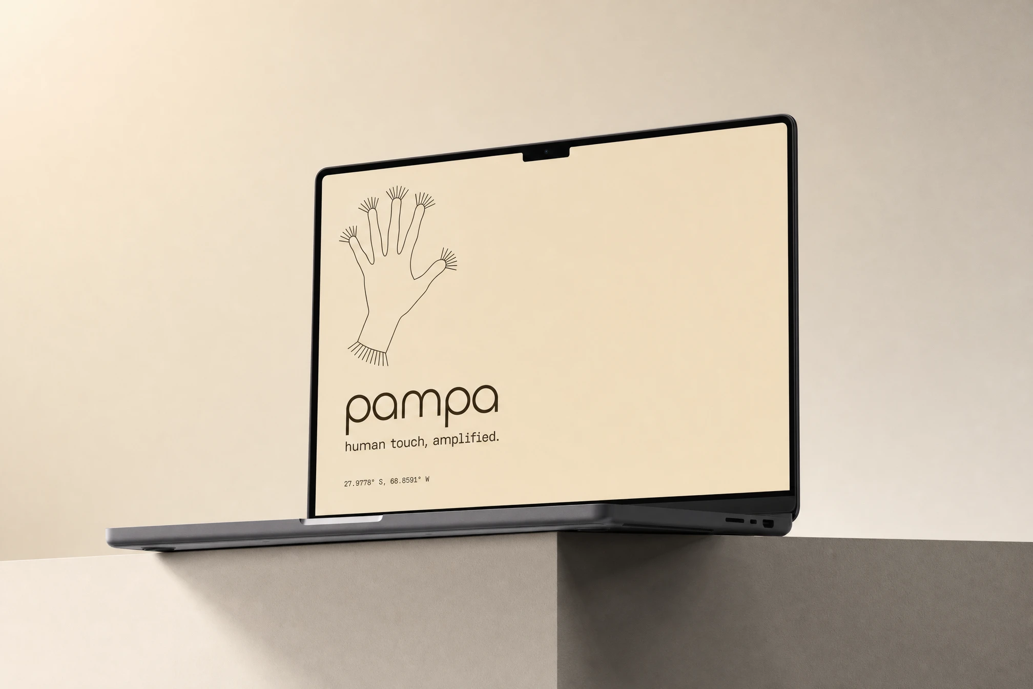
An open right hand, five fingers spread, one continuous contour from wrist to fingertip and back — no closed shapes, no fill. At the tip of each finger and at the wrist, 5 to 9 parallel strokes radiate outward at a consistent 15 to 20 degree spread, echoing the geoglyph's striated fringe device. Rendered flat in Deep Umber
#2B2118, single stroke weight throughout, no calligraphic taper.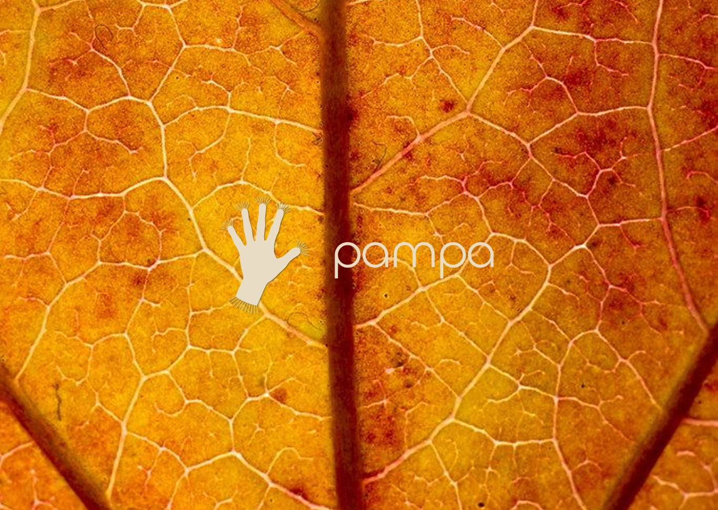
WORDMARK AND TYPOGRAPHY
Lowercase "pampa" set in Chillax — round counters, warm geometric structure, deliberately the most "resolved" element in the system, a counterweight to the hand's intentional roughness. Paired with a fine hairline monospace for coordinates, data values, and anything meant to feel measured rather than designed.
COLOR SYSTEM
Warm Bone
#E8DCC4 carries every surface as ground. Deep Umber #2B2118 is the only ink color for mark, type, and line work — never pure black. Glass Amber #D9A05B is reserved exclusively for the nature/structure register: backlit membranes, data-network visualizations, anything "grown." Desert Ochre #C08A4E is reserved for the geoglyph/ground register: clay, aerial photography grading, anything "marked." The two accents are never allowed to touch inside one gradient.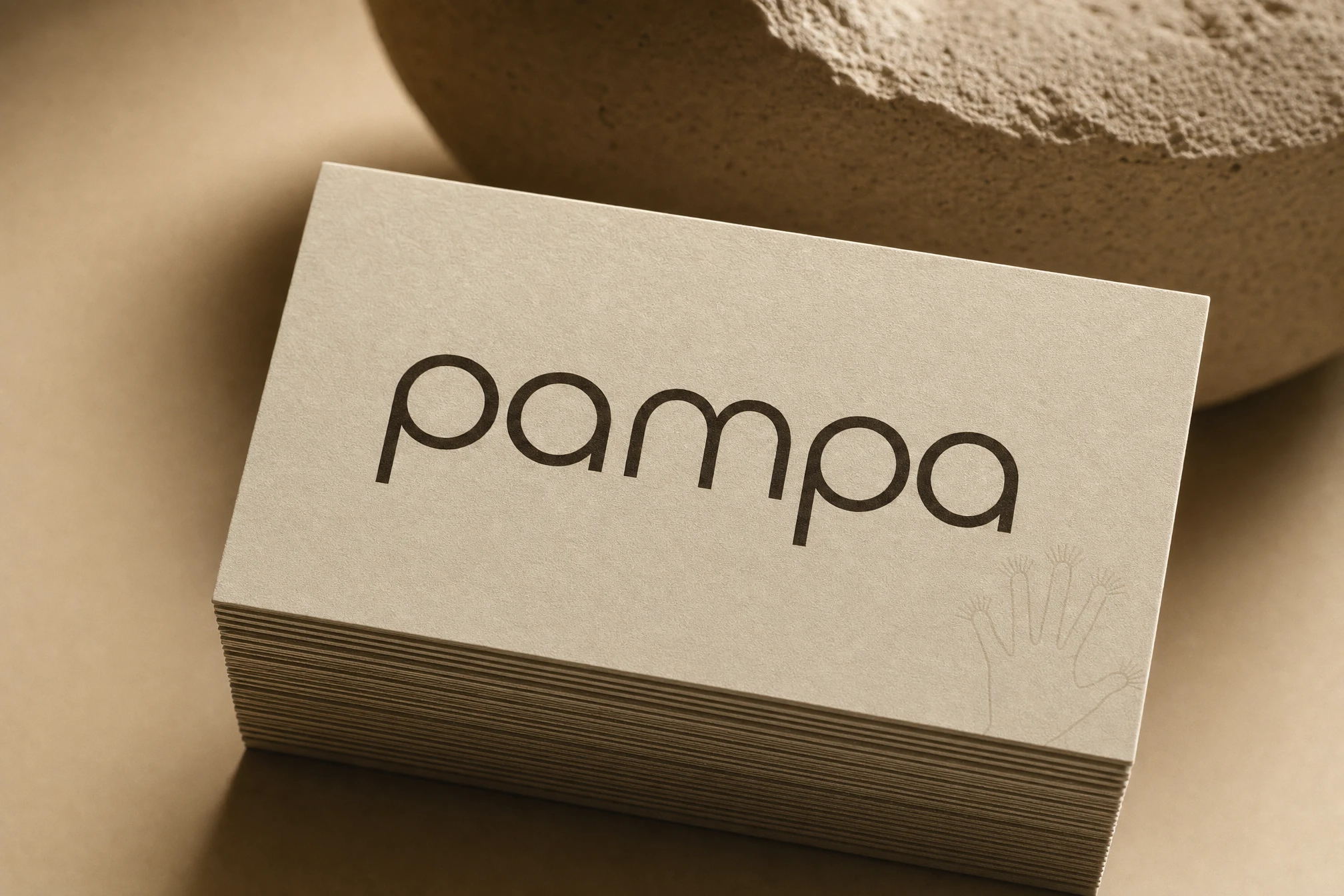
DIGITAL PRODUCT
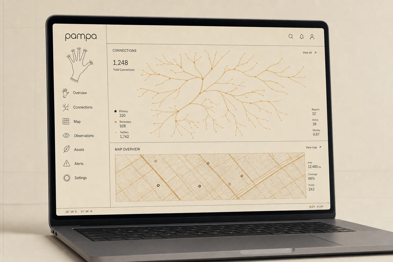
The dashboard splits the same logic across one screen — a branching "Connections" visualization in Glass Amber that reads as vein structure, sitting directly above a "Map Overview" panel in Desert Ochre that reads as aerial survey grid. Sidebar iconography follows the same one-continuous-line construction as the hand mark, scaled down to functional size without losing the striated detail.
CAMPAIGN AND ENVIRONMENTAL
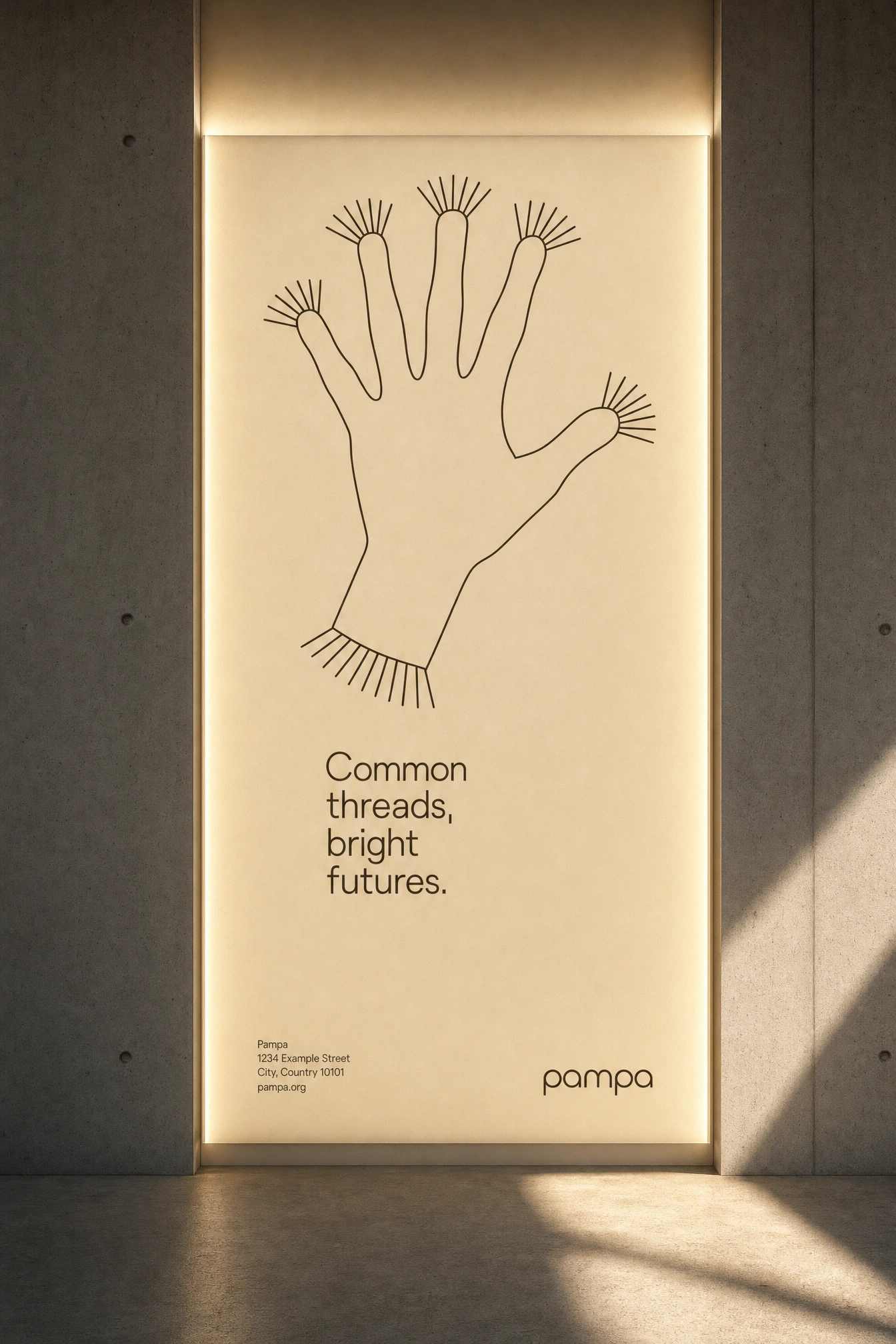
OOH, signage, and print all carry a single line of copy built the same way the mark is built — short, declarative, no adjectives doing the heavy lifting: "Made for living things." The subway panel and the illuminated wall plaque both let the hand mark run large against warm negative space, betting that the strangeness of the gesture itself is the ad.
PHYSICAL OBJECTS AND APPAREL
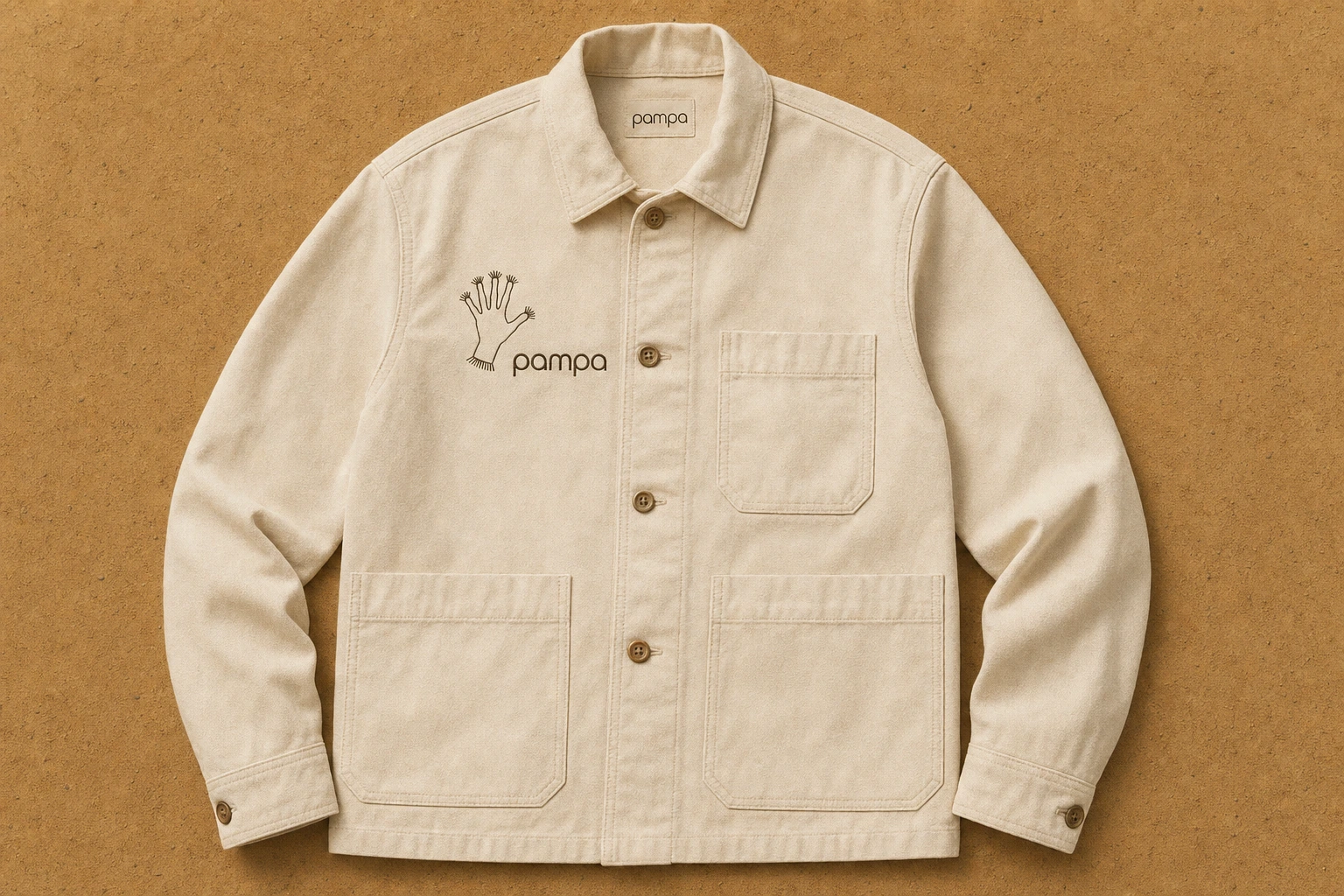
Fieldwear jacket with the hand mark embroidered at chest scale, a woven interior label in the same Deep Umber. A hardcover field notebook, hand mark foil-stamped into a near-black cover, paired with a loose page underneath showing faint coordinate ruling — the "surveyed document" idea made physical.
THE RESULT
What shipped is a system that photographs as two different companies until you look twice — one that surveys, one that grows — and only resolves into a single brand once you understand they were never actually separate. The hand mark carries the whole identity at every scale, from a favicon down to a 6-foot subway panel, without needing a supporting cast of secondary marks to prop it up.
This is a speculative case study — no client, no brief handed to me. I gave myself the constraint and then had to live inside it, which is its own kind of hard.
Révolté — revolte.design
Project: Pampa
Year: 2026
Scope: Brand Identity, Visual System, Digital Product Design, Campaign Direction, Packaging & Collateral
Industry: Data Infrastructure / Technology
Like this project
Posted Aug 17, 2026
A data brand where Nazca geoglyphs and glasswing butterflies aren't mood — they're the operating system
Likes
7
Views
37
Timeline
Jul 15, 2026 - Aug 17, 2026

