Built with Lovart
KLONDER: Cultivating a Distinct Fashion Identity

Révolté


KLONDER — Elegant Logo. Strange Clothes. Quiet Colors.
LOGLINE
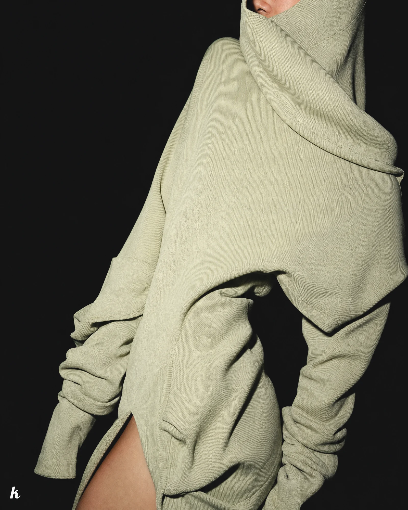
A fashion label with no interest in looking normal. I gave it a refined mark, three colors, and permission to make the clothes feel slightly wrong on purpose.
THE BRIEF
KLONDER came in as a fashion/lifestyle concept with no fixed identity — just an instinct that it shouldn't look like streetwear, shouldn't look like quiet luxury, and definitely shouldn't look like another minimalist basics label wearing a serif logo.
The tension was obvious the moment I dug in: everyone wants "disruptive," almost nobody wants to actually feel uncomfortable looking at their own campaign. Disruptive fashion brands usually chicken out at the photography stage and shoot the same centered, catalog-lit model every other label shoots. That's not disruption, that's a different hoodie.
What I took on was the whole system — logo, palette, fashion aesthetic, photography language, product architecture, packaging, voice — with one condition I set for myself: the refinement had to come from the logo and restraint, and the disruption had to come from everything else. Not the other way around.
THE APPROACH
I started by killing the instinct to make KLONDER "edgy" through graphics — big prints, loud typography, aggressive layouts. That's the streetwear playbook and it reads as trying too hard within about two seconds.
Instead I locked three colors and refused to let a fourth one in:
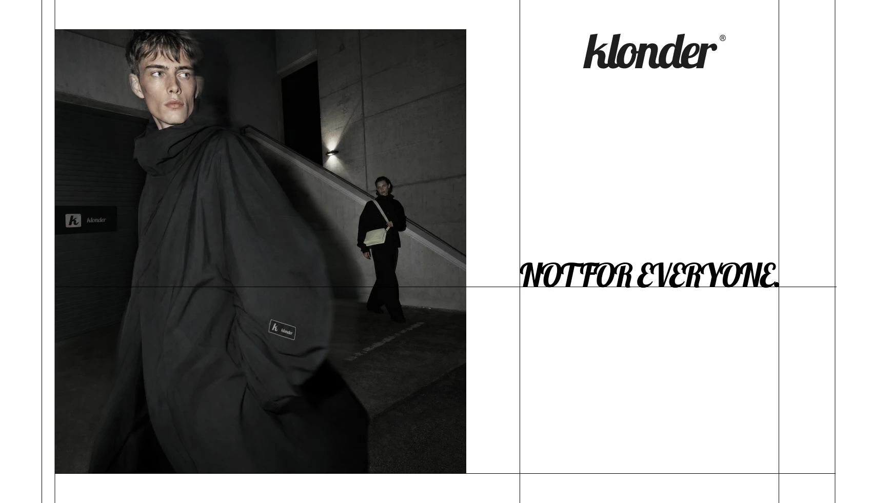
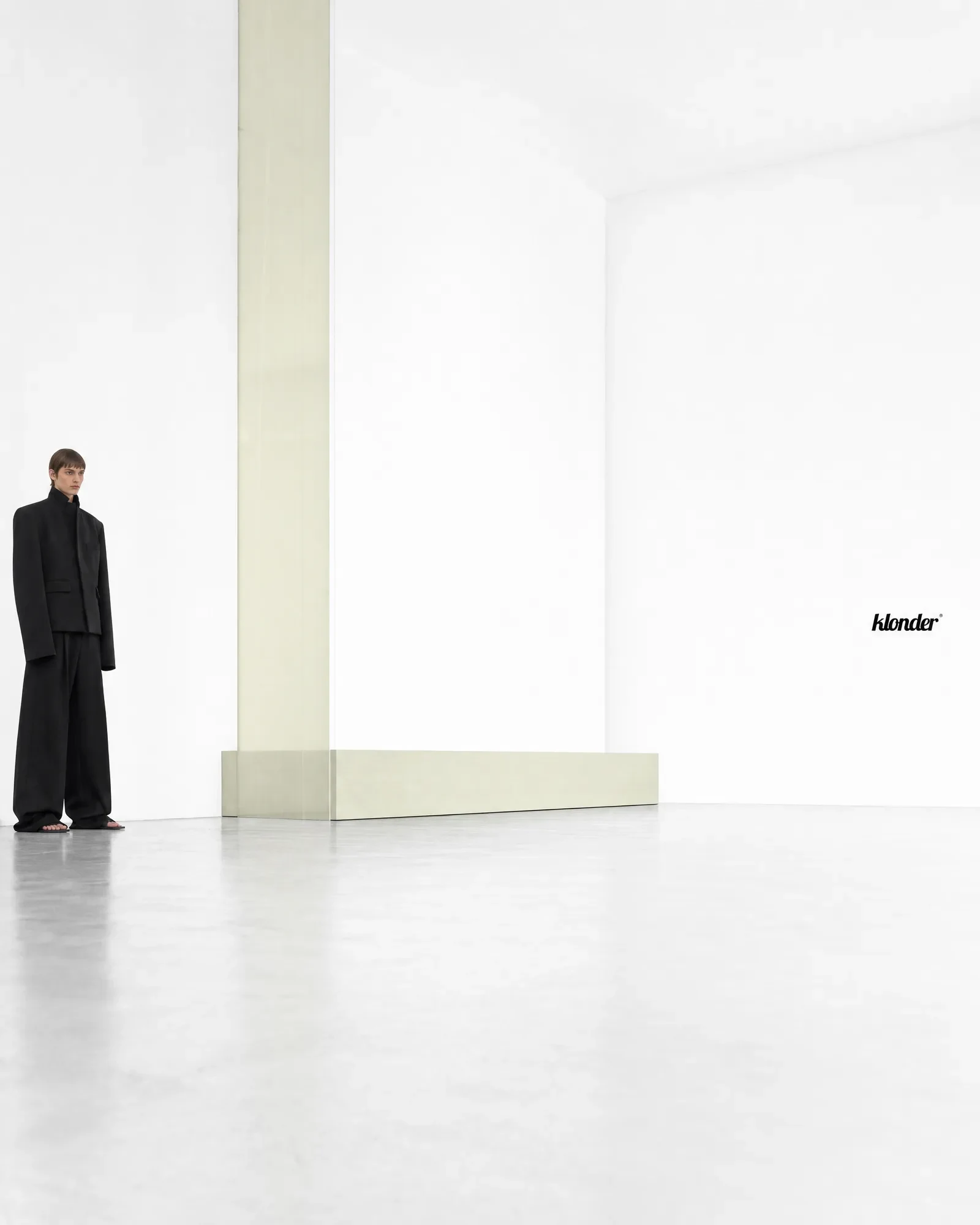
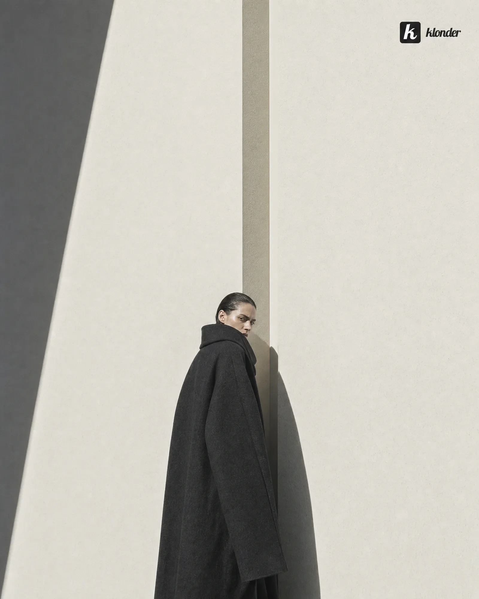
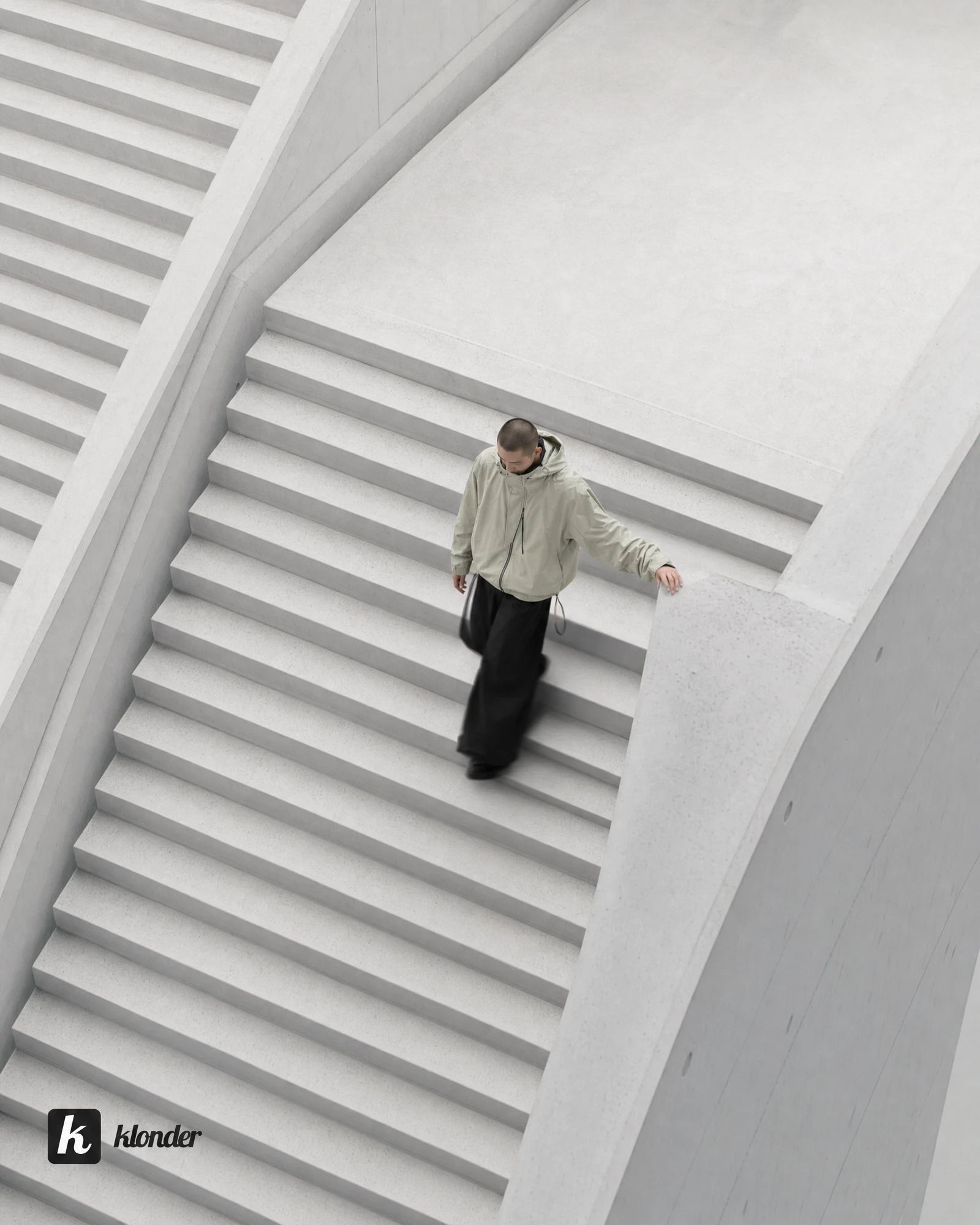
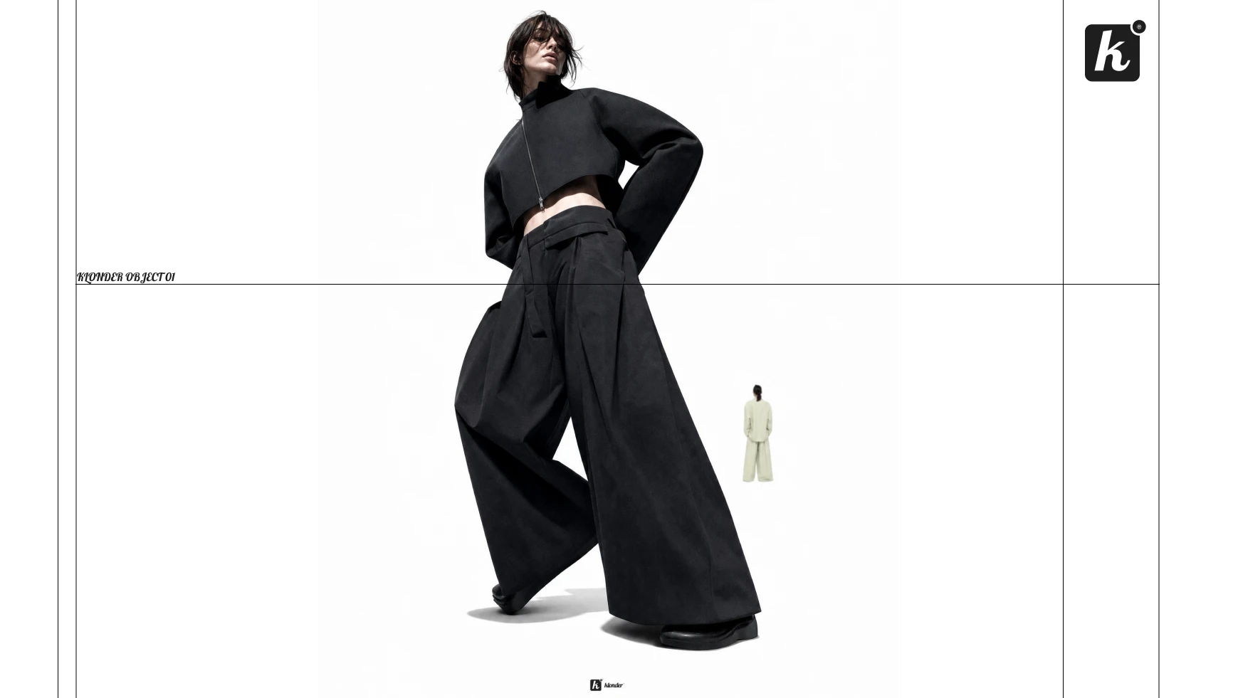
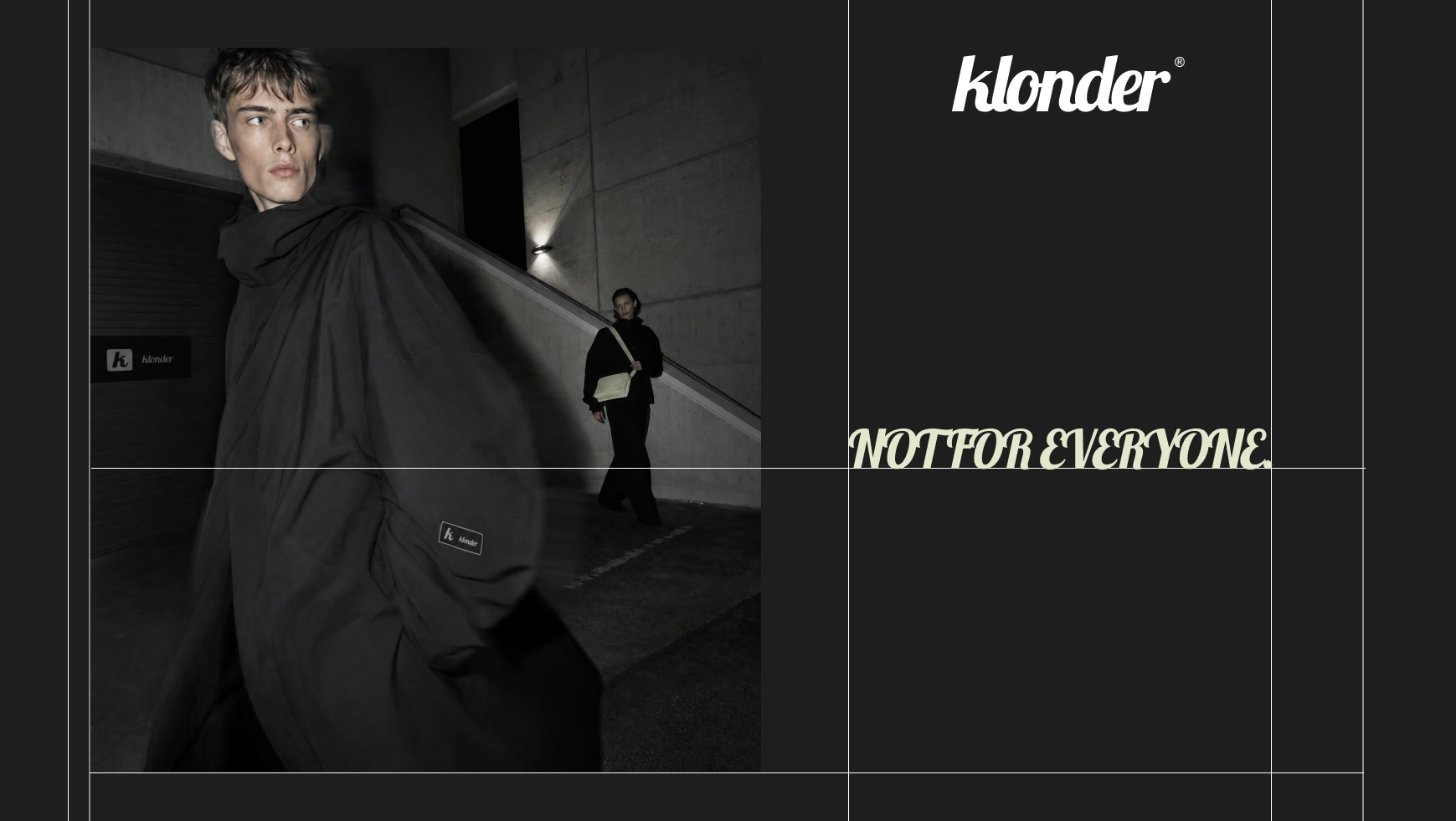
#1E1E1E charcoal, #FFFFFF white, and #E4E6CD, a pale sage I decided would function as KLONDER's signature rather than an accent. That's the part I kept coming back to — most brands treat their secondary color like decoration. I wanted #E4E6CD to work the way a single object works in a Prada campaign: rare, specific, immediately recognizable the second you see it, even alone on a black outfit.The unlock was separating where the refinement lives from where the disruption lives. The logo — a custom cursive-slab wordmark plus a standalone "k" lettermark — stays exactly as designed, pixel-perfect, untouchable, placed like a fixed asset rather than something to be reinterpreted per campaign. That discipline is what lets the photography go weird without the brand losing its spine. Cropped bodies pushed into a corner of an otherwise empty white frame. A model's face fully obscured by an oversized sage knit. A second figure blurred and nearly invisible in a concrete underpass. None of that reads as chaos, because the logo, the palette, and the typography hierarchy never move.
I pulled directional attitude — not literal styling — from a Cosmos "fashion disruptive" moodboard: unconventional composition, tension, imagery that feels almost accidental. The instruction to myself was to borrow the confidence of that reference, not its specific shots.
THE WORK
Brand Identity / Visual System
A three-part formula: 60% refined (typography, logo, negative space, monochrome foundation), 25% disruptive (unusual styling, photography, proportions), 15% organic (the sage color, tactile materials). Every deliverable gets checked against that ratio before it ships.
Logo
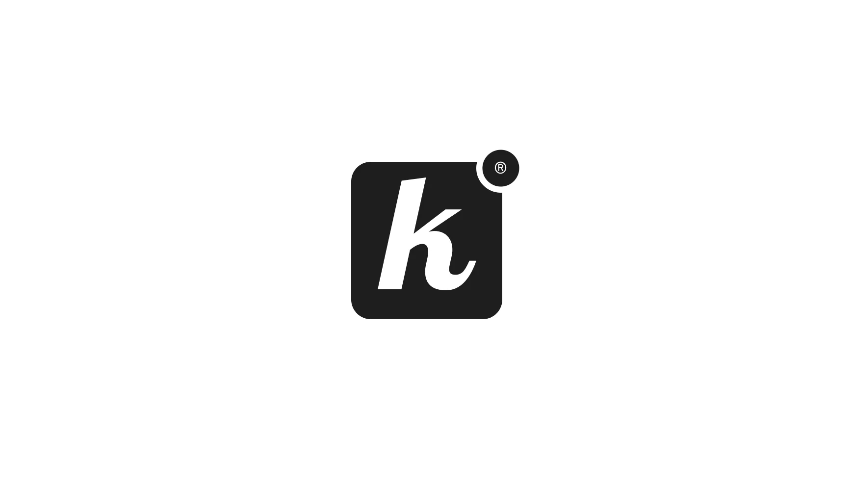
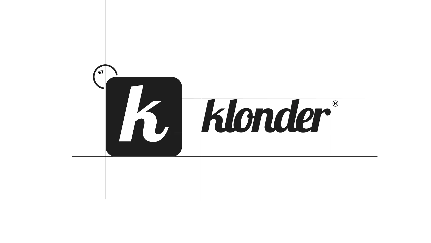
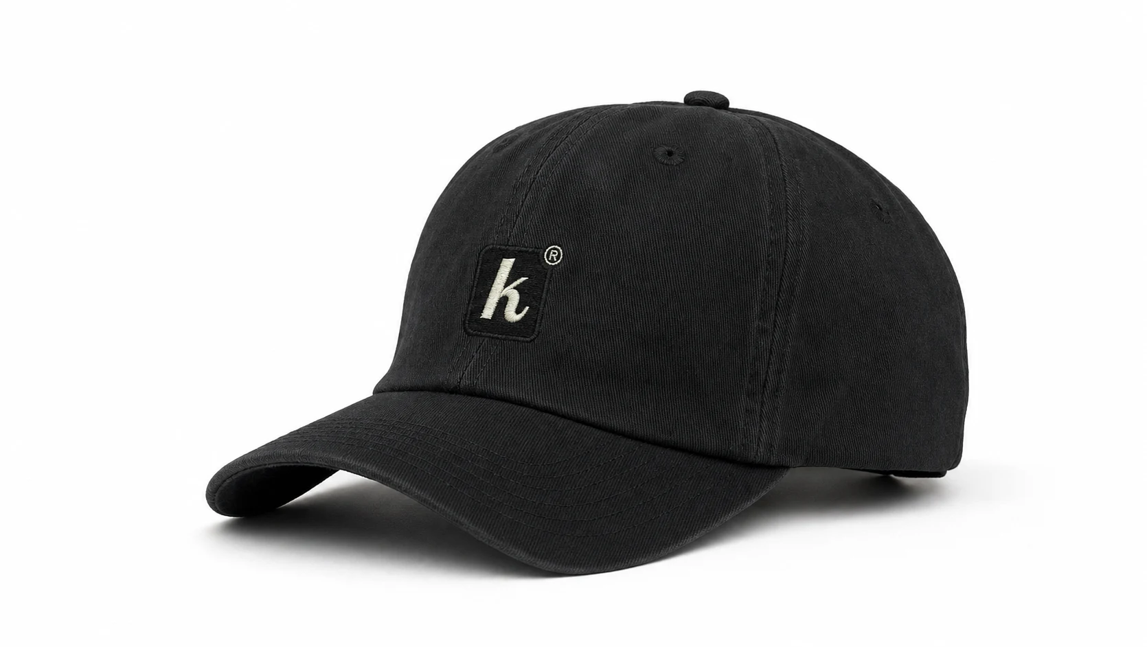
"klonder®" wordmark in a custom cursive-slab hybrid typeface as the primary mark, a standalone "k" lettermark in a rounded-square container as the secondary mark, and a hard rule that neither gets redrawn, recolored, or reinterpreted across any application — treated as a fixed placed asset in every mockup and campaign image.
Color System
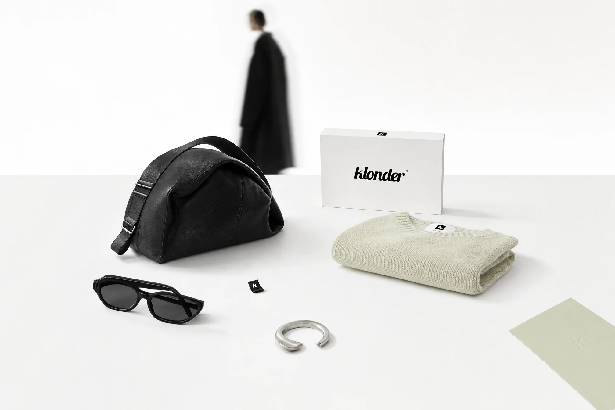
#1E1E1E (dominant — garments, typography, backgrounds), #FFFFFF (negative space, studio environments, packaging), #E4E6CD (signature — used selectively, deliberately, never diluted into a broader green family). No fourth color permitted anywhere in the system.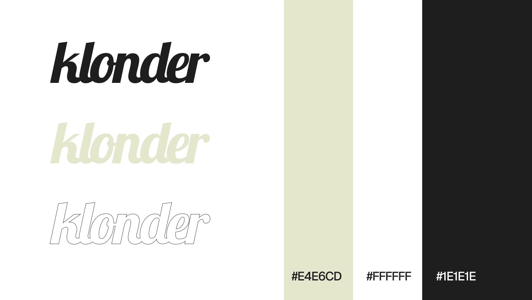
Campaign Photography
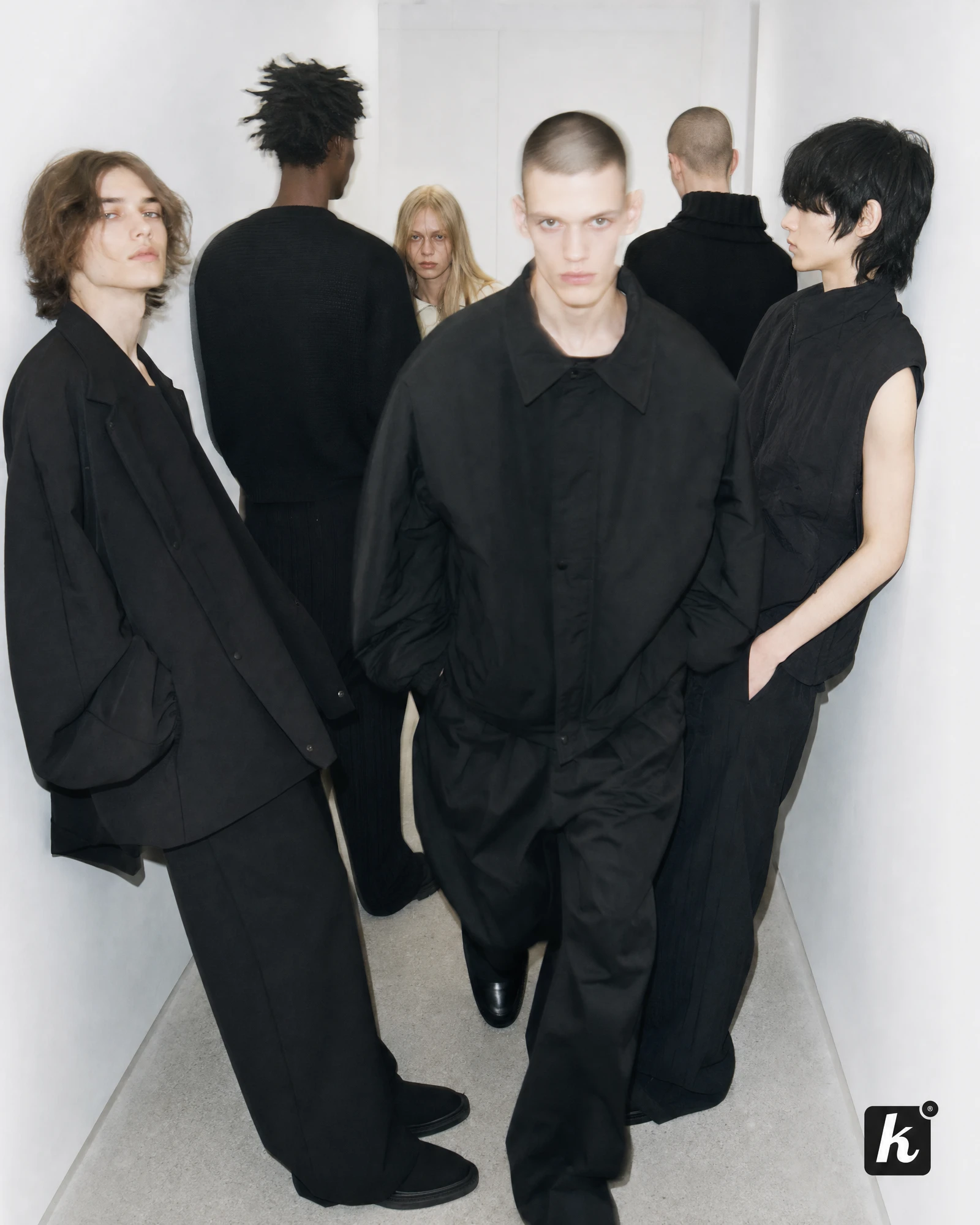
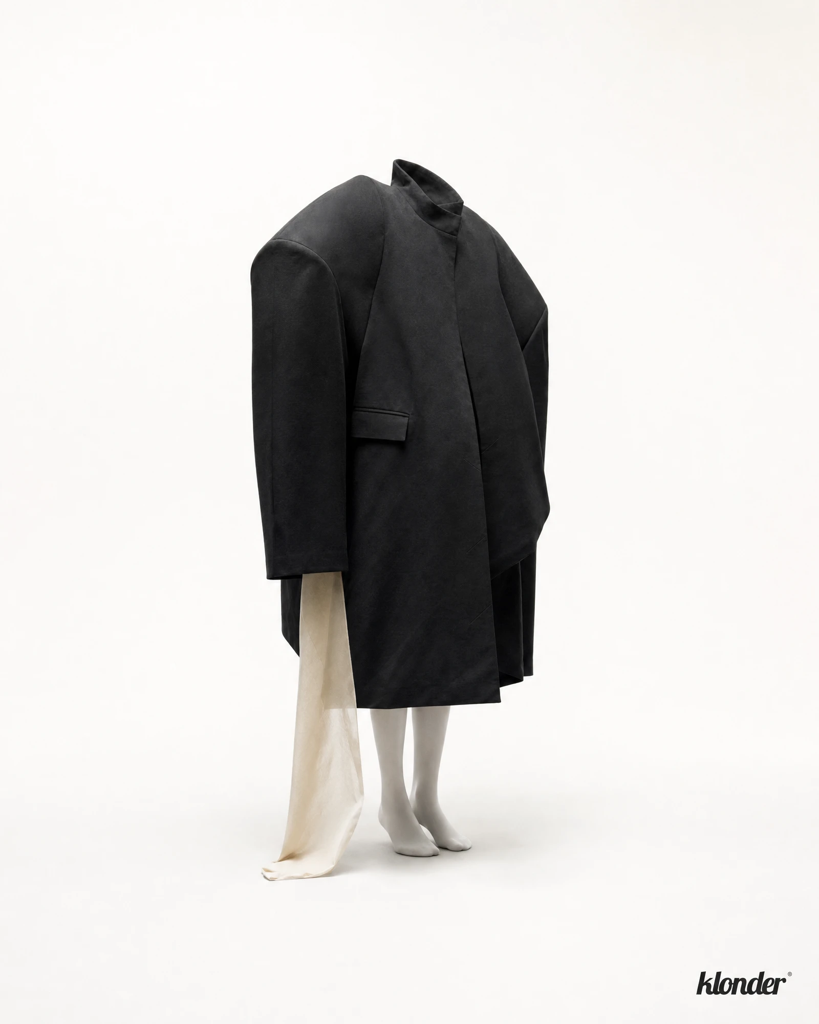
Ten visuals built around the same principle: disruption through composition, scale, and absence rather than graphics. Models pushed into 15-20% of the frame, extreme negative space, cropped faces, flash-and-motion-blur combinations, a second figure blurred in the background wearing the one sage accent in an otherwise monochrome scene.
Product Architecture
KLONDER 001 (Apparel), 002 (Objects), 003 (Seasonal) — with a dedicated Sage drop planned as 002's second release, so the signature color gets its own moment instead of appearing everywhere at once.
Packaging
White or charcoal box, single small logo lockup, sage tissue paper as the interior reveal — one deliberate color moment instead of a fully branded unboxing experience.
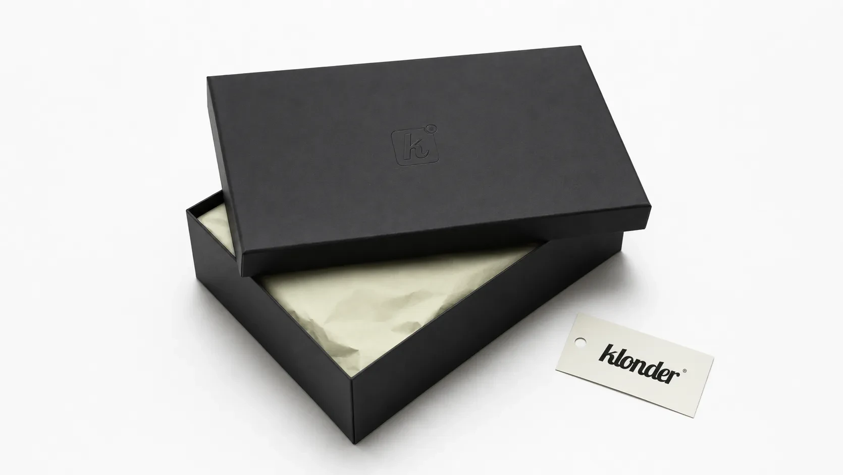
Mockup System
Extended the identity into shipping boxes, stationery, a website hero and landing-page cards, storefront signage, social grid, branded objects, and a motion still — all governed by the same three-color rule and the same negative-space discipline as the campaign photography.
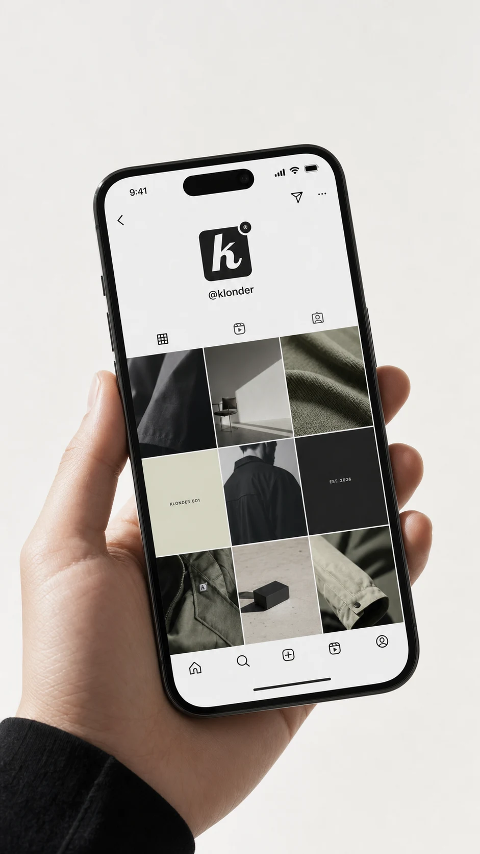
THE RESULT
KLONDER is currently in the identity-and-campaign-development phase — the logo is locked, the palette is locked, ten campaign visuals exist, and the mockup system is expanding batch by batch across packaging, digital, and environmental applications. What's already clear is that the restraint is doing more work than any graphic device could: the brand reads as established and slightly cult-like before a single product has technically shipped, which was the entire bet.
Next up: finishing the mockup system, sequencing the visuals into a lookbook, and locking the 003 Seasonal drop structure.
Révolté — revolte.design
Project: KLONDER
Year: 2026
Scope: Brand Identity, Logo Design, Art Direction, Campaign Photography Direction, Packaging Concept, Mockup System
Industry: Fashion / Lifestyle
See more at revolte.design
Like this project
Posted Sep 2, 2026
KLONDER: a fashion identity where the logo stays quiet and everything else picks a fight with the frame
Likes
2
Views
17
Timeline
Aug 6, 2026 - Sep 2, 2026