Built with Lovart
GLACIS Brand Identity Development

Révolté


GLACIS — Cold as a Design Constraint
LOGLINE
A cold immersion clinic for people who train hard, where the brand had to survive being looked at as coldly as the water inside it. I built a system with no comfort language and let the architecture do the talking.
THE BRIEF
I wasn't hired for this one — I built it. GLACIS started as one of ten speculative directions I wrote for myself, deliberately picking a category with no fashion, no tech, no beauty to hide behind. The brief I wrote was blunt: a cold-immersion recovery clinic for people who put real load on their bodies, treated less like a spa and more like a piece of structural engineering the body has to survive.
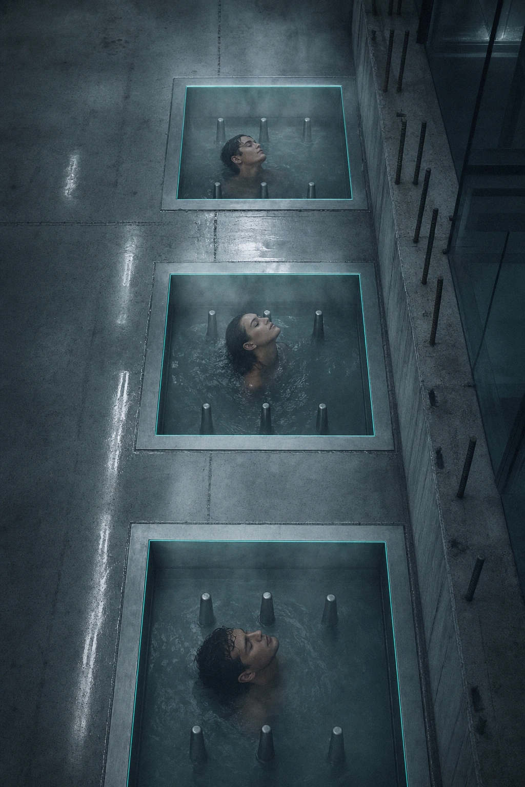
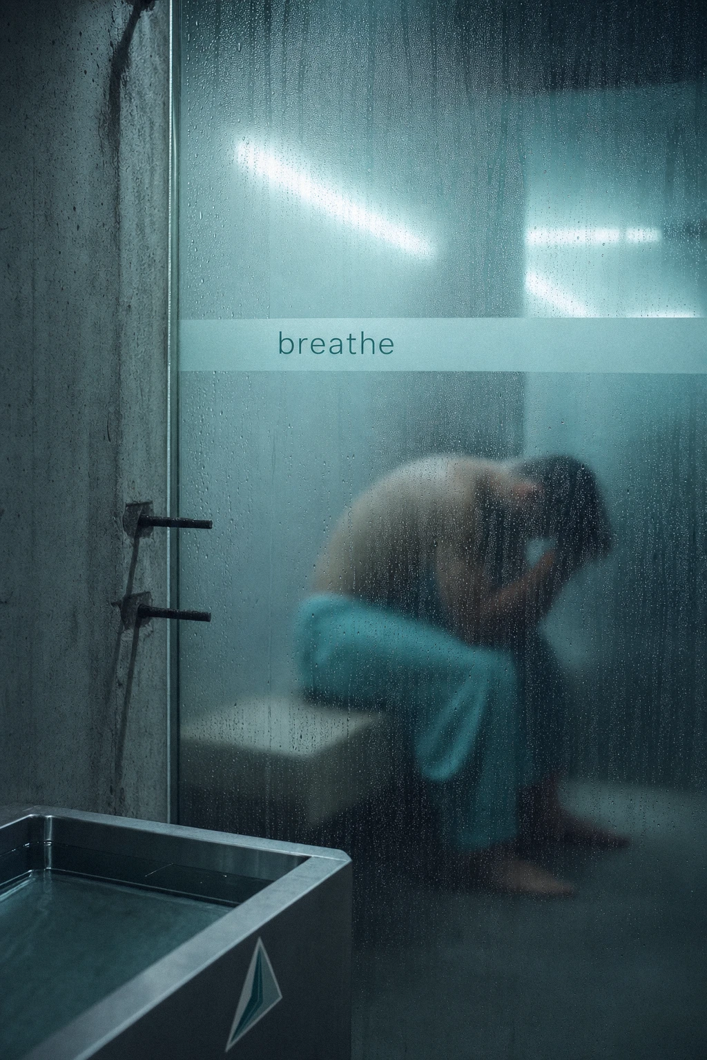
The tension was built in from day one. Wellness branding defaults to softness — rounded shapes, pastel gradients, reassurance. I wanted the opposite: poured concrete, exposed rebar, steel basins, fluorescent light with a slight green cast. Comfort was never the pitch. Precision was.
What made it hard wasn't the concept — it was staying disciplined once I had it. Every soft instinct (a friendlier logo, a warmer palette, a gentler headline) had to be argued down in favor of the cold.
THE APPROACH
My first logomark attempt was wrong, and I said so out loud before moving forward. It was a rounded triangle with nested organic blobs in a pastel teal gradient — technically well-executed, but it read as spa or skincare, not clinical recovery. It was actually a reused mark from an unrelated project, which made the mismatch obvious the moment I looked at it next to the brief.
The fix wasn't a redesign from scratch — it was a single conceptual shift. I kept the triangle but broke it into sharp, angular facets instead of soft curves. That one change turned the mark into something that reads as fractured ice or a glacial peak — which is exactly what the name GLACIS is asking for. A rounded triangle is a logo. A faceted one is a material.
The typography told its own version of the same story. My original plan called for a lowercase industrial grotesque — cold, technical, no personality. What actually shipped is Italiana, an elegant italic serif set at -5% tracking. On its own, that typeface reads romantic, editorial, almost fashion-adjacent — the opposite of the brief. But set against documentary photography of steel basins and fogged glass, it works as tension rather than contradiction: the typeface is the one warm thing in a cold system, and that contrast is what makes the campaign posters land instead of feeling generic-industrial.
The color system had to do real work holding all of this together. I built it around four values — white,
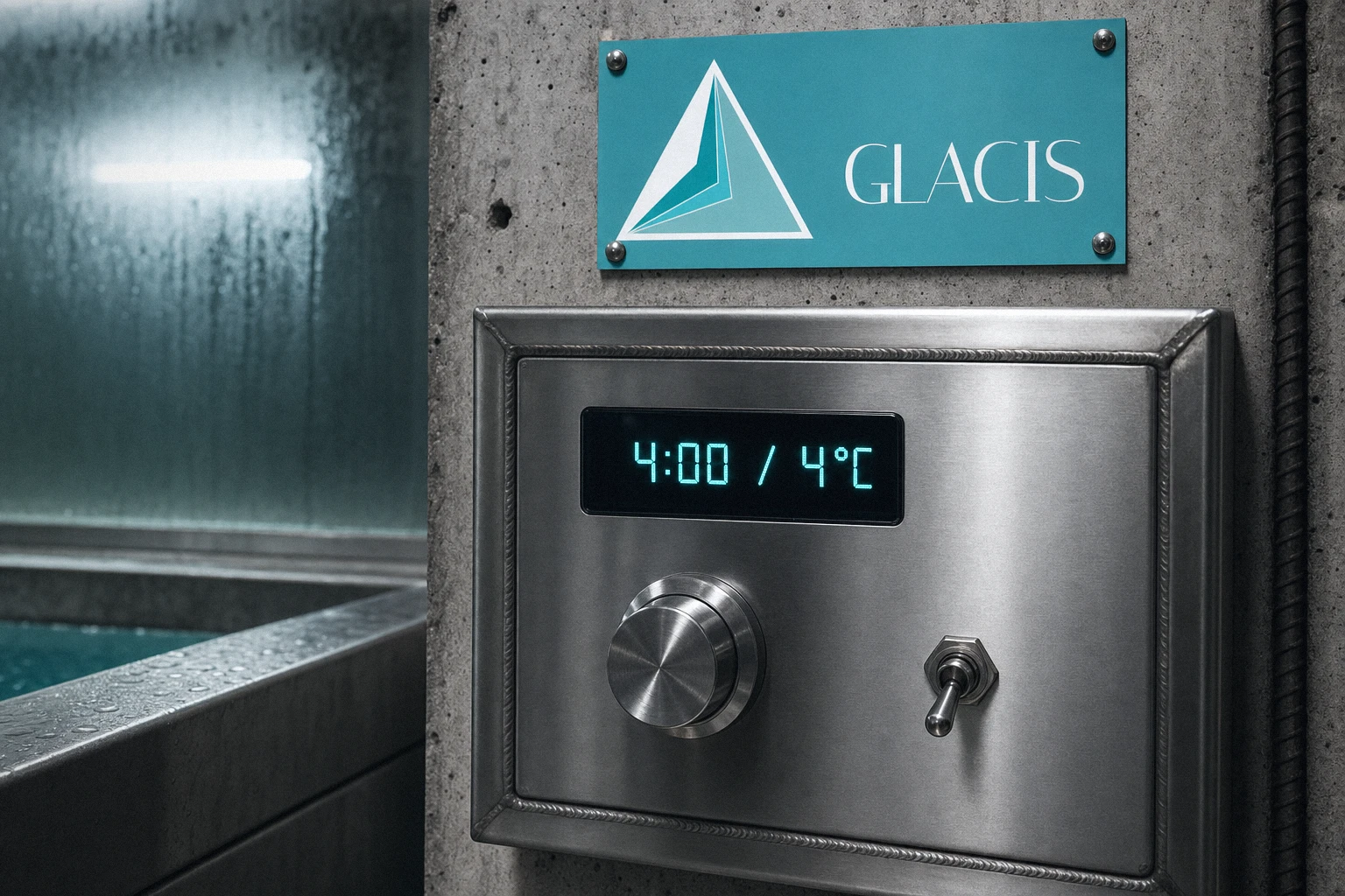
#059A9A, #3BBEBE, #83BABA — deployed almost exclusively as accents: a basin rim light, a woven towel stripe, a monospace data readout. The palette never dominates a frame. It appears exactly where the brand needs to remind you it's there, and nowhere else.THE WORK
BRAND IDENTITY / LOGO
A faceted triangular mark suggesting fractured ice or a glacial peak, built from three overlapping planes in a teal gradient (
#059A9A to #83BABA) against white. Paired with an Italiana wordmark at -5% tracking — the single soft element in an otherwise unforgiving system.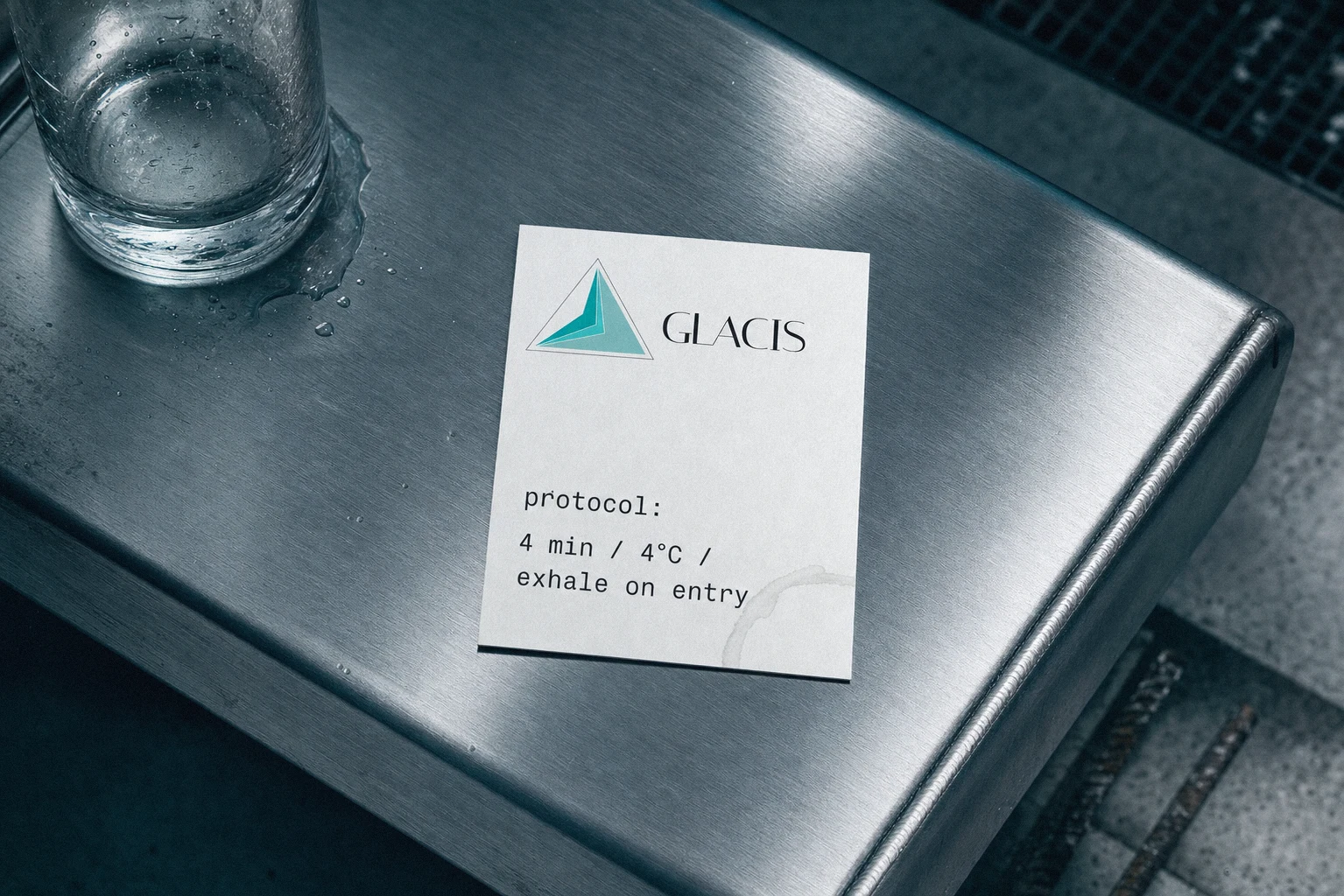
TYPOGRAPHY SYSTEM
Italiana (display, headlines, wordmark) contrasted against a lowercase industrial grotesque for functional and data copy — protocol times, temperatures, session numbers — always set in monospace to read as instrumentation rather than brand voice.
COLOR SYSTEM
White, Deep Teal
#059A9A, Mid Teal #3BBEBE, Pale Teal #83BABA. Restricted to roughly 20-30% of any given frame, deployed as basin lighting, signage glow, and textile accents against dominant poured-concrete grey and void black.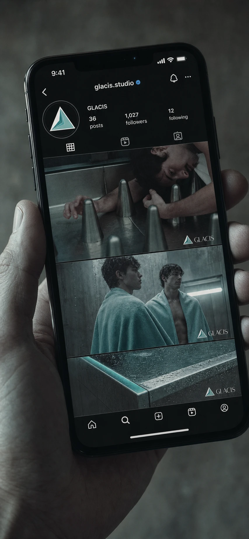
CAMPAIGN / VISUAL IDENTITY
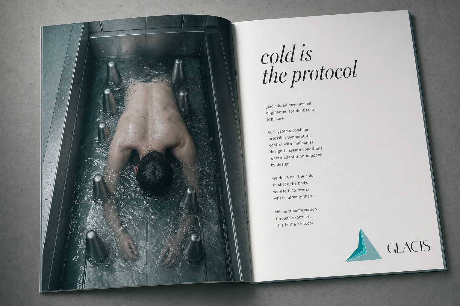
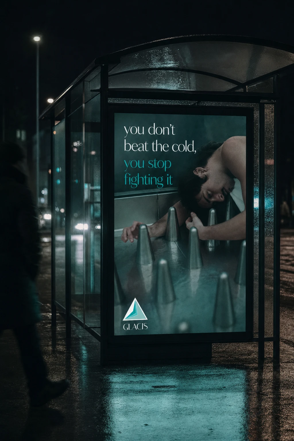
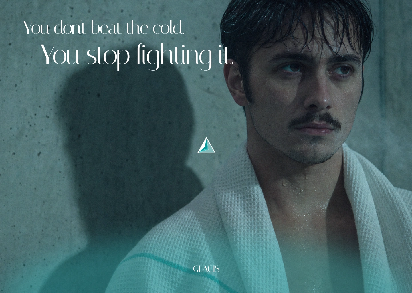
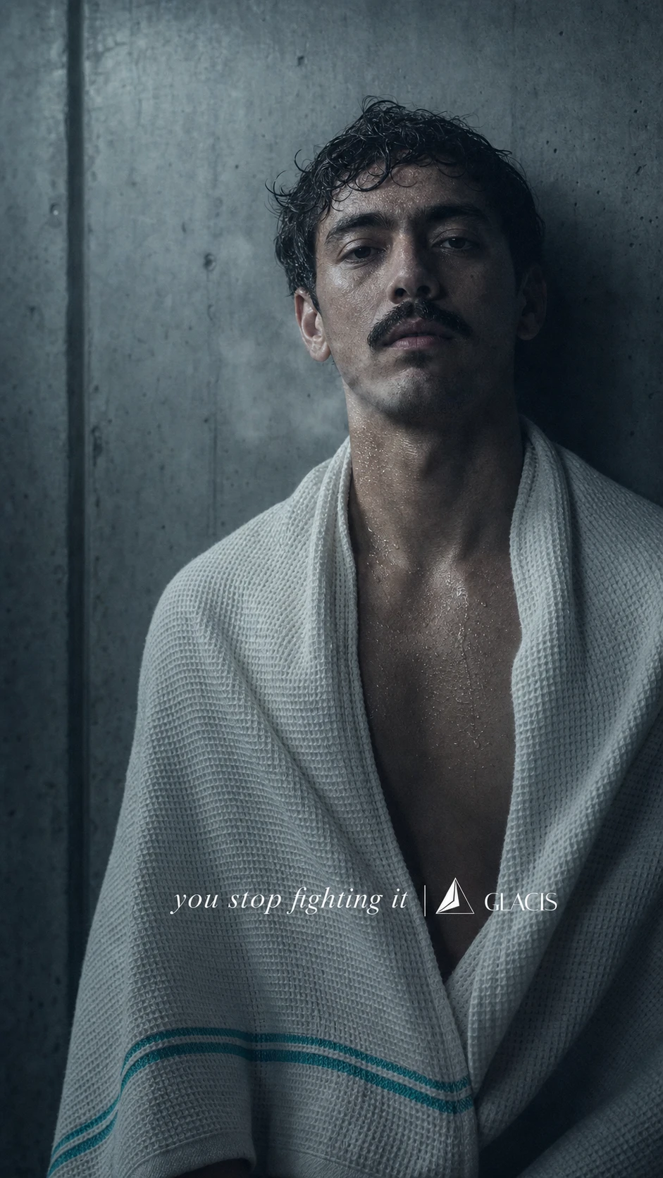
Documentary-style photography shot in a cold, fluorescent-cyan grade — later tested against an Ektachrome E100 pass for richer contrast and depth, which became the final grading direction. Campaign lines built around direct, unsentimental copy: "Cold is the protocol," "You don't beat the cold, you stop fighting it," "The water doesn't care who you are. Your nervous system does." — the last one built specifically around a two-figure portrait to let the image and copy argue the same point from different angles.
APPLICATIONS
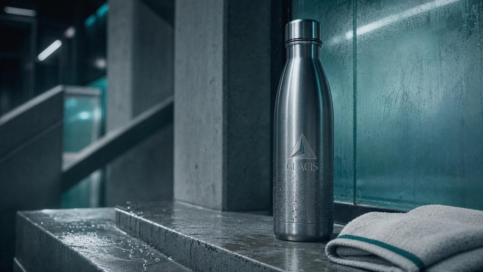
The system extended across business cards (matte black stock, foil wordmark, teal edge-paint), storefront signage (backlit mark on poured concrete facade), reception and facility interiors (dimensional steel lettering, in-basin lighting), a session wristband with embedded monospace timer display, protocol cards, a mobile app tracking interface, editorial print spreads, transit shelter ads, and social presence — each one carrying the same restrained material and lighting logic without softening it for the format.
WEB
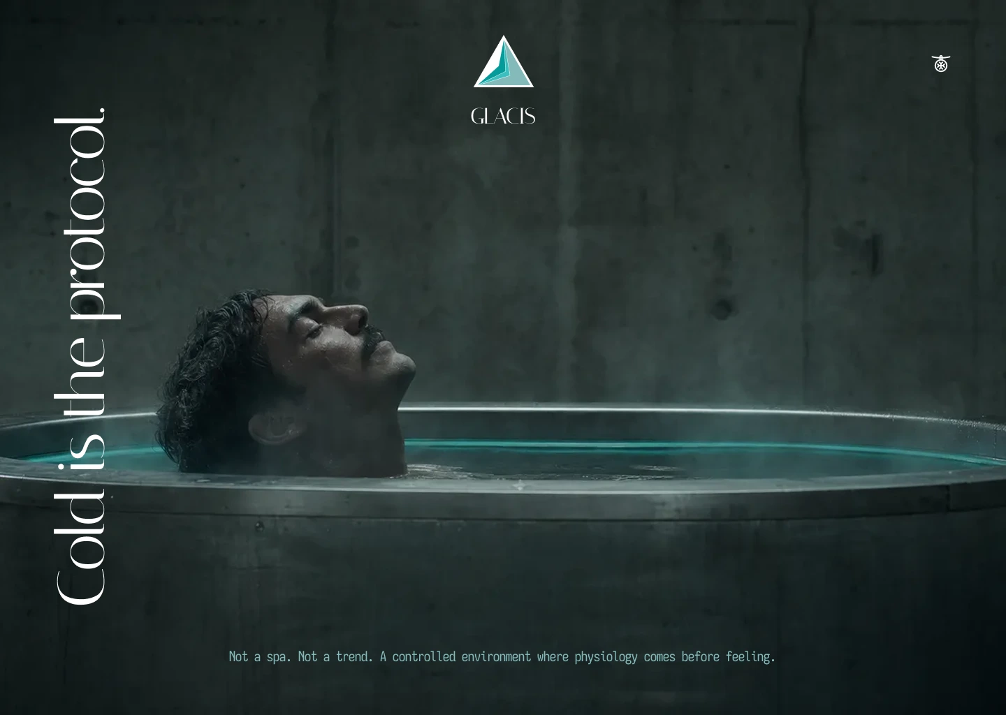
A landing page built around a single hero statement — "Cold is the protocol" — set as a rotated vertical headline against a full-bleed image of a submerged figure, followed by a Method section using a split layout: white panel with body copy on the left, environmental photography on the right, tied together by a teal divider bar.
THE RESULT
GLACIS is a complete speculative brand system, not a shipped client project — but I built it to the same standard I'd hold a paying brief to, including catching and correcting my own mistake mid-process when the first logomark drifted toward a category the brand was explicitly built to avoid. What's live is a full identity, a 25-plus asset campaign system, and a landing page — proof that a category with no obvious visual language (cold clinical recovery, not wellness) can still produce something with real tension and a point of view.
Révolté — revolte.design
Project: GLACIS
Year: 2026
Scope: Brand Identity, Logo Design, Typography System, Campaign Design, Web Design, Copywriting
Industry: Health & Recovery / Cold Immersion Therapy
Like this project
Posted Sep 1, 2026
GLACIS: a cold-immersion recovery brand built on one rule — no comfort language, only structure, steel, and the discipline to fix my own mistake mid-system
Likes
1
Views
22
Timeline
Jul 23, 2026 - Sep 1, 2026