Built with Lovart
VESSEL: Monochrome Identity for Premium Water

Révolté


VESSEL,a brand built on the idea that water can be traced like evidence
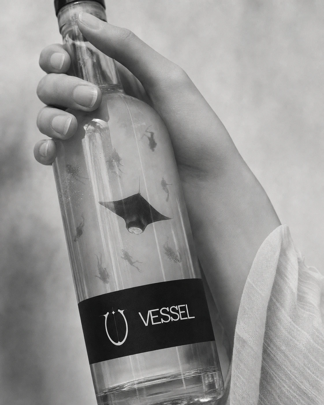
A still mineral water system where every bottle reads less like refreshment and more like a document — numbered, sourced, and accountable to a single aquifer.
THE BRIEF
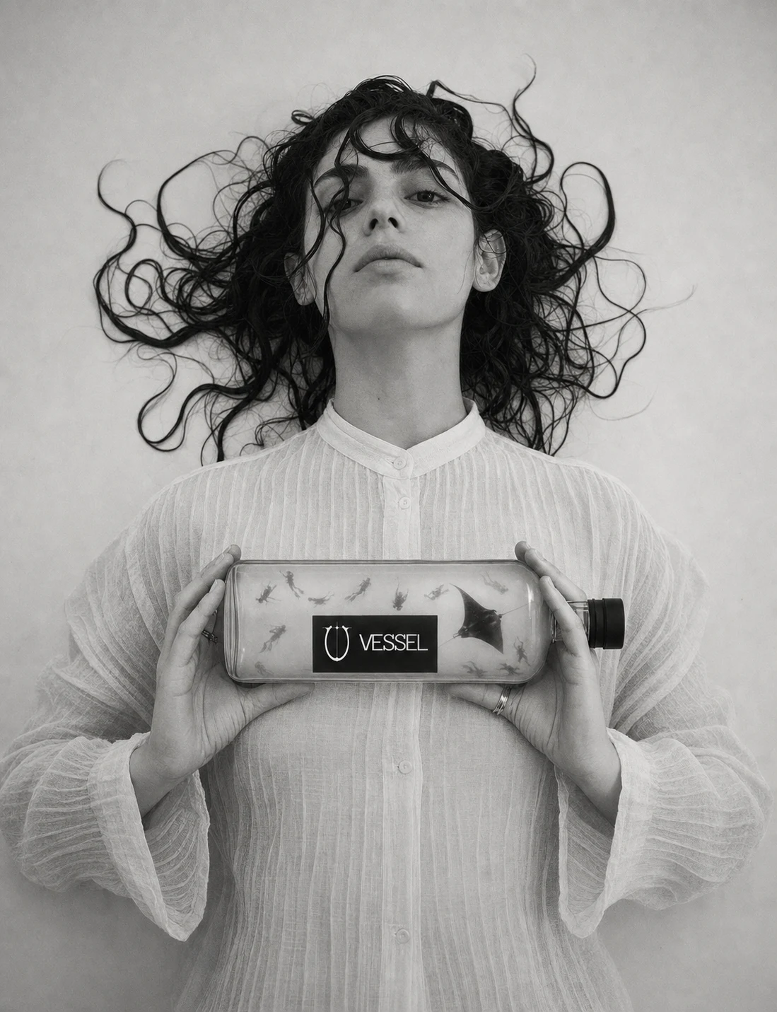
There was no client here. I set myself a harder brief: build a brand in the softest, most disarmed category in consumer goods — still water — that refuses every piece of language the category normally leans on. No "pure." No "refreshing." No lifestyle imagery, no color, no smiling faces mid-sip.
The tension I was chasing: how do you make water feel serious, almost clinical, without making it feel cold. It had to read as a controlled substance, not a commodity — but it still needed one moment of wonder, or the whole system collapses into a joke about minimalism.
THE APPROACH
I started from a framing device, not a mood board — what happens if the label conventions of a controlled substance are applied, in full, to still water. Batch number. Draw date. Aquifer depth. pH. My first pass leaned entirely clinical, no motif, nothing to soften it. That read as a parody of pharmaceutical packaging, not a real brand.
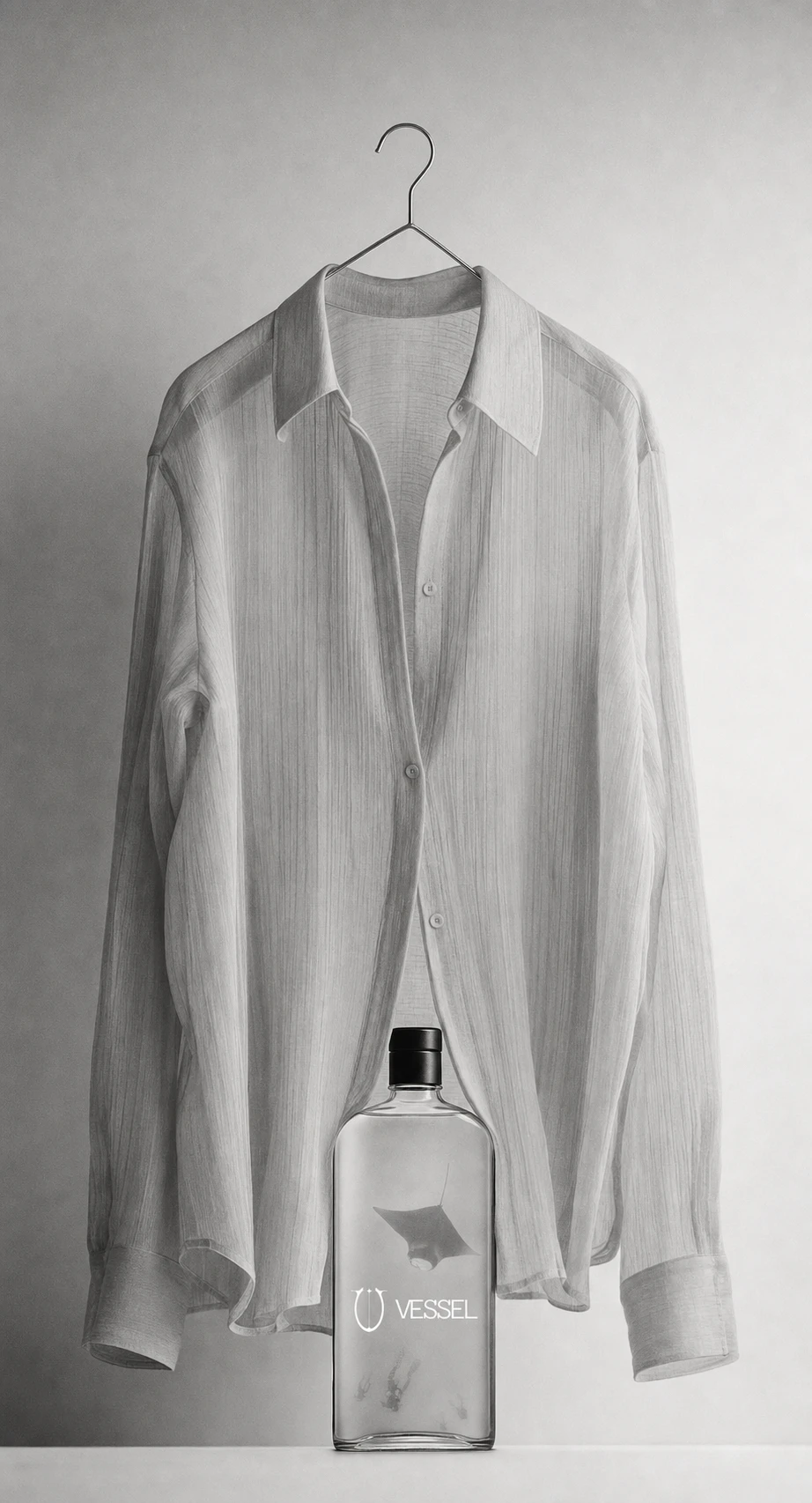
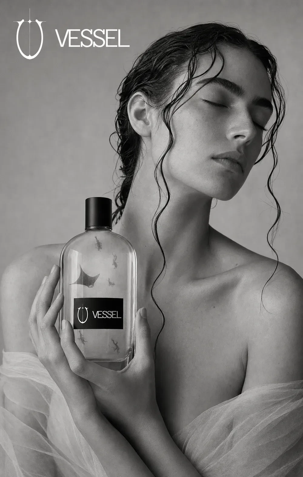
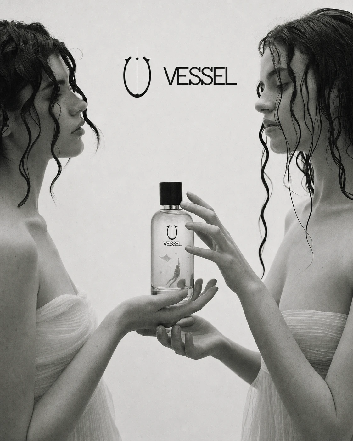
What unlocked it was giving the system one recurring visual idea that carried the wonder the clinical framing had stripped out: ghostly, photographic silhouettes of divers and manta rays suspended inside the liquid, as if the water held a memory of the depth it was drawn from. Once that motif was locked as a constant across every bottle, the rest of the system could stay strict — full black and white, no color grading, low quiet contrast, soft overcast light — without losing its one moment of feeling.
I rejected color entirely, even as a single accent. Any color read as marketing. Monochrome was the constraint that made the "specimen" framing believable.
THE WORK
BRAND IDENTITY / VISUAL SYSTEM
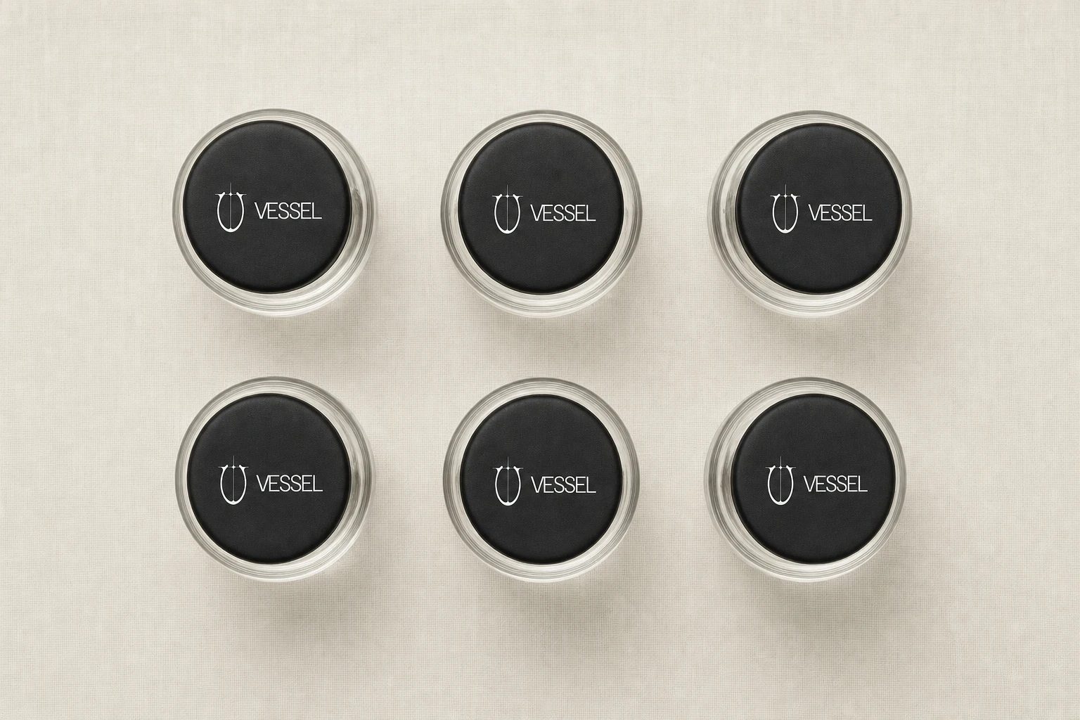
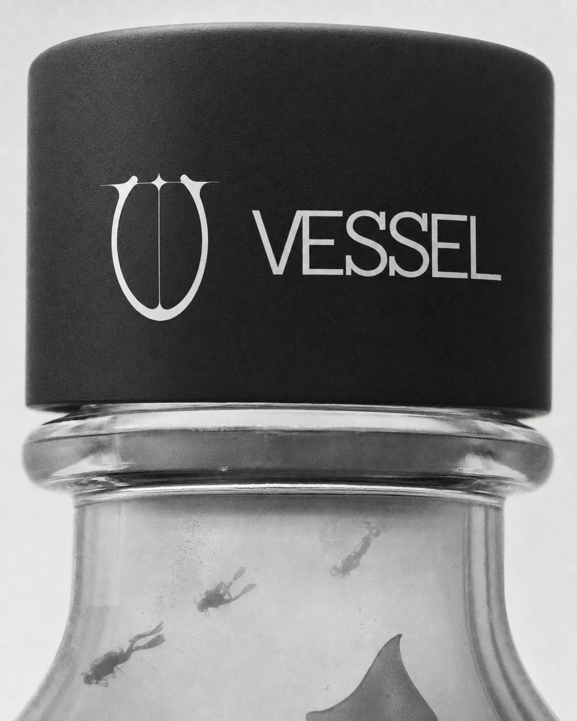
Built around a single physical idea — water as a traceable, single-source substance rather than a lifestyle product. The logomark, a ligatured vessel/urn glyph, functions like a seal rather than a decoration, and appears reproduced pixel-perfect across every touchpoint with no reinterpretation.
LOGO
A ligatured vessel form paired with a modern serif wordmark, set tight and confident — reading equally as a bottle silhouette and an apothecary mark, deliberately suspended between product and specimen.
COLOR SYSTEM
Strictly monochrome throughout — no color anywhere in wardrobe, skin, props, or background. No accent color was introduced at any point; grayscale itself became the brand's discipline, the same way a strict two-tone system would function for a print-based identity.
LABEL SYSTEM
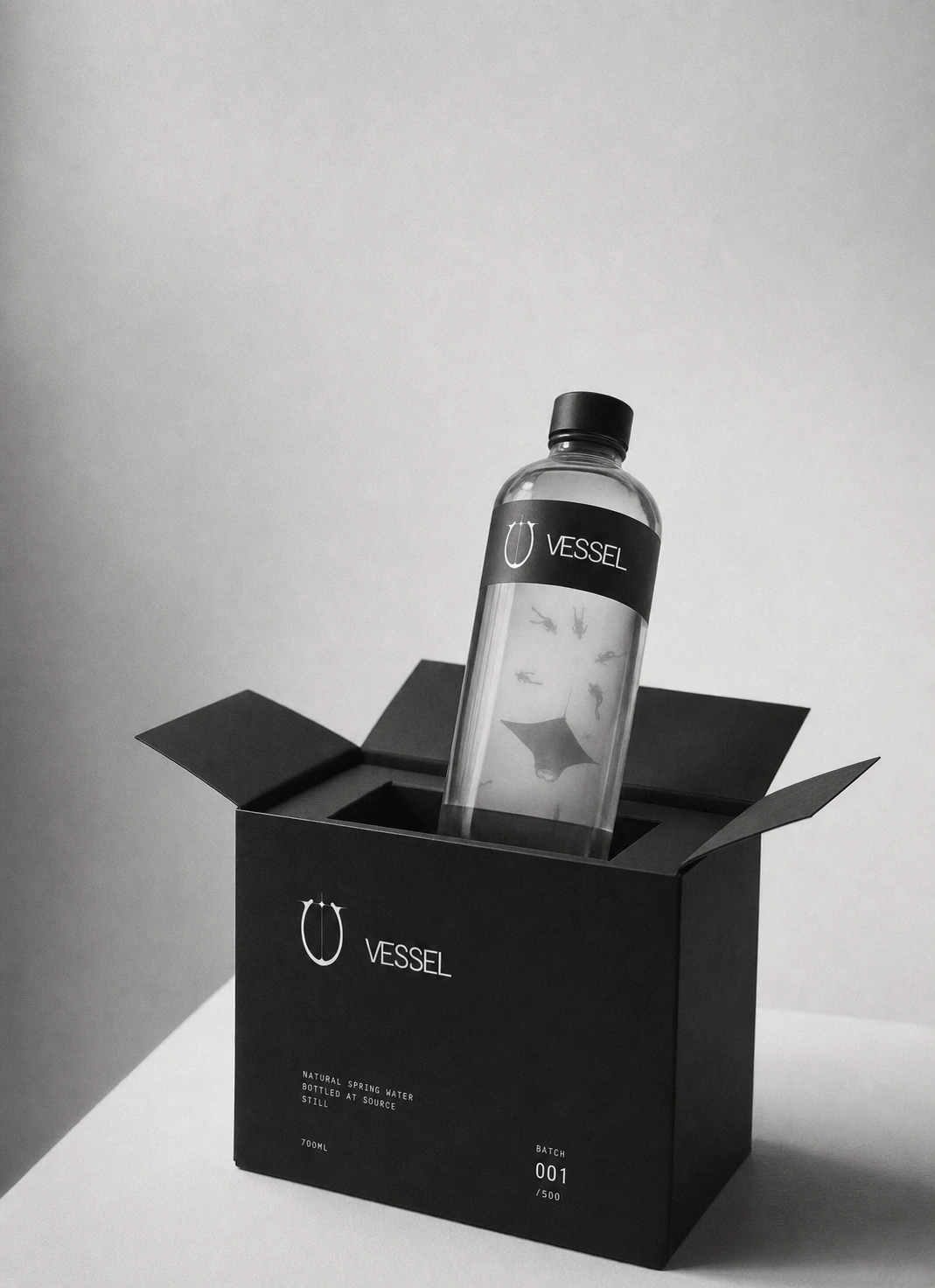
Matte black bands carry the full clinical register — lot number, draw date, aquifer depth, pH, and complete mineral composition in mg/L — executed with the restraint of a pharmaceutical insert, never a tasting-note aesthetic.
CAMPAIGN PHOTOGRAPHY
An image system spanning editorial portraiture, packaging and product detail, and technical back-label macro shots — every frame shot in fine-grain black and white on simulated medium-format film, with the diver-and-manta motif recurring faintly inside the liquid in every bottle, sharp and legible even when a model is the primary subject.
PACKAGING
The provenance logic extends through every format: the 750ml source bottle, 250ml travel bottle, glass table carafe, gift case with embossed lid, three-bottle source set, and shipping carton — each carrying the same batch language, so nothing in the system reads as an afterthought.
THE RESULT
The system is built out — full campaign library, locked label and packaging logic, and a complete monochrome photographic language. What's left is production: extending the system into a first physical drop. The project set out to prove that a category built entirely on softness can hold real gravity without losing the one moment of wonder that keeps it from reading as cold — and the finished system carries that argument from the logomark to the mineral table.
Studio: Révolté — revolte.design
Project: VESSEL
Year: 2026
Scope: Brand Identity, Packaging System, Campaign Photography Direction
Industry: Beverage / Premium Water
Like this project
Posted Aug 24, 2026
A still water brand treated as a controlled substance — numbered batches and clinical labeling, softened by one recurring motif of divers suspended in the glass
Likes
2
Views
18
Timeline
Jul 15, 2026 - Aug 24, 2026