Built with Lovart
Red Room Press Branding and Website Launch

Révolté


RED ROOM PRESS — A Publisher Staged in Color
LOGLINE
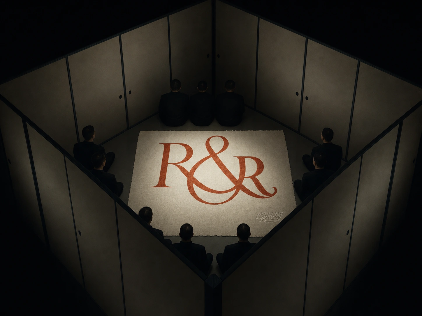
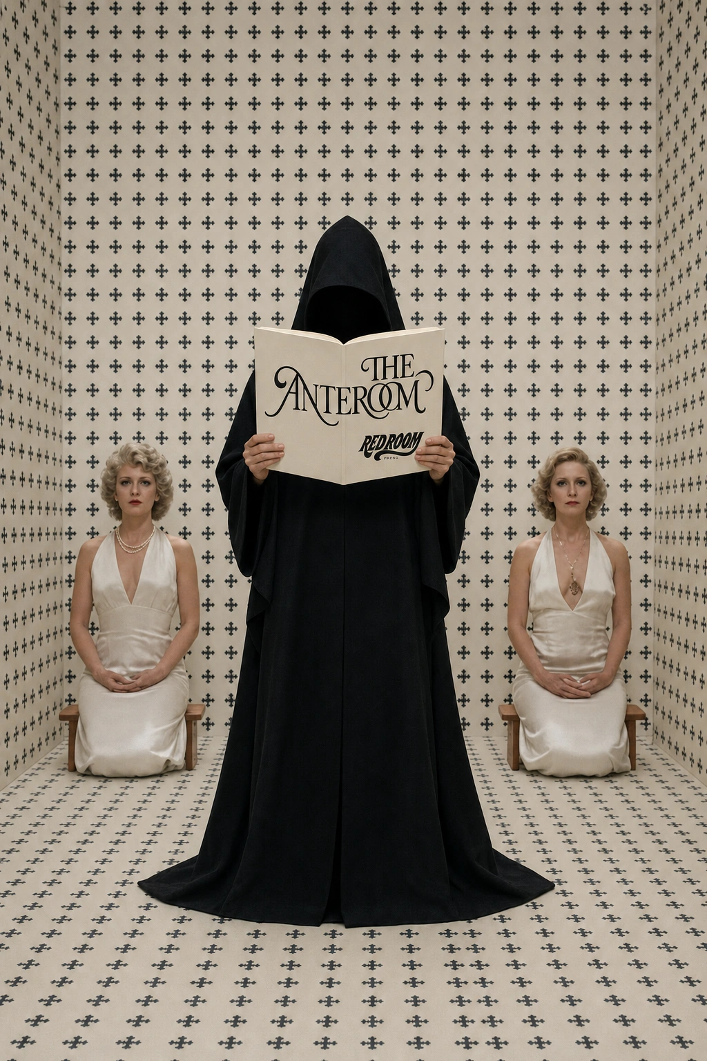
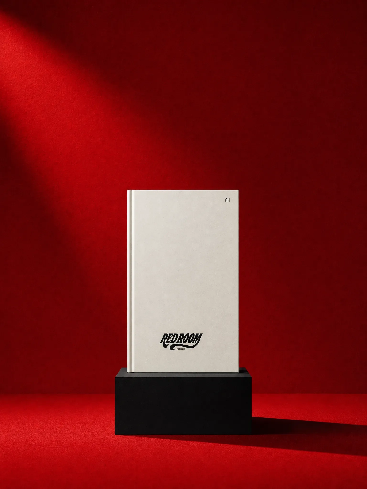
A publisher that treats every release like a stage set. I built a brand where each issue lives inside its own single-color room, lit once, hard, from one side — no white backgrounds, no lifestyle photography, ever.
THE BRIEF
I didn't start with a publisher. I started with a fragrance brand — moodboarding Helmut Lang, Celine, minimal fashion-adjacent bottle photography. It was clean, it was fine, and about three rounds in I realized it was fine because it was familiar. Nothing about it was going to surprise anyone.
So I killed the product category. Kept the instinct that got me excited in the first place — theatrical, cinematic staging, single-color rooms, Kubrick-and-Greenaway-adjacent set logic — and asked what that aesthetic actually wanted to be. Perfume didn't need theater. Publishing did.
The real brief, once I found it: build a press where the physical act of reading feels like an event, not a purchase. No author photos, no cozy reading-nook branding, no illustrated covers. Every book gets staged.
THE APPROACH
My first instinct was literal — pull directly from the film references I'd been moodboarding and restage them almost shot-for-shot. I built a boardroom-cube mockup and a toy-cathedral dinner scene that were, honestly, too close to the source. They looked like fan art of someone else's set design, not a brand with its own logic.
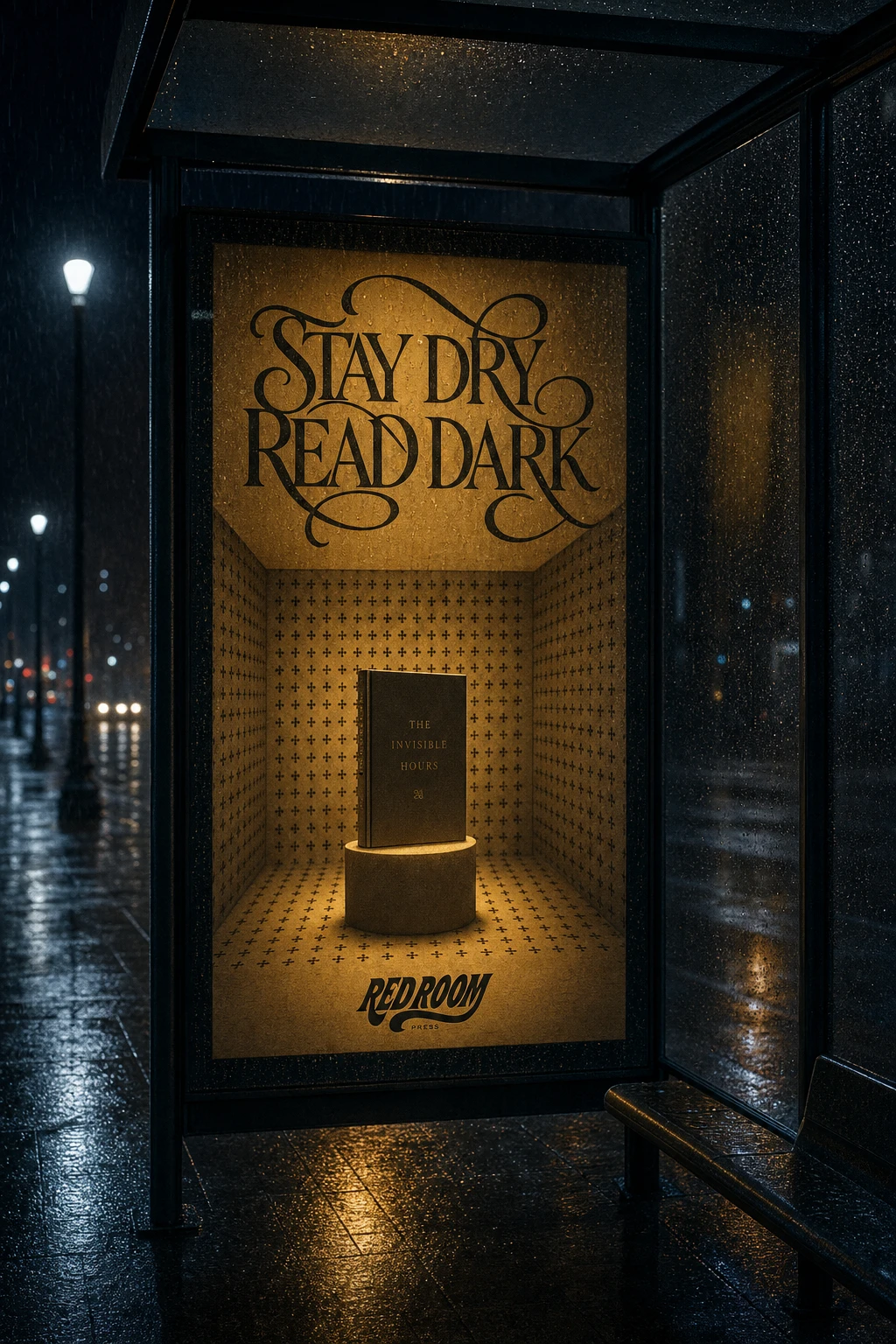
The unlock was separating the principle from the picture. What I actually needed from those references wasn't the specific rooms — it was the rule: one saturated color, one hard spotlight, nothing accidental in frame. Once I extracted that as a system rather than a set of images to copy, I could build original environments (a forced-perspective staircase, a ritual tiled room, a subway platform at night) that lived in the same world without quoting a single shot.
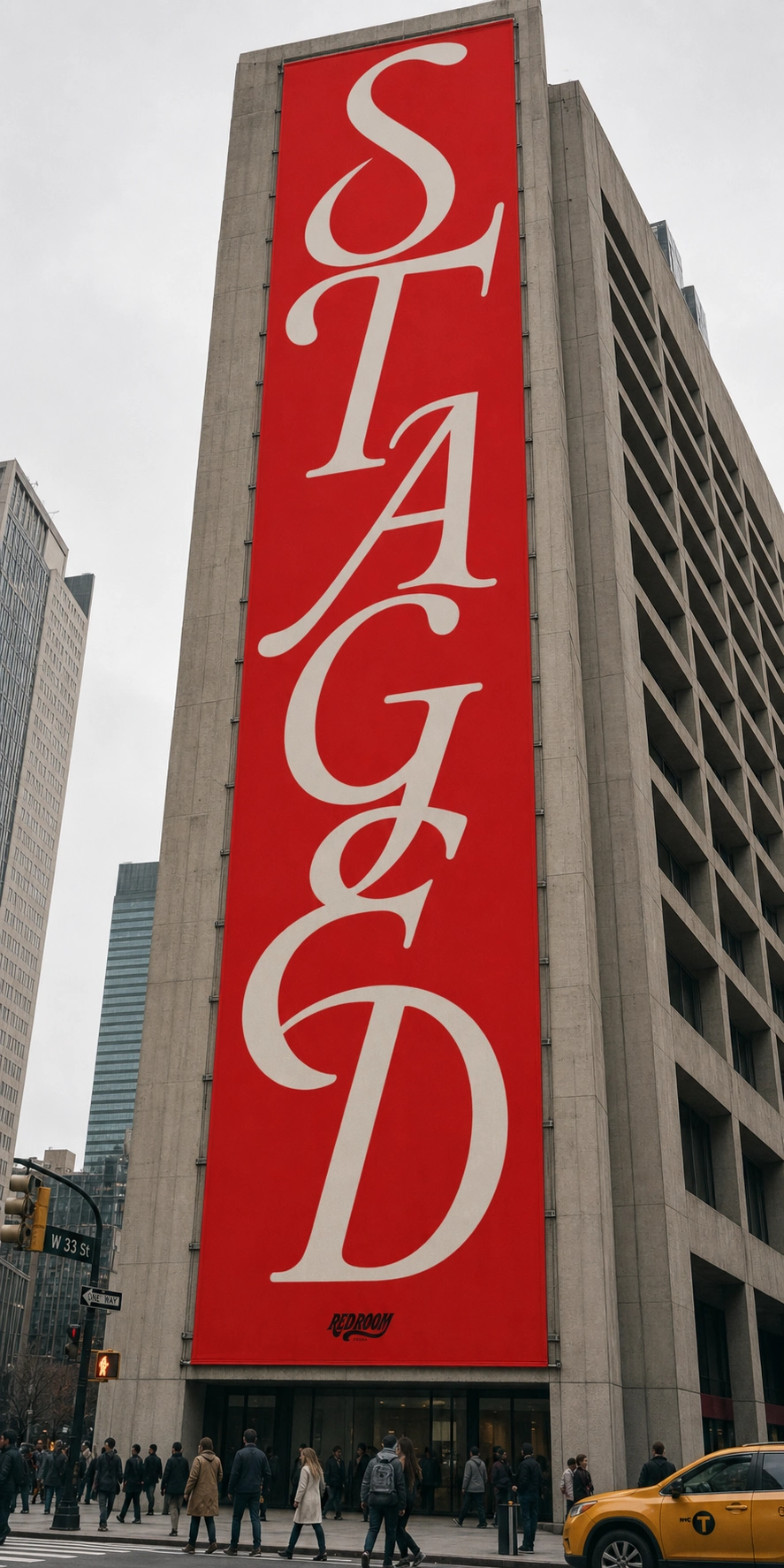
Typography went through its own pivot. I tried an industrial-stencil direction first — raw edges, factory stamps, deliberately unfinished. It read anti-luxury, which was the point, but it fought the theatrical staging instead of supporting it. I rebuilt the whole type system around connected ligatures instead — letters that merge, loop, and share strokes, the same way the staging treats a whole room as one continuous gesture rather than separate elements. That became the throughline: exactly one expressive move per surface, everything else stays quiet.
THE WORK
BRAND IDENTITY
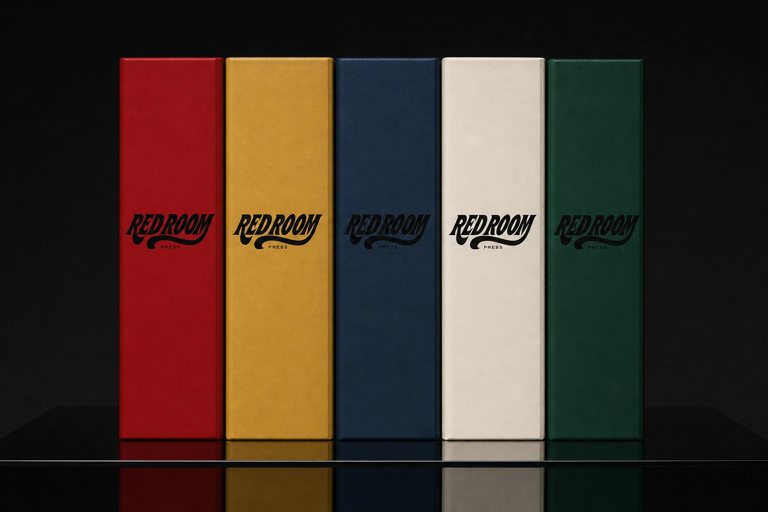
Red Room Press positions publishing as performance. Each issue is assigned one dominant stage color; Void Black
#0C0C0C and Bone White #EDE7DD are the only constants across every release, everything else rotates.LOGO
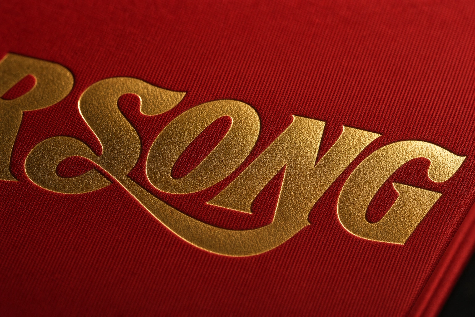
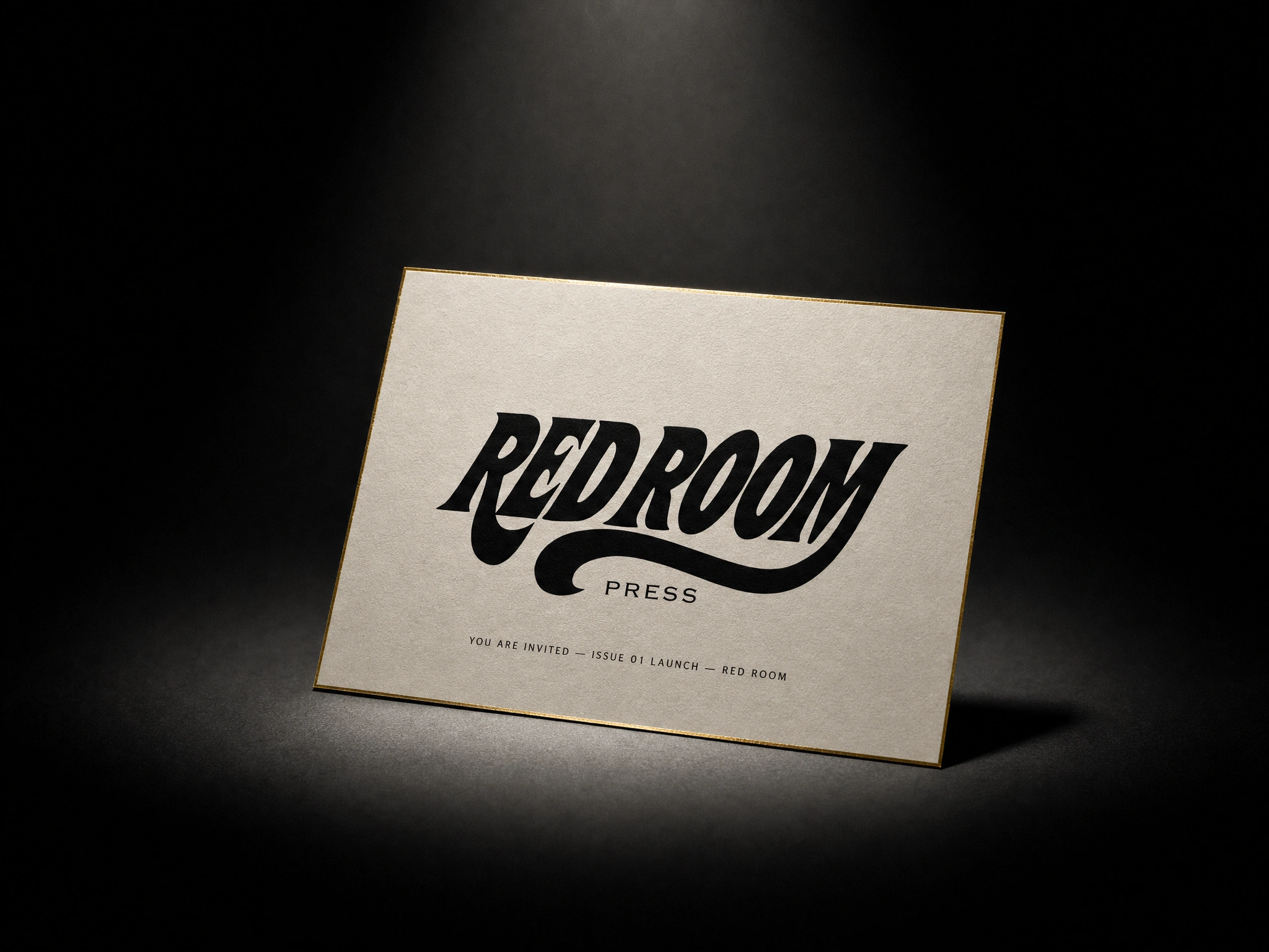
The wordmark locks "RED ROOM" in a custom ligature italic — the final M's stroke extends into a long connecting swash beneath both words, and the double O in ROOM fuses into a single continuous counter-shape. "PRESS" sits underneath in a plain uppercase grotesque at roughly 1:4 the height, deliberately undercutting the drama above it. Each issue gets one permitted ligature variation within the wordmark — collectible, never structural.
TYPOGRAPHY SYSTEM
Display type is built entirely from custom ligatures — no two ornate elements ever share a frame. Functional copy (issue numbers, credits, dates) runs in a tightly tracked, personality-free grotesque, working as the "stage manager" to the wordmark's "performer."
COLOR SYSTEM
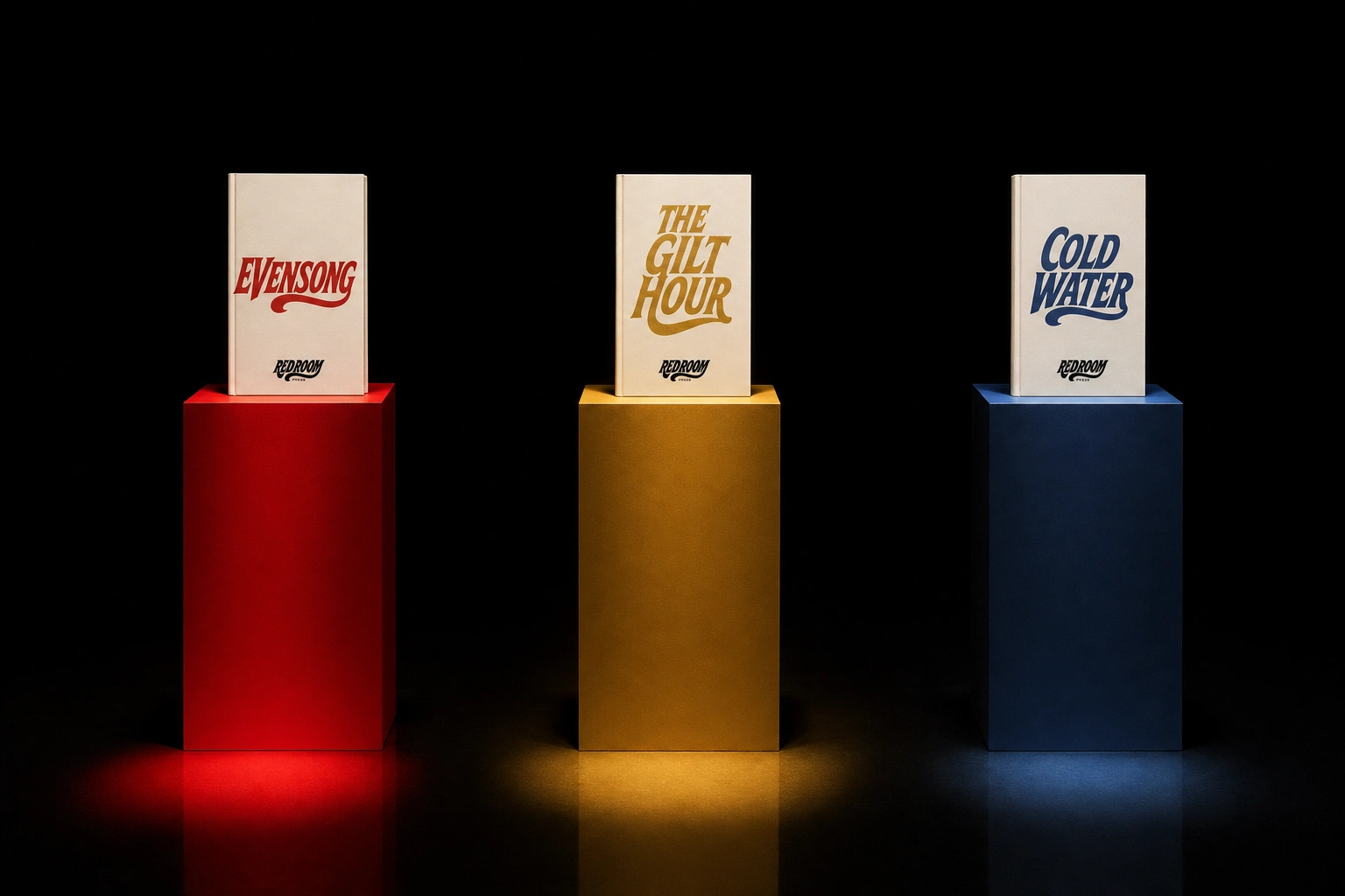
Ceremony Red
#B31217, Candle Gold #C9A24B, Slate Blue #2A3C57, Deep Emerald #1F4D3A rotate as stage colors per issue. Void Black and Bone White are fixed across the whole catalogue.CAMPAIGN / OOH
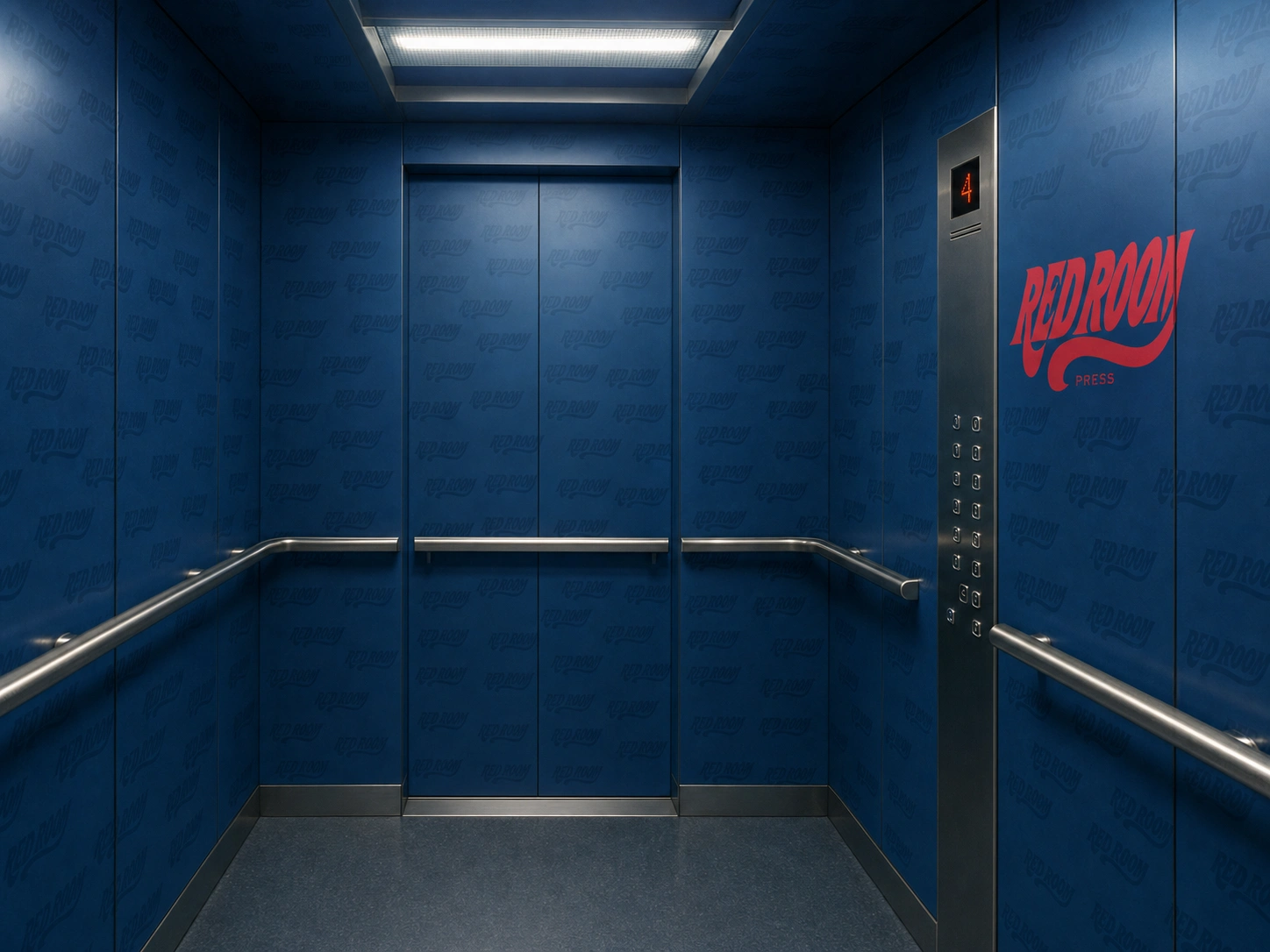
25 mockups across book jackets, packaging, stationery, apparel, studio product photography, and full transit/OOH takeovers — subway panels, bus shelters, taxi tops, construction hoarding — each treating its real-world environment as naturalistic and grey, with the ad itself as the one saturated theatrical intrusion.
WEB DESIGN / DEVELOPMENT
Live site, redroom-reveal.lovable.app. Built on a mask-reveal motion system — GSAP ScrollTrigger driving clip-path wipes and an SVG-wordmark-as-mask hero reveal, Framer Motion handling component-level transitions. No rotation transforms, no particle effects, no CSS-only animation for anything scroll-linked — every reveal is a spotlight finding something in the dark, never a bounce or spin.
THE RESULT
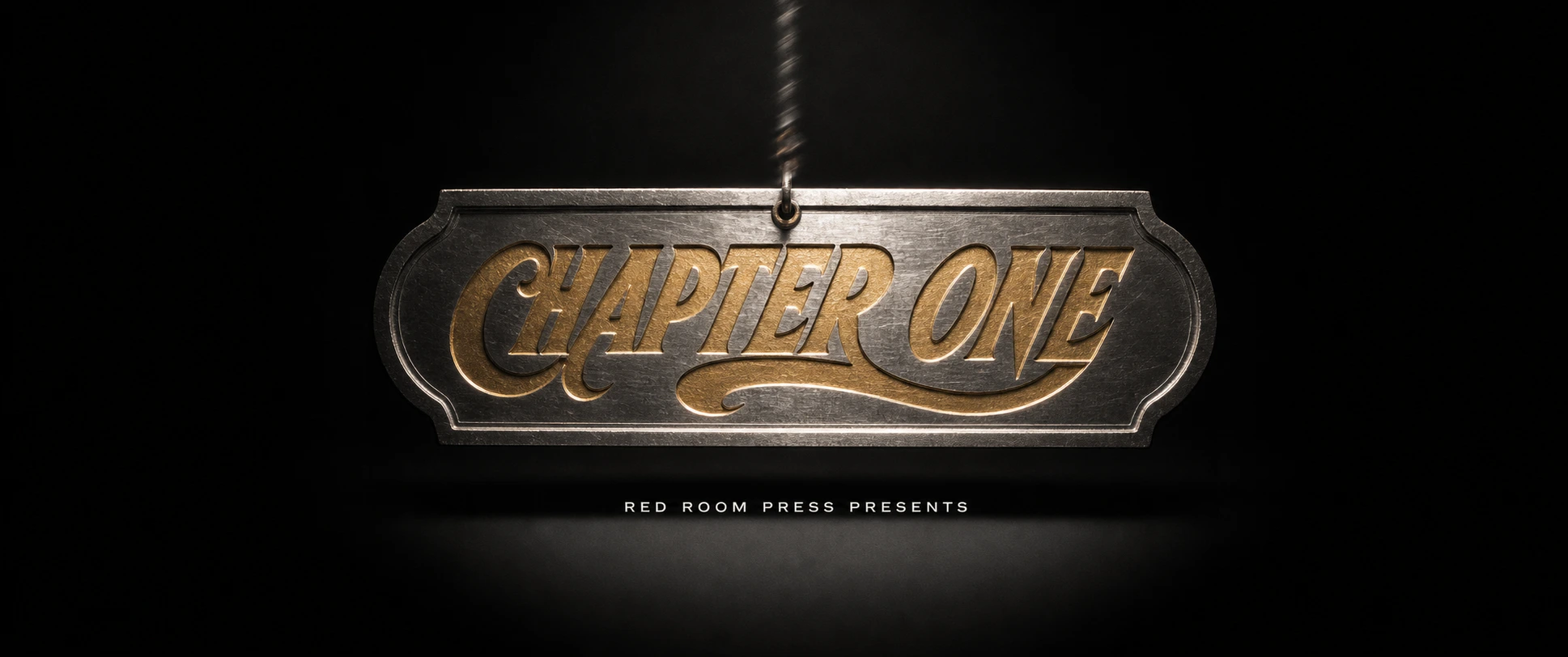
The site is live with four staged issues, a campaign film section, and a studio object shelf. The clearest signal it worked: nothing on the page reads as templated. Every section follows the same rule the photography does — one saturated color, one gesture, nothing accidental — and that discipline is what makes twenty-five different mockups feel like one press instead of a mood board.
Révolté — revolte.design
Project: Red Room Press
Year: 2026
Scope: Brand Identity, Logo, Typography System, Color System, Web Design & Development, Motion/Animation, Campaign/OOH, Packaging
Industry: Publishing
See more at revolte.design
Like this project
Posted Sep 7, 2026
A publishing house staged like theater — one saturated color per issue, ligature-driven type, and a scroll site built entirely on mask reveals
Likes
1
Views
13
Timeline
Aug 19, 2026 - Sep 7, 2026